Key Takeaways
- Missing info or features on Travel Accommodations and Tours and Experiences sites lead to site abandonments
- How well users are able to find and explore Travel Accommodations and Tours and Experiences sites directly impacts their booking decision
- Implement these best practices to improve your Travel Accommodations or Tours site UX
Key Stats
- 40% of sites don’t provide popular industry-specific filters
- 30% of sites don’t make the Travel Accommodations “Booking” search feature the primary content on the homepage
- Up to 83% of sites don’t always provide detailed tours info
- 57% of sites don’t always provide a map on the “tour details” page
- 85% of sites don’t always link to third-party reviews
During Baymard’s large-scale Travel Accommodations and Tours and Experiences testing, it was clear that users need very specific information and features in order to feel comfortable booking a hotel stay or tour experience.
While many user needs in these two contexts dovetail with general ecommerce UX, there are key ways they differ.
Additionally our ecommerce UX benchmark shows that accommodation and tours sites often fail to provide users with the information and features they need — leading directly to some users abandoning the site.
In this article we’ll discuss some of our research findings for Travel Accommodations and Tours and Experiences sites.
In particular, we’ll look at 5 ways many sites are failing users:
- Provide popular industry-specific filters (40% don’t)
- Make the travel accommodations “Booking” search feature the primary content on the homepage (30% don’t)
- Always provide detailed tours info (up to 83% don’t)
- Always provide a map on the “tour details” page (57% don’t)
- Always link to third-party reviews (85% don’t)
(Note: the first best practice discussed applies to both Travel Accommodations and Tours and Experiences sites, the second applies to Travel Accommodations sites, and the final 3 are specific to Tours and Experiences sites.)
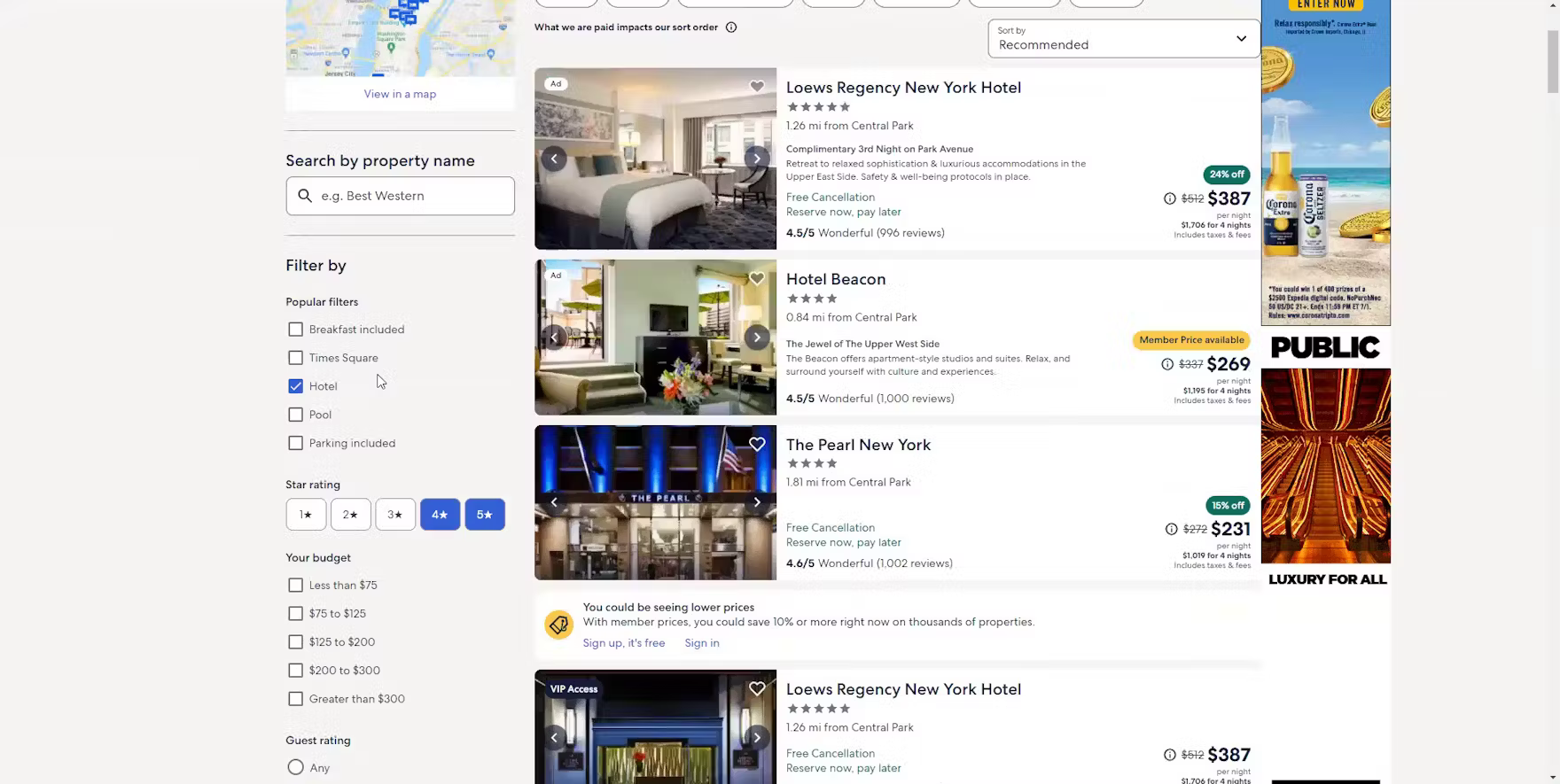
1) Provide Popular Industry-Specific Filters (40% Don’t)
Users shopping accommodations or tours and experiences sites have similar filtering requirements as users shopping at mass-merchant B2C e-commerce sites.
That said, while many filter requirements for accommodation and tours and experiences sites are the same (or very similar to) general ecommerce (e.g., price and guest or user ratings), there are specific filter types that users are likely to seek out when considering booking a travel accommodation or experience booking.
![“I like Marriott but I don’t really like their site. Yeah, this is gonna make it difficult to look through every single one. I don’t like how you can’t [filter by] ‘how many stars’. This is not good. I don’t like this. Done, don’t like that site.” A participant shopping for hotels at Marriott was so disappointed to discover she couldn’t filter the search results by hotel star rating that she abandoned the site entirely.](https://baymard-assets-cdn.imgix.net/research/media_files/attachments/155050/original/research-media-file-25cd5e12649fdea56955f8316aa8f3fc.png?auto=format&dpr=2&fit=max&q=50&w=880)
“I like Marriott but I don’t really like their site. Yeah, this is gonna make it difficult to look through every single one. I don’t like how you can’t [filter by] ‘how many stars’. This is not good. I don’t like this. Done, don’t like that site.” A participant shopping for hotels at Marriott was so disappointed to discover she couldn’t filter the search results by hotel star rating that she abandoned the site entirely.

“I really want to do a volcano tour, so I want to see, is there a kid-friendly one? I don’t see any way I can sort of filter by age, which is a bummer. I wish I could.” This participant shopping for family-friendly tours at Reykjavik Excursions during large-scale Travel Tours & Experiences testing was disappointed by the lack of filtering options.
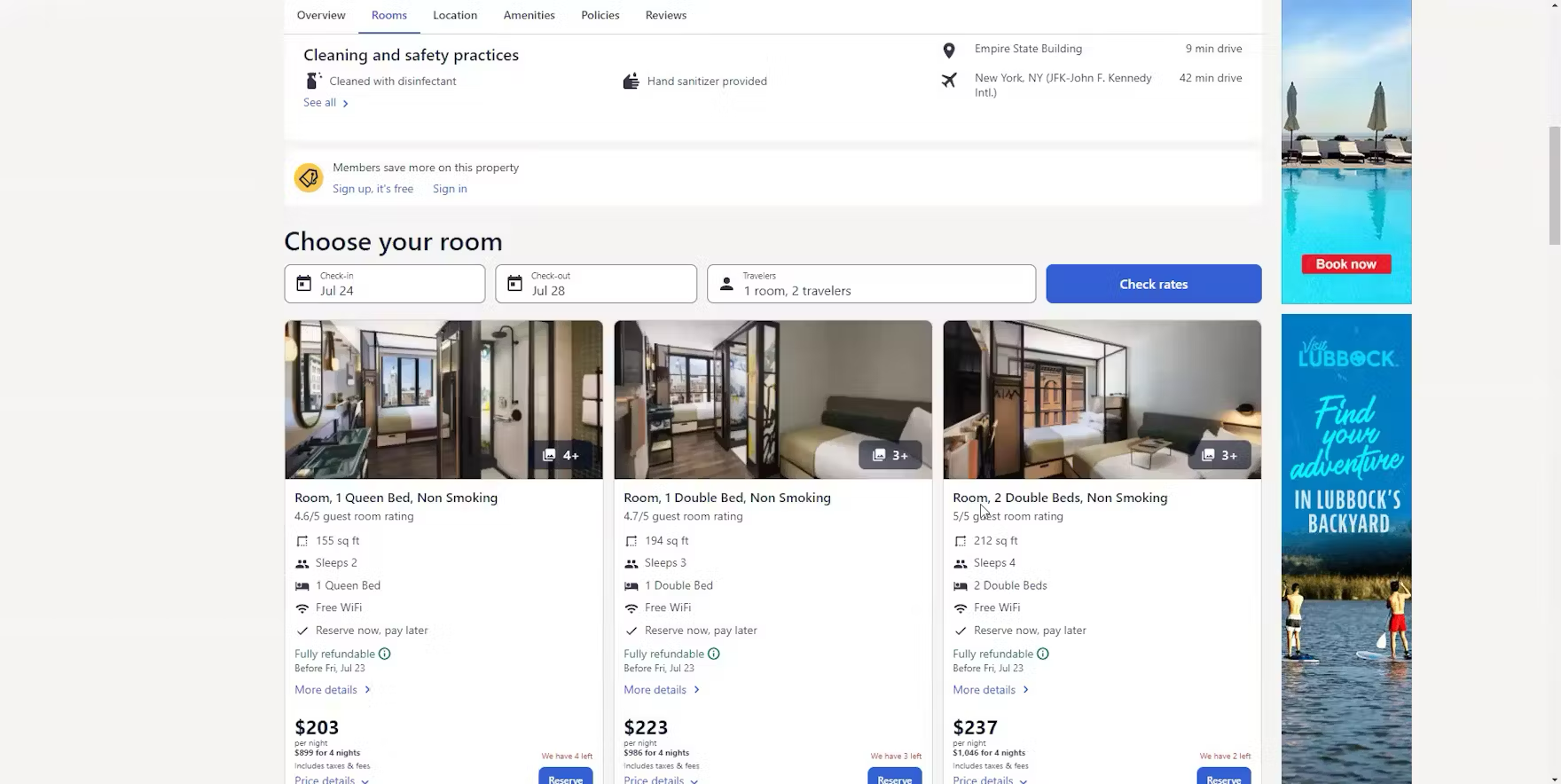
“Oh, this hotel looks like it just has queens [as the biggest], so I wouldn’t get more information on that one”, explained a participant at Expedia viewing a hotel property details page (first image). Returning to the search results she continued, “I wonder if there is a filter for a king bed?” After scanning the filters she explained, “No, it doesn’t look like there is. Yeah, so I guess it would be nice if there’s a filter here to do like the type of room” (second image). During large-scale Travel Accommodations testing, participants shopping for hotel rooms on OTA and large-brand hotel chain sites often wanted to filter by bed size to eliminate hotels that couldn’t accommodate their bed size preference.

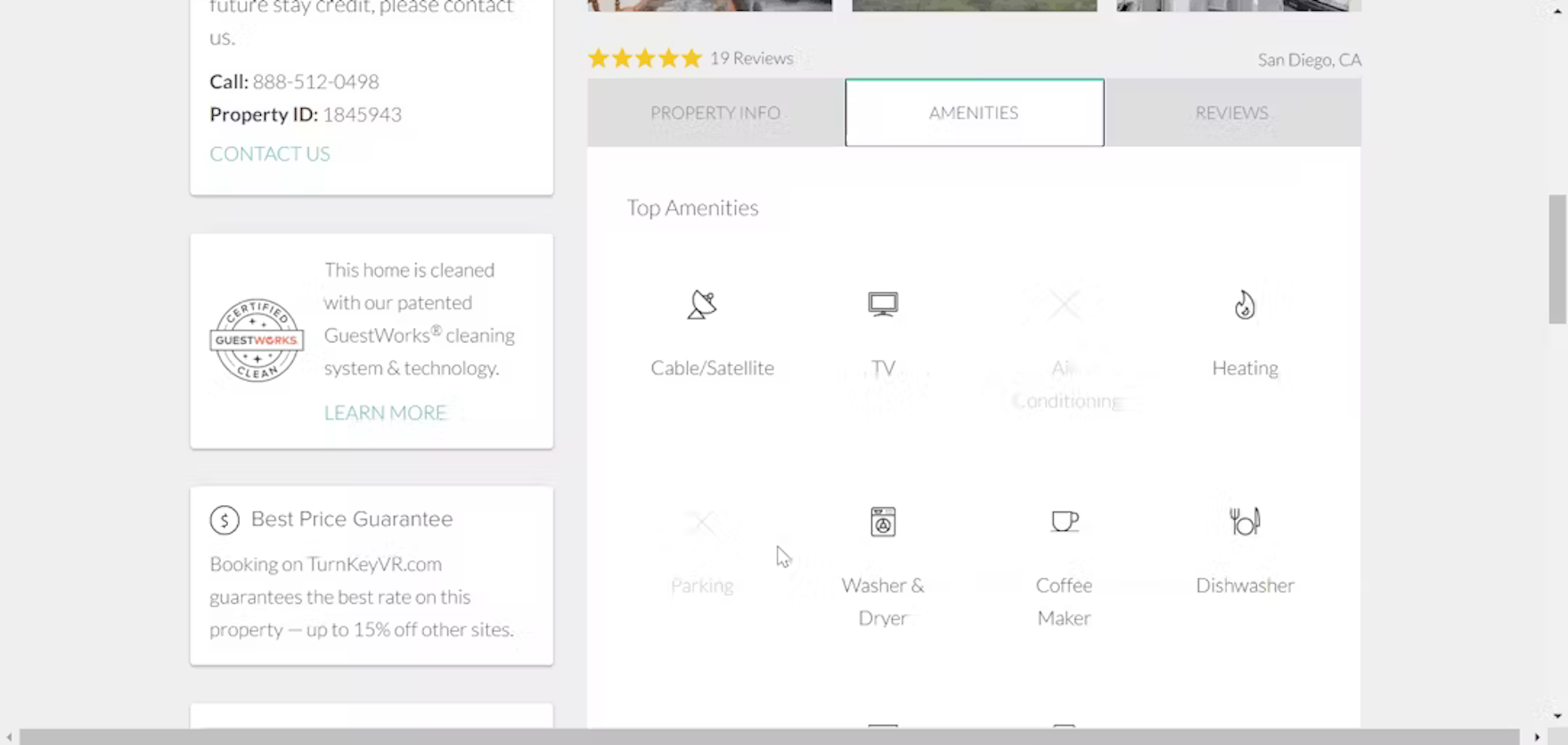
“I think that may be all the filters that are available, which is surprising because there are other things that I could imagine wanting to filter for, but I’m not seeing the option anywhere unless I am missing it where I can apply more filters.” A participant shopping for rental properties at TurnKey was frustrated by the lack of filtering options (first image). “There’s no air conditioning and no parking, so this would probably get axed because I don’t want to stay downtown where there’s no parking”, he complained when he discovered the first property he selected didn’t have any parking (second image). Just like users shopping for products on traditional ecommerce sites, users shopping for travel accommodations have high expectations for filtering options.
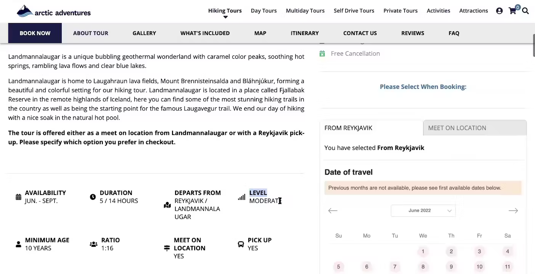

“Is there a way? Am I missing a filter somewhere that says ‘challenging versus easy’?” A participant at Arctic Adventures noted the difficulty level for a hiking tour on the “Tour Details” page (first image). He was shopping for a hiking tour his mom could also participate in, so he returned to the tour listings to see if he could filter for easy tours. He was frustrated to discover he could not (second image).
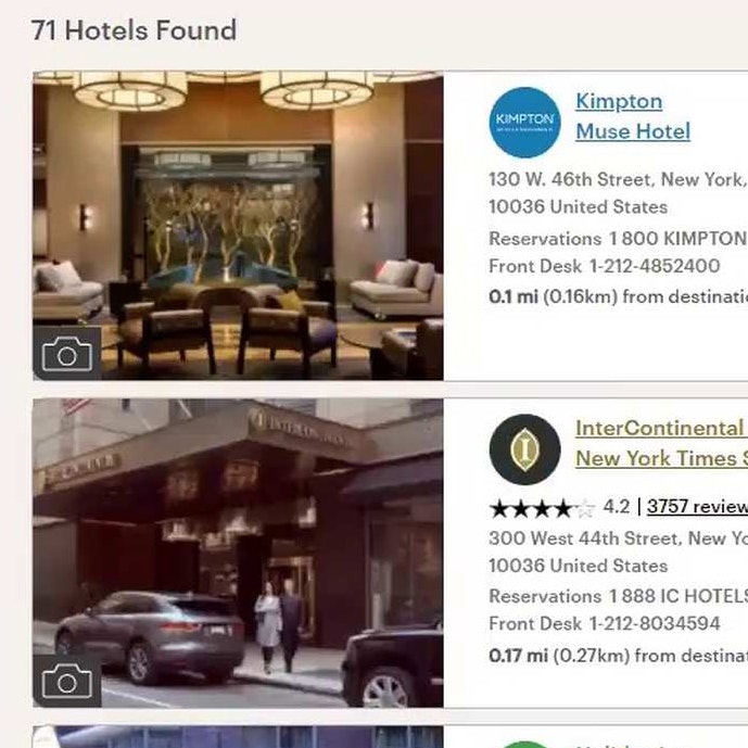
Due to the number of potentially suitable hotel and rental properties offered within even an exact location, narrowing down the search results is directly linked to users’ success at being able to find and consider only relevant hotel and rental property listings.
Similarly, finding the right tour or experience booking can be daunting when considering a variety of tours, along with needs of a specific travel group.

Users at Hyatt can select amongst multiple filter options for ”Hotel Amenities” such as ”On-Site Restaurant”, ”Pool”, ”Free Parking”, etc. Assisting users in narrowing down the list to only include accommodations that provide the user’s desired amenities reduces the time needed to assess and compare potentially suitable options.
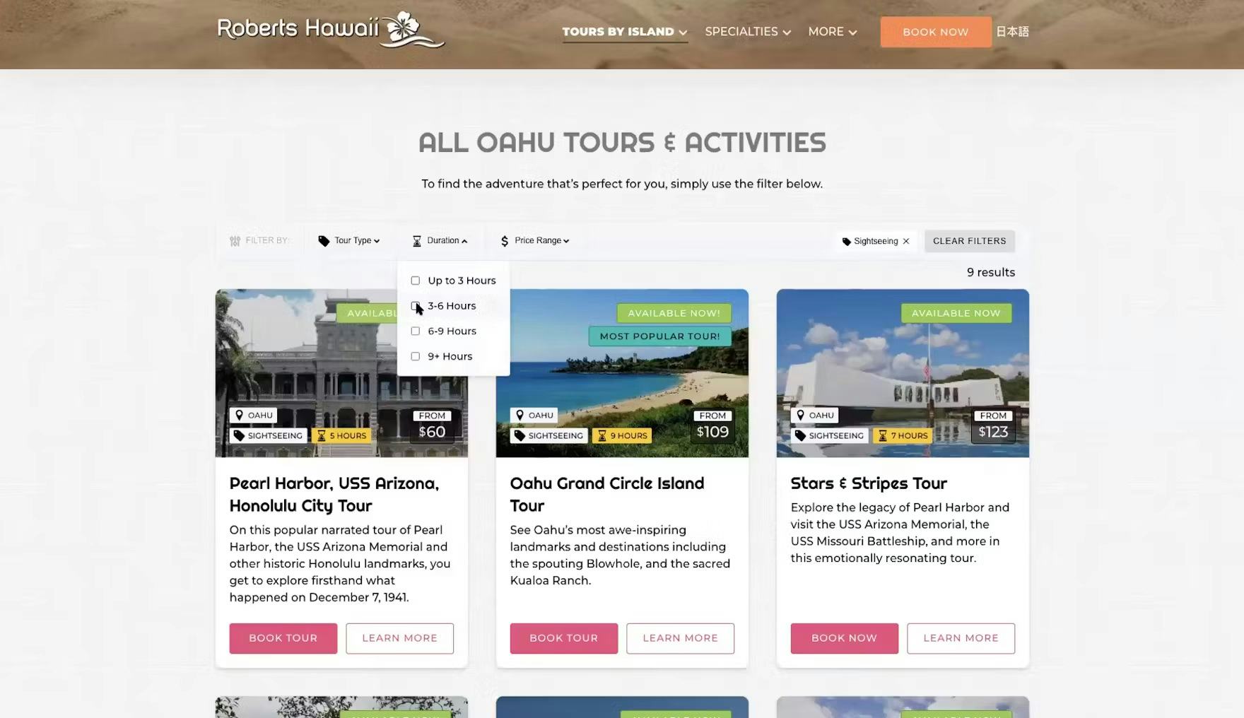
“Ooh! I love this filter option because if I want to do sightseeing and I only have a half day”, exclaimed a participant at Roberts Hawaii. Participants frequently cited tour duration as a desired filter option during large-scale Travel Tours & Experiences testing.
On accommodation sites, amenities like a pool, or an on-site restaurant for hotels, or bedroom and bathroom counts for rental properties (to name a few) — are highly valuable for users to identify the most relevant hotel or rental properties to consider.
For tours, the specific filtering options will vary widely depending on the type of tour being offered — for example, length of tour in hours, “family-friendly tours”, “lunch included”, etc.
While providing the perfect site-specific filter type for every user is not possible, it’s key to provide a sufficient number of specific filter types — at least 5–10 — so that most users will be able to narrow down results lists to accommodations and tours that suit their needs.
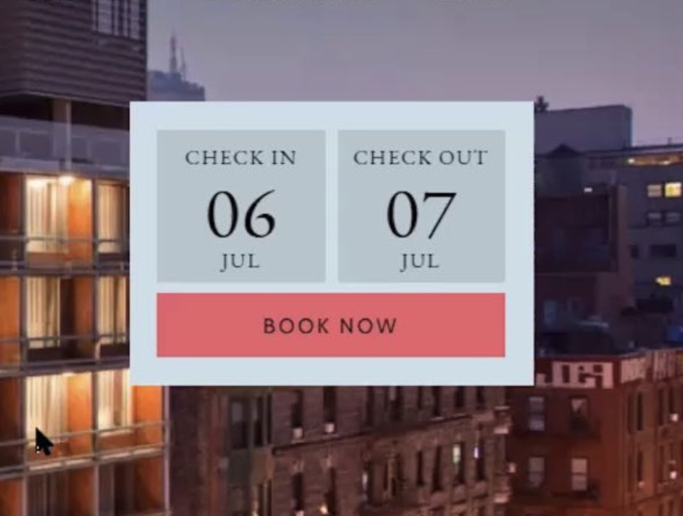
2) Make the Travel Accommodations “Booking” Search Feature the Primary Content on the Homepage (30% Don’t)
During testing, nearly all participants — 99% — shopping at OTA, large-brand hotel, and whole property rental sites immediately looked for the “Booking” search feature on the homepage.
Moreover, all the OTA, large-brand hotel, and whole property rental sites tested displayed a “Booking” search feature directly on the homepage.


“I did notice their hotel lookup module was lower on the page. I kind of feel like that’s the number one thing people are gonna be doing on the site, so they may wanna consider the position of it…I mean, you land on the page, you can’t even see it”, remarked a participant at IHG as he submitted his query. In the absence of an apparent “Booking” search feature on the homepage, he had clicked the “Book Now” button in the main navigation (first image), which moved him down the page (second image). The “Booking” search feature at IHG wasn’t immediately visible for the vast majority of participants during testing (it fell below the fold for 78% of test participants).
However, some of these sites failed to give the “Booking” search feature the attention it deserves, considering its importance in locating a room or property to book.
Consequently, if the “Booking” search feature is difficult to identify on the homepage immediately, nearly all users, regardless of their familiarity with the site, will be unnecessarily delayed in taking the first step toward identifying a suitable accommodation.

At Plum Guide, the “Booking” search feature spans nearly the entire width of the homepage, and its styling and positioning ensure it won’t be missed by users.
Therefore, it’s important to ensure users can easily locate the “Booking” search feature
In particular, to ensure high visibility of the “Booking” search feature, the three design elements that typically have the biggest impact are position, style, and size.
For example, prominent placement, high contrast against background colors and imagery, bigger input fields and font size, bold borders, and increased vibrancy of the “Search” button are all effective in helping users identify the “Booking” search feature immediately when they arrive at the site.
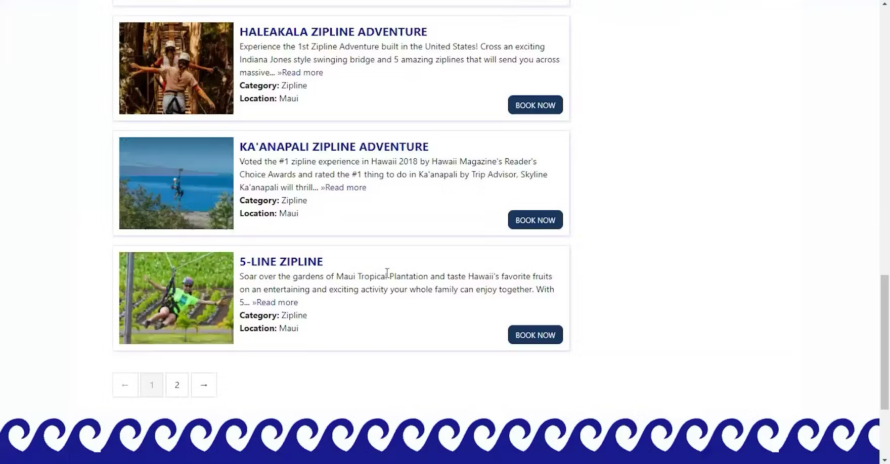
3) Always Provide Detailed Tours Info (Up to 83% Don’t)
When it comes to shopping for tours and experiences, testing revealed that basic tour information is critical for users considering booking.
It was thus somewhat surprising that many of the tour test sites failed to provide this basic information.

“I wish that it would show me the price right away because then that’s going to save me the time of having to click each one”, complained a participant shopping for surf lessons at Blue Hawaiian Activities. She opened a “Tour Details” page but immediately discarded the tour upon discovering the price. Missing prices in tour listing pages are always likely to make a poor impression on users.
“The thing I don’t like and just realized is there’s no pricing! I don’t want to have to go to each one I’m interested in to find out what I’m looking at for price. That is aggravating!” exclaimed another participant at Blue Hawaiian Activities. Without price, users have to spend extra time and effort to open each “Tour Details” page, resulting in a laborious and time-consuming shopping experience.

“I definitely like it more when there are pictures because I feel like it gives you more of an experience of what you’re getting before you click on it”, complained a participant at Wendella. The tour listings contained only tour names, resulting in a cumbersome and dispiriting shopping experience.
Essentially, some test sites asked participants to book a tour — oftentimes costing hundreds of dollars — without the information they needed to make a purchase decision.
As a result, many users will abandon the site to contact the tour company over the phone — or search for an alternative tour online that provides this basic information.
Along with price details, testing revealed the following to be “basic” tour information that most users will look for when booking a tour:
- Tour duration and start time
- Tour departure or meeting points
- Special requirements or restrictions (e.g., “for ages 16+”, weight maximums for helicopter tours, physical fitness requirements for hiking tours, etc.)
- Full descriptions of the experiences users can expect during the tour
- The cancellation policy
If any of the above information isn’t provided — or is difficult to find — at multiple locations, many users will come to a stop and fail to initiate the booking process.
4) Always Provide a Map on “Tour Details” Page (57% Don’t)

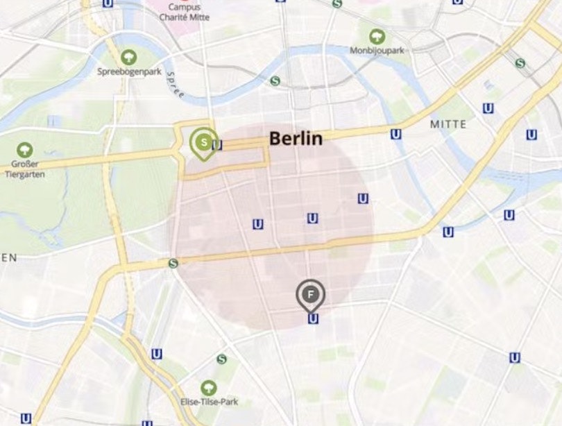
”I don’t think the average person’s going to be able to pick out which volcano in Iceland they’re going to. So they’re going to have to Google this separately, which I can do, but it seems like an unnecessary step.” A participant at Gray Line Iceland was annoyed by the lack of information about the meeting point for the “Fagradalsfjall Volcano Lava Tour”, prompting him to conduct a Google search.

“Tells you where it is. So then I would have to look to see where it’s at and how long it would take to get there from wherever we’re staying”, explained a participant the “Tour Details” page for the “Atlantis Submarine” tour at Roberts Hawaii. During testing, participants frequently wanted to know where the tour or experience was located in context to where they were staying.
During testing, it was observed that, without sufficient visual information about the tour departure or meeting point, a subgroup of users will lack the details they need to make a purchase decision.
These users will search in vain for a visual indication of where the tour departs from, growing increasingly frustrated, with some eventually choosing to give up and leave the site.
Another subgroup will spend additional time pasting the textual description into a Google search — which of course risks that, once they’re off-site, they won’t return, or will be enticed to view a competing tour.
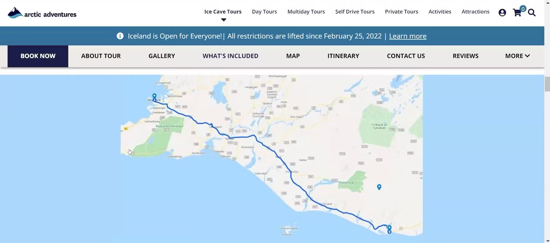
“Here, they actually tell you where you’re going specifically. So, I like that very much”, remarked a participant shopping for guided tours in Iceland at Arctic Adventures. He was able to use the Google map on the “Tour Details” page indicating the pickup and meeting points for the “Katla Ice Cave: Under the Volcano” tour to visualize the distance from the pickup location in Reykjavík to the tour meeting point in Vík two-and-a-half hours away on the southern coast, and felt confident to book the tour.
To prevent needless friction, always have a map identifying the departure or meeting point visible on the “Tour Details” page.
In practice, a map makes it easier for users unfamiliar with the area to visualize the departure or meeting point location generally and in context to other potential points of interest.
Indeed, during testing, sites that offered a map in conjunction with the textual description of the departure or meeting point for the tour helped to dispel participants’ uncertainty about where they would need to go to join the tour and thus helped to enable them to make a confident booking decision.
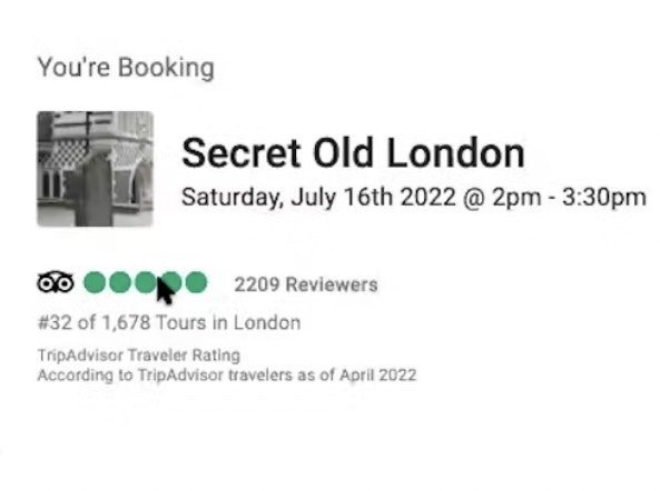
5) Always Link to Third-Party Reviews (85% Don’t)
To satisfy users’ need for reassurance from others about a tour or tour operator, a few of the test sites featured a curated selection of site-provided testimonials from satisfied users, likely solicited directly after taking a tour.
However, as observed during testing, a subgroup of users will be highly skeptical of these glowing reviews and simply ignore them.

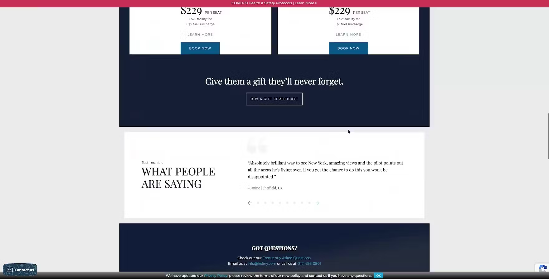
“I never read the testimonials on a website. I think it’s a pointless waste of space because, of course, they’re going to just put whatever nice things that they would say.” A participant at HeliNY dismissed the curated testimonials featured on the homepage outright, perceiving them to be too biased.
“Here I see testimonials, which, usually to me, I don’t really read on their main site because it’s nice that they have them, but obviously they can pick which ones they want to put on there as opposed to a third-party website”, explained a participant at New York Helicopter Tours.
As one participant remarked, “Testimonials are kind of like, everybody is happy about it. So, does it mean that they don’t have any bad reviews, or does it mean that they are only including the good reviews here?”
In practice, a curated selection of site-provided positive testimonials simply lacks credibility, and many users will be uncomfortable relying on only testimonials when making a booking decision.

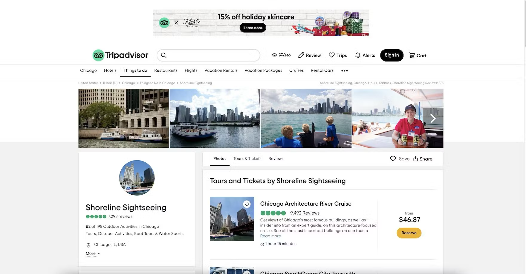
“They have their Tripadvisor ratings — 2017, 2018, 2019, and 2020. They have a long streak of satisfied customers”, remarked a participant at Shoreline Sightseeing, hovering his cursor over the Tripadvisor badge in the persistent footer (first image). The badge is a link, providing one-click access to the tour operator’s profile page at Tripadvisor (second image). Testing revealed that linking third-party logos and badges to the associated company profile page matches users’ expectations while saving them the time and effort of manually navigating to the site and searching for the desired information.
Therefore, when integrating third-party content such as aggregate ratings, reviews, awards, and endorsements, always provide direct access from that content to the associated pages at the third-party sites.
For example, when displaying an aggregate rating such as from Tripadvisor, Yelp, or Google, ensure it’s clickable and leads to the underlying reviews for that tour.
And when displaying tour operator awards and “As Seen In” endorsements, always link those icons and site logos to the company “Profile” page at the third-party sites.
Give Travelers the Info and Features They Need to Make a Decision
When it comes to Travel Accommodations and Tours and Experiences, users typically have a plethora of options to choose from.
Users should spend their time on your site exploring accommodations and tours options — not searching for hard-to-find information or struggling with poor-performing features.
Yet our ecommerce UX benchmark shows sites often fail to support users on Travel Accommodations and Tours and Experiences sites, as in the 5 areas discussed in this article:
- Provide popular industry-specific filters (40% don’t)
- Make the travel accommodations “Booking” search feature the primary content on the homepage (30% don’t)
- Always provide detailed tours info (up to 83% don’t)
- Always provide a map on the “tour details” page (57% don’t)
- Always link to third-party reviews (85% don’t)
Travel Accommodations and Tours and Experiences users are thus often missing the key info and features they need to make a decision — and consequently will delay or abandon their reservation.
This article presents the research findings from just a few of the 700+ UX guidelines in Baymard – get full access to learn how to create a “State of the Art” ecommerce user experience.
If you want to know how your desktop site, mobile site, or app performs and compares, then learn more about getting Baymard to conduct a UX Audit of your site or app.