
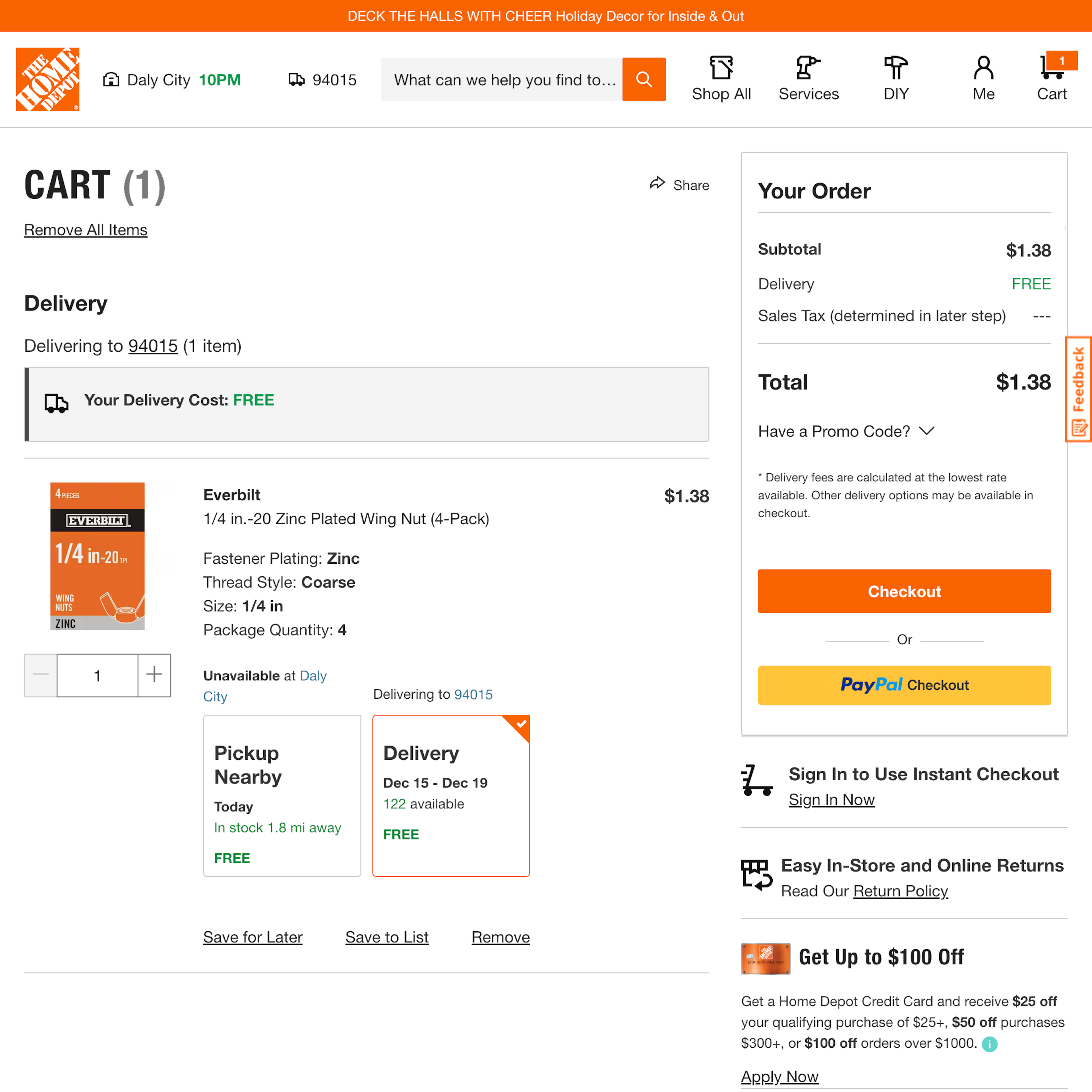
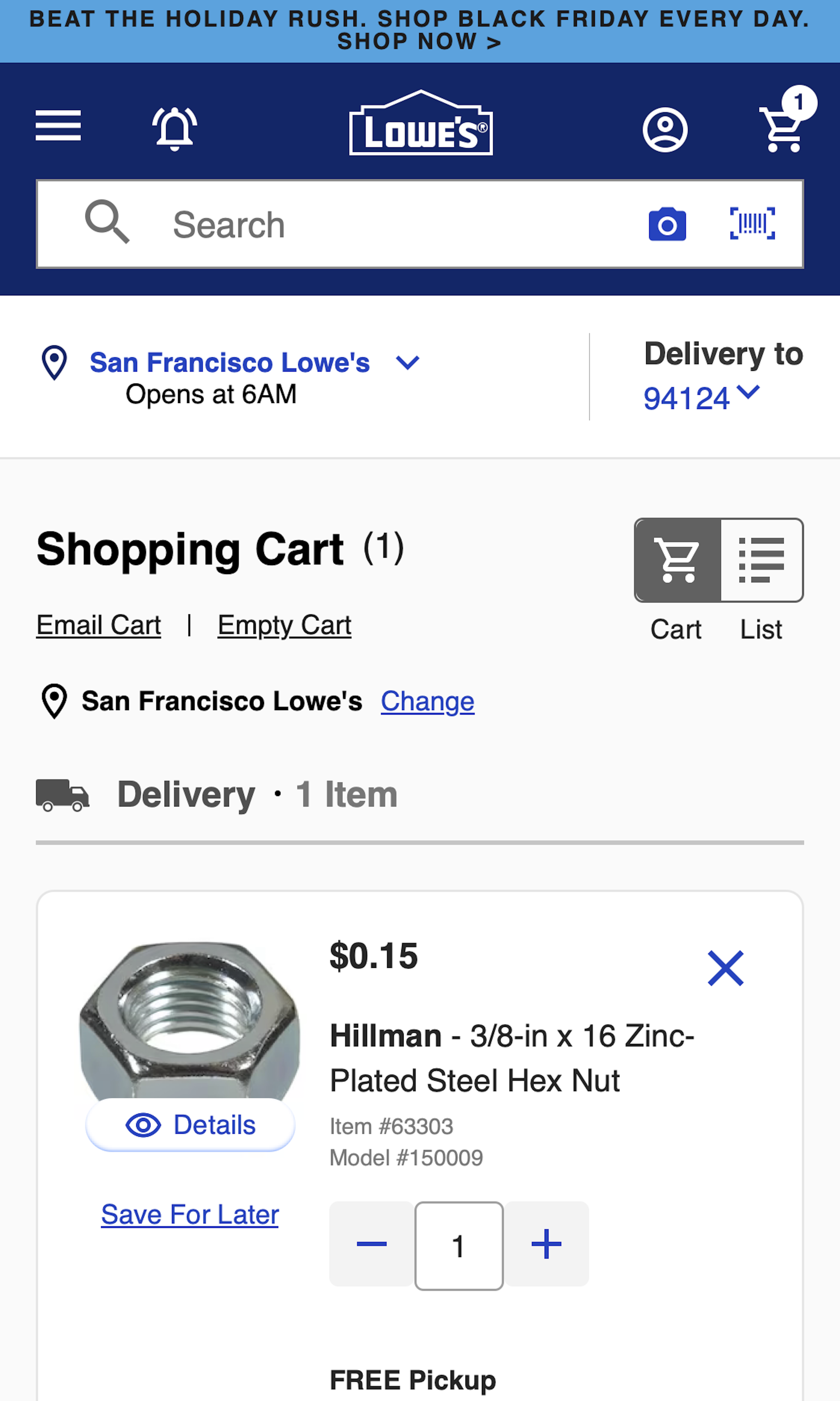
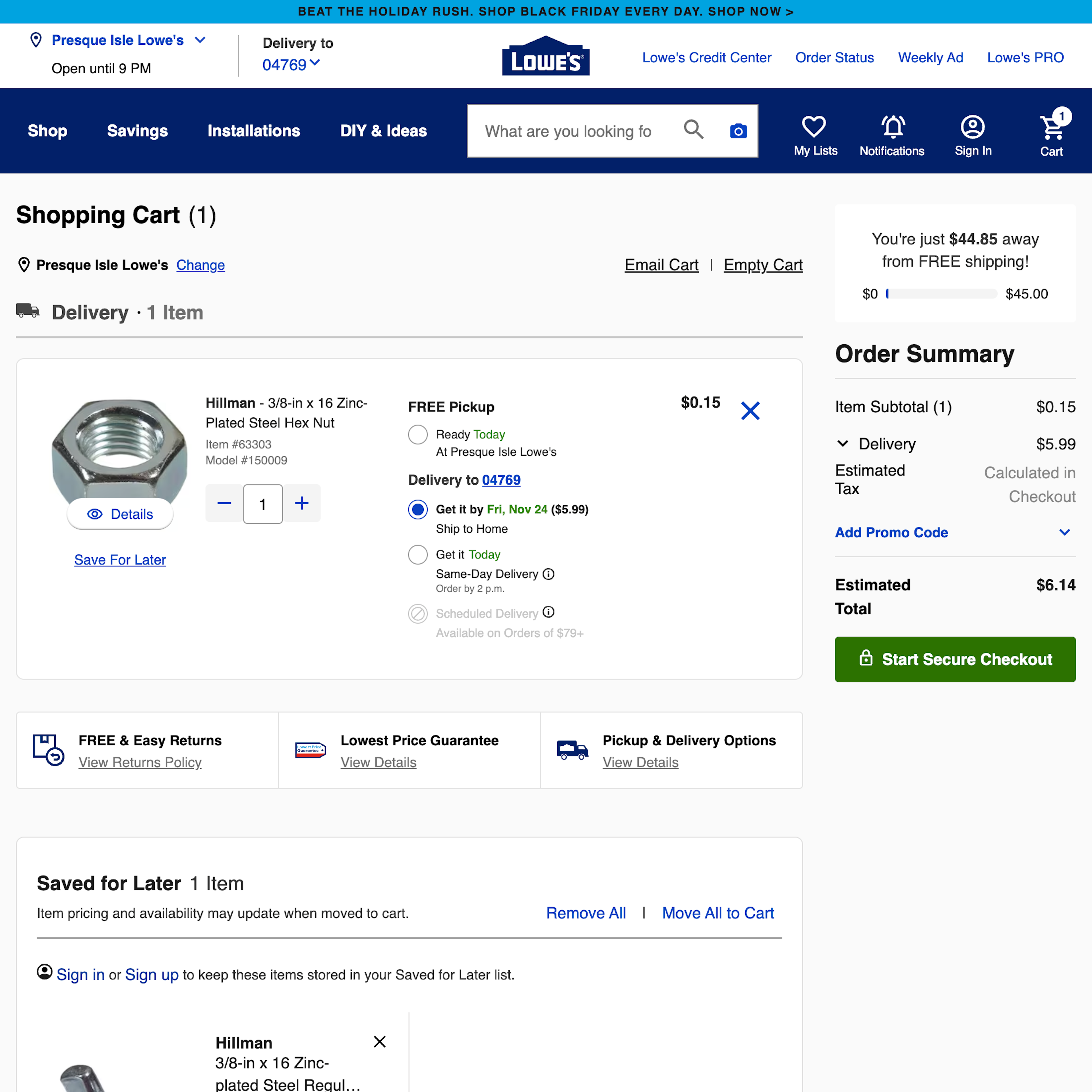
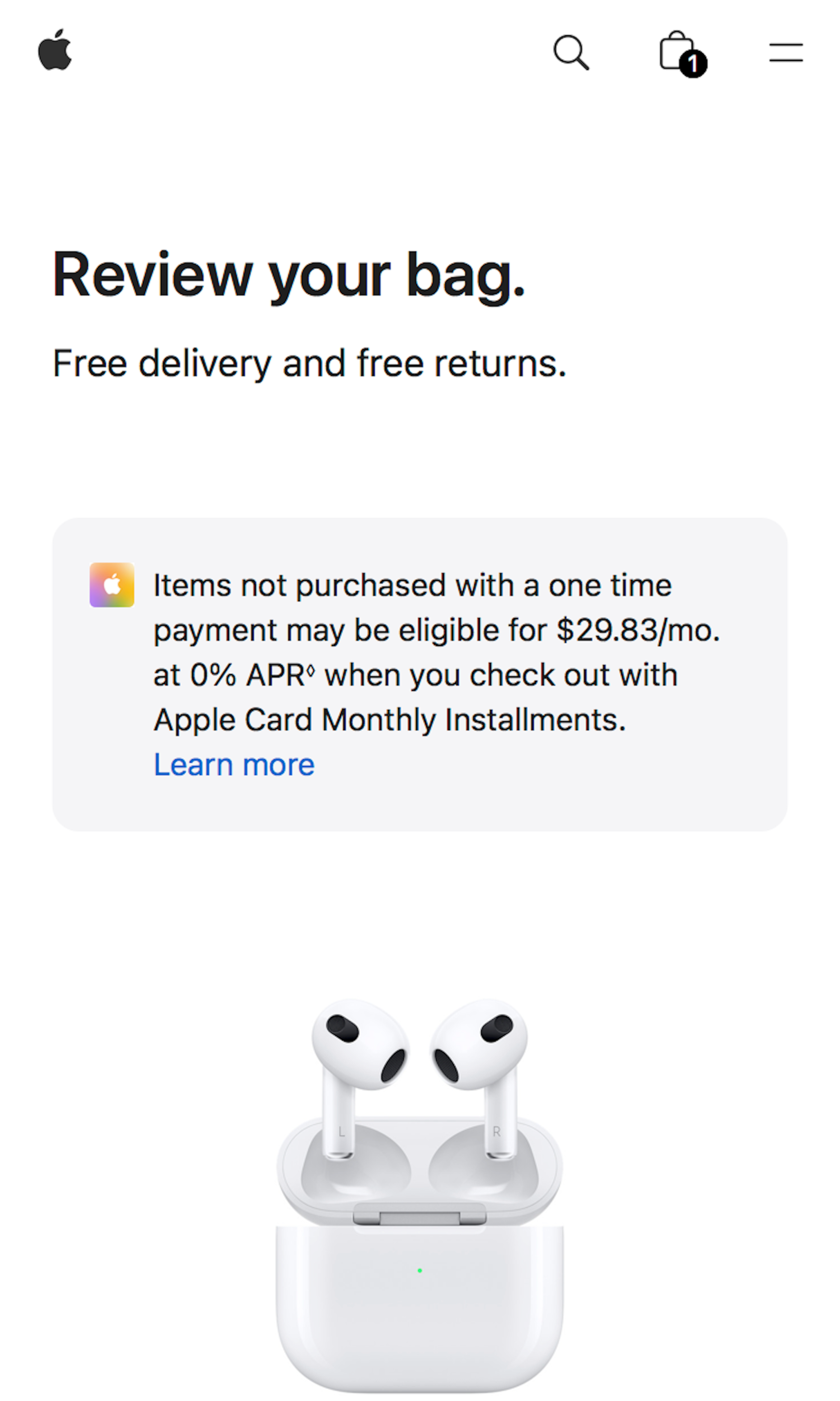
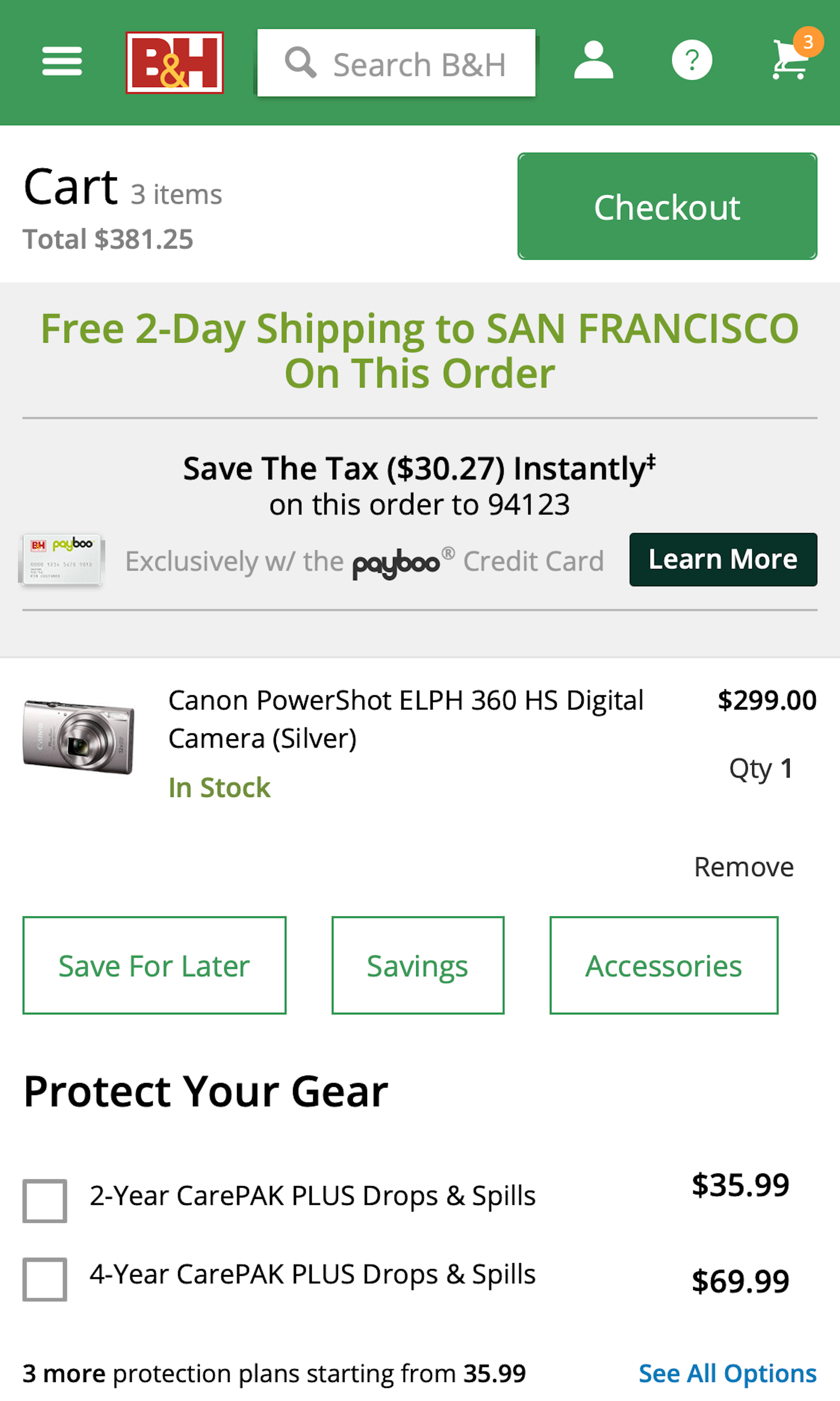
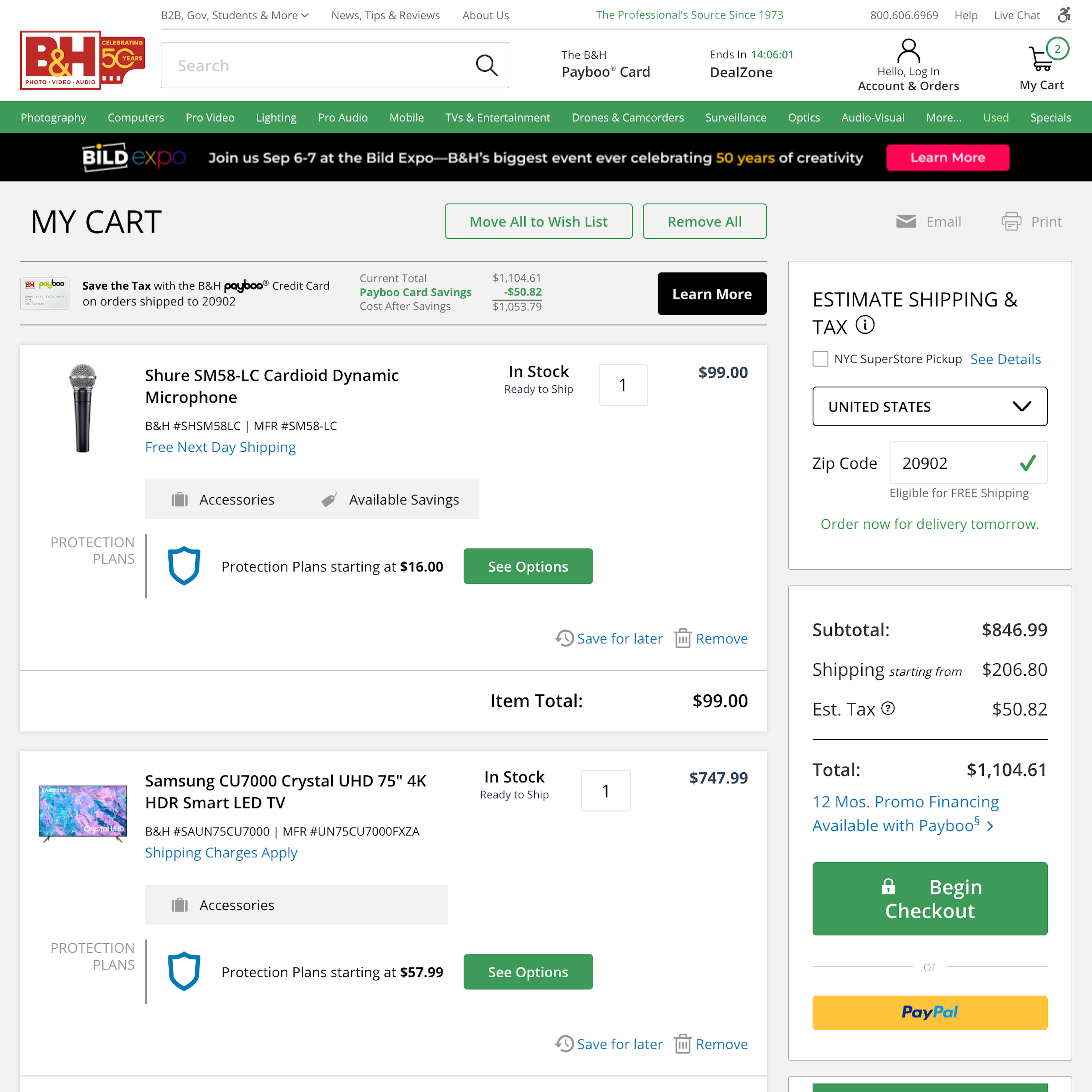
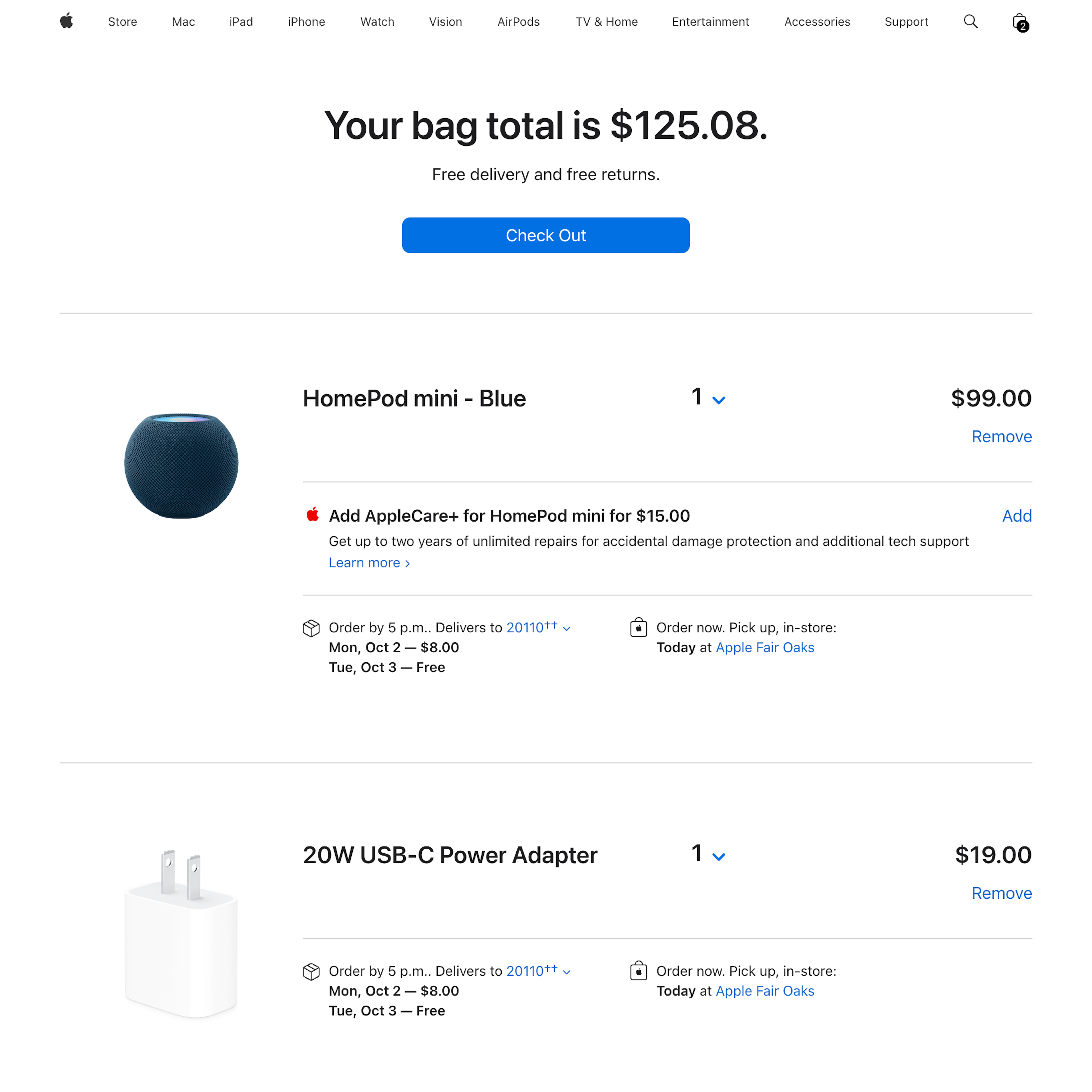
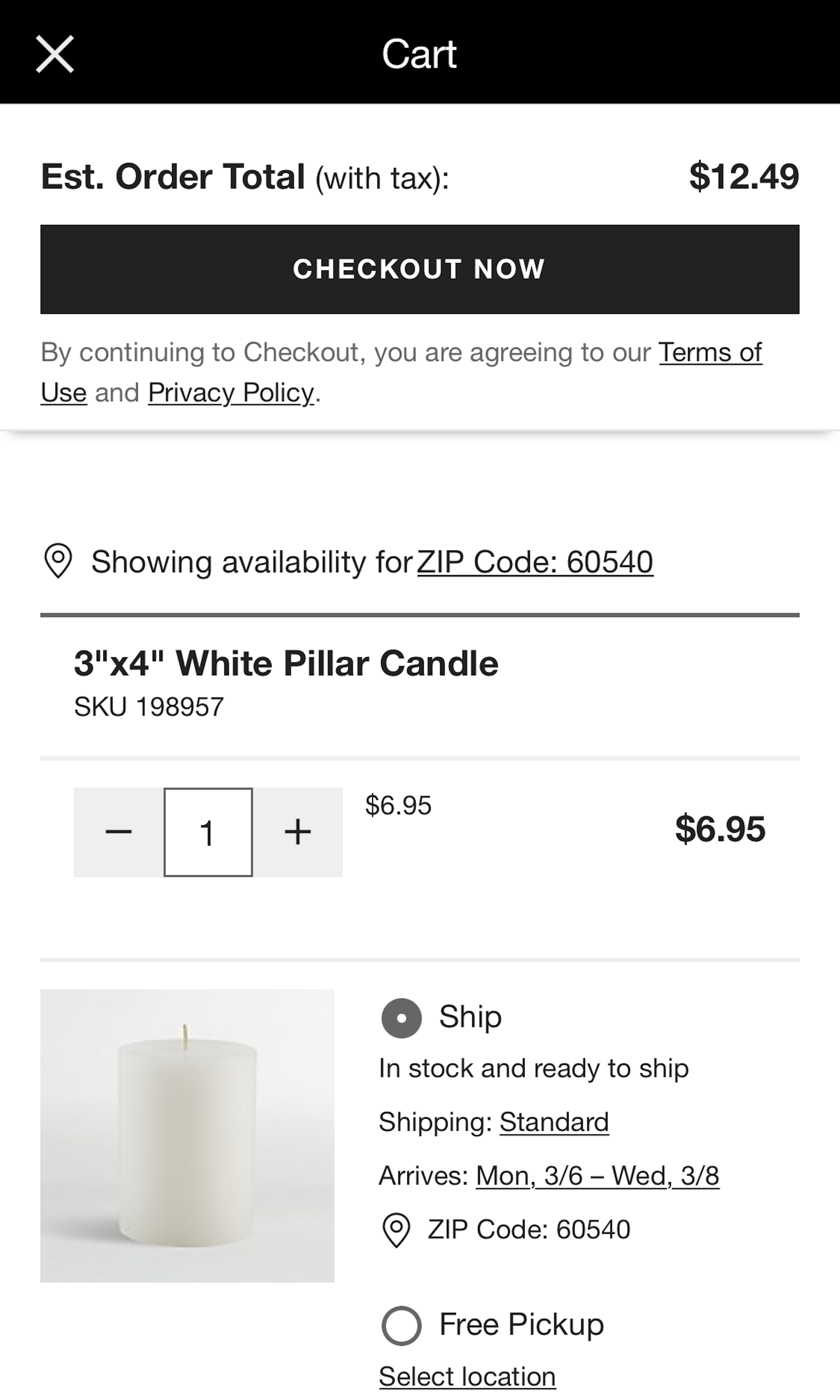
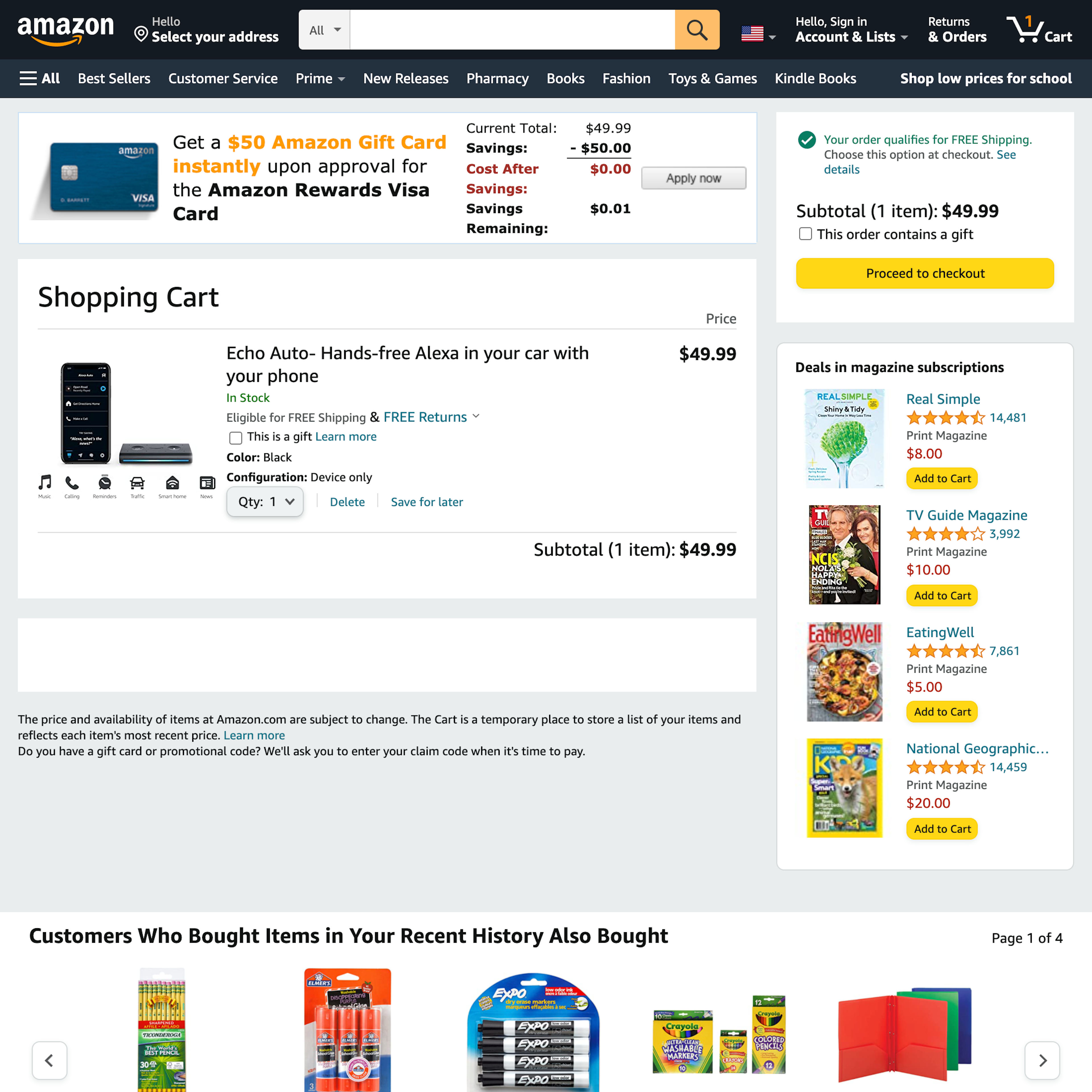
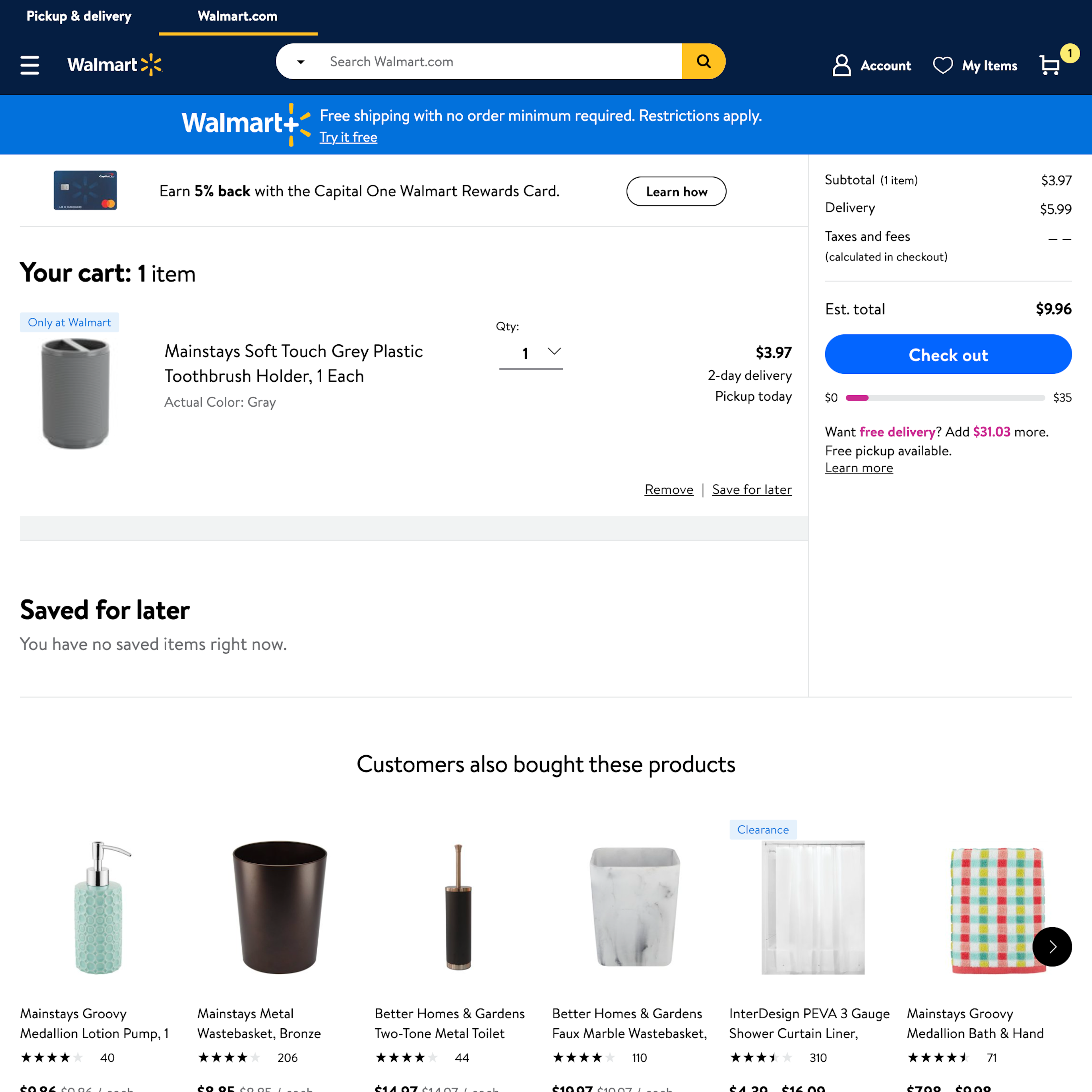
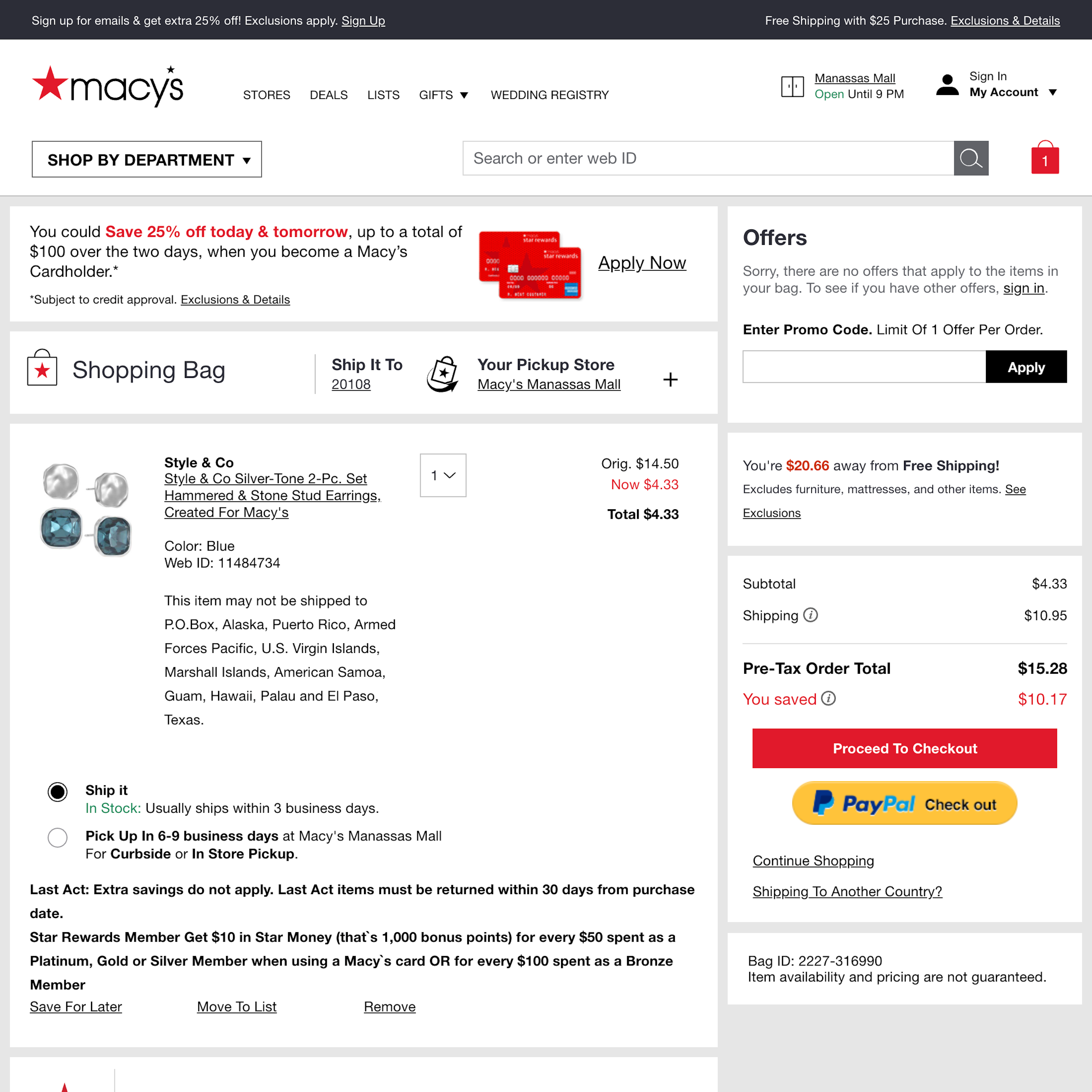
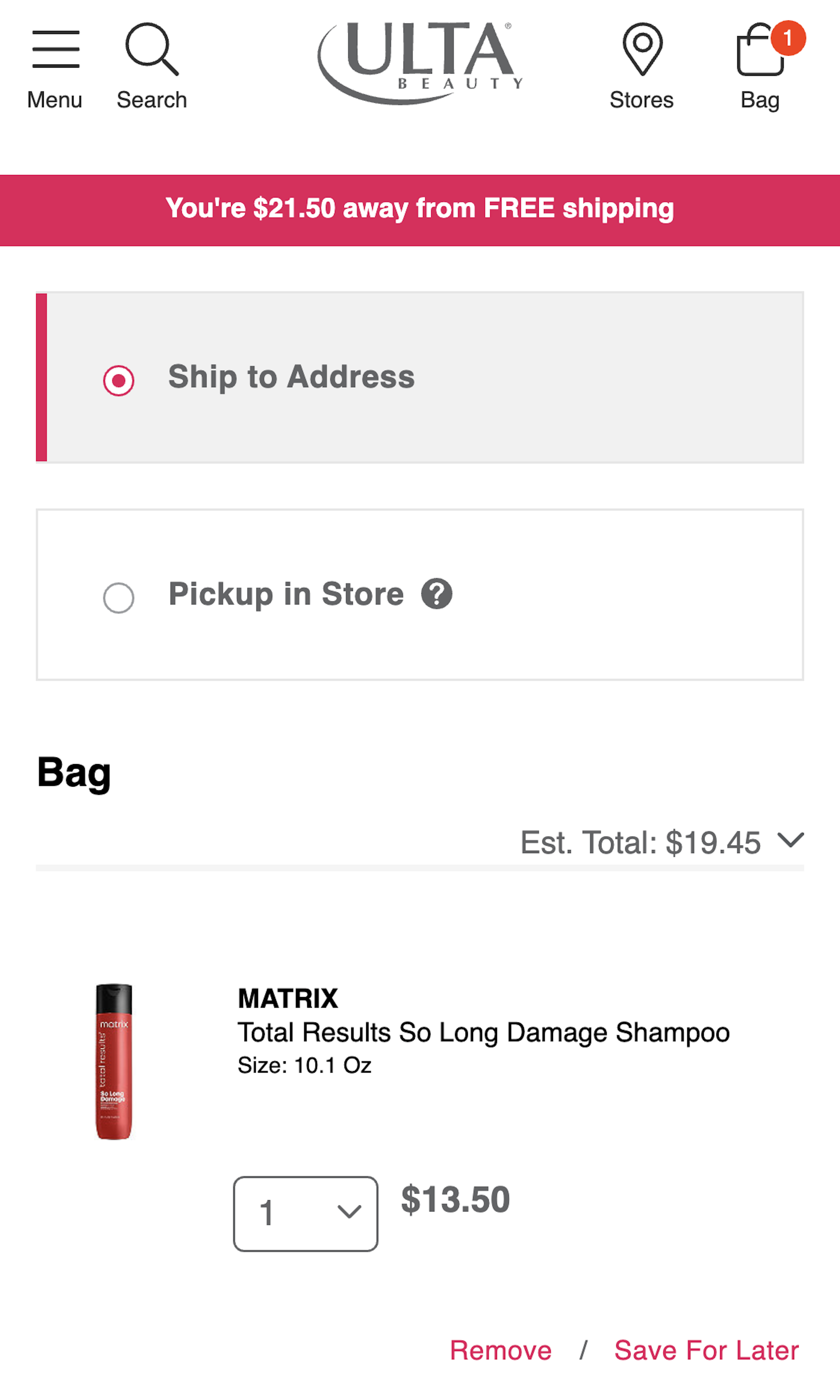
1109 ‘Cart’ Design Examples
Also referred to as: Shopping Cart, Shopping Basket, Shopping Bag
What’s this? Here you’ll find 1109 “Cart” full-page screenshots annotated with research-based UX insights, sourced from Baymard’s UX benchmark of 325 e-commerce sites. (Note: this is less than 1% of the full research catalog.)
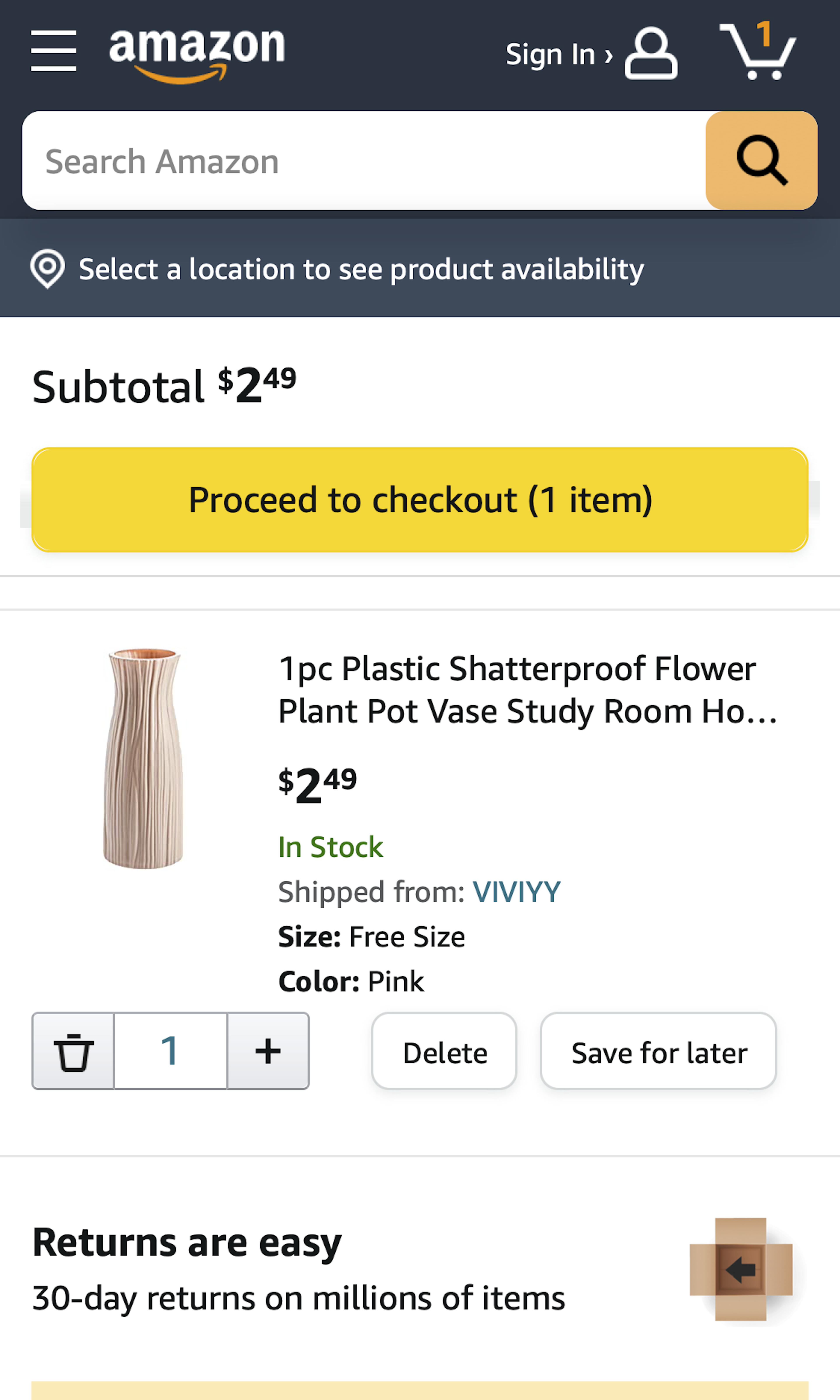
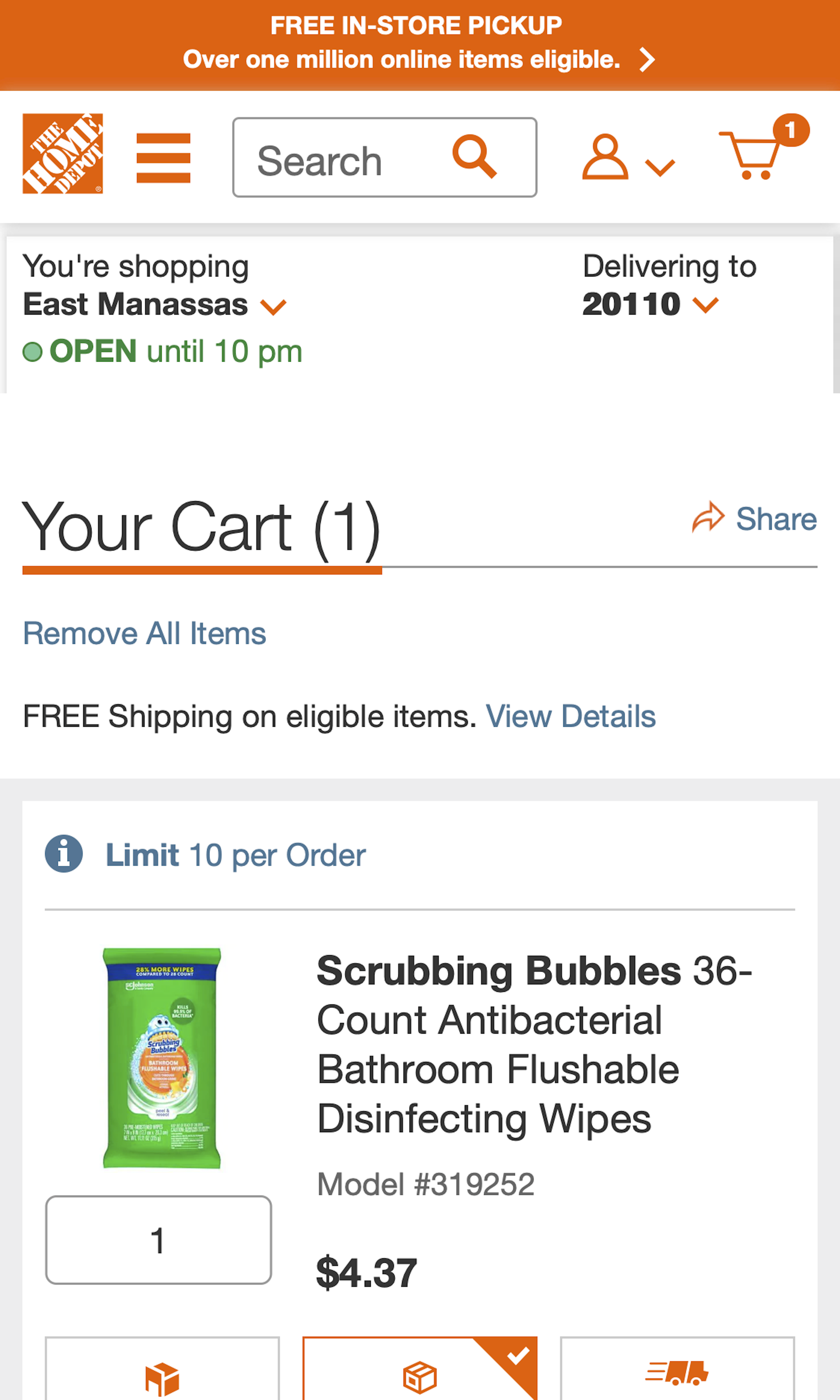
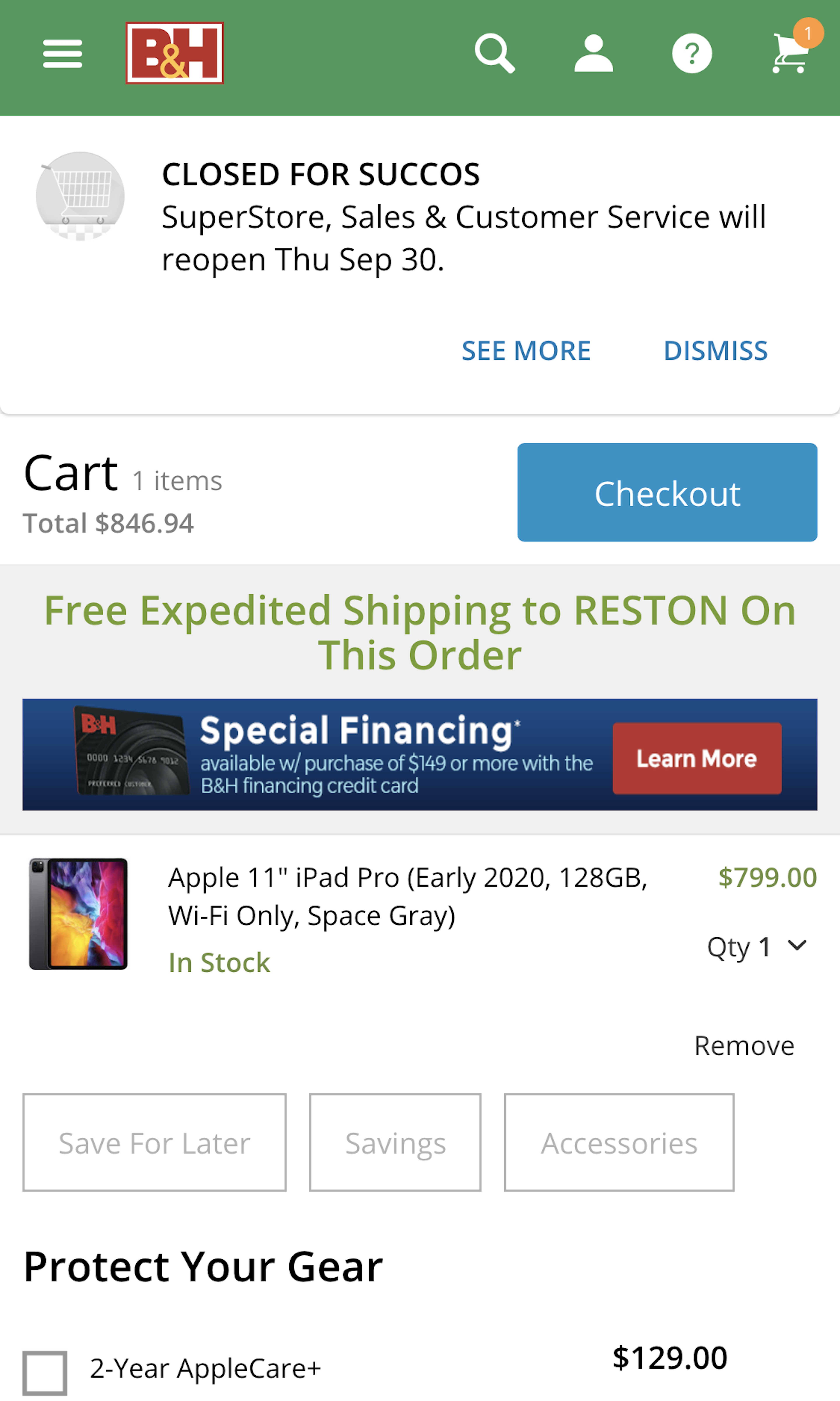
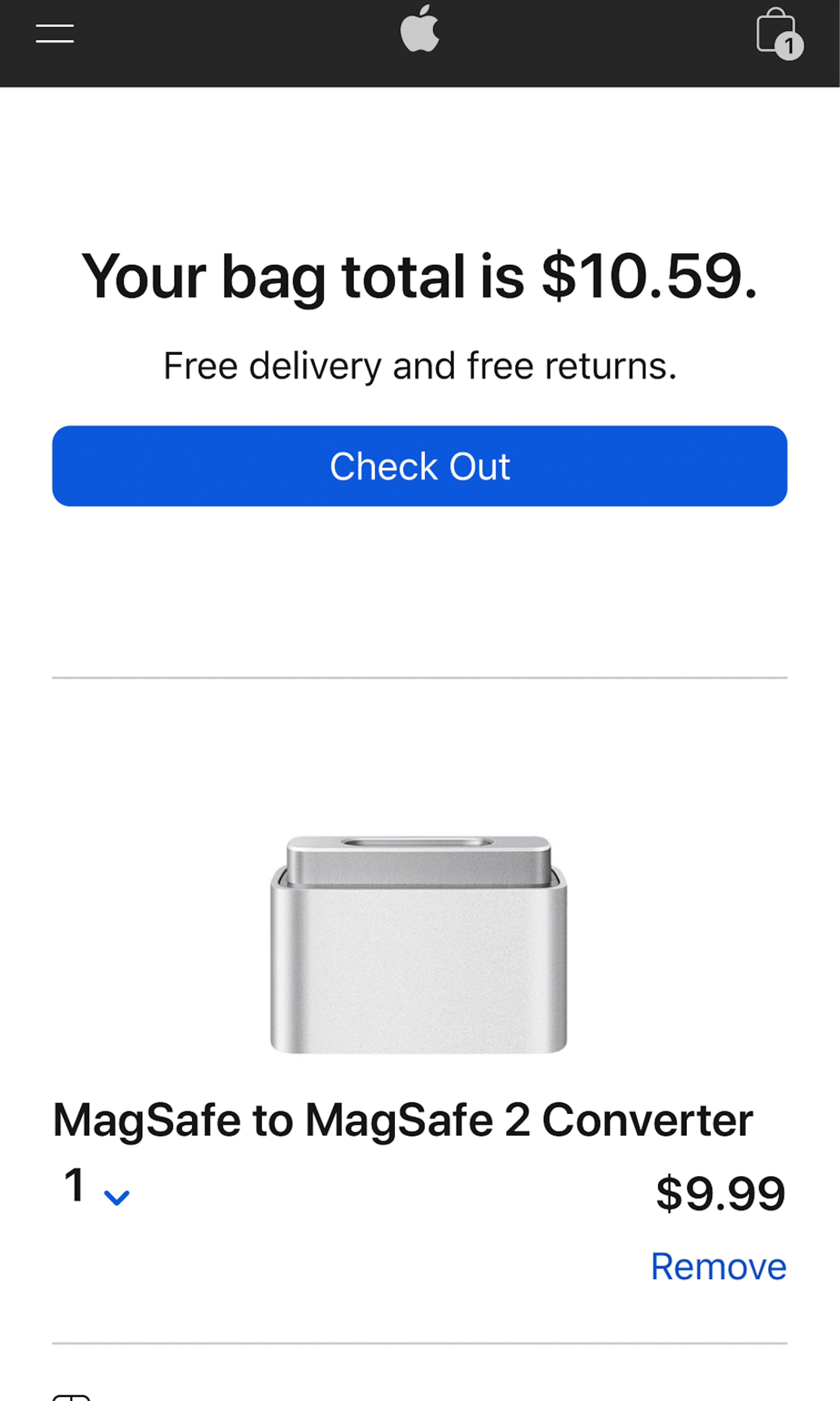
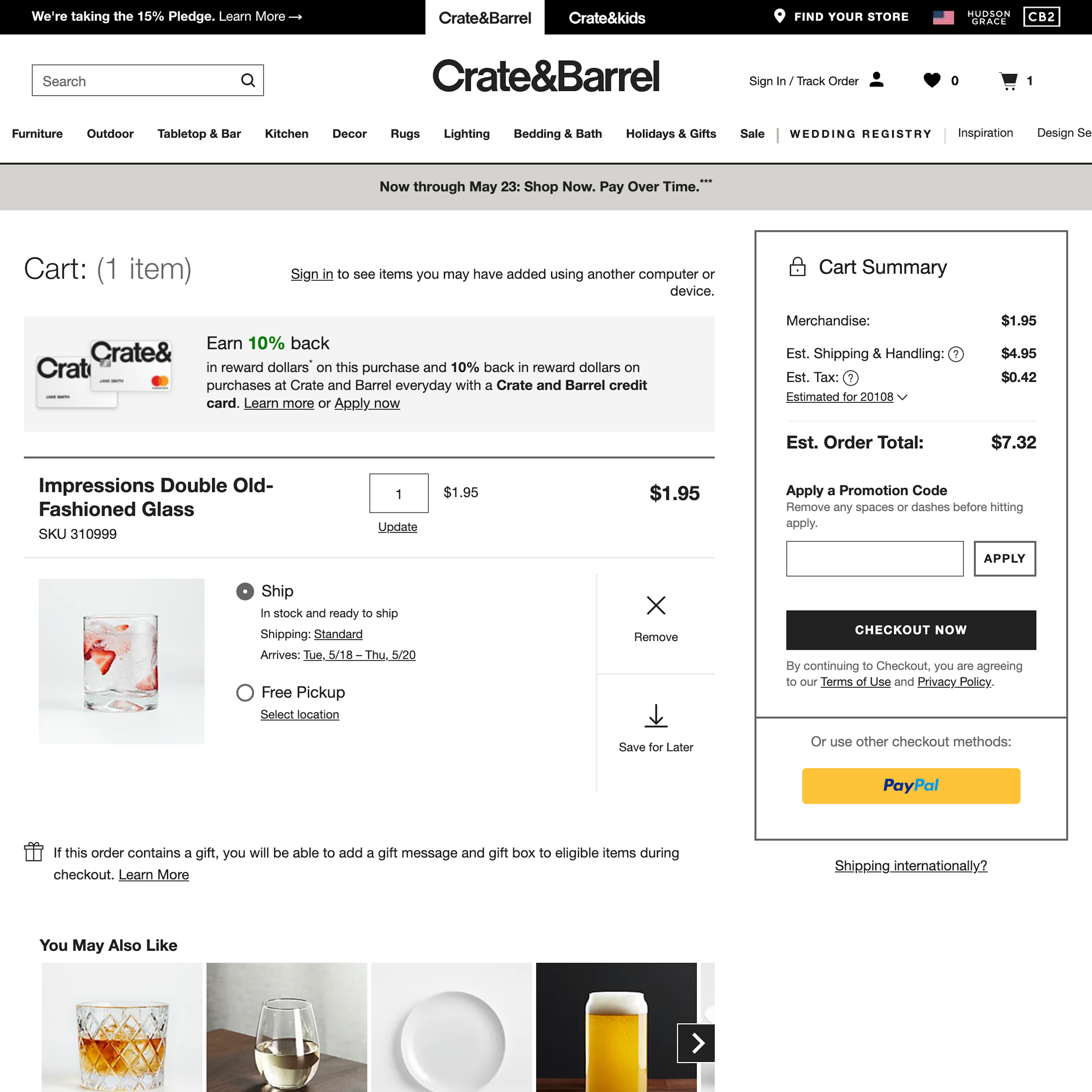
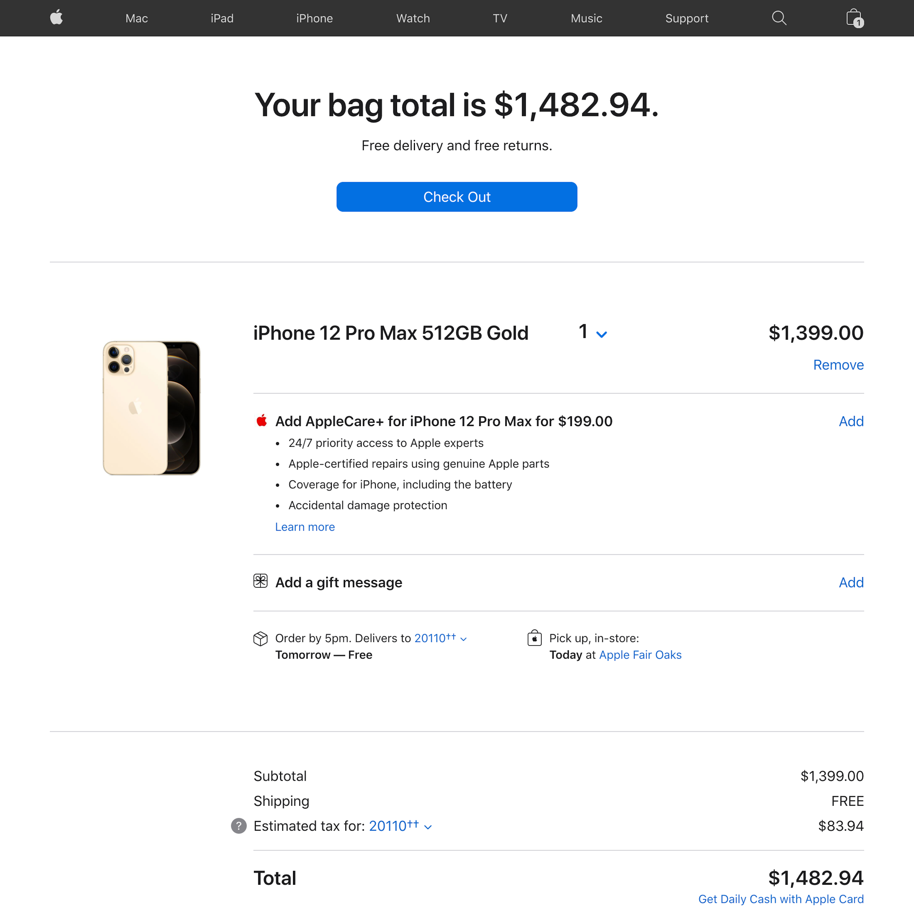
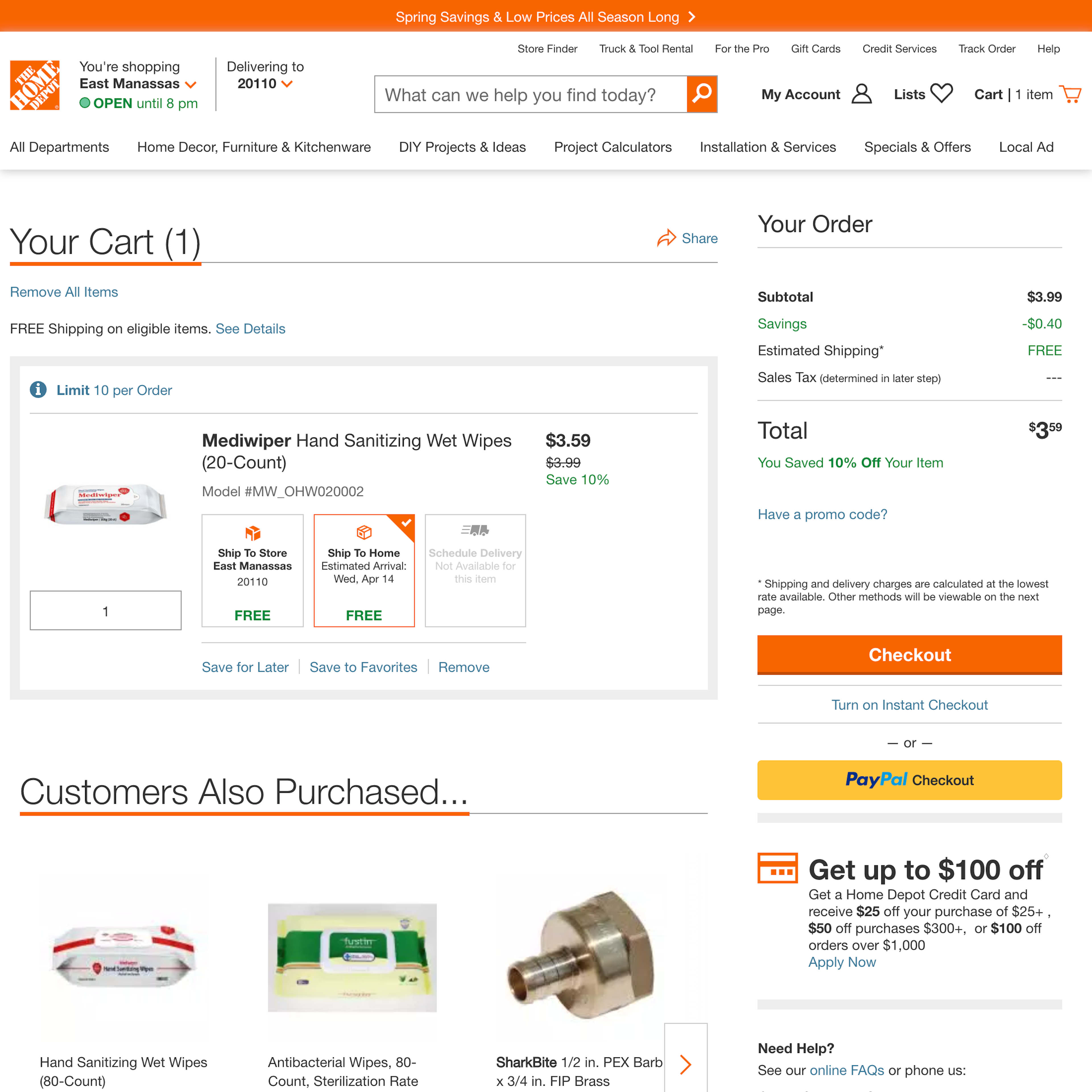
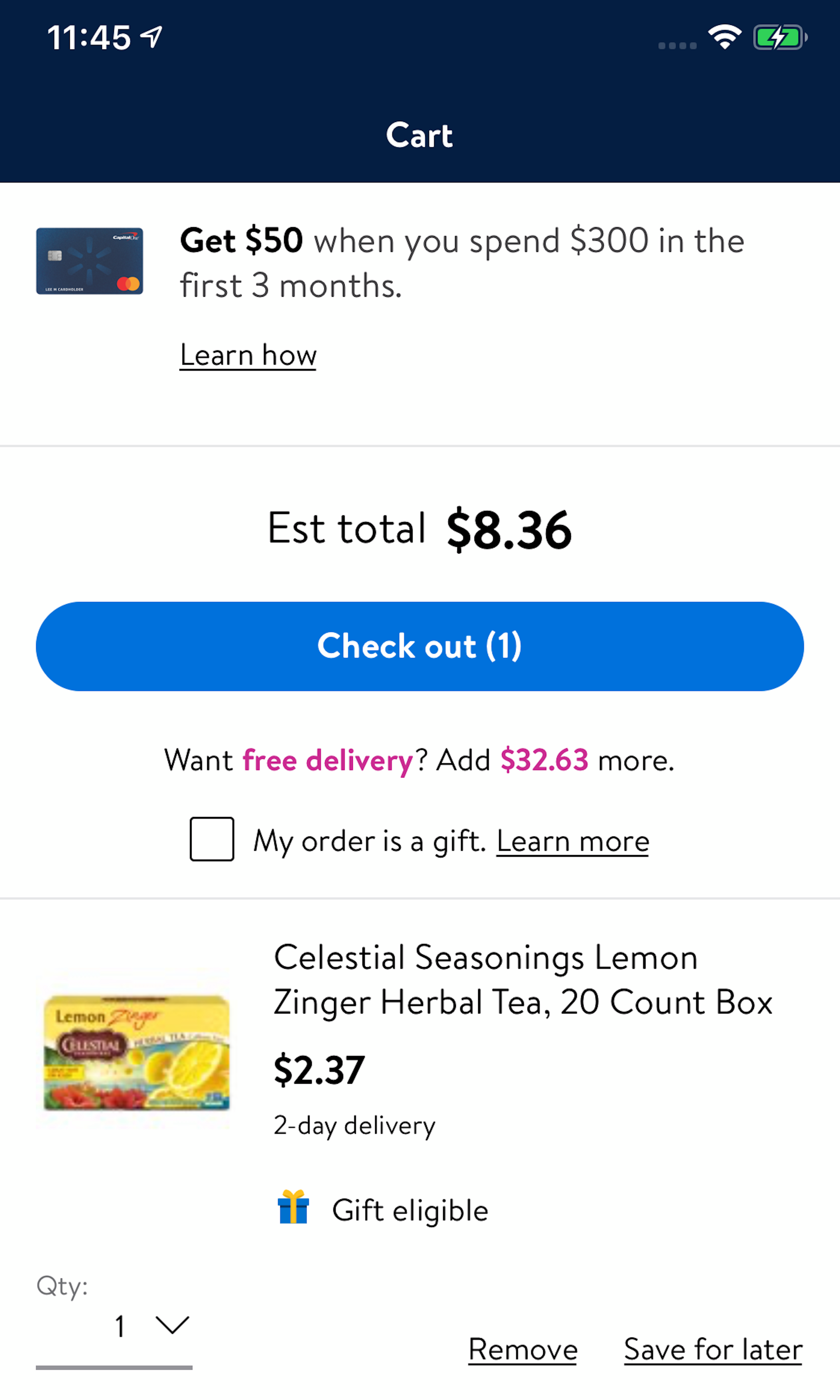
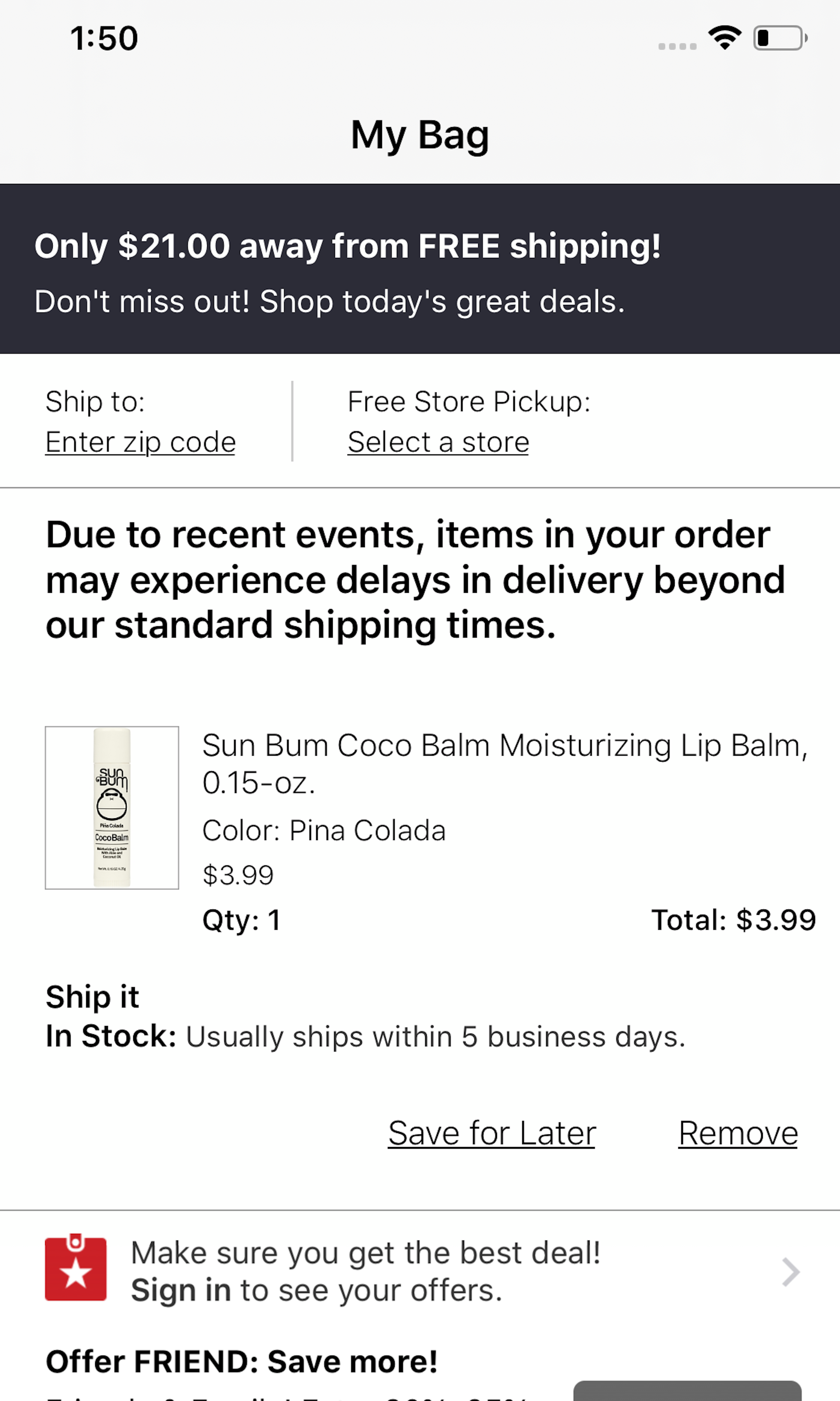
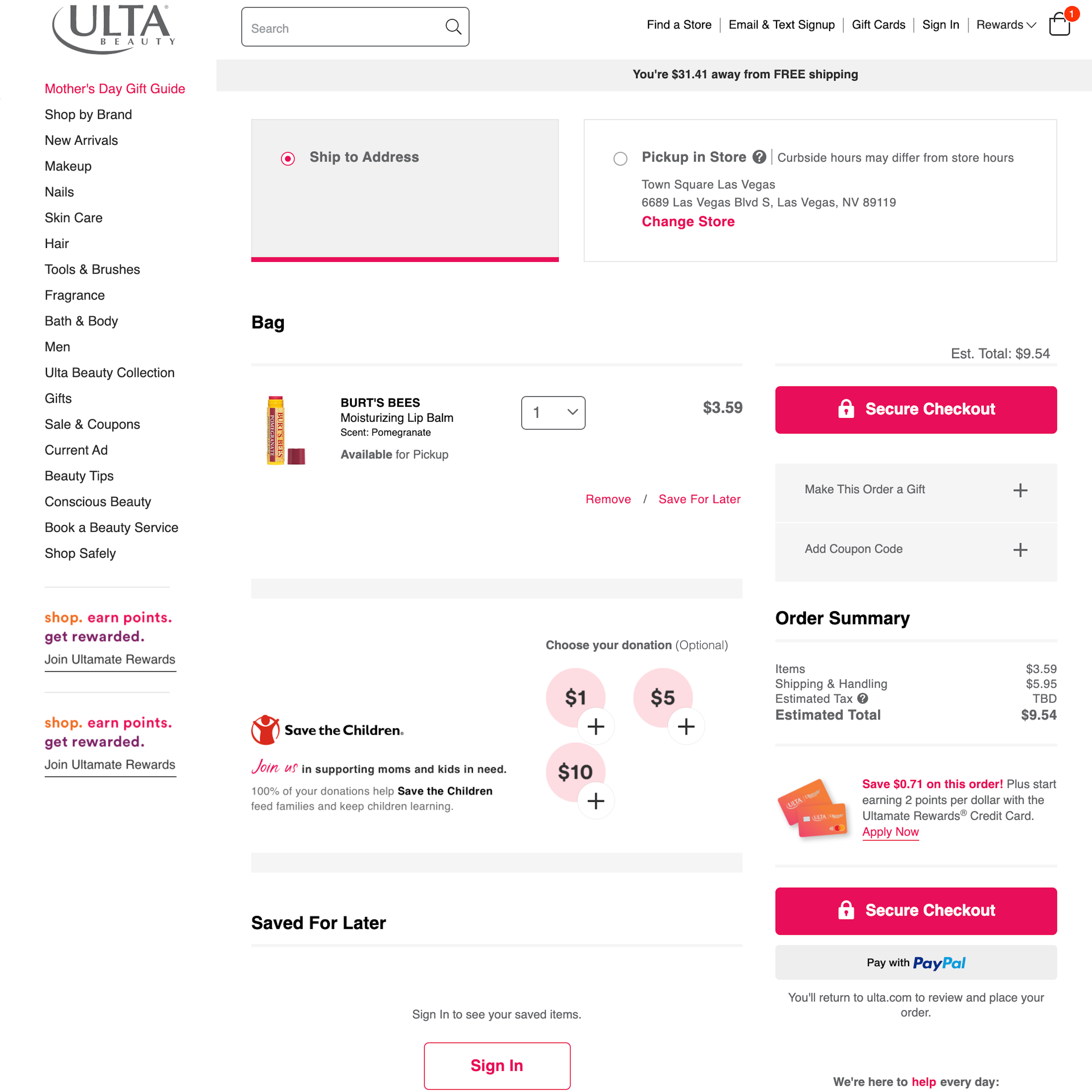
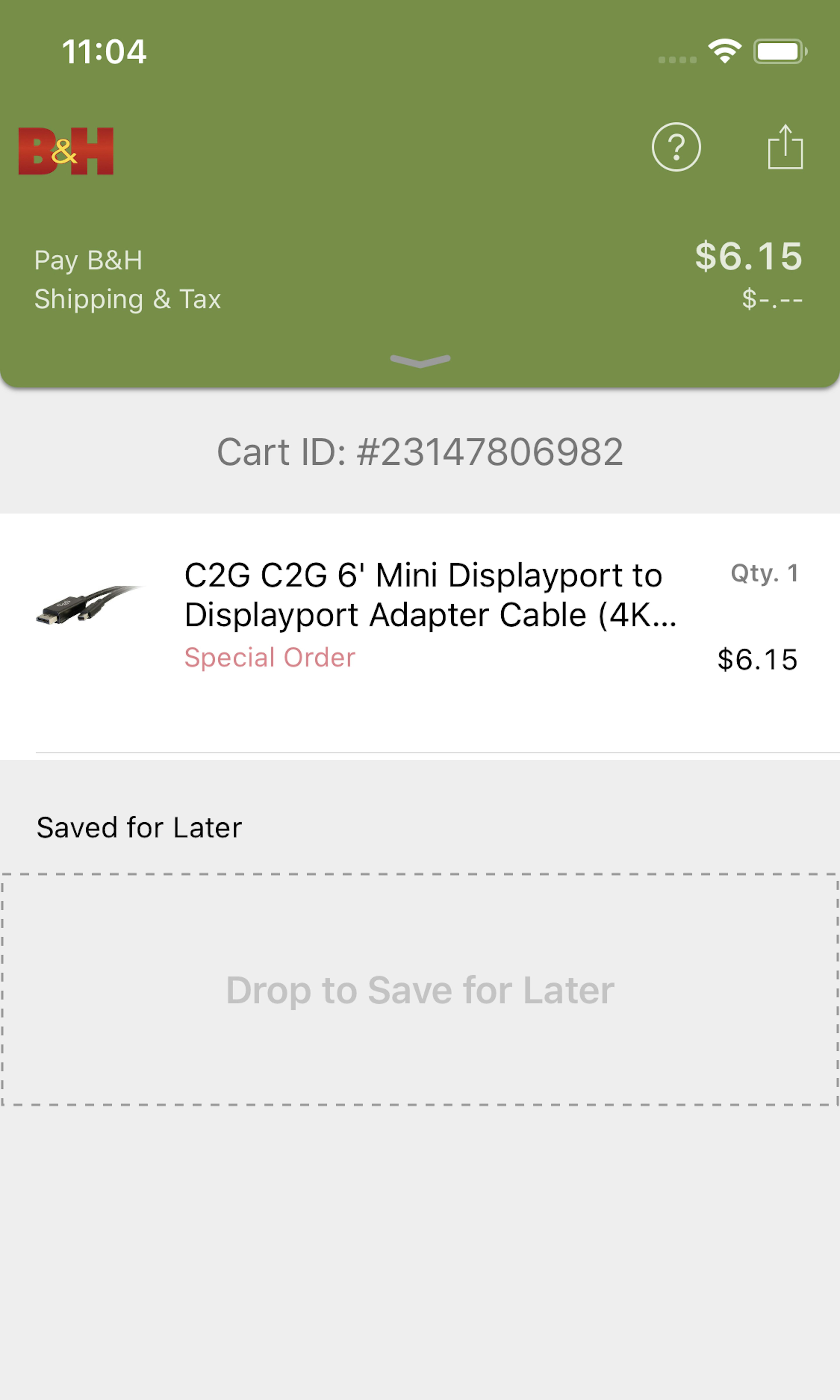
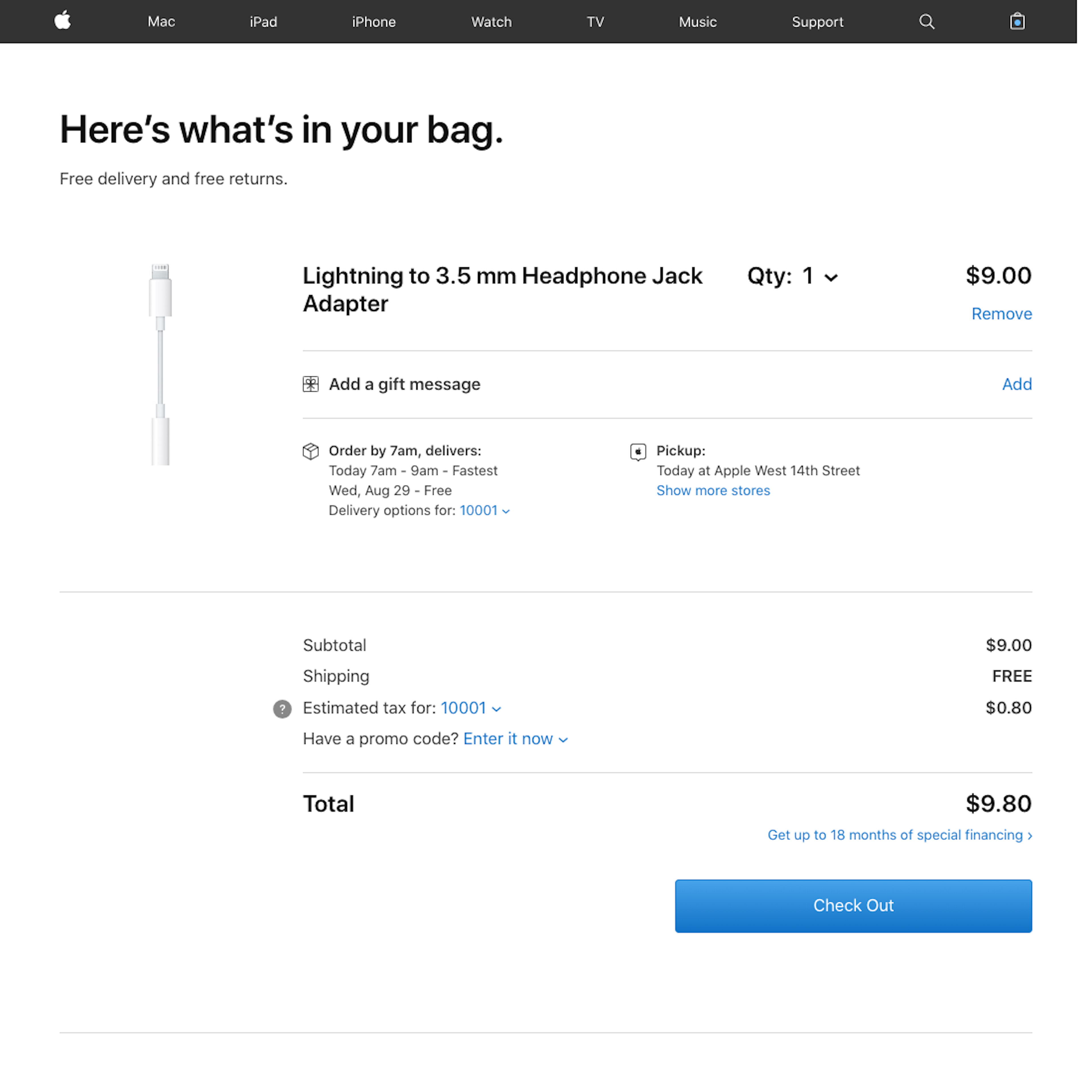
If the Shopping Cart step is not carefully crafted, a large proportion of users will be off to a very bad start, or may not even initiate the checkout but simply abandon their items at the cart step. For example, our quantitative study reveals that 23% of all US online shoppers have abandoned orders in the past quarter solely because they weren’t given an upfront estimate of the total order cost.
More ‘Cart’ Insights
-
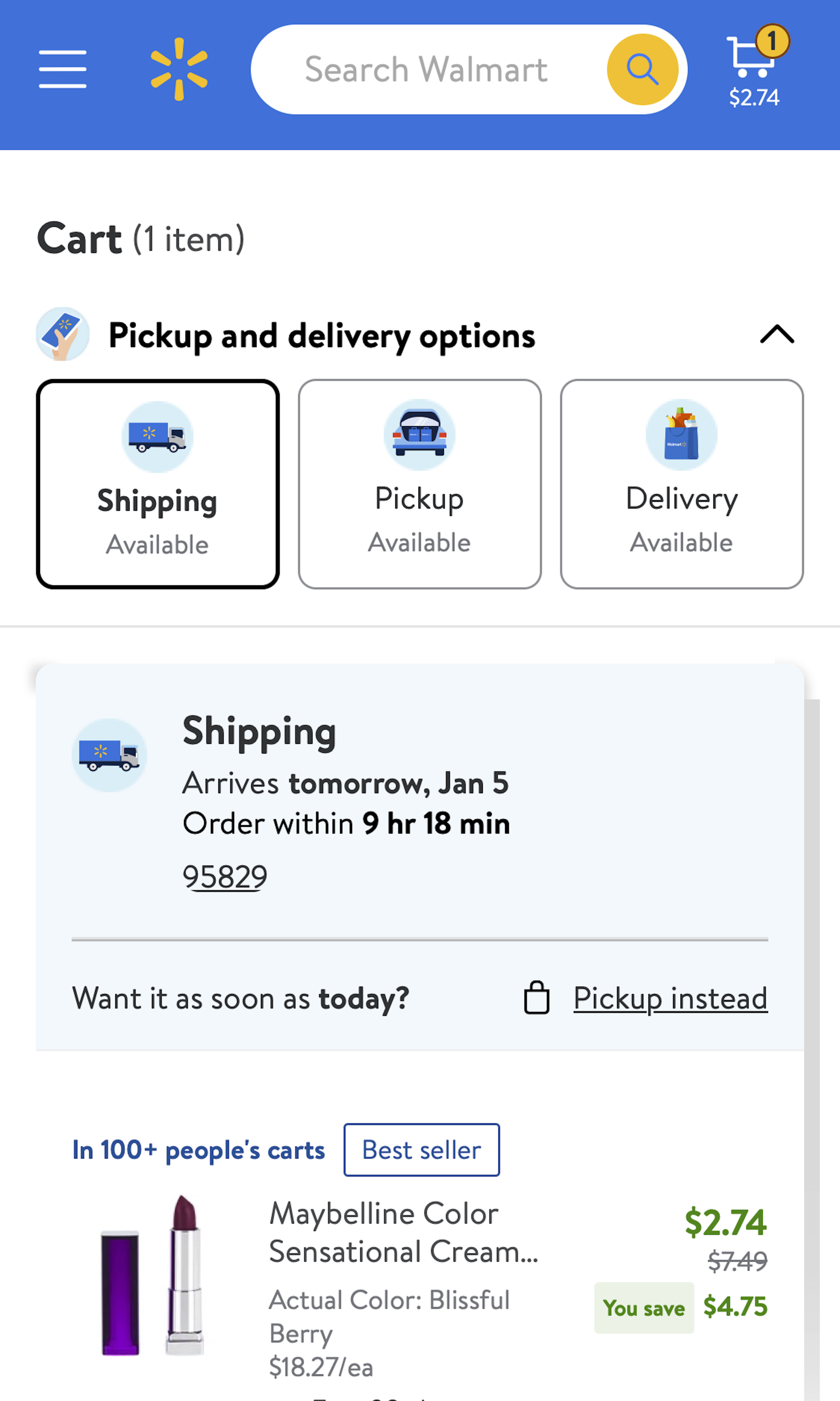
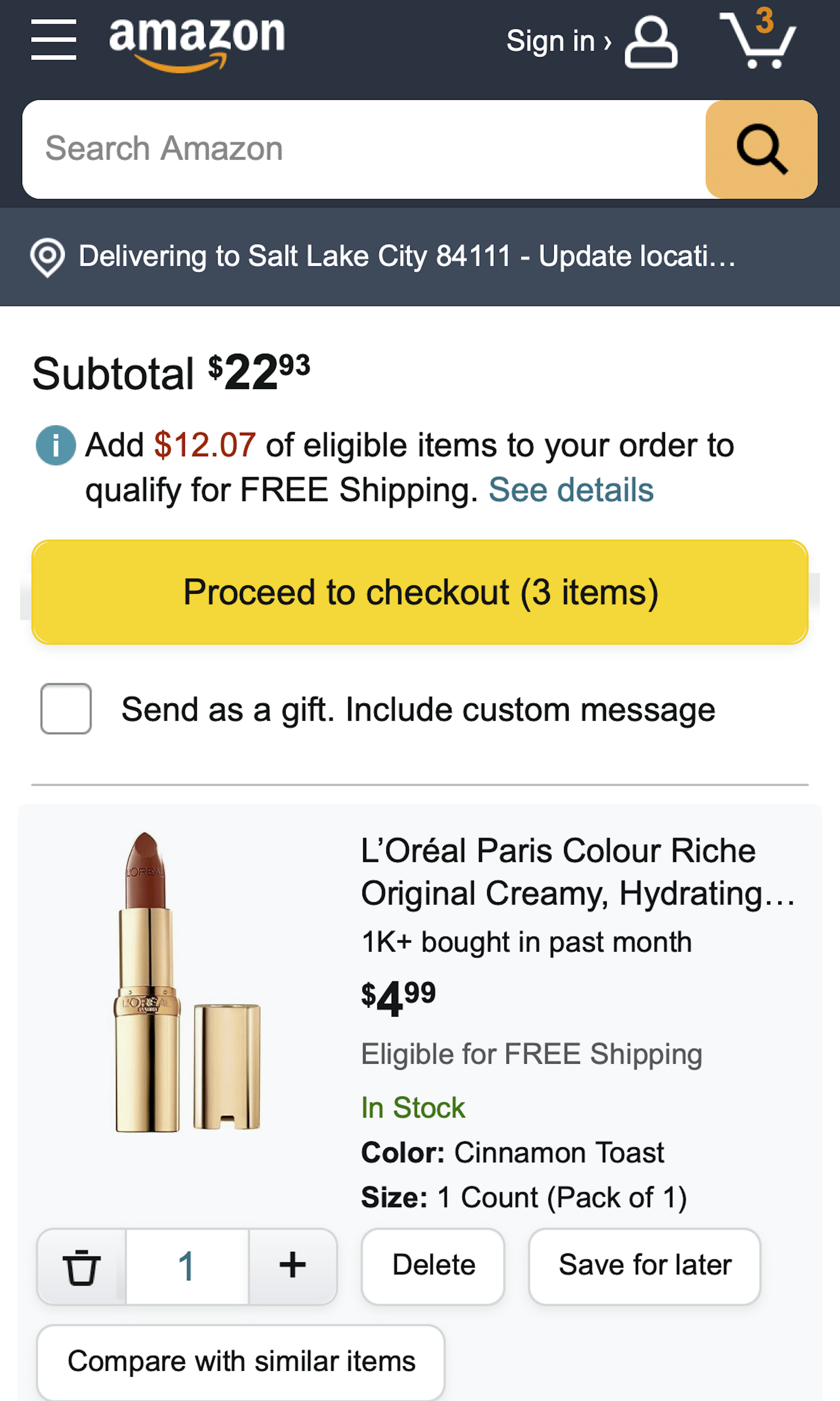
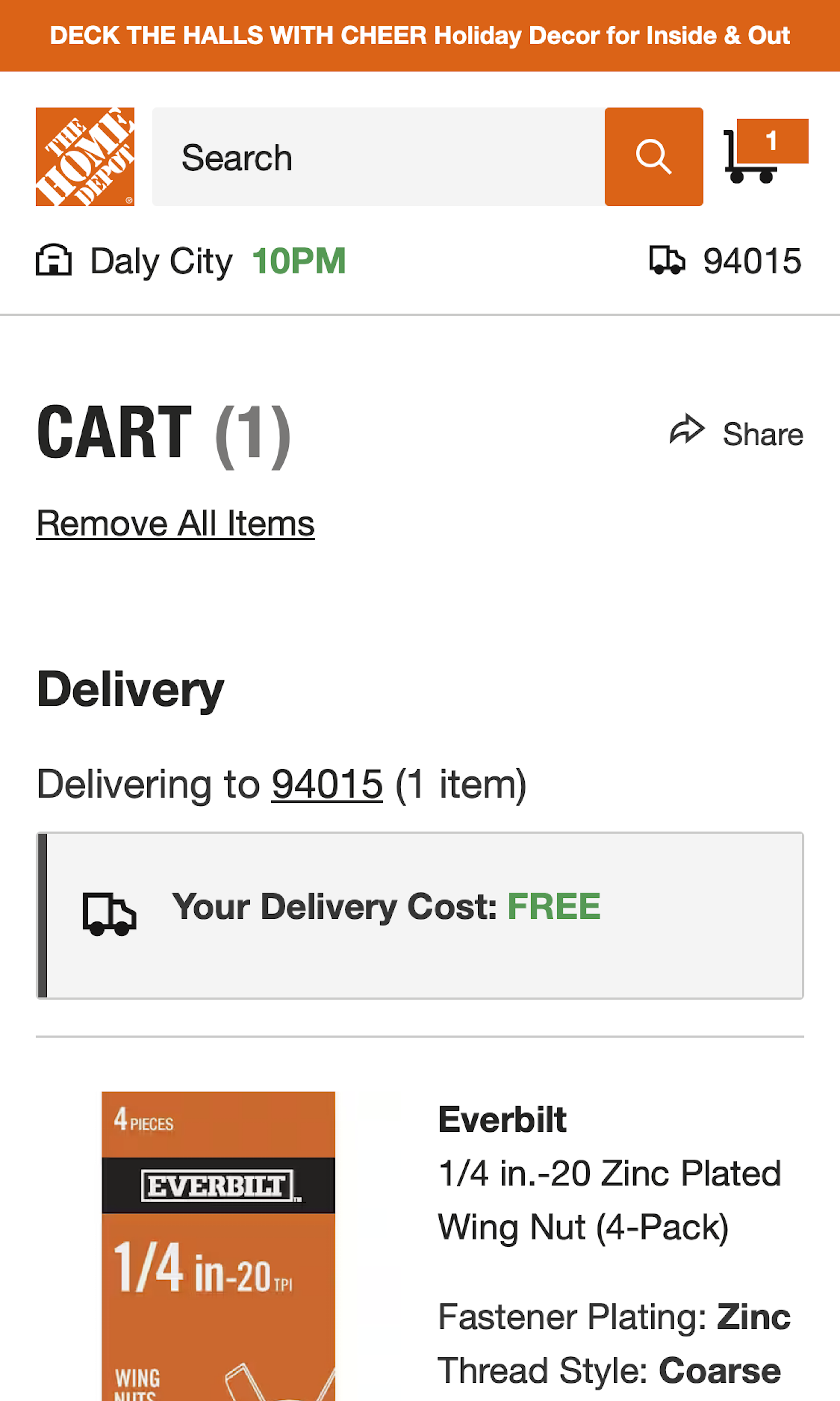
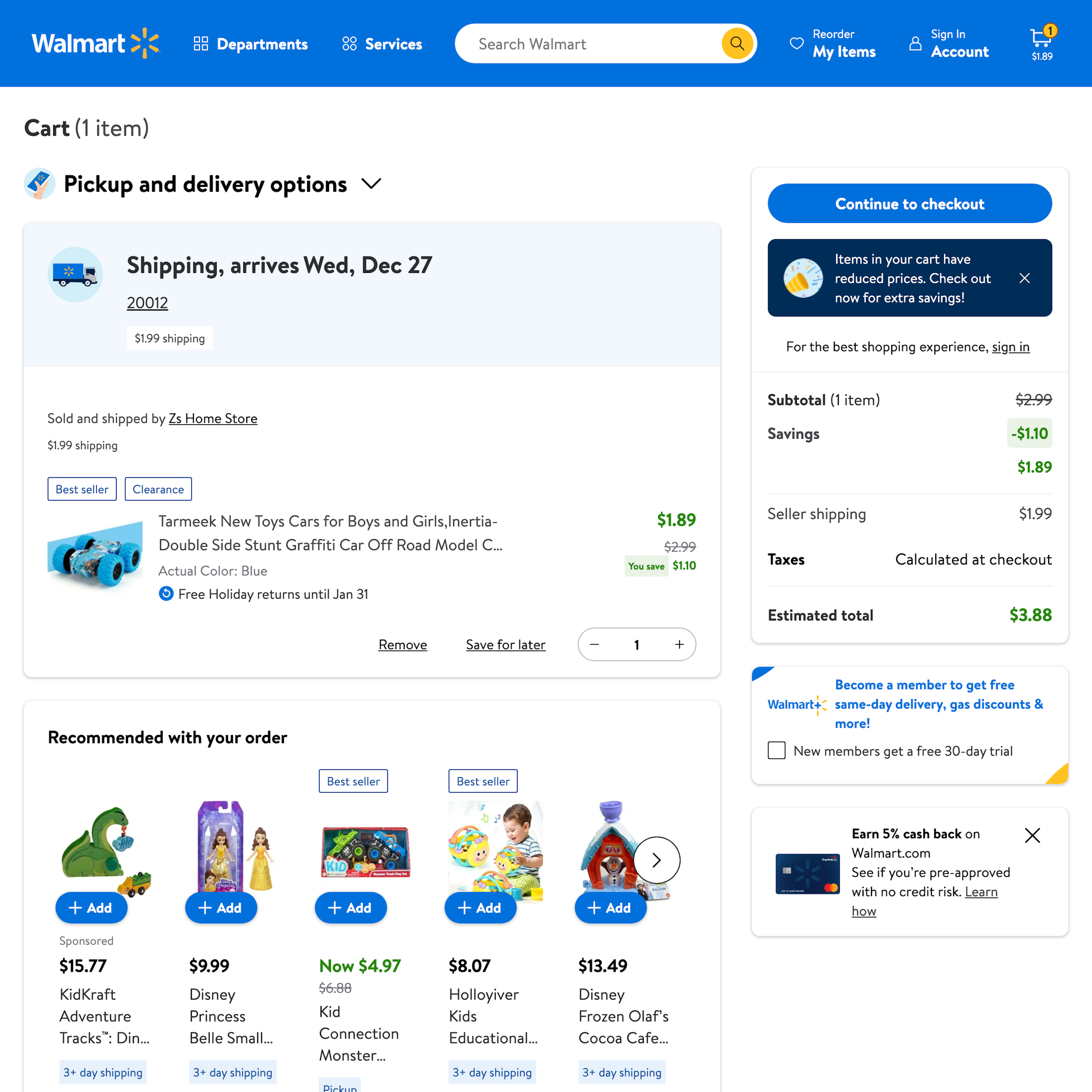
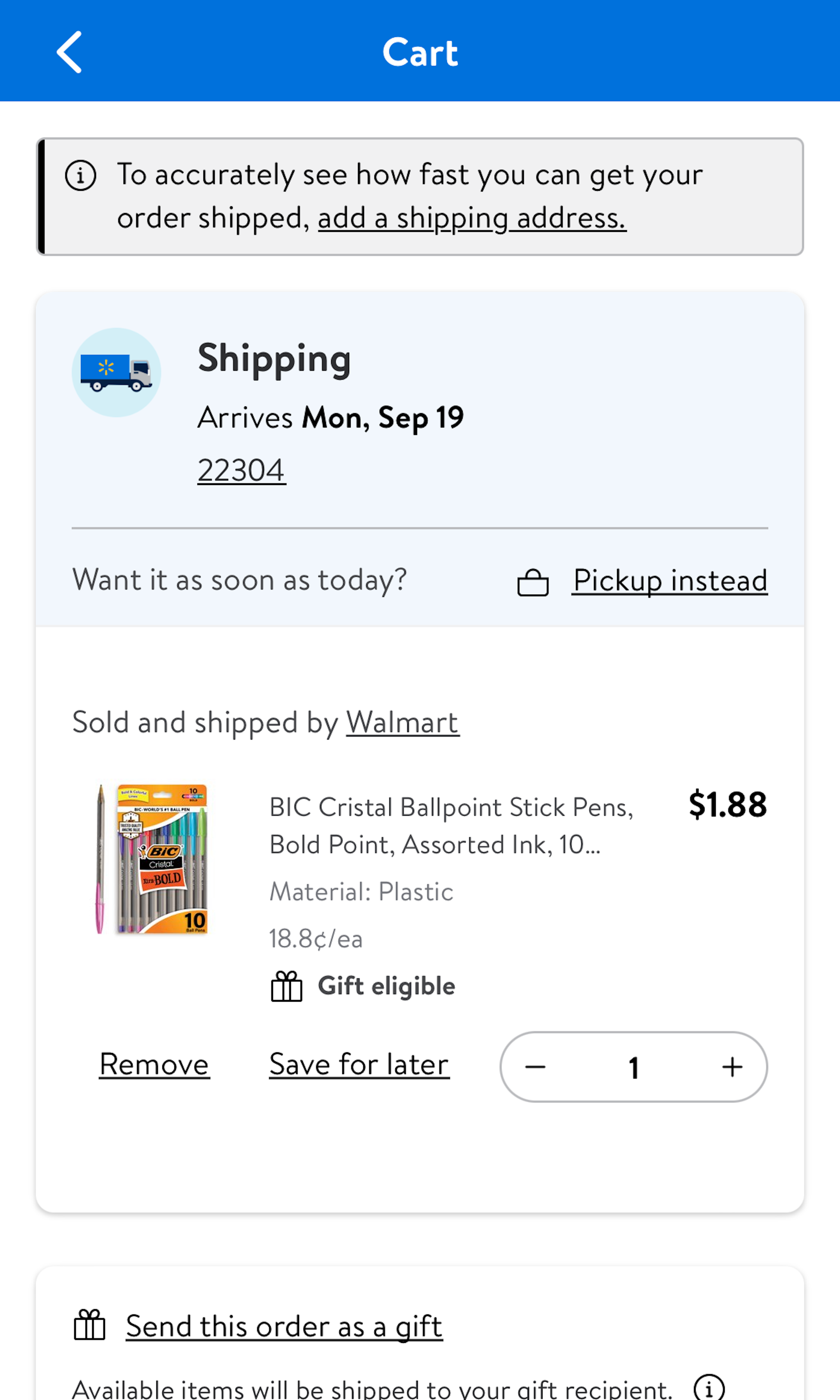
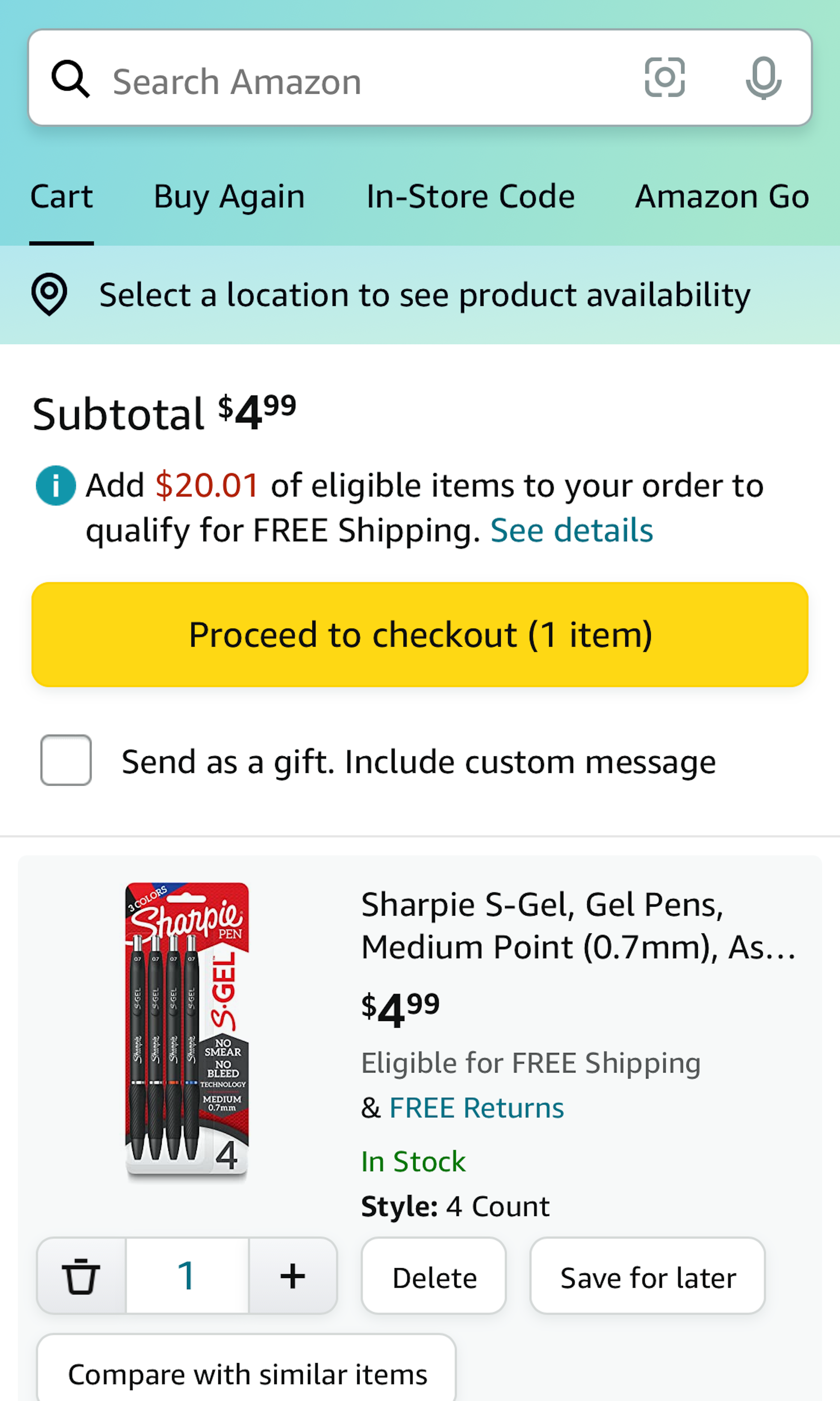
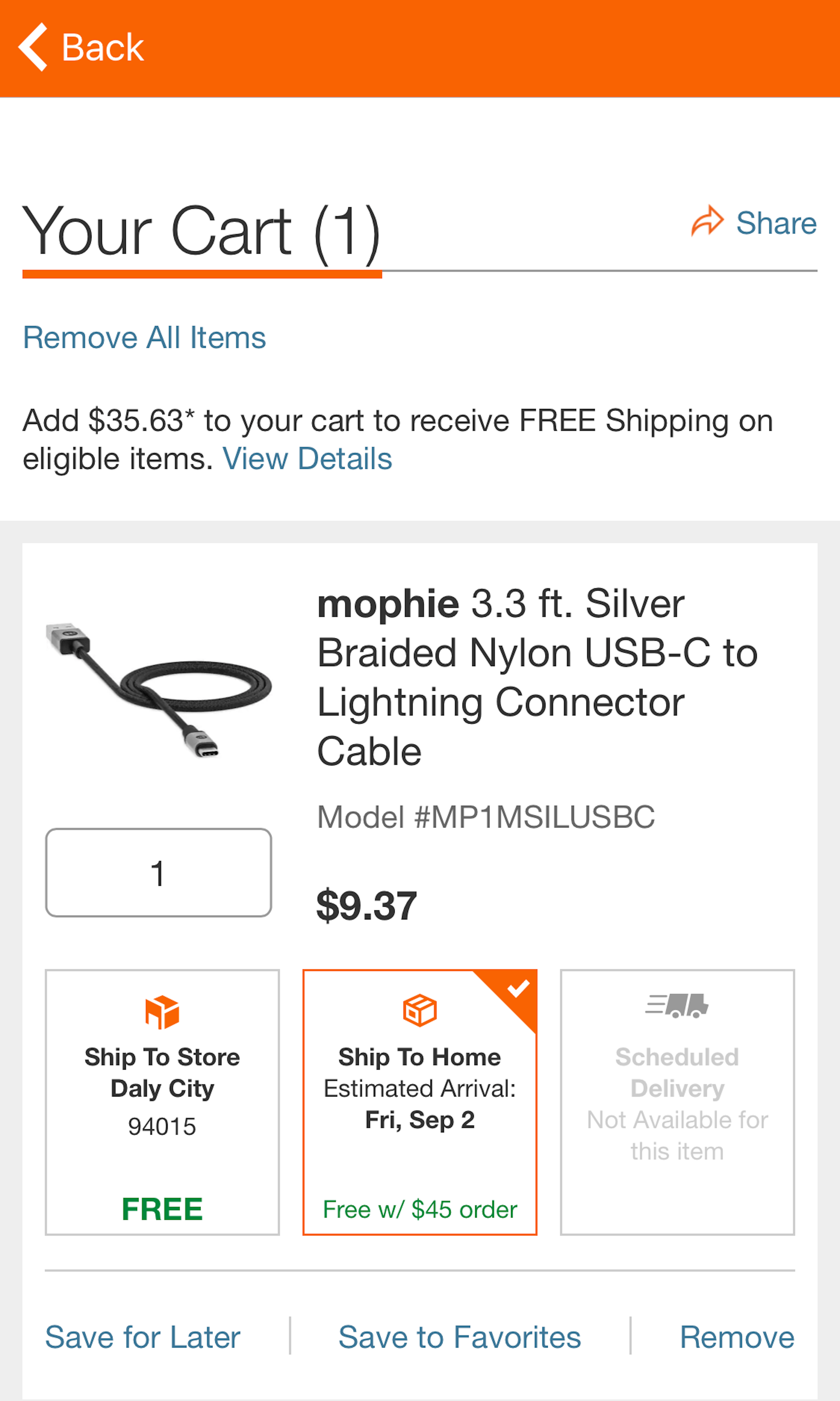
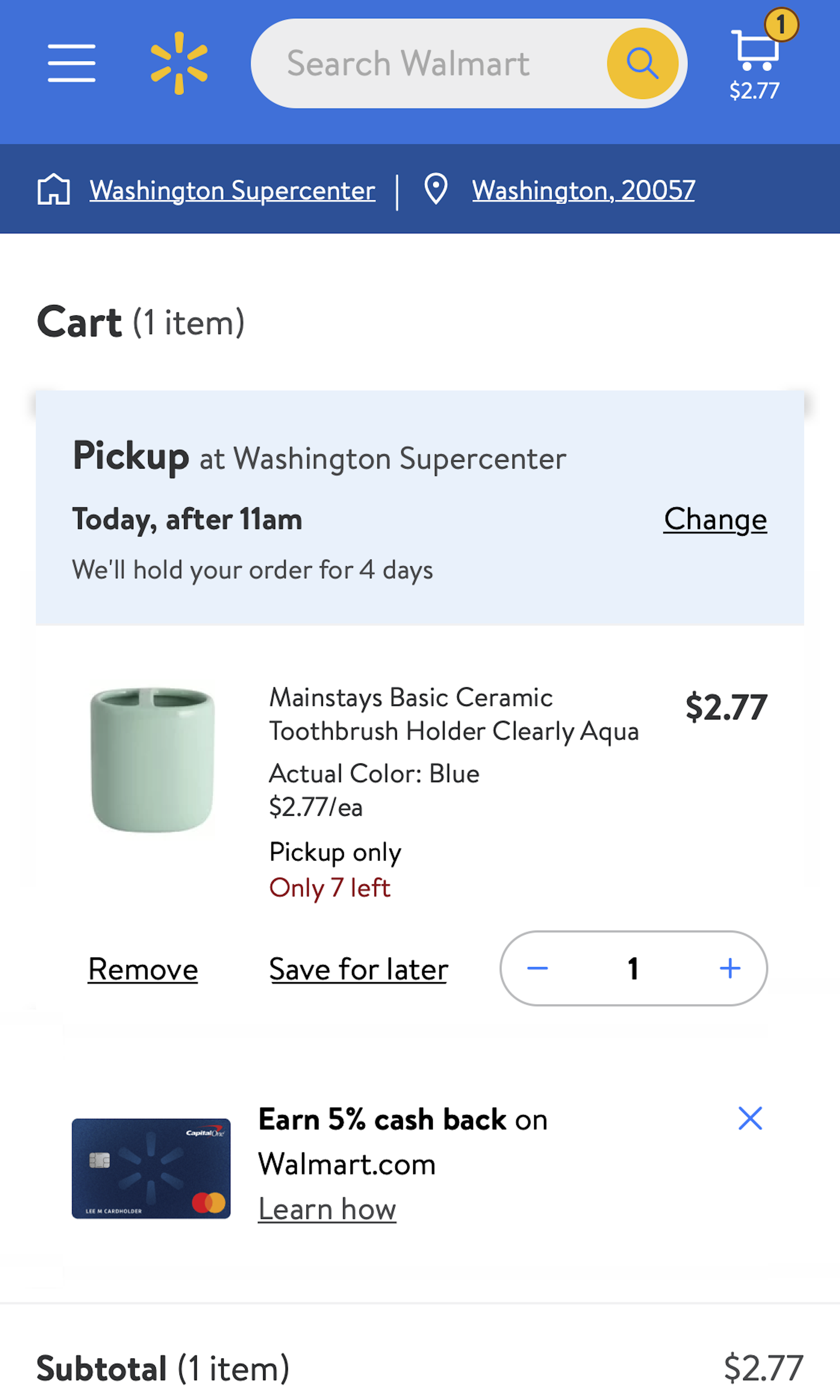
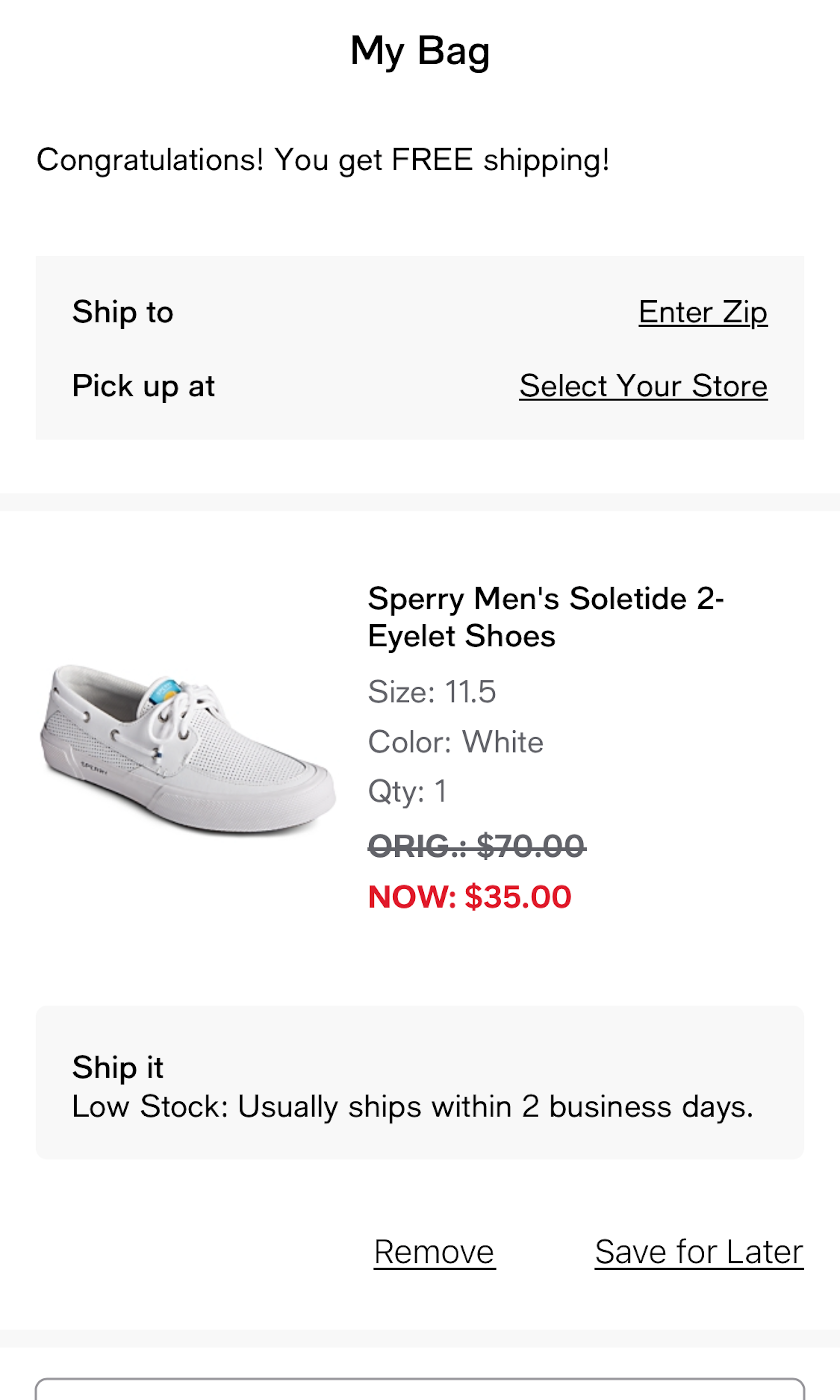
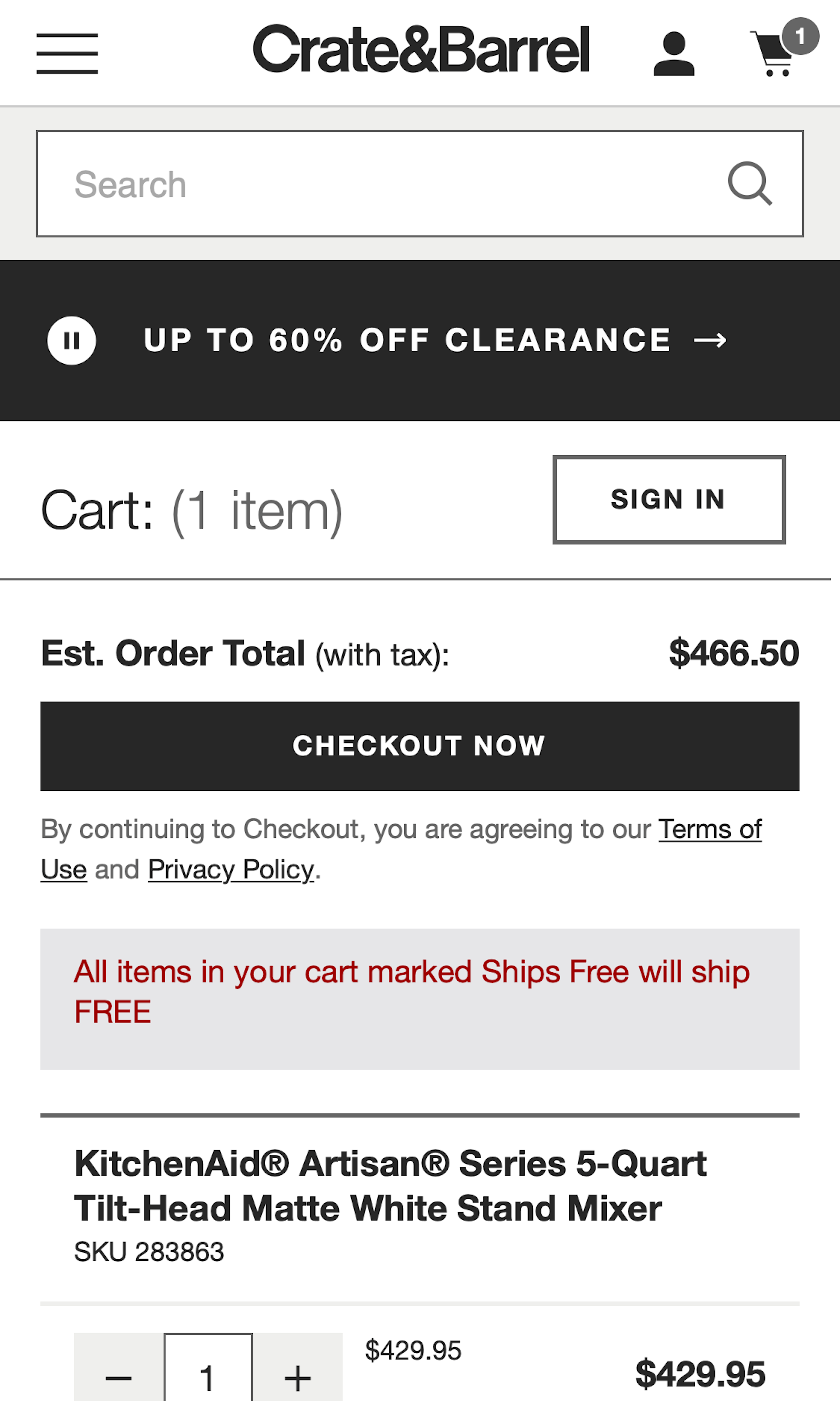
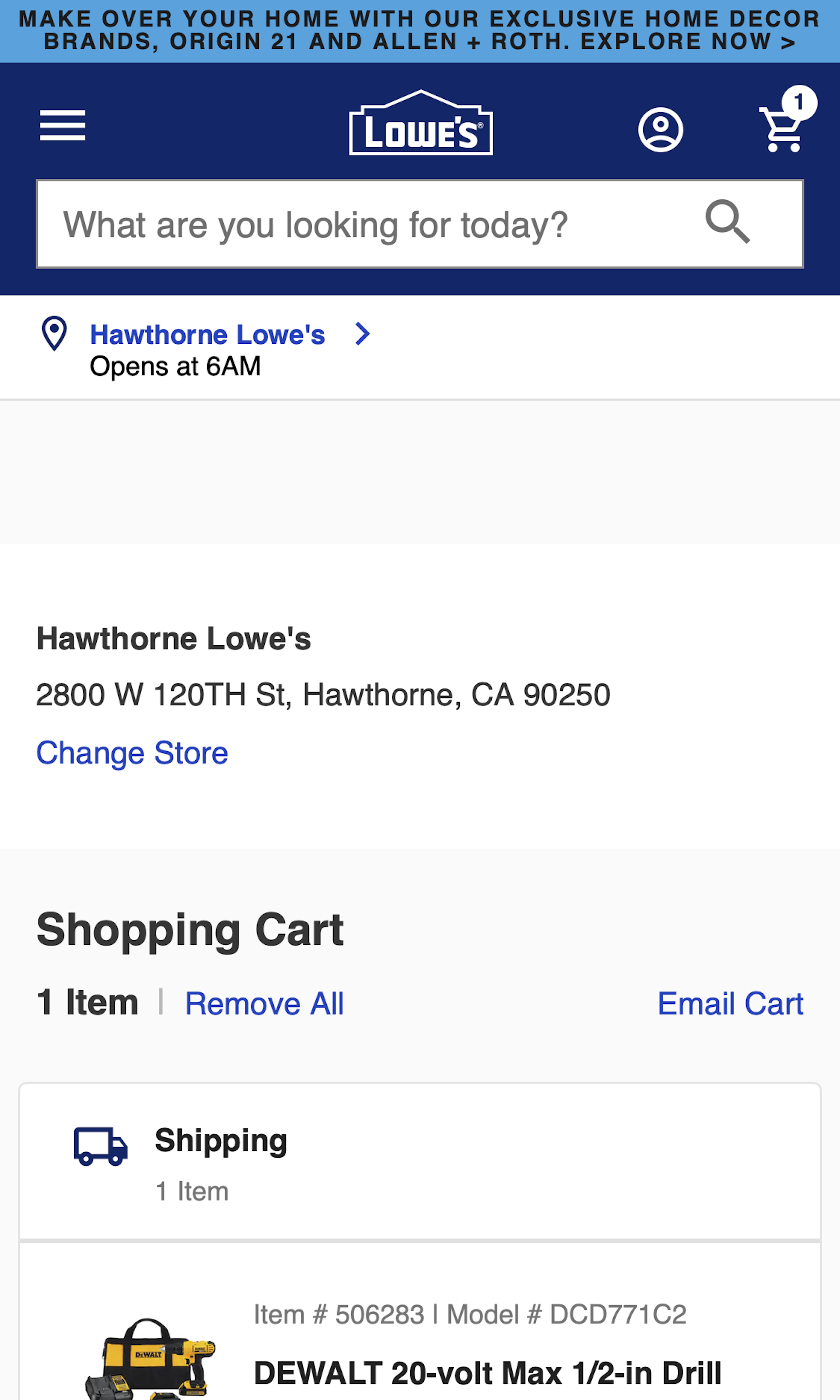
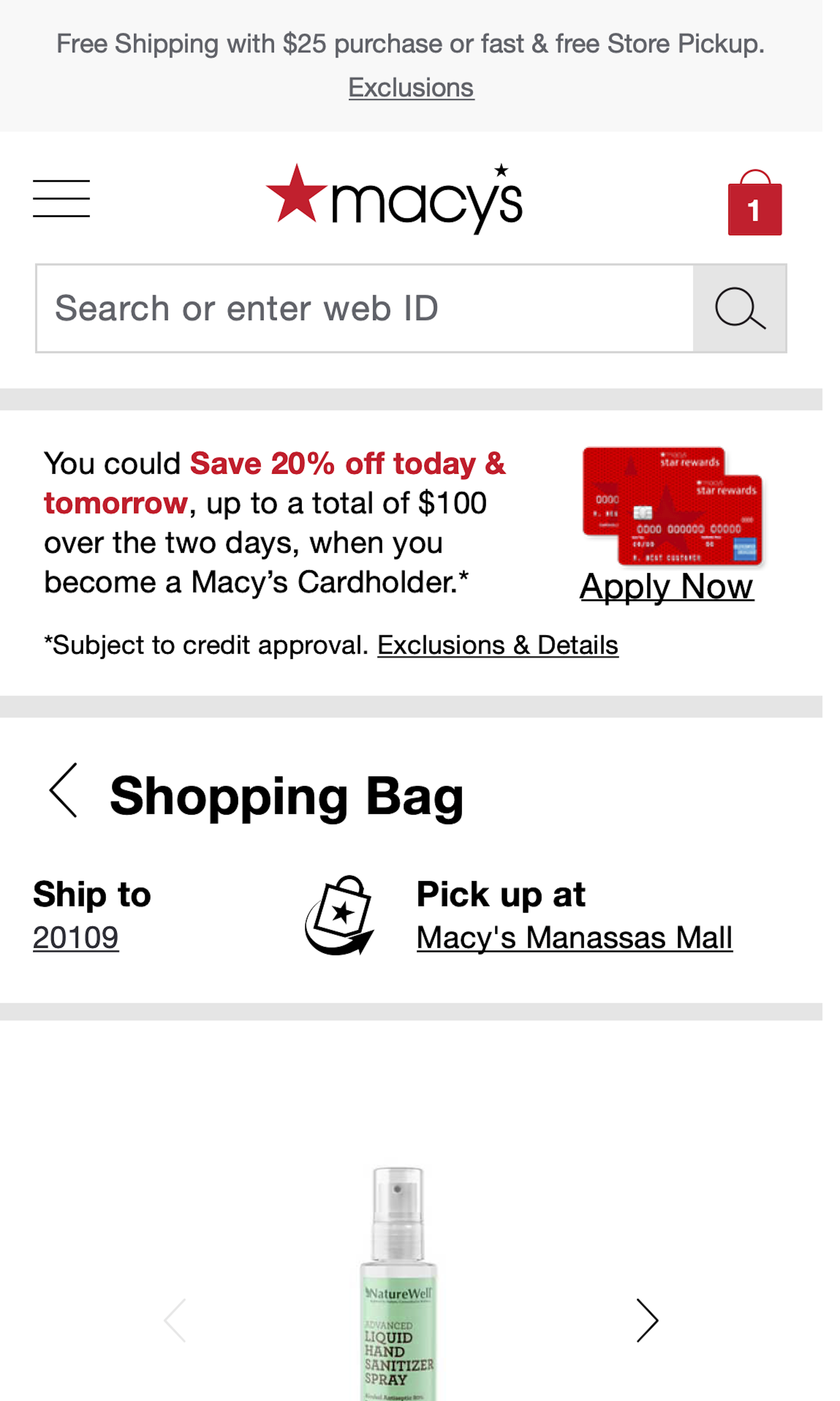
Several sites however have a shopping cart design that has severe usability issues. For example, 58% of sites have a cart design that actively hinders users trying to use the cart as a comparison tool (which is a problem as many users use the cart as “a tool to temporarily save items of interest”). And 86% of sites make it difficult to update cart quantities (50%) or remove items (36%).
-
Learn More: Besides exploring the 1109 “Shopping Cart step” design examples below, you may also want to read our related articles “Auto-Update User’s Cart Quantity Changes and Allow ‘Quantity 0’ – 86% Don’t” and “Why 68% of Users Abandon Their Cart”.
-
Get Full Access: To see all of Baymard’s cart and checkout research findings you’ll need Baymard Premium access. (Premium also provides you full access to 200,000+ hours of UX research findings, 650+ e-commerce UX guidelines, and 275,000+ UX performance scores.)


User Experience Research, Delivered Weekly
Join 60,000+ UX professionals and get a new UX article every week.

User Experience Research, Delivered Weekly
Join 60,000+ UX professionals and get a new UX article every week.
Explore Other Research Content
300+ free UX articles based on large-scale research.

325 top sites ranked by UX performance.

Code samples, demos, and key stats for usability.