Key Takeaways
-
The quantity field proved to be a surprising speed bump for participants during large-scale checkout testing
- Users can be unnecessarily delayed in adjusting quantity, which leads to more friction at the beginning of checkout
- Using buttons or buttons with a text field, and following 5 important implementation details, will alleviate the issue for most users
Increasing or decreasing the quantity for items in the cart is seemingly a simple and straightforward task.
Yet, during large-scale testing, a subgroup of participants had significant issues with this seemingly straightforward task.
In fact, some quantity changes made to orders during testing went unregistered — which led to orders being placed with incorrect product quantities.
Moreover, mobile users are likely to be more frequently and severely challenged by unoptimized quantity selectors due to the smaller viewport and general increased risk of input errors.
However, tweaking the quantity field UI to be buttons or buttons with a text field generally resolves issues users have with the quantity selector in the cart — yet our e-commerce UX benchmark shows that 61% implement the quantity selector as a drop-down or text field instead.
In this article, we’ll discuss some of our Premium research findings related to the quantity field in the shopping cart.
In particular, we’ll discuss the following:
- How open text fields for selecting quantity in the cart can cause user issues
- How drop-down fields for selecting quantity in the cart can cause user issues
- Why using buttons or buttons with an open text field for the quantity field performs best for users
- 5 ways to ensure optimal performance of buttons or buttons with an open text field
How Open Text Fields for Selecting Quantity in the Cart Can Cause User Issues

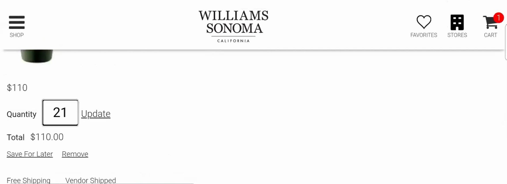
“Whoops, no, we don’t want 21…Hold on, let’s try that again.” This participant on Williams Sonoma meant to update the quantity from 1 to 2, but the default quantity “1” remained even after she began inputting her desired quantity, resulting in the incorrect “21”.
Another participant on Williams Sonoma made a typo while attempting to update the quantity, forcing her to delete the mistyped entry and try again. Despite its small size, open text quantity fields will be prone to the same entry errors as other text fields.
During testing, some participants made typos and input errors when updating the quantity implemented as an open text field — an inherent risk with any text field.
Such errors require users to manually delete their entry and try again, slowing their progress towards checkout.
Additionally, as with any text field requiring keyboard entry, input errors are likely to be more common for the mobile e-commerce UX due to the small mobile keyboard.
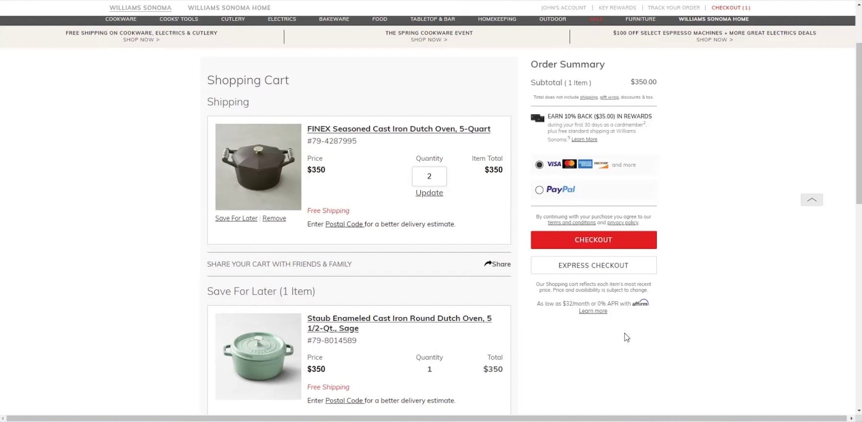
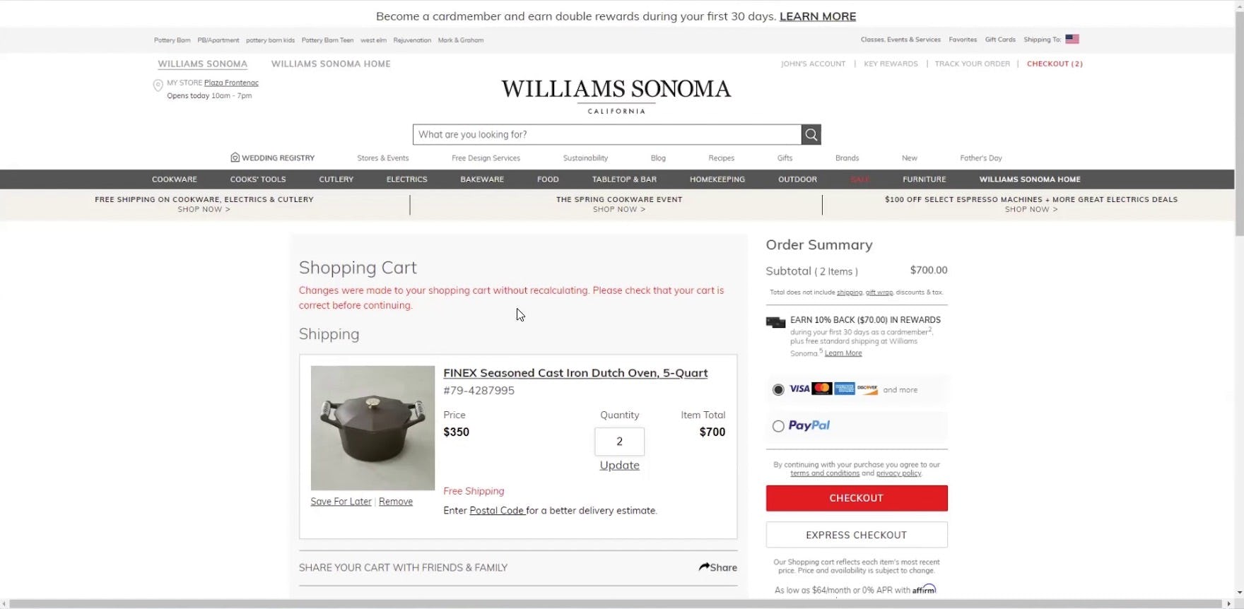
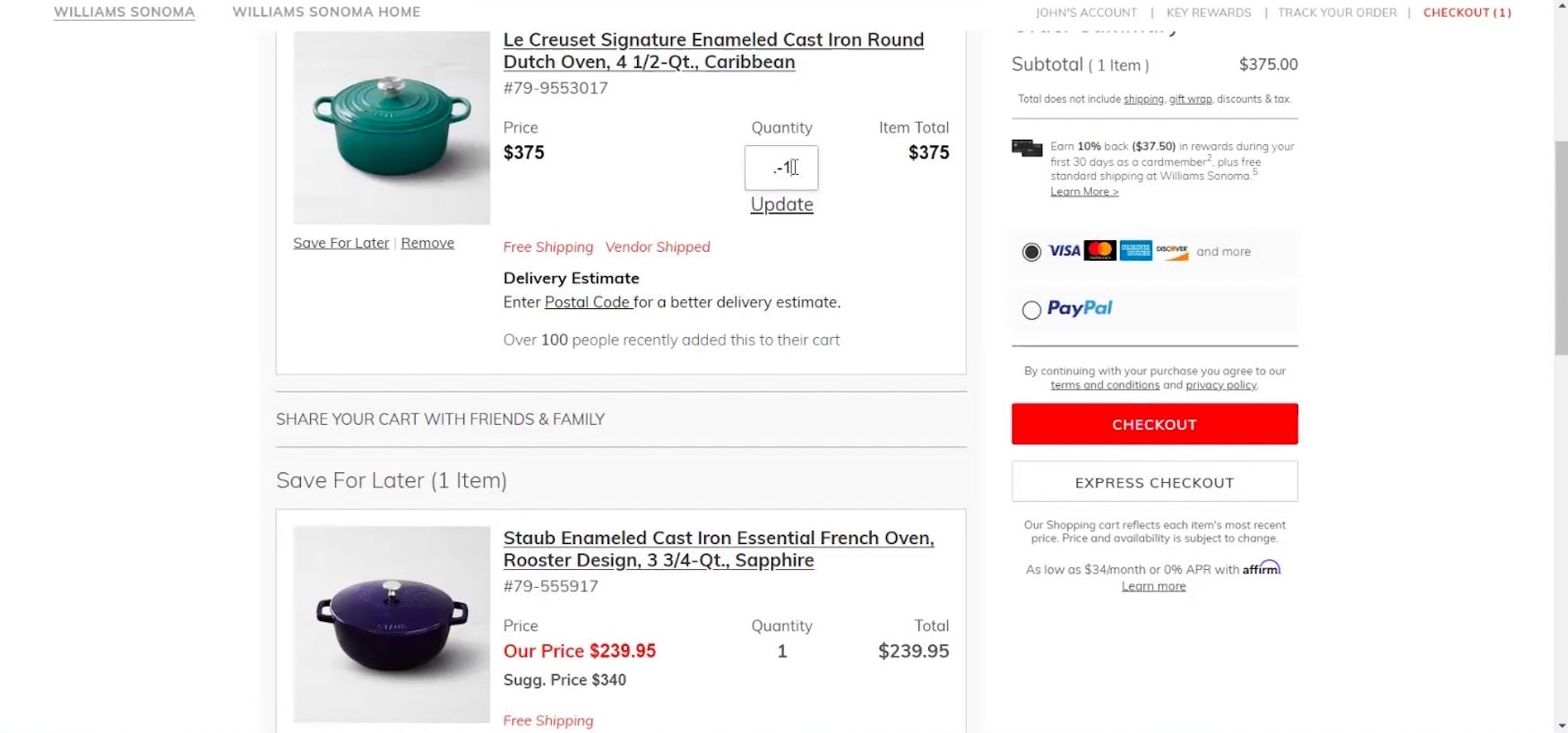
“What I did is I put the quantity in, and then I just clicked off the field, assuming that it would automatically recalculate. I’m used to other sites which do that. So that’s definitely something that caught me off guard a little bit. I didn’t realize I had to update it.” This participant on Williams Sonoma updated the quantity of an item in his cart to 2, but neglected to click the “Update” link beneath (first image). Continuing to checkout, he received an error message alerting him to this fact, forcing him to pause and consider the source of the error (second image). Eventually, he realized his mistake, and clicked the “Update” link: “So when I updated it, I didn’t hit ‘Update’, and so that’s what I’m realizing, you have to hit ‘Update’.”
Furthermore, users in the shopping cart generally assume that once they have made a change it will be automatically registered.
However, many quantity text fields in testing required participants to click or tap a “Save” or “Update” link to save their entry once they have changed the value of an input.
In practice such a requirement will generally be perceived as an unexpected repetitive step, causing some to overlook it.
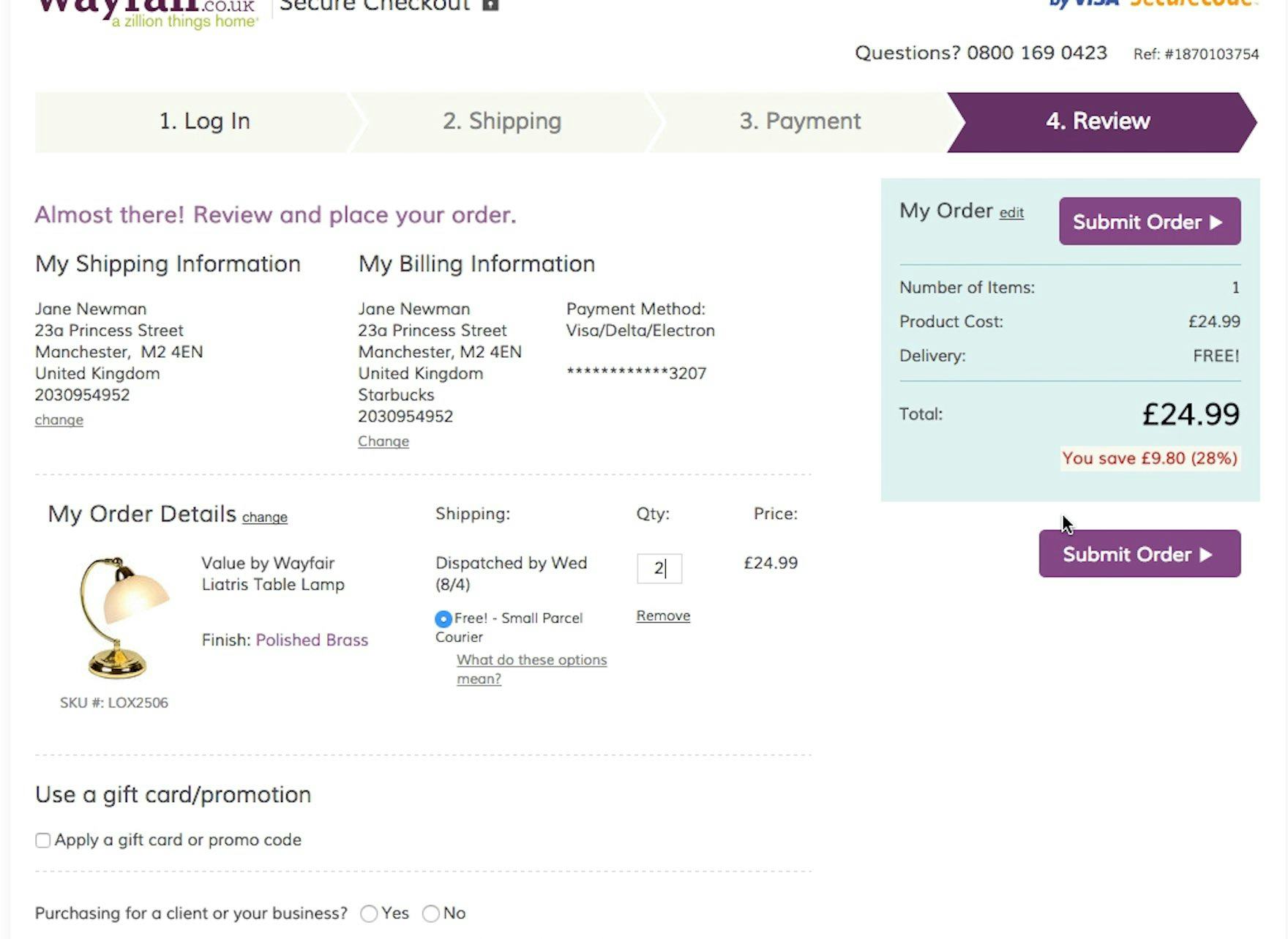
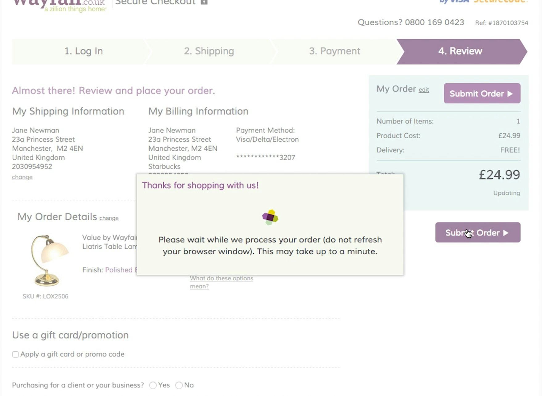
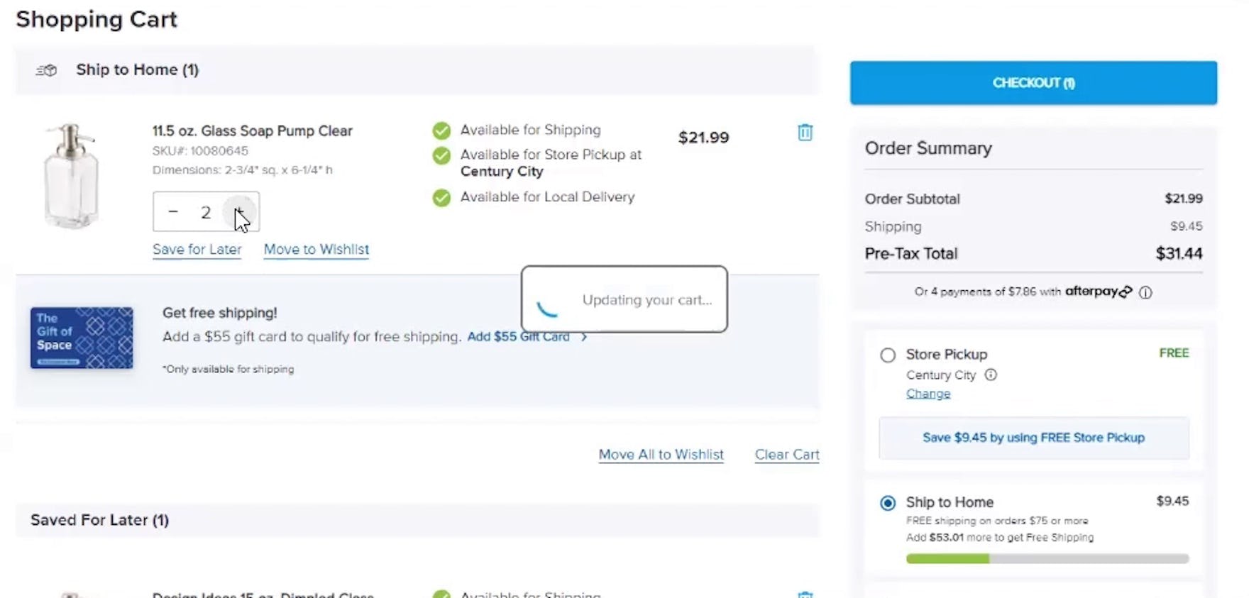
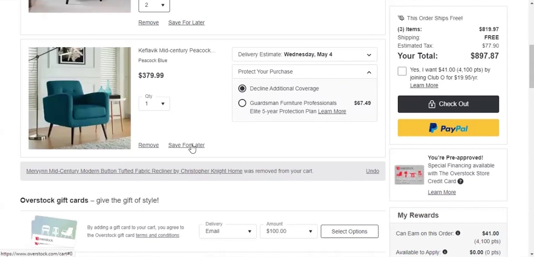
A test participant had intended to order 2 lamps (first image), but Wayfair requires that users focus out of the field by clicking on something other than the field — but not another link or button — before the quantity updates. This caused issues for multiple participants. After pressing “Submit Order”, the order summary shows that only one lamp is being purchased (second image).
During testing, some sites, rather than requiring users to click an “Update” link, autoupdated changes made to the quantity text field — but only after participants clicked or tapped a different page element.
Yet forcing users to move focus off of the quantity selector before a quantity change is implemented (a field onblur event) also leads to usability issues, as some users will go immediately from the quantity field to the button for proceeding to the next or a previous page (or the “Submit” button if changing quantity at the order review step).
During testing, this caused multiple participants to unknowingly lose out on the changes they made — despite the fact that the site had made an effort to implement autoupdating quantity fields — with some users going as far as submitting with an unregistered quantity change.
How Drop-Down Fields for Selecting Quantity in the Cart Can Cause User Issues
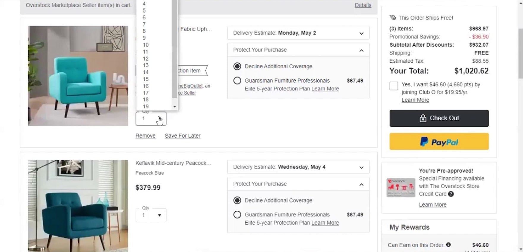
The quantity drop-down on Overstock was so large that this participant had a difficult time selecting finding and selecting his desired change (updating to 2 from 1).
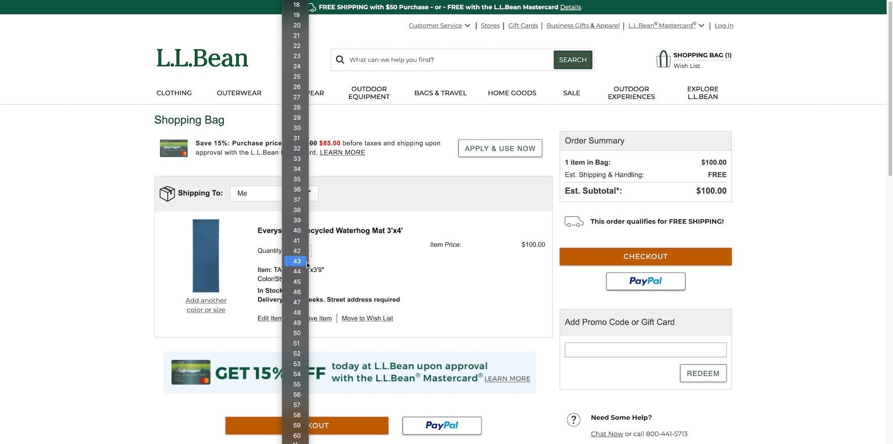
Overly long quantity drop-downs, like this one on L.L. Bean, make targeting individual quantities trickier and provide options that are likely never used (e.g., are users really going to order 100 door mats?).
Likewise, we observed in testing that quantity drop-down menus — especially those containing a high maximum number — caused issues for participants, with participants occasionally struggling to target their desired quantity.
In general, drop-downs can be difficult to use and require dedicated dexterity to manipulate.
Moreover, when selecting large quantities — which may or may not be warranted given the site industry and available product types — users will have to contend with unwieldy, long-scrolling drop-downs that make it difficult to efficiently select the desired option.
Why Using Buttons or Buttons with an Open Text Field for the Quantity Field Performs Best for Users
During testing of the Container Store, this participant easily updated the quantity of an item in her cart using the “plus” button, which registered the change automatically.
On Thrive Market’s mobile app, “plus” and “minus” buttons in the cart allow users to easily adjust their quantity up or down.
In testing, using buttons for adjusting quantities was the most efficient option among the alternatives, allowing participants to adjust the quantity with a single click.
Buttons were observed to be easy for participants to both interpret and use — as long as they are sized appropriately (especially important on mobile sites; see #5 below) — compared to open text fields and drop-downs.
Quantity buttons also obviate the need for a separate “Update” link, as quantity changes can be automatically updated with each click or tap.
Additionally, testing showed that the purpose of a “plus” button and a “minus” button surrounding a quantity field was immediately understood by participants.
However, it’s worth noting that no issues were observed with a few other designs that were used (e.g., a “trash can” button instead of a minus button) — the quantity number sandwiched between the buttons is generally enough for most users to understand the function of the buttons.
Furthermore, consider making the quantity number between the buttons an open text field.
An open text field between the quantity selection buttons allows users to have options when deciding how to adjust the quantity of an item.
This can be especially useful on sites where large quantities are often purchased.
5 Ways to Ensure Optimal Performance of Buttons or Buttons with an Open Text Field
To ensure quantity buttons perform as users expect, it’s important to implement the following 5 design details:
- Update cart and order summary immediately after the quantity is changed
- Highlight the existing quantity if users select the quantity text field
- Allow the “minus” button to set quantity 0
- Provide an “undo” option if cart item is removed
- Ensure appropriate size and spacing of quantity buttons on mobile
1) Update Cart and Order Summary Immediately after the Quantity Is Changed
When updating the quantity, any changes should apply automatically as soon as the value is changed.
Users shouldn’t be required to either leave the field or have to click an “Update” link before the quantity change is registered.
Once a new quantity is entered, the cart summary and order total must also update immediately, as there will otherwise be potentially conflicting information in the interface.
For open text fields associated with a hybrid quantity selector, implementing a slight delay (e.g., 200–300ms) before autoupdating gives users time to type double-digit quantities (e.g., “21”, without it autoupdating on “2”).
2) Highlight the Existing Quantity if Users Select the Quantity Text Field
In testing, entry errors for quantity text fields were sometimes the result of participants failing to realize they needed to delete the existing quantity before typing their new desired quantity.
For example, a user looking to change the quantity from “1” to “2” is likely to simply click into the text field and type “2”.
If the quantity isn’t highlighted or cleared before the user begins typing they’ll end up with either “12” or “21”, depending on where they click.
Even when users realize this requirement before typing, the need to manually delete the content already in the field involves unnecessary effort, making the process of updating the product quantity less efficient.
Instead, automatically highlighting the existing entry so that users may immediately overwrite it provides a more practical and streamlined experience.
3) Allow the “Minus” Button and Text Field to Set Quantity 0
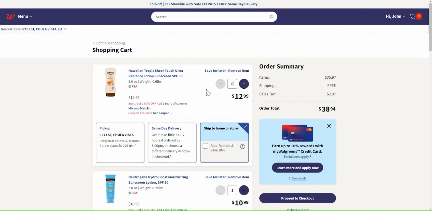
“So if I was going to remove one, I would press ‘Negative’, and I can tell that’s not an option, so I’d highlight it and put zero and then probably press ‘Enter’, and it took it away. I think the option should have been either a plus or a minus instead of pressing zero…I should be able to remove it a different way.” This participant on Walgreens initially tried to remove this sunscreen from her cart using the “minus” button but found it was disabled. Instead, she turned to the open text field and updated it to “0” to remove the item. To accommodate users’ natural behavior, any quantity selector should allow users to remove the item.
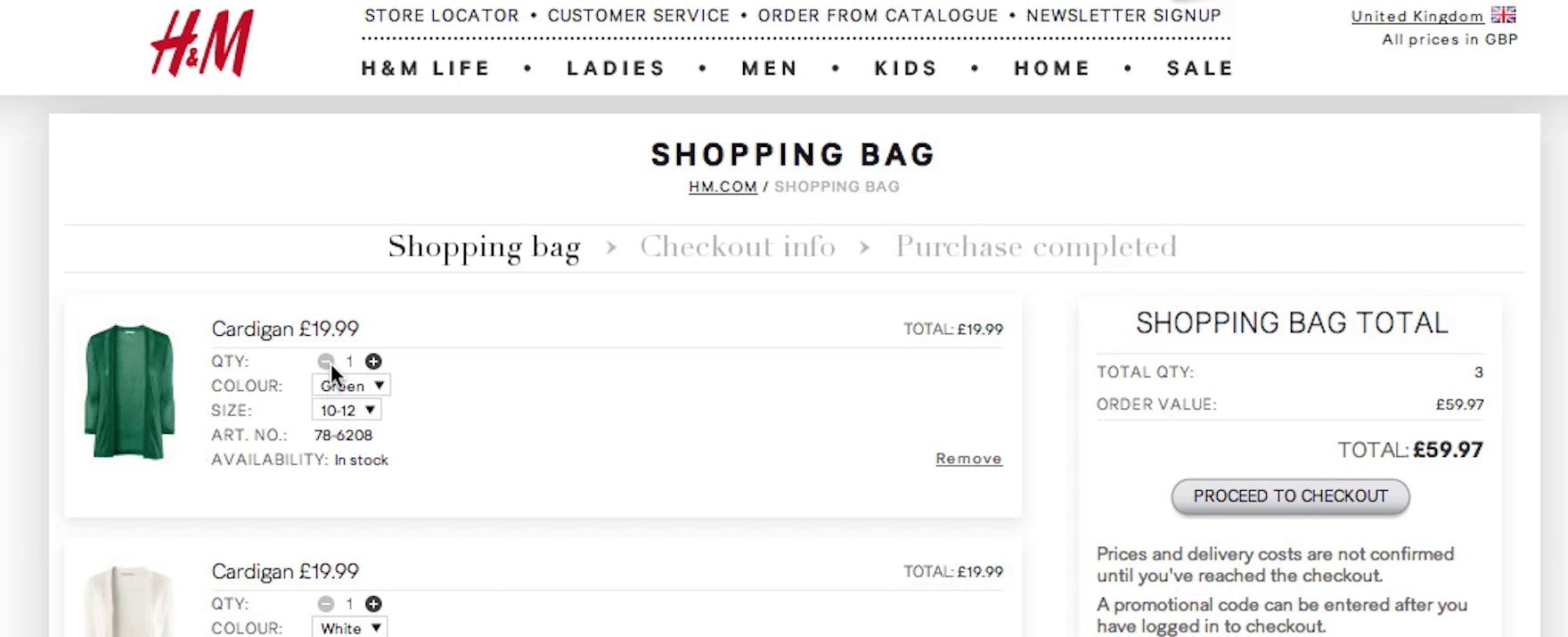
“I tried ‘minus’ because I thought you could get it down to zero.” A test participant at H&M tried to remove a product by subtracting from the quantity in an attempt to set it to 0. However, the “minus” button is disabled when the quantity is at “1”.

A participant at Walgreens tried to remove an item from her cart by tapping the “minus” button several times. However the button was disabled. She eventually found and tapped the “Remove” link instead.
During testing, we observed that some participants’ initial reaction when looking to remove an item from the cart was to use the “minus” button associated with the quantity selector rather than the available separate “Remove” link.
While all participants eventually were able to successfully remove the item, supporting users’ natural inclination for removing items creates the most seamless cart experience.
Thus, users should be able to use the “minus” button when the quantity is 1 to remove the item from their cart, even if a separate “remove” link is provided.
Additionally, across multiple usability studies, we’ve observed that a subset of participants consistently attempt to delete an unwanted item by typing “0” when presented with an open text quantity field.
Therefore, sites using a text field in addition to quantity buttons should honor this method for removing cart items as well.
4) Provide an “Undo” Option if a Cart Item Is Removed
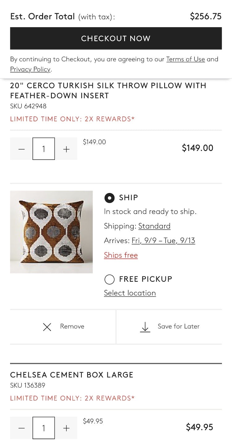
On Overstock, although drop-downs are used for quantity fields, a confirmation message — the notification displayed in gray background color — appears after removing an item from the cart, allowing users to undo the action if it was done by mistake.
Additionally, some users may accidentally remove an item, or may change their mind about removing an item.
Yet refinding the item via the site navigation can be very difficult.
Hence, after removing the product, consider then including an option to “undo” or a link back to the recently removed item’s product page.
This offers users even more of a chance to “go back” if they unintentionally removed a product from the cart or changed their mind.
5) Ensure Appropriate Size and Spacing of Quantity Buttons on Mobile
The small quantity buttons in Italic’s cart may be difficult for some users to accurately target.
Meanwhile, the quantity buttons on Logitech (first image) and CB2 (second image) have a much larger obvious hit area, decreasing the risk of accidental taps.
Finally, mobile e-commerce UX requires that sites take extra care to ensure buttons are adequately sized and have enough spacing to prevent accidental taps of nearby cart elements.
For hybrid quantity selectors, the quantity text field should also invoke the appropriate numerical keyboard.
Avoid Unnecessary Friction at the Beginning of Checkout
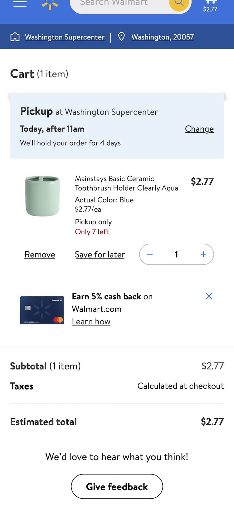
On Walmart’s mobile site, the quantity field is adjusted using either the plus/minus buttons or by entering in a new quantity into the text field. Importantly, the field and its components are adequately sized and spaced, which will help users interacting with the field make fewer tap errors.
The quantity field in the cart may be an afterthought for many designers — yet this seemingly simple field was observed to cause participants during testing a surprising amount of friction.
As the cart has a lot of heavy lifting to do — for example, communicating key product info about items in the cart, providing a cost summary, offering users ways to save the items in the cart for later, and so on — it’s crucial that users not get tripped up on what should be a nearly effortless task of updating the quantity of an item.
Yet 61% of sites in our e-commerce UX benchmark make it unnecessarily difficult for users to update the quantity of cart products by using either only an open text field or a drop-down.
Instead, buttons or buttons with an open text field should be used to optimize the user experience.
Additionally, it’s important to observe the following 5 implementation details to ensure a high-performing quantity field:
- Update cart and order summary immediately after the quantity is changed
- Highlight the existing quantity if users select the quantity text field
- Allow the “minus” button to set quantity 0
- Provide an “undo” option if cart item is removed
- Ensure appropriate size and spacing of quantity buttons on mobile
Using buttons or buttons with a text field, and following the 5 implementation details above, will help ensure users can quickly adjust the quantity of cart items and move on to their primary goal — finalizing their checkout order.
This article presents the research findings from just 1 of the 700+ UX guidelines in Baymard – get full access to learn how to create a “State of the Art” ecommerce user experience.