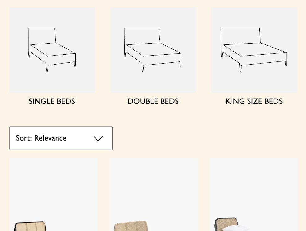
Articles

Filter UI Design: A Horizontal Toolbar Can Outperform the Traditional Sidebar

This is the 5th in a series of 9 articles based on research findings from our e-commerce product list usability study.

At e-commerce sites the filtering interface has historically consisted of a left-hand vertical sidebar. However, over the last couple of years a new filtering and sorting interface has become increasingly popular: a horizontal toolbar which combine both filters and the sort tool. In fact our Product Lists & Filtering benchmark reveal that of 50 top US e-commerce sites 24% have ditched the traditional filtering sidebar in favor of a combined horizontal filtering and sorting tool (similar to the one in the image above).

But how does this new horizontal toolbar interface actually perform with real users? During our large-scale study on e-commerce Product List & Filtering usability several of the tested sites had one of these horizontal toolbar.

In short: our usability study showed that a horizontal filtering and sorting toolbar is only appropriate for certain types of e-commerce sites – yet for those sites, it can significantly outperform the traditional left-hand filtering sidebar.

In this article we’ll explore the usability test findings on this relatively new horizontal Filtering & Sorting Toolbar user interface. We’ll outline which types of e-commerce sites should and shouldn’t consider it, how users responded to the new UI, along with 3 specific interface details which are crucial to get right in a horizontal design.

Test Observations: Why a Horizontal Filtering Design Can Perform Better

During the usability study the horizontal filtering and sorting toolbar design was found to lessen (although not eliminate) two severe issues frequently observed with the traditional sidebar filtering interface found on most e-commerce site:

  1. Users overlook or ignore the filtering sidebar entirely (this is the most common scenario),
  2. Users sometimes mistake the site’s sorting tool for the sites filtering tools, thinking they are the only ones available.

Both issues are severe as it prevents users from getting a well-defined product list which match their purchasing criteria – and instead leaves them navigating overly broad product lists. During testing, fatigue quickly set in when the test subjects browsed overly broad product lists, and they would then switch up their product finding strategy – including abandoning the site for a competitor.

These issues were not just observed during this e-commerce usability study on Product Lists & Filtering, but also for Homepage & Category navigation, On-Site Search, and in particular for our study on Mobile Commerce. The following is a short except of just 3 typical test observations of misinterpreting the sorting tool as the sites filtering options:

“I thought there might be an option to sort by manufacturer or something,” a subject said after being dissatisfied with the top products he’d looked through at Newegg. Here, he’s opening the “Sort by” drop-down, expecting a way to “sort” (by which he actually meant: filter) by manufacturer

Similarly, at Pixmania, a subject pondered, “I’m looking for a way to narrow this down to something more manageable. Are there some criteria I can use?” before concluding that the only filtering options he had were the 4 sorting options displayed right above the product list.

The sorting tool’s central position meant it would typically grab the test subjects’ attention, especially those who had engaged with the product list (which is placed at the center of the page too) and then scrolled back up to the top of the page, as seen here when testing Macy’s

When users have initially explored a product list and then decide they want to alter the products displayed, they tend to scroll upward towards the top of the product list. A natural area to focus at first is the center of the page right where the product list stops. Since this is often where the sorting tool is placed, misinterpreting the sorting tools for filters is understandable, especially considering that sorting and filtering are highly related in that they are both tools designed to alter the product list. In fact, during testing, several subjects used the term “sort” when in fact what they wanted to do was filter.

For the majority of users the most common behavior was however one of “tunnel vision” – overlooking or ignoring the filtering sidebar, despite actively looking for a way to alter the products displayed. While a clear filtering design, e.g. using checkboxes for each filtering value, was observed to reduce the occurrence of this issue, it did in no way eliminate it (e.g. notice the clear filtering design in the Pixmania example).

IKEA uses a unified horizontal filtering and sorting bar. During testing, this proved very effective, and the subjects who wanted to alter the product list instantly spotted the tool as they scrolled up page – and more importantly, they didn’t mistake the sorting tool for the site’s filtering options.

This is a heatmap from a recent eye-tracking study we did showing the accumulated eye-fixations of 32 test participants at Allposters. This clearly confirms that a horizontal filtering toolbar can have a very high discovery rate. Notice how the horizontal filtering tool – consisting of 3 filtering drop-downs – get as much attention as the top 3 products (a behaviour not commonly observed at sites that only have the filters in a sidebar).

During the research study, the tested unified horizontal filtering and sorting designs proved to perform very well in regards to both discoverability and utilization of the site’s filters. The subjects were observed to both apply filters more frequently when faced with this filtering design and never confuse the sorting widget as being the only filtering options.

As if this wasn’t enough, a horizontal filter and sorting tool has another major benefit: it opens up the possibility of removing the traditional left-hand sidebar altogether, allowing for either larger product thumbnails (see example later in the article) – which is particularly desirable for visually driven industries – or making room for an extra column of products per line on sites with a grid layout.

Sites That Can Use a Horizontal Filtering & Sorting Toolbar

The horizontal filtering design has one major shortcoming: space is limited. Because it utilizes the screen width, and not the “unlimited” screen height as the traditional filtering sidebar does, it only works well for industries and site types that naturally have few filters. Apparel and home decoration are two such industries, where a horizontal filtering tool may be considered as their filtering types are often limited to size, color, material, price, brand, and style, allowing them to reasonably be fitted onto a single line.

Crate & Barrel employs a horizontal toolbar design which suits their industry perfectly well as few filters are needed.

If a site outside apparel and home decor currently has few filters, it’s important that before considering a horizontal unified filtering and sorting bar, it is thoroughly investigated whether the site does in fact have all the filtering options that users need. This word of caution is given in the light of our Product Lists & Filter benchmark showing that 60% of all sites have an inadequate number of filtering types, lacking either category-specific filters (42%), thematic filters (20%), or compatibility filters (32%) - as we detail in this article on Smashing Magazine (see chapter #2, #3 and #4).

Site types that deal with even remotely spec-driven products, will nearly always need a larger set of category-specific filters making it unfeasible to fit them into a horizontal toolbar. This includes site types such as Mass Merchants, Electronics, Office, Hardware, Sports, Hobbies, and most B2B verticals.

3 Interface Details Crucial to Performance

While 24% of the benchmarked e-commerce sites have a horizontal filtering interface, our benchmark also revealed that only half of these implementations are likely to perform as well or better than a traditional filtering sidebar. The other half of horizontal filtering toolbar implementations have usability issues so severe they are likely to limit the user’s ability to see and apply filters.

Due to vertical alignment concerns, these horizontal filtering designs are virtually always implemented as drop-downs (native or custom), or similar collapsing interface. However, during our usability studies of checkout processes, mobile e-commerce and e-commerce navigation, drop-down interfaces often caused severe usability issues if not implemented with great care (read more here, here and here). Drop-down interfaces for displaying filtering values are no different and require the utmost attention if they are not to severely hurt the user’s filtering experience and abilities.

There’s in particular 3 interface details that proved crucial during testing to getting a high-performing horizontal filter implementation.

1) Use a Custom-Designed Drop-Down to Display Checkboxes for Each Filter Value

Ann Taylor features a horizontal filtering and sorting bar. However, note how the user’s filtering capabilities are severely limited as they can only apply a single value within each filter, leading to extensive pogo-sticking for any users interested in multiple values (e.g. a user could reasonably be interested in all “brown”, “beige”, “neutral” and “ivory” sweaters).

Regardless of the interface, it’s critical that users can always select multiple filtering values within the same filtering type. However, the native HTML drop-down element (the <select> tag) is nearly always used to serve mutually exclusive options – something many users have come to expect. It’s therefore not recommended to use a native drop-down interface for displaying filtering values (even if it is set up to allow multiple values to be selected). Links suffer from the same issue. A custom-designed drop-down, or similar collapsing user interface, displaying a list of checkboxes (which have a very well-established multi-select affordance) is therefore required to ensure that it is clearly communicated to the user that multiple values can be selected. (This was also observed for mobile filter designs as well – more here on the general issue and M-Commerce report owners: see guideline #58).

2) Live-Update the Product List when Filters Are Applied

As custom drop-downs are an unconventional way of applying filtering values, some test subjects became in doubt of what would actually happen when clicking the values within it. It’s therefore advisable to live-update the list of matching results, as this will allow users to check and uncheck the values and learn the interface behavior without being interrupted by a page reload (a conduct exhibited by multiple test subjects). An additional benefit of live-updating the product list is that you don’t need to fit an ‘Apply’ button inside the drop-down.

3) Display Applied Filtering Values Outside the Drop-Down Widget Too

Note how Nordstrom’s drop-down design repeats any applied values outside the drop-down, not just making them immediately and permanently visible to the user, but also providing an easy option for disabling each applied value.

This allows the user to see which filters are applied and thereby always see the exact criteria the current list is filtered by. When one or more filtering values are applied, it’s important that this is clearly communicated to the user, as overlooking even a single applied filter can make the user misinterpret both the type and range of products the site carries. Displaying the filtering values outside the drop-down furthermore provides the user direct access to deselect any of the applied filters.

Horizontal Filtering & Sorting Toolbar

For select sites where only very few filtering types exists – such as apparel, home decoration and similar aesthetically-driven verticals – a horizontal filtering and sorting toolbar is a completely valid filtering interface, which should be seriously considered.

Our usability studies show that the horizontal filtering and toolbar can increase both the discovery and the utilization of a site’s filters, and avoid misinterpretations of the sorting tool (by juxtaposing filters and the sorting tool to one another, prompting the user to make a distinction between the two). Furthermore it opens up the possibility of removing the traditional sidebar altogether which frees up horizontal screen real estate which can be used for displaying either an additional product per row or larger product thumbnails.

However, the user experience is only improved when the horizontal filtering design is implemented carefully. Resources must be spent to get the implementation details right – something half of the current horizontal filtering toolbar implementations fail to do. Specifically, make sure that:

  • Filtering values are implemented as a custom drop-down interface, that
  • Allow multiple filtering values of the same type to be selected,
  • Auto-apply and live-update the product list as each value is clicked, and
  • Display any applied filtering values outside the drop-down.

This article presents the research findings from just 1 of the 650+ UX guidelines in Baymard Premium – get full access to learn how to create a “State of the Art” e-commerce user experience.

Authored by Christian Holst on May 5, 2015

Share:
If you have any comments on this article you can leave them on LinkedIn

User Experience Research, Delivered Twice a Month

Join 37,000+ UX professionals and get a new UX article every second week.

A screenshot of the UX article newsletter