
Key Takeaways
- When users don’t open the “Size” filter in the product list, they can waste time needlessly evaluating items that turn out to be out of stock
- 39% of participants discovered on product pages that their choice items were not available in their size — forcing them to start a new search
- For apparel products, placing the “Size” filter at or near the top of the filtering sidebar and opening it by default can significantly prompt users — 90% in testing — to first filter by size before browsing
Video Summary
In Baymard’s large-scale UX testing of Apparel & Accessories, size availability was shown to be a crucial factor in determining whether users purchase an item or not — if a clothing item doesn’t fit, users will likely not purchase it.
Indeed, as observed during testing, 39% of participants, after spending undue time and effort exploring products in the product list, found out on the product page that their size was in fact not available for their product of choice — forcing them to start their search over again.
By optimizing the placement and presentation of the size filter in the filtering sidebar, sites can significantly encourage users to first filter by size before browsing — mitigating the issue of users exploring products that aren’t available in their size.
However, testing showed that few sites helped users take action to select their size — thereby causing these participants to waste undue time and effort that would have been better spent finding alternative clothing items available in their size.
This article will discuss our latest Premium research findings on how to display the size filter in the filtering sidebar for Apparel & Accessories products:
-
How users risk wasting time on products that aren’t available in their size
-
How placing the size filter near the top and expanding it encourages users to filter by size
-
Why presenting size filter buttons as a grid ensures their maximum visibility
How Users Risk Wasting Time on Products That Aren’t Available in Their Size
As observed during testing, despite the fact that “Size” is a critical product attribute for apparel, most participants didn’t filter by size, eager to get to the more exciting task of browsing and evaluating clothing items instead.
However, this leads to issues when users find a product they like in the product list and proceed to explore it in more detail on the product details page — only to discover that their top choice is out of stock in their size.
As a result, users have to abandon their favorite item and start their search anew.


”They don’t have my size, which is not fun! Yeah, so that’s a huge bummer!” A participant who didn’t open the “Size” filter in the product list at Madewell (first image) became frustrated when she had to abandon the pair of jeans she liked because it was not available in her size “29” (second image). She returned to look for a different pair in the product listings — this time filtering for her size.


”Okay, so they don’t have this in my size…So I can’t get this. Let’s try [different lengths] and I don’t want long, let’s look at short. Yeah, it’s just slightly too small I think — the size.” This participant shopping for jeans at Express didn’t open the “Size” filter in the left sidebar and subsequently scrolled through 26 pairs of jeans in the product list before finding a pair she liked (first image). However, when she opened the product details page she discovered her preferred size was not available in the “Regular” length — or the “Short” length that she also considered (second image).
Indeed, testing revealed that many users, once they arrive at product pages, will first linger on product images, reviews, and other product information in detail, only checking for size availability as a final step.
This waste of time and effort was compounded for participants whose modus operandi was to open several tabs at once in order to cross-compare the product pages of promising items with the goal of finding their favorite one.
In fact, it was not uncommon for participants to spend upwards of 15 minutes closely comparing clothing items in this manner only to discover that some of their selected items were not even available in their size.
Users are therefore forced to spend a longer time finding items of their choice when they needlessly evaluate items that don’t even fit them.


This participant at Madewell skipped the “Size” filter (first image) and proceeded to evaluate 10 pairs of jeans, at one point opening the product pages for 8 pairs she liked in separate tabs so that she could better compare their images and reviews (second image). ”Okay, then I see these garment-dyed jeans that are an interesting color, but…they don’t have my size because it’s a sale item. So I’ll probably close it out.” The time wasted looking at jeans that didn’t come in her size “29”, such as this pair (third image), contributed to the 15 minutes it took her to evaluate and compare her selection of jeans.
Furthermore, being forced to let go of items they had their heart set on also caused participants considerable frustration — as one participant vented when her anticipation about getting a pair of jeans was dashed, “I hate when that happens! When I see something I really like, and there’s none left in my size”.
As observed during testing, participant frustration was cumulative, with sizing issues the major source of such friction.
At their tipping point, such repeated incidents of frustration resulted in site abandonment — with the time and effort wasted evaluating items that are not available in their size causing users to lose faith in the site itself.

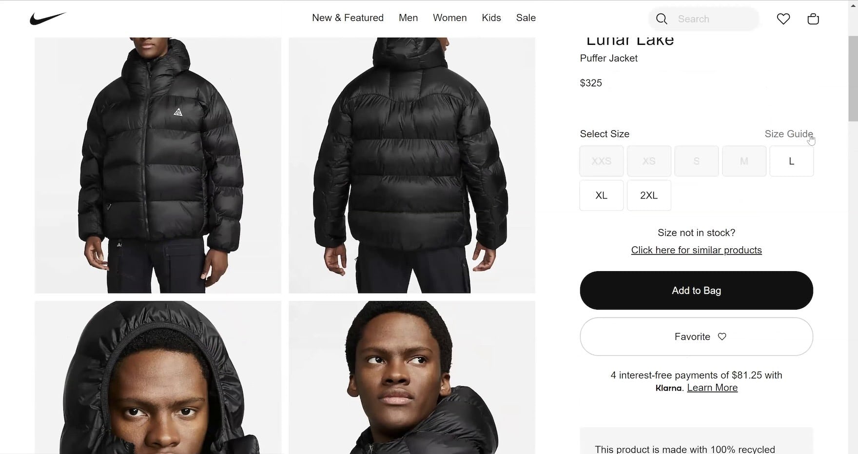
”I’ll click the black color. Well, the size isn’t there, so I guess then I should go for some other jacket.” This participant at Nike didn’t interact with the “Size” filter, which was pushed beneath the fold and never fully came into view as he scrolled down the product listings to look at jackets (first image). Disappointed when the black jacket he had his heart set on was sold out in his size “M” (second image), he looked for a different jacket instead — and overlooked the “Size” filter yet again.


”But this doesn’t seem to have my size though…Also this one seems to be sold out. So I’m just going to close that. I’m going to filter by ‘medium’. I think I should have done this previously.” Another participant at Nike didn’t initially interact with the “Size” filter, which, despite being open by default, never fully came into view as he scrolled through many pages of product listings (first image). Overlooking to filter by size caused him a headache as he wasted almost 4 minutes comparing 3 hoodies he liked — only to realize that 2 of them were sold out in his size “M” (second and third images).

Here in Francesca’s “Tops” category the “Size” filter option was not visible within the viewport because it was pushed down by the “Color” filter.
During testing, some sites attempted to make “Size” filters more visible by expanding them by default in the filtering sidebar — but they were pushed far down below the viewport.
In theory a “Size” filter that is in the second, third, or even fourth or fifth position in the filter list could feasibly be visible within the viewport.
However, if the other filter options positioned above it have a fluctuating number of associated filter values — for example, a “Color” filter will often show more colors for “Dresses” than for “Jeans” — in practice this means that the “Size” filter can be pushed further down the viewport.
“Size” filters that aren’t among the first options in the filter list therefore can’t always be counted on to remain visible above the fold.
How Placing the Size Filter near the Top and Expanding It Encourages Users to Filter by Size


”Oh, this is great! You can select by your waist size”, exclaimed a participant shopping for jeans at Levi’s when she noticed the “Size” filter (first image). Another similarly remarked, ”I feel like this is like the best in terms of filtering, just because it specifies what the “Waist” size is and what the “Length” size is” (second image). Participants consistently praised “Size” filters that were easy to find.

”So, I will…just filter by size. So ‘28’, and because I self-identify as fun-sized at ‘5’2”’, I’ll go with the length as well!” When the “Size” filter is expanded by default and positioned at the top of the sidebar — as in both these instances at Levi’s — users are more likely to notice it.

”I’m going to just do it by my size. This is nice that they have the filters all on the side over here so I don’t have to do a drop-down. It’s very straightforward.” Users are also more likely to use “Size” filters that stand out.

”I would filter it by ‘Size’. I love that they have the ‘Length’ available right away, without having to go to a different step!” This other participant’s first action before browsing at Levi’s was also to select her size in the filters. Participants consistently gravitated to size filters that were both visible by default as well as clearly visible in the viewport.


Like 90% of study participants at Levi’s, the first action of these 3 was to filter by their size from the visible sidebar filters before browsing.
Therefore, to ensure that users in product lists don’t waste time exploring items not in their size, position the “Size” filter at or near the top of the sidebar and expand it by default.
This presentation prompted 90% of participants to first filter by size before they began browsing, on the one test site that did this (Levi’s).
In practice, promoting the “Size” filter allows users to easily discover it when they gather their bearings upon arrival on the product list, in order that they filter by their size.
Indeed, the sudden jump from selecting a navigation category to arriving on the product listing can be bewildering for users, who sometimes don’t necessarily know what they need, and sites can help by nudging them to take actions that will result in a better experience for the majority.
Choosing to expand the “Size” filter by default, and to place it near the top of the filter list in the sidebar, does mean that other filters are necessarily made less prominent.
However, our testing revealed that the “Size” filter is particular in that it’s key for users to apply it to avoid wasting time exploring products that aren’t available — yet the vast majority of users won’t seek to apply the “Size” filter before starting with product exploration.
On the other hand, participants keen to browse products by price, color, or subcategory, for example, were observed to generally start by applying the relevant filter in the product list.
Thus, if “Price”, “Color”, “Subcategory”, or other important filters are pushed down, users most interested in those product attributes are still likely to hunt for them in the filtering sidebar.

At Cole Haan, the “Category” filter only displays the current scope, allowing the “Size” filter maximum visibility even though it is the second filtering option.
Note that the “Size” filter doesn’t necessarily have to be the first filter type in the filtering sidebar.
In particular, “Size” can be placed beneath a “Category” filter type, as long as the space the “Category” filter takes still allows the “Size” filter to be immediately visible to users — for example, by only displaying the current scope or collapsing it by default.
Similarly, 1 or 2 other filter types can be placed above “Size” as long as they’re collapsed (e.g., see the “Pickup In-Store” type in the Levi’s example above).
Finally, site search should ensure users arrive at appropriate search results when they search for a specific category of apparel — for example, a search for “Jeans” should direct users to the “Jeans” category, where users will find appropriate contextual product filters such as “Size”.
Why Presenting Size Filter Buttons as a Grid Ensures Their Maximum Visibility

The “Size” filter at Levi’s maximizes the horizontal space of the filtering sidebar by presenting the “Size” buttons in a grid — as opposed to a drop-down, for example.

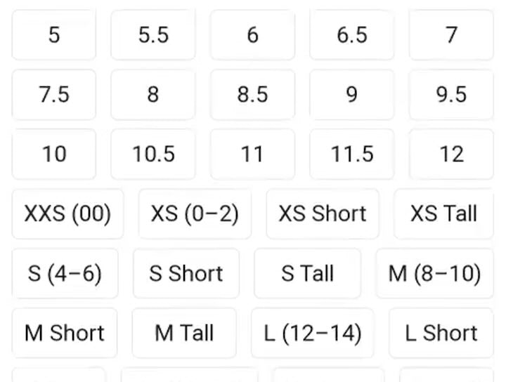
Although positioned at the top of the filtering sidebar and expanded, the “Size” filter at Land’s End is given slightly less prominence due to the vertical alignment of the “Size” selector buttons.
Finally, to ensure the maximum visibility of “Size” filters, consider using “Size” filter buttons and presenting them as a grid.
Because a grid of buttons takes up more visual space than vertically aligned buttons, it has more chance of attracting a user’s attention.
Moreover, the compact nature of a grid ensures that more sizes are visible at a glance within the viewport, thus increasing the odds that users spot their size when they arrive on the product list.
Help Apparel Users Filter for Their Size

This participant shopping for jeans at Nordstrom never opened the “Size” filter in the left sidebar when in the product list — ultimately discovering, after spending 8 minutes browsing for jeans, that her preferred pair was sold out in her size.
By placing the “Size” filter at or near the top of the sidebar and expanding it by default, sites can dramatically encourage users to first filter for their size, thus ensuring that items they explore are in stock.
However, many apparel and accessories sites don’t make their “Size” filter prominent in the sidebar — either collapsing the “Size” filter when it is at the top of the filter list, or burying it so that it is below the viewport.
This risks that users overlook this critical product attribute, increasing the likelihood of discovering on the product details page that a product they like is not available in their size.
Getting access: our current Apparel & Accessories research study is ongoing and new Apparel guidelines are published every month in Baymard Premium. The full study is expected to be completed in Fall 2024.
If you want to know how your apparel or accessories desktop site, mobile site, or app performs and compares, then learn more about getting Baymard to conduct an Apparel & Accessories UX Audit of your site or app.