
Findability and Discoverability: 6 UX Tips for E-Commerce
If users become frustrated looking for content or products on your site — or if your prospective customers don’t know you exist — you may have a findability problem.
Why should you care?
In the competitive world of e-commerce, ensuring that your information is conveniently and intuitively “within easy reach” for users whenever they need it can be the difference between success and failure.
Today, the internet is like a giant library, where consumers need to navigate a maze of shelves to find the right book. If they don’t find their book of choice on the shelf where they expect it – they’ll leave empty-handed.
If a user enters your corner of the e-commerce “library” without any guidance about how and where to find what they’re looking for, their user experience will suffer. They’ll be less likely to find suitable products and complete a purchase.
What is findability, and how can you improve the findability of information and products on your e-commerce site?
Let’s dig into some definitions and establish why findability is so critical for e-commerce conversion rates. Then, keep reading for some actionable findability UX recommendations to make it easier for shoppers to locate what they need on your website.
What Is the Definition of Findability?
Findability is a measurement of how easy it is to locate content on your website — both externally and internally. Ideally, users will be able to find content easily on your site from outside (for example, from search engines) and when they are already browsing your platform.
When your products are findable, that means they are easy for customers to locate, identify, and buy.
Low findability on your e-commerce site isn’t just frustrating to users — it can make a significant dent in your revenue. Every successful sale depends on the user being able to find the product they need. The longer they have to search, the more likely they are to abandon your site.
Findability vs. Discoverability
“Findability” and “discoverability” might seem like the same thing — and they are both connected to improving the user experience — but they are distinct terms with different key outcomes.
What is findability?
Findability refers to how easy it is for customers to locate a feature or piece of content that they know is available.
For example, when you’re getting ready to leave your house, can you locate your wallet before you walk out the door? Your wallet is a known object; you assume that it’s present somewhere in your home, and your objective is to find it as quickly and easily as possible.
What is discoverability?
Discoverability, on the other hand, refers to whether or not a user notices or finds a feature or piece of content on their own — without knowing in advance that it exists.
If you’ve just finished reading an article, for example, the website may provide links to related content at the bottom of the piece. This strategy increases the discoverability of the content because you didn’t know those related articles existed when you landed on the site.
Users rarely come to your website knowing about every piece of content you’ve published or every product in your catalog, so findability and discoverability are both important for creating a successful e-commerce site.
Findability Types
When trying to find exactly what they want on an e-commerce site, there are two critical obstacles customers need to overcome: external findability and on-site findability.
External Findability
External findability can be tricky to control because there is so much online competition, and it’s difficult to make your site stand out from competitors when people are looking to buy.
Improving your external findability involves content marketing, branding, and advertising — but since the vast majority of customers will find your site through search engines (primarily Google, which processes 94% of all mobile searches), getting your site on the first page of Google’s results is critical.
Search engine optimization, targeted pay-per-click (PPC) advertising, and content marketing strategies can help you boost your external findability and drive more customers to your site.
On-site Findability
Can potential customers find what they’re looking for on your e-commerce site?
Several factors affect on-site findability:
- On-site search: Your website’s search functionality acts as a “mini-Google” that lets customers search for specific items. If customers can’t locate what they want using your site search, they tend to leave. For this reason, e-commerce search UX is a great place to start if you want to improve on-site findability.
- Information architecture: Information architecture (IA) is the practice of organizing content effectively. For e-commerce, that means navigation and product categories should align with user expectations.
- Thoughtful user experience design: Customers get frustrated when they see content, ads, and promotions, that have nothing to do with their interests. Follow solid UX design principles to provide relevant content from start to finish.
- Related products: Offering related products based on a user’s search terms and past purchase history allows you to personalize the shopping experience while increasing your internal findability and discoverability.
- Consistent cross-site experiences: Providing a consistent experience across all devices is critical for findability – which includes addressing issues specific to mobile UX search and navigation.
→ Sign up free to free research-backed UX guidelines and start improving your site today.
6 Simple Ways to Improve E-Commerce Findability
If your e-commerce site is large and complex, don’t despair: There are many ways to ensure users can find the products they’re seeking.
Our research catalog includes hundreds of actionable guidelines to improve findability (and discoverability) with changes to on-site search, navigation, product taxonomy, and categorization.
Here are a few examples of common issues and opportunities from our UX research to help you get started improving findability.
Display Product Categories in the Main Navigation
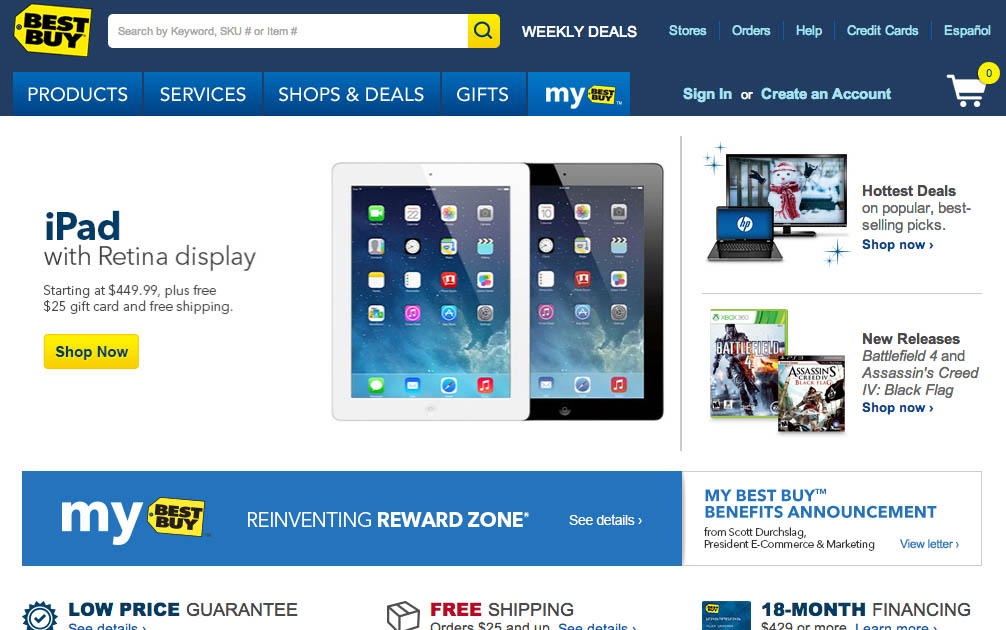
Best Buy includes the entire product catalog navigation under a single “Products” item in the main navigation area. When testing the site, this extra layer in the site hierarchy caused frequent issues for users — due to “double-hover” navigation and by making it difficult for users to infer the site type and what type of products it carried. Some users even mistook Best Buy for a price comparison site, not an e-commerce store.
Not displaying product categories directly in the main site navigation causes severe findability issues for users.
In our usability testing of Homepage and Category navigation, sites that require users to hover over a single navigational item (like “Products” or “Catalog”) before they are able to see the first level of product categories (like “Electronics” or “Apparel”) have difficulty navigating and finding what they need.
To improve findability, put your product categories at the first level of the main navigation on your site. This design fix allows visitors to immediately see what type of site they’ve landed on and quickly navigate to where they need to go.
Support Misspelled Search Queries
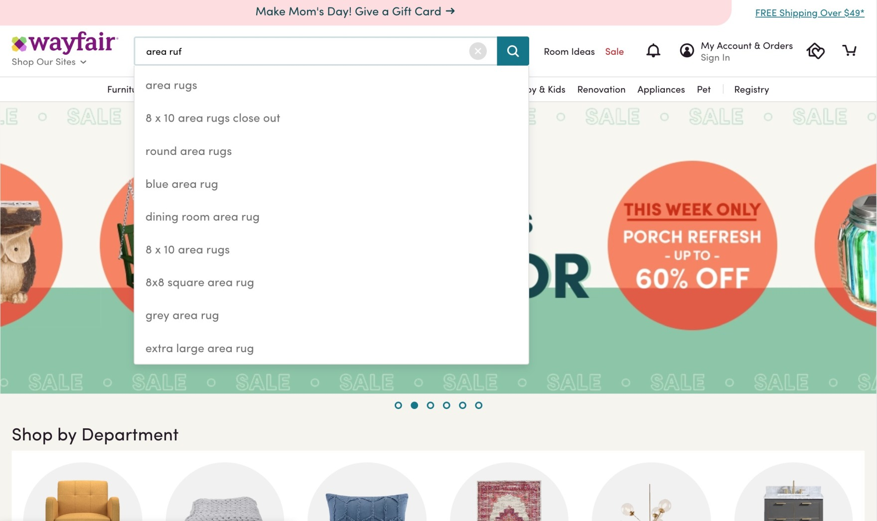
At Wayfair, a query intended to find “area rugs” includes a typo (“area ruf”). Autocomplete still offers relevant product suggestions, with the corrected search phrase at the top of the suggestion list. Mapping obvious misspellings to correct suggestions will increase findability and make it easier for users to find what they need without having to edit their original query.
If you want to improve findability, examining your site’s search function is critical.
For example, during our large-scale usability testing, nearly all users relied on autocomplete suggestions when using the internal search function on sites. However, many autocomplete suggestions failed if users’ queries contained spelling errors or typos.
When autocomplete isn’t set up to handle typos, unexpected suggestions can cause users to change their browsing methods, rework their queries, or abandon a site if they can’t find relevant results quickly.
To ensure that your e-commerce site can handle simple errors in search, map common misspellings to their correctly-spelled counterparts in your search suggestions.
Offer the Essential Product Filtering Options
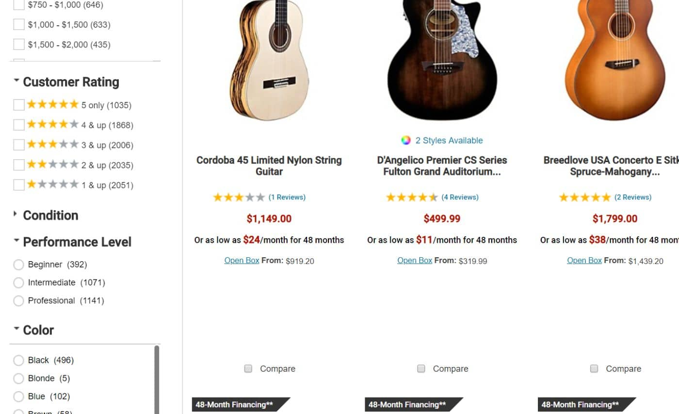
Musician’s Friends’ “Customer Rating” filters allow users to narrow the product list to just the products with an average rating of 5 stars (“5 Only”) so they can view only the top-rated offerings. Notice how the filter options include “& up” so users can see a range of products. On a site like Musician’s Friend, where there are over 1,000 products that have a 5-star average rating, users will still have plenty of choices if they select this filter option.
Users need to be able to filter your site’s product lists according to their purchasing preferences. If they can’t adequately filter and personalize the lists, so they see only relevant items, it will restrict their ability to find what they need.
In our usability testing, the majority of participants chose options from five specific filter types. These 5 essential filter types should be available on most sites to improve findability:
- Price
- User Ratings Average
- Color
- Size
- Brand
Include a Range of Featured Products on the Homepage
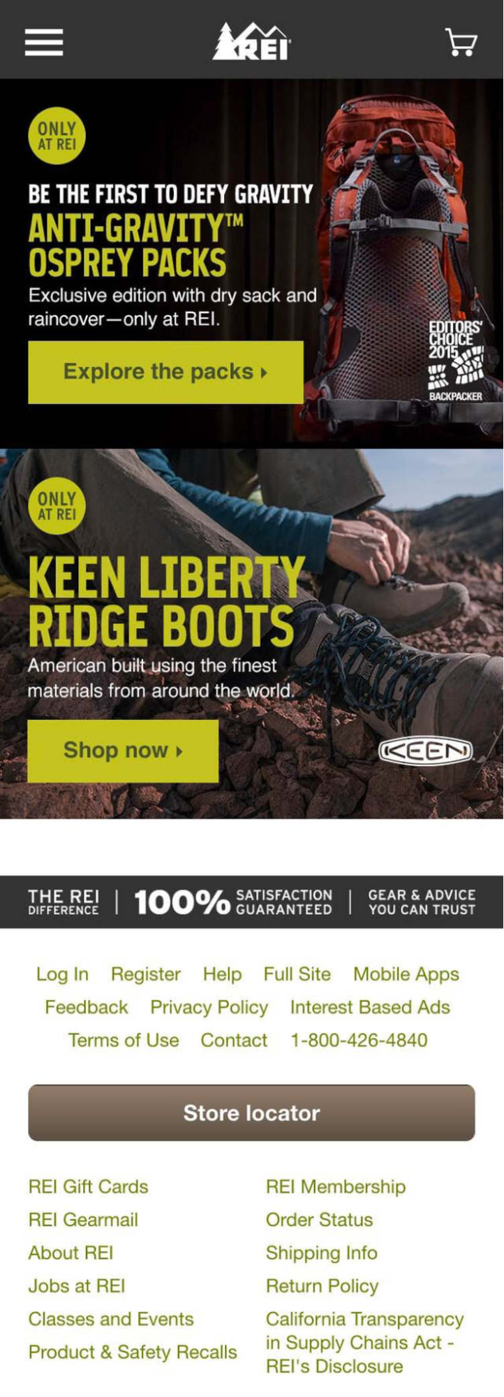
REI sells hiking equipment – that’s clear when users land on the homepage. But the user may not know the company also offers items like yoga mats, road bikes, and skis.
Visitors who land on your homepage rely on it to help them figure out the type of site they’ve landed on. Do the featured product images on your homepage do a good job of representing the types of items your site carries?
When users misinterpret or underestimate a site’s product range because of the featured images on the homepage, it can be harmful to conversions — most users won’t search for products they don’t believe the site carries.
On your homepage, use a selection of images to visually highlight the different types of products users can find on your site. Sites that sell a broad range of items should highlight at least 40% of product types on the homepage. On mobile, text links can be used in place of (or in addition to) thumbnails or images.
Recommend Alternative and Supplementary Products
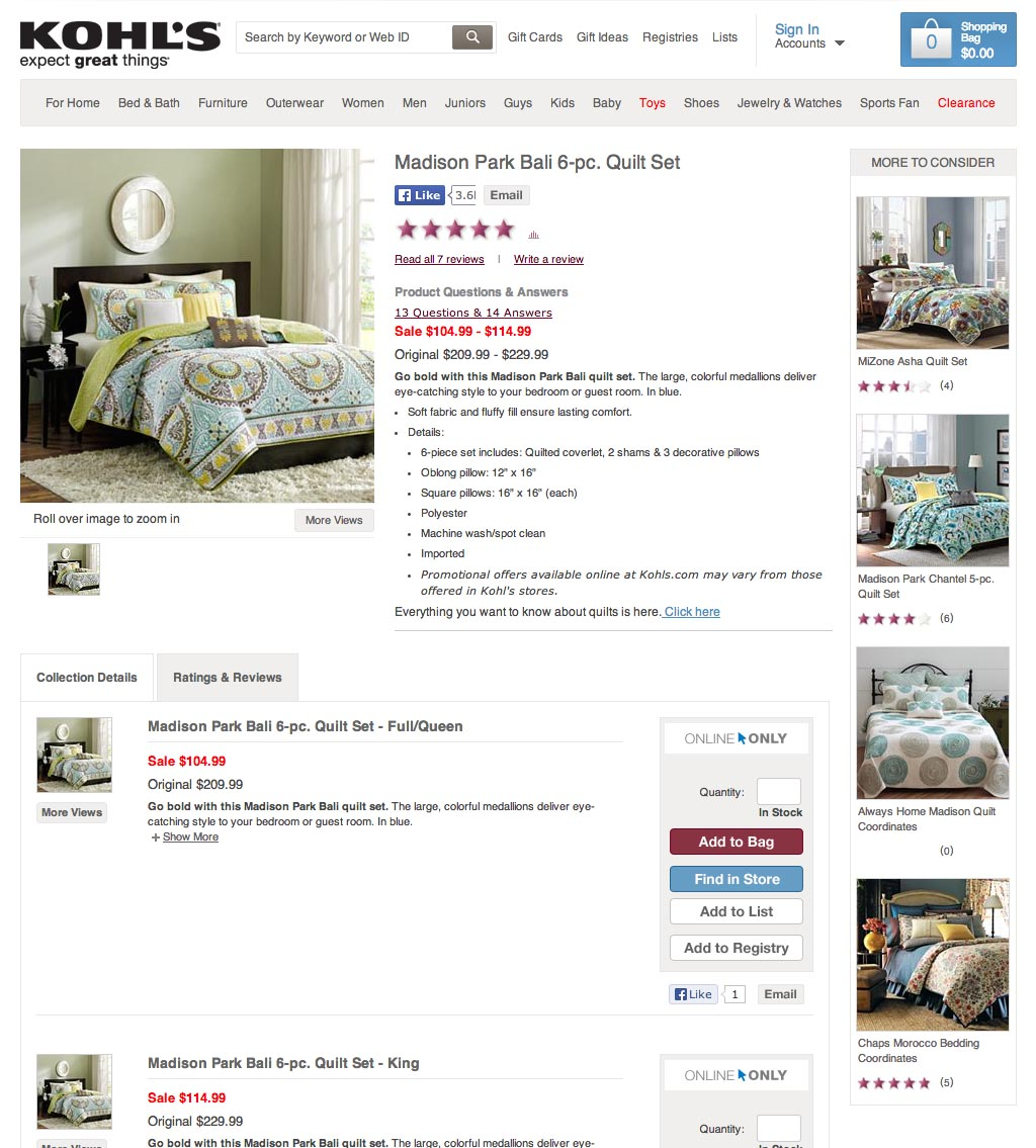
Kohl’s lists alternative products in a “More to Consider” sidebar, giving the user quick access to other possible bedding products.
Users land on product pages for different reasons, and they come to your site from different directions online. Often, users don’t know the exact product they need, but they have a general idea of what they’re looking for.
Including suggestions for alternative products can help users find the right product, and supplementary “add-on” product suggestions can help them discover additional items to go along with the product they’re shopping for (for example, suggested jewelry for a particular shirt or sweater).
On your product pages, offer links to products relevant to the current product page or to the user’s original search query.
Consider a Product Comparison Tool
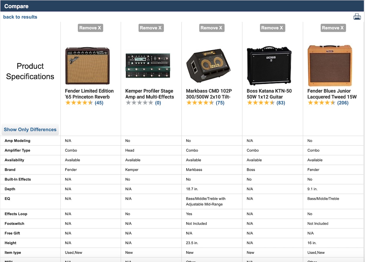
Many spec-driven product verticals — like these amplifiers on the Musician’s Friend site — may benefit from implementing a high-performing “Product Comparison” tool. Tools like these give users an efficient way to compare product specifications across several similar items.
On some e-commerce sites, implementing a well-designed “Product Comparison” tool that allows users to view side-by-side specifications of selected products can increase findability and improve conversions.
Keep in mind that a poorly-implemented comparison tool can do more harm than good, so perform these checks to help decide if adding this functionality is necessary and possible for your site.
If you decide to implement a comparison tool on your site, ensure it performs well by following these three UX requirements:
- On desktop, show the “Compare” link only when the user is hovering over the item to reduce clutter in the product list for people who don’t want to use the comparison tool.
- Provide explanatory tooltip text that briefly explains the comparison tool when the user hovers over the Compare option.
- Provide easy, prominent, and immediate access to the Comparison Table page after clicking the Compare link for a product.
More Ways to Fix Findability
The findability factor of your e-commerce site can make or break your chances of success. Increase findability and make it easier for users to find the items they need, and your conversions will increase — ignore findability UX recommendations, and you risk losing out on sales because prospects never know you exist or assume you don’t carry what they need.
For hundreds of detailed guidelines to increase findability and help your customers discover products through better UX performance, get access to our research catalog at Baymard Premium.
Research Director and Co-Founder
Christian is the research director and co-founder of Baymard. Christian oversees all UX research activities at Baymard. His areas of specialization within ecommerce UX are: Checkout, Form Field, Search, Mobile web, and Product Listings. Christian is also an avid speaker at UX and CRO conferences.