Key Takeaways
- Our latest Product List UX benchmark shows that most sites continue to underperform
- Poor-performing Product List UX can hamper users’ ability to find suitable products and could cause them to abandon
- In this article we provide 8 ways to improve Product List UX
Key Stats
- 58% of desktop ecommerce sites have a “poor” to “mediocre” performance in Product List UX
- 78% of mobile ecommerce sites have a “poor” to “mediocre” performance in Product List UX
As Baymard’s large-scale testing has revealed, finding just the right product can be almost impossible without the right tools.
Ecommerce product lists and their filtering and sorting tools determine how easy or difficult it is for the user to browse the site’s product catalog.
Yet, two-thirds of ecommerce sites perform “mediocre” or worse when it comes to product list usability.
As a result, many users will struggle to use the list effectively and efficiently to find suitable products.
Baymard’s latest 2025 Product Lists and Filtering ecommerce UX benchmark adds to our previous Product Lists and Filtering benchmarks, and now contains the following:
- 21,000+ Product Lists and Filtering UX parameters that have been manually reviewed and scored by Baymard’s team of UX researchers
- 16,000+ best practice (and worst practice) examples from 170+ leading ecommerce sites in the US and Europe (performance verified)
In this article, we’ll share a portion of our large-scale Baymard research findings UX dataset, which provides an overview of the current ecommerce UX landscape for Product Lists and Filtering and outlines 8 best practices applicable to most ecommerce sites.
The Current State of Product List UX
To assess the current state of ecommerce sites’ Product List performance, we’ve summarized the 21,000 + UX performance scores for the 170+ benchmarked sites that have been manually reviewed and scored by Baymard’s team of UX researchers.
In the scatterplot above, each dot indicates the performance of one site’s Product List UX.
The top row represents the summarized weighted UX performance of each site’s desktop Product List UX, and the overall Product List mobile UX performance is summarized in the row below.
The scatterplot is further broken into Product List UX performance topics; for example, the “List Layout”, “List Item Thumbnails”, etc. (click each row to expand).
Finally, the topics can be expanded to reveal the sites’ performance on individual Product List UX guidelines.
The high-level benchmark results show that 58% of ecommerce desktop sites have an overall “mediocre” or worse UX performance for their Product List implementations.
For mobile, 78% have an overall “mediocre” or worse performance.
Clearly there’s much work to be done when it comes to ecommerce sites’ Product List UX performance.
To help you get started with improving your Product List UX, below we focus on 8 best practices.
These best practices were chosen as they are broadly applicable to most sites’ Product List UX performance.
1) Combine Variations of a Product Into One List Item (42% Don’t)
Certain products have variations that users need to be aware of when browsing product lists.
Examples of variations include the colors of clothing and consumer electronics items and the exterior finishes of home appliances like refrigerators.
There are 2 ways to display these product variations in product lists:
- Combine variations into a single list item, with the variations often indicated using swatches below the thumbnails.
- Display variations as individual list items, with each variation — for example, shirts in different colors — showing up separately in the list.
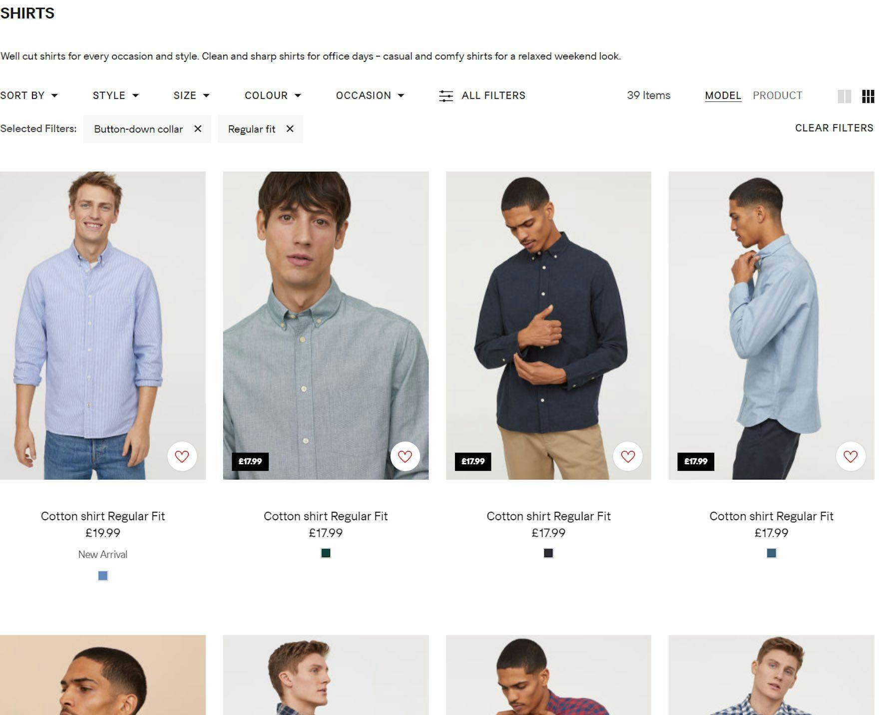
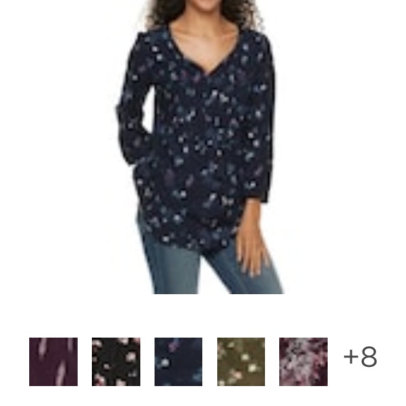
At H&M, color variations of shirts are shown separately. Users thus have a larger and more cluttered list to browse and it is difficult to figure out how many distinct products exist.
During multiple rounds of testing, it became evident that 2 major usability issues emerge when product variations display as separate list items:
- Product lists can become overly cluttered with product variations, overwhelming users and making it harder for them to get an overview of the actual range of products.
- When variations are spread throughout the product list, many users struggle to find a particular variation of a product, such as an item in a specific color.
At Debenhams, color variations for a single product are combined in one list item and displayed as swatches below the main image. Users can focus on finding the right item first before drilling down to view an item in a specific color, all of which display in the item detail.
Therefore, it’s important to combine product variations into a single list item to help users accurately estimate the range of the products and quickly find suitable variations.
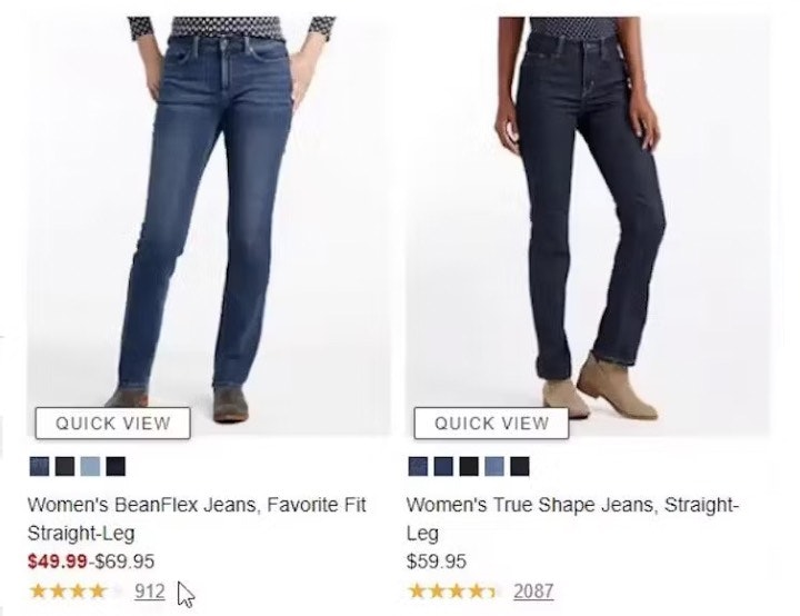
2) Always Provide 3 or More Product Thumbnails in Product Lists and Search Results (80% Don’t)


“Here, you’re not able to scroll through different pictures. It looks like they just have two options: with the model and then just the shorts.” A participant browsing for shorts at Nicce (first image) was disappointed that only 1 additional thumbnail was provided for each item, on hover (second image). He resorted to opening the product pages of several shorts in different tabs in order to see more images (third image): “So maybe I’ll open the item, I could get more views. Well it’s a little bit of an inconvenience…[when arriving at the product page] yeah, clearly more pictures now!”

“‘Ultra stretch high-rise skinny fit jeans’, I like the sound of that!” A participant at UNIQLO paused on the item listing for a pair of jeans that caught her attention — but without any additional thumbnails offered to explore the item further, she resumed browsing without ever returning to that item.
Thumbnails are heavily relied on when users scan lists, and multiple rounds of testing revealed that 2 images were often not enough for most users to get sufficient visual information about the product.
Indeed, additional images often contain information that cannot be communicated any other way, especially for visually driven products or products with multiple features or complex configurations.
For example, users shopping for a couch may want to see a “Cut Out” image to understand its overall look, an “In Scale” image to assess its size, a “Feature Callout” image to understand storage or sleeper features, and a “Lifestyle” image to gauge its style in relation to other decor.
When sites offer only 1 or 2 thumbnails in the product list, users are almost guaranteed to need to click or tap through to the product page to see all product attributes that are best assessed visually.


“I like how it has the different views that you can see, like right in this aspect right here. That makes it super convenient!” exclaimed a participant at Express while clicking through a thumbnail carousel for a pair of jeans (first to third images). Confident after viewing multiple thumbnails of the jeans she was interested in, she opened its product page and immediately added the jeans to her cart: “I do like those. So I click it! And then add it in.”
To maximize the visual information available to users scanning list items, access to additional thumbnails should always be provided in the product list and search results.
Importantly, 1 additional thumbnail won’t be enough for most users — 2 additional thumbnails should be considered a minimum, while 3+ will provide users with even more information.
However, apparel and accessories products, where both specific features and aesthetics count, will need a wide variety of image types and may need as many as 5–15 thumbnails to cater to users’ different needs for performing a full visual inspection and evaluation of the product.
Therefore, on both desktop and mobile sites provide 3 or more thumbnails, so that users can navigate without having to leave the product list.
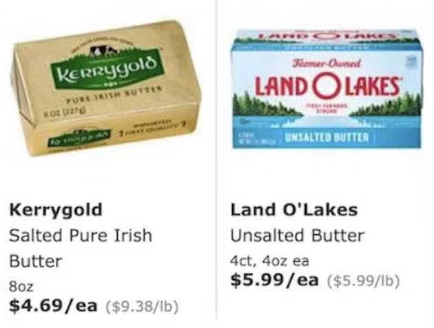
3) Display “Price per Unit” for Products with Varying Volumes or Quantities (67% Don’t)
When users compare the products available to them, price is often a critical factor that can significantly influence their buying decision.
Yet sometimes highly similar products are sold in different volumes or quantities together in the same list, making it hard to compare one item to another.
These products actually have two price points that are important to the user: the total product price and the unit price.
At Costco, similar products come in a variety of volumes and packaging. For many products, the total item cost is not reflective of the product’s value, as more expensive items may contain less product and vice versa.
If sites only display the total price, users aren’t provided with the information they need to make an informed purchase decision.
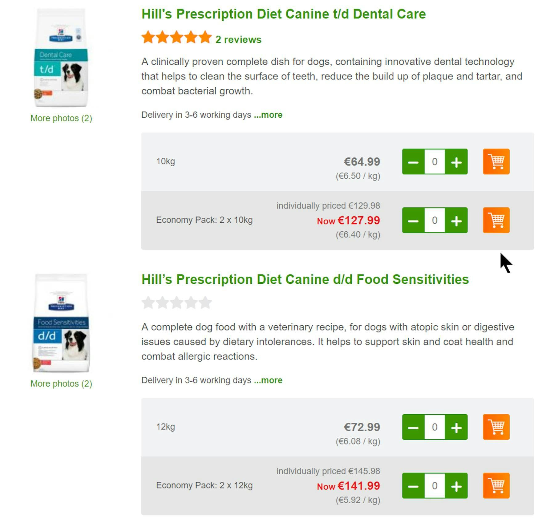
By providing unit costs, Zooplus makes it easier for users to select between product types and pack sizes. Users don’t have to calculate unit prices so the comparison process is easier and quicker.
Therefore, when offering similar products of different quantities and volumes, we recommend displaying both the total price and the unit price.
4) Horizontal Filtering Toolbars: 2 Reasons to Be Cautious
Horizontal filtering toolbars, which appear above product lists and search results instead of in the sidebar, are used less often by sites than sidebar filtering.
While horizontal filtering toolbars were observed to work satisfactorily for some product types during our testing, their inherent shortcomings caused some participants to struggle when there were many filter types to consider.
In fact, there are 2 drawbacks of horizontal filtering toolbars compared to sidebar filtering interfaces:

Without being able to scan for “Color” filter options at IKEA, users who don’t see sofas in a preferred color won’t immediately know if they’ll find suitable ones for their space.
The first issue with horizontal filtering toolbars is that the filter options within each filter type are not visible by default.
This means that users find it more difficult to get an overview of the scope of the catalog.
For example, users on apparel sites who land on the product list page won’t get immediate feedback on all color variations for an item or how many product matches there are for each filter option.
On the other hand, with sidebar filtering, options can be shown for each type along with the number of matches for each.
With horizontal filtering toolbars, users have to click on the filter type to reveal more information about the current scope — adding an unnecessary extra step to their product finding.

”They don’t seem to have as many…sorry, you have to take an extra step to do your filters. Which is kind of annoying.” When all the filter types aren’t included in the single horizontal toolbar row such as here at Staples, desktop users must click to see more filter types. However, some participants overlooked these “All Filters” buttons completely or only noticed them after initially interacting with the visible filters. (Note also the horizontal space available, where additional filter types could fit.)
Another issue with horizontal toolbars can occur if there are too many filters to display.
If there are a large number of filters, sites either have to add more rows to the toolbar or display the “hidden” filters when users click an “All Filters” or “See More Filters” button.
During testing, these buttons were overlooked by some participants.
If some filter types are overlooked, users could struggle to tailor product lists to a suitable number of items — making product finding more troublesome than it needs to be.
Generally, therefore, horizontal filtering toolbars can only work with a limited number of filter types.
For example, many apparel sites provide no more than 8 or so filters, and horizontal toolbars accommodate them comfortably.
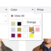
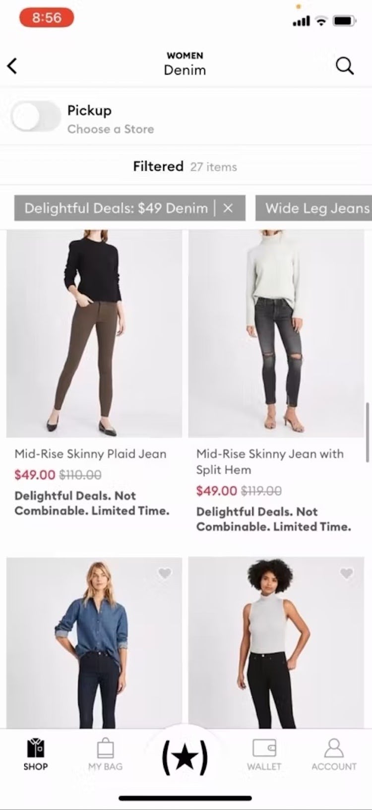
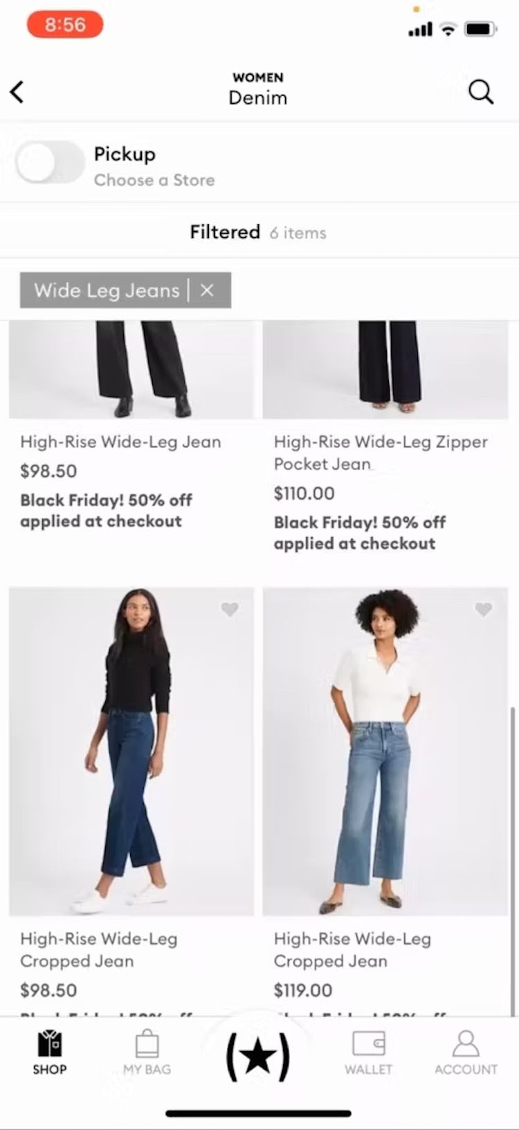
5) Always Allow Users to Combine Multiple Filtering Values of the Same Type (14% Don’t)
To understand how negative an impact mutually exclusive filter values can have on the end user, it’s worth considering the process a user must go through when the site doesn’t allow filter options to be combined.
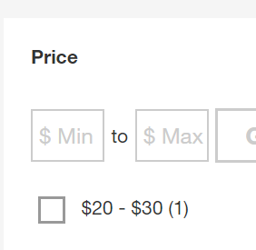
“I wouldn’t mind paying up to ‘$100,’ but if I select that option I don’t get to see any of the ‘$50–$74’ training shoes…In fact, I would like to tick these 3 price options so I don’t miss out on any good deals.” (Participant, Apparel testing)
When selecting filter options, users frequently need to choose more than one option from each filter type — for example, users in a product list of jeans may want to see both “Blue” or “Black” jeans.
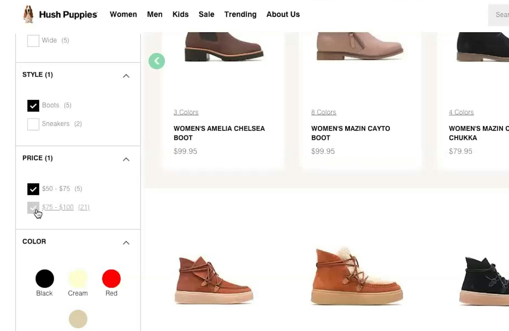
“Let’s say I have a budget of $100 for boots, so I’ll do about both of those [price options]. Oh, it looks like you have to pick one or the other.” This participant at Hush Puppies was unable to see all boots priced under $100 in one list because she could only choose one option in the “Price” filter. Without being able to see all suitable items in one list, comparing products becomes needlessly tedious.
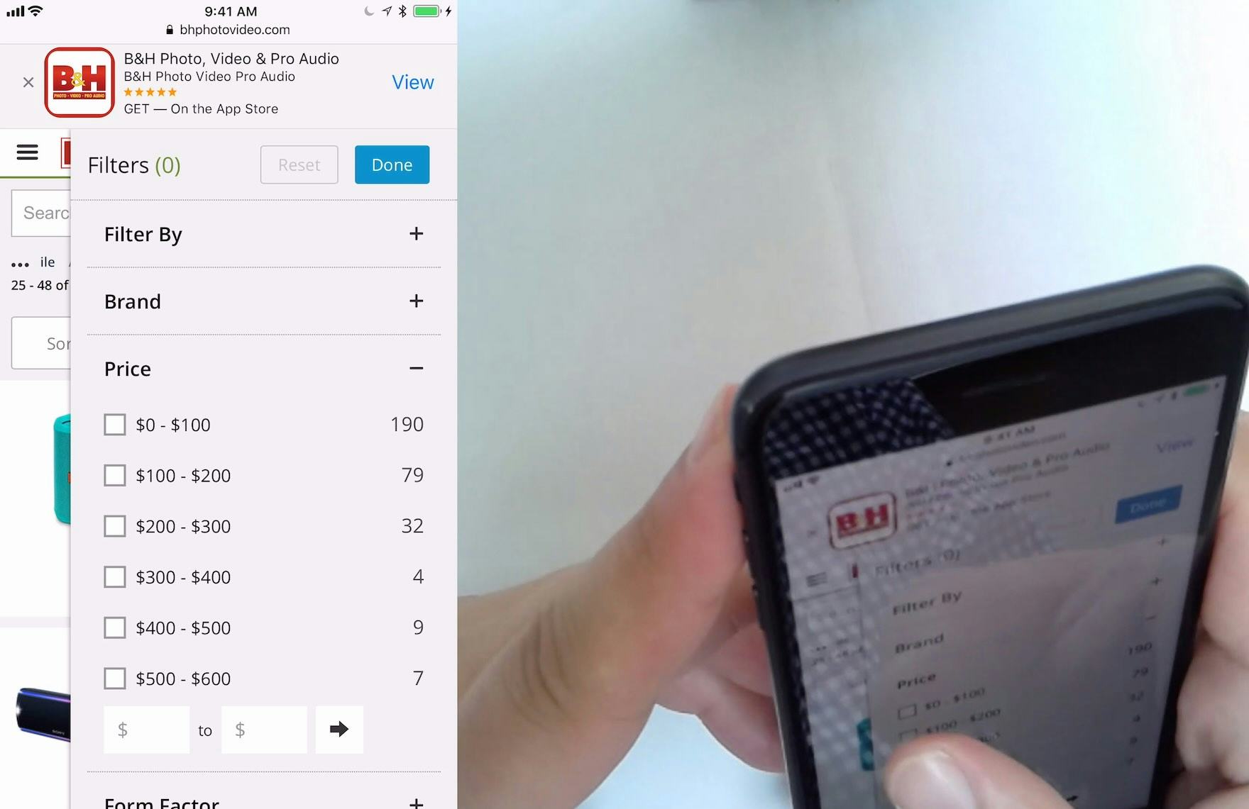
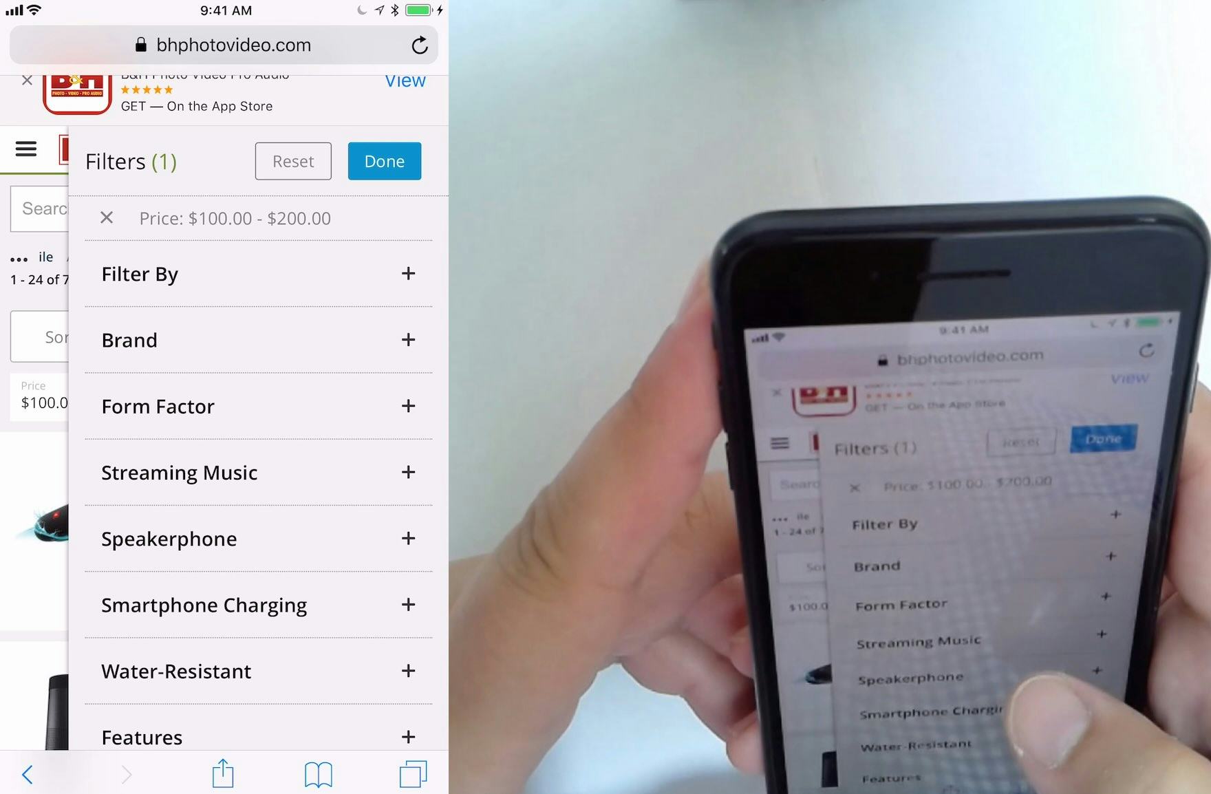
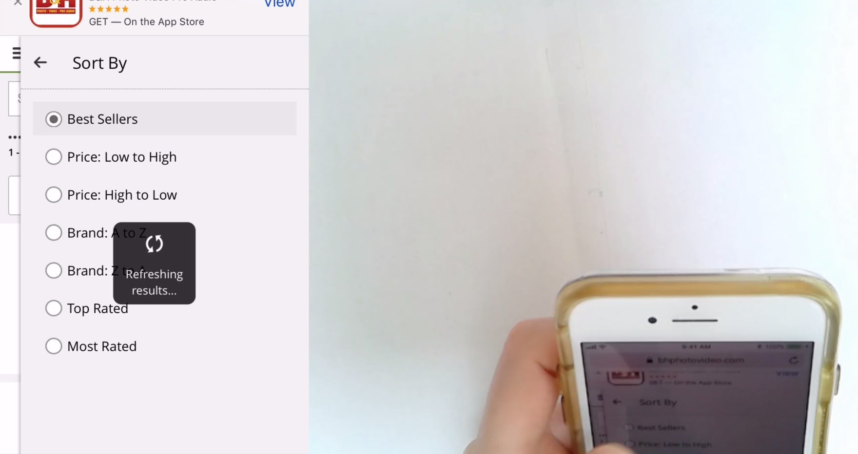
At B&H Photo, this participant wanted to select more than one price range for headphones. However, when she selected the “$100 – $200” range (first image), the “Price” filter type was removed (second image), making it impossible to select another price range. While “Price” was the only filter on B&H Photo that allowed only one option to be selected, price is a key factor for users, particularly when there are many products available in more than one price range.
Indeed, during testing, it was commonplace for participants to try to select more than one filter option in a single filter type.
When they were unable to do so, participants couldn’t establish an overview of all the products matching their unique set of requirements and some had to abandon their efforts to find a suitable product.
So when users cannot select more than one filter option in the same filter type it is both unexpected and problematic — and sites that don’t allow multiple selections are very much the exception.
At sites where the filtering options within a filter type cannot be combined, users who are interested in, for instance, either “Blue” or “Black” jeans must go through the following process to access a set of suitable products:
-
Apply the first filtering option (“Blue”)
-
Look through the products in the filtered list
-
Memorize the interesting products for “Jeans: Blue”
-
Deselect the “Blue” filtering option and wait for the page to reload to see the prior product list without any filters applied
-
Apply the second filtering option (“Black”) at the now unfiltered product list
-
Look through the products in this new filtered list
-
Memorize the interesting products for “Jeans: Black”
-
Deselect the “Black” filtering option and again wait for the page to reload to see the prior product list without any filters applied
-
Finally, users must now — from memory — locate all the wanted options in the now unfiltered product list and compare them
And as more filters are needed, the process gets both increasingly tedious and increasingly impractical because the user has to memorize more and more products across the product list — until they can’t realistically remember all of the options anymore (during testing it was not uncommon for test participants to apply 5 or 6 filters, with some applying up to 10).
When filter options cannot be combined, users are effectively prevented from seeing all relevant products matching their needs.
In fact, during testing, when filter options were mutually exclusive, participants were far less likely to use filters, or to use them effectively — and therefore were less likely to find suitable products.
Furthermore, memorizing products is harder on mobile, because users have to take the extra step of opening and looking at the filter interface each time they apply a filter option.
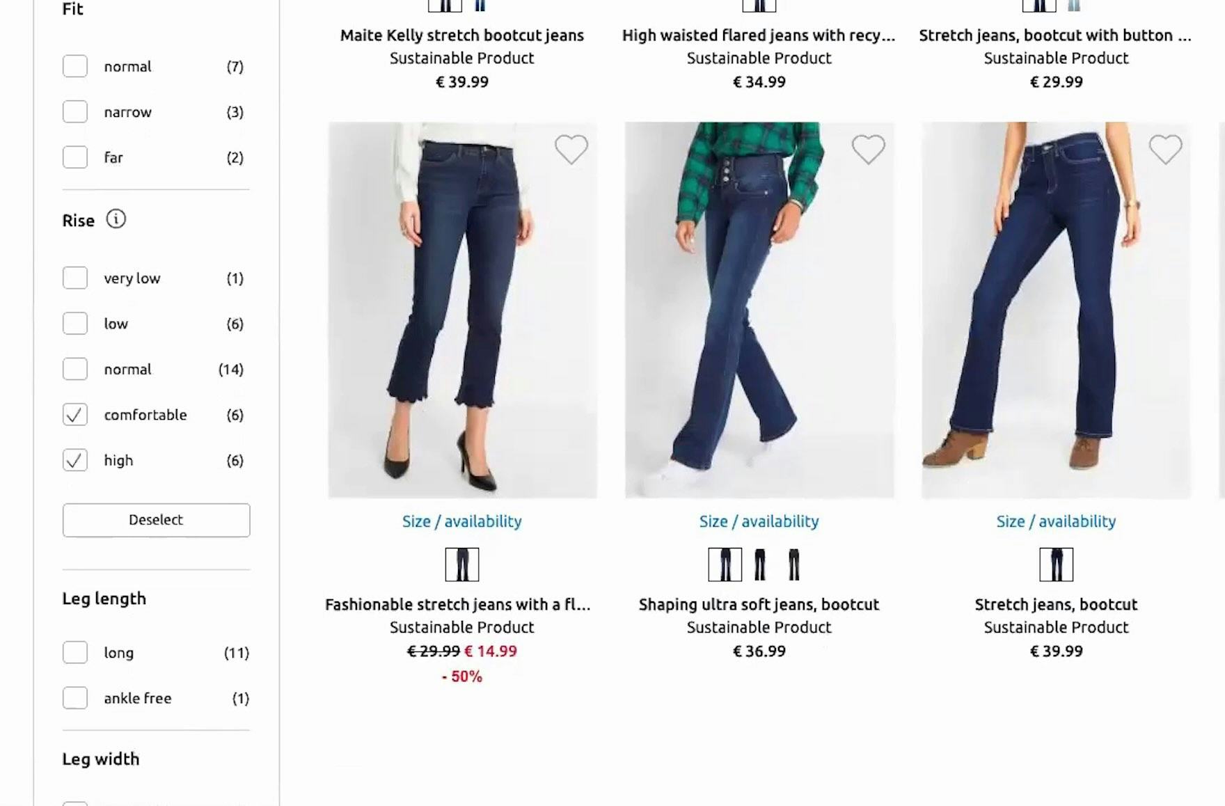
“I wanna select both. Does it let me do that? It does, so now I’ve 12 pairs to look at. It really lets you narrow it down.” Bonprix (Germany) allows users to select more than one filter option in the “Rise” filter type, which was very helpful to this participant during large-scale European testing.
![“See if I can select multiple [filter options], yep! Especially with jeans, because sometimes two are very similar, and sometimes I don’t know what size I’m in, so I would like to try two [filter options] for one pair of jeans, if they’re quite similar sizes.” Likewise, this test participant at Zalando (Germany) found the ability to select more than one size helpful.](https://baymard-assets-cdn.imgix.net/research/media_files/attachments/92891/original/research-media-file-e10c6da8c5deb0664fd4ceb22aa1c3b8.jpg?auto=format&dpr=2&fit=max&q=50&w=880)
“See if I can select multiple [filter options], yep! Especially with jeans, because sometimes two are very similar, and sometimes I don’t know what size I’m in, so I would like to try two [filter options] for one pair of jeans, if they’re quite similar sizes.” Likewise, this test participant at Zalando (Germany) found the ability to select more than one size helpful.
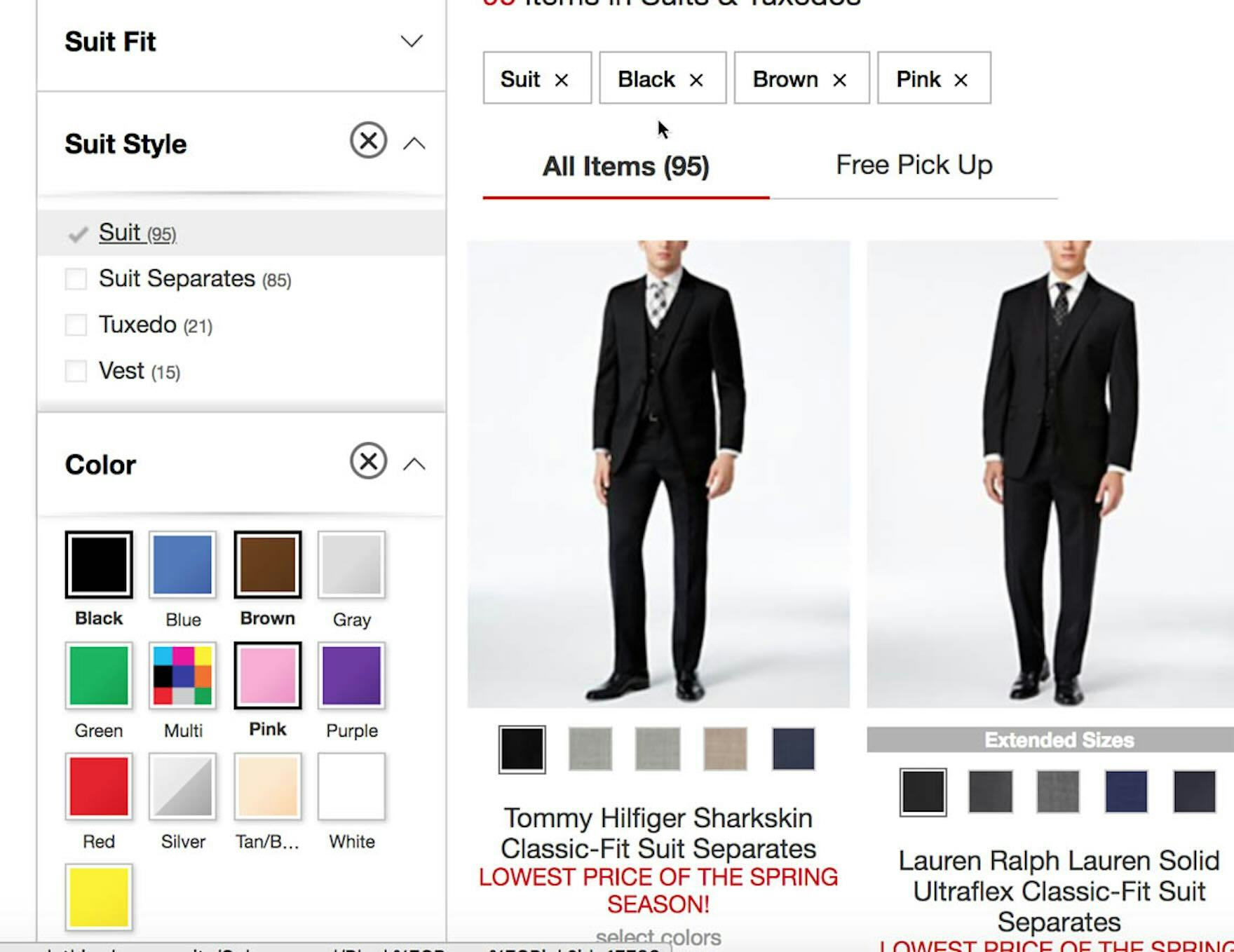
At Macy’s, a participant selected 4 filter options (“Suit”, “Black”, “Brown”, and “Pink” ) from 2 filter types (“Suit Style” and “Color” ), resulting in a very refined product list.
To avoid these difficulties, allow users to combine multiple filter options within the same filter type.
The process of applying multiple filter options when they aren’t mutually exclusive is much simpler:
-
In the unfiltered product list or in the separate filter interface on mobile, apply the desired filtering options
-
Look through the products in the filtered list
And this straightforward process is applicable regardless of how many filtering options the user is interested in.
When filtering options can be combined within the same type — such as applying “Blue”, “Black”, and “Red” for a “Jackets” category, or applying 3 different brand filters in a product list of cosmetics — users can easily create a tailored product list.
Furthermore, allowing multiple filtering options of the same filter type to be applied also lets users remove irrelevant product variations by applying all filter options except those for the variations they’re not interested in.
6) Always Provide These 5 Essential Filter Types (51% Don’t)
Effective product finding relies on users’ ability to filter ecommerce product lists according to their purchasing preferences.
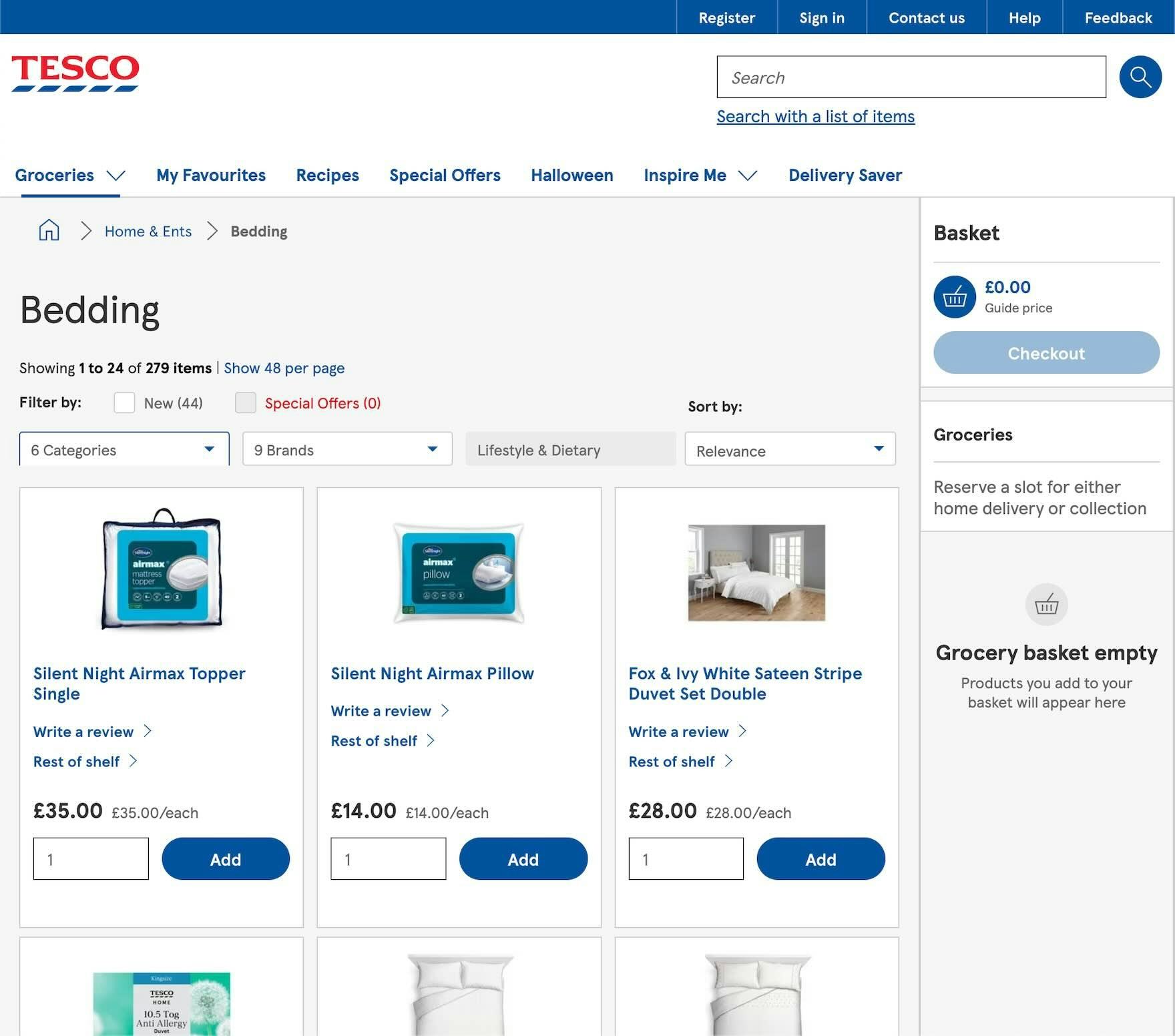
Users shopping the “Bedding” category at Tesco are unable to filter by price, user ratings, size, or color. Instead, they must wade through a list of 279 items without the ability to narrow the scope using these essential factors.
When users can’t adequately filter product lists, they often can’t properly tailor the list to only items of interest, and they may be unable to find products that actually exist on the site.
Indeed, the absence of one or more of these key filter types could easily result in users leaving the site to look elsewhere for the products they want.
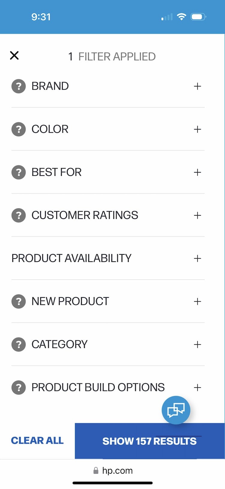
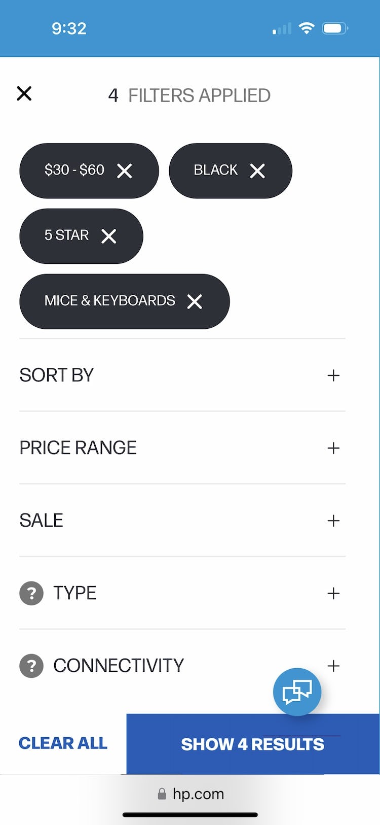
Users searching for “Mice & Keyboards” on HP can quickly filter the product list of 157 items using essential filters such as price, user ratings, color, along with numerous other category specific filters. Users can thus skip any lengthy scrolling tasks and narrow the list quickly to just relevant items.
Our testing revealed 5 filter types in particular that should always be provided if applicable, as they are commonly used and critical helping many users find suitable products:
- Price
- User ratings average
- Color
- Size
- Brand
Providing these 5 essential filters will allow the vast majority of users to filter product lists to a subset that better matches their items of interest.
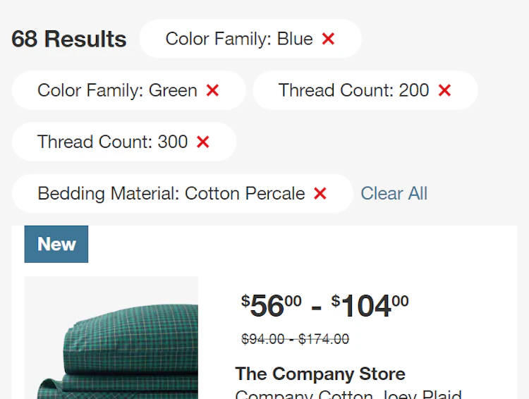
7) Always Display Applied Filters in an Overview (20% Don’t)
When users filter product lists, almost all sites confirm their choices at the location where the filters were applied — for example, by showing a selected checkbox for a filter option on a desktop site.
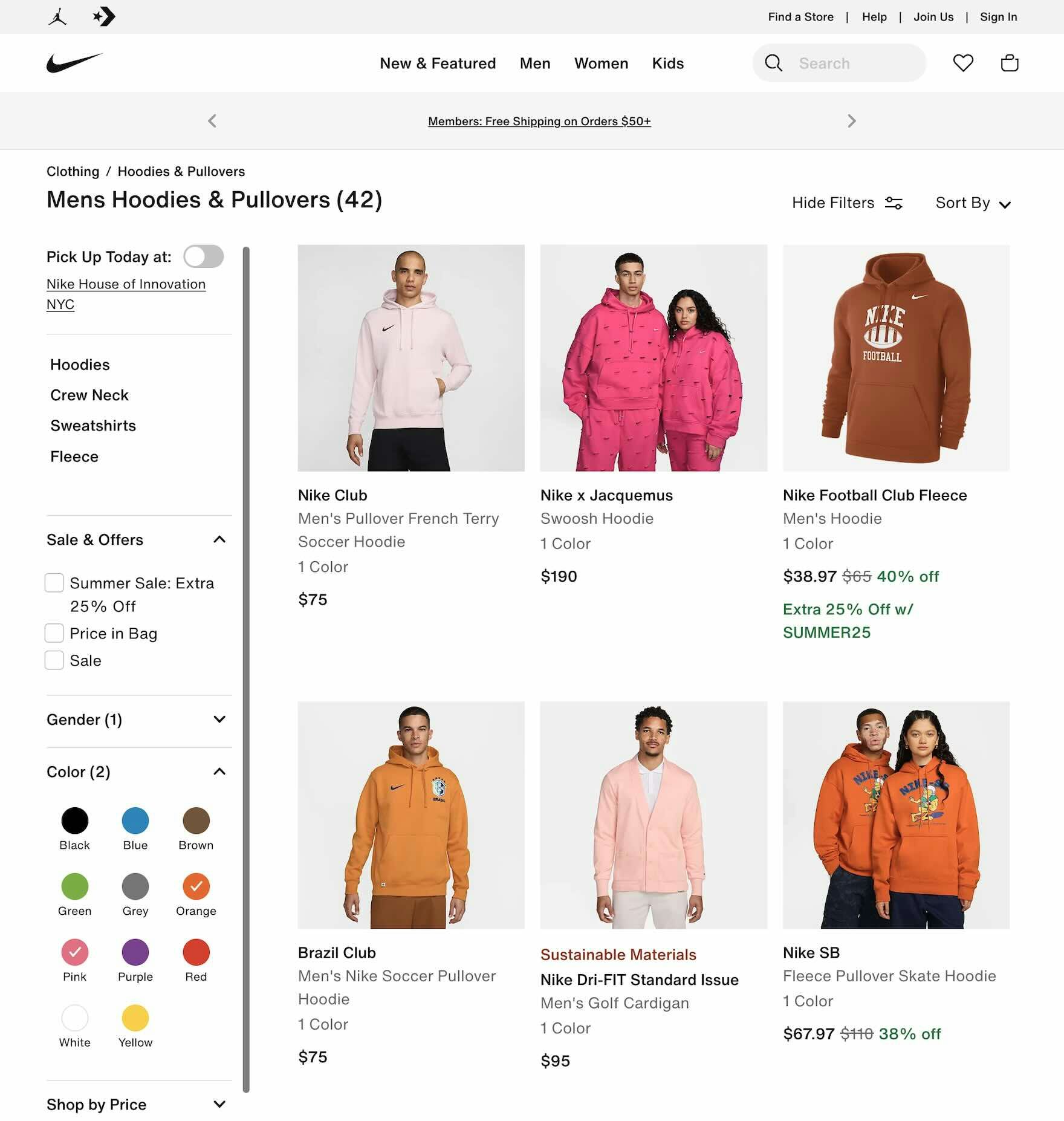
On desktop, the absence of an applied filters overview can slow users down when they need to check which filter options they have selected. If multiple filter options are applied and are out of view because they are spread across more than one viewport — as can be the case with a tall sidebar such as here at Nike — it will take longer to find all of the applied filters than if an overview were present.
However, during both desktop and mobile large-scale UX testing, many sites failed to provide an overview of applied filters.
Without this overview, users encounter 2 main issues:
- No easy way to confirm which filters are applied
- Removing the applied filters is often cumbersome
Some users can even become disoriented by the results of their filtering operations because they lack the overall context of the product list, which cannot be easily seen at a glance.
Therefore, the selected filters should be displayed in an overview.
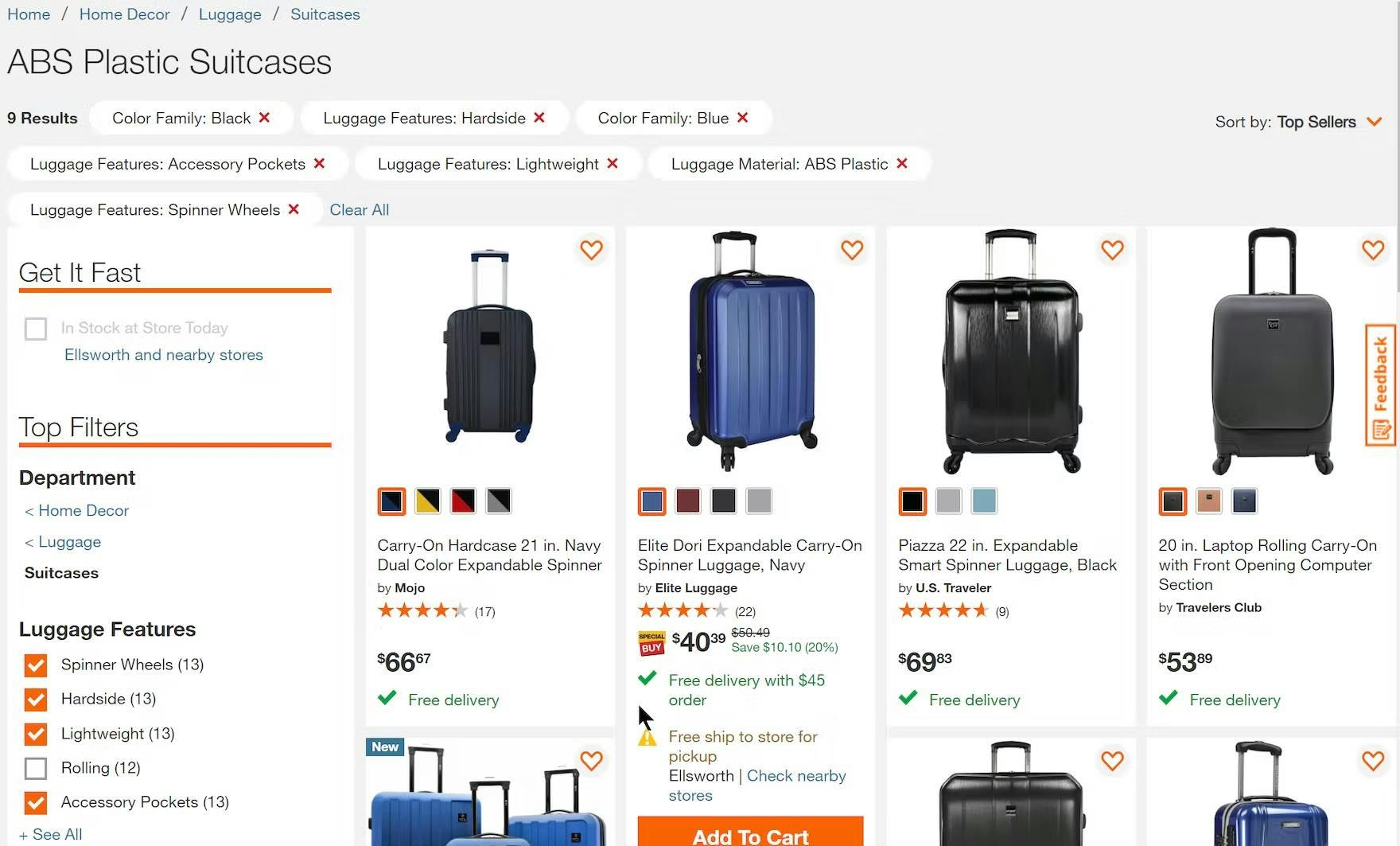
Applied filter options on Home Depot are large and very obvious. The red “Xs” within the applied filters also help to draw attention, and the “Clear All” link allows for their easy removal. Users will find it easy to confirm what filters are applied, remove those that are not needed, and keep apprised of the context of the list.
“I’m going to get rid of that [filter]…okay.” The use of horizontally scrolling applied filters in the Banana Republic app made it very easy for this participant to remove one. In this case, the width of the two filters made it easy to see that there was more than one applied.
Depending on the platform — desktop or mobile — there are several different solutions that have been verified to perform well for users during testing:
- On desktop, filters can be displayed in an overview above the product list, above the filtering sidebar, or below a horizontal filtering toolbar.
- On mobile, filters can be displayed in a horizontally scrolling or stacked list at the top of the product list.
8) Always Provide These 4 Essential Sorting Types (69% Don’t)
Sorting allows users to rearrange products in the list so that those of most interest are at the top.
During testing, we observed 4 essential sorting types to be commonly sought out by users:
- Price
- User Rating
- Best Selling
- Newest
![“I’m going to sort — so again, this is another one where I wish they had more of a ‘Highest Rated’ or ‘Bestseller’ [sort option].” This participant at GAP was dismayed to be unable to choose a sort option that reflected other people’s opinions and buying preferences.](https://baymard-assets-cdn.imgix.net/research/media_files/attachments/110781/original/research-media-file-7768015957e59b1bcd2de052054546e8.jpg?auto=format&dpr=2&fit=max&q=50&w=880)
“I’m going to sort — so again, this is another one where I wish they had more of a ‘Highest Rated’ or ‘Bestseller’ [sort option].” This participant at GAP was dismayed to be unable to choose a sort option that reflected other people’s opinions and buying preferences.
However, our latest benchmark shows that 68% of desktop and 69% of mobile sites don’t offer all four of these sorting types.
Failing to provide all four of these basic sorting types means that some users will be unable to rank products by the criteria that matter to them.
“Maybe “Best Sellers””, ’cause I don’t really know what I’m doing.” This participant at B&H Photo, unfamiliar with the wireless speakers he was browsing, opted for “Best Sellers” as a way to view the most popular products.
On the other hand, sites that make sorting discoverable and that carry the expected sorting types will help users shop more efficiently and effectively.
Therefore, providing each of these four sorting options is crucial to helping users float relevant items to the top of the list.
Improving Ecommerce Product List and Filtering UX
This high-level analysis of the current state of Product Lists and Filtering UX focuses on only 8 Product Lists and Filtering guidelines included in our ecommerce UX benchmark analysis.
We recommend reviewing the other 76 guidelines as well to gain a comprehensive understanding of the current state of Product Lists and Filtering UX and identify additional site-specific issues not covered here.
As our benchmark has revealed, many sites clearly have room to improve the Product List and Filtering UX, as 58% of desktop ecommerce sites and 78% of mobile sites have a “poor” to “mediocre” performance in Product List UX.
Adhering to these 8 best practices is a great first step toward improving users’ Product List and Filtering experiences:
- Combine variations of a product into one list item (42% don’t)
- Always provide 3 or more product thumbnails in product lists and search results (80% don’t)
- Display “price per unit” for products with varying volumes or quantities (67% don’t)
- Horizontal filtering toolbars: 2 reasons to be cautious
- Always allow users to combine multiple filtering values of the same type (14% don’t)
- Always provide 5 essential filter types (51% don’t)
- Always display applied filters in an overview (20% don’t)
- Always provide these 4 essential sorting types (69% don’t)
This article presents the research findings from just a few of the 700+ UX guidelines in Baymard – get full access to learn how to create a “State of the Art” ecommerce user experience.
If you want to know how your desktop site, mobile site, or app performs and compares, then learn more about getting Baymard to conduct a UX Audit of your site or app.