During our e-commerce research studies, particularly on checkout usability, we’ve found that tab-style and inline accordion form layouts can inadvertently confuse users, or even flat out violate their expectations.
The issue arises when users can’t figure out which form fields will be submitted – whether it is only the fields in the currently active inline accordion or tab “sheet”, or whether the collapsed “sheets” will be submitted as well.
In this article we’ll dive into the observations from our test sessions, highlight the issues and design affordances that both inline accordion forms and tabbed form layouts produce, and touch upon some design alternatives.
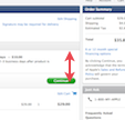
During our mobile e-commerce study multiple subjects had issues with inline accordion forms, where other fields were placed above and/or below the accordion element or where the sections could be open and close ad-hoc. A good example of this is Footlocker’s shipping methods – presented in an inline accordion form – which troubled the test subjects who were confused by the three options, how to select between them, and how the buttons were related to the fields in the inline accordion sections. For example, will the button ‘Update’ save just the three fields, or also the info typed in the other accordion sheets (collapsed), or will it update the entire page?
Similar issues are present in tabbed form designs where it’s often not immediately apparent if the changes will need to be saved before going to the next tab, or changes can be made to all tabs before saving the form.
When designing user-friendly form layouts it’s key to ensure that the user always instinctively knows which form fields will be submitted. Now, typically this is a non-issue since users assume all form fields will be submitted, and on most sites they are.
However, tab-style and inline accordion form layouts can muddy this relationship, making it unclear if the fields in each “sheet” are mutually exclusive or if switching between them simply toggles their visibility but not the actual form. This can make users uncertain as to which fields in the form will actually be submitted, which is highly problematic as this leads to a sense of unpredictability and the fear of potential data loss (obviously very undesirable sensations to invoke in a user filling out your forms, e.g. during the checkout process).
Lack of Predictability for Accordion Forms and Tabbed Forms
Common questions that tab-style and inline accordion form designs invoke in users include:
- “Do I need to save the changes before I open another tab?”
- “Is it only the options that I’m currently seeing that will be submitted or will it submit all sections (including the ‘collapsed’ ones)?” (i.e. is it a partial or a “full” submit)
- “Will clicking one of the other sections cause the page to reload, and if so, will the other entered data be persisted?”
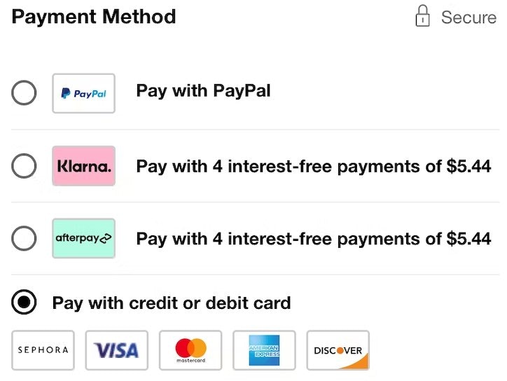
Now, sometimes the options will logically imply whether they are mutually exclusive or not. For example, with payment options it is typically clear that they are mutually exclusive: either you pay with credit card or PayPal, but it’s important to note that in these cases it’s the content and not the design that’s driving the affordance. Therefore, whenever the content could potentially be interpreted either way, it will be, and confusion and uncertainty is bound to arise. In fact, even the aforementioned “payment options” example could potentially be confusing since some sites actually do allow multiple payment types to be combined.
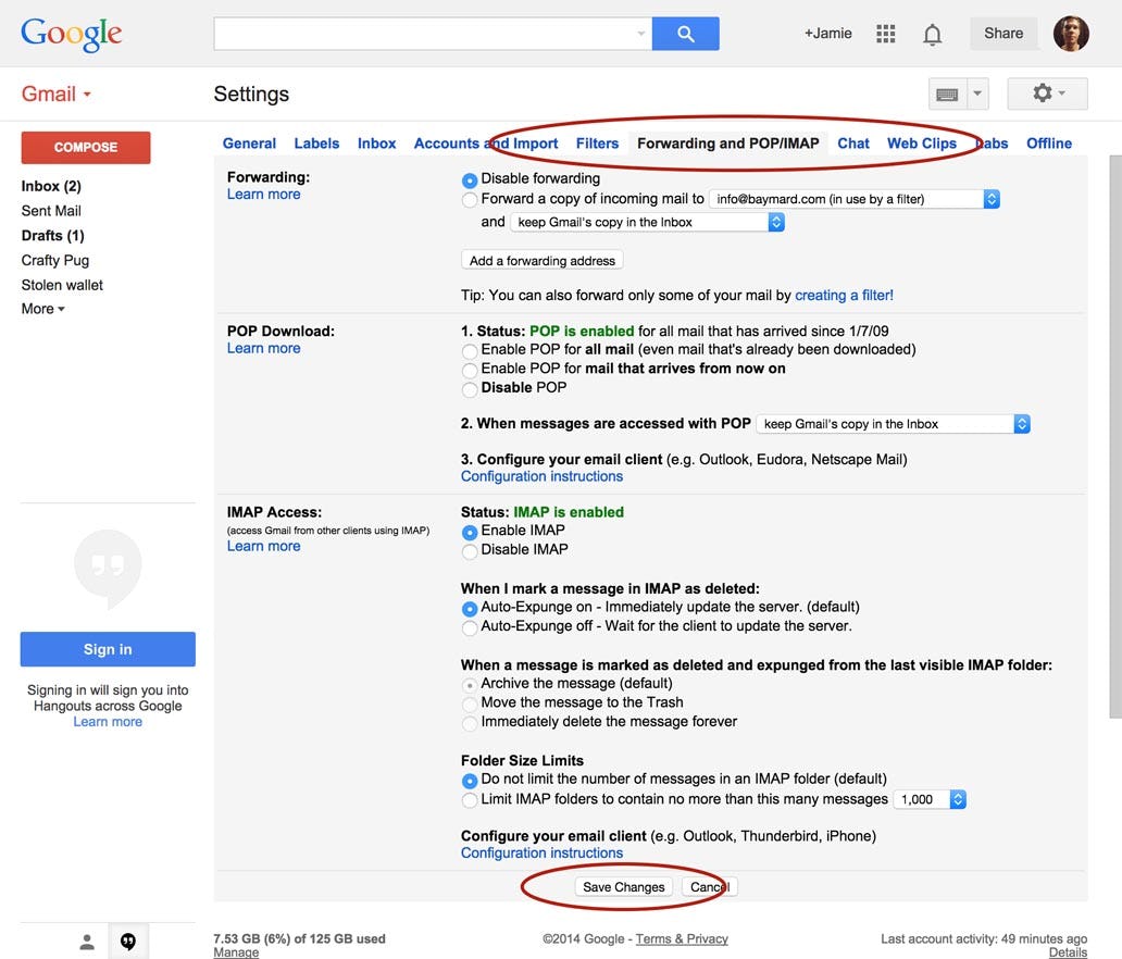
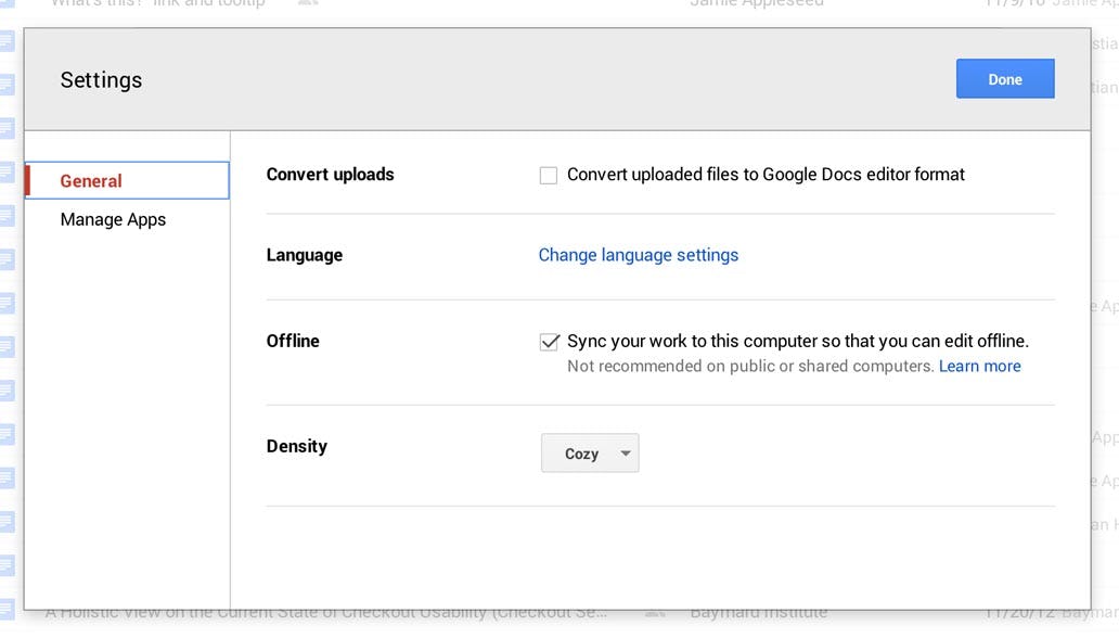
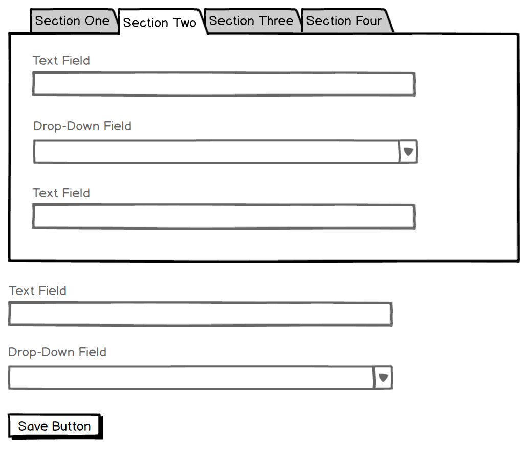
Another example of a tabbed form design that can cause confusion. As users make changes, will they need to click the bottom ‘Save Changes’ button for each individual settings tab? Or does the ‘Save Changes’ apply to all of the tabs?
Good usability is about predictability – does the user understand what will happen when they take XYZ action – i.e. can they accurately predict the consequences of a given UI interaction? Tab-style and inline accordion form designs tend to fail this test. It’s the same reason multi-column form designs can be troublesome – users may become in doubt if all columns will be submitted or only one of them. With inline accordions and tab-style forms, users often can’t tell if the “sheets” are mutually exclusive or if they are simply toggling their visibility.
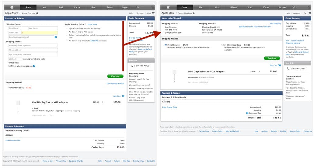
Unlike an inline accordion form, a sequential accordion checkout design can work well because the user is able to see their input being saved as they work their way through the checkout flow. (Here, Apple’s checkout process.)
This is why accordion checkout designs tend to work just fine, while inlined non-flow accordion designs cause trouble. When the accordion design is sequential and progresses the user from page to page (e.g. an accordion checkout process), it’s clear that only the current section will be submitted, while previous sections display summaries of the entered data letting the user know they have already been saved, while the future sections won’t be clickable at all as the user hasn’t yet progressed to them. It’s a linear flow that the user works their way through, step by step. (Indeed, our research finds that users perceive accordion steps as separate pages which is why it’s so important to adhere to the user’s back-button expectations when adopting this checkout design.) This stands in contrast to inline accordion forms where the user can open and close sections ad-hoc and where there may even be other form fields above and/or below the accordion element. Because of the indiscriminate section access, it isn’t obvious what has been saved and what will be saved. Tabs of course suffer much the same fate.
Design Affordances for Accordion and Tabbed Forms
If an inline accordion or tab-style form layout must be used, there are some subtle design affordances to be aware of. It’s key that the design affordance of these form layouts align with their actual technical behavior and implementation.
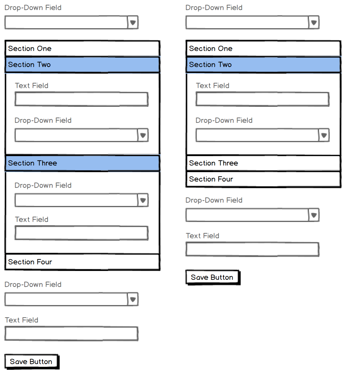
Left: Sheets open and close independently of each other, allowing multiple sheets to be open at once. Right: Only one sheet can be open at a time.
For accordion designs, it is possible to visually have multiple “sheets” be open at once (i.e. sheets open and close independently of each other – see left-hand example), or the implementation can restrict the accordion to only have a single sheet open at a time (i.e. opening a new sheet automatically collapses the currently active one – see right-hand example).
This creates an affordance as to whether all sheets or only the currently active one will be submitted. Allowing multiple open sheets suggests that all sheets will be submitted, although the user may be unsure if only the open ones will be submitted. If only allowing one sheet to be open at a time, most users will assume that only the active sheet will be submitted since the other fields auto-close whenever a new section is selected (i.e. the interface is mutually exclusive, therefore the options are perceived so too).

Tab-style form designs are a little more tricky because visually only one tab can be “open” at any given time. It doesn’t have the same affordance available as the accordion-style design, making it more difficult for the user to figure out whether all tabs or only the open one will be submitted – the design can’t imply this through its interface / behavior.
Accordion- and tab-style forms do however share an affordance when it comes to the primary button (i.e. ‘Save’ button). When the button is placed within the active sheet, it suggests only that sheet will be saved when it’s clicked. However, if the button is placed outside the form element, things get a little more complicated. For tab designs, it suggests that all tabs will be saved. Whereas for inline accordion designs that allow multiple sheets to be open at time, it still remains unclear to the user whether the collapsed sections will be saved or not – the design only allows them to feel certain that the currently open sheet(s) will be saved.
Better Alternatives: Making the Most of Accordion UX
So given these UI weaknesses of tab-style and inline accordion form designs, what are the appropriate alternatives?
If the content isn’t mutually exclusive, consider simply listing all of the fields on the page or splitting them out across multiple form steps. Our research shows that good checkout usability isn’t about the number steps but rather how user-friendly those steps are. Whether you have a 2 or 4 checkout steps doesn’t matter that much, what matters is what users have to do at each step, and how they are asked to do it (i.e. are users able to seamlessly progress through the steps).
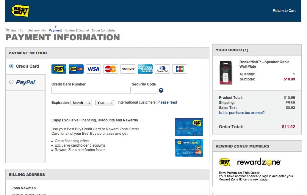
At Best Buy, radio buttons are used to indicate that the payment tabs are mutually exclusive. In the case of ad-hoc (non-exclusive) behavior, checkboxes may be used instead.
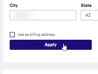
Alternatively, standard form elements like radio buttons and checkboxes can be used or integrated into the design. Since these standard UI elements have at least a decade’s worth of consistent web usage, the vast majority of users will be able to instantly recognize them and intuitively grasp the form’s behavior because of the strong usage connotations tied to those standardized UI elements.
For example, if the content is mutually exclusive, then use the standard UI element designed to indicate this: radio buttons. These can be integrated into a tab-like design, but it’s important that the radio buttons are an integrated part of that as they clearly set user expectations. (Just make sure to watch out for potential radio button proximity issues, as described in Checkout Design: Payment Method Selection.) Meanwhile if the sections are optional and multiple may be submitted at once (i.e. ad-hoc behavior), checkboxes would be the way to go.
It all boils down to that core usability principle of predictability: when seeing and interacting with the form, will all users instinctively know what will happen? Is it clear what data has been saved and what will (and won’t) be saved? Tapping into standard UI elements such as radio buttons and checkboxes can help clarify such form behavior – although a perhaps safer strategy is to avoid designs which provoke such concerns in the first place.