The “My Account” drop-down is a critical feature for self-service e-commerce.
Indeed, during our large-scale Accounts & Self-Service usability testing the drop-down menu often served as a navigational anchor that users would turn to over and over again, no matter what account feature they were looking for.
However, when paths to primary and secondary account features are styled the same in the “My Account” drop-down it’s more difficult for users to access the most relevant account features — which leads to fewer users being able to complete critical account-management tasks, longer completion times for others, and a more negative perception of the site on the whole.
While visually styling primary paths differently from secondary sounds like a “usability basic”, our UX benchmarking reveals that 71% of e-commerce sites fail to separate primary and secondary paths in the “My Account” drop-down.
Thus, in many cases improving the “My Account” drop-down is an instance of low-hanging fruit — changes are often not overly difficult to implement, while a well-performing “My Account” drop-down menu can significantly aid users attempting to manage their account features.
In this article, we’ll discuss the test findings from our E-Commerce Accounts & Self-Service usability study related to the “My Account” drop-down. In particular, we’ll discuss:
- How to identify primary account features in the “My Account” drop-down
- Why it’s important to visually distinguish primary from secondary paths in the “My Account” drop-down
- 6 additional implementation details to improve “My Account” drop-down performance
How to Identify Primary Account Features in the ‘My Account’ Drop-Down
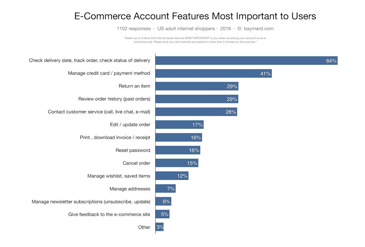
Baymard’s quantitative study of 1,102 users, identifying what Self-Service Account features users generally consider the most important.
As part of our self-service research, Baymard conducted a quantitative study with 1,102 users to determine what the most widely used account features are.
Results indicate that order-related features (e.g., tracking, delivery dates), managing credit cards, return-related features, past orders, and links to get help are some of the most sought-after by users.
It’s important to note, however, that the site context matters. For example, wishlists may be heavily used on one site, while on another they are rarely used by any users. Therefore, we recommend using site-specific data in addition to these general results when trying to determine which account features are most important to a specific site’s users.
Identifying the primary account features is a first step towards organizing and structuring the “My Account” drop-down menu, as once the primary paths are known they can be visually distinguished from the secondary paths in the menu.
Why It’s Important to Visually Distinguish Primary from Secondary Paths in the ‘My Account’ Drop-Down
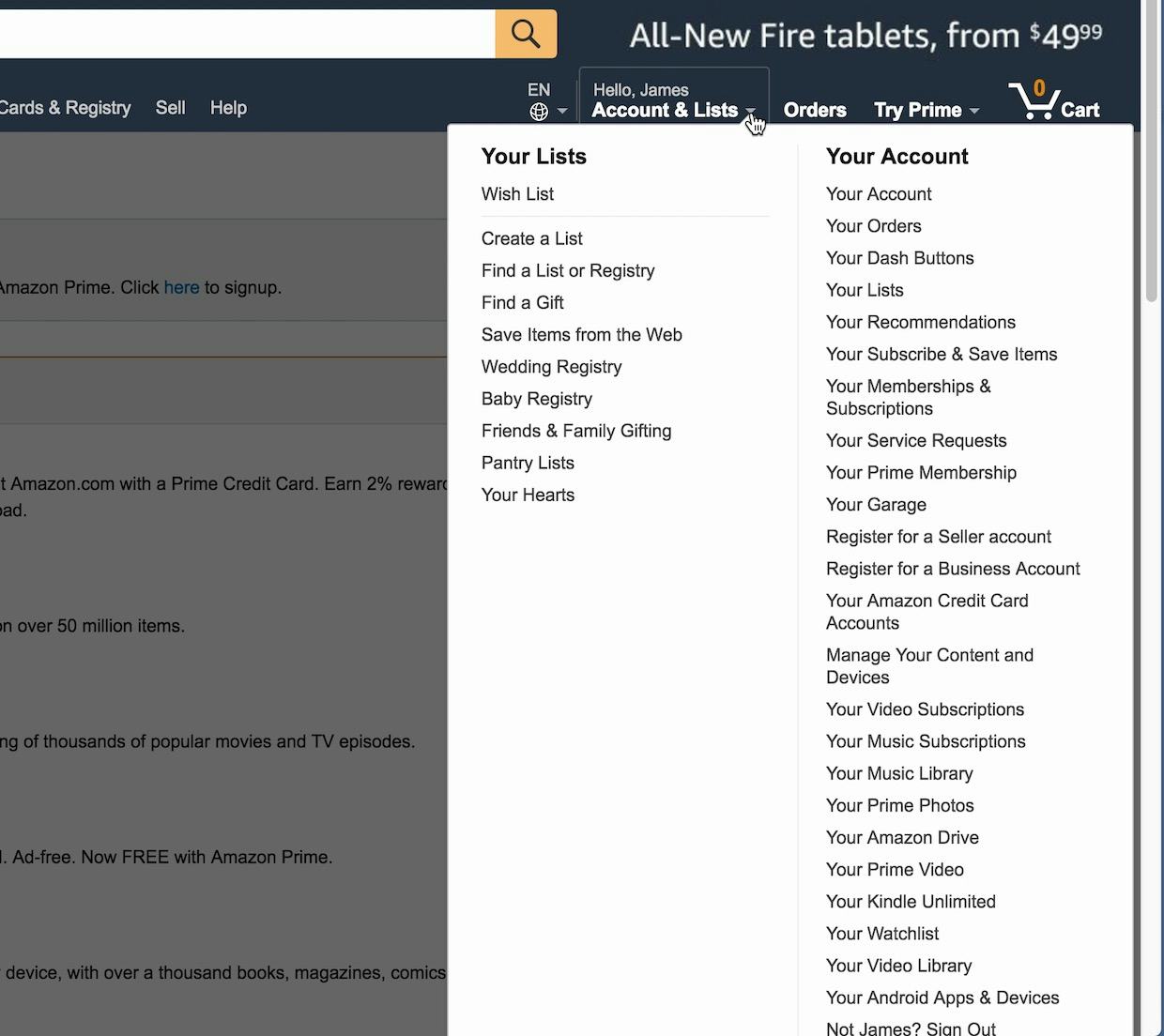
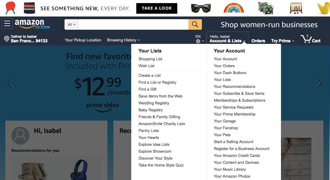
“Right now I’m just trying to check out everything that’s listed under ‘Your Account’. Which is a myriad of options, actually…‘Your Account’, ‘Your Orders’, ‘Your Dash’…it’s sort of all over the place”. Many subjects during testing had trouble navigating Amazon’s “My Account” drop-down due to the number of links included and the lack of structure in the “Your Account” column of the drop-down.
During testing, some users were observed to get bogged down when facing a “wall of links” in the “My Account” drop-down. Others simply felt overwhelmed — as one user put it, when scanning Amazon’s “My Account” drop-down, “It’s sort of all over the place”.
Users faced with no obvious organization or information hierarchy in a “My Account” drop-down will often become victims of choice paralysis — it’s not clear where to start to accomplish an account-management task — and will spend seconds or even minutes scanning the “My Account” drop-down before choosing a path.
However, once paths to account features have been placed into “primary” and “secondary” buckets, then the two groups can be visually distinguished in the “My Account” drop-down menu to ensure the most widely sought-after paths are the most prominent.
This is most important for sites with many “My Account” drop-down links (e.g., more than 10), though sites with fewer links may still want to make primary paths more visually prominent than secondary paths.
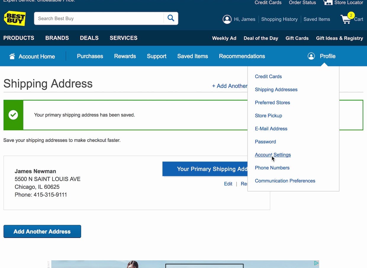
“I thought it was under ‘Account Settings’, but then I noticed it said ‘Password’ right above it”. A subject at Best Buy initially missed the “Password” link and clicked on “Account Settings” instead, but quickly realized her error. Although Best Buy’s “My Account” drop-down contains fewer links than Amazon’s, the links aren’t given any structure beyond the prioritization provided by the order of the links.
Some sites in testing relied on list order to indicate the relative importance of paths, with the most important paths placed first and the less-important paths following.
This may be sufficient for “My Account” drop-downs with a very small number of links (e.g., 5 or fewer); however, for “My Account” drop-downs with more links it’s not enough to ensure users are able to easily and efficiently navigate the “My Account” drop-down menu.
During testing, it was observed that users would sometimes skip links they were looking for, even if those links were placed among the first few in the “My Account” drop-down.
Furthermore, even if the order of the links is based on usage data, an individual user doesn’t know (or care) what the most used links are: they’re only interested in finding the specific link they’re looking for, for their current, specific, account-related task.
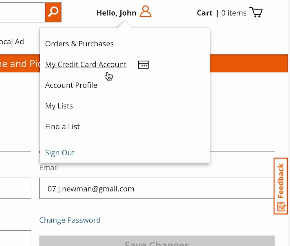
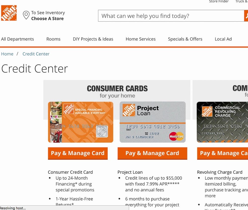
“I guess I would go to…‘My Account’…‘My Credit Card Account’…credit cards I could apply for, that’s not what I’m looking for”. A subject at Home Depot attempting to update her saved credit card information (first image) wound up on a promotional page for Home Depot credit cards (second image). The “My Credit Card Account” link wasn’t styled any differently than the other account-related links, and its placement between “Orders & Purchases” and “Account Profile” further indicates to users that it’s a primary link.
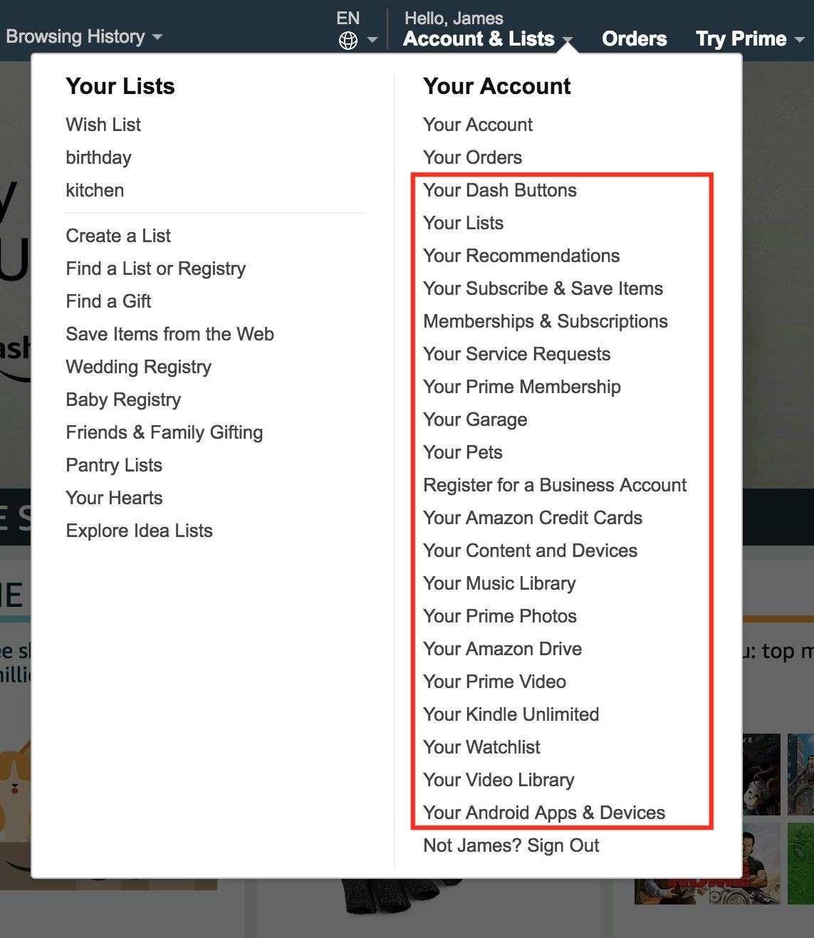
Amazon’s “My Account” drop-down menu mixes many secondary account features with only a few primary account features in the “Your Account” column. Here, we’ve marked the secondary account features. Users wanting, for example, to change the password, add an address, manage credit cards, or unsubscribe from newsletters all have to click “Your Account”, yet most users during testing spent extensive time considering, or even clicking, the many secondary account features instead.
Secondary account features, which are often links to promotional content (e.g., store credit cards) or subareas of the account (e.g., specific lists or optional memberships), were during testing found to be highly problematic if not carefully differentiated from primary account paths.
When visually undifferentiated, users don’t know that many of the drop-down options aren’t relevant to common tasks — like looking up an order, changing the password, adding an address, updating an expired credit card, changing newsletter settings, etc.
Consequently, users have to carefully read and consider each of the unstyled secondary paths — making it more difficult to quickly find the account feature they’re looking for.
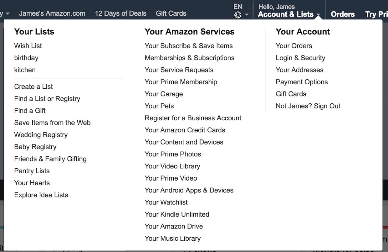
As illustrated in this mockup, restructuring the Amazon “My Account” drop-down into three columns allows secondary account features to be grouped together under “Your Lists” and “Your Amazon Services”, while primary account features are kept separate under “Your Account”.
However, these secondary account features don’t necessarily have to be removed from the “My Account” drop-down menu.
Instead, consider treating secondary account features similarly to how “thematic” and inspirational content should be treated in the site’s main product drop-down navigation. That is, placing these secondary paths in a separate column, placed after primary paths, and using a visual style to indicate the lower priority, such as secondary font styling or a faded background color. The exact styling decision matters less than simply using a differentiated style for secondary account features.
6 Ways to Further Improve the Performance of the ‘My Account’ Drop-Down
Identifying the primary paths is the first step toward improving the “My Account” drop-down, and visually distinguishing primary from secondary paths is the second. Below are 6 additional implementation details to consider when attempting to improve the performance of the “My Account” drop-down, which we observed in testing to help users navigate the menu.
1) Make the ‘Account Dashboard’ Link More Prominent
B&H Photo emphasizes the path to the dashboard by placing it first (the “My Account” link).
Every “My Account” drop-down won’t be able to meet the needs of every user, some of whom will be looking for a very specific account feature which isn’t included in the “My Account” drop-down menu, or which may be included but for whatever reason the user doesn’t recognize it (e.g., due to the terminology used).
Therefore, it’s important that the “My Account” link that leads to the account dashboard — often called “My Account”, “Profile”, or “Account Settings” — is more prominent than the other links, including other primary links, included in the “My Account” drop-down. That way, users are nudged to begin on the dashboard if they don’t immediately find the link they’re looking for in the “My Account” drop-down menu.
This also supports the behavior observed for a distinct subgroup of users who treat the dashboard as a navigational anchor (the same way some users treat the “My Account” drop-down menu), quickly navigating to the dashboard even if the path they’re looking for is available within the “My Account” drop-down menu, in the courtesy navigation, or elsewhere on the interface.
At a minimum, the path to the account dashboard should be placed first in the “My Account” drop-down, but also consider increasing the size of the path to the dashboard relative to other paths or using a distinctive icon or eye-catching graphic.
2) Use Columns and Headers
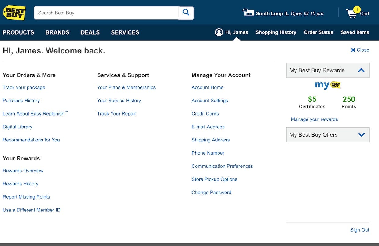
Best Buy uses a multicolumn structure to separate primary and secondary features (taken after Best Buy redesigned the “My Account” drop-down after testing concluded).
Columns and headers are frequently used in product navigation drop-downs and footers to organize links, and are a good way of organizing paths when there are many for users to consider. The same pattern can help organize “My Account” drop-downs with many links into thematically similar sections.
3) Use Icons for Crucial Paths
Icons at ASOS provide users with information scent and help draw the eye to the link text.
Icons can help provide information scent and draw users’ attention to their corresponding link text. Icons are however easy to overuse, and thus should be employed sparingly — for example, to draw extra attention to the primary paths in the “My Account” drop-down or solely for the path to the “My Account” dashboard.
4) Use Horizontal Separators
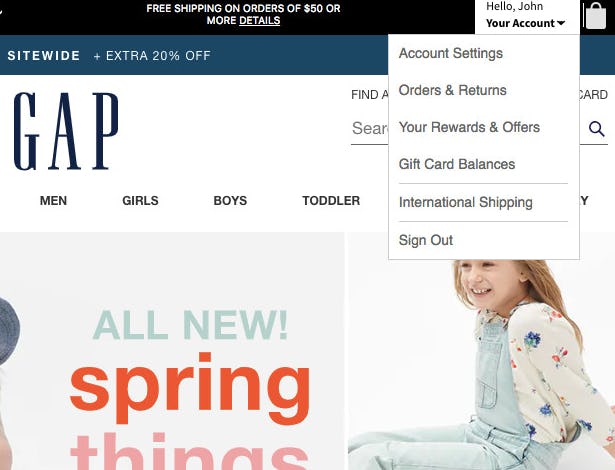
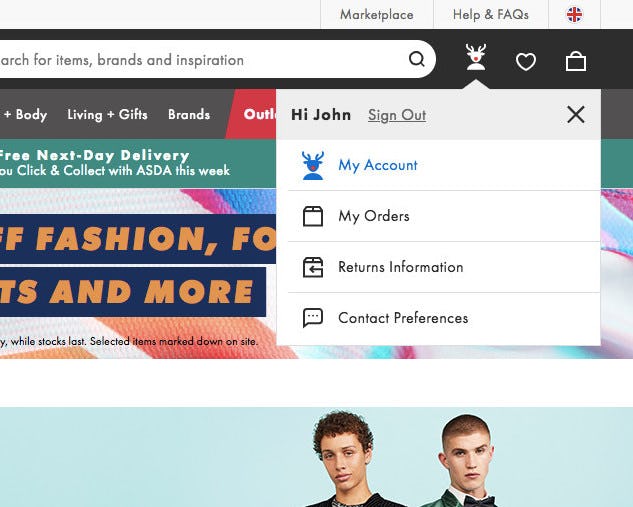
At Gap, a horizontal line is used to separate primary paths — the first four links in the menu — from a secondary path. This path is then separated by another horizontal line from the path to sign out.
Horizontal lines are effective at separating content — for example, primary from secondary paths, or grouping paths into themes (e.g., “Account Settings”, “Delivery and Returns”, etc.), which adds helpful structure to the “My Account” menu.
5) Provide Secondary Text Descriptions
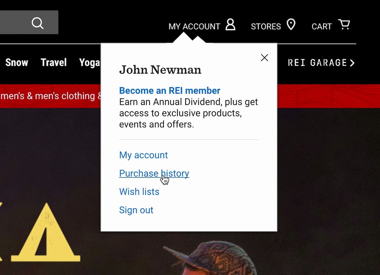
REI provides an inline text description for the REI member path, clarifying where the path leads as well as providing some reasons why users may be interested in exploring this account feature.
Secondary text descriptions — often used in product-navigation menus — are the technically simplest way of clarifying the meaning of an ambiguous account path. These inline descriptions can be used for those paths that are the most ambiguous and thus the most likely to be misinterpreted. On desktop sites, a simple tooltip (or even the link hover title) can also be used for such descriptions to avoid cluttering the navigation menu.
6) Offer Some Personalization
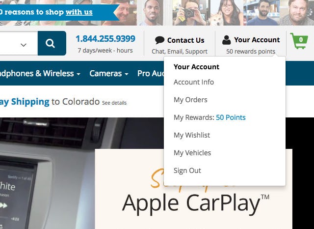
Crutchfield shows signed in users their rewards balance, helping them avoid a trip to the rewards page to learn this info, as well as giving the “My Account” drop-down a more personal feel.
Personalizing the “My Account” drop-down to adapt it to the individual user’s context can make the “My Account” drop-down even more useful for a subset of users. Users who are able to, for example, see their rewards balance upfront in the menu will have useful information at their fingertips, without being required to navigate to the account rewards page. Personalization can also take the form of removing or deemphasizing paths that the user doesn’t currently have access to or isn’t using (e.g., the “Wedding Registry” path in Amazon’s drop-down likely is only relevant to a small subset of the site’s users, who might then access it quite frequently).
Help Users Quickly Access the Account Features They’re Looking For
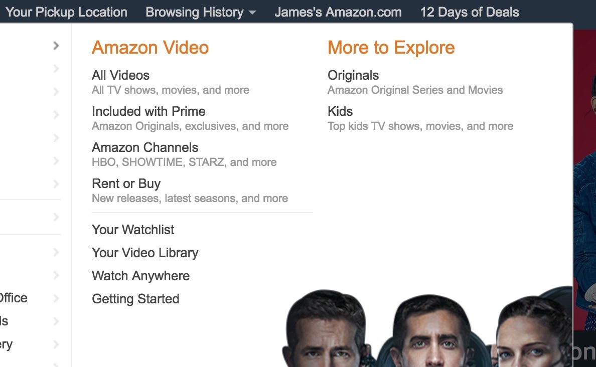
While Amazon’s “My Account” drop-down (shown earlier) largely failed to provide users during testing with the structure and styling they needed, Amazon’s main product navigation illustrates many of the principles that can be applied to improve “My Account” drop-down menus. For instance, effective separation of primary and secondary content (through a multicolumn format and horizontal section dividers), inline text descriptions with a secondary font styling, and section headers.
For inspiration on “My Account” drop-down structure and styling sites can often turn to their own main product drop-down navigation.
For many sites, it’s clear a good deal of thought (and resources) has been given to how to design the main product drop-down navigation, and most of the same design choices and principles can be adapted for the “My Account” drop-down menu.
Yet 71% of sites fail to provide even basic structuring to the “My Account” drop-down by separating primary from secondary content — potentially because the difference between the two has never been investigated.
Additionally, to improve the overall performance of the “My Account” drop-down consider adopting some combination of the following 6 implementation details:
- Make the dashboard link more prominent
- Use columns and headers
- Use icons for crucial paths
- Use horizontal separators
- Provide secondary text descriptions
- Provide some personalization
Adopting some of the above implementation details will help ensure the “My Account” drop-down is an effective entry point for users seeking to access account features — once primary paths have been identified and made visually distinct.
This article presents the research findings from just 1 of the 640+ UX guidelines in Baymard Premium — get full access to learn how to create a “State of the Art” Accounts & Self-Service user experience.