While breadcrumbs may seem like a pretty uninteresting site element, during our recent Homepage & Category Usability study they proved themselves to be vital navigation paths. Perhaps more interesting is that the study revealed that e-commerce sites should offer 2 types of breadcrumbs: both hierarchy-based and history-based breadcrumbs.
Yet, when benchmarking 50 major e-commerce sites we found that a staggering 68% suffer from sub-par breadcrumb implementations: 45% have only one type of breadcrumb (typically hierarchy-based, lacking the history-based), and 23% don’t have breadcrumbs at all.

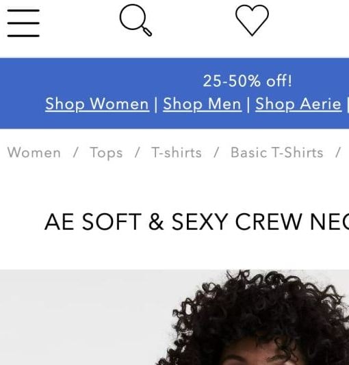
Some of the 68% of top e-commerce sites with sub-par breadcrumb implementations.
In this article we’ll go over the findings from our research study, outlining the characteristics of both history-based and hierarchy-based breadcrumbs, and discuss why it’s important for e-commerce sites to have both.
Breadcrumb Usage Behavior
Without breadcrumbs on the product page, it’s difficult for users to efficiently browse a collection of products because there’s no way to go “one step up” in the hierarchy (to the product category), or return to a previous product list or search results page. This often forces users to make drastic scope jumps (e.g. select a top-level category, perform a search, etc.) or remain stuck at the product page.
With breadcrumbs, however, any user who doesn’t find the product to be a good match or simply wants to see other products (for comparison, due diligence, or additional purchases) can use the breadcrumbs to seamlessly traverse up the site hierarchy and in this way continue their product browsing instead of having to resort to drastic scope jumps.

Hierarchy-based breadcrumbs enable users to easily navigate to a product’s category to find related products. Here a test subject isn’t 100% sure about the jacket, so she easily navigated to the “Jackets & Coats” category she came from using the hierarchy-based breadcrumb links at H&M’s product page.
During testing the most common usage of breadcrumbs was as a way to return to the category the test subject just came from – much like using the browser’s “Back” button, only this is part of the webpage’s interface. In this sense, breadcrumbs are essentially an easy way for users to return to the product category and continue their product browsing, jumping back and forth between product page and product list.
Alas, breadcrumb links often don’t work like the browser “Back” button as they are typically hierarchy-based, whereas the web browser’s “Back” button is history-based (that is, it’s based on the user’s navigation path). Consequently, any previously applied filters and sorting options are lost when the user navigates back using a hierarchy-based breadcrumb. This is where history-based breadcrumbs enter the picture. When the breadcrumb is history-based it sends the user back to their previous page, which is often not the plain category list – for example the user may have filtered by a product attribute or applied a different sorting direction, or maybe even entered the product page in a non-linear fashion, such as search (on-site as well as off-site) or an ad.

At Nordstrom, a “Back to results” option allows the user to return to the product list with all previous filtering and sorting settings intact (and it works for search too). However, the lack of the traditional hierarchy-based breadcrumbs makes it difficult for users from external sources to infer or jump scope (i.e. traverse “back up” the catalog hierarchy).
A few sites implement breadcrumbs that are based solely on the user’s navigation path (i.e. history-based breadcrumbs), effectively functioning as “back” links. However, this limits the user’s ability to explore scopes they’ve accessed in a non-linear fashion as they can’t shift to a linear browsing strategy by traversing up through the categories the product is placed in.
Why You Need Both Breadcrumb Types
Users who land on a product page in a non-linear fashion (e.g., from an internal or external search, or from a featured promotion) will often use breadcrumbs to see other products in the same sub-category. It’s essentially a way for the user to find related products despite accessing the product from a completely different part of the site or even from another site altogether. Hierarchy breadcrumbs are therefore hugely important to search, promotions and other non-linear paths, as it enables the user to easily switch to a linear product-browsing strategy if the scope is relevant to them.

At Best Buy, a subject opened a Targus laptop adapter from a list of “Best Selling” accessories. However, not being 100% convinced, the subject wanted to check out other laptop adapters – luckily, this proved as easy as clicking the hierarchy-based breadcrumbs on the category page which took him directly to a “Laptop Chargers & Adapters” category.
Yet while hierarchy-based breadcrumbs work well for users who accessed the product page in a non-linear fashion, they don’t always suit the needs of users who accessed the product page in a linear way. If a user has applied a number of filters on the category page and then opens a product, clicking the category in the hierarchy-based breadcrumbs on the product page will typically not retain the filters but rather send the user back to the category page with no filters applied because it’s simply a link to the category and not based on the user’s history. Meanwhile what the user really needed was a history-based breadcrumb that would send them back to their previous page – whether it be a list of search results or a category with previous filters and sorting applied.
Clearly, there’s a legitimate need for both hierarchy-based and history-based breadcrumbs – so which should you implement? The answer is both. An elegant, and relatively simple solution is to have a set of hierarchy-based breadcrumbs and then append a history-based “Back to results” option at the end (or beginning). This gives the user the best of both worlds: access to categories despite accessing the product page in a non-linear way, while also providing the user a way back to their previous page with any filters, sorting and/or search queries intact.


This is a good example of a seemingly ordinary site element that can actually have a significant impact on the user’s ability to browse your site’s product catalog. By fusing hierarchy- and history-based breadcrumbs, users can change product browsing strategy and seamlessly leaf through product lists.
What makes this fusion particularly interesting is that it blends site taxonomy and user behavior into a single functional element. It’s details like this that can make the difference between a site that supports rapid product browsing and shifts in product finding strategy and a site that hinders it.
This article presents the research findings from just 1 of the 700+ UX guidelines in Baymard – get full access to learn how to create a “State of the Art” ecommerce user experience.