Internal graphics, banners and ads for promotions and site features are fairly common on e-commerce sites and can – when linking to relevant content – be immensely helpful to users. However, during our latest e-commerce usability study, a large number of the test subjects were led astray by poorly placed and designed internal ads. In some cases this even resulted in site abandonments.
We found the following 5 types of internal ads and banner graphics to cause particularly severe usability and user experience issues during testing of 19 leading e-commerce sites.
Note that the use of “ads” throughout this article refers to any type of banner or graphic. By “internal” ad we refer to any such banner or graphic that publicizes a feature or product of the site instead of an external 3rd-party offering.
1) Don’t Place Ads Above the Product List
When internal ads are placed above a product list, they are likely to introduce scope confusion and lead users to believe that the ad is somehow related to the product list. Any ad text may be misinterpreted as a header for the product list, and buttons and links may be mistaken for filtering and sorting options, as the following examples illustrate.
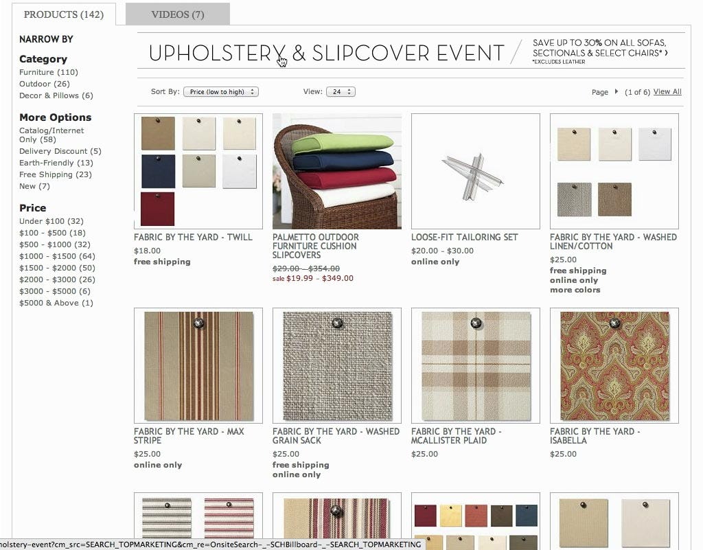
Here a subject mistook the banner ad placed above the search results list at Pottery Barn for a header, and therefore thought the results only included upholstery and slipcovers.
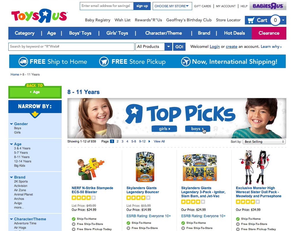
Multiple subjects mistook a “Top Picks” banner placed above the product list at Toys’R’Us to be a filtering tool for their current product list – however, upon clicking the “Boys” link, the subjects were sent to an entirely new category of “Top Picks for Boys” instead of seeing their current age-filtered product list filtered by gender.
It’s easy to see how a hurried user can mistake such banners as related to the product list, and it’s therefore recommended to avoid placing ads above product lists altogether – neither on search result pages nor on category pages. The internal ads depicted above are fairly relevant to the user’s context and their presence on the page is thus justified – it’s not that they shouldn’t be on the page, they just shouldn’t be placed above the product list.
2) Avoid Ads Within Product Lists
When ads are placed within a product list, users tend to interpret it as the end of the list. In the user’s view, the ad represents the beginning of a new page element and the ad therefore also comes to signify the end of the current page element (i.e. the product list). This problem is only exacerbated on devices with fading scrollbars, as the one visual clue indicating that plenty of additional content is available on the page will often be hidden.
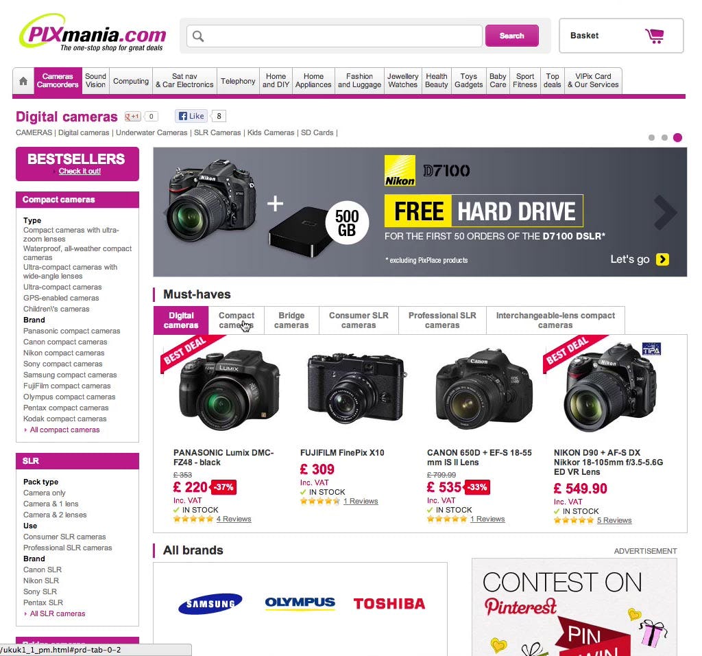
The “All brands” images and “Contest on Pinterest” ad made this subject think that the page contained no more than the first row of product tabs and that the product list ended after this. In fact, there were many more products farther down the page but the subject took the ad as a sign that he had reached the end of the product list already.
Users generally perceive lists of product and categories as a “collection” and expect it to be represented as a whole. Therefore, when subdividing such lists by intersecting them with internal ads, a good deal of users will perceive it not as a singular list divided by an ad but rather as one list, an ad and then another list. As hinted, this issue isn’t specifically related to product lists but also applies to custom category pages and help sections, causing users to miss out on important navigational content and critical site assistance.
3) Avoid Text Ads Below Product Lists
We furthermore observed that when ads are placed below a product list, users are more likely to mistake any text links in the ad for sub-categories or filters for the product list.
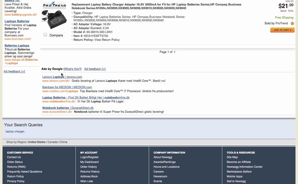
At Newegg, a subject was looking for an adapter for his Lenovo laptop. As the subject reached the end of the product list, he spotted the blue and underlined text links and took them as links to relevant sub-categories. Just before clicking one of the links, the subject noticed the “Ads by Google” banner and decided not to click after all.
Users seem to be more likely to perceive links placed below the product list (and above, as described earlier) for filters and sub-categories. However, graphical ads placed at the end of a product list didn’t suffer from this, but were instead perceived to signify the end of the list, as described earlier.
Graphical ads may therefore purposely be placed below product lists to signify their end – just be sure to avoid text links so the ad isn’t confused for sub-categories or filtering options. In other words, it’s OK to place ads below the product list as long as they are properly designed (i.e. graphical in nature).
When benchmarking 50 major e-commerce sites, we found 43% of them to violate the principles described in the this and the above sections by either placing graphical banner ads above or within the product list, or by locating text ads below it (see all 52 product list examples). So be sure to double-check your e-commerce design for these three pitfalls in particular.
4) Don’t Show Overlay Dialogs on Page Load
Some of the test sites had overlay dialogs (or “lightboxes”) appear upon page load – often containing surveys, contests, newsletters, promotions, country-selection, etc. This didn’t just happen on the homepage but also on category pages and product lists as well. Each time it happened, the vast majority of the test subjects would reflexively close the overlay dialog, not even glancing over its contents.
What’s more, the subjects would get annoyed with the site for bothering them, even though they – as just mentioned – never actually read what they were being bothered with. Some subjects went as far as referring to any overlay dialogs as “spam,” which gives a pretty good idea of just how much users loathe these dialogs and how poorly it can reflect on sites that use them.
It’s therefore recommended to avoid displaying overlay dialogs on load altogether, especially if the content is highly relevant to the user (again, most users will ignore it and just close the dialog instantly thus missing out on important content). And of course if the content isn’t of great importance, should you really be bothering the user with it?
“I don’t know what that was, and I don’t care. I just want my cough syrup”, a subject said after closing the survey dialog the very instant it appeared.
“I normally click X on these without really reading them, a subject explained as she closed the newsletter dialog.”
It shouldn’t come as a surprise that overlay dialogs aren’t popular with users, as they are essentially the in-page equivalent of the much hated popup-windows that were rampant on spammy sites during the 1990s and early 2000s. Surveys, newsletter sign-ups, contests, discounts, you name it – most users will close the overlay dialog without even realizing what it’s about.
It should be noted that overlay dialogs may be used to display content upon user request – as long as the overlay dialog doesn’t appear upon page load it is absolutely fine. So by all means do display inline help, cart contents, etc. in an overlay dialog, as long as it happens as a response to a user action (e.g. mouse click) and not upon page load.
Of the 50 benchmarked sites, a hefty 40% flash an overlay dialog in the user’s face when they visit the homepage or a category page. Unfortunately, users ignore this younger cousin of the ’90s popup-window, reflexively closing these overlay dialogs despite their often perfectly relevant content.
5) Design Homepage Ads Very Carefully
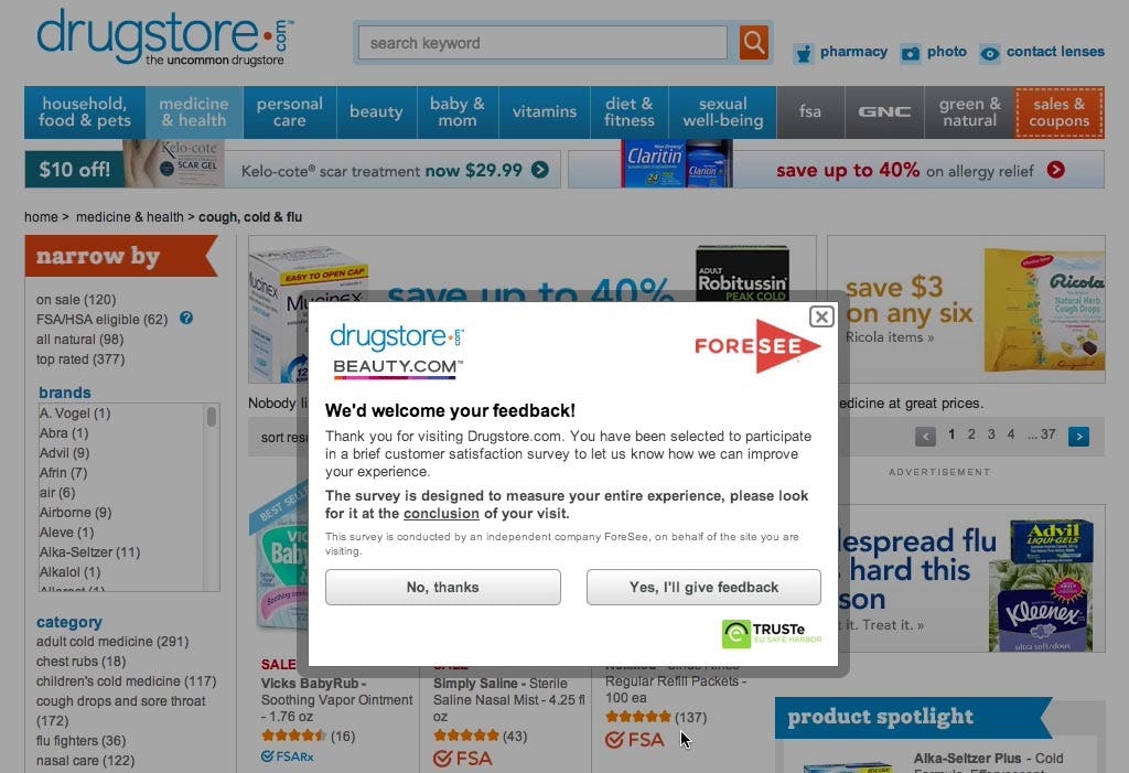
“Wha– Hey… that’s some pretty aggressive ads they show here,” a test subject said as Drugstore’s homepage loaded, “Argh, this distracts me.” Internal ads and banners were generally perceived negatively by the test subjects, which confirms similar observations made during both our E-Commerce Checkout and Mobile E-Commerce studies. However, a new addition to these observations is a particularly marked distaste for ads on the homepage specifically.
When an ad was placed in a prime content location on the homepage – typically in the middle column, and particularly in the upper part of the page – the subjects would often comment negatively upon it. Since the homepage is many users’ entrance page such ads can therefore set a poor first impression of the site, potentially rippling throughout the user’s entire shopping experience.
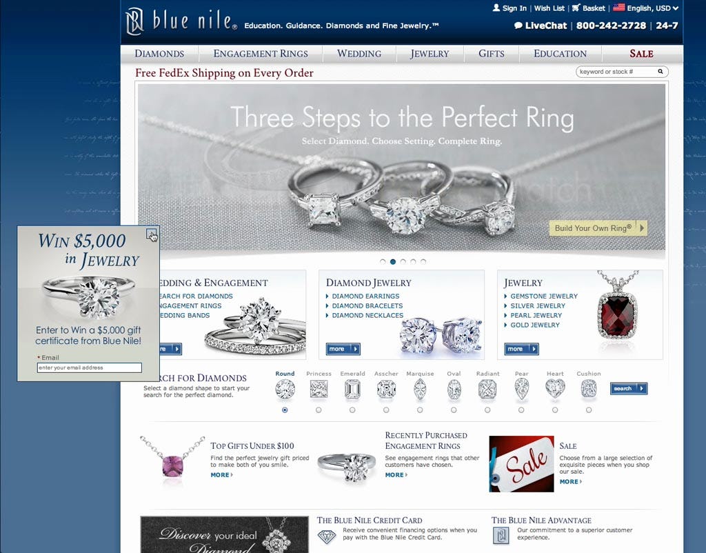
On Blue Nile, a small dialog would appear on the left-hand side of the page. Despite the relatively unobtrusive placement, this dialog caused great dismay to the test subjects, who all closed the dialog immediately.
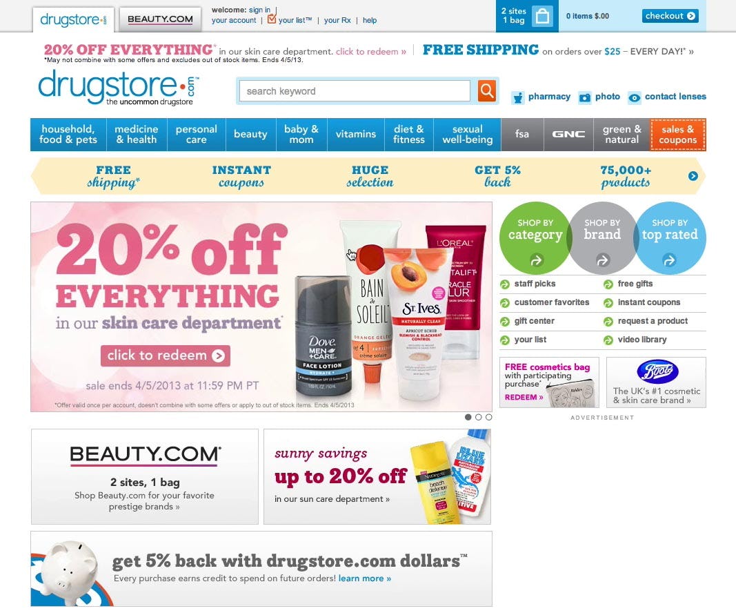
On Drugstore.com, the centerstage “20% off everything” banner was received poorly by most of the subjects too, despite its positive implications.
Ads on the homepage can in other words set a negative tone for the entire site – a poor first impression that permeates through the rest of the user’s browsing experience. What’s tricky here is when something is perceived as an ad vs just a nice graphical representation of a product, category or site feature.
Users don’t make the technical distinction between internal and external ads, but rather respond with a gut reaction that has been conditioned over years use of websites with banner graphics. It therefore doesn’t matter if the content is relevant or appropriate – if it looks like an ad, it will generally be perceived as one.
We found the subjects more likely to perceive graphics with headers boasting about site-wide competitions and discounts as ads, whereas graphics showcasing specific products, categories and seasonal campaigns, were generally perceived as “legitimate” content. However, there were multiple exceptions and we therefore strongly advise designers to be very careful when designing their homepage and its graphics so that they don’t come across as ads.
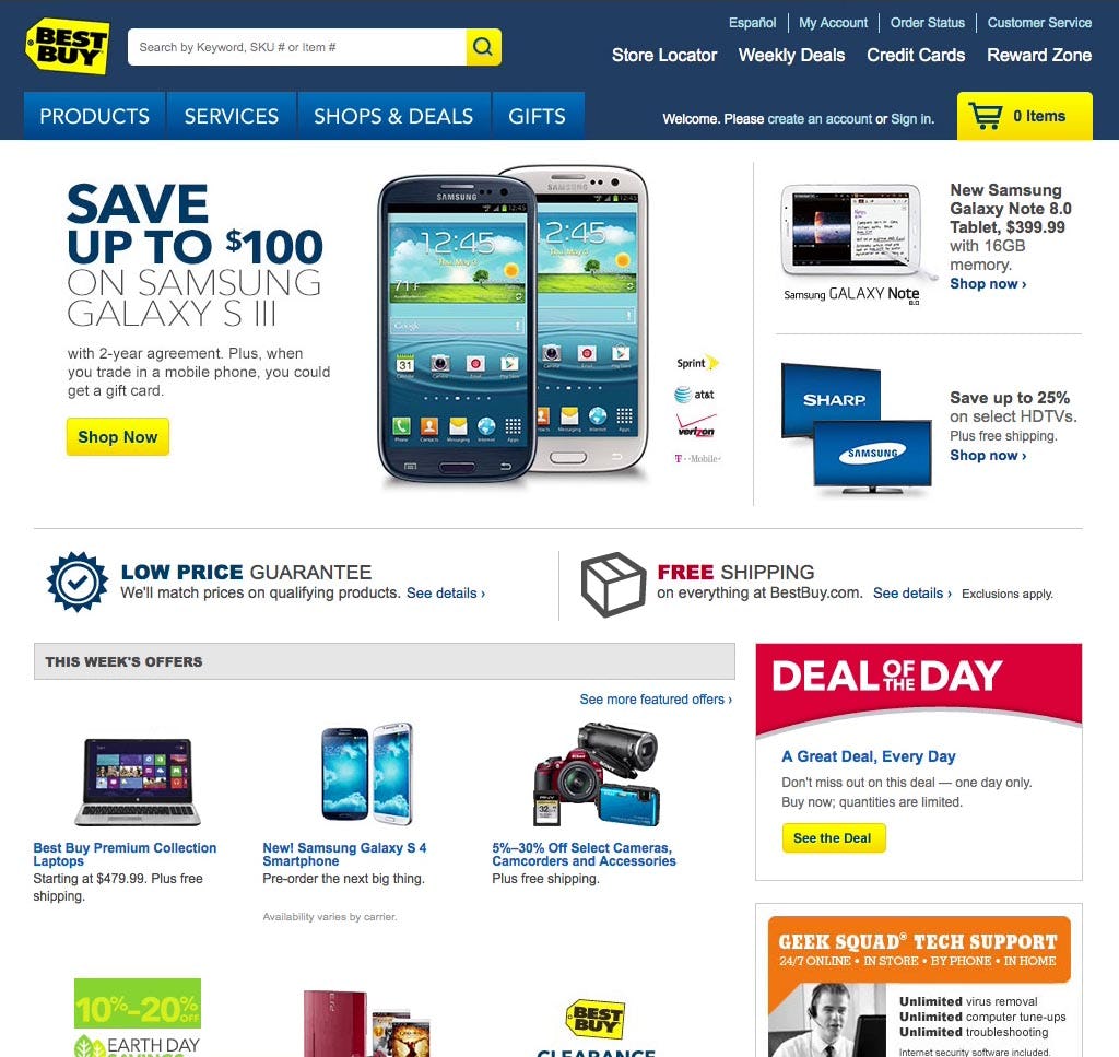
BestBuy offers a decent example of a carefully designed ads, which despite its visual dominance and prominent position on the homepage wasn’t negatively perceived by the subjects – in fact, the Samsung promotion was perceived as helpful navigational content.
In general, the primary header of the ad shouldn’t be overly boastful. Font choices and background graphics also greatly influence what is and isn’t perceived as an ad. If a graphic largely adopts the visual characteristics of the site (background, text colors, font choices, etc) and avoids visual borders or similar visual boxing, it’s less likely to be perceived as an ad. Notice how the prominent smartphone offer in the above BestBuy example adopt the general visual characteristic of the site and thus feel like a more natural part of the page than the “Deal of the Day” and “Geek Squad Tech Support” boxes lower down the page.
40% of the benchmarked e-commerce sites unfortunately fall victim to the allure of having highly graphical ad blocks in prime content locations on their homepage (see all 51 homepage examples). While numerous of the other benchmarked sites also had graphical blocks on their homepage, they had designed them much more carefully so they’re unlikely to be perceived as ads but rather as legitimate and helpful content.
The Do’s and Don’ts of Ad Design
In an effort to solve the logistical issue of having many different departments frequently in need of promoting offers or site features, it can be tempting to carve out blocks of fixed position and size in various places on the site, and then allocate these spaces for internal “ads” and campaign graphics. This is convenient for everyone: design just has to carve out a block on the page, development doesn’t have to deal with trivial site updates, and marketing can do frequent site updates and upload graphics as they please.
However, internal ads spread across the site this way are likely to cause issues since it’s difficult to foresee all the contextual issues they may provoke (see earlier Pottery Barn and Toys’R’Us examples). These “ad blocks” can also turn out to produce misleading design clues (see earlier Newegg and Pixmania examples). Finally, if highly graphical ads boasting about discounts and competitions are inserted, the page may appear cluttered and overly salesy (see Drugstore and BlueNile examples), which is likely to set a poor first impression of the site.
Therefore, if opting for this strategy, it’s particularly important to avoid the don’ts presented throughout this article. We can summarize these don’ts of internal ad design as follows:
- Don’t place internal ads (of any kind) above or within a product list, and don’t place text ads below a product list.
- Don’t display overlay dialogs on page load regardless of how important the content is.
- Don’t display highly graphical ads in prime content locations on the homepage (be particularly careful when promoting competitions and discounts).
Luckily, when great care is taken, internal ads can be implemented successfully without stirring up negative emotions or misleading the user. (Indeed, as we’ve seen with the BestBuy example, carefully designed internal ads can be perceived as useful content.)
So what is good internal ad design? As already mentioned, carefully designed graphical banners publicizing specific products, categories and seasonal campaigns are perfectly fine, even on the homepage (in fact, large bespoke product imagery was very well-received by the subjects). Also, graphical ads placed below product lists are perfectly fine and can help signify the end of the list. In addition to this, we observed that internal ads placed in a sidebar didn’t cause any issues.
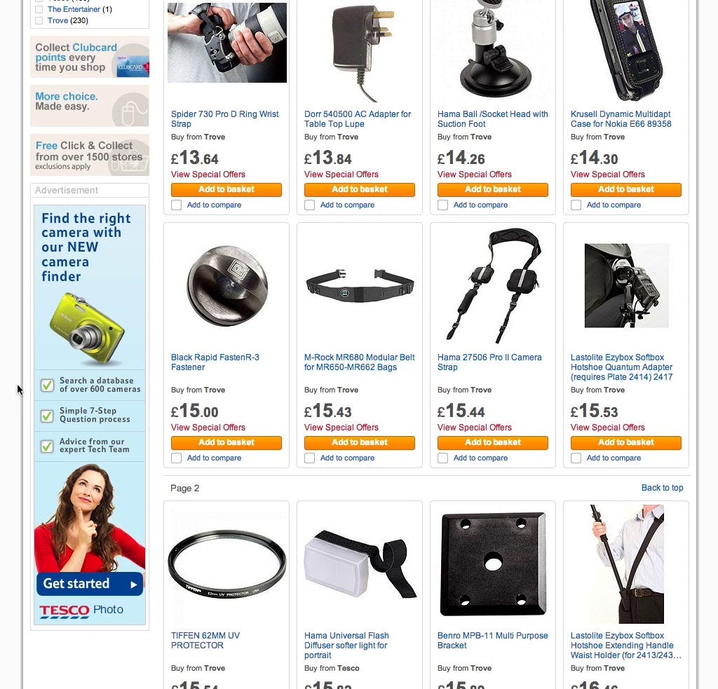
At Tesco a “Camera Finder” banner in the sidebar helped a subject who identified it as an ad for a product wizard. Sidebars seems to be one of the few “safe” areas to place ads around the product list.
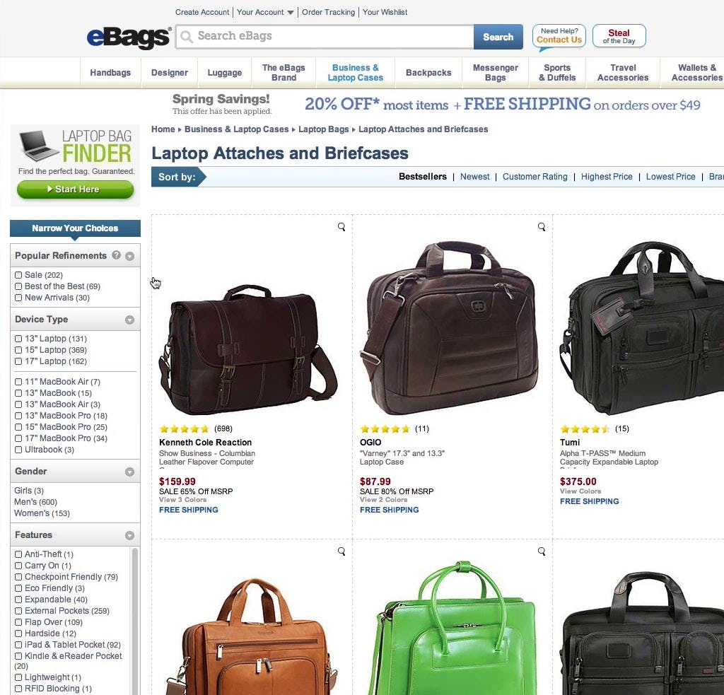
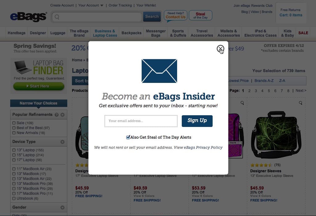
The “Laptop Bag Finder” ad in the sidebar at eBags was perceived by the subjects as an ad (which is fine, although it did cause some subjects to ignore it due to banner blindness).
Ads placed in a sidebar at either side of the product list were never interpreted as anything but ads. In other words, you’re free to place any type of ads in sidebars, as long as they aren’t intermingled with filtering tools or sub-categories, and as long as it’s not the only path to important navigational features (due to the risk of banner blindness).
It’s recommended that the ad remains somewhat graphical if placed immediately above or below categories or filters (to help differentiate the two), but during the study the subjects were generally quite good at making the distinction, as long as the ad was in a sidebar and not above or below the product list.
The do’s of ad design can thus be summarized as follows:
- Ads (of any kind) may be placed in a sidebar on either flank of a product list
- Graphical ads may be placed below product lists
- On the homepage, graphical banners must be carefully designed to be in tune with the rest of the homepage design, avoid visual boxing, and preferably publicize specific products, categories or seasonal campaigns.