During our most recent usability study of e-commerce sites, we often observed users doubting whether to look for a given product type in category A or B, especially when the categories overlapped thematically or when the product could logically belong to both categories. The category boundaries simply weren’t sufficiently clear from the category name and thumbnail alone – further information about each category was needed to accurately choose one path over another.
Perhaps the simplest solution to this information problem is to add sub-sub-category links below each category. On the tested sites that adopted this design, novice users had an easier time working out the boundaries of each category, while expert users were able to bypass intermediate pages.
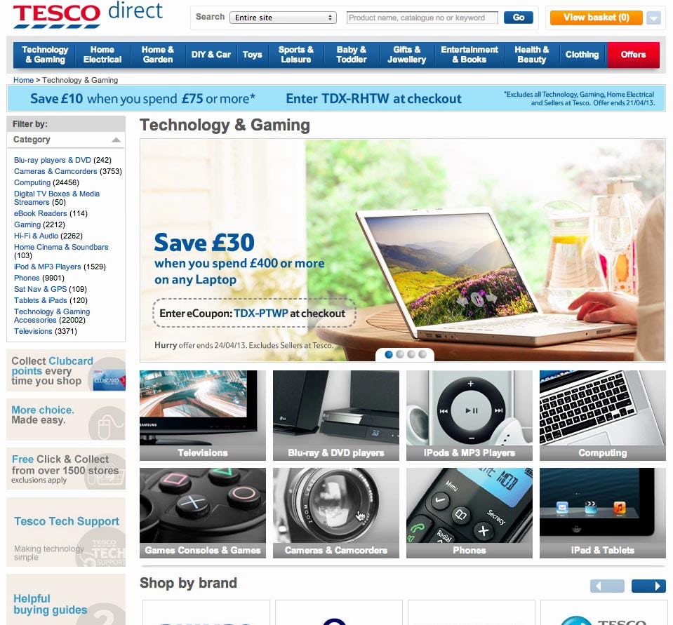
While it was clear to the subjects that ‘Cameras & Camcorders’ would hold digital cameras, it wasn’t clear if this category would also be the place to look for camera accessories, or if they would be placed in a separate ‘Accessories’ main category. And does Tesco even carry iPhones since the ‘Phones’ category doesn’t specifically mention this device while other categories such as ‘iPods & MP3 Players’ and ‘iPad & Tablets’ do..? Had sub-sub-categories been listed below each category, these questions would have been answered.
With the sub-sub-categories listed below each category option, the test subjects were able to work out which category would be most appropriate to their product search, and sites which listed sub-sub-categories on their intermediary category pages therefore vastly outperformed those that didn’t. Yet, of the top 50 e-commerce sites that both 1) have Intermediary Category Page, and 2) have three or more layers in their product hierarchy – 52% do not display sub-sub-categories on their intermediary category pages (despite qualifying by having the two pre-requisites).
Benefits Both Novice and Expert Users
Having the sub-sub-category options displayed alongside (typically beneath) each sub-category option turned out to be a very effective strategy. It’s not that the subjects never hesitated or ran confused – they absolutely did, asking questions like “Are sofa pillows within the sofa category?” However, the subjects were often able to infer the correct path by looking at the sub-sub-categories for a couple of different sub-category sections.
In other words, displaying sub-sub-categories on intermediary category pages function as navigation information scent, allowing the user to resolve any doubts they may have regarding the site’s category taxonomy.
During testing of IKEA, many subjects relied on the sub-sub-category options below each sub-category to reliably deduce which path(s) would be most appropriate to their product search. Here a subject found that sofa cushions weren’t placed within the ‘Sofa’ category as he had first assumed (like the majority of users).
Here, another subject, who knew he wanted to see pillows, simply chose that specific sub-sub-category over the much more generic ‘Textiles’ sub-category.
It isn’t just users in doubt who will benefit from sub-sub-categories being displayed at intermediary category pages – those users who already know what they want also benefit. During testing, savvy subjects with domain knowledge or prior site experience used the sub-sub-categories as direct deep-links, saving themselves a trip to an intermediate parent category. This often make intermediary category pages more effective than drop-down menus (which generally shouldn’t include sub-sub-category options), as users can get a quick overview of all their options and then dive directly into the one(s) relevant to them, bypassing more generic categories.
When implementing sub-sub-categories at a intermediary category page, it’s important to visually indicate the hierarchy clearly (e.g., by using indentation, different font type, size, and color). This allows users easily scan the sub-category headers, helping them decide on just a few groups of sub-sub-categories to focus in on. Of course, the sub-category itself (i.e., the header) must be selectable for those not interested in any of the sub-sub-categories.
Implementation pitfalls
It’s very important to distinguish what page type we’re talking about here. While displaying sub-sub-categories on intermediary category pages increased performance, it was observed that sub-sub-categories within a drop-down “mega” menus often turned out to decrease performance. So the above observations only apply to intermediary category pages. (Also see the earlier article in this series for more on intermediary category pages and why e-commerce sites need them for the first 1-2 layers of the hierarchy.)
After reading the sub-sub-category options, some users, like this subject, will still want to pick the more generic option by clicking the header.
Also, we observed that a few sites have replaced the category link and only display it as a header for the sub-sub-categories. It’s very important when implementing sub-sub-categories to still keep the parent category clear and accessible, by still keeping the title and thumbnail as a link pointing to the generic category. Otherwise undecided users are forced into an overly narrow scope – which often ended up leading the test subjects astray, until they would finally give up and abandon the site.
Let’s take a look at some intermediary category page implementations, both with and without sub-sub-categories, and see how they compare:
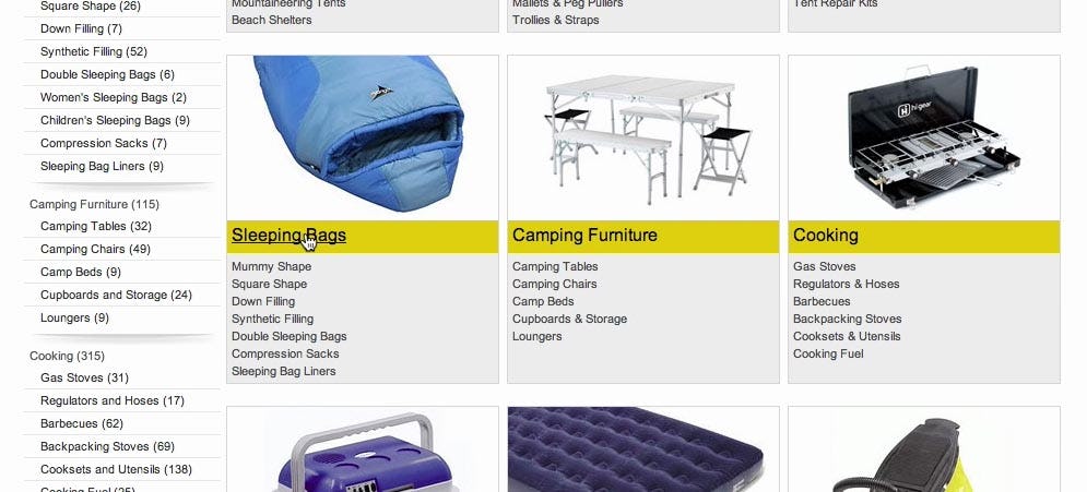
The lack of sub-sub-categories at Grainger’s intermediary category page makes it very difficult for the user to infer that the ‘Finishing Tools’ category is the place to find product groups such as Machining Shears, Corded Oscillating Tools, etc.
At Williams Sonoma’s intermediary category page, the ‘Specialty Cookware’ is somewhat ambiguous, and requires the user to carefully read and understand all other categories to deduce that, e.g. a Dutch Oven, isn’t specialty cookware since it has its own category.
In comparison to the two previous examples, notice how the inclusion of sub-sub-categories ‘socks, underwear, undershirts’ at Target’s intermediary category page helps the user understand what the ‘men’s basics’ category is likely to contain. Most users would probably be able to work it out on their own but the inclusion of sub-sub-categories allows them to instantly confirm (or discard) their assumptions about the scope of this category scope.
Also, many users looking for a specific product type, say socks, will scan the page closely for that term. Including the sub-sub-categories can therefore also improve the scannability of the page, as the term(s) the user is looking for is more likely to appear on the page.
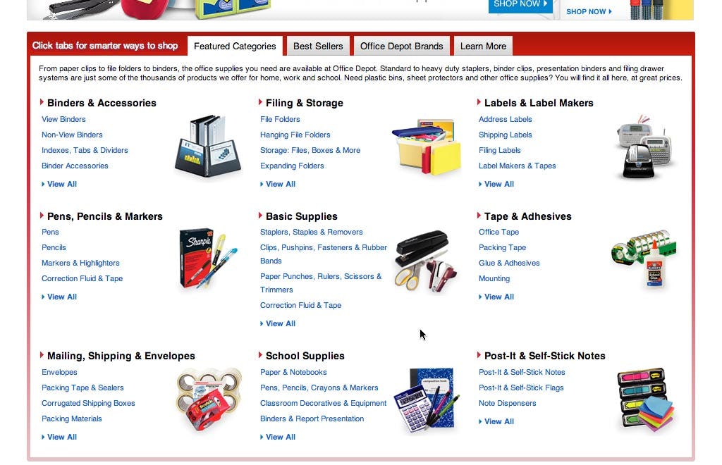
Another example is Office Depot’s intermediary category page, where the sub-sub-categories makes it much easier for the user to navigate the comprehensive category hierarchy. If there’s too many sub-sub-categories for each displayed sub-category, then only including the most popular along with a ‘View all (19)’ link is a much better alternative than not displaying any sub-sub-categories at all.
Information Scent
The main purpose of displaying sub-sub-categories is to allow the user to make a more informed decision about which category scope to pursue. That the user is able to bypass an intermediate category page or two on their way is a nice bonus. The same goes for increased keyword scannability. The key benefit of sub-sub-categories is the information scent they provide.
Information scent is critical because it allows the user to make better navigation choices, increasing their Return On Click Investment. When the user is able to easily work out which navigation paths to pursue (and which to avoid), they are obviously less like to drift astray and instead begin to feel in control of their product browsing.
This increases the user’s confidence in their ability to navigate the site and makes them more likely to find the products they are looking for – which is a prerequisite to buying those products. After all: if they can’t find it, they can’t buy it.
This article presents the research findings from just 1 of the 700+ UX guidelines in Baymard – get full access to learn how to create a “State of the Art” ecommerce user experience.


