Key Takeaways
- Health and Beauty users need to replicate the “in-store experience” as much as possible using website features
- Failure to provide key visuals or other features can quickly lead to abandonment in favor of competing Health and Beauty sites
Key Stats
- 3,000+ hours of new Health and Beauty research
- 1,200+ medium-to-severe usability issues were observed during Health and Beauty testing
- 490+ Health and Beauty guidelines included in our Health and Beauty research study
At Baymard our research team has spent 3,000+ hours on new large-scale qualitative usability testing and research focusing on Health and Beauty website features, layouts, content, and designs.
This study tested 18 U.S. sites, though several are owned by international companies.
These sites span three categories — Direct Brand, Specialty Beauty Retailers, and Mass Retailers — and include a cross-section of price points from discount to high-end:
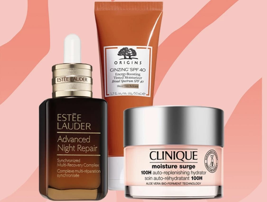
- Direct Brand Sites: Avène USA, Bobbi Brown Cosmetics, e.l.f. Cosmetics, Estée Lauder, Glow Recipe, Ilia Beauty, Kiehl’s, MAC Cosmetics, SkinCeuticals, Urban Decay
- Specialty Beauty Retailers: FragranceNet, LovelySkin, Micro Perfumes, Sephora, Stylevana
- Mass Retailers: CVS, Rite Aid, Walgreens
This research is based on over 275 qualitative usability test sessions conducted via 1:1 remote moderated testing.
Participants followed the “Think Aloud” protocol while testing sites on both desktop and mobile devices.
During testing, the participants considered and explored makeup, skincare, and fragrance products and encountered 1,200+ medium-to-severe usability issues.
These issues have subsequently been analyzed and distilled into the 490+ UX guidelines found within our Health and Beauty UX research study (which are available as part of our Baymard research findings).
The 490+ guidelines address the health and beauty product-finding experience, ranging from broad user behaviors to the granular usability issues observed in our sessions.
In this article, we’ll introduce 3 high-level UX best practices essential for users’ ability to find, evaluate, and make the decision make a purchase at Health and Beauty sites:
- Provide extensive product visuals
- Provide clear product labeling and product-finding features
- Build user confidence through social proof and reciprocity
Provide Extensive Product Visuals
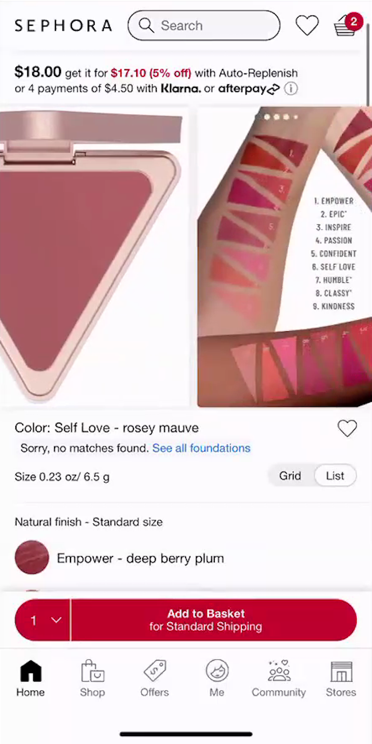
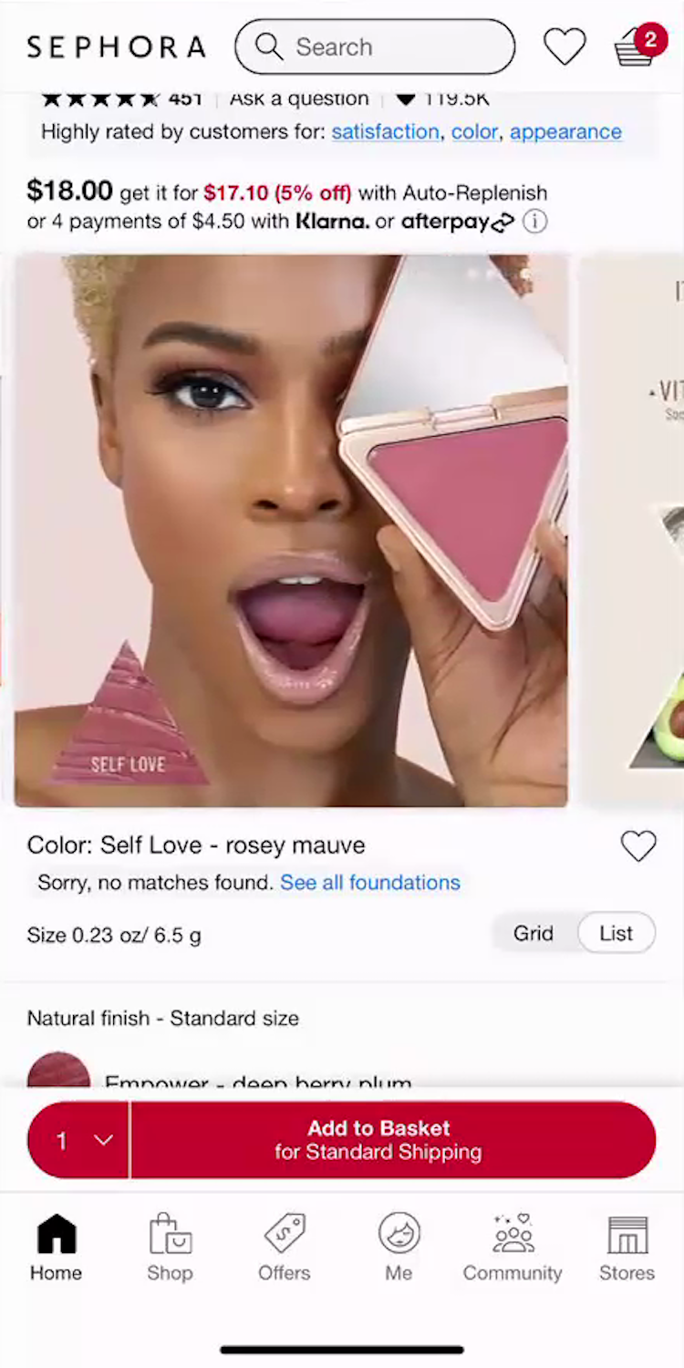
“I would say this number ‘5’ right here, ‘5’ or ‘6’ would be my face…So ‘Self Love’ will be that,” noted a participant as she identified her blush shade match using an arm swatch image at Sephora (iOS, first image). She then scrolled through the images hoping to find a “Human Model” with a matching skin tone similar to her own, but was disappointed: “I don’t necessarily like that they don’t have a lot of photos with the models having it on their skin! She’s very pretty, but I don’t have as dark a complexion as her. So I would like a few more options with different skin tones to see!” Unable to confidently assess the shade, she abandoned the product: “So I am going to go back and keep looking. I don’t think that would be something that I would add.”
The main hurdle in buying health and beauty products online is that users cannot visit a physical beauty retail space to try testers on their own skin and see how a product’s color, coverage, or texture will look on them.
Instead, users rely on a set of complementary images to piece together a complete picture of how the product will look and perform on their own unique complexion.
Indeed, health and beauty is the second most visually driven “industry” we’ve studied at Baymard, after apparel and accessories.
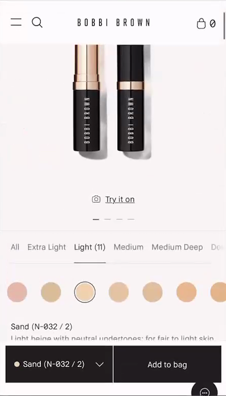
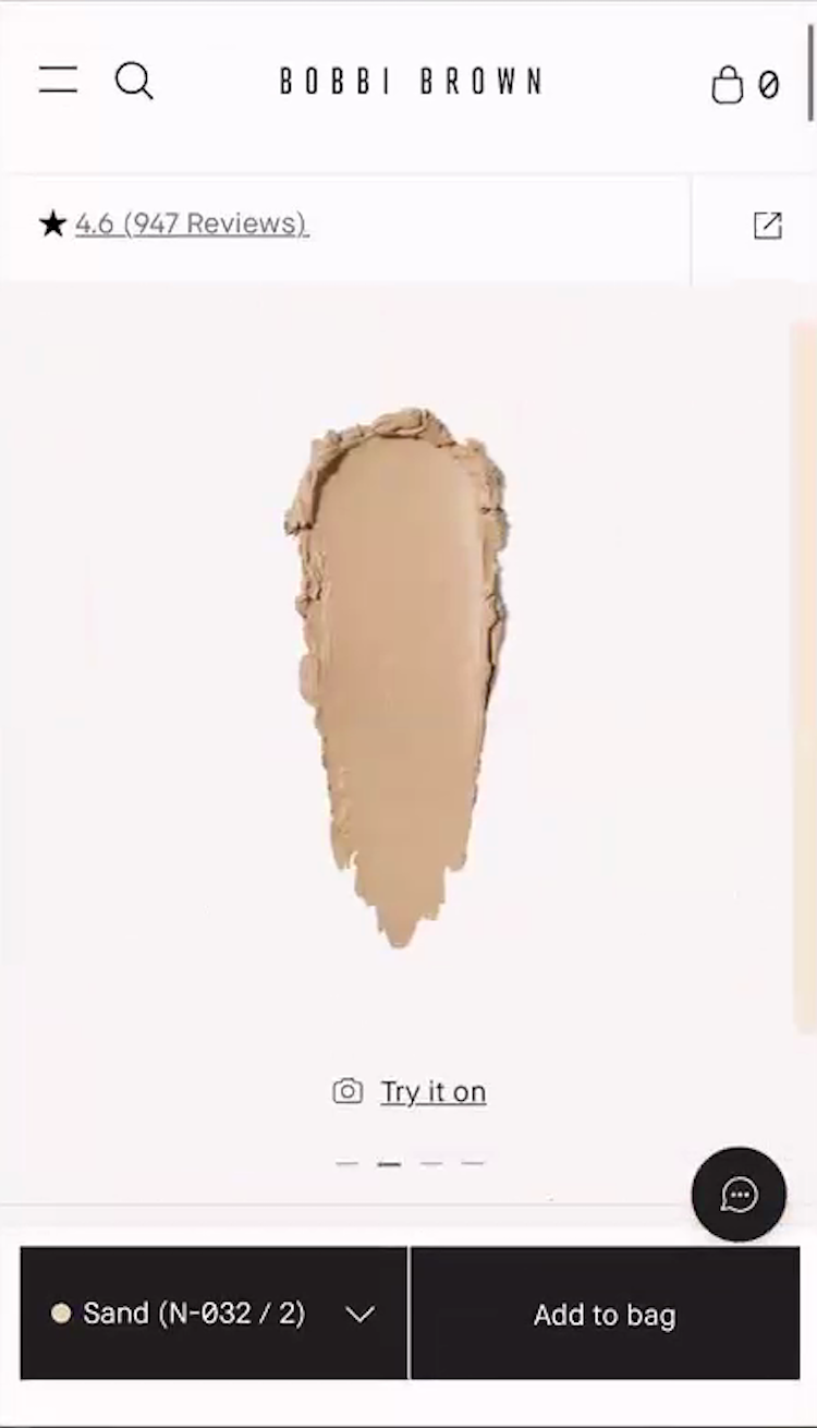
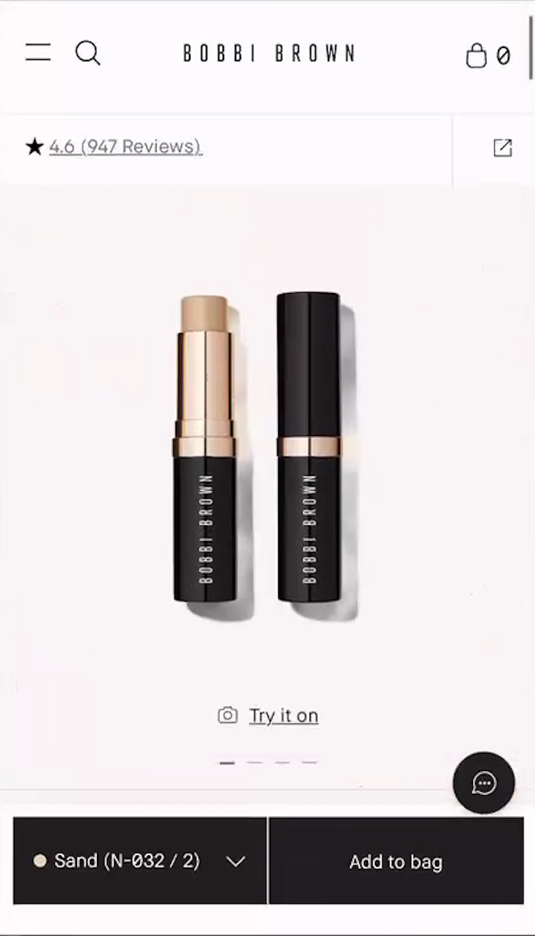
“Trying to see how it would look on my skin,” complained a participant at Bobbi Brown Cosmetics, who opened the shade finder tool after realizing that none of the foundation stick shades were shown on real skin (iOS, first and second images). Note that on mobile, the lack of a shade overview was even more frustrating because every time she selected a shade she had to scroll up to view it in the image gallery (third image), repeating this for each shade option.
Notably — especially relative to general ecommerce — only having a few “Cut Out” product images will cause some users to abandon.
As one participant complained, “I don’t love the images that they’re providing, because they don’t even have photos of people’s faces.”
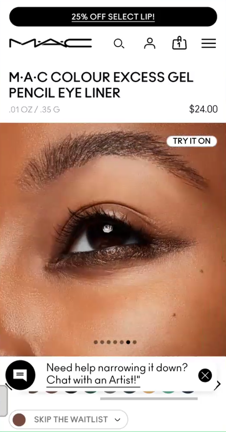
”And then it’s also showing different shades, which is also what I like!” A participant at MAC Cosmetics (Android) was enthusiastic about images showing the eye liner shade she was viewing applied on “Human Models” with different skin tones.
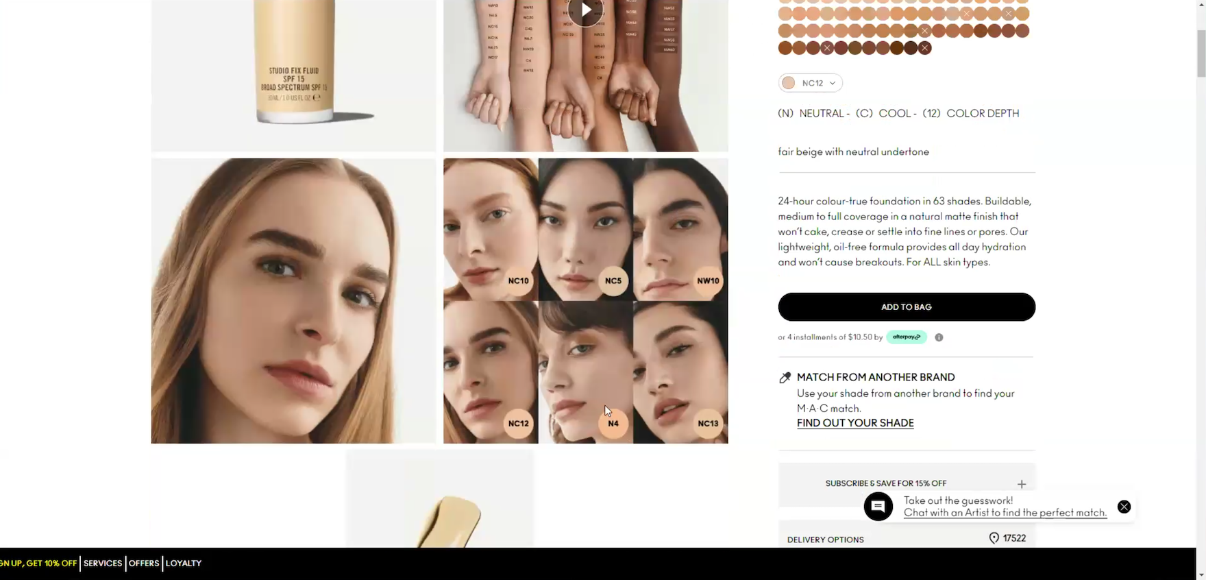
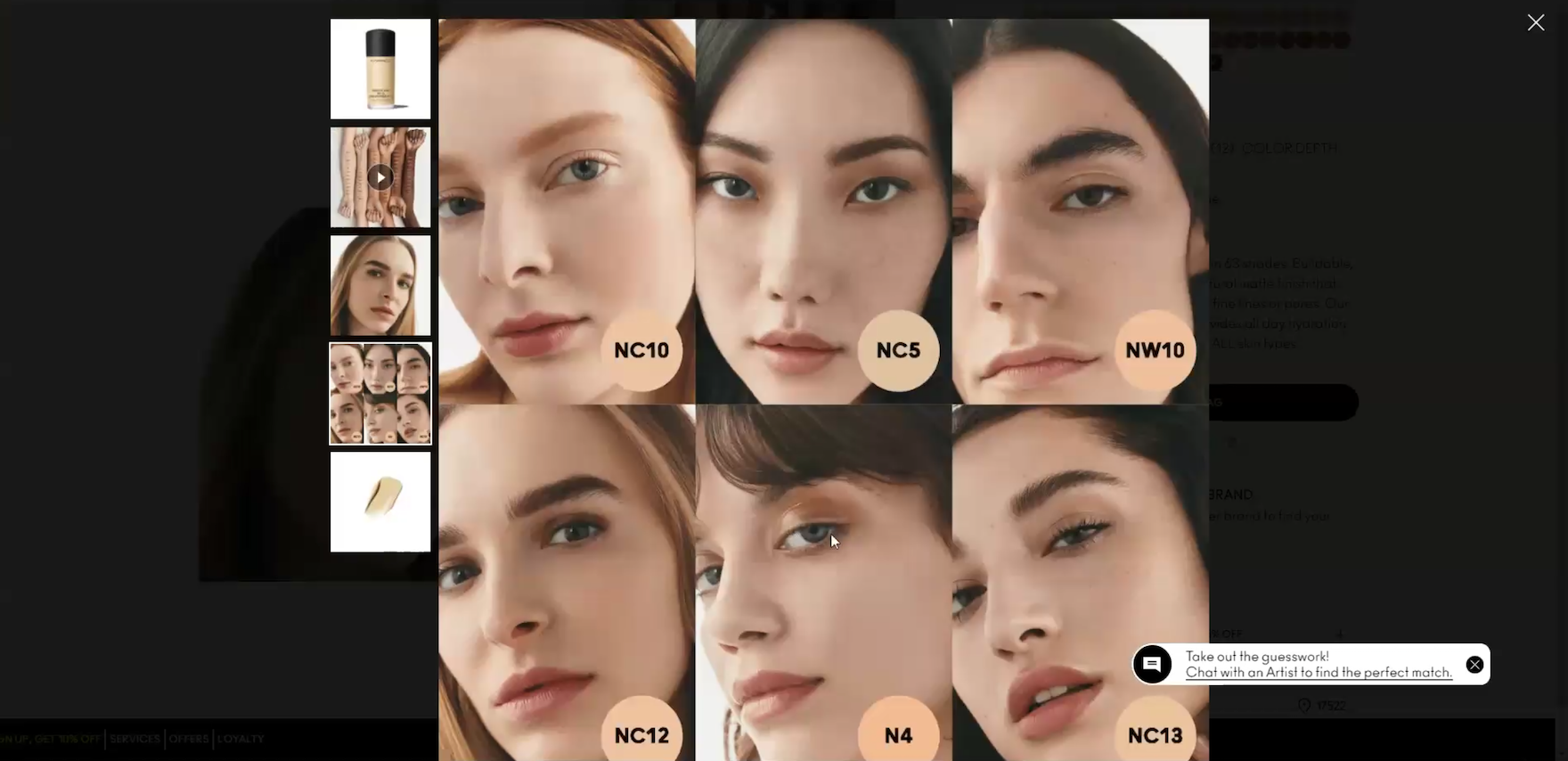
”I like the models on this one with the different shades! So I would definitely probably choose one of these”, exclaimed a participant viewing a foundation at MAC Cosmetics (first image). She clicked to get a closer look at the models’ skin tones and selected the best match for herself (second image): “I would go by what would match my skin tone the best — ‘N4’”.
During testing, participants looked for a variety of high-quality image types that included “Applied Makeup” images of the product worn on the intended area of the body (guideline #3171), “Human Model” images featuring each individual shade on a matching skin tone (guideline #3174), and “Arm Swatches” that showcased the entire shade range across multiple complexions for a side-by-side comparison (guideline #3177).
When sites fail to bridge the gap between a digital swatch image and the product’s actual appearance on a real complexion, users face high levels of “shade anxiety”, often leading to site abandonment or a detour to social media for more reliable images — risking that they don’t return to complete the purchase.
Provide Clear Product Labeling and Product-Finding Features
Selecting the right makeup color online is a high-stakes decision because users can, at best, only approximate how a shade will actually look against their own complexion.
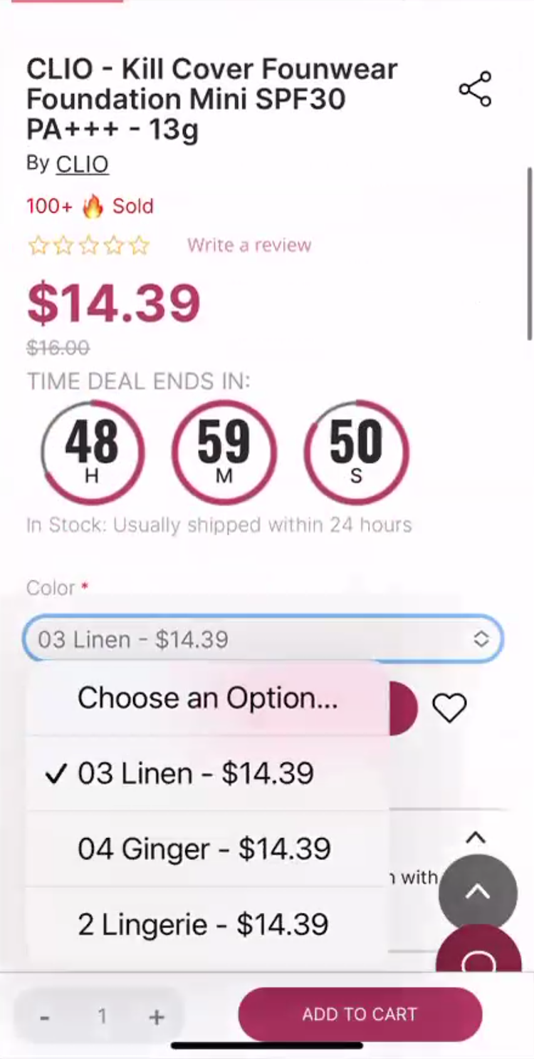
“Well! For one thing it doesn’t have the undertone information as far as ‘medium, tan’, if you’re ‘warm’,” remarked a participant at Stylevana (iOS) while looking at the shade options for a foundation. The use of fantasy color names such as “Linen”, “Ginger”, and “Lingerie” didn’t clearly convey the exact shade or undertone color to her. Frustrated by this lack of guidance as well as other issues trying to determine the right shade, she gave up on the product: ”Yeah, I don’t know.” Note that drop-downs should be avoided for selecting shades.
This is made more difficult by the lack of consistent shade naming across brands — for example, a “Medium” foundation in one brand’s lineup might be deeper or warmer than a “Medium” in another, causing users significant uncertainty when selecting a shade.
This challenge is compounded by complexion products where users must select not just a shade level, but also an undertone like “cool”, “neutral”, or “warm” to correctly match their skin tone (see guideline #3180).
“Shopping online for this, it’s just an even bigger kind of an ick from this product because it’s not describing what the shade is,” commented a participant dissatisfied with the shade labels for a complexion product.
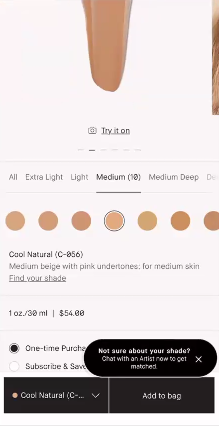
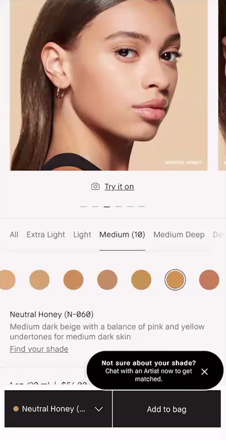
”So I’m looking at the name as well as the description. I have a tendency to have a bit of a cooler undertone — cooler to neutral — so anything that has ‘tan’ or anything like that I try to stay away from! Anything that says ‘beige, neutral’ is more up my alley — so like ‘Cool Natural’”, noted a participant as she read through foundation shade descriptions at Bobbi Brown Cosmetics (iOS, first image). She explained how she used the shade description in tandem with the “Human Model” image to narrow in on a match (second image): ”And then I’m looking at the model to see if she looks like my skin type…we’re getting closer, here we go…All right, ‘Neutral Honey’ with ‘Medium dark beige with a balance of pink and yellow undertones for medium dark skin’. I think that this would be perfect for me!”
Clear product naming (for example, in the form of shade descriptors) are essential to help users identify the actual color of each shade.
These plain-language labels provide necessary context that is often missing when brands use alphanumeric codes like “4N1” or “fantasy names” like “Linen” or “Tahoe”.
“I don’t like this because they’re not giving me a description of the shade! It’s fine that there’s a code, but then I would expect it to say like ‘light with neutral’…This is overwhelming to me right away!”
Indeed, a participant confused about the shade description simply gave up on the product: “This is overwhelming to me right away!”
For complexion products, these descriptors should include both a shade level and an undertone — such as “medium with olive undertones” — to help users distinguish between subtle variations.
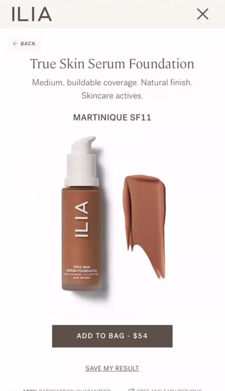
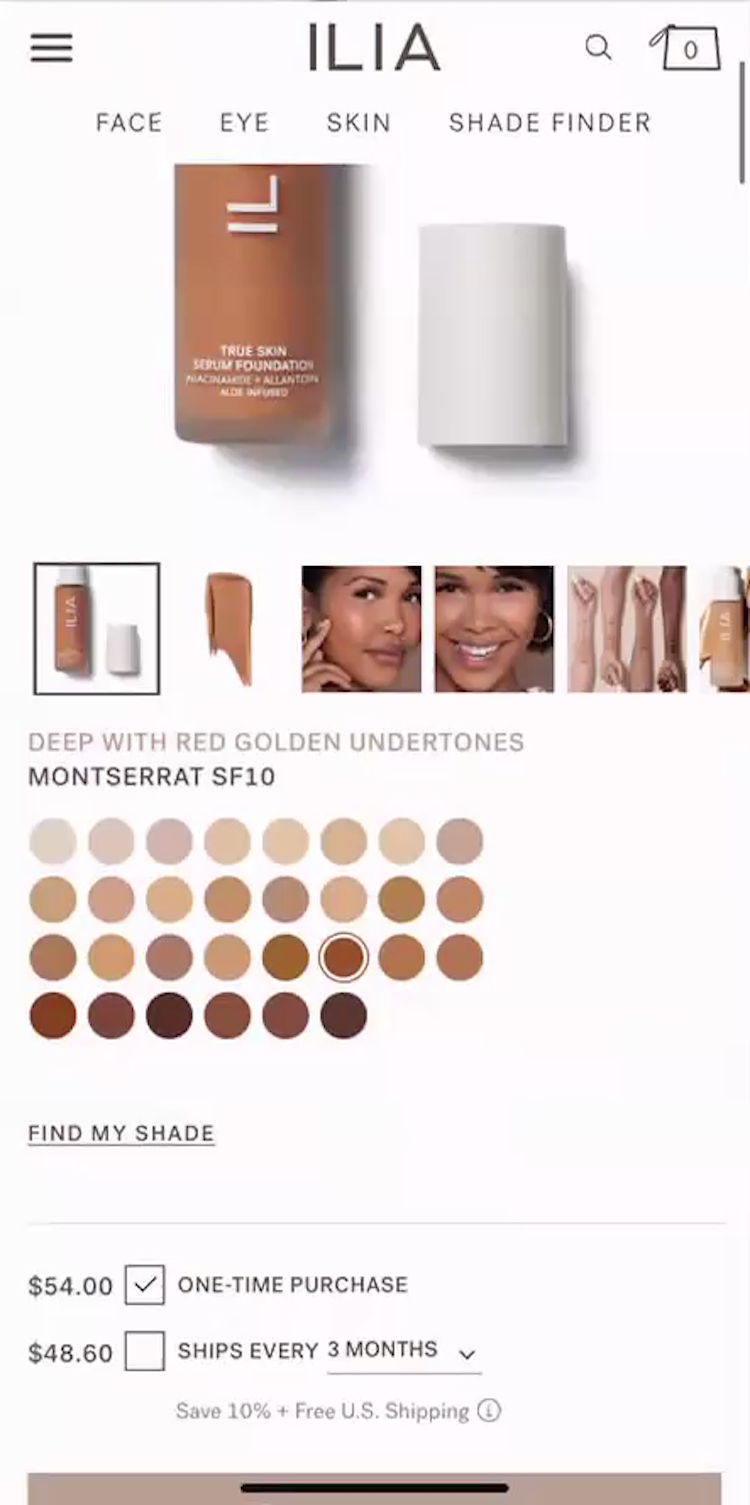
”So my shade is ‘Martinique’.” A participant at Ilia Beauty received a recommendation for “Martinique SF11” from the foundation shade-finder feature (first image). She dismissed the screen by tapping on the “X” — one of several ways to exit — and noticed that the shade on the product page was different (second image): ”That’s not the shade y’all gave me.” She began tapping through the shade swatches to find her match and grew frustrated with the effort: ”This is a lot of work to go through each one!”
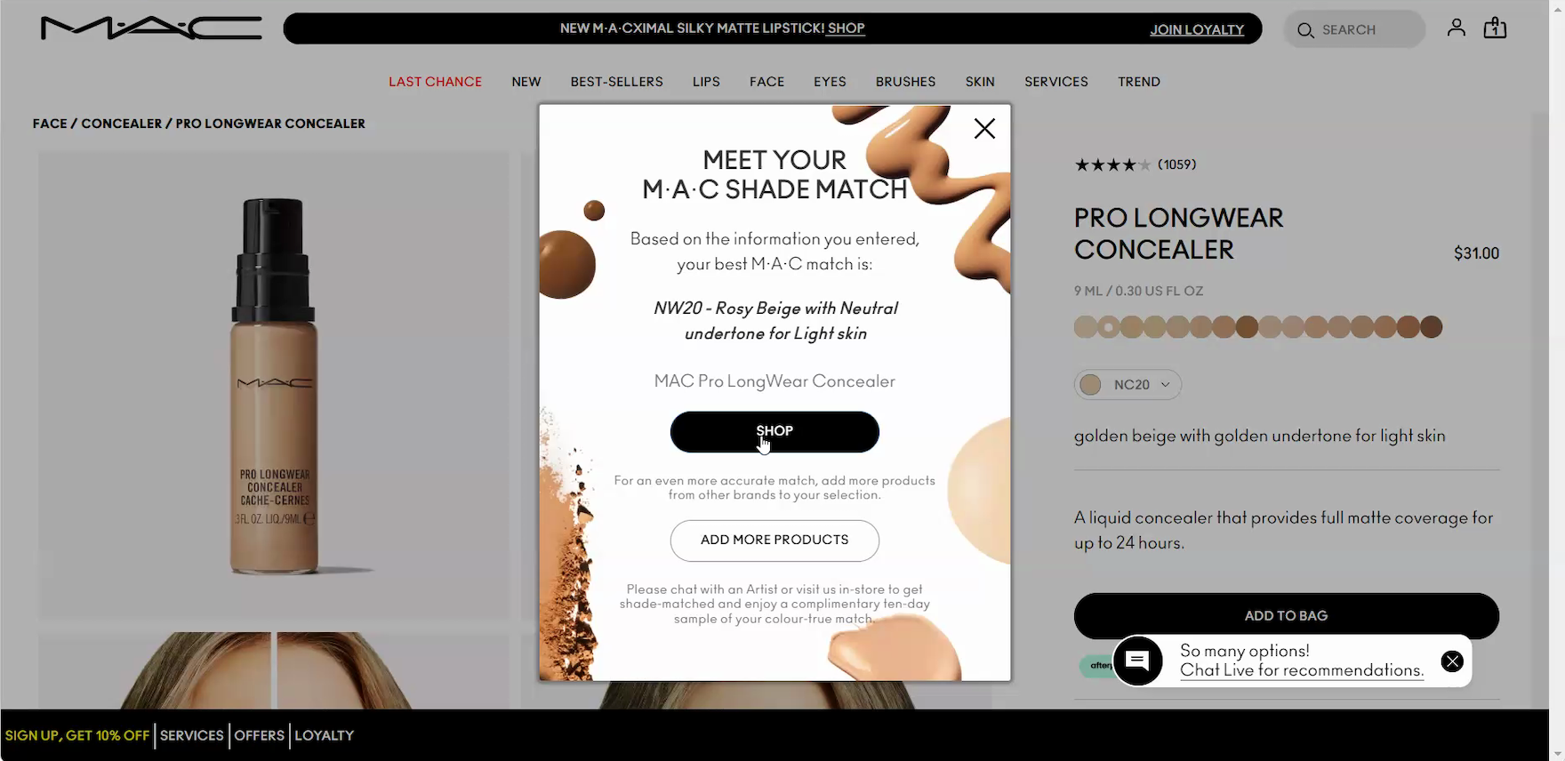
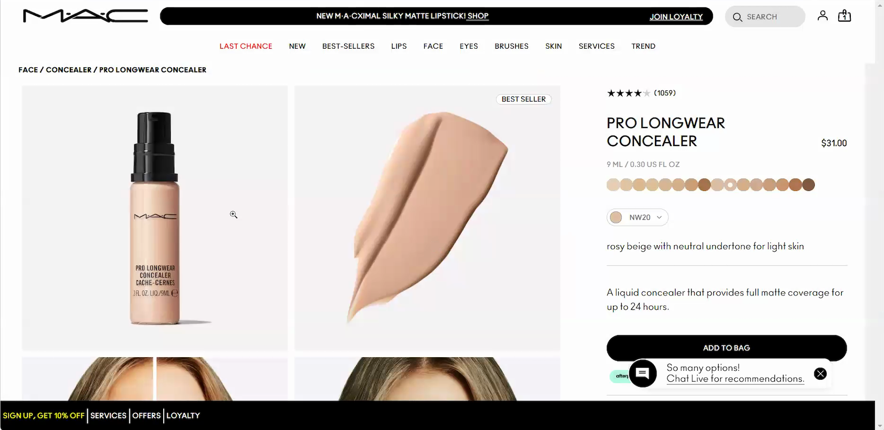
”Interesting, it’s saying a different shade than I thought. So I’ll press ‘Shop’ with that.” A participant vacillating between 2 shades at MAC Cosmetics was intrigued by the shade-finder recommendation (“NW20”) and clicked the “Shop” button in the overlay to view the recommended shade on the product page (first image) where the matched shade was automatically displayed (second image).
Additionally, to help simplify these selections, users often rely on shade-matching features like shade finders and virtual try-on tools (see guidelines #3186 and #3239).
These tools help users find a shade match or confirm their initial choice.
When they are missing, users may abandon the purchase rather than guess at their shade.
This struggle is especially acute on mobile, where limited screen real estate often separates shade details from product images.
This makes side-by-side comparison very difficult, forcing users into a cycle of scrolling and memorization that adds friction to an already complex decision.
Build User Confidence through Social Proof and Reciprocity
Once a makeup product is selected, users rely on reviews to see how its color and formula perform in real life.
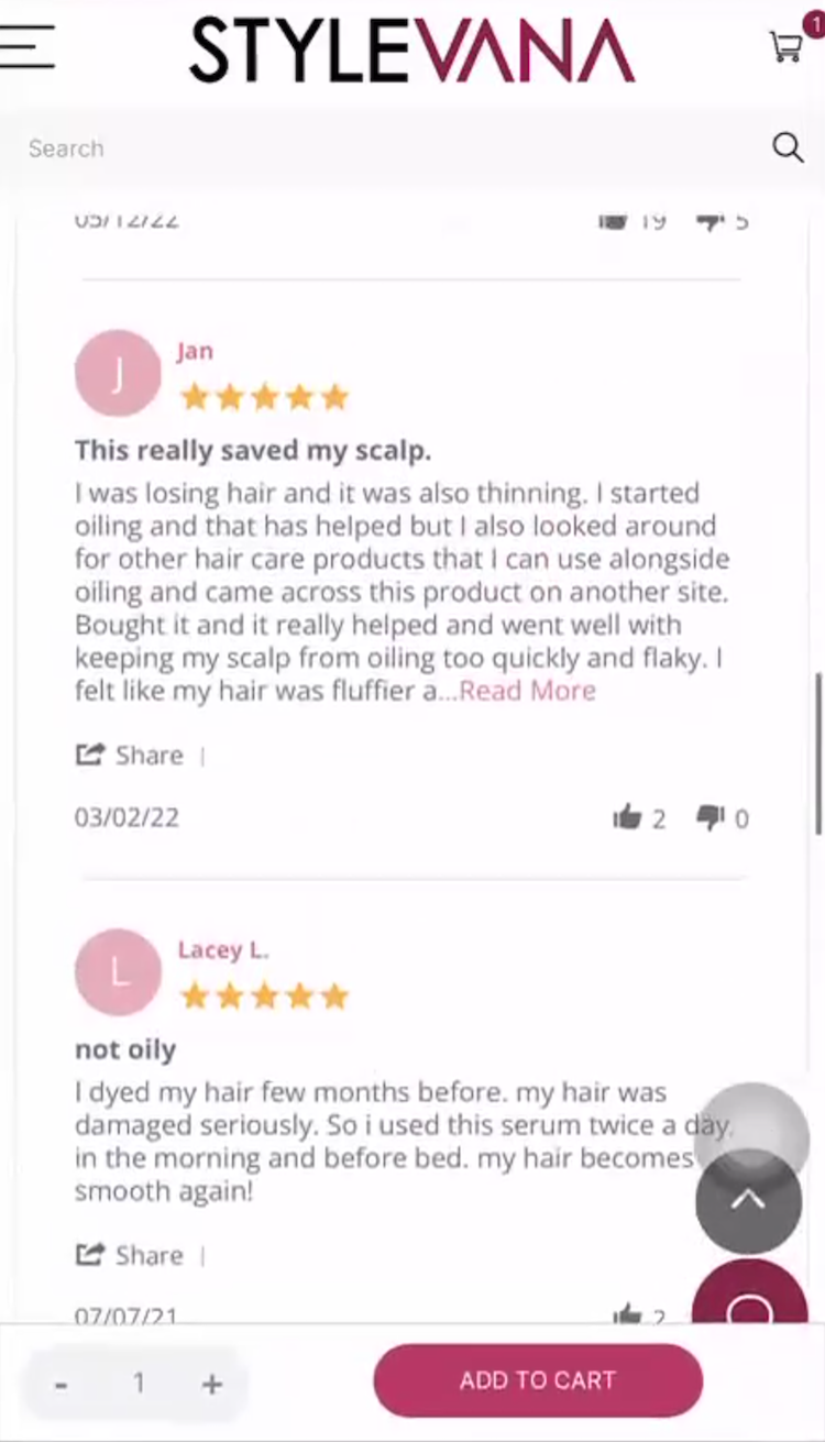
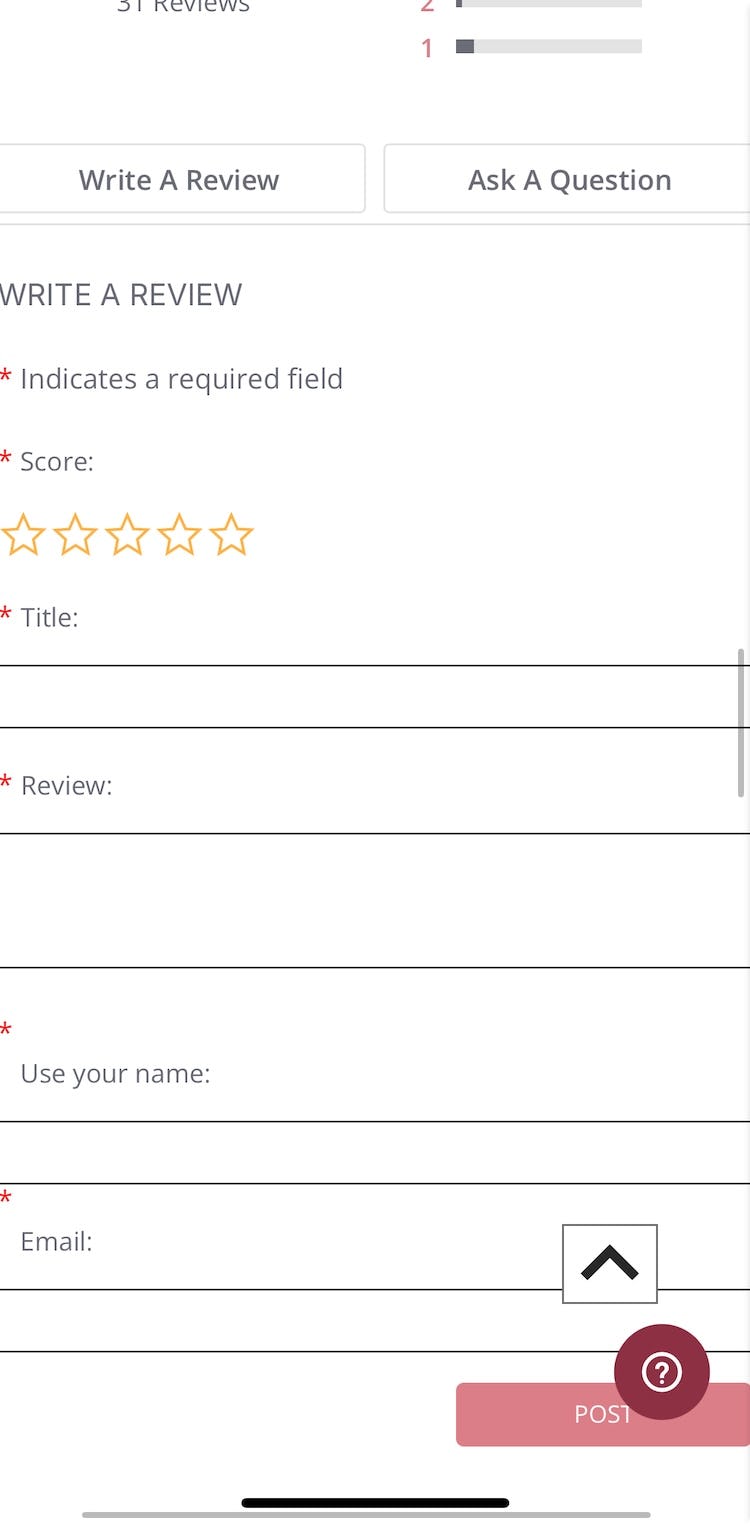
”On this one, I would like to see what type of hair this person has…That would be one thing I’d be concerned about, because I’m not sure what type of hair they have.” Despite a hair serum’s positive reviews, a participant at Stylevana (iOS) was frustrated that reviews didn’t include information on the reviewer’s hair type (first image). Since the site didn’t collect reviewer attributes in its review form, this context was missing (second image; taken by the researcher after testing concluded). The participant explained that in cases like this, she would turn to YouTube: ”This is when I would go on YouTube and search for this product.” Forcing users to seek additional review information off-site risks that they won’t return.
In the health and beauty category, a high star rating is often less influential than the reviewer’s specific beauty profile.
Because a product’s color and texture can look and feel different on everyone, seeing a reviewer’s age, skin type, or eye color allows users to find feedback from people with similar characteristics (see guidelines #3195 and #3192).
“That’s awesome that they give the description of the person and what kind of skin they have, because you can see if it relates to you, if it goes with your skin,” extolled a participant.
Surfacing these specific details allows users to scan for relevant advice from reviewers with similar beauty attributes, enhancing their confidence about the product and increasing the likelihood of purchase.
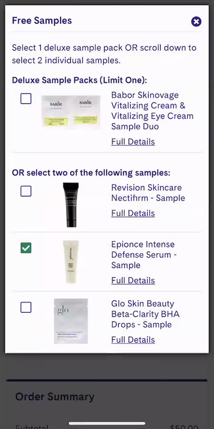
”Oh, and it says ‘Choose 2 Free Samples’ — free is always good!…I’m being rewarded for spending money. So essentially, I didn’t really spend money!” A participant at LovelySkin (iOS) was gleeful about the complimentary samples offered in her cart, describing them as a reward from the site for her purchase.
The checkout process offers a final chance to leave a lasting impression.
In the health and beauty industry, complimentary samples are an effective way to reward users for their purchase and build stronger loyalty to the site or brand (See guidelines #3251, #3245, and #3242).
“I love free samples!” health and beauty participants frequently exclaimed across testing.
When samples are prominently displayed with clear thumbnails and descriptions, they not only allow users to trial new products risk-free, but transform a routine transaction into a moment of delight that encourages them to return.
Replicate the “In Store” Experience as Much as Possible for Users
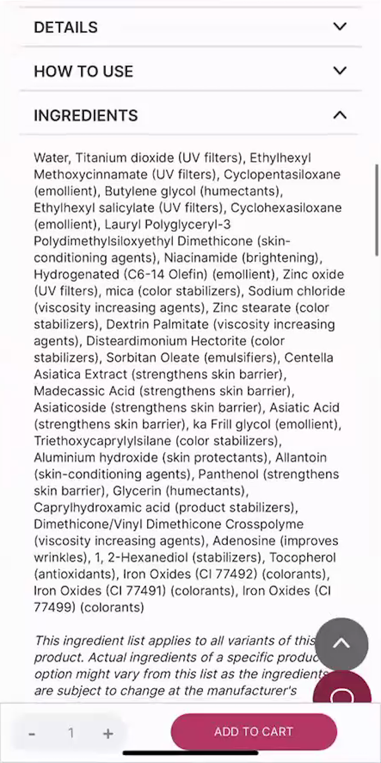
“Let me see what they have for the ingredients here…Doesn’t look like there’s any skin-nourishing ingredients in there unless I don’t know what some of these longer words are, which is definitely possible.” A participant was unable to identify any “skin-nourishing” ingredients for a BB cream at Stylevana (iOS) — even though a good dozen, such as “Panthenol (strengthens skin barrier)”, did in fact meet that criteria. She turned instead to the reviews and ultimately decided against adding the product to her cart due to this and other aspects around how the product information was presented: ”I probably wouldn’t add that to the cart.”
For many products, shopping online isn’t fundamentally different from shopping in-person.
For example, a user considering purchasing a computer monitor from a site can use product images, videos, and descriptions (e.g., dimensions information) to approximate the in-store experience — and thus proceed relatively confidently with their purchase.
On Health and Beauty sites, testing showed that the disconnect between shopping online and shopping in person was even greater than it is for other general ecommerce products.
At a physical store, a customer can actually test the product on their body — and get a great sense of whether the product will work for them.
Of course, this experience isn’t possible online — and thus Health and Beauty sites have to be diligent about providing the visuals, information, features, and “perks” that Health and Beauty users will turn to when trying to make a purchase decision.
As our testing shows, this should be a key area to focus on when improving UX design for Health and Beauty sites.
Getting access: all 490+ Health and Beauty UX guidelines are available today within Baymard. (If you already have access through an account, open the Health and Beauty UX study).
If you want to know how your Health and Beauty desktop and mobile site performs and compares, then learn more about getting Baymard to conduct a Health and Beauty UX audit of your site.