Key Takeaways
- Users voraciously consume product images to validate a site’s depiction of the product and view products in real-world contexts
- Customer reviews with images are like gold, but many sites require users to painfully sift through pages of reviews to uncover these visual nuggets
- Instead, sites should provide all user review images in a single collection, available from any review image users open
Many users like to move through reviews quickly, scanning and skimming for the information they seek across a set of reviews rather than focusing on a single review at a time.
Some use a similar approach with reviewer-submitted images, wanting to rapidly peruse all the uploaded visuals to inspect or confirm specific details or patterns.
Yet Baymard’s large-scale testing reveals that many sites constrain participants to navigating only the images within a single review, frustrating users with the extra work required to see these critical product visuals.
This article will discuss Baymard’s Premium research findings that uncover:
- Why laborious hunts for reviewer-submitted images can hinder users’ purchase decisions
- How to easily provide access to all reviewer-submitted images on desktop and mobile sites
Reviewer-Submitted Images Are Difficult to View Efficiently


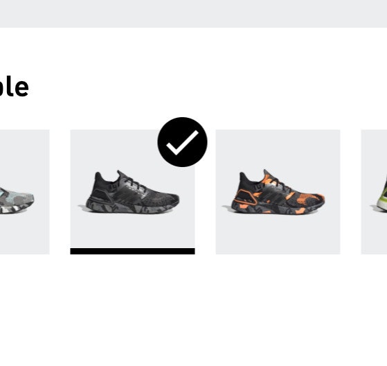
“And so [when I try to scroll] it’s just showing me the same picture. I like when it will show you more pictures.” At Article, this iOS participant clicked into the images within the individual reviews (first image), expressing frustration that she couldn’t view the 50+ available reviewer-submitted images within the same overlay (second image) like she could on a previous site.

To see all the reviewer-submitted images at Bob’s Discount Furniture, this iOS participant had to click in and out of each review individually to see the images up close.


“One last thing I want to do is look at product reviews…I do like seeing these extra pictures that other customers have uploaded.” This iOS participant at Ashley scrolled down and spotted an image in a review (first image), next clicked on it to view it closer (second image), and then closed out of the image and returned to the reviews to look for the next review with an image.
In testing many participants wanted to gather as much visual information about products as possible.
Users will thus gravitate to different areas of the product page where they expect to see images, such as the main image gallery, social media carousels, or the reviews section.
Up to 95% of users across desktop and mobile devices consult reviews when considering a product, so providing easy access to reviewer-submitted images is valuable.
Users rely on customer images to validate that site photos are truly representative of the product, and often judge these submissions (even if lower quality) as more objective, reliable, and trustworthy.
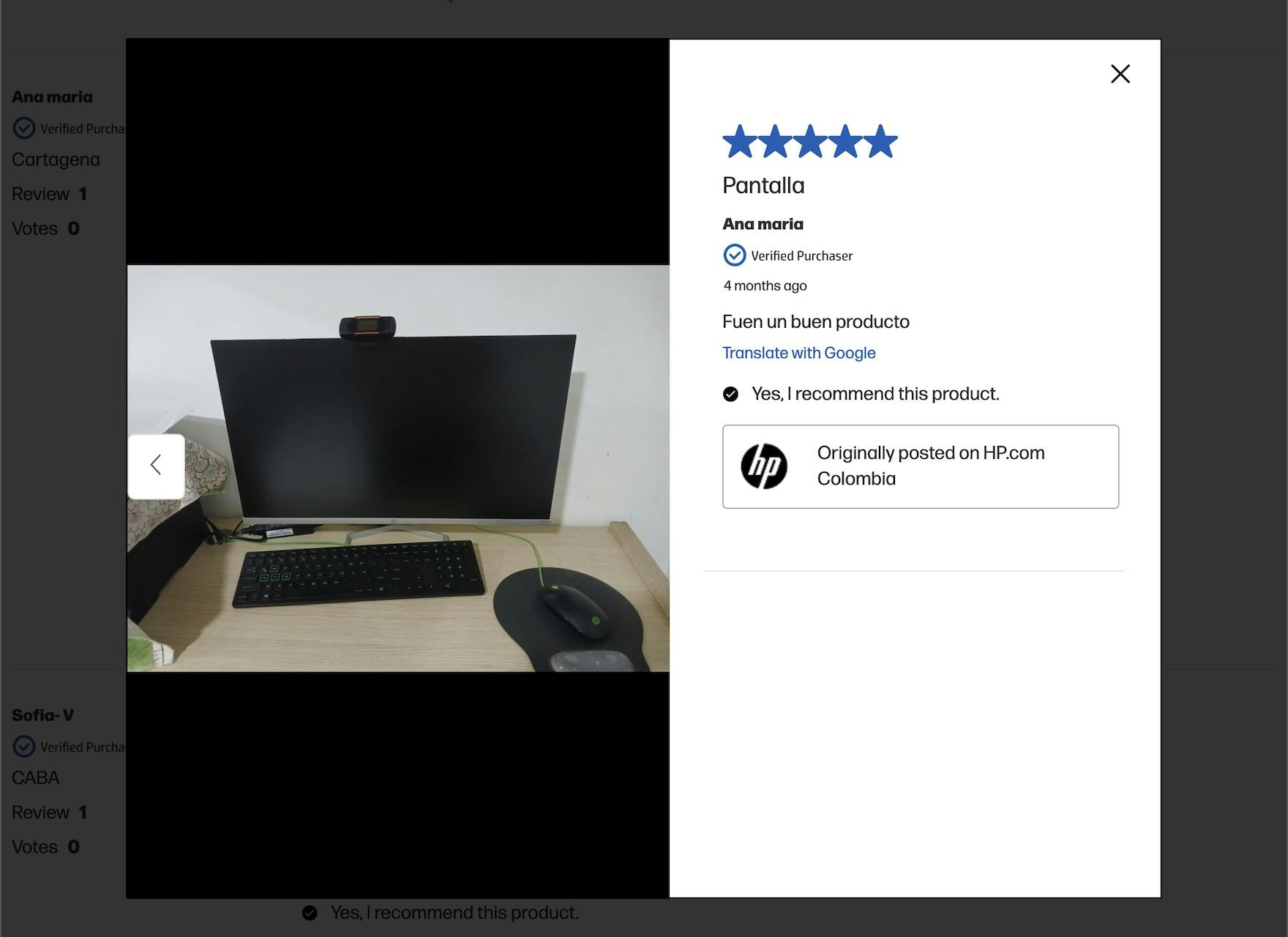
At HP, when viewing photos opened from the review, users can only see photos from that review and cannot traverse images from one review to another. This makes the task far more arduous than it needs to be.
However, many sites do not offer a way to easily view and navigate across all images uploaded to reviews, instead requiring the user to hunt for those that contain image thumbnails and then click in and out of each review individually.
When sites don’t offer an easy way for users to navigate across reviewer-submitted images, users can grow tired of this time-consuming task and possibly abandon a product that is suited to their needs.
Provide Access to All Reviewer-Submitted Images from Any Image Opened


“I like when they do this, how you can slide in the pictures, and go from one review to the next, and just see all the reviews that include pictures. I do like when they do that.” This iOS participant at Lamps Plus gave a gasp of delight when she swiped on the image of the chair in a flowered print (first image), and was taken to an image from a different reviewer (second image).

“Customer photos! ‘Cause you don’t know what it looks like until a customer puts it in their room.” The desktop site for the same Lamps Plus brand made it just as easy for a participant to browse images from reviews as the mobile site in the example above. Users can scroll across images in the carousel on the product page, or click on an image within a review and then scroll to the next image within the same overlay.


“I’m just gonna check the reviews and look at customer photos. Seeing it on real people is very helpful.” This participant at Express clicked into a reviewer-submitted image, opening up a closer view of the picture with the review displayed alongside (first image), and was then able to navigate to the next image from a different reviewer in the same overlay (second image). The images were accompanied by the full text of the associated review, along with key reviewer insights like the perceived level of comfort, quality, and whether it fit as expected.


At B&H Photo, users can open the reviewer-submitted photos from a single review or the image gallery available in the Reviews section, and then easily click to the next review with photos. Here we see the last photo from one review and the first photo from the next review that has photos.
In testing participants appreciated when sites allowed them to easily traverse the reviewer-submitted images across reviews.
Many users like to scan quickly through review images, similar to how they approach the reviews themselves.
As not all reviews contain images, sites must offer a way for users to seamlessly navigate through images and their associated reviews without impacting the main reviews feature.
In particular, participants appreciated when clicking on an image within a review launched an overlay with an image carousel allowing them to move directly through all the images submitted with customer reviews.
Thus, users should be able to progress through the image carousel using manual controls like arrow navigation or touch gestures on mobile.
Touch gestures are particularly important on mobile sites and apps — for example, the “swipe” gesture to change to the next slide — as users have come to expect them.
Further, carousels should still be implemented with traditional controls (such as arrows, “next” or “previous” buttons, or slide indicators), but testing showed that these should be provided in addition to supporting gestures on mobile, not in place of them.


“It makes it so easy to picture it, that looks comfortable.” A similar implementation at Raymour & Flanigan allowed this iOS participant to view the images from one review (first image) and then immediately navigate to the images from a different review (second image). She added the product to her cart next without ever reading any of the accompanying review text.
Clearly visible controls should be placed on either side of the carousel or on a slight overlay, and they should be large enough to be noticed immediately and contrast well with the background.
The overlay should include the review text, as well as any key review attributes, such as the variation and the date of review.
Alongside the images, sites should also include any product-specific attributes that could help the user better interpret the visual, like the reviewer’s size for apparel products.
Lastly, a prominent close element will help users exit without issue, but users should still be able to use the Back button to exit the overlay.
Avoid Only Providing Access to All User Images from the “Review Gallery”
Additionally, testing revealed that some sites allow scrolling images across reviews when an image is opened from the gallery of reviewer-submitted images, but when an image is opened from within an individual review users can only scroll images within that review.
The latter implementation should be avoided; users expect to scroll across all reviewer-submitted images within the same overlay, regardless of how they access the first image.
Even if multiple entry points exist to help users access reviewer-submitted images, each one should still offer the same one-step click or swipe navigability across a single-stream of images from different reviews.
Enhance Trust with Easily Traversable Reviewer-Submitted Images

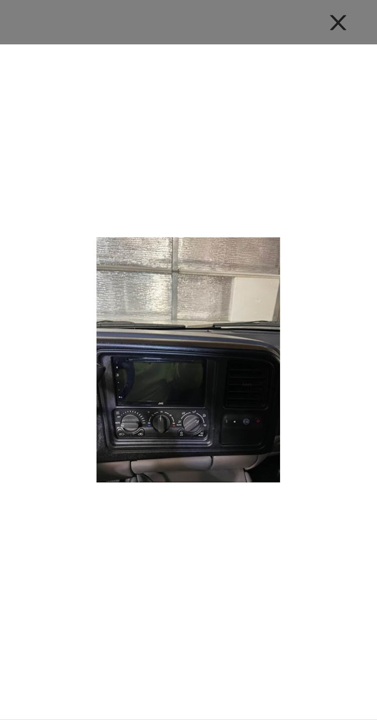
At Crutchfield, users cannot navigate between different reviews within an image viewer and must exit a review to find another review with images.
Although product images provided by websites deliver the essential information that most users rely on before making a purchase, a degree of skepticism often persists.
Users recognize that websites aim to showcase products in the most appealing manner; however, many also realize that this “enhancement” can sometimes be deceptive, creating a more favorable or unrealistic impression of the products than what exists in reality.
And on mobile, where 76% of sites make it hard to find additional product images, providing users with a way to easily traverse reviewer images is even more important.
Thus, reviewer-submitted images inform the buying decision by filling information gaps and validating product details, so sites should avoid frustrating users with the tedious experience of hunting for valuable customer photos.
Given our testing shows that up to 95% of users consult user reviews while considering purchases, it makes sense to ensure this high-value task is efficient.
This article presents the research findings from just 1 of the 700+ UX guidelines in Baymard – get full access to learn how to create a “State of the Art” ecommerce user experience.
If you want to know how your desktop site, mobile site, or app performs and compares, then learn more about getting Baymard to conduct a UX Audit of your site.