Key Takeaways
- Sites don’t always allow users to accurately assess the suitability of apparel items, in fact, 90% of sites neglect one or more key aspects
- Users who don’t feel confident about the appearance, size, or fit of an item may abandon the site
- 5 UX best practices help ensure users have the necessary info to proceed with their apparel purchase
Key Stats
- 1,765 hours spent testing and analyzing Apparel & Accessories sites
- 1,720+ medium-to severe usability issues uncovered
- 500+ Apparel & Accessories guidelines available in Premium
Unlike physical stores, where apparel products can be handled, tried on, and physically compared to other products, users shopping on apparel ecommerce sites must trust the site to provide accurate assessments of their products via images, descriptions, and interactions.
Indeed, the perceived risk of purchasing an article of clothing that doesn’t fit properly is much greater when shopping online vs. when shopping in person.
When also accounting for things like delivery (and potentially) return times, it is understandable why some users are still hesitant to purchase apparel online.
Therefore, it’s critical that apparel sites provide users with everything they need to make a confident purchasing decision.
Yet Baymard’s Premium research findings and ecommerce UX benchmark show that 90% of sites neglect one or more key aspects of the apparel-purchasing process.
As a result, some users will abandon an apparel purchase simply because they don’t have the necessary information to make a purchase decision.
In this article we’ll walk through 5 UX best practices for apparel sites:
- Provide sufficient sizing information (82% don’t)
- Always allow users to navigate across user reviews via reviewer-submitted images (90% don’t)
- Always use buttons for each size variation (70% don’t)
- Provide images of apparel products on a Human Model (21% don’t)
- Always provide an aggregate “Fit” subscore in the reviews (24% don’t)
1) Provide Sufficient Sizing Information (82% Don’t)
For apparel products, selecting the correct size is a highly important aspect of the purchase.
Our large-scale testing of apparel ecommerce sites showed that users can be hesitant to purchase a product if they’re not confident in its sizing.
Furthermore, if the correct size is not easily discernible, users may leave the site to find this information, risking that they do not return.

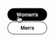
“So this one I’ll need the ‘Size Chart’…not too helpful. It’s just basic European to US [conversions]. So I’ll have to kind of take a chance.” At Hush Puppies, a participant who wanted to verify the measurements for a pair of loafers (first image) was unable to because the “Size Chart” only provided a conversion key for country-specific sizing — and no measurements (second image).
Indeed, during both desktop and mobile UX apparel usability testing, uncertainty around sizing was a common cause for abandoning a product.
Moreover, a product that does not fit — whether it’s a t-shirt or an evening dress — will need to be returned, causing significant hassle and disappointment for the user and strain on the site’s customer support.
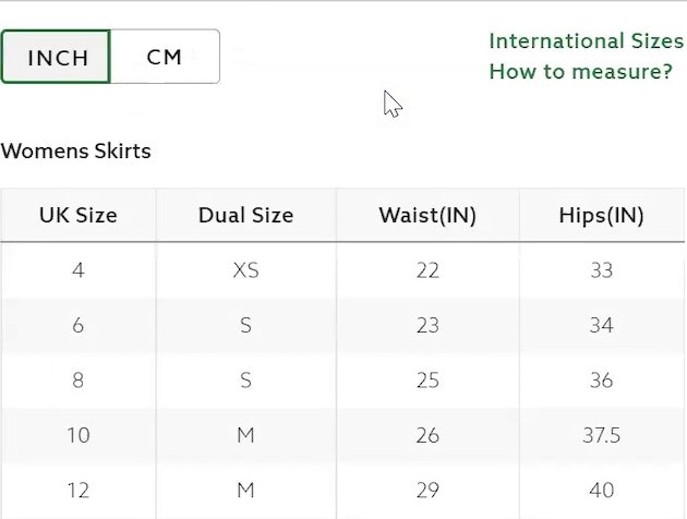
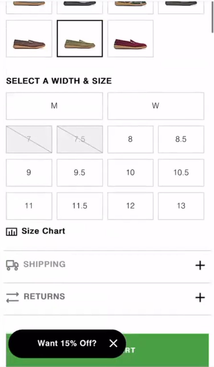
The “Size Guide” on Pangaia only lists product measurements in centimeters. Users more familiar with inches — as well as the many users who don’t know the measurements of their favorite garments — are likely to have a difficult time determining which size to purchase.


“This one will look perfect with the black pants and they do have my size. Oh, let me check their ‘Size Chart’ just for clarification.” A participant at Madewell who wanted to double-check that a bodysuit in “Large” would fit her (first image) was easily able to verify her size in the “Tops Size Chart” (second image) and added the item to her cart: ”I’m a ‘12’. Okay! Perfect, perfect.”
Our Apparel & Accessories research reveals there are 10 details to get right to ensure sufficient sizing information is provided:
- Provide conventional sizing information
- Provide numeric sizing information
- Provide measurements in both inches and centimeters
- Provide international size conversions
- Provide instructions and tips for taking accurate measurements
- Ensure sizing and measurement information matches the product type
- Include a link to the “size guide” near the size selector
- Support for users’ expectations for “Back” buttons
- Include a link to customer service in the size guide
- Consider including measurements of human models
However, our apparel ecommerce UX benchmark shows that more than 80% of apparel sites fail to provide sufficient sizing information — risking that users abandon their site.
2) Always Allow Users to Navigate across User Reviews via Reviewer-Submitted Images (90% Don’t)
Many users like to move through reviews quickly, scanning and skimming for the information they seek across a set of reviews rather than focusing on a single review at a time.
Some use a similar approach with reviewer-submitted images, wanting to rapidly peruse all the uploaded visuals to inspect or confirm specific details or patterns.


At Nike, users who tapped into the images of a hoodie within the individual reviews (first image) were not able to view all available reviewer-submitted images within the same overlay (second image).
Yet our testing reveals that many sites constrain participants to navigate only the images within a single review, frustrating users with the extra work required to see these critical product visuals.
Users rely on customer images to validate that site photos are truly representative of the product, and often judge these submissions (even if lower quality) as more objective, reliable, and trustworthy.
In testing participants appreciated when sites allowed them to easily traverse the reviewer-submitted images across reviews.


“I’m just gonna check the reviews and look at customer photos. Seeing it on real people is very helpful.” A participant at Express clicked into a reviewer-submitted image, opening up a closer view of the picture with the review displayed alongside (first image), and was then able to navigate to the next image from a different reviewer in the same overlay (second image). The images were accompanied by the full text of the associated review, along with key reviewer insights like the perceived level of comfort, quality, and whether the item fit as expected.
In particular, participants appreciated when clicking on an image within a review launched an overlay with an image carousel that allowed them to move directly through all the images submitted with customer reviews.
Thus, users should be able to progress through the image carousel using manual controls like arrow navigation or touch gestures on mobile.
Further, carousels should still be implemented with traditional controls (such as arrows, “next” or “previous” buttons, or slide indicators), but testing showed that these should be provided in addition to supporting gestures on mobile, not in place of them.


In testing participants appreciated when sites allowed them to navigate easily across reviews using reviewer-submitted images. Here at Macy’s users could scan quickly through review images, similarly to how they approach the reviews themselves.
Thus, reviewer-submitted images inform the buying decision by filling information gaps and validating product details, so sites should avoid frustrating users with the tedious experience of hunting for valuable customer photos.
Given that our testing shows that up to 95% of users consult user reviews while considering purchases, it makes sense to ensure this high-value task is efficient.
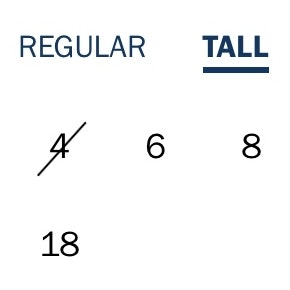
3) Use Buttons for Each Size Variation (70% Don’t)
Another important aspect of the apparel shopping journey to get right is the display and selection of product size options. Our testing revealed that, when presented as a drop-down menu, participants were prone to overlook the size selector entirely.
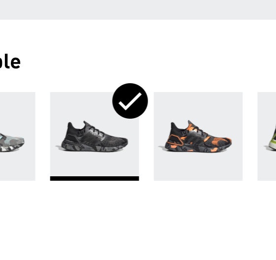
“These are cute!” A participant at Adidas found a pair of shoes she liked (first image) but couldn’t see that her size was out of stock until she interacted with the size drop-down menu (second image): “Oh, they don’t have my size.” Hiding sizes within a menu makes it harder to tell what sizes are in stock, which can set users up for disappointment.
Additionally, when participants did activate the menu, they were often surprised or disappointed by the sizes available.
In practice, some users who overlook the size selector risk triggering an avoidable error message.
Other users must check to see if their size is available for each variation under consideration — a potentially tedious task that often leads to users simply giving up.


A participant at Columbia Sportswear, interested in a jacket that came preselected in “Spring Blue” (first image) selected her size (“2X”) and in a single glance could determine which colors were available in her size (second image).
“This is clear as to what sizes there are.” At Marks & Spencer (UK), a participant was able to quickly work out what the available sizes were and easily picked her own size.
Therefore, instead of using a drop-down with the size options hidden by default, expose the size options by using button-like selectors to help ensure that these crucial product variations are easily seen by users.
Yet 70% of benchmark sites don’t implement buttons for size selection or don’t implement them correctly.
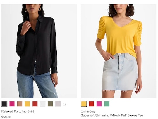
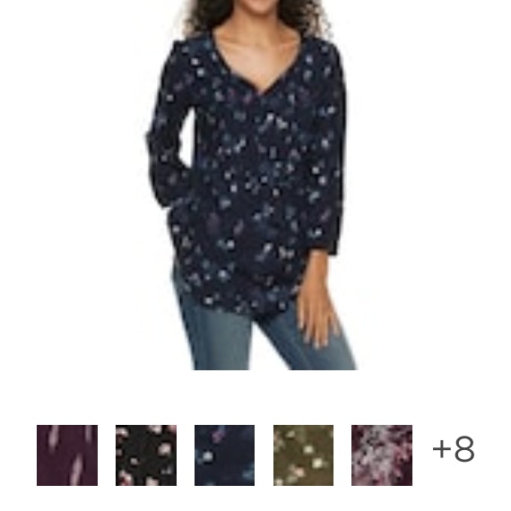
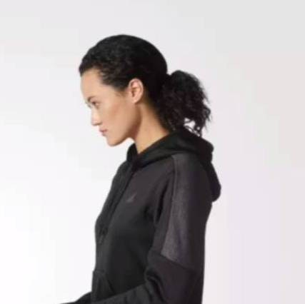
4) Provide Images of Apparel Products on a Human Model (21% Don’t)
Providing the right kind of apparel product images is essential to users’ ability to understand key visual details and make a purchase decision about a particular product.
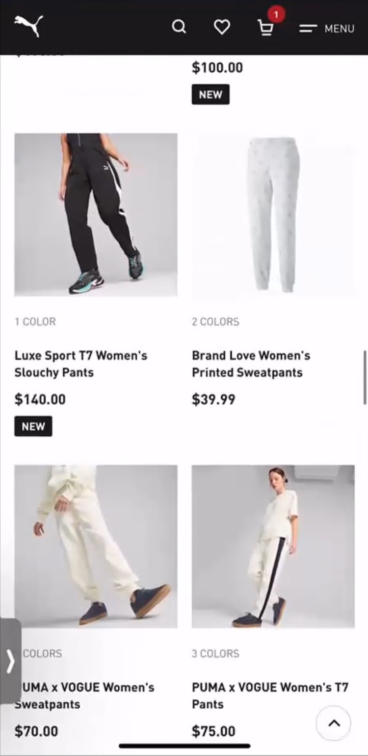
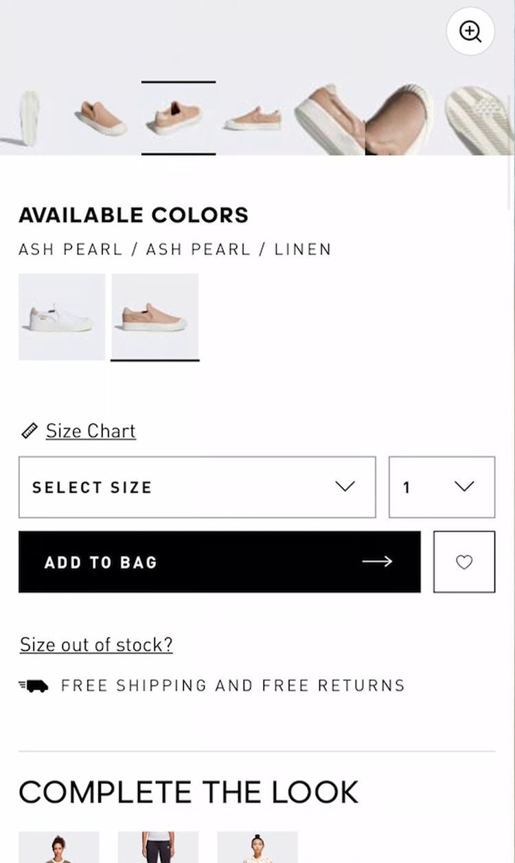
“I think it’s weird how they’re not modeled on the actual person.” This participant at Puma didn’t like that a pair of sweatpants was not featured on a “Human Model”. For this reason she bypassed the sweatpants despite her original interest in them: ”I’m just going to keep looking and see if there’s anything else that I like.”

“I think without the model that it’s hard to picture it. So that’s why I’m not really interested in seeing it. So I would prefer the one with the model.” Without an image showing a “Human Model” wearing this dress in the Urban Outfitters app, a participant was unable to evaluate it properly.
Indeed, our testing determined that, for apparel products, “Cut Out” images of the product against a white background are simply not enough for users to get a sense of the clothing’s physical qualities.
For example, users can’t easily judge how a dress would hang, how tightly a pair of jeans or a shirt would fit, or whether a skirt would fall above or below the knee.
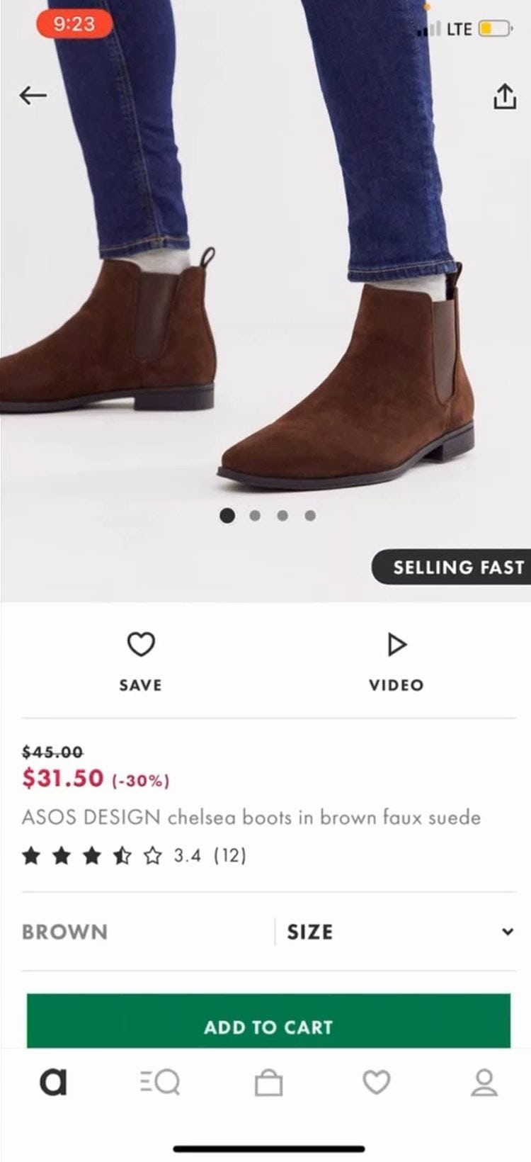
“The pictures are great and it’s got some really good close-ups and then showing someone wearing them. It’s nice.” Showing boots on a “Human Model” allows users, such as this participant on the ASOS app, to better judge their suitability.

“Likewise, Norstrom allows users to judge product features like length and fit because the products are shown on human models.”
Instead, apparel sites should provide “Human Model” images on the product details page.
Only with the context provided by seeing the apparel product worn by a “Human Model” can users come close to an in-store experience, as they’ll gain a better visual understanding of the product and feel more confident in purchasing it.
Without “Human Model” images, it’s left up to the user’s imagination to try to picture how a clothing or accessory item might look when worn — which for many users is not enough to make them feel confident enough to purchase the product.

“Having a mannequin in really boring clothes…it doesn’t make me want to buy this.” The bag on this mannequin on eBags failed to excite this participant, who found the mannequin styling off-putting.
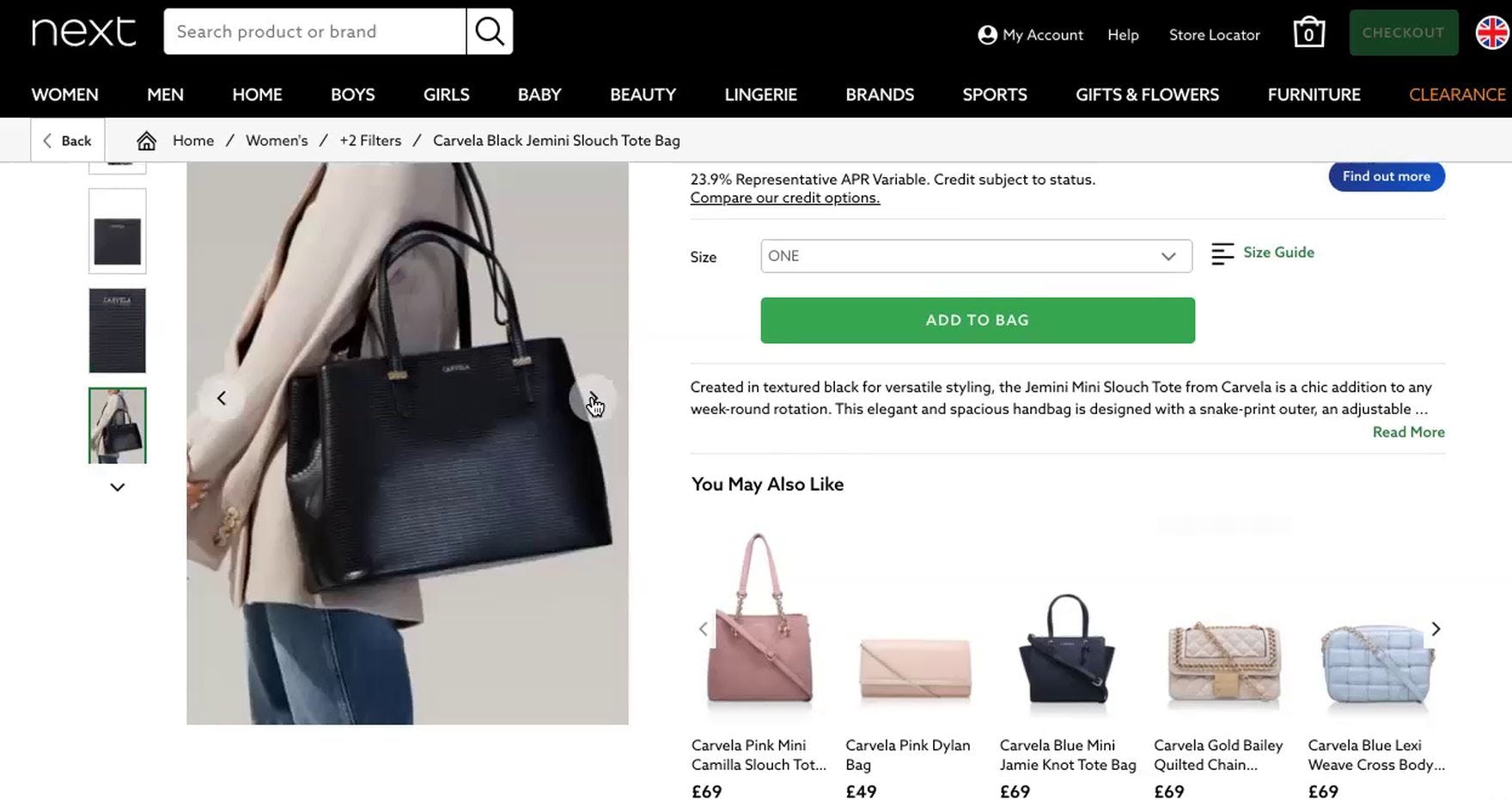
“I can also see the model so I can see that it’s quite large.” Showing a handbag being worn by a “Human Model” answers any questions users may have about its size, as demonstrated here at Next (UK) during our large-scale European testing.
Additionally, testing revealed that mannequins or virtually rendered “models” should be considered only as a last resort, as test participants generally responded negatively to such images.
Therefore, real human models should be used whenever possible.
Yet 21% of benchmark sites don’t provide any “Human Model” images, or only provide a single image, which will not be enough to satisfy most users.
5) Always Provide an Aggregate “Fit” Subscore in the Reviews (24% Don’t)
Participants in testing were observed to predominantly turn to reviews in order to determine how an apparel item fits — for example, whether a pair of pants or a top fits “too small”, “too large”, or “true to size”.
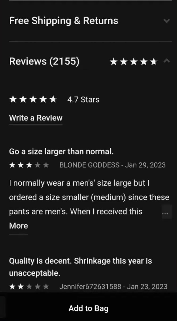
“There’s a lot of reviews here.” This participant at Nike was taken aback upon realizing that he’d have to wade through 2,155 reviews to find out sizing information for a pair of joggers. Without any way to specifically scan for “fit” information, he soon became overwhelmed and gave up on the joggers after reading only a handful of reviews: “The few that I’ve seen have been kind of negative on the sizing…Because I don’t feel confident enough, I’d probably pass on these.”


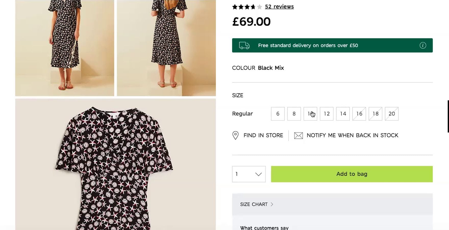
“I’m someone that hates wearing a belt, so I look for jeans that fit at the waist.” Because “fit” info wasn’t evident in the reviews for a pair of jeans (first image), and not all of the 13 reviews mentioned fit, a participant at Madewell had to closely read each review to glean any “fit” info (second image): “I like these, but I did see someone that said that they sized down. So I don’t want it to be too big.” Yet, still unsure about fit after reading all the reviews, she turned next to the size guide.
However, several participants in testing had difficulty finding the “fit” info in the user reviews, leading them to incorrectly assess an item’s overall fit.
As a result, without a clear way to identify and assess relevant “fit” info in reviews, some users might select the wrong size — or even pass on purchasing an item.

“Alright, so it runs a little bit large.” A participant at Columbia Sportswear gleaned from the aggregate “fit” subscore for a pair of tights that she might need to size down.


“I always like to see if they have any reviews on it…It seems like it’s true to size.” A participant at Express who consulted the reviews for a blazer homed in on the “fit” aggregate subscore (first image), taking into account the “true to size” rating in her decision to add her regular size to her cart (second image).
Therefore, to provide an overview of an apparel product’s fit, it’s important to include an aggregate “fit” subscore in the reviews section.
An aggregate “fit” subscore saves users the time and effort of having to scan individual reviews for this information — an insurmountable task if there are hundreds of reviews.
During testing, an aggregate subscore represented by a bar chart scale that was rated from “too small” to “too large” (or similar terminology) performed well.
By including an aggregate “fit” subscore in the reviews section, sites can help users efficiently select their correct size.
However, when reviews make it difficult to determine the overall fit at a glance, users are burdened with the unrealistic task of calculating the overall “fit” score on their own.
Yet 24% of sites don’t allow users to easily understand an item’s overall fit — risking that users incorrectly gauge the fit and select the wrong size.
Provide Apparel Users with the Information They Need to Make a Purchase Decision
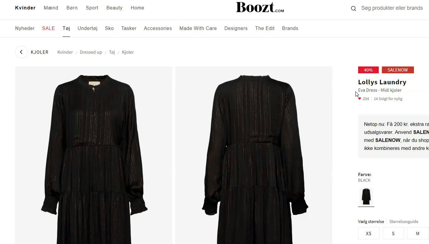
“I’ll search on Google; for example, ‘Lolly’s Laundry, Eva dress’ and to see if there’s any pictures with the dress on a person. Where the person wears the dress.” When users really want to see clothing on a model, such as this European participant at the Nordic site Boozt, there is a real danger that they could go elsewhere to find those images. In some cases, they may not return.
Given how important the above-discussed 5 best practices are for apparel sites, it’s striking that 90% of sites get at least one best practice wrong.
As a result, many users will experience significant friction in their evaluation of apparel products, while others will be so frustrated that they’ll leave the site altogether (as observed during testing).
Therefore it’s important to follow the following best practices:
- Provide sufficient sizing information (82% don’t)
- Always allow users to navigate across user reviews via reviewer-submitted images (90% don’t)
- Use buttons for each size variation (70% don’t)
- Provide images of apparel products on a Human Model (21% don’t)
- Always provide an aggregate “Fit” subscore in the reviews (24% don’t)
An apparel site that meets or exceeds users’ expectations with regards to these best practices will set itself apart from its competitors and provide ample support to users considering apparel products.
Getting access: all 500+ Apparel & Accessories UX guidelines are available today via Baymard Premium access. (If you already have access through an account, open the Apparel & Accessories Study).
If you want to know how your Apparel desktop site, mobile site, or app performs and compares, then learn more about getting Baymard to conduct an Apparel UX Audit of your site or app.