Updated with new data in 2025.
Returns are a fact of life when it comes to e-commerce: our quantitative study of users’ return habits finds that 58% of users say they have made at least one return of an online purchase over the past year (#GC054).
Furthermore our qualitative testing finds that, for many users, the return process can be a source of anxiety, as it may be an unfamiliar process and there are many factors that can impact whether and when users will receive their refund (e.g., a site’s specific return policy, whether return labels are included in the product shipment, if there’s an online return interface, etc.).
During our large-scale Self-Service E-Commerce usability testing, it became clear that there are many ways sites can reduce users’ anxiety when it comes to the return process, and by doing so make it more likely that a user will develop a positive perception of the site on the whole.
Testing also revealed that an advantage omni-channel sites often have when it comes to e-commerce is allowing users to drop off returns in store (or at a dropoff point), rather than requiring users return products by mail. In-store returns can for some users be easier, as they don’t have to worry about return packing, return shipping costs, and the time it takes to receive a refund or exchange a product.
However, users must be able to find the in-store return option to benefit from it. An in-store return option that goes unnoticed by users can be as bad as not having the option available at all — representing a missed opportunity for sites.
In this article, we’ll discuss the test findings from our Accounts & Self-Service E-Commerce usability study related to in-store returns. In particular, we’ll discuss:
- Why some users prefer in-store returns over online returns
- How to promote the in-store return option so that it’s easy for users to find
Why Some Users Favor Returning Products to a Brick-and-Mortar Store
In testing, 20% of users indicated a preference for returning an item directly to the store.
For many users the reasons why they would choose to return to a brick-and-mortar store boil down to 1) Cost, 2) Convenience, 3) Faster refunds, and 4) Easier exchanges.
1) Cost
Many users are very concerned with all of the costs associated with online shopping, including the cost to return products when they don’t work out.
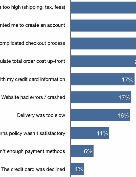
Indeed, our Checkout research reveals that 15% of users (#GC050) say they have abandoned a checkout in the previous quarter due to dissatisfaction with the return policy.
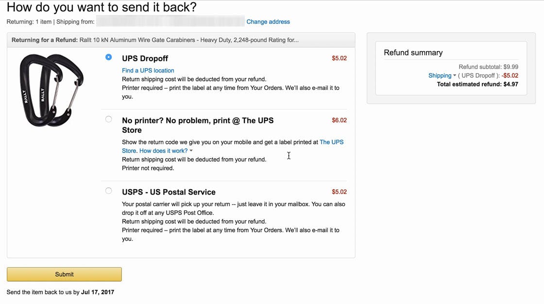
“It looks like I would have to pay for the shipping…I’d be a little upset that I have to pay to ship it back”. At Amazon a user expressed his dissatisfaction with having to pay for return shipping costs. Note the low original purchase cost: the cost to ship the product back represented roughly 50% of the original purchase cost. For many users the ability to return a product to a physical location for free is greatly appreciated.
Having the option to return a product to a store, for free, is therefore for many users a prime benefit of shopping at a site that has in-store returns.
2) Convenience
Many users during testing mentioned how it would be easier to return a product to a store, since they knew (or suspected) there was one close to where they lived or worked.
As one user stated during testing, “I appreciated that I could return it in store…it was more convenient to go talk to the person at the desk, ask about the return policy”.
Another user noted, “You probably gotta get a box [to mail the return], and it gives you an address to send it to, then you gotta wait, and make sure.… And you’re always kinda checking…I’d rather go back to the store with an item and have them throw the refund on my credit card”.
Mailing a product back to a store can be quite a hassle, and can include completing the return process online, printing a shipping label, finding appropriate packaging, packing the product securely, and finally taking the package to be shipped.
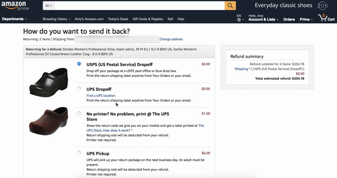
“I’m just going to go to the post office! That is closest to my house, so I’m going to submit”. Returning a product purchased online to a physical location can be the most convenient option for some users. Note that at Amazon, which doesn’t have traditional brick-and-mortar stores, users can still access the benefit of being able to return a product to a physical store by dropping the product off at a shipper.
In short, for users who live near the brick-and-mortar store they want to return an item to, it’s often just easier to go to the physical store to return the product (or at least perceived to be easier).
3) Faster Refunds
The end goal that most users have in mind when trying to complete a return is to get a refund for their purchase.
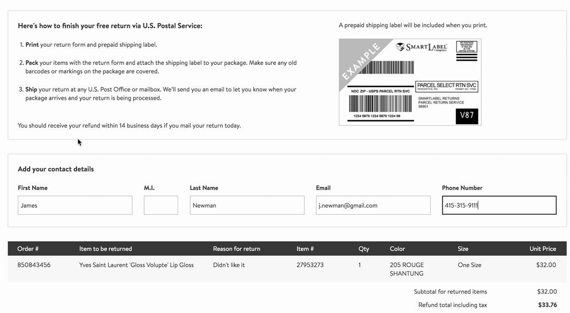
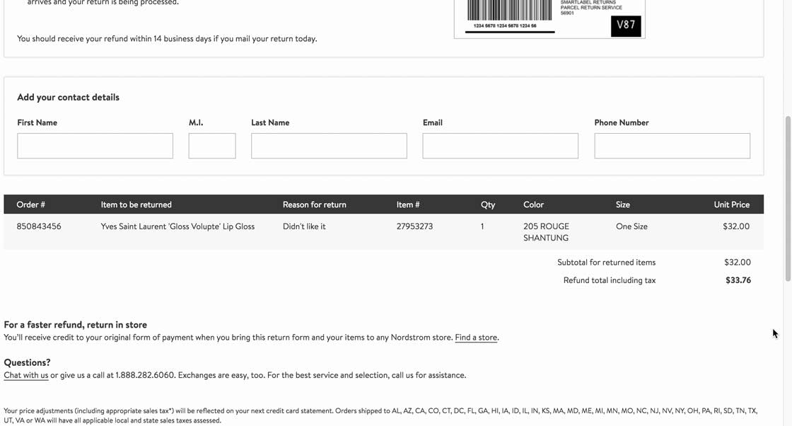
“It says right here, I should expect my refund within 14 days”. Nordstrom indicated the time expected for users to receive their refund during the online return flow. Many users are keen to receive their refunds as fast as possible, and mailing a product back can often add days or weeks to the time it takes for a refund to be processed.
Returning a product to the brick-and-mortar store eliminates shipping time, often resulting in faster refunds for users. Users can also ask sales associates when they can expect to receive their refund when returning a product in store, helping to mitigate their anxiety.
4) Easier Product Exchanges
Some users don’t want a refund of their purchase but rather want to exchange the item for a different product — for example, an apparel purchase that doesn’t fit right.
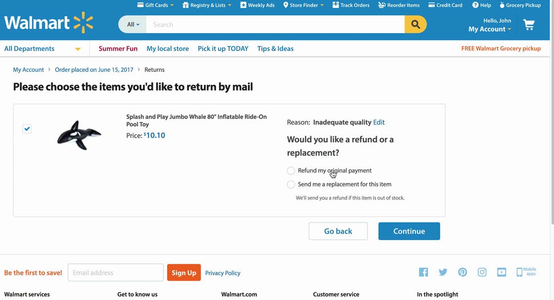
“I would not want the same size, so, I’ll just take my money back”. A user at Walmart was returning a toy because it was too small. Unable to find out how to easily exchange the product through the online return flow, he elected to just get a refund. Users who are able to use the in-store return option would often find it much easier to exchange a product.
However, users who are forced to complete a return flow online can find it very difficult. As a user noted during testing, “I will hesitate to buy things online because I find returning very difficult. For Father’s Day, my daughter bought me a nice t-shirt from the Appalachian Mountain Club online. It’s too small. I don’t know what to do. I’m kinda stuck.”
Making the In-Store Return Option Easy to Find
Our Checkout and Mobile research has found that failing to present in-store pickup alongside other shipping options makes it much more difficult for users to find — which negates a crucial benefit of omni-channel sites (i.e., being able to pick up an item rather than having to pay for it and wait for it to be shipped).
At Nordstrom, the information on returning products in store in the return flow is secondary to the return shipping option, making it much more difficult to find.
Similarly, Self-Service testing revealed that failing to present in-store returns alongside return-by-mail options makes it difficult for users to notice the option, and consequently makes it less likely that they’ll take advantage of it.
This is a missed opportunity as not only do a clear subgroup of users prefer in-store returns (for the reasons described above), but users returning items to stores can also have benefits for the business.
For example, when users return products directly to stores, sites save on return postage costs (if providing free return shipping), are able to reintroduce the returned item to inventory faster, and there’s a possibility that users will stay in the store to shop further.
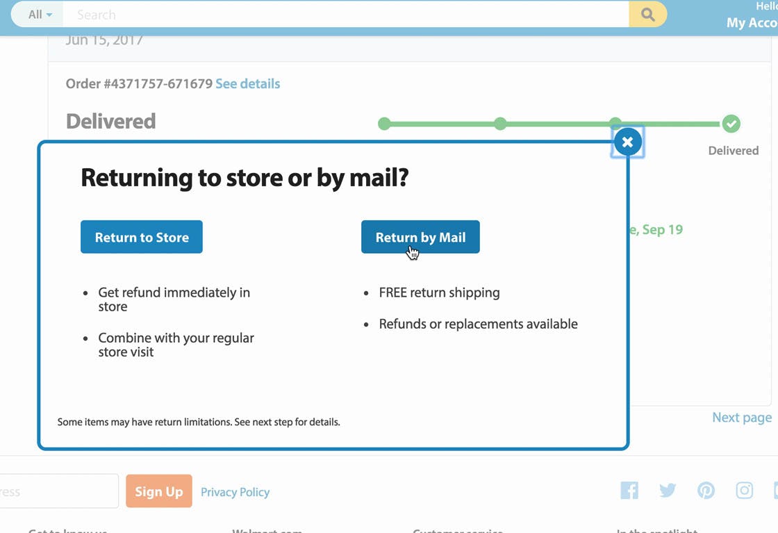
Walmart presents return-by-mail and in-store return options side by side. Each option highlights benefits so users can evaluate which is the best option for them. (Although, ideally, the interface would have indicated the distance or location of the nearest store, based on the package’s original shipping address.)
To ensure an in-store return option is easy to find, it should be presented as an equal option to returning by mail.
Often this means that, if there’s an online return interface, the in-store return option should be just as prominent as the return-by-mail option. This makes it clear to users that these are separate, but equally valid, options, and they can choose whichever is best for them.
Making the options visually equal in the interface ensures that users will be able to find the in-store return option when they’re actually thinking about returning the product.
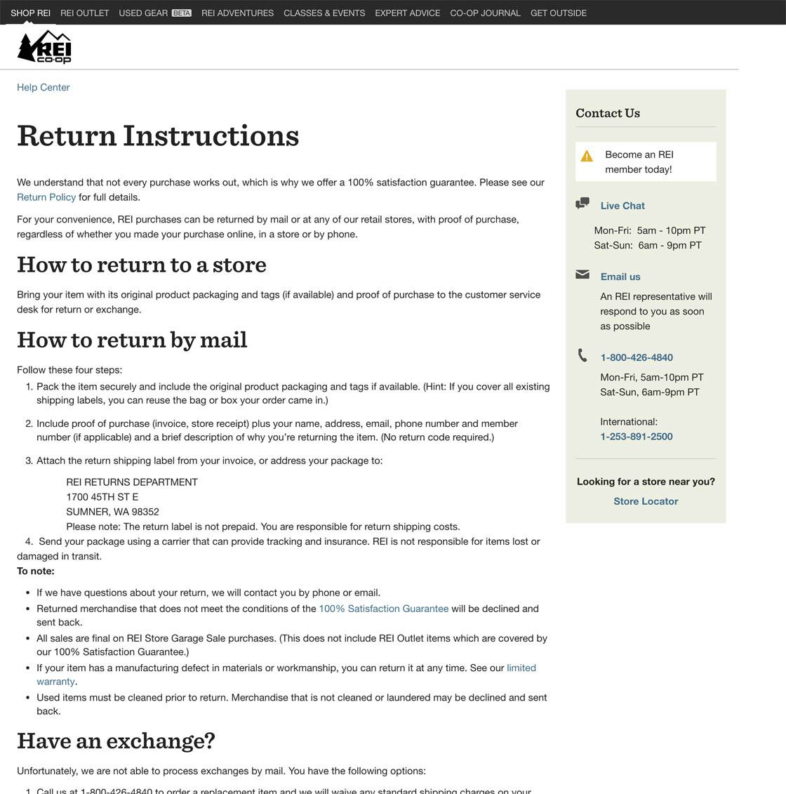
REI provides information on in-store returns alongside information on returning by mail in the help section, making it easy for users to discover that in-store returns are an option.
Sites that don’t have an online return interface, but do allow in-store returns, should still provide in-store return information alongside return-by-mail instructions so that users understand their return options. Often this means including the information in the FAQs, help section, or on the product page. (Note: sites should consider having an online return interface, as it made the return process easier for users during testing.)
Leverage a Benefit of Offering an Omni-Channel Return Experience
At Patagonia, the options to either return by mail or return in store are presented to users as visually equal in the return flow. Users are able to make their decision while they’re in the process of actually initiating a return online. Note the links to find stores and shippers — important information that should take advantage of IP geo-targeting to find the locations that are most likely to be convenient to users.
When users are returning products they are often already unhappy — their purchase didn’t work out, and now they must spend more time trying to get a refund. Along the way there are many potential pitfalls to the return experience, which we document in our Order Returns chapter in our Self-Service UX research study.
Therefore, to make the return process easier for some users, be sure to promote in-store returns equally alongside return-by-mail options. In particular,
- style in-store returns and return-by-mail options similarly so that they have the same visual prominence,
- promote in-store returns alongside return-by-mail options in the online return flow, and
- provide information on in-store returns wherever information on return-by-mail options is provided (e.g., in help sections or order status emails).
This article presents the research findings from just 1 of the 640+ UX guidelines in Baymard Premium — get full access to learn how to create a “State of the Art” Accounts & Self-Service user experience.

