
Key Takeaways
- “Names” that specify the function of UI elements are crucially important to users relying on assistive technology such as screen readers
- Many sites however fail to include “names” for all relevant UI elements
- Failing to support “names” consistently will make accessibility compliance difficult
E-commerce sites contain an abundance of different interactive UI components — for example, form fields for search and checkout, checkboxes for filters, radio buttons for payment and shipping options, etc.
When implemented natively using HTML, each of the various page elements will usually have specialized markup, which assistive technologies are designed to work with.
However, when UI components are implemented using a custom method (e.g., a form field implemented as a <div> container, or a checkbox created using a <span> element, etc.), they often lack the programmatic language for users aided by screen readers to interact with them.
As a result, key information and functionality will often be missing for users who rely on assistive technologies, resulting in these custom UI components becoming either partially or entirely unusable.
Because of this, extra care must be taken to properly employ accessible markup in nonstandard implementations of page elements, so that users aided by screen readers may experience the full functionality of a site — rather than potentially abandon a site in frustration.
In this article we’ll focus specifically on “names”, which identify page elements to assistive technology.
In particular, we’ll discuss the following regarding “names”:
- What “names” are from an accessibility perspective
- How “names” differ from “labels”
- How both native HTML and custom page components play a role in properly specifying UI elements
(Note: other important fundamentals of accessible markup for custom page components — “roles” and “states” and “properties” — are not discussed here. Premium subscribers can read more about “roles”, “states”, and “properties” in our guideline “Fundamentals of Accessible Markup for Custom Page Components”.)
“Names”
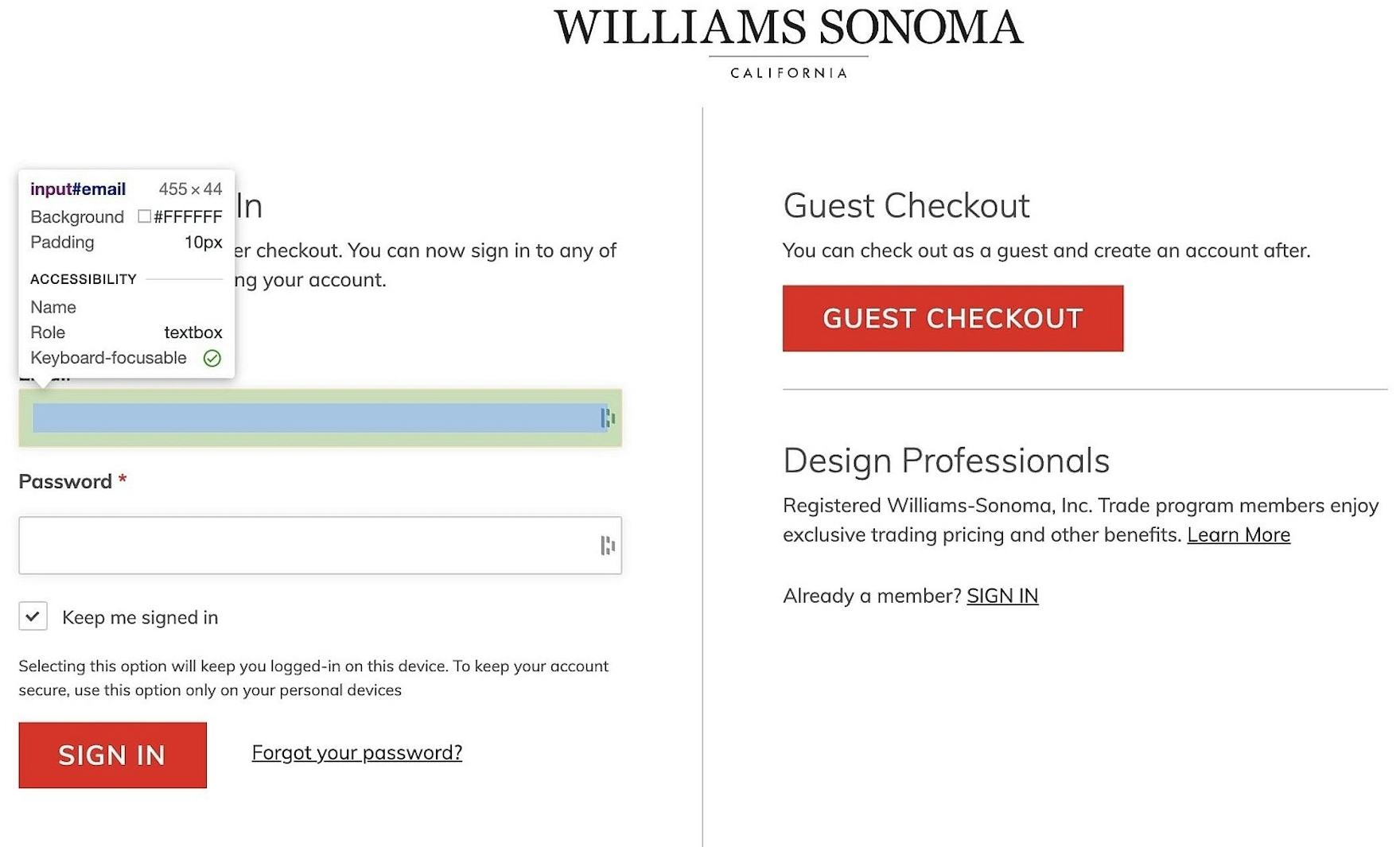
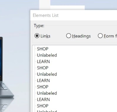
At Williams-Sonoma, the “name” is missing from the email field at the account-selection step of checkout, which won’t meet the needs of users relying on screen readers to navigate the form.
In order to be interpretable and operable by assistive technology users, all interactive UI components (e.g., links, buttons, or controls for things like collapsible containers or carousels) need to have a programmatically determined “name” associated with them in the HTML markup language.
Interactive UI components can be defined as those elements on a webpage that act as a single control for a distinct function.
However, some complex web elements may contain multiple interactive UI components.
For example, image carousel controls consist of multiple individual interactive UI elements (e.g., move carousel forward, move carousel back, image zoom, image links, etc.).
Each UI element will be treated separately by assistive technologies.
Therefore, each interactive element must be properly identified using HTML or ARIA attributes in order to be operated correctly by users aided by screen readers.
“Names” vs “Labels”
The WCAG guidelines refer to both “labels’’ and “names” being potentially associated with UI elements.
While these terms may seem very similar, for the purposes of accessibility they have subtly different meanings.
Although there is often overlap between the two, the primary difference between these terms is user visibility.
Whereas a UI element’s “label” refers to a component presented to the user visually — typically text, but it may also be an image (e.g., an informational image or a “decorative” or “functional” image) — a UI element’s “name” refers to the accessible text that is read by assistive technologies to identify the element to the user.
While a “name” will often functionally act as a “label” for the purposes of the user aided by a screen reader, there are situations in which it may be necessary to have them be different — where a “label” might be acceptable to sighted users, but fail to give enough context to users aided by assistive technologies, such as screen readers.
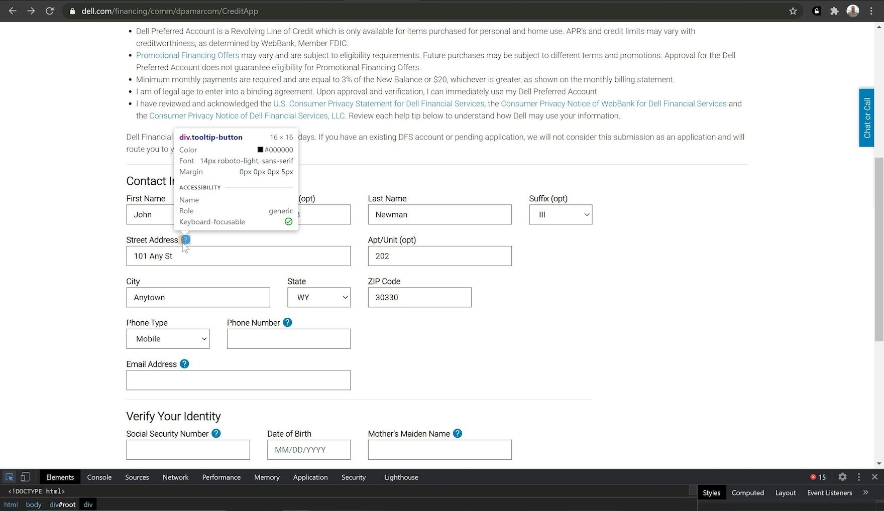
At Dell, tooltips placed alongside form field labels do not have accessible names, or an assigned role (instead relying on the role “generic”). As a result, when screen readers encounter these tooltips they will simply announce the elements as “clickable” when they receive keyboard focus, leaving users without the necessary context to understand their inclusion alongside the form field label prior to clicking.
A basic requirement of accessibility is to ensure that users aided by screen readers receive the same information as sighted users.
Therefore, every UI component — whether the label contains text or an image of text — must have a name that contains the same or more information as in the label text.
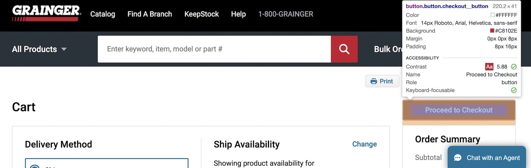
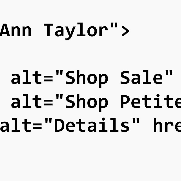
At Grainger, the button label visible to sighted users — “Proceed to Checkout” — matches the name provided to users using screen readers, ensuring they have sufficient information to determine the button’s purpose.
For example, if a button element has a visual label marked “Next Page”, the accessible name associated with that button can’t just be generic text such as “Next” — which may be applied as a default value for that style of button element — but instead needs to contain the label text in its entirety.
While the name text doesn’t need to completely match the label text in order to be in accessibility compliance, the essence of the label text must be communicated to users aided by screen readers — for example, a visual label marked “Next” with a programmatically assigned name “Next Page” would be in compliance with accessibility standards.
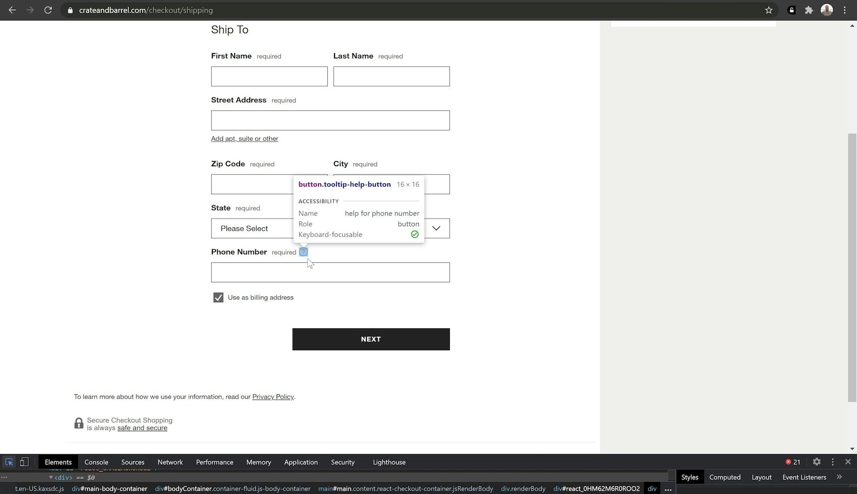
At Crate & Barrel, tooltips include accessible names (e.g., “help for phone number”) and appropriate roles (e.g., “button”).
Indeed, the programmatically assigned name may even contain additional text, which can act as contextual information for users aided by screen readers — for example, a visual label for a button can read “Continue” while the programmatically associated name would announce “Continue to Checkout”. (See WCAG 2.1 - 2.5.3 (Level A).)
Correct Implementation Code Example
<a href="https://www.site.com/orderreview">
  <img src="https://www.site.com/img/rvw.png" alt="review order">
</a>
Incorrect Implementation Code Example
<a href="https://www.site.com/orderreview">
  <img src="https://www.site.com/img/rvw.png" alt="next page">
</a>
Mismatches between an element’s visual label and programmatically defined name can lead to problems for users who rely on assistive technologies.
For example, a user utilizing voice controls may see a button marked “Review Order” but be unable to use voice to select it if the associated accessible name (i.e., “next page”) doesn’t match the user’s request.
Using Native HTML vs Custom Page Components
When using the native HTML <label> element, the label value automatically extends to that element’s programmatically defined name — making integration with screen readers relatively effortless.
Indeed, page elements assigned the native <label> markup element (e.g., the input types "text", "checkbox", "radio", "file", "password", as well as the <textarea> and <select> HTML elements) are automatically in compliance with accessibility standards.
Note however that the <label> element cannot be applied to some HTML elements — for example, the input types "submit" and "reset" (for buttons), "image" (for image buttons), "hidden" (for hidden input fields), and script buttons (i.e., <button> elements or the "button" input type). (See 4.1.2 (level A).)
However, for custom-designed page elements — such as those using <span> or <div> containers — accessible names must be intentionally applied to maintain accessibility.
Naming Custom Page Components Using aria-labelledby and aria-label
When considering naming a page element, and there are multiple relevant pieces of information on which to potentially draw, the W3C has identified what information can serve as a name and the order of priority from which a name will be drawn.
While the specific factors differ based on the type of component in question, the following is a rough approximation of the priority sequence for general page elements.
The accessible name for an element — the one that will ultimately be announced by screen readers — will always be drawn from either an aria-labelledby or aria-label attribute if present (with aria-labelledby being at the top of the prioritization list).
The value of an aria-labelledby attribute will override any other information that could serve as a UI component’s name, including an aria-label.
Therefore, aria-labelledby or aria-label attributes should not be included on an element that derives its name using a different method — such as a native HTML <label> element.
Additionally, while similar, aria-labelledby and aria-label attributes serve different programmatic purposes.
How to Use Aria-labelledby
Aria-labelledby is used to label an element by referencing the ID of another element in the page’s markup.
The text contained within the element matching the specified ID becomes the first element’s label, which also gives it an accessible name:
aria-labelledby Code Example
<span id="shipping-options-label">
  Shipping Options
</span>
<div role="radiogroup" aria-labelledby="shipping-options-label">
  …
</div>
In the example above, the <div> element containing the aria-labelledby attribute is assigned the label — and, by extension, the accessible name — “Shipping Options” from the ID text within the <span> container.
While the aria-labelledby attribute is typically used to reference text that is already visible on the page, it can also reference text that is visually hidden — as in text that is included specifically to be read by screen readers, which may include additional context for users aided by screen readers.
In certain rare cases, and for some web conventions (e.g., the ubiquitous “Search” icon for a search field), visible labels are not strictly necessary.
However, since all other page elements will require both a visible label and an accessible name, solely relying on invisible text — for example, a product color swatch icon label with no visible text — could cause the site to fall out of compliance with success criterion. (See 3.3.2 (level A).)
How to Use Aria-label
On the other hand, the aria-label attribute is used to directly specify an accessible name for an element.
Aria-label attributes are not visibly displayed on the page, and will generally only be announced by assistive technologies, such as screen readers:
Hamburger Menu Code Example
<button aria-label="navigation menu" class="hamburger"></button>
In this example, the aria-label attribute gives the hamburger menu button an accessible name (i.e., “navigation menu”) that otherwise wouldn’t be available to screen readers due to the menu being displayed as an icon without text (with the image file being referenced at the CSS level).
While sighted users may be able to correctly interpret icons — like the hamburger menu — without the need for text, users aided by screen readers with pronounced visual impairments will not be able to properly navigate the site without these programmatically added labels.
It is important to note that there are some restrictions on what elements support the aria-labelledby and aria-label attributes — for example, these attributes are ignored when added to noninteractive content such as <p> elements, and <li> and <ui> list elements.
For more information about the aria-labelledby and aria-label attributes, and their use cases, see the W3C’s reference document for Accessible Rich Internet Applications (ARIA) 1.1 and section 2.10 of the W3C’s guide to Using ARIA for the full list of implementation considerations.
Help Users Relying on Assistive Technologies Effectively Navigate to Find Products and Services
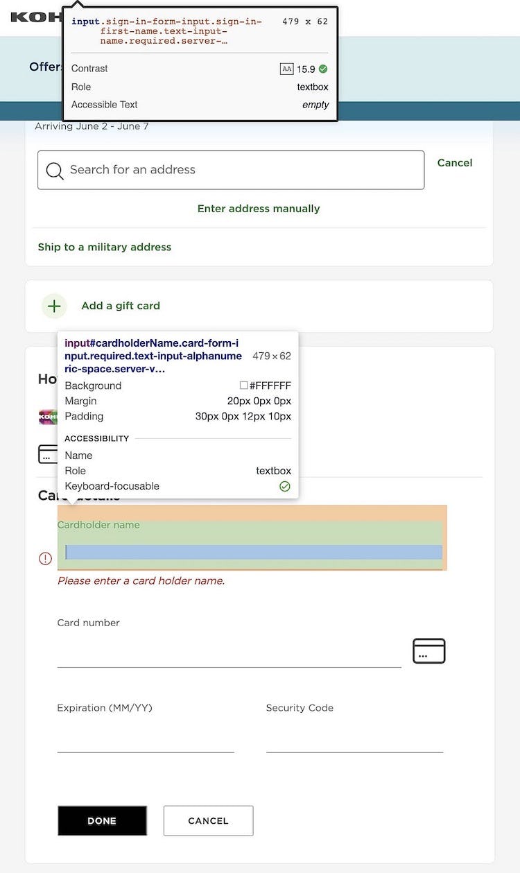
Form fields or inputs with labels missing from the markup (as seen here at Kohl’s) can create problems for users aided by screen readers as they may not know what information is being asked of them — resulting in users having to problem solve the issue or enter potentially erroneous information, which they’ll have to fix later. Moreover, form fields are not marked as “required” (as was the case with 18% of the sites we rated).
Our accessibility research shows that failing to programmatically support names — a fundamental principle of web accessibility — can make sites unusable for users relying on assistive technologies.
Moreover, beyond being inaccessible to such users, sites that fail to properly support names (as well as other fundamental accessibility principles such as providing accessible images or accessible links) will likely not pass an accessibility compliance audit, leaving themselves open to litigation.
For users relying on assistive technology such as screen readers, it’s therefore critically important to have programmatically determined names identifying various UI elements.
Doing so consistently with all interactive page elements will help ensure users using assistive technologies will be able to navigate through a site and complete a purchase successfully.
All e-commerce accessibility guidelines are available today via Baymard Premium access. (If you already have an account, open the Accessibility study.) See our E-Commerce Accessibility Audit service if you might be interested in getting Baymard to audit your site.