Key Takeaways
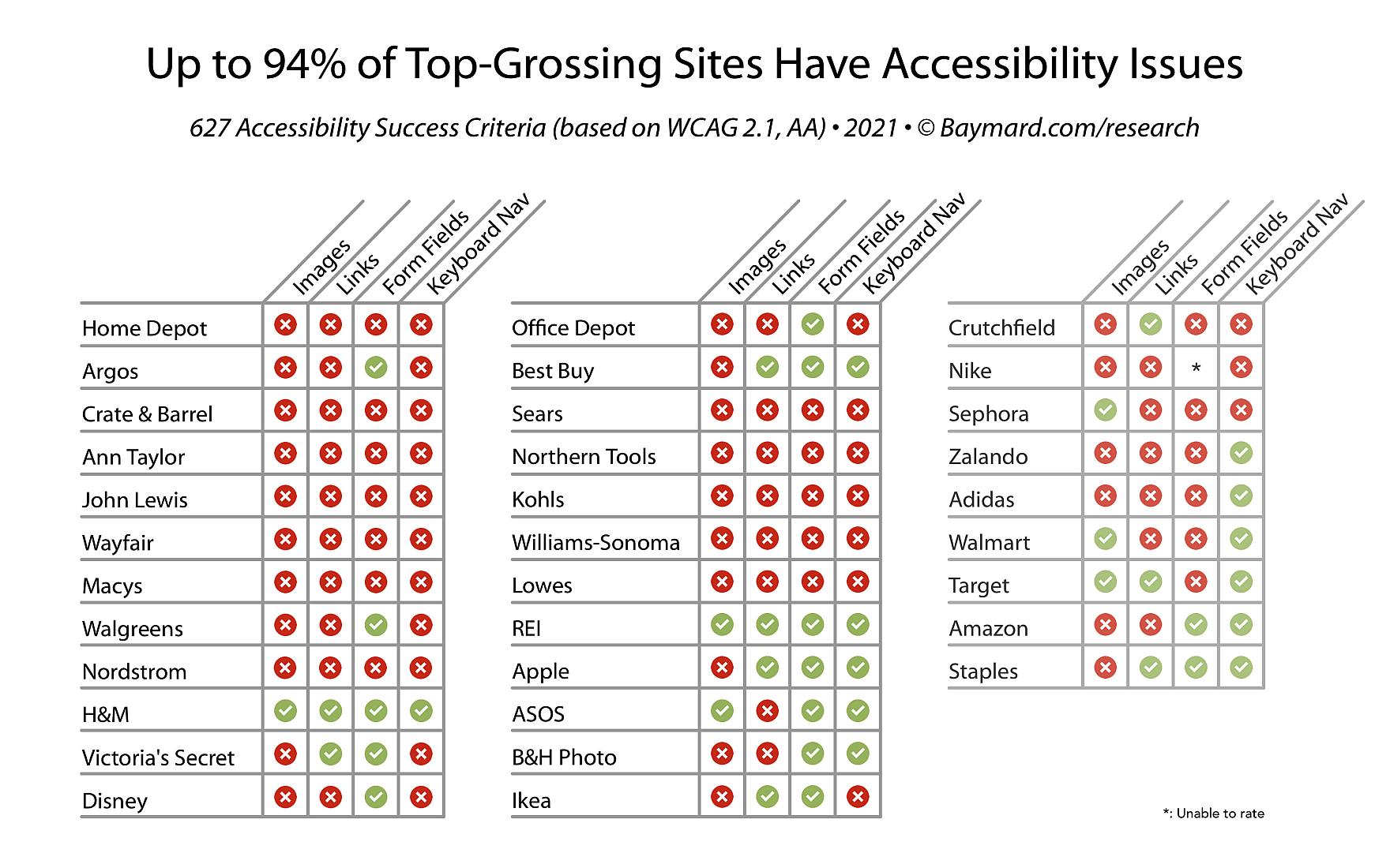
- Our rating of 33 top-grossing e-commerce sites against 4 core accessibility guidelines reveals that 94% of sites are incompliant (WCAG 2.1 AA):
- 82% of sites have accessibility-compliance issues with images
- 73% of sites have accessibility-compliance issues with links
- 58% of sites have accessibility-compliance issues with form field markup
- 64% of sites have accessibility-compliance issues with keyboard navigation
At Baymard our research team has just spent 4,400 hours researching accessibility principles and applying them to the e-commerce field — leading to our new research study on Accessibility for E-Commerce Sites.
Additionally, we’ve benchmarked 33 top-grossing e-commerce sites across 4 key areas of Accessibility — images, links, form fields, and keyboard navigation — resulting in 625+ weighted Accessibility performance scores (assessed by WCAG 2.1, AA success criteria).
The results are stark: up to 94% of sites are incompliant with these 4 basic accessibility requirements (WCAG 2.1 AA).
It’s important to reiterate that these are some of the largest sites — we can only assume the incompliance number is higher for sites with a much smaller budget (or no budget at all) to meet accessibility requirements.
In this article we’ll walk you through this Accessibility benchmark dataset, and show you 4 common accessibility areas to watch out for, as many e-commerce sites are incompliant on these.
This article is divided into the following 7 sections
- Why it’s important to have Accessibility-compliant sites
- Accessibility-compliance performance
- Images (82% of sites have compliance issues)
- Links (73% have compliance issues)
- Form fields and user inputs (58% have compliance issues)
- Keyboard navigation (64% have compliance issues)
- Conclusion: Accessibility issues hiding in plain sight
The Importance of Having Accessible E-Commerce Sites
Before we get into the Accessibility benchmark results, it’s important to understand why Accessibility requirements are vitally important to a subgroup of e-commerce users (leaving aside the fact that in many countries sites are legally required to meet an Accessibility standard — and can thus open themselves up to lawsuits if they fail to do so).
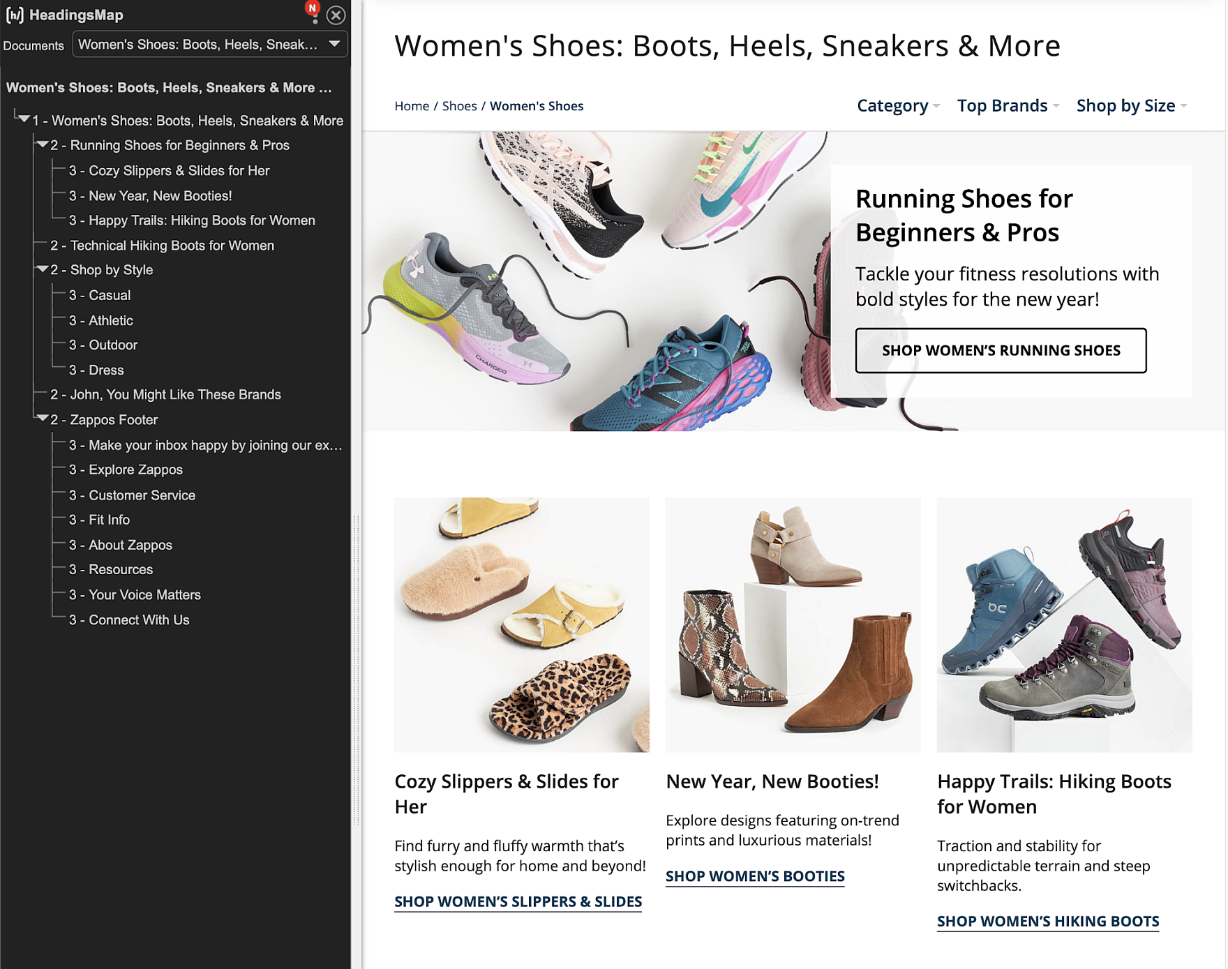
At Zappos, a screen reader — one type of assistive technology for users with disabilities (in this case, visual) — displays the list of headings and subheadings on a page, which users with disabilities can use to navigate to various sections of the page more easily (rather than cycling through each individual site element).
Users with disabilities can have a vastly different experiences on e-commerce sites, depending on the nature of their disabilities — and the assistive technologies (e.g., screen readers) they must use to understand and navigate the sites.
Take, for example, users with visual impairments. Whereas users with mild-to-moderate impairments may only have to rely on their browsers built-in zoom function and high-contrast mode to access site content, users with more severe visual impairments will require the use of a screen reader to access and interact with an e-commerce site.
Similarly, users with limited mobility or other physical impairments may not be able to reliably use a mouse to navigate and interact with a site and will instead have to rely on keyboard navigation to operate.
If sites fail to accommodate these users, it’s the same, for many of them, as being locked out from using the site at all.
Others may be able to struggle through and complete an order — yet will unnecessarily spend much more time doing so compared to users without disabilities.
Accessibility-Compliance Performance (Based on 33 Top-Grossing Sites)
Due to the importance of ensuring accessibility on e-commerce sites for all users, researchers at Baymard benchmarked 33 top-grossing sites to assess their varying levels of compliance — and incompliance — with our 19 newly published accessibility guidelines. (If you already have a Premium account, open the Accessibility study.)
1) Images (82% of Sites Have Compliance Issues)
When it comes to accessibility, all images on a site must contain some kind of descriptive label — either through the use of HTML markup (i.e. alt text) or an accessibility-specific label using Accessible Rich Internet Applications (ARIA) markup.
However, during our rating we discovered that 64% of the benchmarked sites had some issues with making images adequately accessible.

At Lowes, an image is presented which contains an alt text tag: `alt=”A Craftsman circular saw, Kobalt cordless impact driver and Dewalt cordless drill”.
Images can have a number of different functions on an e-commerce site, from acting as a link, conveying information, or being purely decorative. Consequently, each image type requires unique accessibility considerations to fully translate their function for users aided by screen readers:
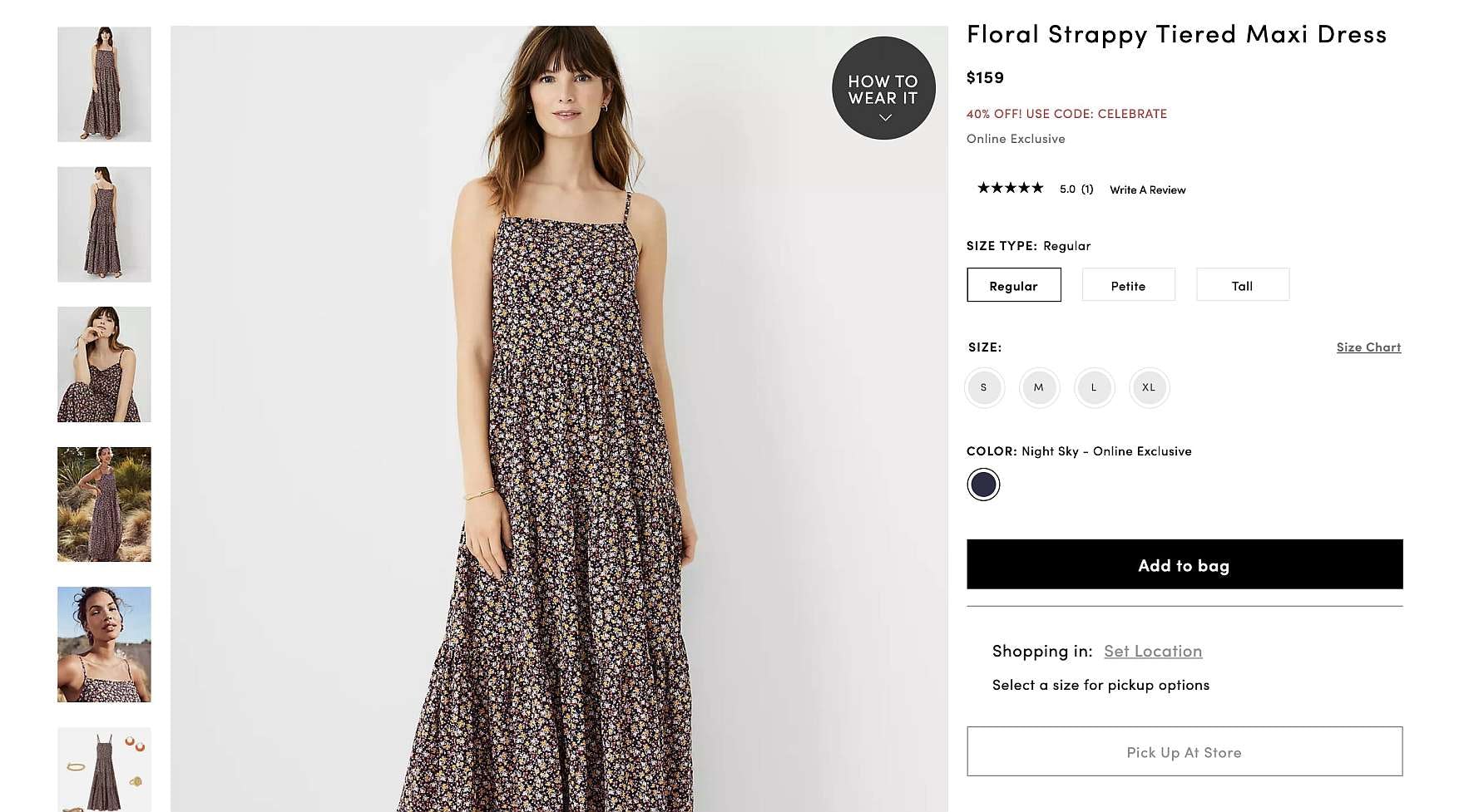
- For Images which act as links (e.g., images representing a product category), 48% of benchmarked sites either have entirely missing descriptive labels (which should tell users where image links will take them) or have incomplete descriptions
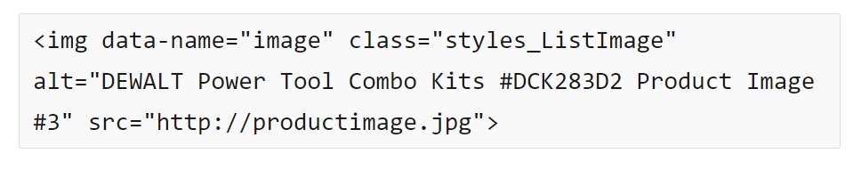
- Similarly, for images that are used to convey information — such as images of products in use or images explaining features of a product — our benchmark reveals that 54% of sites have images missing labels or have labels which do not adequately describe the contents of the image
- Images which were included strictly for decorative purposes fared only slightly better with 21% of sites failing to include an empty
alttag
Text embedded in images — for example, text reading “Shop the Spring Sale Now!” displayed over an image — should generally be avoided, since screen readers can’t access embedded text and must instead rely on labels included in the markup.
If these labels are missing, users aided by screen readers may have no idea what information the text contains — or if the text is even there.
Unfortunately, 63% of sites still use embedded text in images without adequately conveying the information contained therein, and 24% of sites have text which lacks sufficient contrast to be visible to users with visual impairments.
2) Links (73% of Sites Have Compliance Issues)
As links are critically important for navigating a site, it’s especially important that they’re implemented correctly for users with disabilities. When links aren’t given an adequately descriptive title (which 66% of sites failed to do), users aided by screen readers will have no way of knowing where a given link will take them.
Links fared generally better when it came to the markup, with only 9% of sites failing to identify links as links within the markup language for user aided by screen readers.
For example, if links aren’t identified within the markup it’s likely that screen readers will simply announce something generic (e.g., “Shop Now”), or merely read out the link URL destination (which isn’t always descriptive), neither of which are likely to be helpful to users with disabilities.

Links without an adequate contrast ratio with their background and surrounding text — such as the one pictured — may be difficult to find for users with visual impairments.
Furthermore, only 9% of sites failed to provide adequate contrast with the surrounding text and 12% failing to provide adequate contrast with the site background.
3) Form Fields and Inputs (58% Have Compliance Issues)
When it comes to users entering information on the sites, it’s important the form fields and inputs are all properly labelled — both individually (e.g., “First Name”) and as a group (e.g., “Shipping Address”).
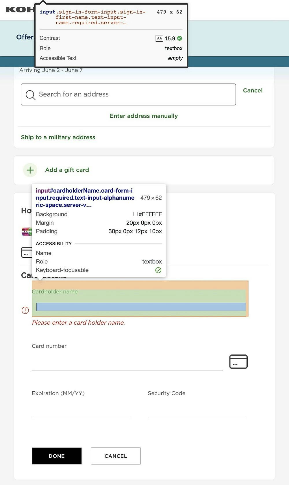
Form fields or inputs with labels missing from the markup (as seen here at Kohl’s) can create problems for users aided by screen readers as they may not know what information is being asked of them — resulting in users having to problem solve the issue or enter potentially erroneous information, which they’ll have to fix later. Moreover, form fields are not marked as required (as was the case with 18% of the sites we rated).
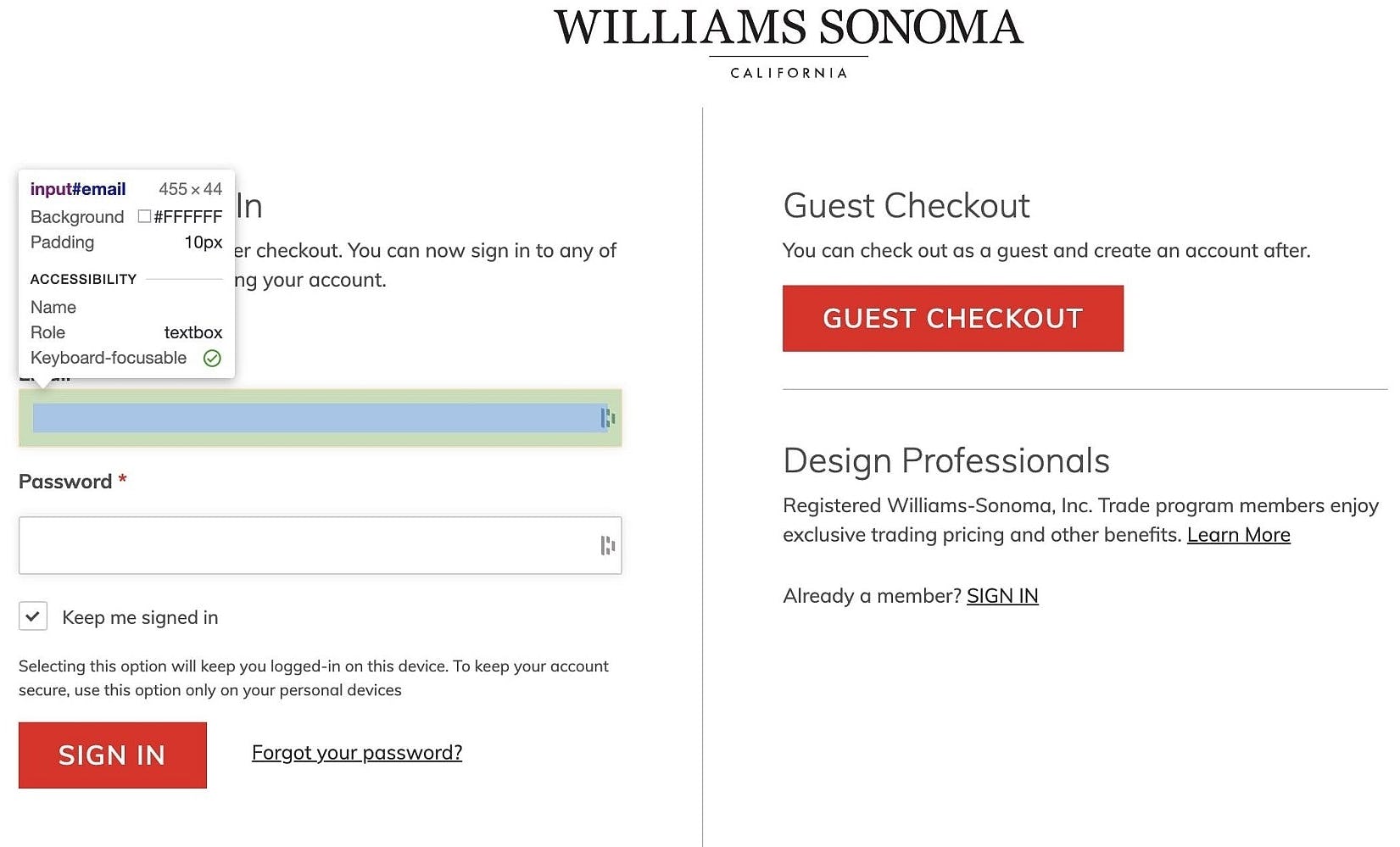
Another form field input missing a screen reader–accessible label at Williams-Sonoma.
Of the 33 sites we benchmarked, 18% of sites failed to provide screen reader–accessible group labels — for example, while sighted users may be able to see the visual heading (e.g., “Shipping Address”), users aided by screen readers must be informed of the form field group (and label) through screen reader–accessible markup language.
Similarly, another 18% of sites failed to group form fields together within the markup language — thus failing to inform users aided by screen readers that form fields and inputs are related to each other.
Further, while only 9% of sites have issues conveying the purpose of individual form field and inputs — usually as a result of missing form field and input group labels within the markup — 37% of the 33 sites we benchmarked failed to provide labels for individual form fields and inputs.
Additionally, when considering any special instructions for form fields and inputs — such as whether a given field is required or the data entered requires special formatting (e.g., “DD/MM/YYYY”) — 18% of sites failed to communicate these instructions to users aided by screen readers.
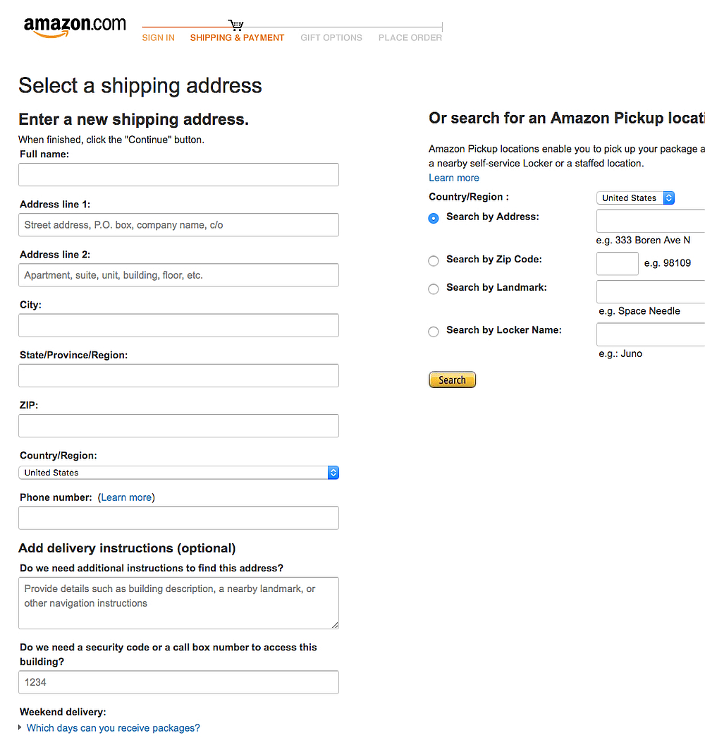
At Amazon, form fields are presented with text labels (which meet the minimum contrast requirement with the background) above them. Note that the inline placeholder text used is to display example user inputs (e.g., “Street address, P.O. box, company name”), which are supplementary to the text labels and may be skipped by the user with minimal loss of information.
If accessible markup language is missing from form fields and user inputs, it will be much more difficult — if not impossible — for users aided by screen readers to progress successfully through an e-commerce site’s various flows, particularly checkout.
Keyboard Navigation (64% of Sites Have Compliance Issues)
For users with mobility issues, or for those users being aided by screen readers, keyboard navigation can be the primary mode of interaction with e-commerce sites.
Consequently, it’s important to ensure that all site functionality is operable by keyboard (or provided via a keyboard-operable alternative), and that the focus indicator is visible at all times.
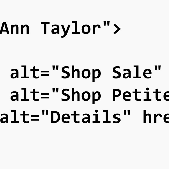
Every part of a site needs to be operable by keyboard navigation — to assist users aided by screen readers and those with mobility impairments. At Ann Taylor, the “Click here for details” link (under “All Rewards Credit Card”) in the footer is left out of the keyboard order — and is thus inaccessible to users employing keyboard navigation.
However, a full 45% of sites have some site functionality that is inoperable by keyboard navigation, and 48% fail to ensure that the keyboard focus indicator is visible at all times.
Site elements have to be logically arranged within the order of keyboard focus elements. At Ann Taylor, the “Size Chart” and “Set Location” elements are skipped over, making them inaccessible to users.
Similarly, ensuring the focus order of site elements follows a logical order improves accessibility for users with cognitive impairments; however, 30% of sites have some site elements that are placed unintuitively in the focus order.
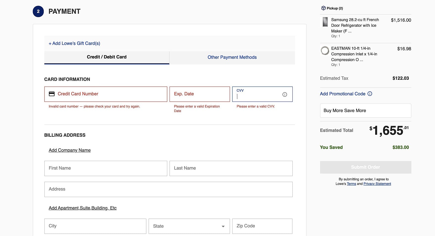
Keyboard focus traps — that is, site elements that can be entered by keyboard focus, but not exited — can be particularly problematic for users employing keyboard navigation. At Lowes, users’ focus can become trapped in the “CVV” field if the previous two fields are left blank.
Worst of all, 9% of sites have some site elements that can trap keyboard focus — making it difficult to impossible for user’s focus to escape back to the rest of the page.
Accessibility Issues Hiding in Plain Sight
Our benchmarking of 33 top-grossing sites across only 4 out of 19 accessibility-related guidelines shows that e-commerce sites harbor a multitude of accessibility-incompliance issues.
Indeed, 94% still have severe issues with basic accessibility (rated against the WCAG 2.1, AA success criteria), including within the following key site areas:
- Images (82% are incompliant)
- Links (73% are incompliant)
- Form fields and inputs (58% are incompliant)
- Keyboard navigation (64% of sites are incompliant)
These basic accessibility issues will severely disrupt those users who need accessibility considerations, and will prevent some from being able to effectively use the site to purchase products.
All e-commerce accessibility guidelines are available today via Baymard Premium access. (If you already have an account, open the Accessibility study.) See our E-Commerce Accessibility Audit service if you might be interested in getting Baymard to audit your site.