Key Takeaways
- “Roles” that specify the purpose of UI elements are crucially important to users relying on assistive technology such as screen readers
- Many sites however fail to include “Roles” for all relevant UI elements
- Failing to support “Roles” consistently will make accessibility compliance difficult
In a previous article, we discussed the importance of “Names” — which identify page elements to assistive technology — for accessibility.
In this article, we’ll further explore this topic by discussing “Roles”, which mark the purpose of a page element (and how to interact with it).
As with “Names”, elements implemented natively via a web markup language (e.g., HTML) generally have their “Role” preassigned, and will thus already be accessibility compliant.
However, not all page components are available using native markup, which means that some page elements will need to be custom built, and therefore require additional consideration to be brought into accessibility compliance.
In this article, we’ll discuss such custom-built elements, and provide examples of how to assign the “Role” using the ARIA role attribute.
“Roles” and Accessibility
In addition to being identified to users through either a “Name” or “Label”, all interactive UI components need to have a programmatically discernable “Role”, which defines the component’s type and function for software — which includes assistive technologies, such as screen readers.
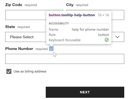
At Apple, the “Role” for an image is appropriately specified as img.
For example, if a screen reader identifies the “Role” of an element as an “image”, then it will announce to the user “image” and read any associated alt text if available (in cases where the alt text is unavailable, it will read the image’s filename).
Further, when screen readers announce an element’s “Role”, users who are familiar with screen readers will already understand how to interact with the element — for example, when a screen reader announces “link”, the user will know that they can follow that link by pressing the “Enter” key.
Such implementations of “Roles” are more or less straightforward when using native HTML markup.
Due to this, it is advised that UI components be implemented using native elements whenever possible.
However, in some cases custom-built components are required — and consequently the implementation of the element’s “Role” must adapt accordingly to remain accessibility compliant.
Using ARIA Role for Custom Components
When a UI component is implemented in a nonstandard way — for example, implementing a button element using a <div> container — the ARIA “Role” attribute should be used to inform browsers (as well as assistive technologies) how to treat the element.
If the “Role” isn’t specified for a custom component, users relying on assistive technologies are at best left confused as to the purpose of the component and, at worst, completely sidetracked and unable to continue browsing the site.
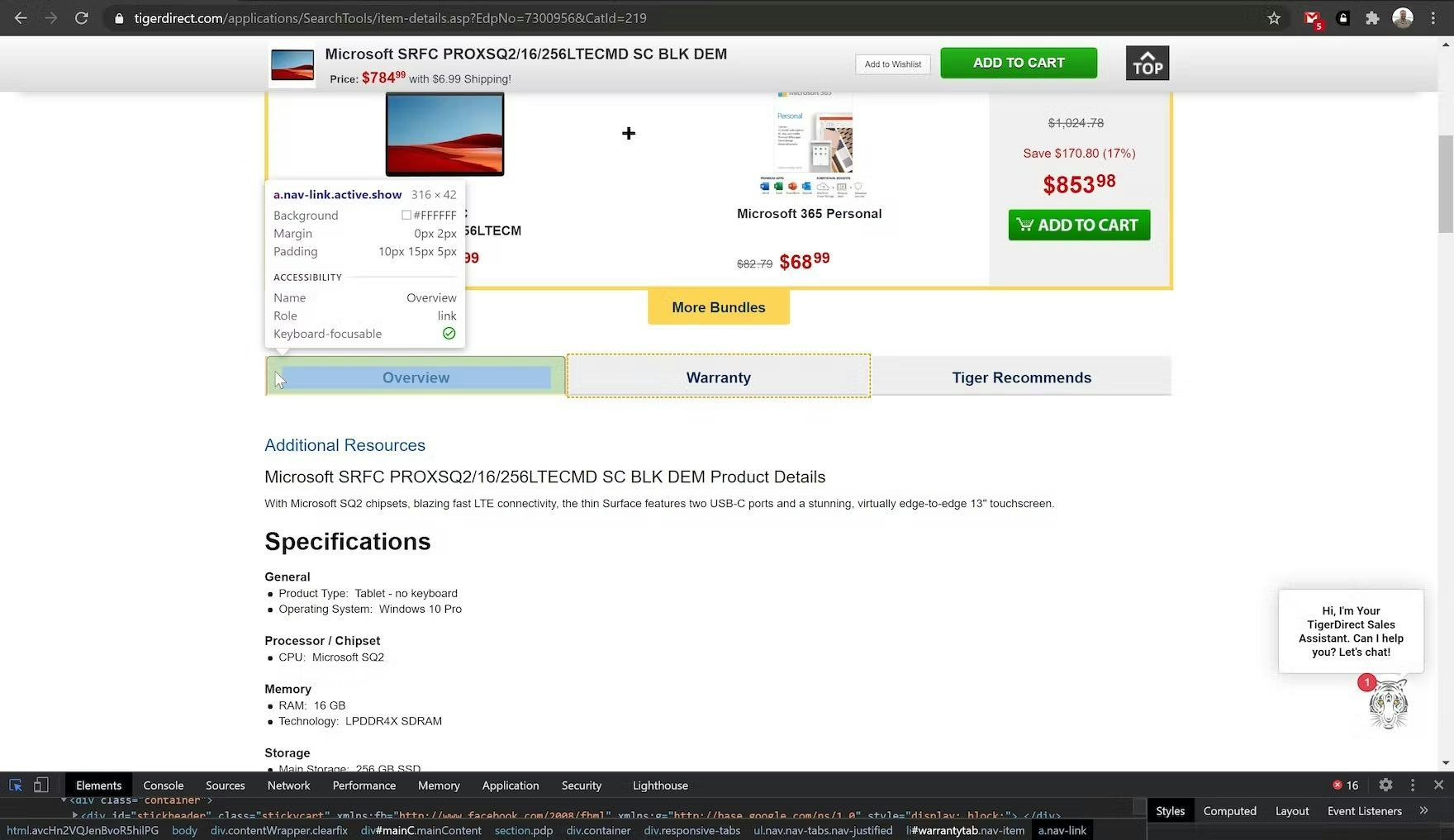
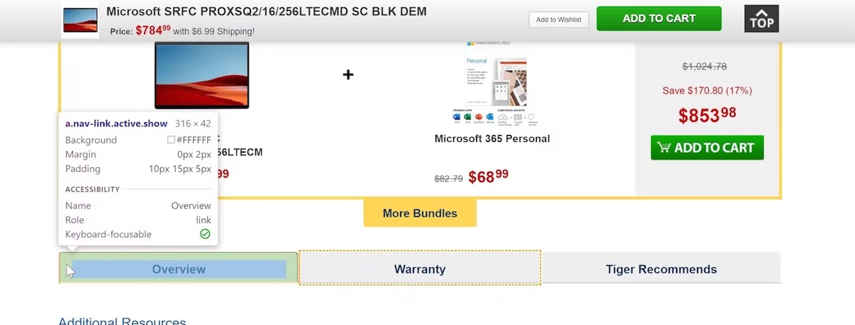
At TigerDirect, while a “Role” is defined for the horizontal tab title here, it’s defined as a link. Screen readers will announce this as “Overview, link”, which some users will misinterpret as leading to a new page. Moreover, activating a tab set up this way doesn’t announce to the user that any change has been made on the page, leaving them to have to guess or try and problem solve in order to figure out what activating the link does.
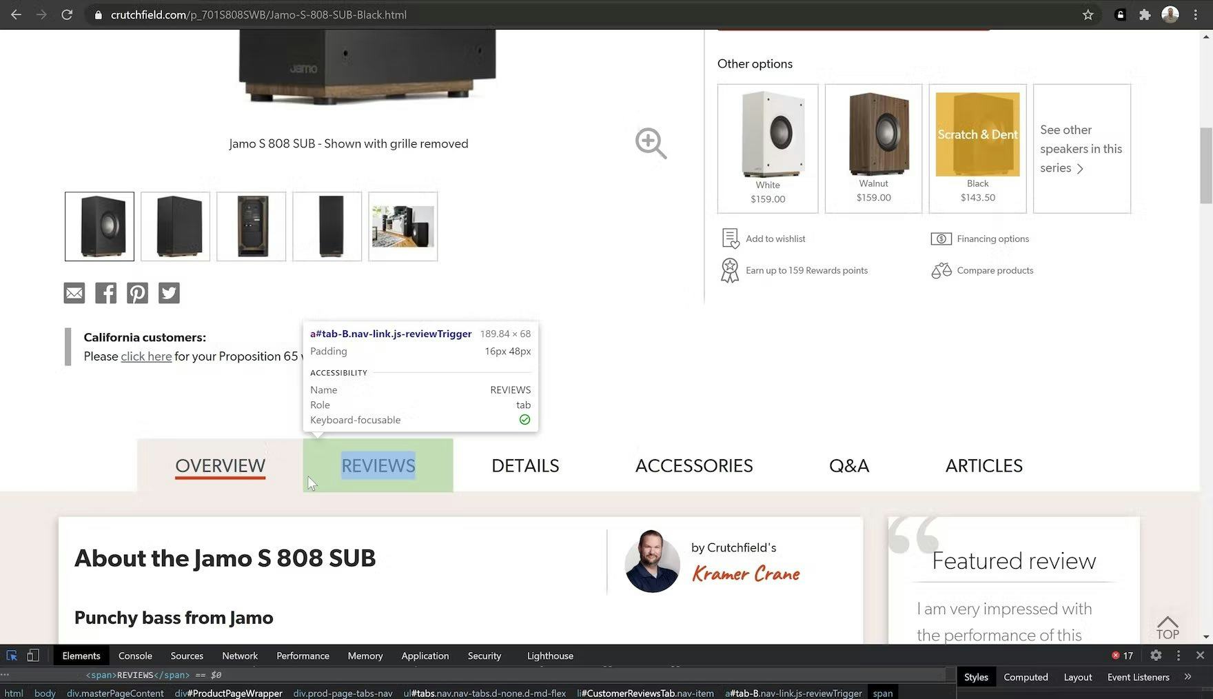
An example at Crutchfield. Tabs are correctly identified as such. Screen readers will convey this as something like “Reviews, Tab - Not selected”, which better conveys the content layout on the page than in the TigerDirect example. When activated, the screen reader will announce “Reviews - Selected”.
For example, “Horizontal tabs” — which can be problematic for all users — require custom ARIA markup (i.e, indicating that the navigation has the role “Tab” rather than “Link”).

At Costco, an “Edit Shipping Address” form is presented to users as an overlay.
Shipping Address Form Overlay Code Example (from Costco)
<div
  role="dialog"
  class=”review_modal"
  id="edit_shipping"
  aria-labelledby="ship_label"
  aria-modal="true"
>
  <h2 id="ship_label">
    Edit Shipping Address
  </h2>
  …
</div>
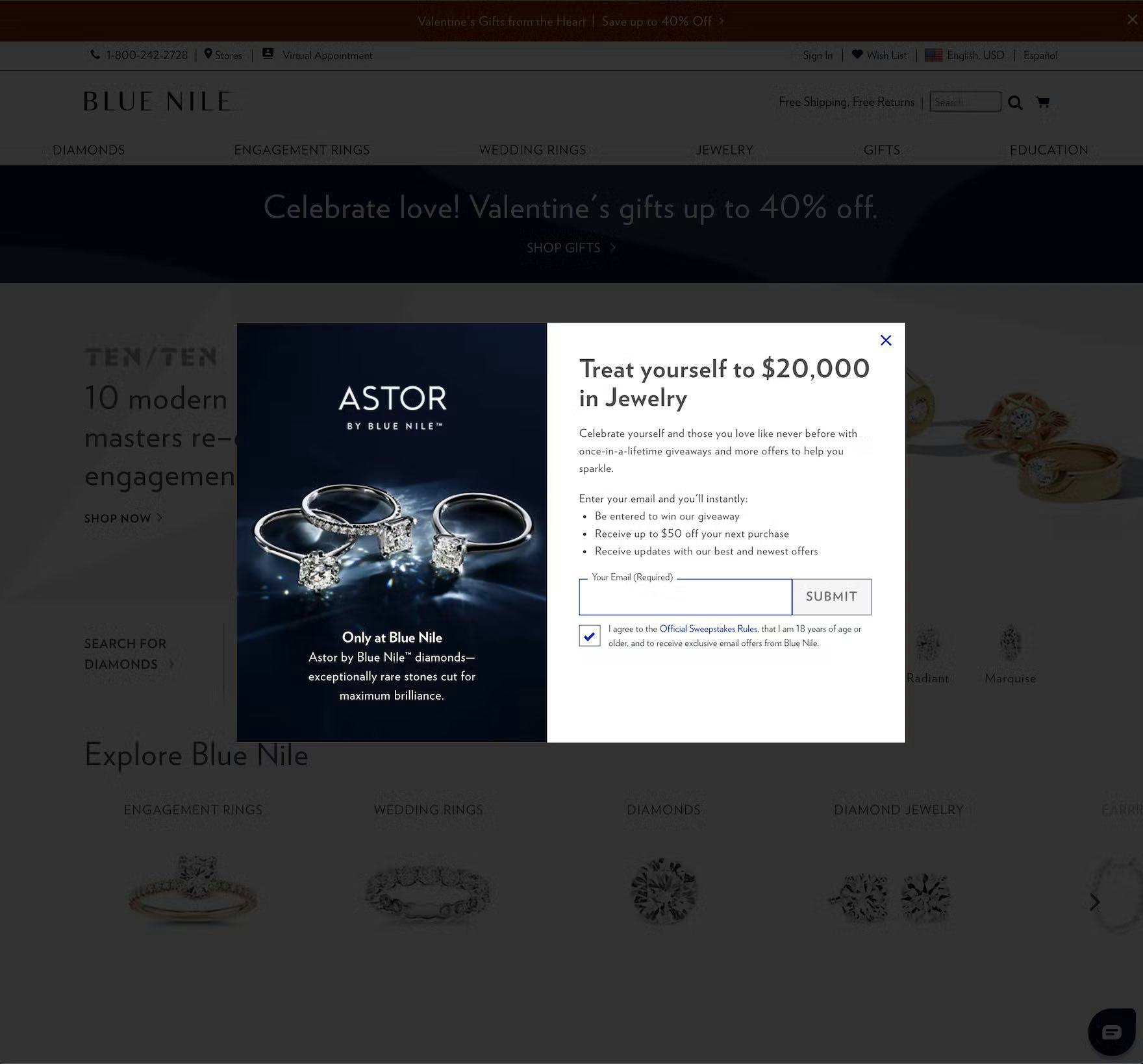
At Blue Nile, an overlay is used to present a newsletter sign-up in the form of a promotional sweepstakes entry form, and the “Role” is appropriately defined as dialog.
Sweepstakes Newsletter sign up Code Example (from Blue Nile)
<div
  role="dialog"
  class="modal_sweepstates_popup"
  aria-modal="true"
  aria-label="Enter to win a $20,000 in jewelry"
>
  ...
</div>
Likewise, overlays — ubiquitous in e-commerce as appearing as soon as users arrive at a site (e.g., “Sign up now to receive 10% off your first order”) — also need special consideration for their assigned “Role”.
The preferred method to accomplish this is by using either the role="dialog" or role="alertdialog" ARIA attributes.
In most instances, the ARIA role="dialog" suffices to communicate the function of the page element to assistive technologies.
However, in cases where the overlay conveys urgent information that demands users’ immediate attention and input, the "alertdialog" role is more useful — for example, when a user is exiting an area that will result in data loss (e.g., leaving the checkout flow on some sites), if there’s a time-out warning when the user is about to be logged out of their account, or when time-sensitive products are about to be released (e.g., hotel room or flight-booking websites).
Note: ARIA “Roles” are standardized and can be found by visiting the W3C’s Accessible Rich Internet Applications (WAI-ARIA) 1.1 documentation.
Ensure the Purpose of Components Is Clear to Users with Disabilities
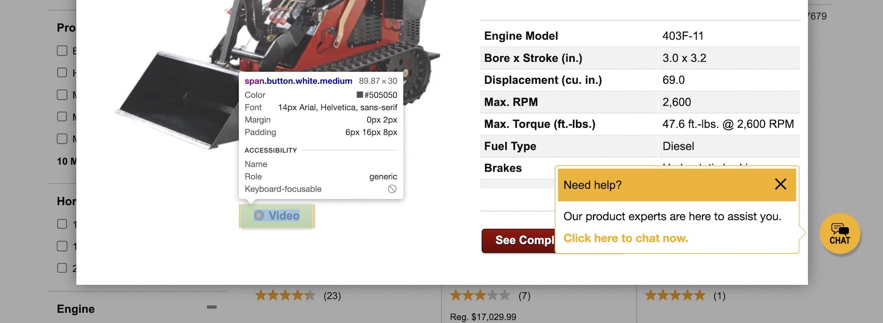
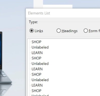
At Northern Tool, the “Role” is left as generic — instead of being specified as link — and the “Name” is empty, which won’t be of much help to users using assistive technologies and who are seeking to view the video of this product.
Inclusion of an ARIA “Role” is a requirement for accessibility compliance for any page element for which it would be relevant.
For example, a button implemented using the native HTML, as well as a button implemented using a custom method (e.g., a <div> or <span> container), would both require the addition of an ARIA role="button" attribute.
It is also important to understand that defining the “Role” of a custom UI component only informs the user of its intended purpose or function — it does not determine how the UI component will react to user input, as this functionality must be added separately.
For example, identifying a page element as a “button” informs assistive technologies that the element is intended to be interacted with like a button (e.g., “Hit ‘Enter’ when focused to press the button”).
It does not, however, cause the element to act like a button, and additional markup (or Javascript functions) will be required to allow users to interact with the button using any kind of input device — including screen readers.
Yet ensuring all components are marked up with the proper “Roles” is not only key to identifying the purpose of site components to users using assistive technologies, but also is an important step toward making an accessibility-compliant e-commerce site.
Getting access: all e-commerce accessibility guidelines are available today via Baymard Premium access. (If you already have an account, open the Accessibility Study.) See our E-Commerce Accessibility Audit service if you might be interested in getting Baymard to audit your site.