
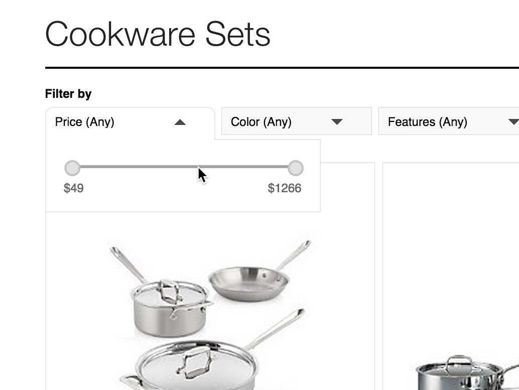
One of the observed issues: when the slider scale is linear it becomes very difficult for users to set their desired values. Here 50% of the slider width is used to control just 2% of the products, which makes the slider needlessly sensitive in the $50-$300 range where 5% of the slider width is used to control 50% of all the products.
While testing 18 major e-commerce sites for our study on e-commerce filtering, one of the form interfaces that proved most problematic to the test subjects were slider designs, e.g. commonly used for price sliders. In fact, dual-point range sliders for price and budget were misinterpreted by more than 50% of the test subjects and in general provoked numerous interaction issues.
Most often slider handles are overly sensitive for users to accurately set their desired value. During testing, the subjects would often go through multiple attempts at setting the slider values before arriving at their desired value range.
Now, this is not to say sliders should be avoided at all costs. They can work, but the usability tests revealed that slider designs must adhere to a handful of implementation details to avoid causing more harm than good. If a site is unwilling to spend the resources and effort required to resolve those implementation details, then the test sessions clearly showed that sliders turned out to be a poor interface choice.
In this article we’ll therefore explore the observed usability issues with slider interfaces by going over 5 implementation details integral to slider UX and slider designs.
1) Non-Linear Slider Scale
Linear slider scales will very often not be appropriate within e-commerce filtering, especially for price and budget. Normally the vast majority of products will be clustered within a relative narrow range with only a few outliers at either end of the scale.

When the slider scale is linear it can be very difficult for users to set meaningful values. Here at Crutchfield, 50% of the slider width is used to control just 2% of the 200+ products in the list. This in turn makes the slider needlessly sensitive in the $50-$300 range where 5% of the slider width is used to control 50% of all the products.
In practice we often observe that linear budget slider interfaces use 50% of the width to control just 5-10% of the products. This makes the slider extremely sensitive when users are trying to set the most commonly used values – the exact opposite interaction pattern than what it should ideally be.
Of the top 50 e-commerce sites with sliders, 83% use a linear slider scale despite product clustering, making the slider very difficult for users to control.
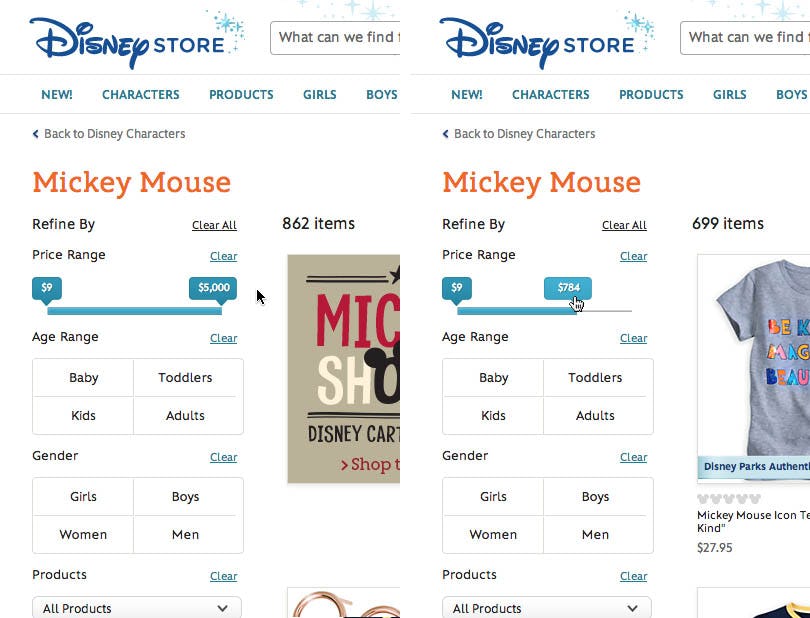
At the Disney Store, the price slider goes from $0 to $5,000. However, notice in the second image how Disney has cleverly used a non-linear slider scale as there are very few products that cost more than $1,000. This way the $1,000 - $5,000 range only takes up 25% of the slider width. Had the slider had a linear scale this upper price range would have consumed 80% of the width, which would have made it almost impossible to set a more common price range such as $25 - $45.
Instead of a linear scale, sites nearly always need to use either a biased-scale, a logarithmic scale, or similar. This is not just the case for price and budget filters, but also for most other numeric filtering values, such as filters for specific product features.
A biased-scale is based entirely on how the matching products are actually distributed along the filtering scale, and dynamically adjusts the interval jumps based on that distribution. While this offers the user the best control over the slider-jumps it can also introduce quite a bit of complexity to the site’s technical platform and setup. A technically simpler alternative to ensure non-linearity may also be using an exponential or logarithmic scale (log x and ln x), assuming the product distribution follows this curve somewhat accurately.
Tip: Sigurt Bladt has developed a proof-of-concept of the biased-scale concept – be sure to read his article about it.
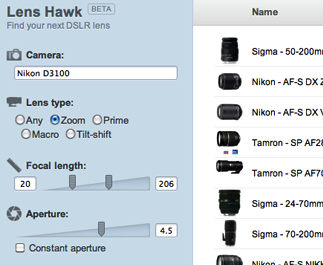
If you want to try out a non-linear scale yourself, you can test the slider at Disney Store for the “Price” filter and LensHawk for the “Focal Length” product attribute filter. The latter is using the exponential 2nd power, and also has an offset as the minimum slider value is different from 0.
While it is an important detail for all slider interfaces to indicate the current handle value, it is a prerequisite for non-linear sliders to live-update this value while the user drags the handle since it is otherwise impossible for the user to know the value, as opposed to linear sliders where the user can approximate the value from the handle position.
2) Slider ‘Handle’ Design Affordances
The usability test sessions revealed a crucial misalignment between how users tend to think of a budget and how websites typically implement their filtering slider. When it comes to several key product parameters, users often have a single-point mentality, i.e., “my budget for this gift is around $30.” Yet most sites will use a dual-point slider to allow both min and max filtering values to be set as a way of determining the filter boundaries.
User logic and slider implementation clashes because the user won’t necessarily expect the slider interface to have two values that needs to be defined. Indeed, more than 50% of the test subjects misinterpreted dual-point range sliders for price with a single-point slider.
More than half of the test subjects misinterpreted range sliders like this one for a single-point slider, often trying to click a specific value in the range. “Then I set a maximum of $30…”, the subject said as she clicked the point in the slider scale that matched $30, “Did it do it? No.. I tried clicking on $30 but it wouldn’t do it – so I might have to drag it there. Great, like this. Minimum?! No. Argh, this is freaking difficult.” It was only once the value was set that she realized she had defined a minimum price of $30, and not a $30 max as she had intended.
To mitigate some of this misalignment, the slider handles for dual-point range sliders should visually suggest to the user that multiple values can be set. A common design to achieve this affordance is giving the two slider handles opposing arrows, letting each point toward the other. The arrow helps create a visual hint that suggests a direction for the handle value thus helping the user see it as either a ‘from’ or ‘to’ value, which in turn implies that multiple values can be set.

Wayfair uses different handle designs for the minimum and maximum values to help indicate dual-point sliders.
Slider handles without directional affordances, or with a vertical direction, are naturally more likely to be misinterpreted for a single-point slider since there is nothing to logically suggest that the slider has multiple handles. Meanwhile, an opposing arrow design create this visual affordance and furthermore helps the user tell the two handles apart during interaction, letting them intuitively know which handle they are currently dragging.
3) Interpreting Mouse Clicks
For single-point sliders, if the user clicks at an point along the slider, the handle should jump to the appropriate value. This will support the commonly observed behavior of the test subjects just clicking at the slider’s range instead of dragging the slider handle. However, which of the two values, if any, should be set when the user clicks along a dual-handle slider?
Users were frequently observed to try to click at the desired value they wanted to set. However, for dual-point sliders one can’t predict if the user is trying to set the min or max value. Click behaviour should therefore be disabled entirely for dual-point sliders – as seen here on Crate & Barrel.
For dual-point sliders, clicking an interval value should not set the value for any of the handles. There are two reasons for this:
- It increases the risk of the user misinterpreting the slider for a single-point slider.
- There is no way to reliably predict which of the handles the user actually intend to set.
There should, however, be a click behavior. Simply ignoring the user’s click without any reaction creates a poor user experience and may cause misinterpretations of their own (such as “this feature is broken”). Therefore, on click, rather than setting the value of one of the handles, a message should appear which tells the user to please drag the two slider handles to set their desired value range.
After all, we can reasonably assume that the user is trying to manipulate the slider values, we just can’t guess which of the values they’re trying to change and we don’t want the user to confuse the dual-point slider for a single-point.
4) Text Field Fallback
Sliders controlling numeric filtering values (price, dimensions, performance attributes, etc.) should always be accompanied by text input fields acting as a fallback. The input fields provide the user with an alternative to the slider control – which can be imprecise if the user wants to set very specific values – and makes it easier for the user to infer if it’s a single-point slider (one input field) or a dual-point range slider (two input fields).

After a few failed attempts at setting the values using the slider, some subjects reverted to using the input fields at Blue Nile for setting the price filter.
Input fields makes it easier for the user to define precise ranges as they simply input their desired values, whereas dragging a slider handle requires finding the exact pixel on the screen where the slider interval comes closest to their desired value. Slider ranges are just inherently inaccurate, which is good for encouraging exploration but limiting and bothersome to users with precise constraints.

Since the currently set value for each handle needs to be indicated in the interface anyways, the small fallback form field won’t necessarily consume much extra space. It can however add some visual complexity, which might be why some sites leave them out. This is a serious mistake when designing forms however considering just how important these fields are to users who want to set an exact range or for those with degraded fine motor skills in their hands.
5) Live Update Results
Since text field fallbacks are required, the main benefit of slider interfaces is not a visually simpler interface, but rather in the way users filter. Having the filter represented visually can act as an encouragement to filter – both through the more visual representation and though the seemingly simpler interaction.

If the results update live, it can encourage users to explore different values as they see the direct impact it has when narrowing or broadening the slider range.
If sliders are combined with live updating results – i.e. the product list updates while the user is dragging the handle – a slider can not only encourage filtering but may also encourage exploration. The direct correlation between how far the slider handle is dragged and what products the user sees, can add a playful feel to setting a value and can therefore encourage users to drag the slider just a few values further than originally intended to see what other products might then appear/disappear.
Having a minimum of latency between the slide handle and the live updated results is crucial as the effect diminishes if the live updating lags behind. In other words, low latency is essential, with 250-500ms being a reasonable upper threshold.
This last implementation detail isn’t necessary for a slider interface to work. It is however a great way to increase its usefulness which of course helps justify the design.
Getting Slider Designs Right
Sliders are generally rare on e-commerce sites. Only 16% of the top 50 sites have a slider for setting any type of filter. And that is rightfully so.
If there aren’t the available resources to address all of the first four implementation details described then a slider interface shouldn’t be used at all. Otherwise the slider interface ends up as a case of false simplicity – it seems simple when looking at it, but as users try to actually use the interface it breaks apart and results in a very clumsy slider user experience.
In particular using a non-linear slider scale for non-linear distribution is one of the most important components – while at the same time also being the implementation detail most sites lacked. In fact, 83% of the top sites with a slider, wrongly use a linear scale on values that aren’t distributed evenly – making the slider interface largely useless.
If the basic implementation details are in place, however, and low-latency live updating of the product list results is achieved, one may take sliders to the next level by experimenting with ‘fuzzy’ boundaries to support users’ single-point mental metal of wanting something “around $30”.
This article presents the research findings from just 1 of the 700+ UX guidelines in Baymard – get full access to learn how to create a “State of the Art” ecommerce user experience.