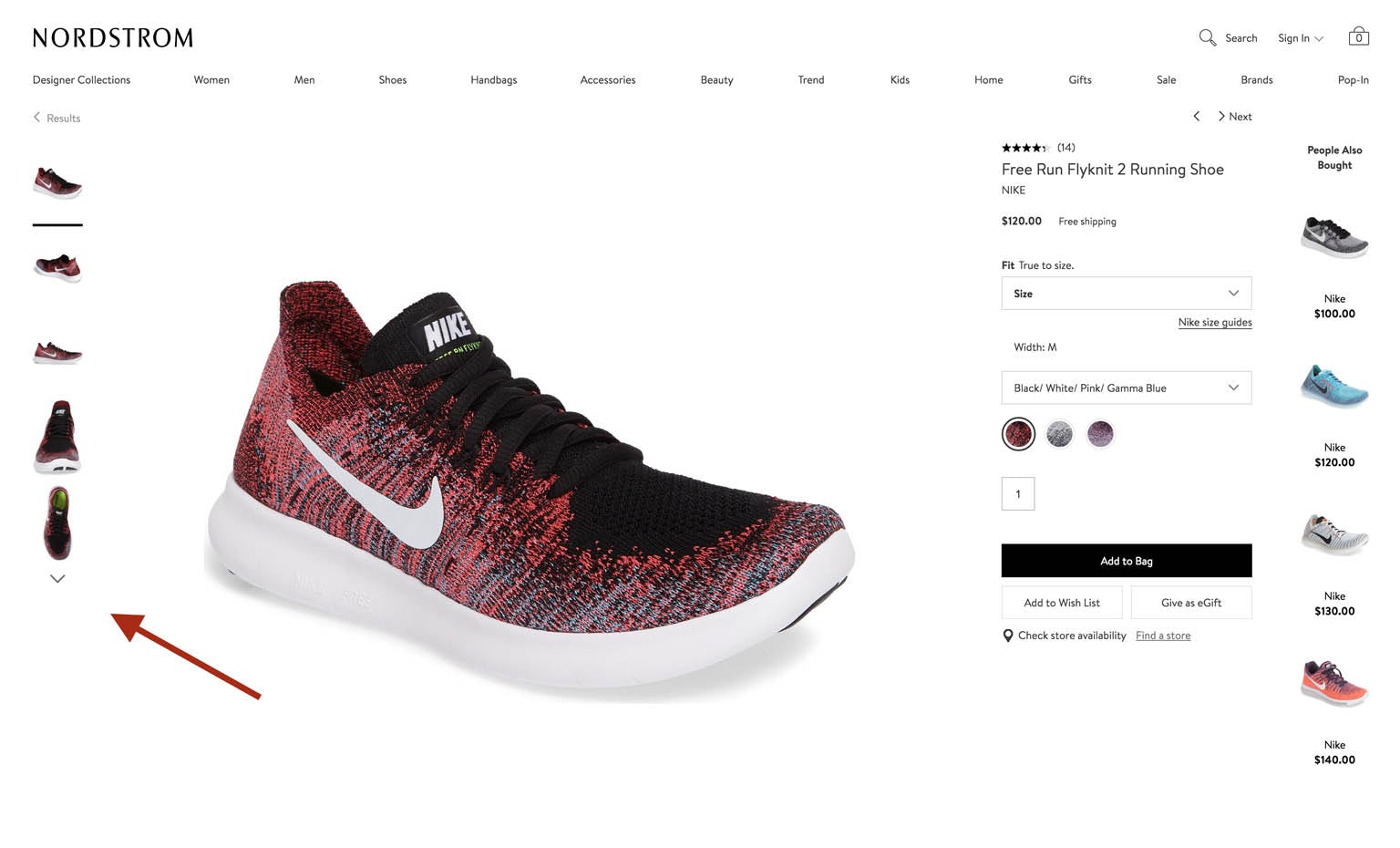
Our Product Page usability testing shows that truncating the additional product thumbnails — for example, by using a manual carousel with an arrow as the “truncation indicator” — causes 50–80% of users to overlook all of the truncated/hidden product images. Yet 30% of sites use truncation designs similar to what’s seen here at Nordstrom.
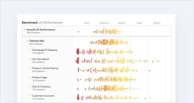
Product images are some of the most important components on the product page, as they directly influence users’ product exploration and decision process. In our latest Product Page usability study we found that 30% of e-commerce sites truncate thumbnails in the image gallery without a sufficiently clear truncation indication. In our large-scale usability testing this caused 50–80% of users to overlook all of the additional (truncated) images available on the product page, and resulted in multiple direct site abandonments.
Testing did, however, also reveal two design patterns that solve the issue, as these patterns ensured that all of the test subjects noticed all of the product thumbnails available.
In this article we’ll therefore cover our test findings from our Product Page usability study that pertain to “thumbnail truncation.” In particular, we’ll discuss:
- the three ways e-commerce sites typically truncate product thumbnails in the product page image gallery, and why each causes grave issues, and
- the two design patterns that testing showed solves the issue.
Truncating Thumbnails Causes 50–80% of Users to Overlook Them
Our Product Page benchmark reveals that half of e-commerce sites reduce the number of product thumbnails shown to users in the image gallery by truncating additional product thumbnails beyond a certain number. For example, five product thumbnails may be displayed in the image gallery by default, yet there are ten thumbnails in total. Unfortunately, 30% of all sites use a poor truncation indicator, making it difficult for users to find the additional images.
when users overlook images it’s as severe an issue as if the site didn’t provide them
Our testing revealed several issues with truncating product thumbnails, the most severe of which was that 50–80% of subjects never realized there were additional product thumbnails or images available on the product page (the other, less severe issues being related to unexpected and quirky UI interactions). It’s important to realize that from a user’s perspective, images overlooked are the same as if the site didn’t provide those images at all.
In e-commerce, there are three predominant ways of truncating thumbnails:
- Manual thumbnail carousel – i.e. the thumbnails only advance when the user actively clicks an arrow or similar icon.
- Truncation link - i.e. all the thumbnails are revealed either inline or in an overlay when a link is clicked.
- Auto-advancing thumbnail carousel – i.e. the thumbnails automatically rotate when the last visible thumbnail is clicked.
All three methods of thumbnail truncation were found to cause severe issues with users overlooking the hidden thumbnails. In the following we’ll examine our test findings for all three truncation methods.
(Note that in this article we have deliberately chosen not to “zoom” any of the interface screenshots, in order to better reflect how users will view the small truncation indicators, when the indicators appear within the overall Product Page context.)
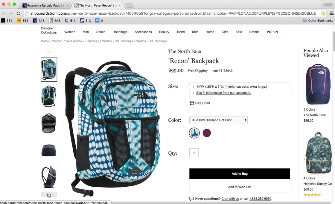
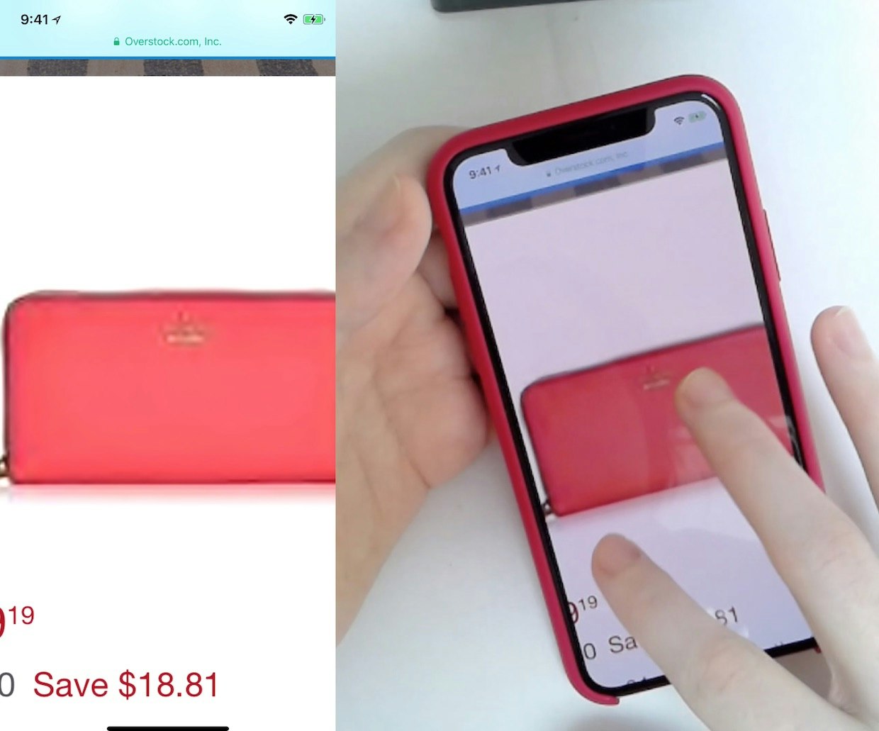
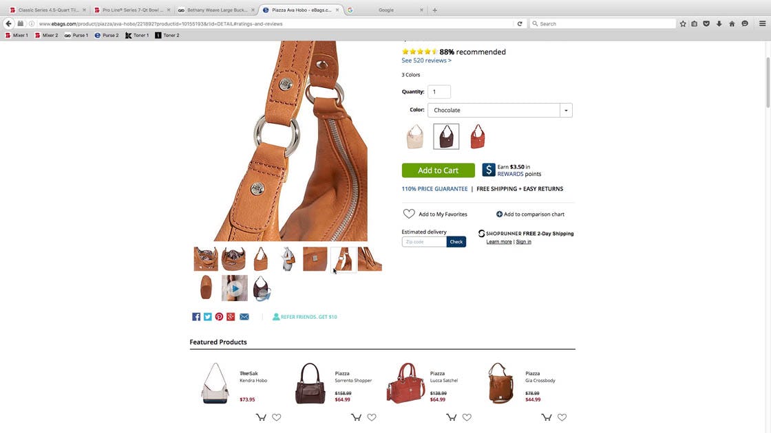
“Okay so there’s additional images… that’s what I was missing… I just missed the scroll down.” This subject closely examined all the default displayed product thumbnails, but took 7 minutes to discover that there was an additional truncated product thumbnail. 83% of the test subjects overlooked or had significant issues finding truncated product thumbnails that were accessible only via a manual carousel arrow at Nordstrom.
“Having a picture helps me, I’m a visual person,” a test subject commented during testing. Indeed, this subject spent 3 minutes carefully investigating each of the 5 product thumbnails and images shown by default, including zooming most of the images and watching the entire product video. However, the subject failed to use the arrow to navigate to the 3 additional product thumbnails available, thereby missing out on 38% of the visual information available – despite it clearly being important to her.
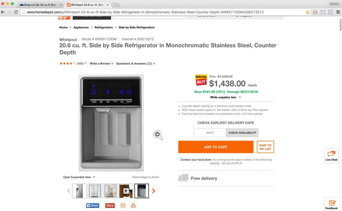
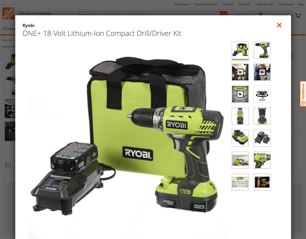
Some product pages provide a “manual carousel” to switch between the truncated product thumbnails. This provides users with manual carousel controls — typically in the form of “arrows” — to indicate the existence of truncated product thumbnails. Such designs performed poorly during testing. In fact, 60% of subjects either never found the truncated product thumbnails or had trouble finding them when the product thumbnails were within a manual carousel located below the main product image (as in the Home Depot example above).
Truncating product thumbnails by using a carousel performed poorly regardless of whether the product thumbnails appeared below the main product image (i.e., horizontally, as described above) or to the side of the image (i.e., vertically). In fact, 83% of subjects during testing had significant trouble finding (or never found) truncated product thumbnails when the product thumbnails were displayed vertically next to the image. When truncated product thumbnails are within a carousel the majority of users will miss or struggle to find them.

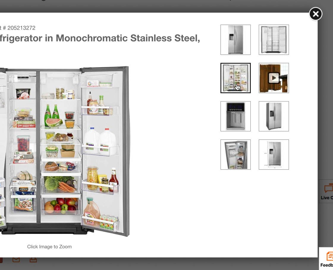
“I want more photos… Oh there they are. That was a little hard to find, the ‘Expanded View’.” A different subject had difficulty finding the “Expanded View” truncation link used at Home Depot, which opened an overlay that then displayed all the product thumbnails. Truncation links are prone to be overlooked (users are looking at the image and thumbnails themselves) and often demand too-little visual attention considering the high amount of product images they “hide.”
Truncation links – such as clicking a link to open an “Expanded View” and then viewing all product thumbnails, as shown in the Home Depot example above – also performed poorly during testing. Both carousel controls and truncation links suffer from having a limited visual impact on users and a small hit area.
These truncation indicators are very subtle compared to other elements on the product page, such as the main product image, the product description, buy buttons, and so on. These more visually dominant elements make truncation indicators easy to overlook and, even when noticed, appear as highly secondary, unimportant controls. This is a major usability issue, considering the importance of serving users with a large and diverse set of product images — for example, “In Scale” images.
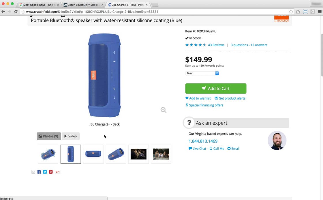
Not a single test subject viewed all of product thumbnails available at Crutchfield. The auto-advancing carousel design doesn’t use any truncation indicator, but instead rotate the product thumbnails when the (currently) last product thumbnail is clicked – which makes it impossible for users to know that additional thumbnails even exist.
Even worse than using carousel arrows or links to indicate the existence of truncated product thumbnails is not using any indicator at all. This design is often observed in auto-advancing carousels, where a truncated thumbnail is automatically shown when the last visible thumbnail is clicked. In practice, this design results in users consistently overlook some or all of the truncated product thumbnails.
Without any indication of additional product thumbnails, users are extremely likely to miss out on them, because even the most attentive users will, in their initial scan and familiarization with the product page, not be able to see that additional product thumbnails exist. It’s only when users interact with some of the visible thumbnails that this design pattern reveals itself to the user. Alas, at this point, the user’s focus will often have shifted toward the large and just-changed product image (which is, after all, the purpose of the image gallery interface).
Two Design Patterns Identified to Solve the Issue
Testing revealed two design patterns that ensured that all subjects were able to notice all of the product thumbnails available.
Subjects were easily able to view all of the available product thumbnails on eBags, which were simply displayed in two rows underneath the main product image. This design eliminates the risk that users will mistakenly skip over product thumbnails because they’re unaware of them.
1) The first solution, which in testing performed well with users, is to simply display all product thumbnails directly in the image gallery and avoid thumbnail truncation altogether. Testing showed that subjects had no problem reviewing product thumbnails on the product page, even if the product thumbnails spanned two rows.
Of course, there’s an upper limit to the number of product thumbnails users will tolerate on the product page, but, for products with as many as 10–14 product thumbnails, simply displaying them all on the product page will often be the easiest and “safest” design solution.
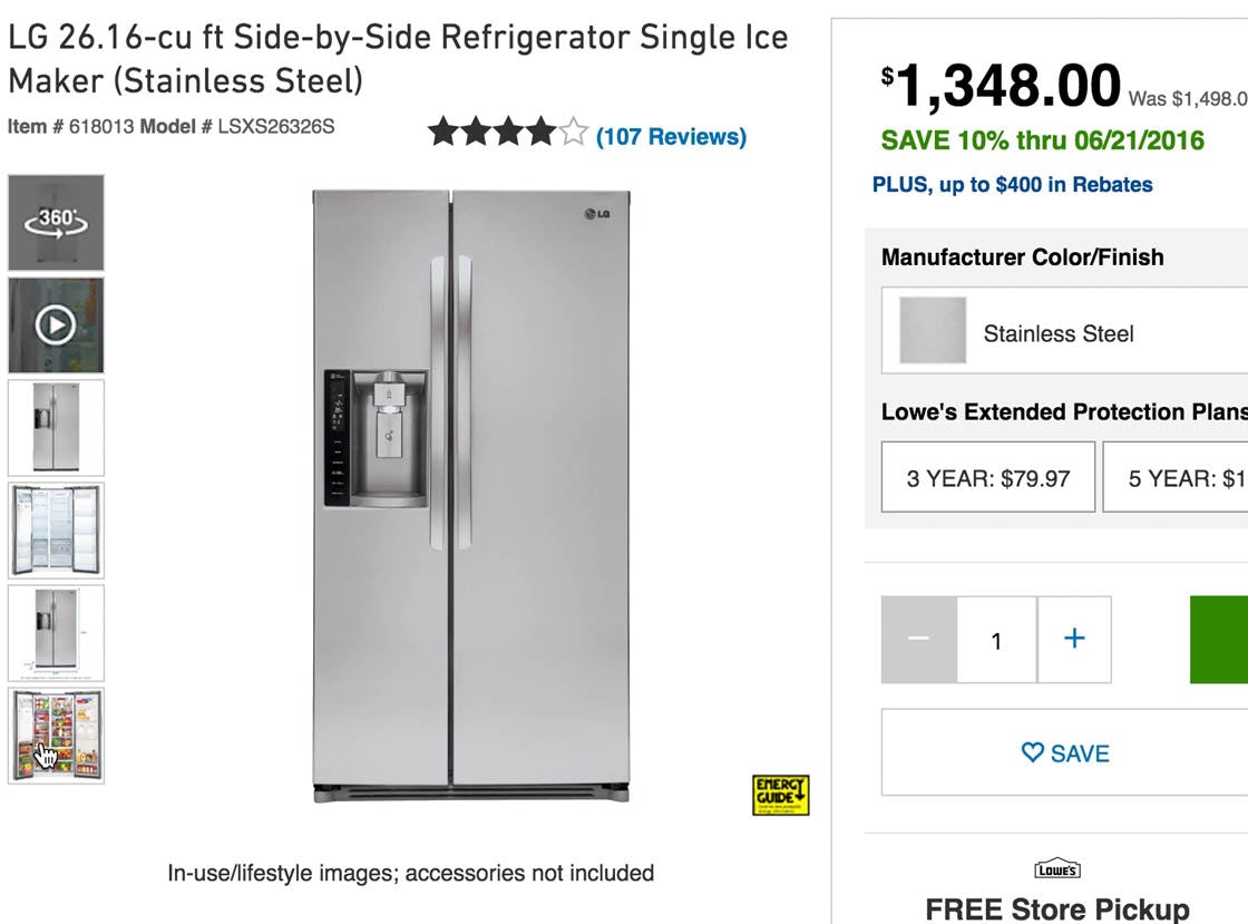
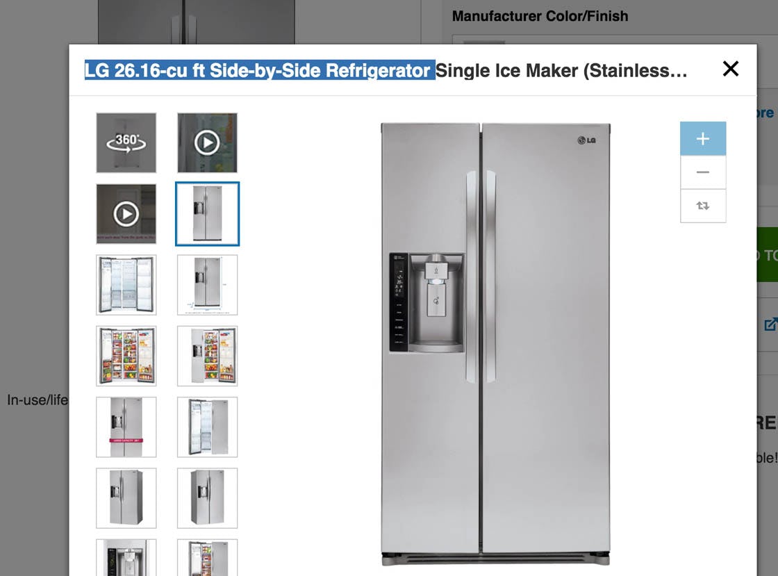
“Oh wow… right here it shows only these options. But when it popped up there’s a bunch of options [thumbnails] and you can see a lot. I like that,” a subject said at Lowe’s. Lowe’s truncates the product thumbnails by default on the product page, but when users click any product thumbnail in the image gallery an overlay is opened with all the product thumbnails.
2) The second solution verified to perform well is to reveal all the product thumbnails available when users click on any of the default displayed product thumbnails on the product page. This method has the benefit of exposing users to all of the product thumbnails available if they click any thumbnail on the product page. This design pattern, therefore, addresses the biggest issue with truncation: discovering the truncation trigger.
When any thumbnail in the image gallery is clicked, the extra thumbnails can either be inlined in the default image gallery view (using a multi-line approach), or a product image overlay can be used, which displays all thumbnails along with a larger product image.
In summary, e-commerce sites should therefore either display all product thumbnails directly on the product page (i.e., no truncation), or reveal all product thumbnails when users click any thumbnail.
It’s Not Necessarily an ‘All or Nothing’ Situation
Currently 30% of e-commerce sites use overly subtle truncation indicators resulting in their users having a difficult time finding (or even altogether overlooking) the additional thumbnails available to them.
While sometimes necessary, truncation designs are fraught with usability pitfalls. This is why solution #1 proved to perform so well during testing – by eliminating the truncation you eliminate its potential pitfalls.
Yet for the instances where truncation is warranted, solution #2 works (i.e. revealing all thumbnails regardless of which one is clicked), because it discloses all truncated content immediately upon the user showing interest in the content (inferred by them interacting with it). This naturally makes discoverability less of an issue, because everything is revealed upon the slightest of user “provocations” – yet it doesn’t altogether eliminate the issue. Before interacting with the image gallery, users still have no way of knowing that additional images exist. Supplementing solution #2 with a truncation link may resolve this issue for a sub-set of users.
As mentioned, 50-80% of users overlook truncation indicators and links. This means that this is insufficient as the primary design affordance. Yet it also means that 50-20% of users do notice these links; something we can take advantage of by using truncation links as a secondary affordance – that is, as a supplement to solution #2.
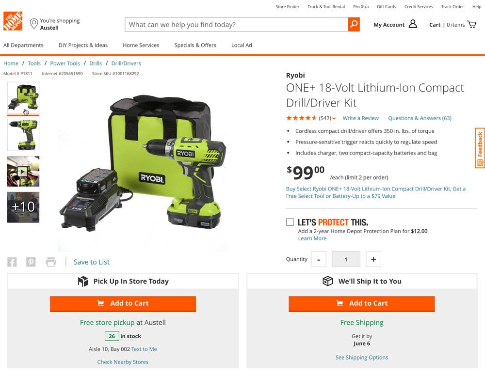
Home Depot now uses solution #2 by invoking an overlay that reveals all thumbnails regardless of which of the visible thumbnails are clicked. In addition to this, they also display a ‘+10’ truncation indicator on top of the last thumbnail visible in the image gallery at page load, supplementing attentive users with indication that more images are available.
Displaying a truncation link saying “7 additional images available” in addition to revealing all truncated content upon the first user interaction means that a not-insignificant sub-set of users (20-50%) will get the benefit of information scent about the additional images available without any interaction with the image gallery (the secondary solution), while simultaneously ensuring that all users are exposed to all the images available upon interaction with it (the primary solution).
This is an important design principle to keep in mind: a design pattern that suffers from discoverability issues doesn’t necessarily have to be rejected outright, it just isn’t sufficient. While you therefore cannot rely upon that as your primary design affordance for the feature, you may find that it can serve as a helpful supplement to another design solution.
(To learn more UX design principles, consider these UX courses, including our UX certification.)
This article presents the research findings from just 1 of the 650+ UX guidelines in Baymard – get full access to learn how to create a “State of the Art” ecommerce user experience.