1167 ‘Customer Info & Address’ Design Examples
Also referred to as: Shipping Address, Personal Data, Email Address, Name, Telephone Number
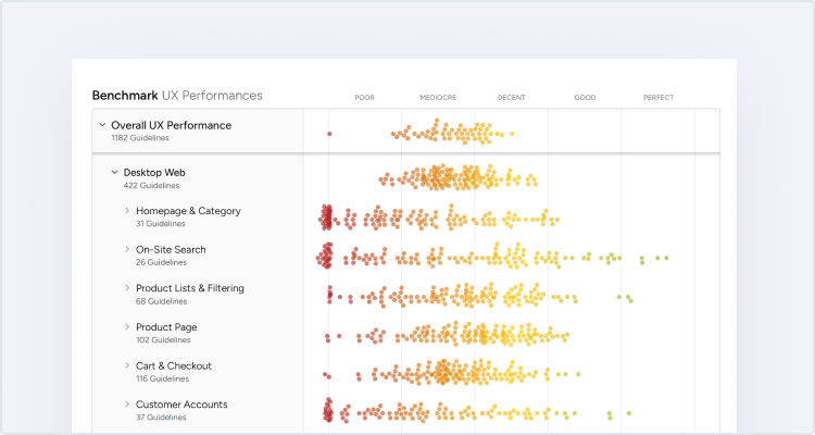
What’s this? Here you’ll find 1167 “Customer Info & Address” full-page screenshots annotated with research-based UX insights, sourced from Baymard’s UX benchmark of 319 e-commerce sites. (Note: this is less than 1% of the full research catalog.)
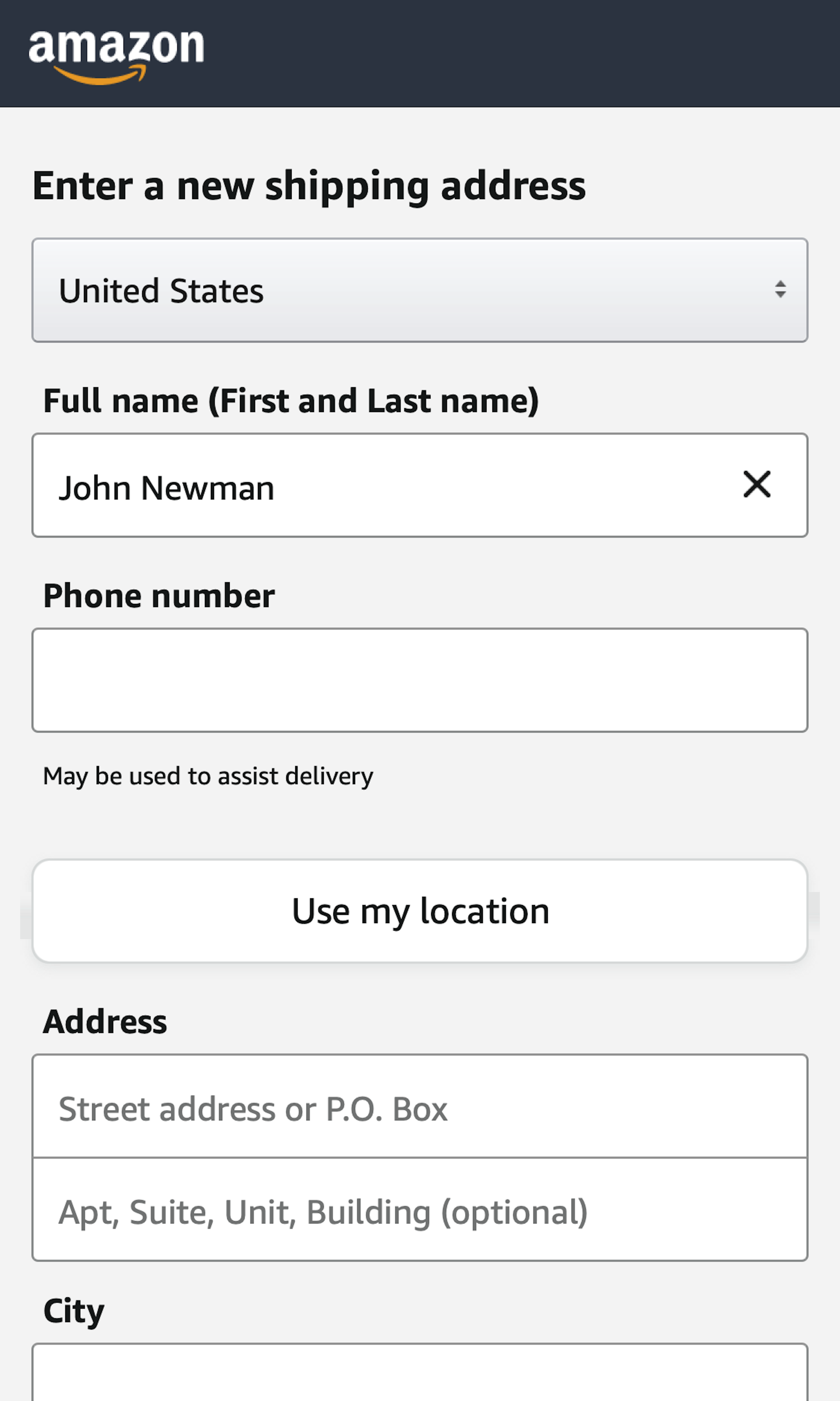
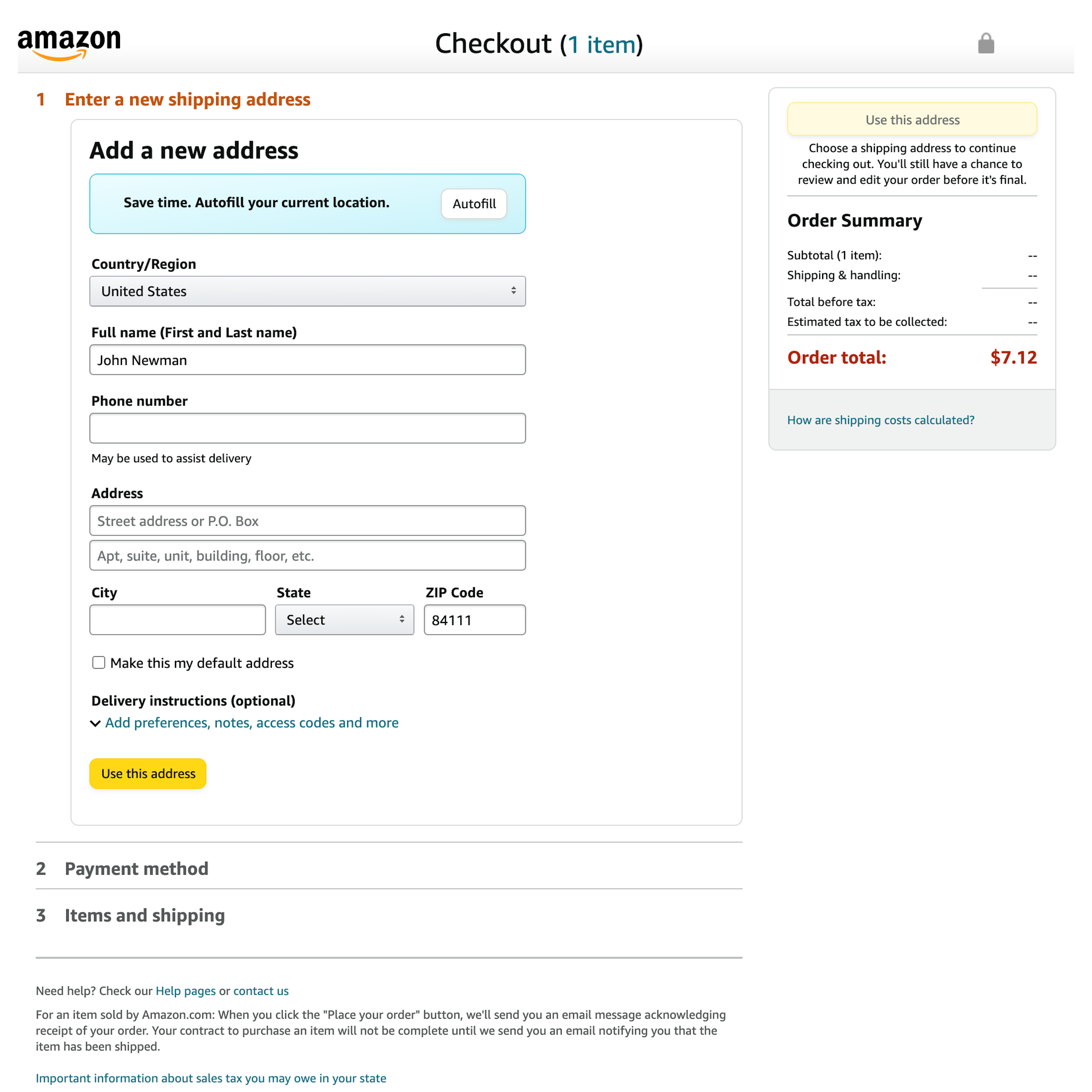
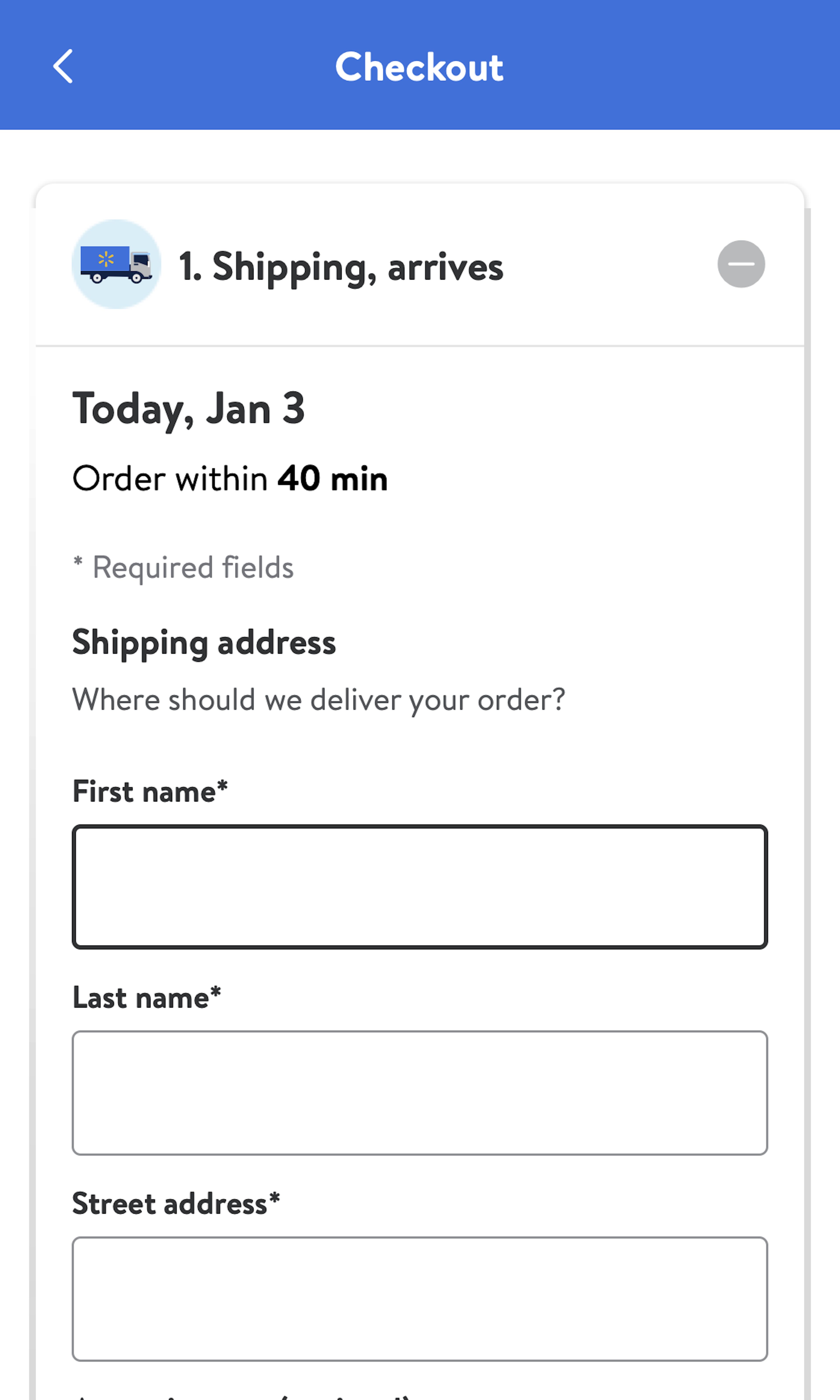
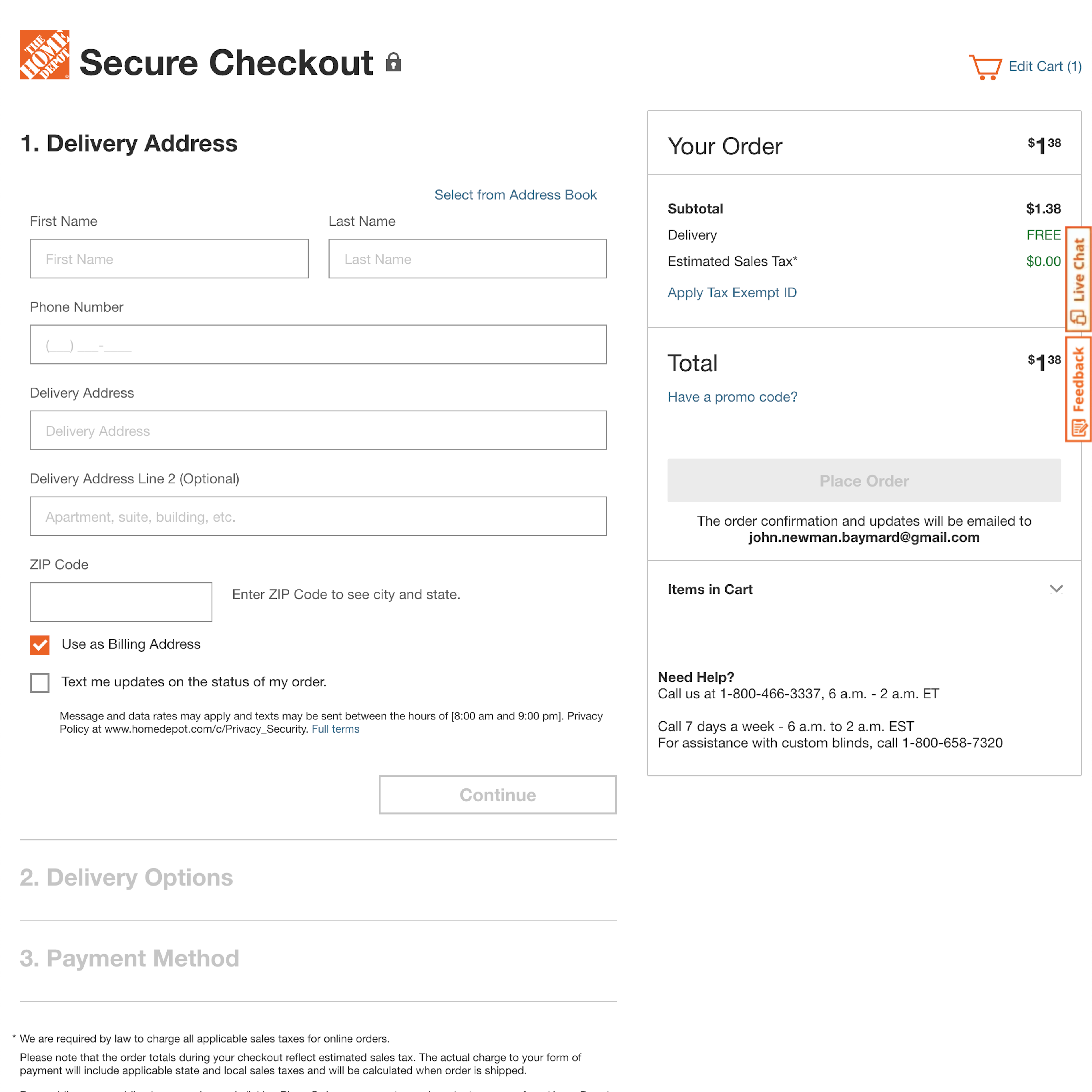
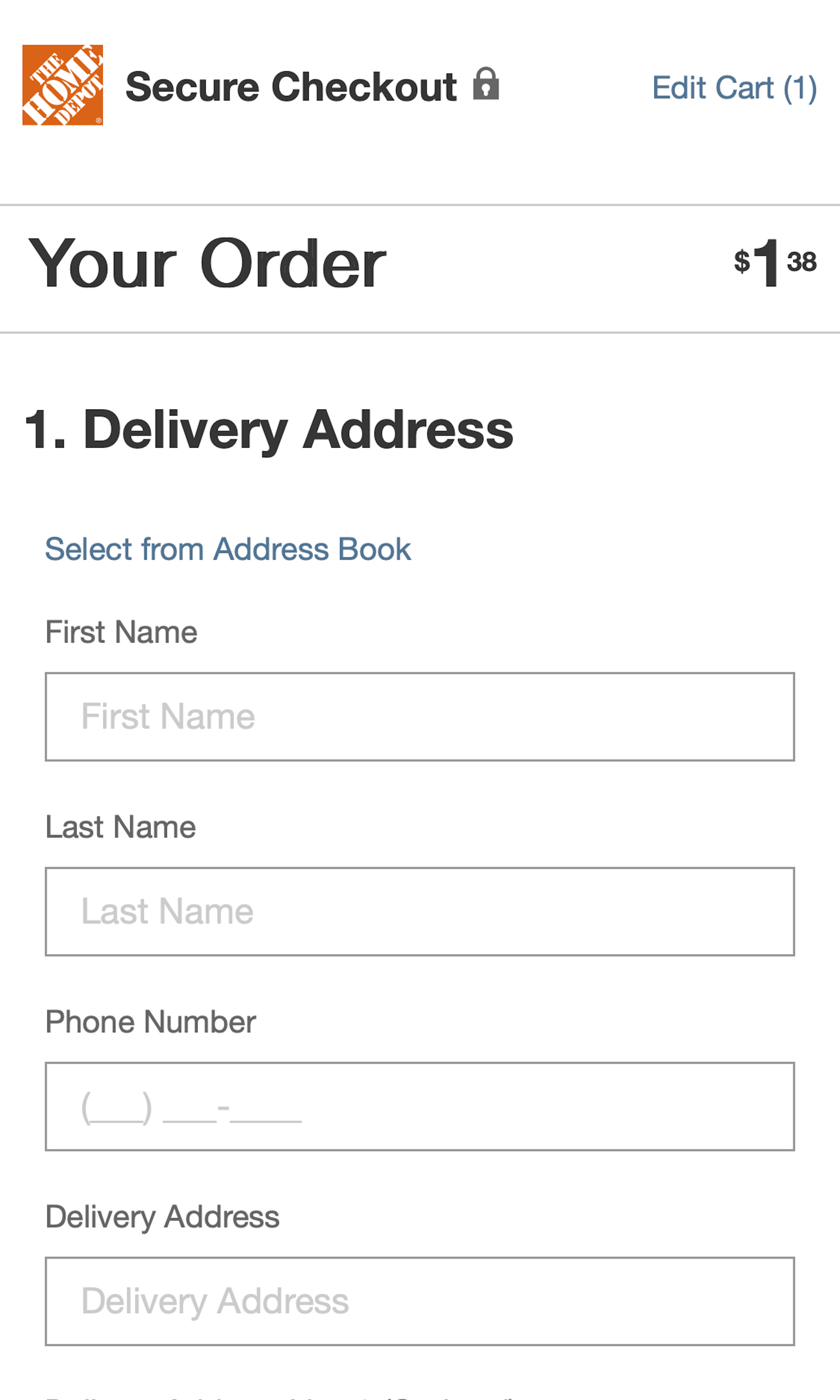
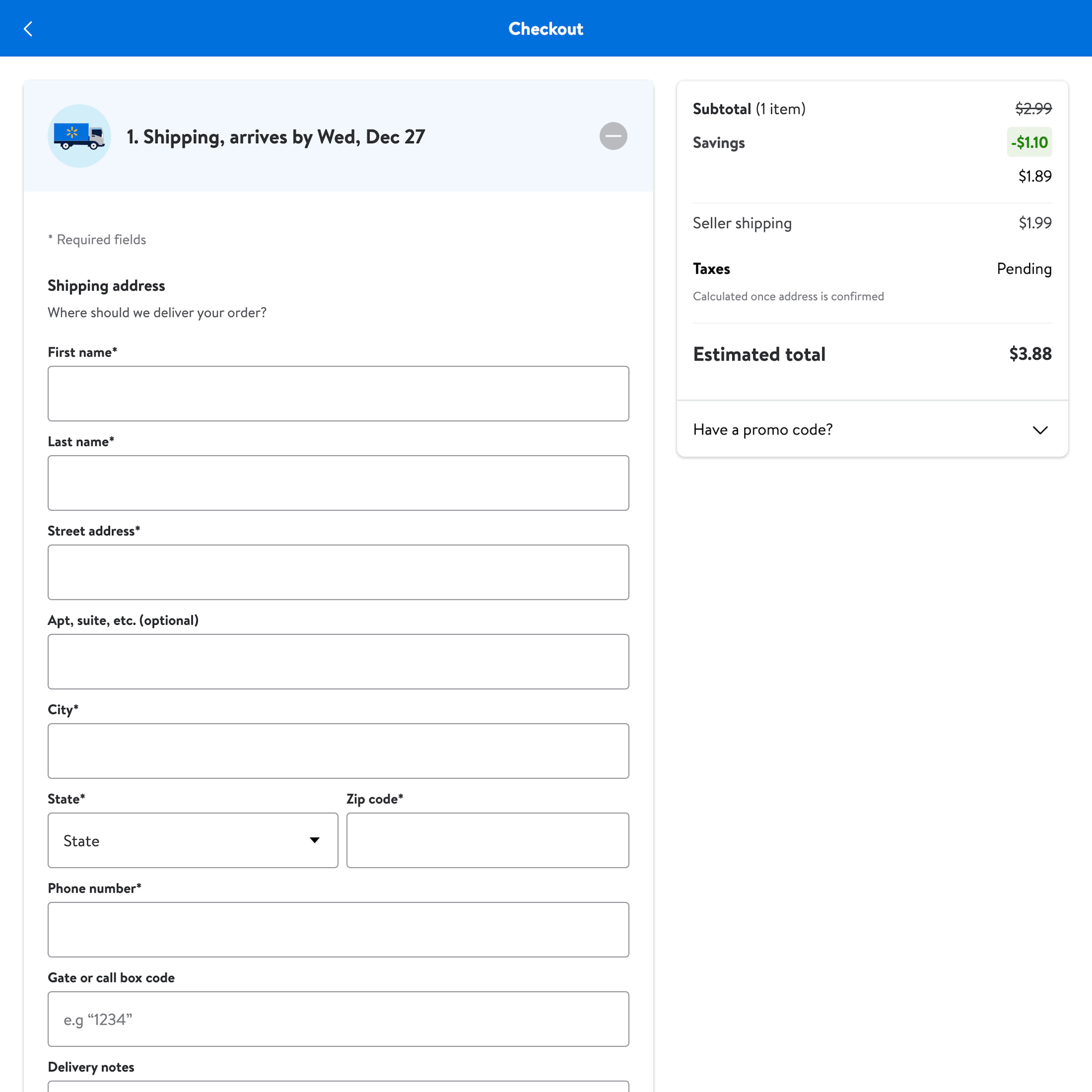
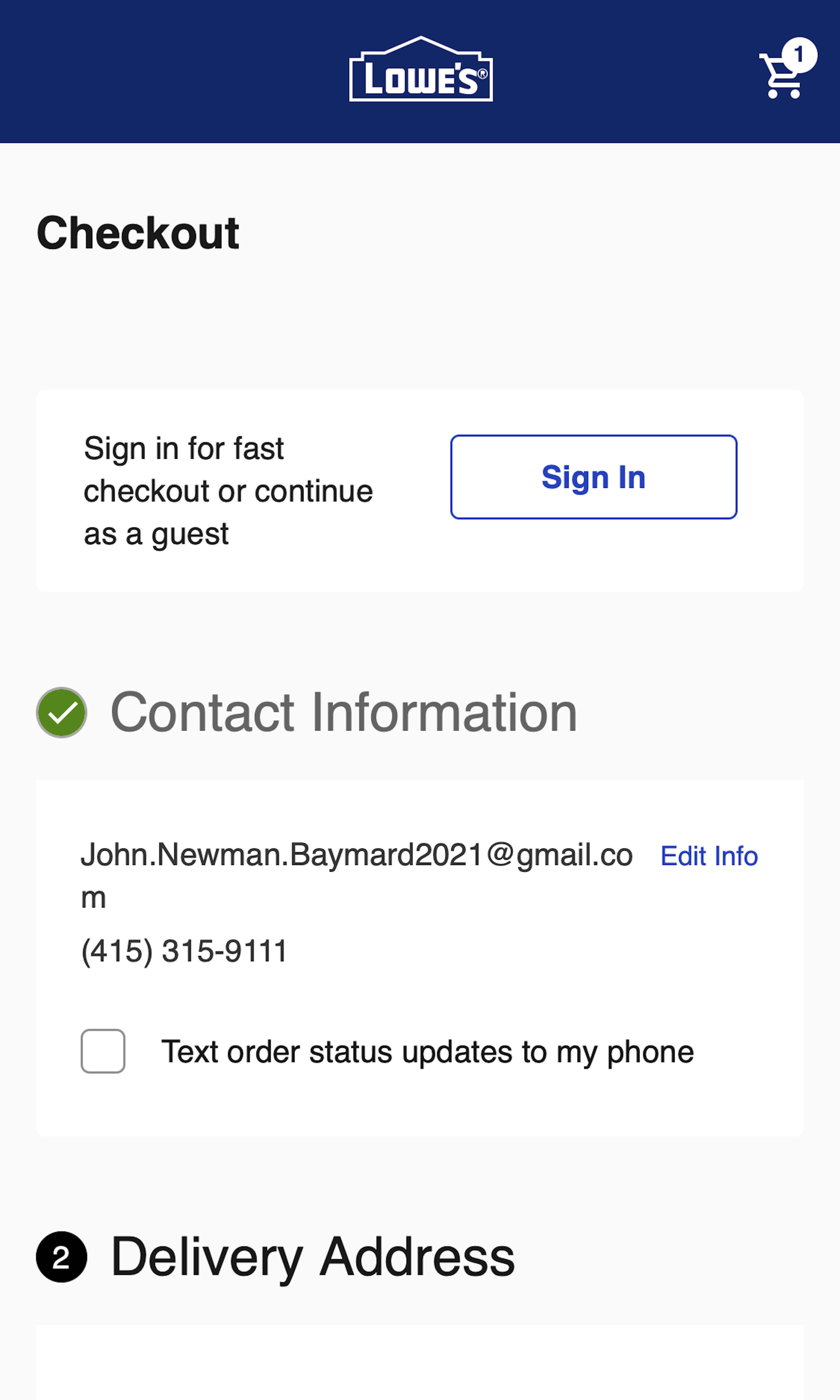
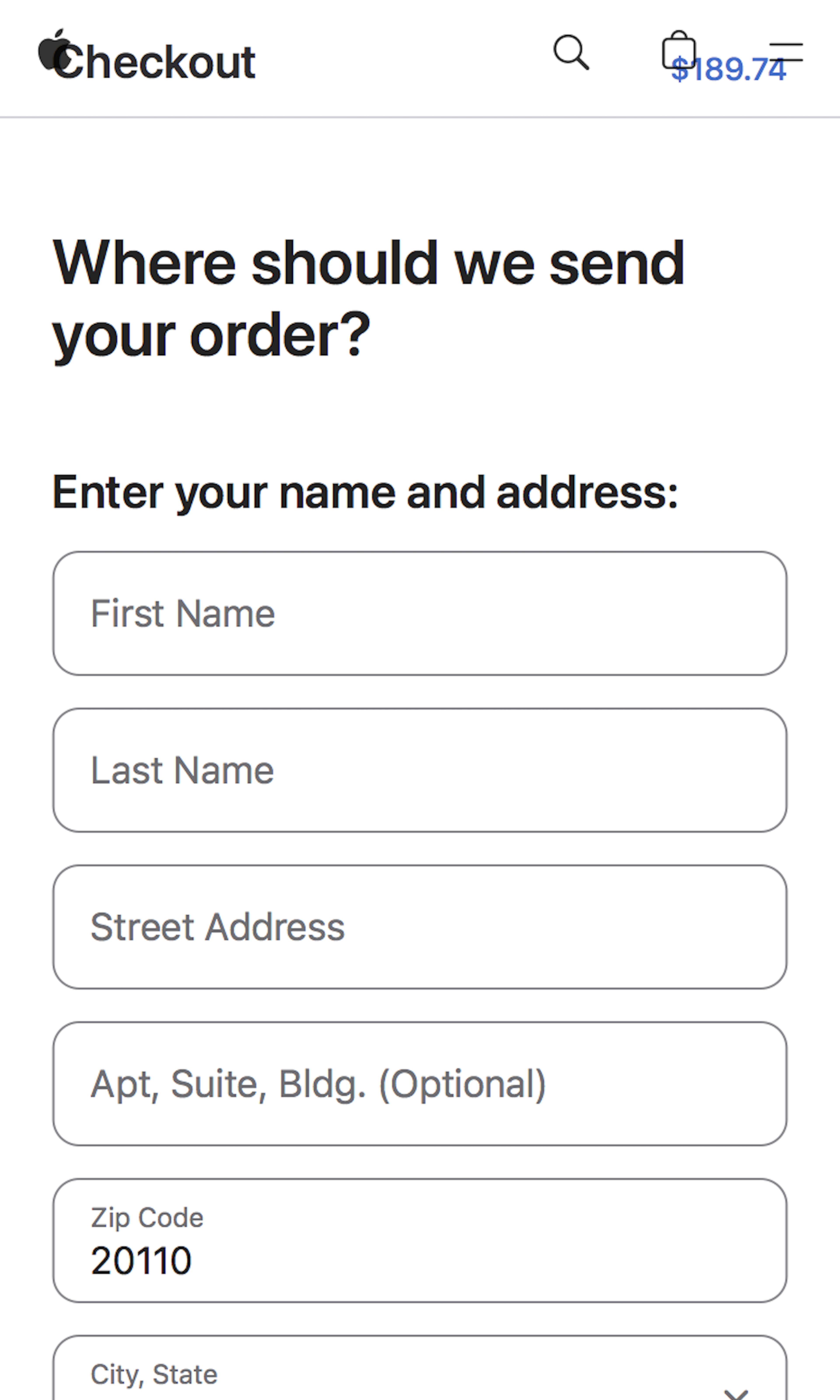
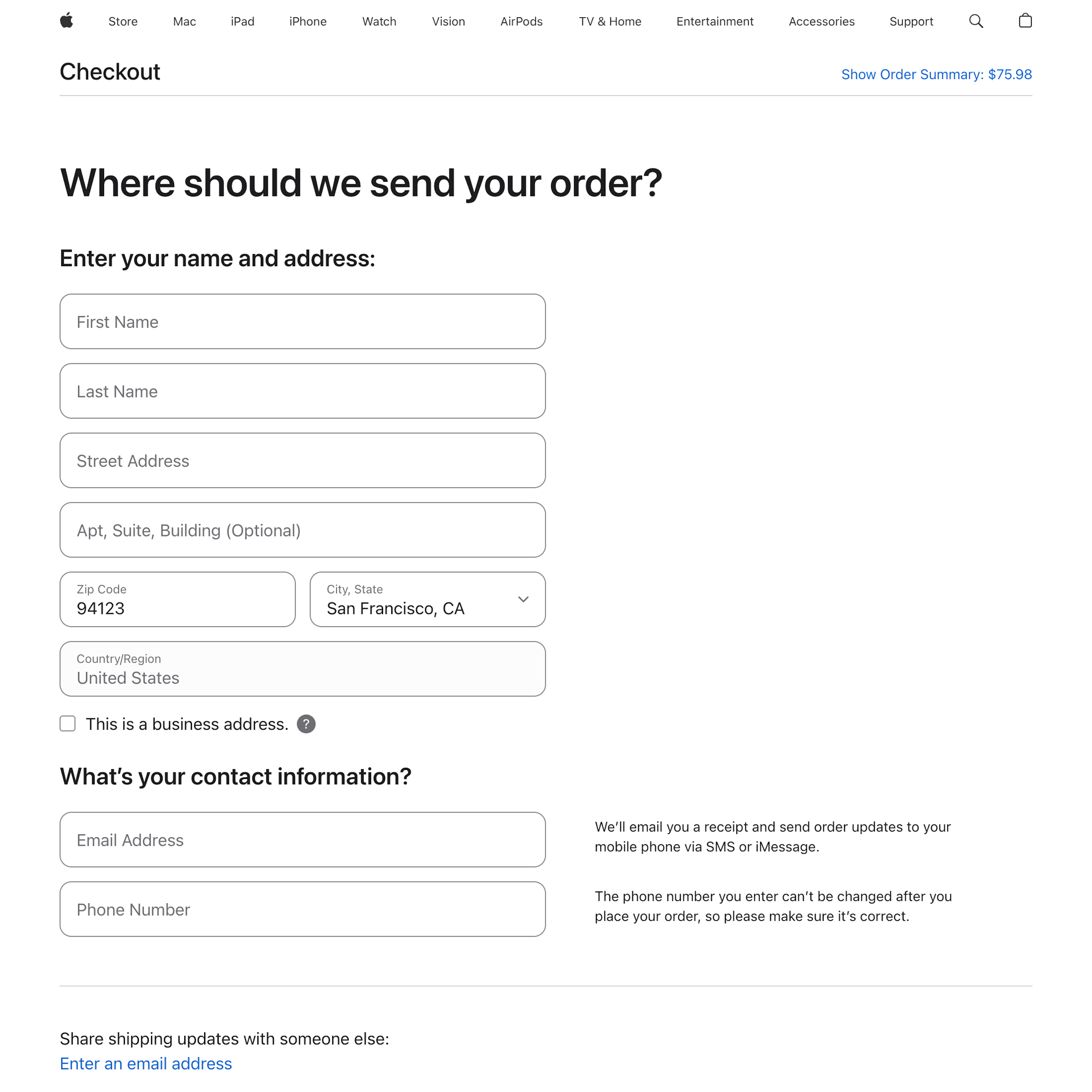
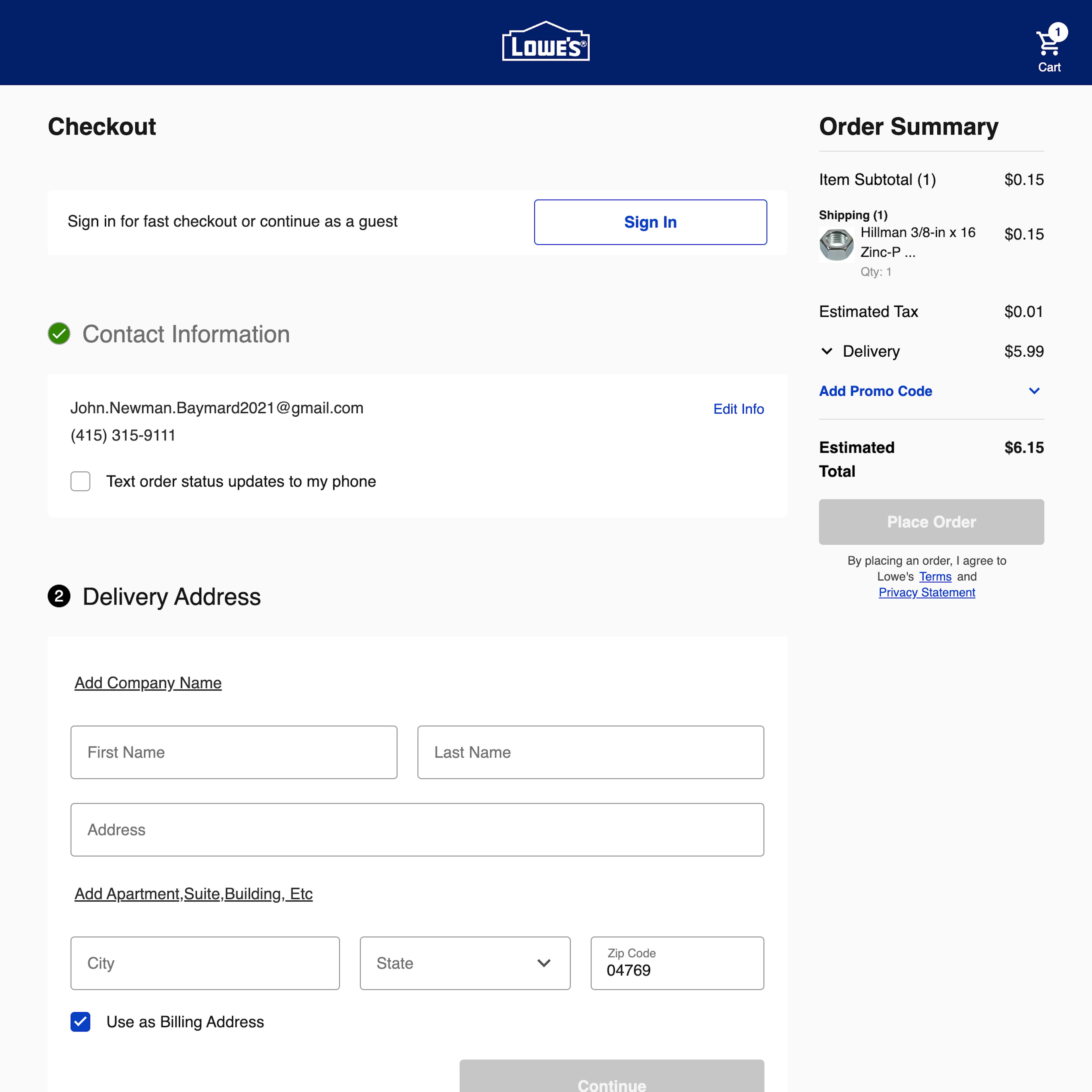
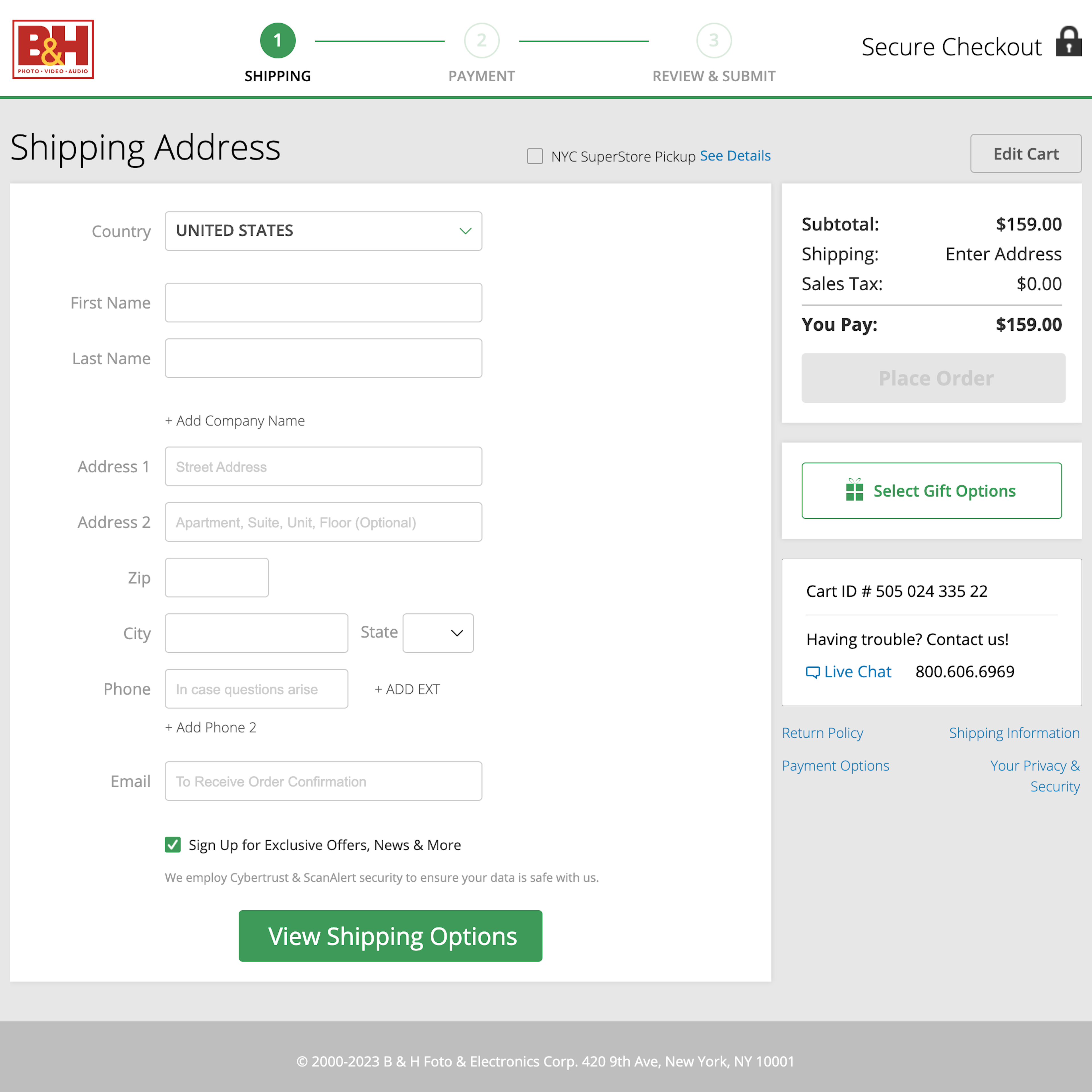
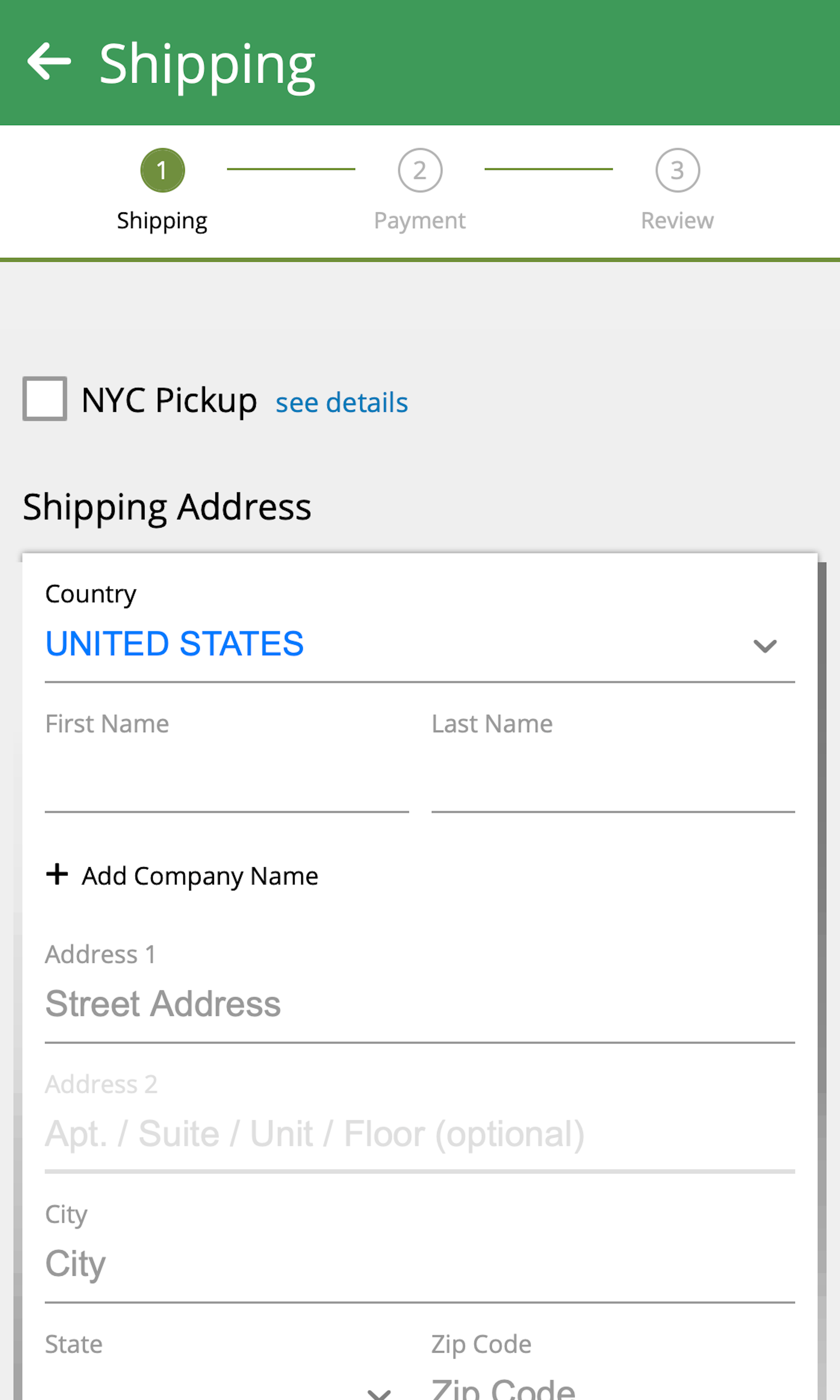
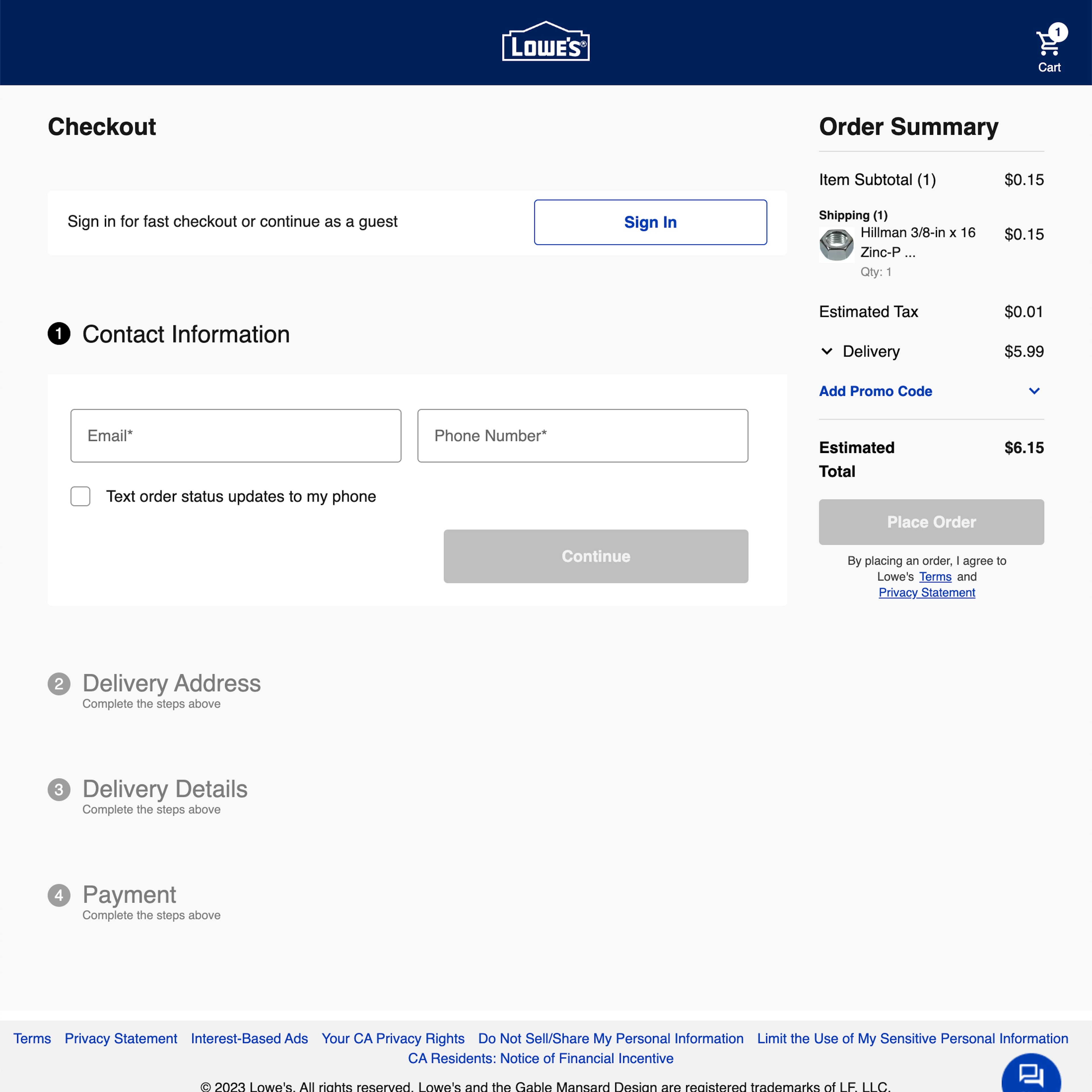
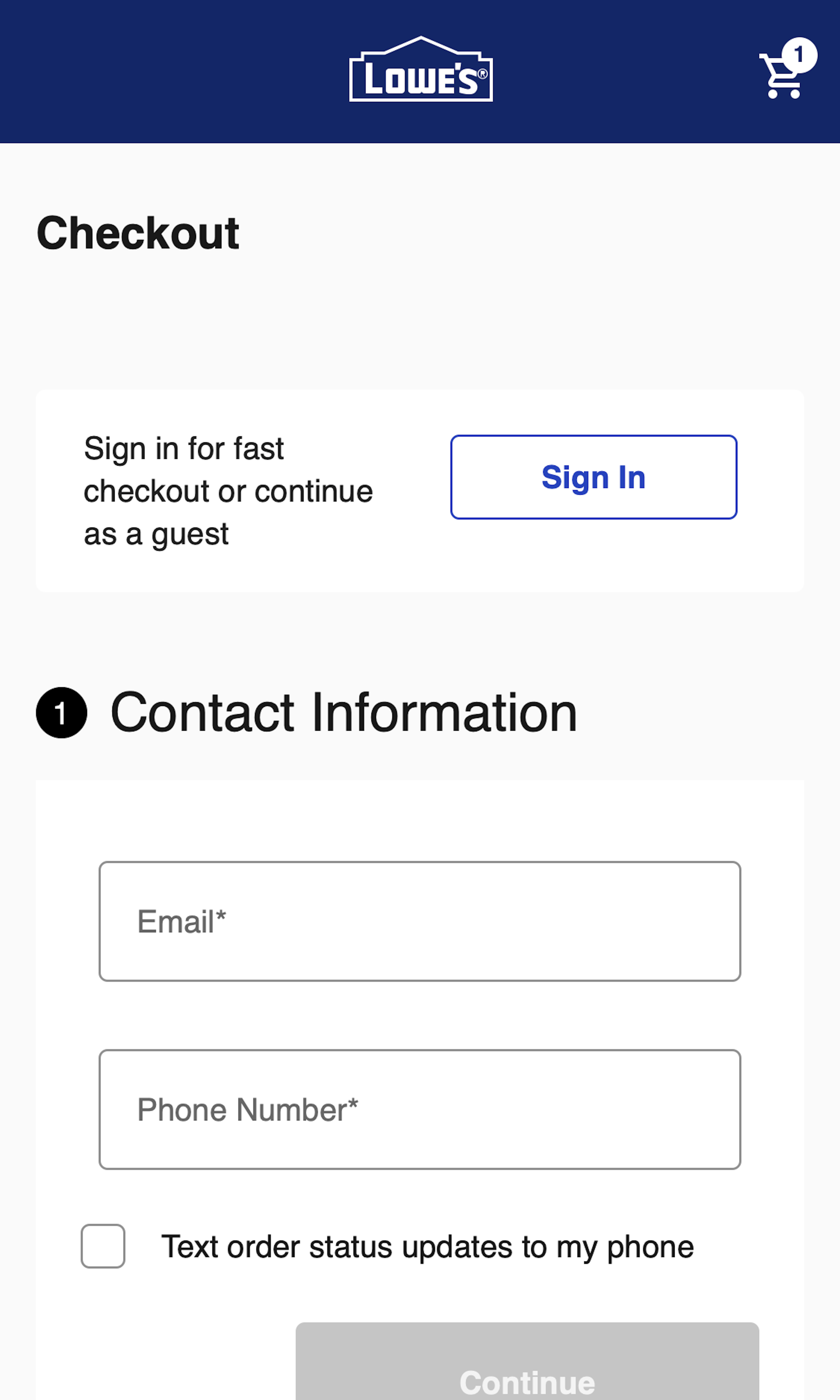
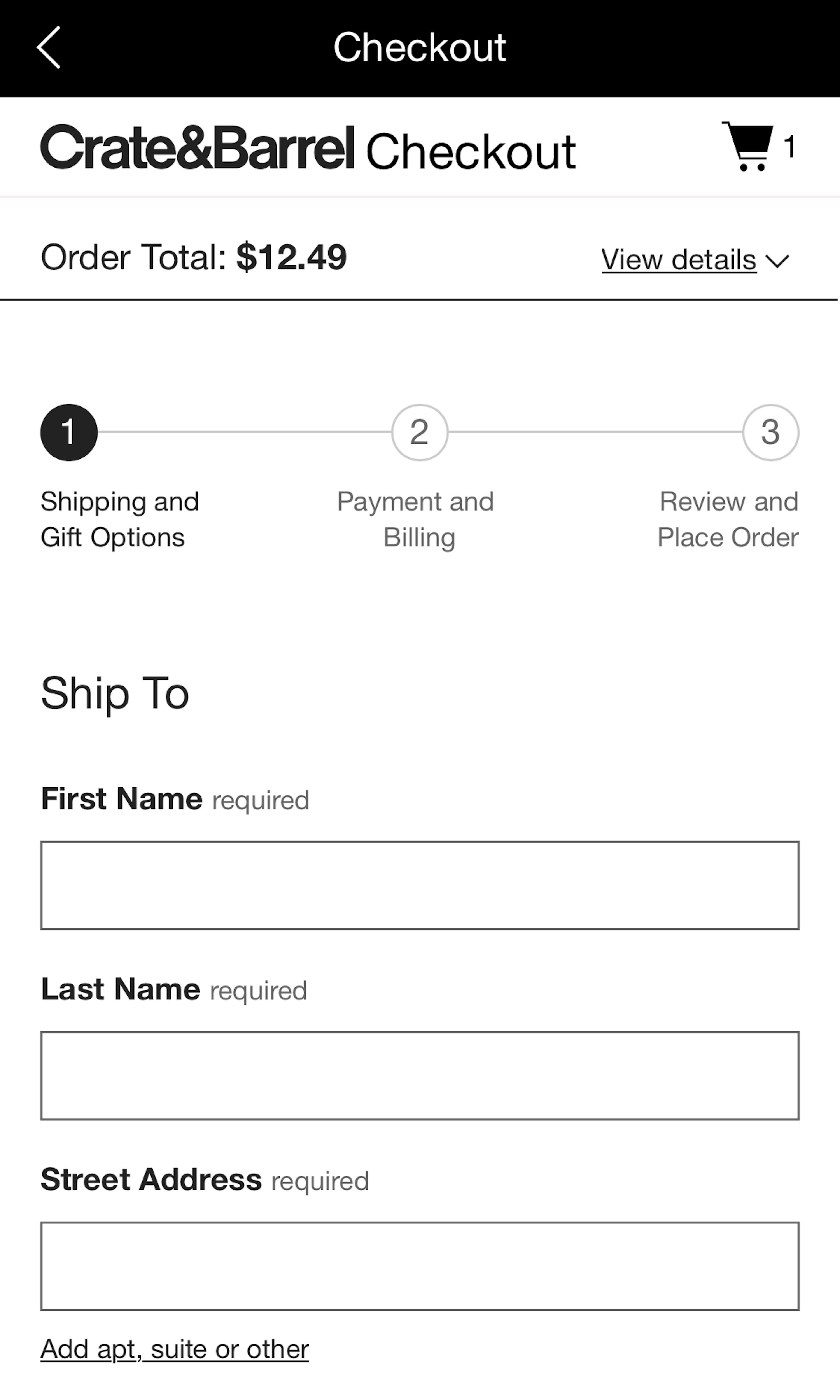
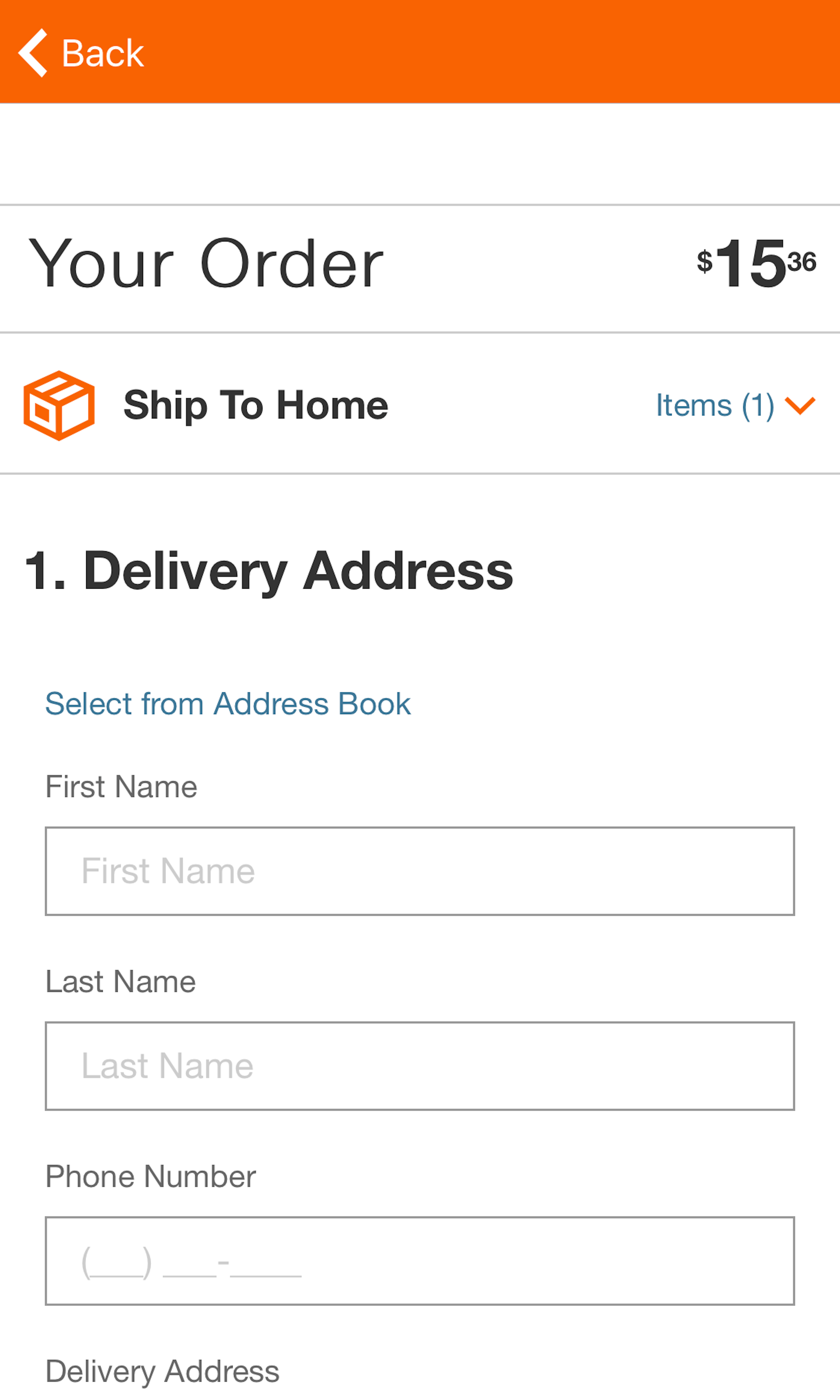
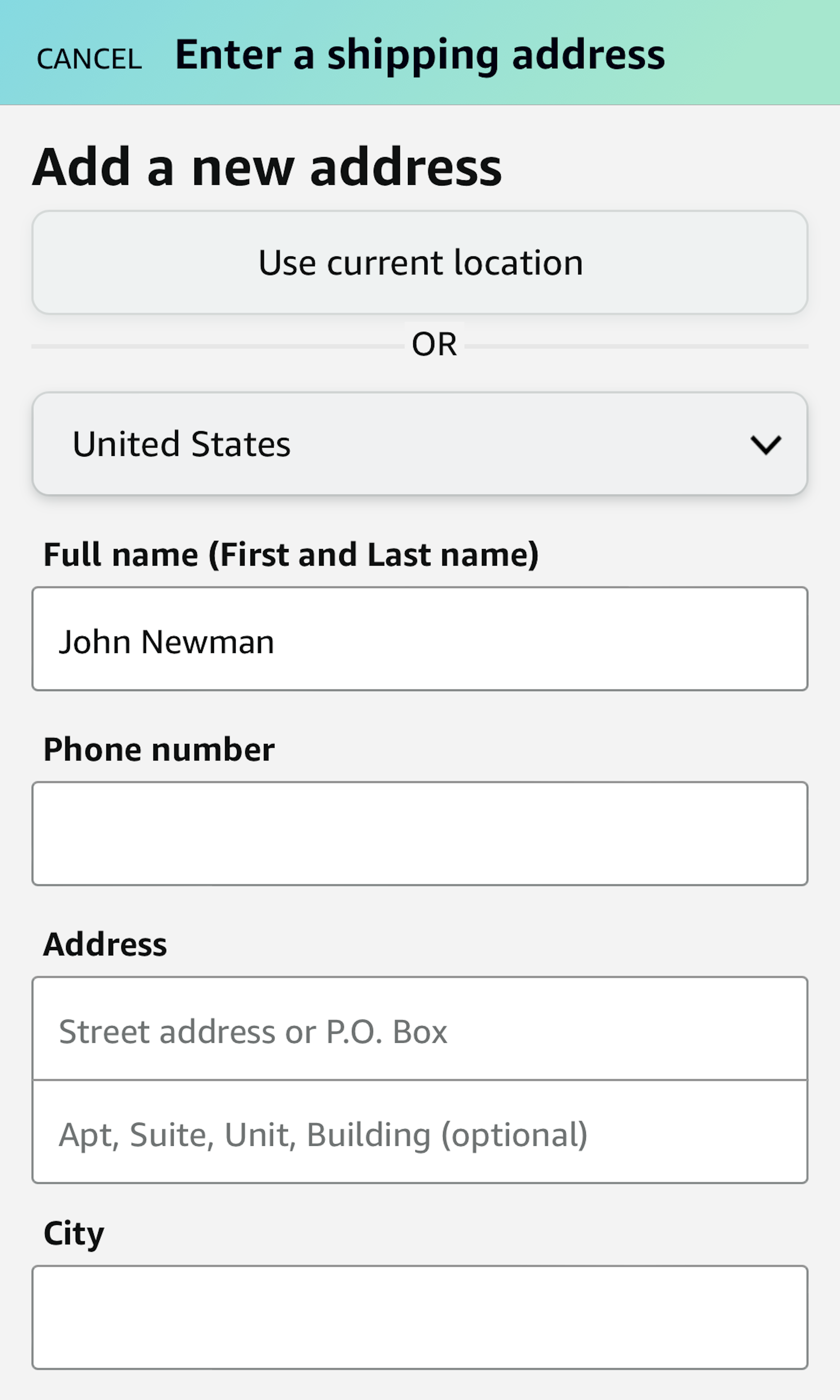
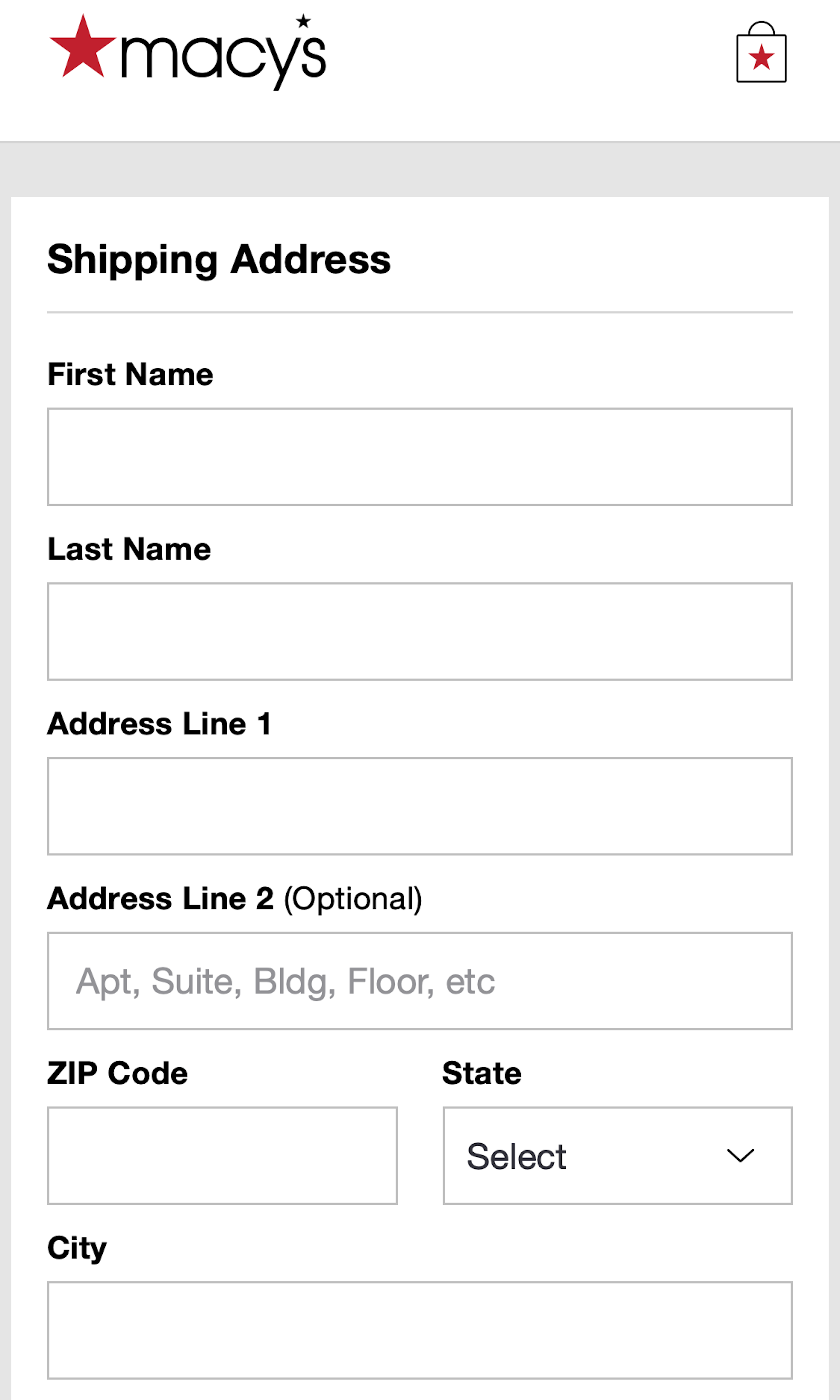
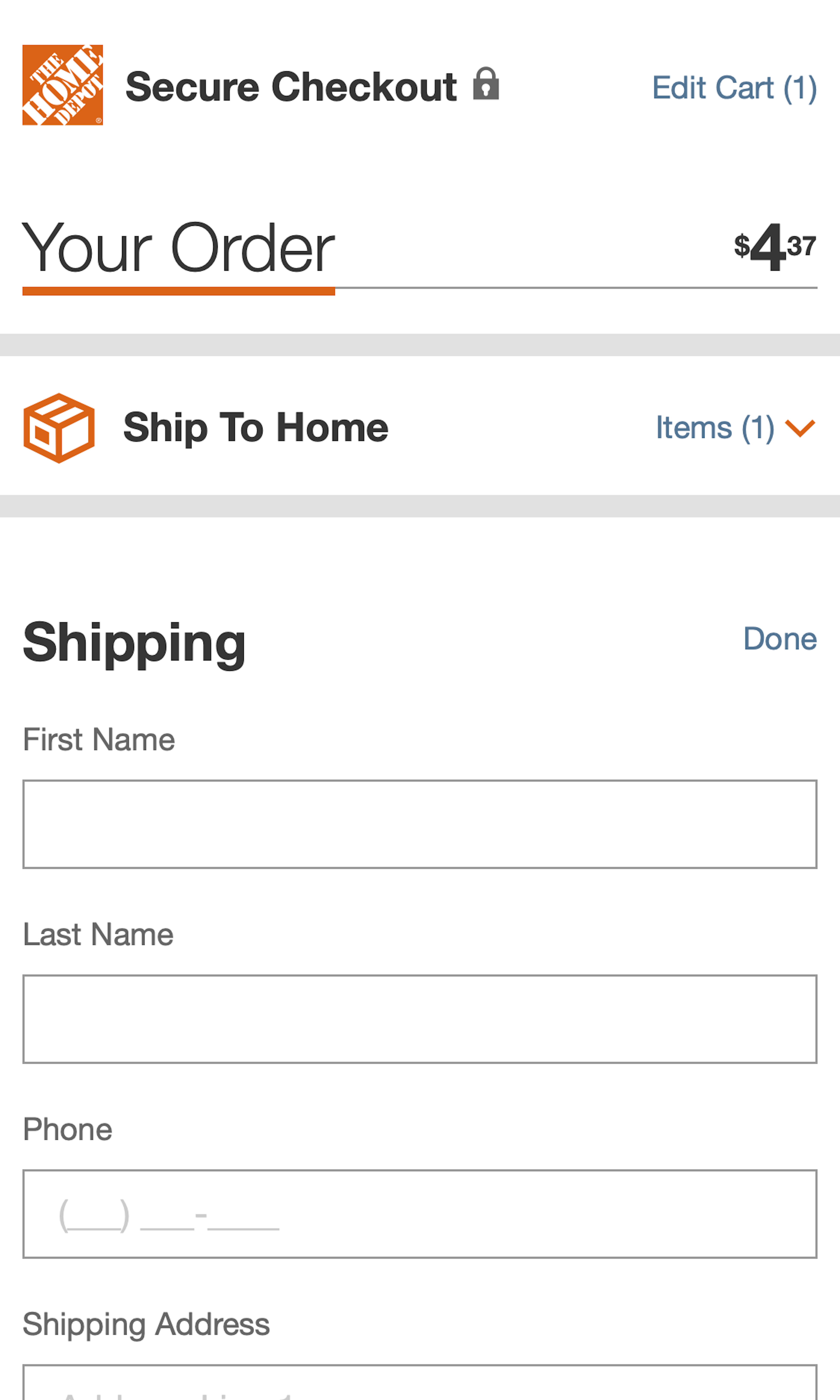
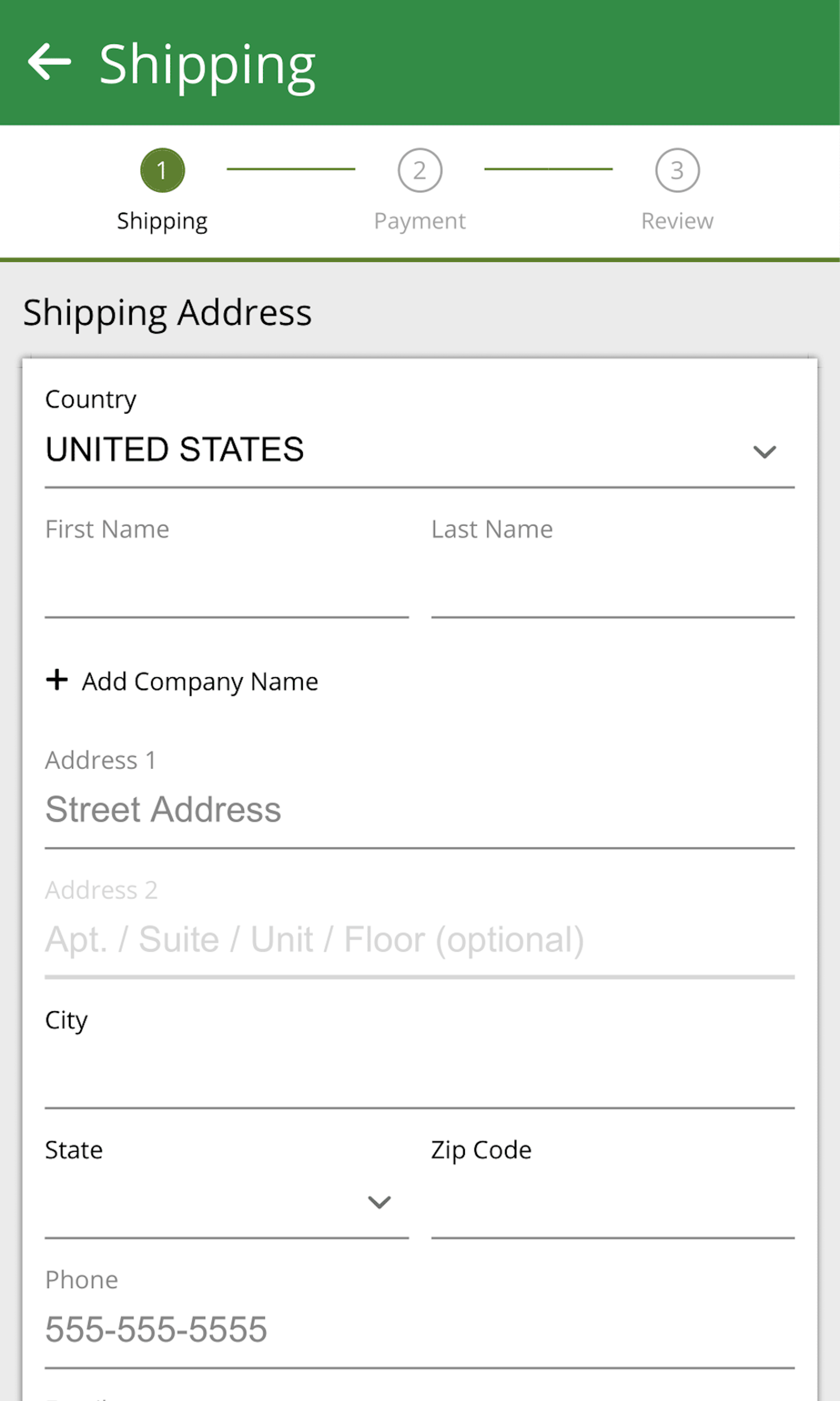
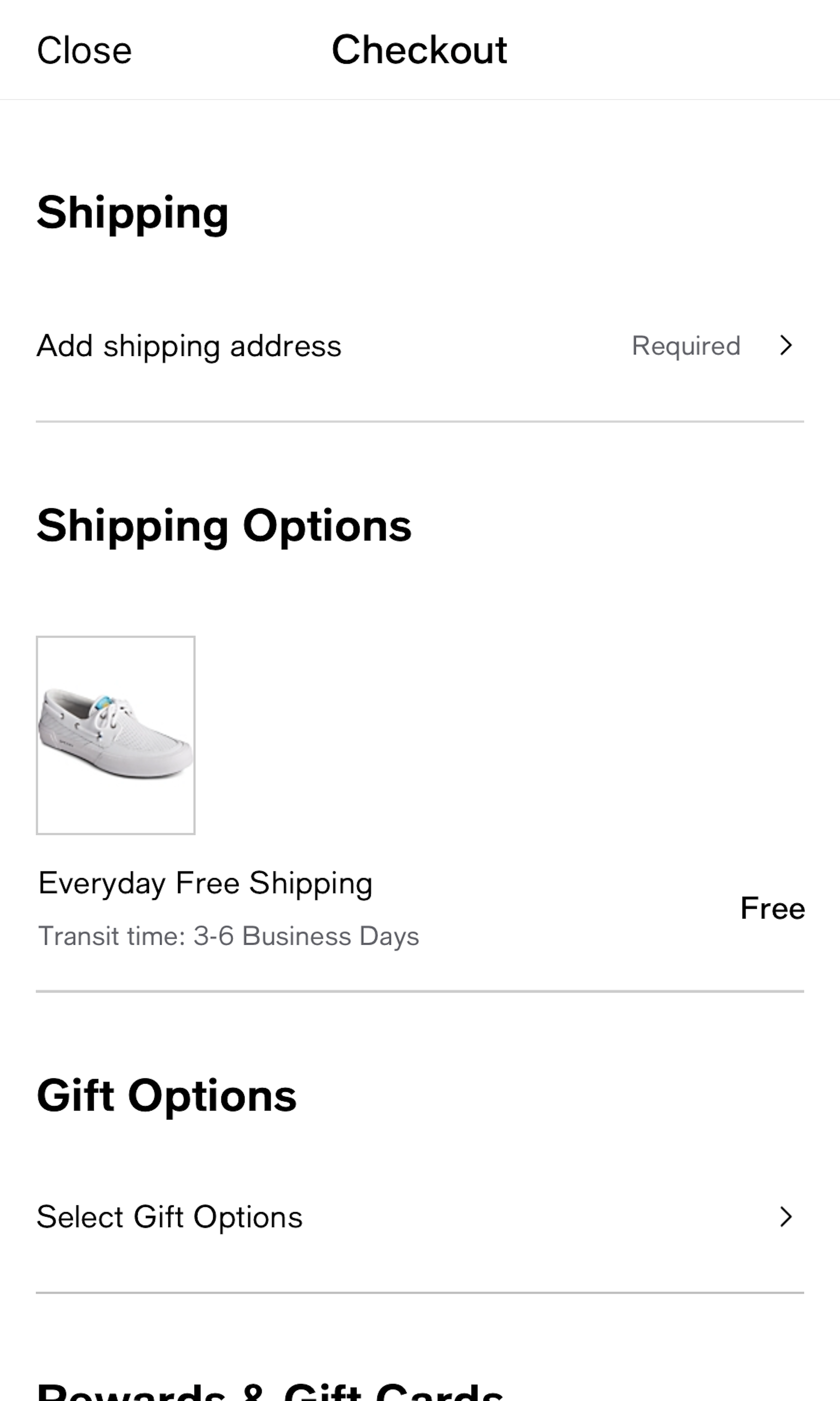
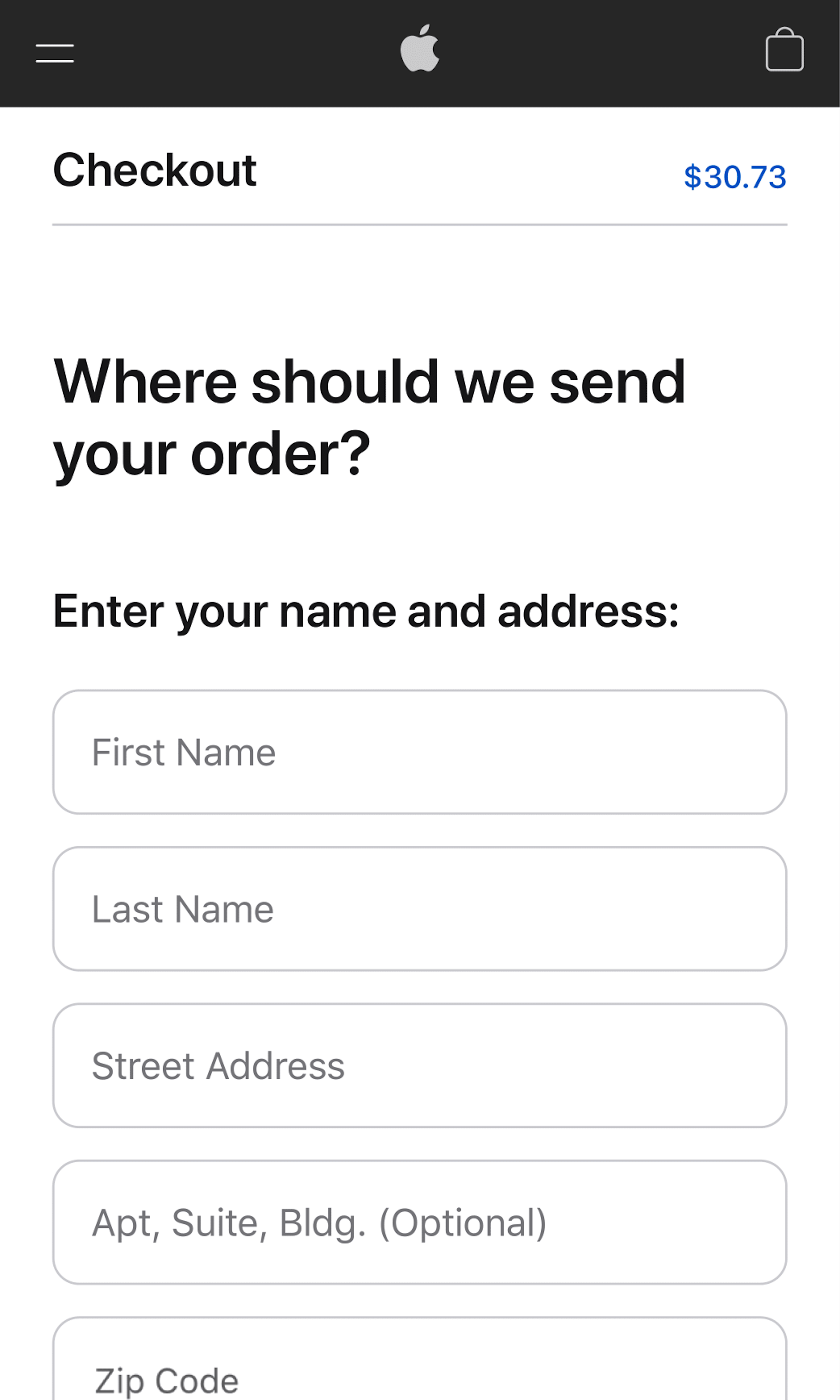
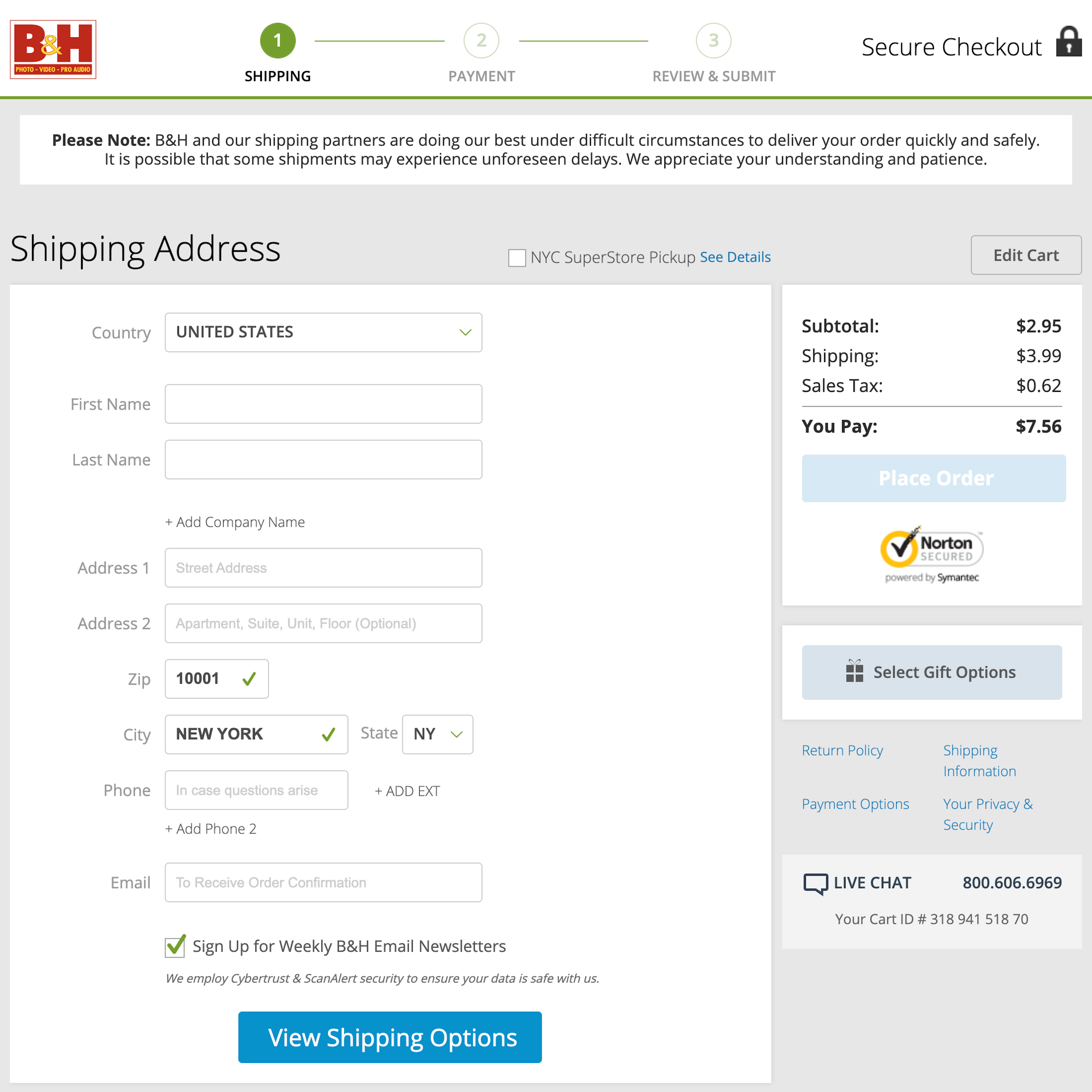
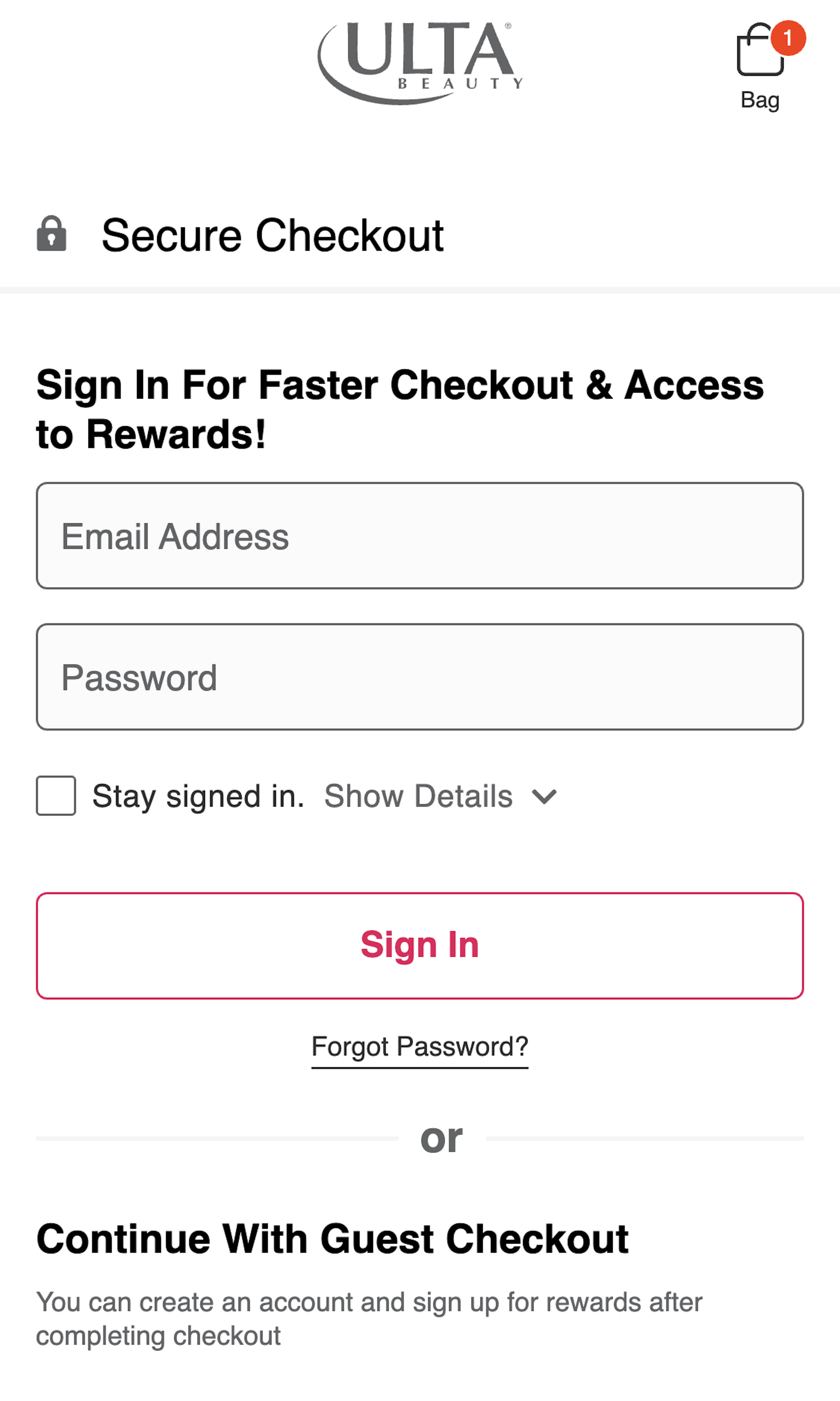
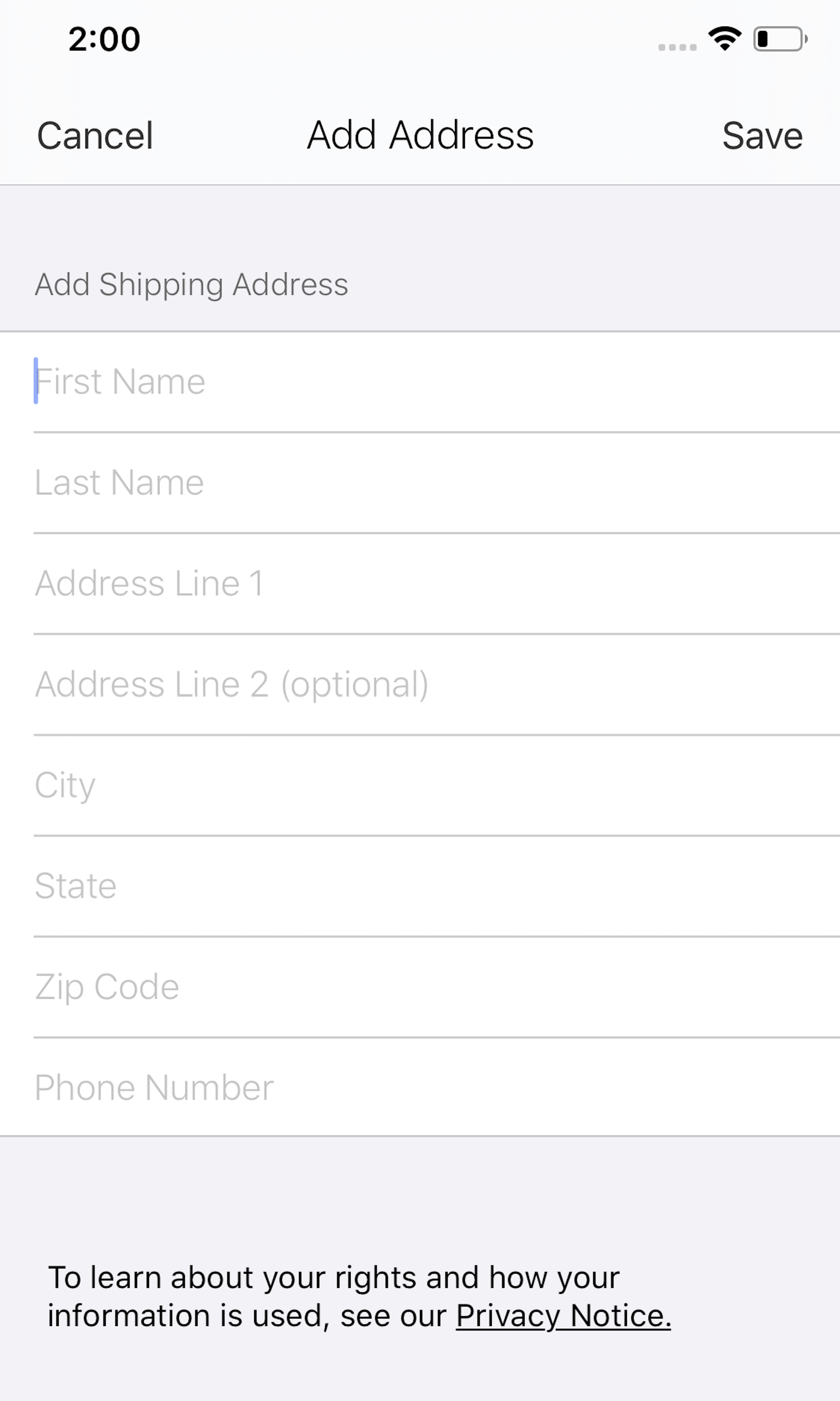
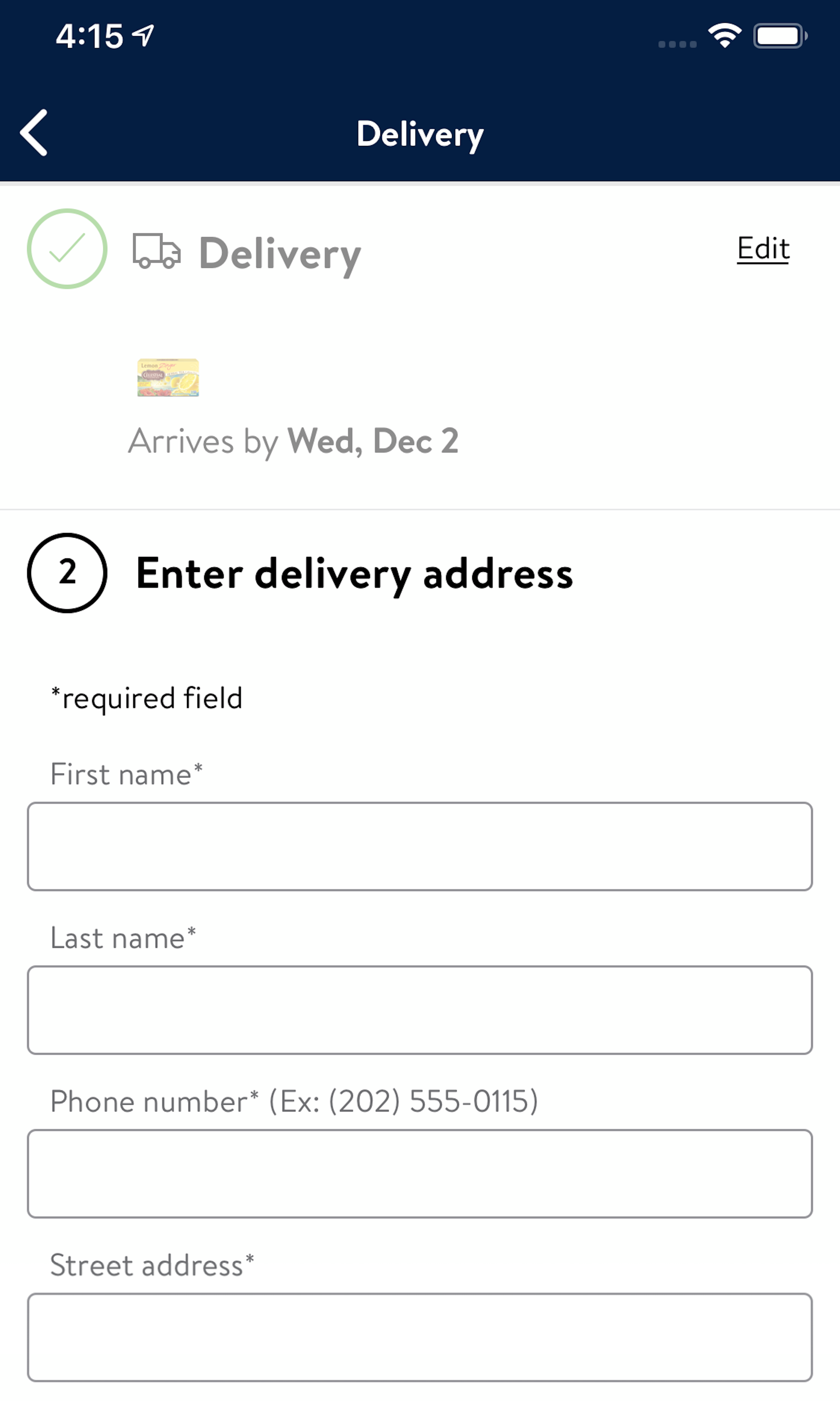
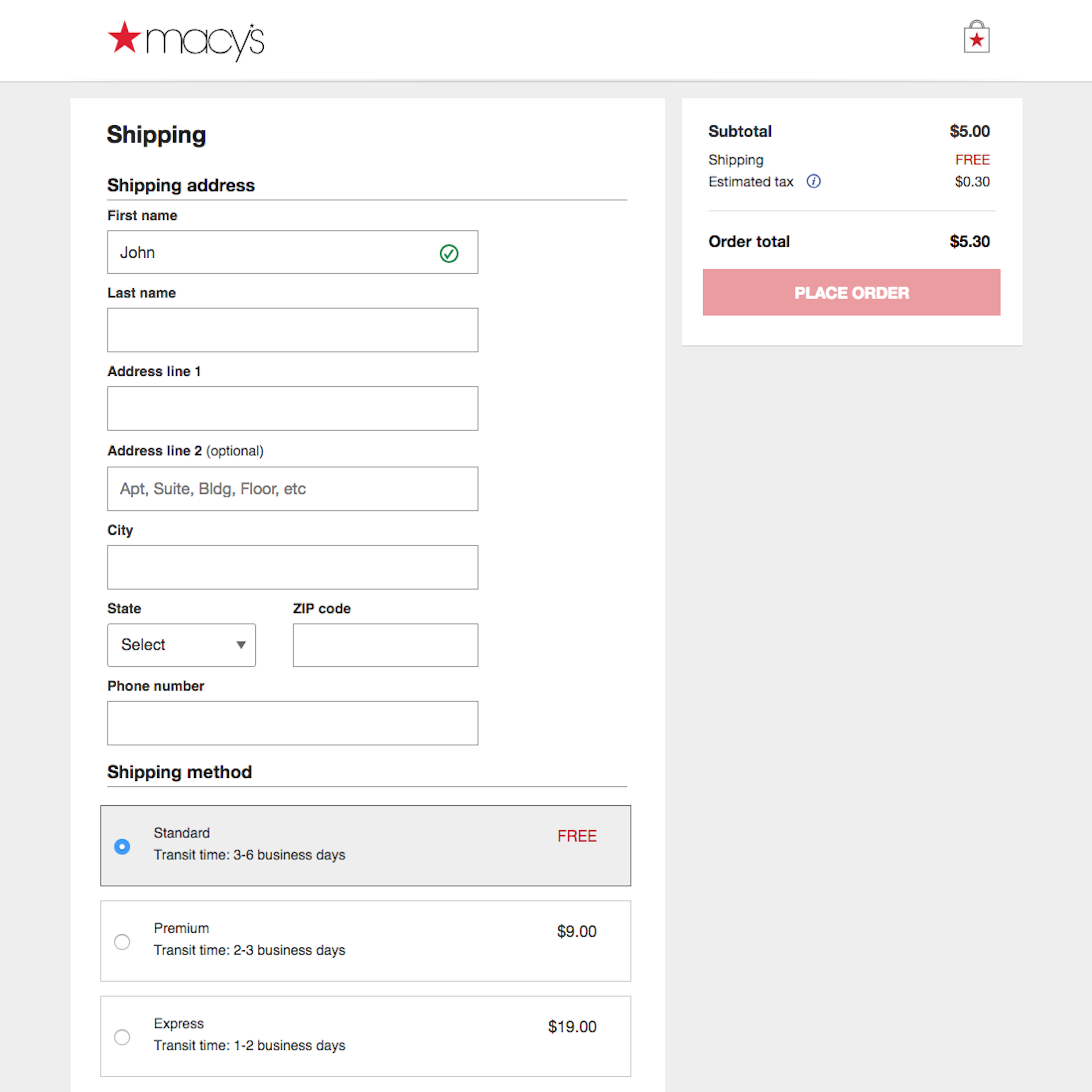
Customer Information, such as the customer’s name, email address and telephone number is the standard minimum required in e-commerce checkout across different industries. It is frequently combined with a shipping address form, which represents the largest amount of typing the users have to perform during the checkout flow. Therefore, it’s also where most sites have great potential to optimize users’ checkout experience, by reducing and easing typing of address and contact info. The most common severe issue is that 52% of sites neglect to address users’ privacy concerns.
More ‘Shipping Address’ Insights
-
The two most important aspects when looking to minimize the amount of typing users have to do, and how intimidating the Shipping Address checkout step will appear, are 1) defaulting the billing address to be the same as the typed shipping address (by hiding the fields entirely) and 2) auto-detecting the city and state values based on the typed ZIP code (see our article “Auto-Detect ‘City’ and ‘State’ Inputs Based on the User’s Postal Code – 60% of Sites Don’t”.
-
Learn More: Besides exploring the 1167 “Shipping Address” checkout design examples below, you may also want to read our related articles “Checkout Optimization: From 16 Form Fields to 8 Fields (keynote presentation)”, “Always Explain Why the ‘Phone’ Field Is Required (58% of Sites Don’t)”, and “Form Usability: Getting ‘Address Line 2’ Right”.
-
Get Full Access: To see all of Baymard’s cart and checkout research findings you’ll need Baymard Premium access. (Premium also provides you full access to 150,000+ hours of UX research findings, 650+ e-commerce UX guidelines, and 275,000+ UX performance scores.)


User Experience Research, Delivered Weekly
Join 60,000+ UX professionals and get a new UX article every week.

User Experience Research, Delivered Weekly
Join 60,000+ UX professionals and get a new UX article every week.
Explore Other Research Content
300+ free UX articles based on large-scale research.

319 top sites ranked by UX performance.

Code samples, demos, and key stats for usability.