
Button Design: Best Practices for Optimal UI Buttons
Buttons might seem like minor elements of your website, but improving button design can make a big difference when it comes to UI and UX.
For ecommerce, button design is an opportunity to improve conversion rate. After all, customers can’t get through a checkout process or complete a sign-up form without clicking at least one button.
Placed throughout a website’s UI, buttons communicate actions that users can take in places like forms and toolbars. When a user performs an action, like “submit”, “create account”, or “join”, they are probably clicking a button to do it.
That’s why designing intuitive, easy-to-use buttons is a critical part of creating a positive UX and a website that converts.
In this article, we’re going to give you best practices for website button design, based on our extensive usability testing and UX research.
Access 18,000+ Annotated UX Design Examples
Get inspiration for your next UX project with real-world UX design examples, all assessed and annotated using 200,000+ hours of testing insights.
Button Design Fundamentals
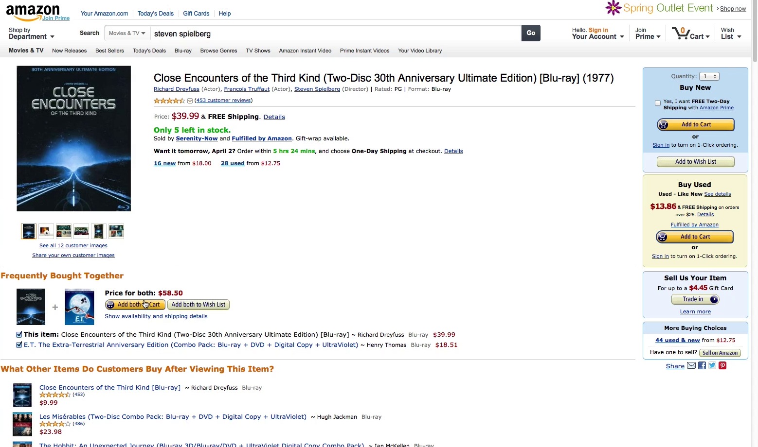
A usability test participant was ready to add a product to the cart on Amazon, but the multiple similarly styled buttons caused hesitation. There are three similarly styled “Add to Cart” buttons, two “Add to Wish List” buttons, a “Trade In” button, and a “Sell on Amazon” button on this page, making the intent of each button confusing for users.
Buttons drive users in a particular direction on their journey, like moving on to the next step in the checkout experience or submitting a form to create an account. A well-designed button provides a call to action that prompts users to take a step, providing a clear path forward.
Picture a button as a conveyor belt that moves the user toward success. But the conveyor belt needs to be user-friendly if it’s going to work.
How can you improve your webpage button design, to make it easier for people to understand the purpose of a button so they can click with confidence?
Here are a few of the fundamental components of effective buttons, and how each one impacts user experience.
Button Size
The size of a button affects the user’s ability to find it and identify its purpose. On mobile, where buttons are tappable elements, size is much more than a visual cue.
When mobile buttons are too small, it causes user difficulties like unregistered, unintended, and erroneous taps — or sometimes, complete disorientation on the site.
Disruption to the user can range from mild annoyance at having to tap multiple times before they hit the right spot, to severe frustration and cart abandonment if they mistap and lose data during checkout.
Our research finds a minimum hit area of 7mm by 7mm reduces the number of tap issues and makes it easier for users to navigate.
Button Color
Button styling — including color — can have a big impact on conversions, but there is no “perfect” color to use when you’re designing UI buttons.
Instead, consider color an important visual cue to ensure a primary button stands out from the other buttons on a page.
Unique button styling, prominence, consistent placement, and descriptive microcopy are all required to attract a user’s focus to the primary button during checkout. Our research reveals that 48% of ecommerce sites neglect one or more of these elements.
Because users often don’t read button microcopy, many of them rely purely on visual cues like color and placement to identify the logical next step.
Intent of the Button
Clear and consistent button styling and microcopy are essential elements to help users understand the intent of a button. If it’s not clear what a button is for, the checkout UX can be confusing.
Clearly communicate what will happen when a user clicks on or taps on a button, so the intent is clear. For example, a “Download” button leads to downloading a free incentive from a landing page.
“Add to Cart” buttons should have a unique styling that isn’t reused with other buttons, so they are clearly distinguished on the page, and consistently styled across the site.
Number of Buttons
Putting a lot of buttons on your user interface may seem like a good idea, but overwhelming shoppers with too many options can backfire.
Your job is to present logical next steps for the user, so they can reach their desired outcome faster and with less friction. If you have more than one button on a page, ensure the primary button is placed more prominently and separated from other buttons.
→ Sign up free to free research-backed UX guidelines and start improving your site today.
Button States
The “state” of a button communicates its status to your user. Each state must have clear characteristics that distinguish it from other states, and from the surrounding background — but the button states shouldn’t create visual noise on the page.
The types of states you choose for buttons will depend on the UI you’re designing, and what the user’s goals are.
Here are 6 common button states:
- Normal: This is the default button state that communicates whether the button is enabled and available for interaction.
- Focus: The focus state is critical for accessibility. A button in this state will be highlighted when a visitor uses “tab” or another input method to navigate the UI. In many cases, the focus state will appear as a light blue outline around a button — but it varies according to different browsers.
- Hover: When a user places a cursor over a button on a screen, that button enters a hover state. The hover state is specific to web design, as mobile devices don’t usually support a hover function.
- Active: The active state is used for the “click” or tap of a button. It shows that the user has tapped the button, and may resemble the look of a “pressed” button.
- Progress/Loading: When an action is not performed immediately, the progress/loading state communicates that the website or app is working on completing the desired action.
- Disabled: The disabled state communicates that a button is currently unavailable for interaction. If a process is loading, it may block action and disable a button. A disabled button state can also indicate an action on your site that requires a membership, account, or upgrade before use. This state should be paired with a tooltip that explains why the button is disabled.
Guidelines for Ecommerce Button UX
We’ve compiled short summaries of some button design guidelines for ecommerce sites, as well as some examples gleaned from our extensive large-scale UX research.
Here are some best practices to help you design buttons that give your users effortless, foolproof control over their experience on your site.
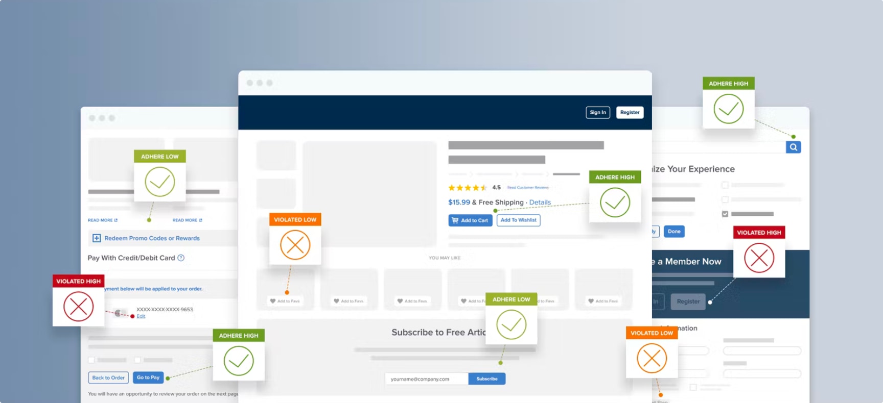
1. Clarify If Primary Buttons Finalize the Order (Guideline #586)
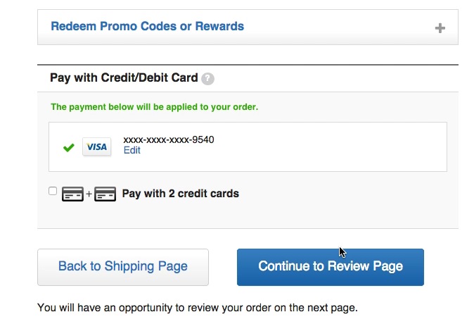
Crate & Barrel opted for both reassuring text below the buttons (“You will have an opportunity to review your order on the next page”), and a longer, more descriptive primary button (“Continue to Review Page”).
Making an online purchase can be intimidating to some users, and it’s important to let the user remain in control throughout the entire checkout process.
This is particularly important at the payment steps, when they’ve typed their payment information and have become cautious about clicking any primary buttons.
Don’t leave it up to users to guess whether their card is going to be charged when they click a button.
After users have typed their payment information, include reassuring text next to all primary buttons or display clarifying microcopy that specifies whether the order is finalized or not.
2. Avoid “Apply” Buttons in Checkout and Instead Auto-Update and Highlight Changes (Guideline #727)
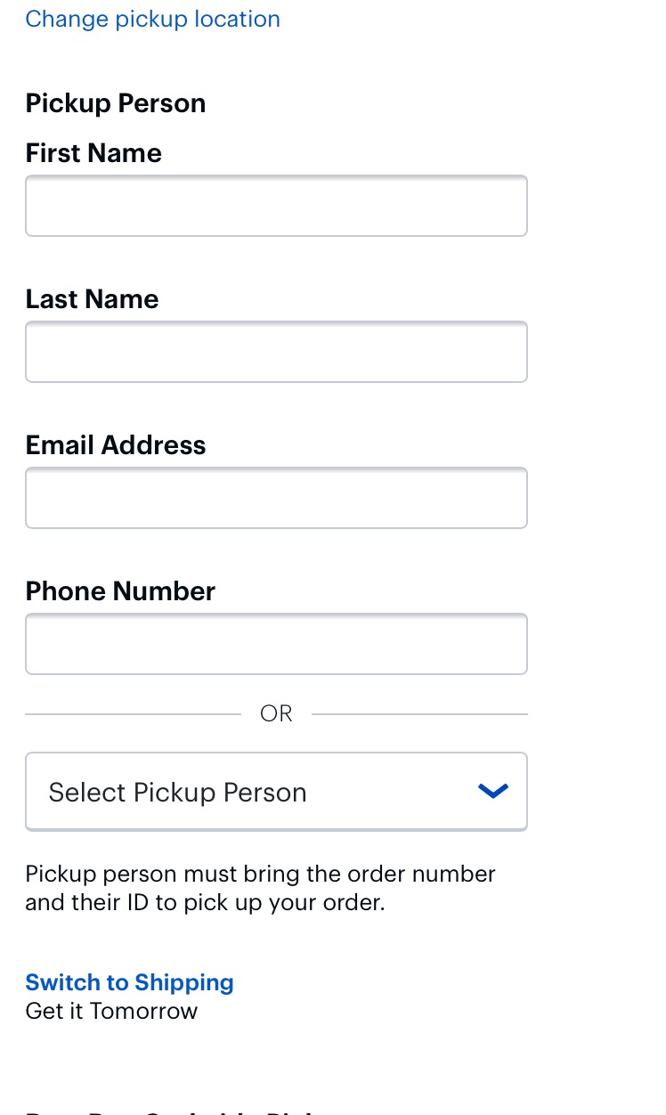
At Best Buy, users can specify a “pickup person” to get the order once it’s ready. There’s no “Apply button”; the changes are registered when users move forward in the checkout by tapping the primary “Continue” button at the bottom of the page.
Some users overlook “Apply” buttons within a form during checkout, or they misunderstand the intent of the button. This can cause friction during checkout, or even lead to data loss.
Instead of requiring users to click a dedicated “Apply”, “Update”, or “Add” button to save data, auto-apply users’ input. Highlight core order values if those values are changed during the auto-application, so users can make changes as needed.
(Note: for changes users make in the accounts area of the site — for example, editing their address — the reverse actually applies: “Apply” buttons are needed for users to feel like their change has successfully been registered by the site.)_
3. Always Provide a Submit Button Adjacent to the Search Field on Mobile (Guideline #944)
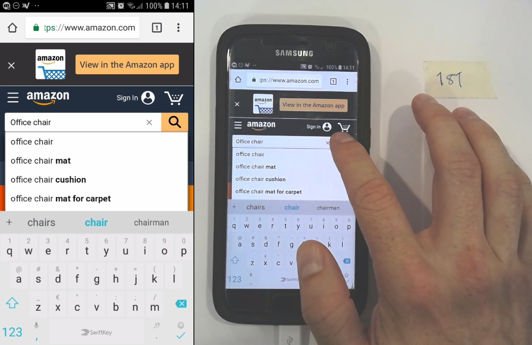
After typing a query for “office chair”, a test participant on Amazon looks for the search submit button (a magnifying glass icon) and finds it in the expected location. Tapping this button helps him begin exploring products quickly.
There are three key ways to submit a mobile search query:
- Tapping a search submit button that the site has placed in the UI adjacent to the search field
- Using the touch keyboard submit button (provided by the mobile OS)
- Selecting an autocomplete word or phrase
During our mobile testing, many users turned to a search submit button adjacent to the search field as a first choice.
Despite the fact that there are different ways to submit mobile search queries, 53% of the sites we tested in our mobile usability research failed to accommodate the group of users who primarily wanted to use the webpage UI to submit the search.
Therefore, always provide a search submit button adjacent to the search field, in addition to using a touch keyboard optimized for search submit. Place the search submit button on the right side of the field, and use a contrasting design to make the button stand out on the page. Optimize the button size to provide a sufficiently sized tap target.
4. Always Provide Sticky “Apply” Buttons in the Mobile Filtering Interface (Guideline #1125)
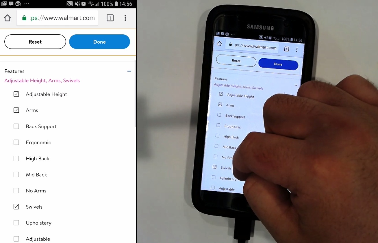
Walmart allows users to apply multiple filters by tapping a prominent “Done” button that is sticky at the top of the viewport.
Autosubmitted filters slow users down when they want to choose more than one filter option. Users can find it difficult to find the products they need when unexpected filter options remain in place in the interface.
In separate filter interfaces, provide prominent, clear, sticky ‘Apply’ button and a way to exit the interface without making changes.
Starting With Button Design to Improve UX
During usability testing, we spotted a large array of significant UX issues related to poor button design. These issues can be remedied by integrating these best practices for buttons into your overall UX design process.
This article presents the research findings from just a few of the 700+ UX guidelines in Baymard Premium — get full access and learn how to create UI buttons that lead to more conversions and a better user experience on your ecommerce site.
Research Director and Co-Founder
Christian is the research director and co-founder of Baymard. Christian oversees all UX research activities at Baymard. His areas of specialization within ecommerce UX are: Checkout, Form Field, Search, Mobile web, and Product Listings. Christian is also an avid speaker at UX and CRO conferences.