
Website Usability Best Practices (Backed By Research)
Website usability is a term we use to describe the ease of use of a site. It’s another way of saying “How user-friendly is this site?”
Since many users formulate an opinion of a brand based solely on their experience of the company’s website, the value of UX becomes apparent — website usability is essential.
If a website is usable, it means users can achieve their goals while using it. The website’s design and development focus on the user experience, to make sure it’s easy for users to complete desired actions.
Ecommerce UX performance depends on hundreds of elements that influence how easy it is to find and select products, locate shipping and return policies, set up an account, and complete a purchase.
In this article, we’ll show you some best practices to avoid common website usability issues and ensure a positive user experience, all sourced from our large-scale UX research.
Access research-backed UX guidelines
Make best-in-class design decisions and improve conversions with 200,000+ hours of validated, industry-specific UX research and benchmarks.
What Is Website Usability and Why Is It Important?
What makes a website “usable”?
The answer to this question depends on the nature of the site and the goals of the company behind it. But in general terms, websites that are usable provide well-organized, useful, easy-to-navigate information in a well-structured format.
Why is website usability important?
When you follow website usability standards to make your site easier for users, your conversion rate will improve. More people stay engaged with your site, click on your calls to action, and complete their purchases with a seamless checkout UX.
7 Website Usability Principles
Here are 7 key principles of outstanding website usability that you can keep in mind when designing your visitors’ experience.
1. Accessibility
“The power of the Web is in its universality. Access by everyone regardless of disability is an essential aspect.” – Tim Berners-Lee, Inventor of the World Wide Web and W3C Director
When websites and apps are accessible, it means they are designed so that people with all kinds of disabilities can access, navigate, interact with, and contribute to them.
Web accessibility encompasses all disabilities that can affect access to sites, including auditory, physical, visual, verbal, and neurological.
Accessible design also benefits people without disabilities, including older adults with changing abilities, or people with situational limitations like trying to read a small screen in bright sunlight.
2. Clarity
Users come to your site or app with specific goals in mind, and your job is to help them reach those goals as quickly and easily as possible.
The UX design process includes steps to understand user personas and map the user journey. Providing a clear, simple, consistent design guides people through their journey on your site and lowers abandonment rates.
3. Recognition
Humans have limited short-term memories. Your users shouldn’t have to remember information from one part of your website or app’s interface to another. Information like menu items or font hierarchies should be visible and easily retrievable throughout your interface.
When you follow UX design basics, aim to keep the learning curve short and make elements, actions, and options visible.
For example, many of your users will need to navigate back to your homepage at some point in their visit, and they will most likely try to click on a logo in the upper-left corner of their screen to get back to home.
If your website doesn’t follow that convention, the user will become confused and will need to spend time learning how to get to where they want to go.
4. Credibility
When customers don’t feel they can trust your site, it will be useless for them — no matter how beautiful your design is or how logical your functionality might be.
Demonstrate your site’s credibility by making it visually appealing, providing testimonials, including clear contact information, and displaying security icons or badges.
5. Relevance
To be usable, your website content needs to highlight content that is relevant to your users’ needs. Carefully research your target audience to determine what they want and need, and meet those needs as clearly as possible.
6. Mobile Usability
The mobile experience is a huge part of website usability. More than 52% of all internet traffic now comes from mobile devices. If a website is not mobile-friendly, 50% of customers report they will stop visiting that site even if they are a fan of the company or brand.
In the best practices below, we share a number of recommendations for improving your site’s mobile UX so you don’t lose sales to your competitors.
7. Usability for Multilingual Websites
Multilingual usability means optimizing your website or app for more than one language and culture so speakers of multiple languages can use it. You may also see this process referred to as “localization.”
Multilingual design can include localization of things like language, visual elements, and user interface components.
→ Sign up free to free research-backed UX guidelines and start improving your site today.
19 Data-Driven Ecommerce Website Usability Best Practices
Now here are 19 data-driven best practices you can follow on your website to make it more usable for all your visitors.
They’re specific guidelines sourced directly from Baymard Institute’s 200,000+ hours of large-scale research.
Some of the world’s most successful ecommerce sites, including 71% of all Fortune 500 ecommerce companies, use Baymard’s UX guidelines to improve their user experience.
The research behind these best practices is available in Baymard Premium, where you can find all 700+ guidelines with in-depth insights from usability testing, actionable advice for implementation, and a review tool to assess your site.
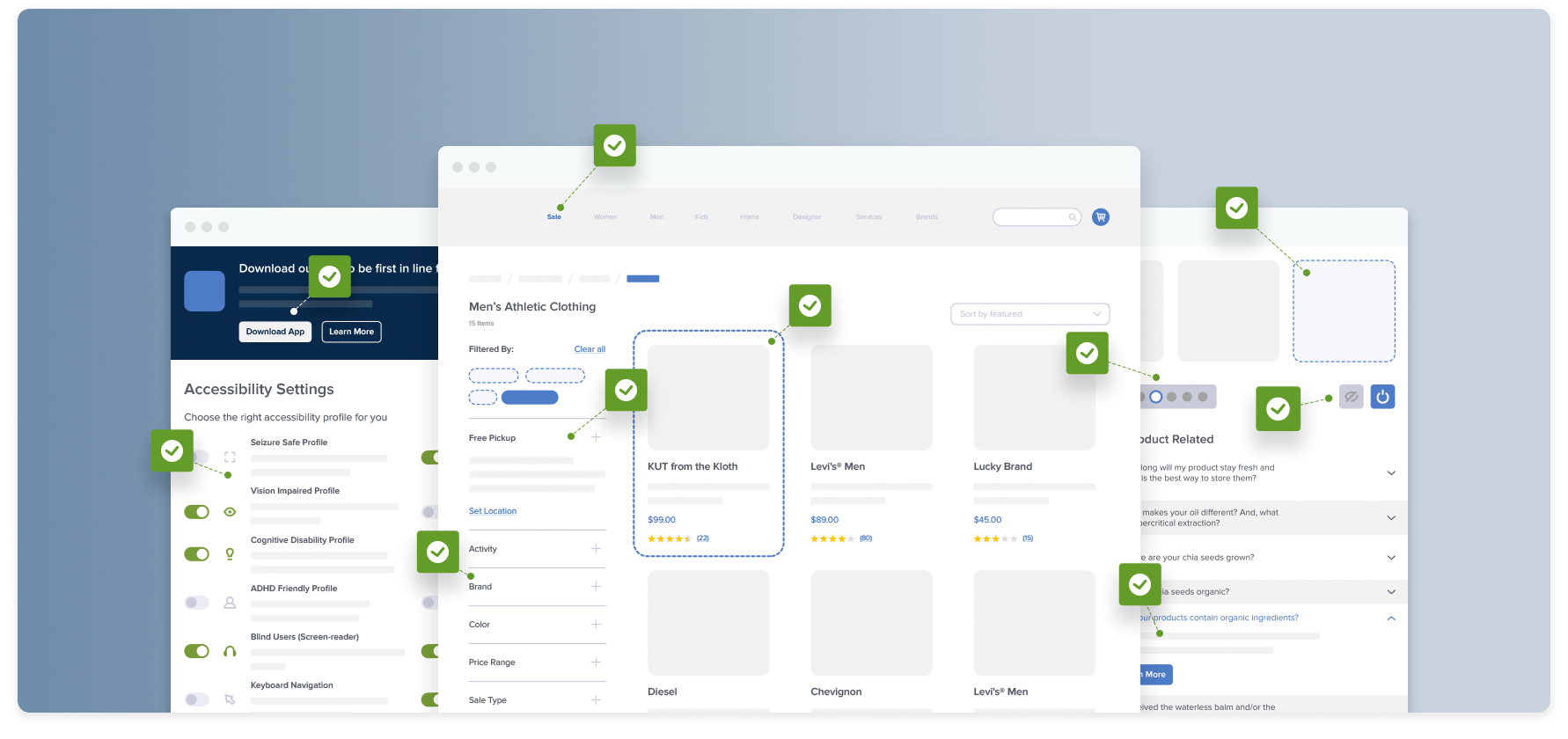
1. Adapt Images for Users with Visual Impairments (Guideline #1543)
Users with visual impairments may have trouble understanding images that don’t include proper markup.
Consistently use descriptive “alt” tags that describe the information or function represented by the image. Avoid embedding text in images, and present complex images like size charts as tables that users can navigate with screen readers.
2. Ensure List Items Are Fully Accessible and Easily Navigable by Keyboard (Guideline #1703)
All the information on Zappos products is accessible for screen readers. When a user navigates to a product list item, the focus is set to the list item container, and the information on the list item is read aloud. Users can use typical keyboard commands like arrow keys or tabbing to navigate to individual pieces of information such as product titles, prices, and reviews.
Some users will be using a screen reader to select a list item. When your site’s content or other elements aren’t accessible or are structured in a confusing way, it makes it difficult for users to select appropriate products.
All list item content should be accessible to screen readers. Consolidate links to the same location to one focusable element, and make “Quick View” overlays accessible by keyboard. Keyboard focus should be clearly visible on all list page elements.
3. Improving Accessibility for Links (Guideline #1542)
Users with low vision and those assisted by screen readers may have difficulty identifying and following links.
All links should be identified in the markup using either native HTML elements or ARIA (Accessible Rich Internet Applications) attributes.
For sighted users, give your links distinctive styling that doesn’t exclusively rely on color. Make sure users can navigate links with the keyboard and identify the link that is currently highlighted.
4. Creating Accessible Form Fields and Inputs (Guideline #1544)
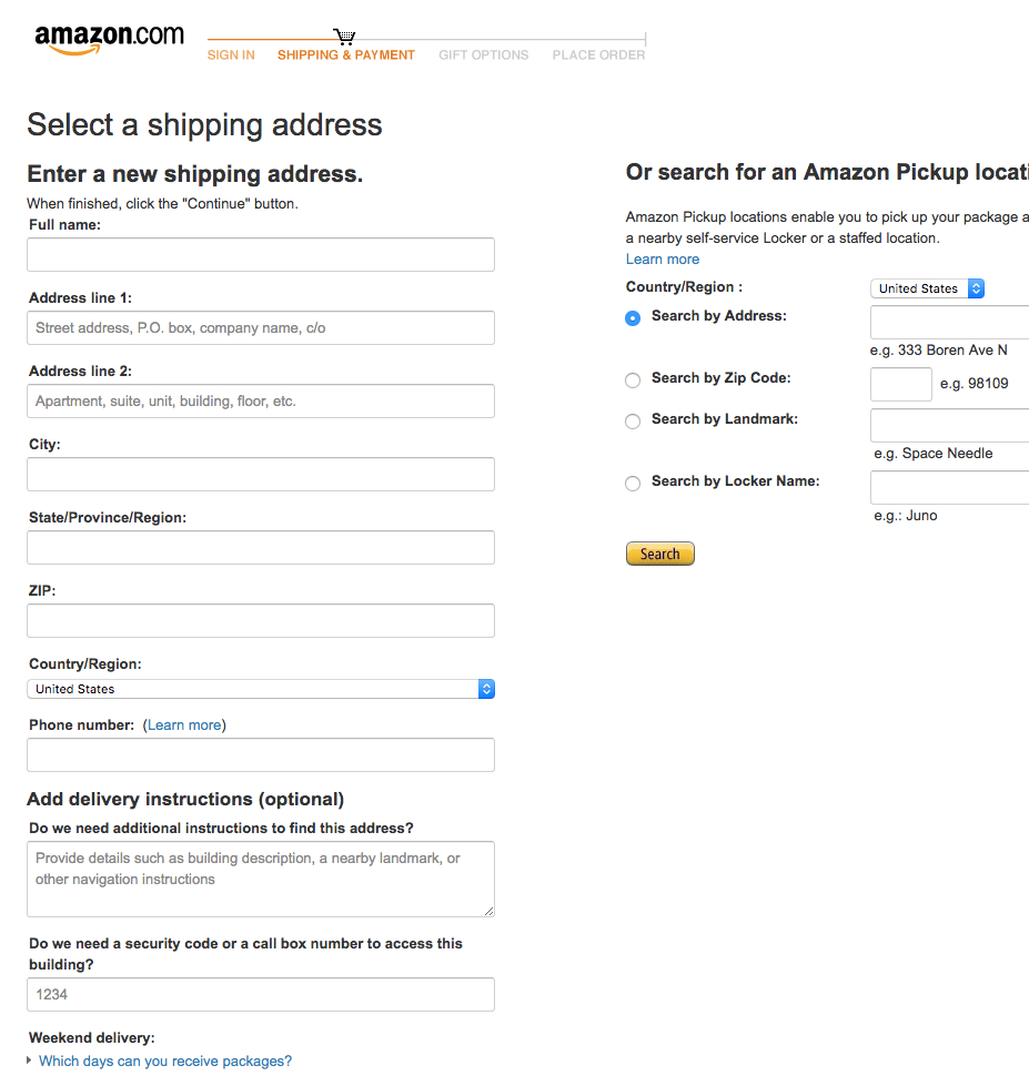
Amazon presents form fields with text labels above them that meet the minimum background contrast requirements of 4.5:1. The site also uses inline placeholder text to display example user inputs (e.g., “Street address, P.O. box, company name”), which are supplementary to the main text labels and can easily be skipped.
Poorly implemented form fields can make it difficult to input key information, especially for users aided by assistive technologies. Users might be unsure what information they’re supposed to input and/or what format is needed.
Place your form field labels close to their associated form fields and make them programmatically discernable by assistive technology.
Associate grouped fields with any relevant instructions provided for the overall form. Avoid inline form field labels and placeholder text except for nonessential information.
5. Allow for a Diverse Range of User Interaction Methods Across the Site (Guideline #1662)
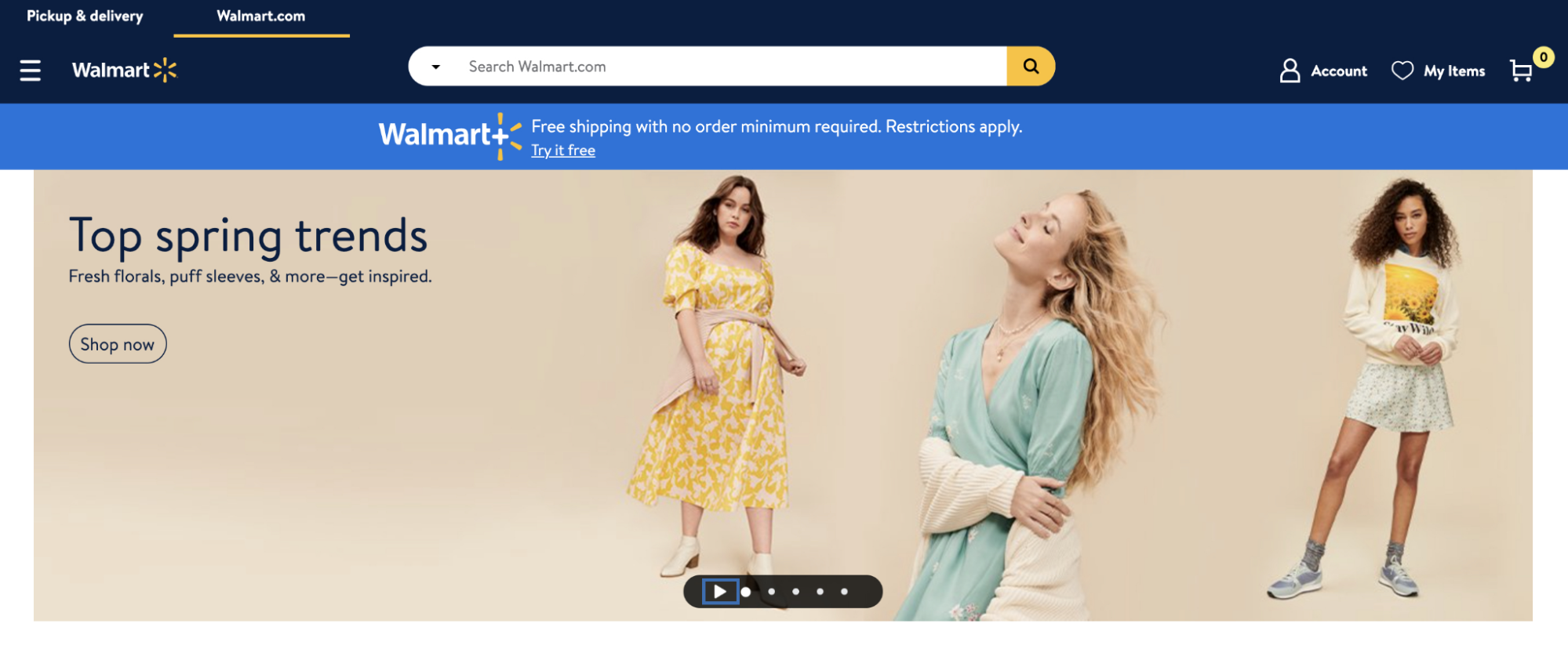
Users who rely on assistive technologies like screen readers or voice control need to be able to operate and interact with your site using multiple input methods, including keyboard navigation.
Complex site elements like rotating image carousels should have keyboard-operable controls, like the Walmart example below.
6. Don’t Rely on Accessibility Plug-Ins (Guideline #1776)
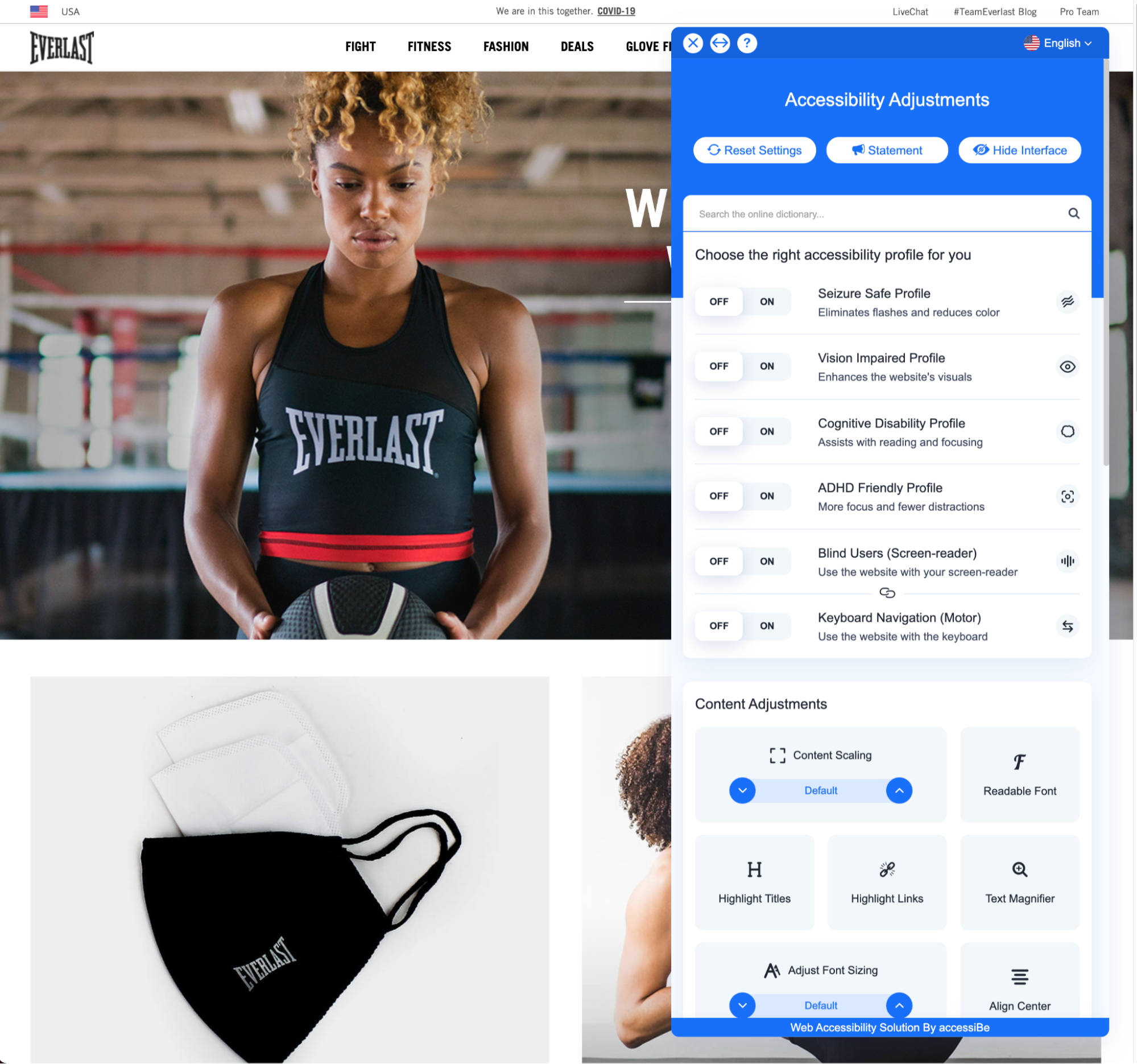
Everlast uses an accessibility plug-in that places an accessibility control panel widget in the lower-right corner of the users’ viewport (first image). Users can then activate the widget to reveal a number of accessibility-related site controls (second image).
Creating a fully accessible website or app can be a time-consuming and labor-intensive process, so it’s no surprise that some sites opt to use third-party solutions like “Accessibility Plugins” or “Accessibility Overlays” as a shortcut.
These third-party solutions provide a false sense of security, however — these types of plug-ins or overlays often do not work well, and don’t follow through on their promises of making websites fully compliant. They can malfunction, be blocked by ad-blocking tools, or just go unnoticed by users with disabilities.
Accessibility plug-ins may also leave sites open to litigation if not implemented correctly or comprehensively enough to pass W3C’s WCAG standards.
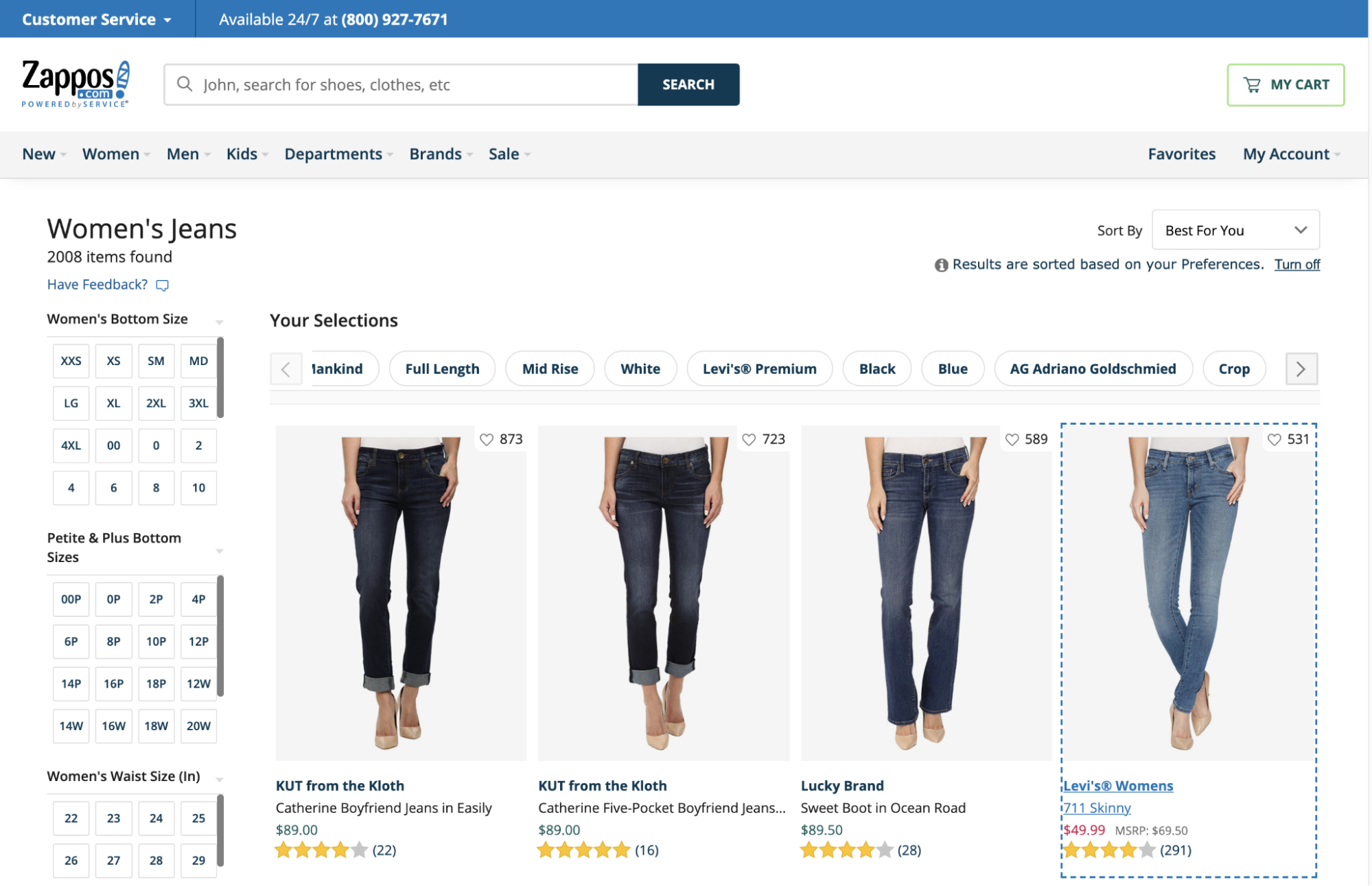
7. Ensure Filter Interfaces Are Keyboard and Screen Reader Accessible (Guideline #1702)
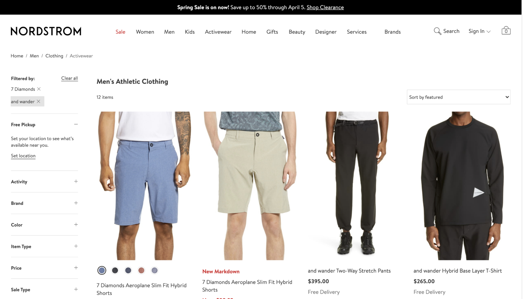
Nordstrom displays applied the filters “7 Diamonds” “and wander” at the top of the filtering sidebar. Users can focus on these filters with the keyboard and press the “Enter” key to remove previously selected filters.
People who use screen readers can have difficulty understanding and navigating options and categories of the filtering menu, leaving them unable to narrow their options and select the product they need.
All filter menus — including horizontal drop-downs, expanding sections, and hover actions — need to be navigable using a keyboard.
Provide screen reader–accessible contextual information (like the number of matching search results or the filters that are currently applied) alongside the filter menu and menu options.
8. Improve the Performance of Pages and Features (Guideline #1509)
Websites or apps that take a long time to load are a direct cause of high bounce rates and cart abandonment.
Reduce lag time by minimizing, compressing, and caching assets. Improve your user’s perception of the site performance — and improve their user experience — by prefetching products, providing load indicators, and limiting interruptions.
9. Remove or Downplay the “Install App” Ad on Mobile Sites (Guideline #930)
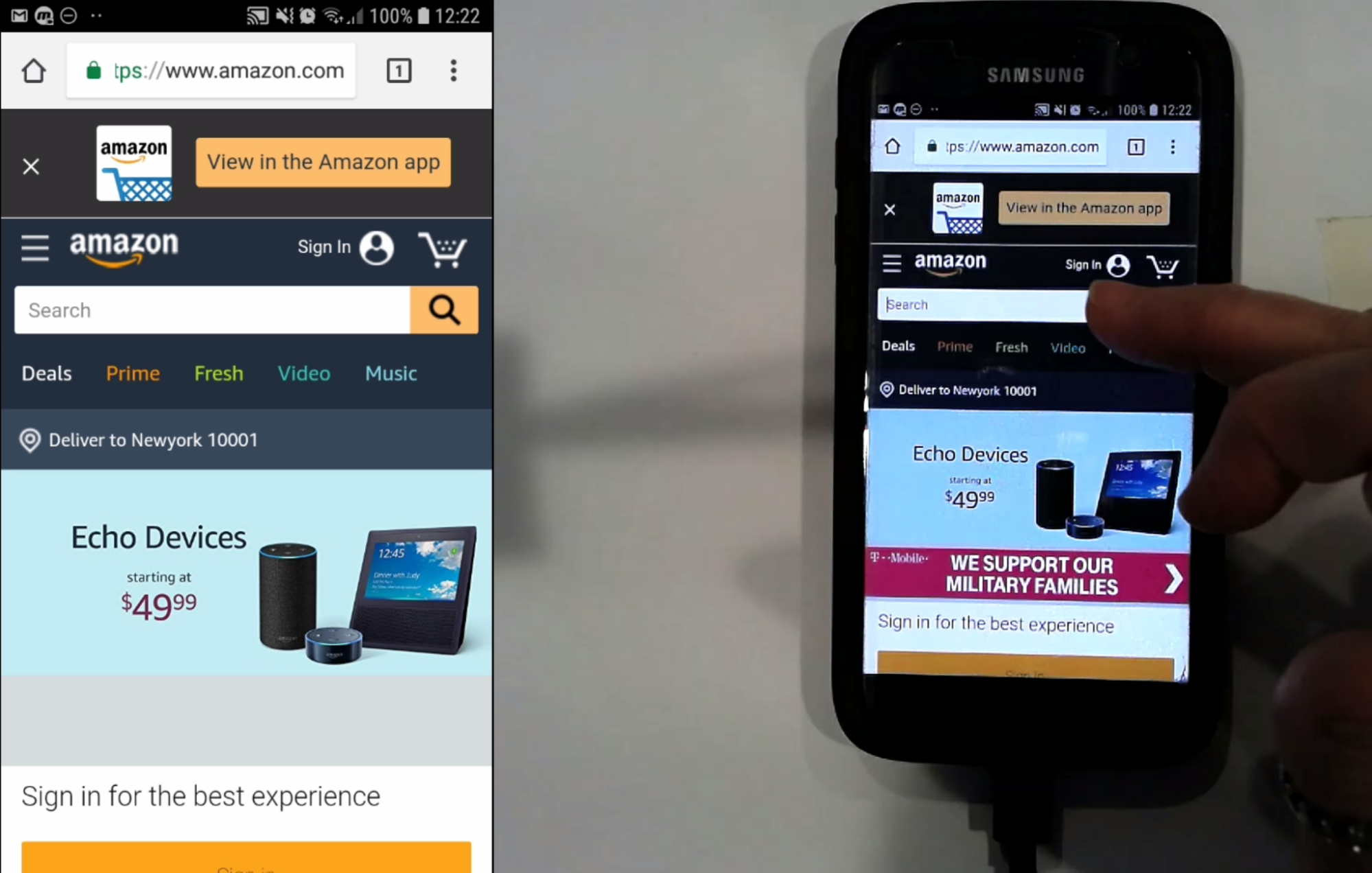
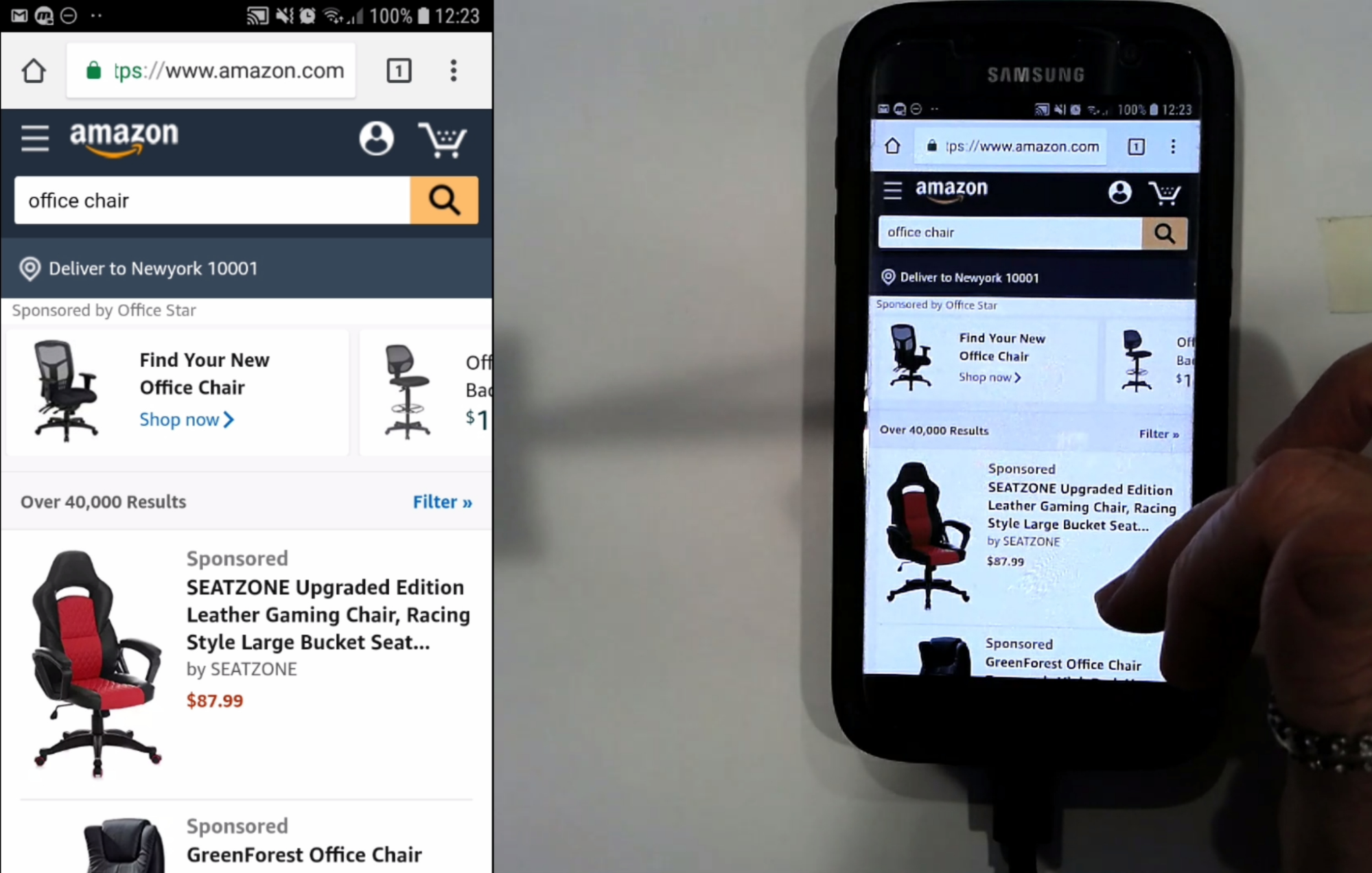
At Amazon, the “Install App” ad was automatically removed once this test participant moved from the homepage (first image) to viewing search results (second image). This lowered distraction levels for the user.
Prominent, difficult-to-close advertisements to install your app can obscure critical elements of your mobile site.
Consider removing the “Install App” ad on your mobile site. At a minimum, if you must use an “Install App” ad, deemphasize the ad by displaying it only on select landing pages and removing it after a specified amount of time.
10. Don’t Show Overlay Dialogs on Page Load (Guideline #284)
Users often close overlay dialog boxes without even reading the content on them, and these types of boxes can distract users from what they’re trying to accomplish on your site.
Our research on the current state of homepage UX found 59% of sites using overly-aggressive ads on the homepage, often eliciting negative reactions from users.
Avoid showing overlays immediately when the page loads. If you must use one, display the overlay only after users have been on-site for several minutes.
Consider limiting them to (or excluding them) from specific pages, and exercise caution when designing ads for the homepage.
11. Provide Sitewide FAQs (Guideline #1706)
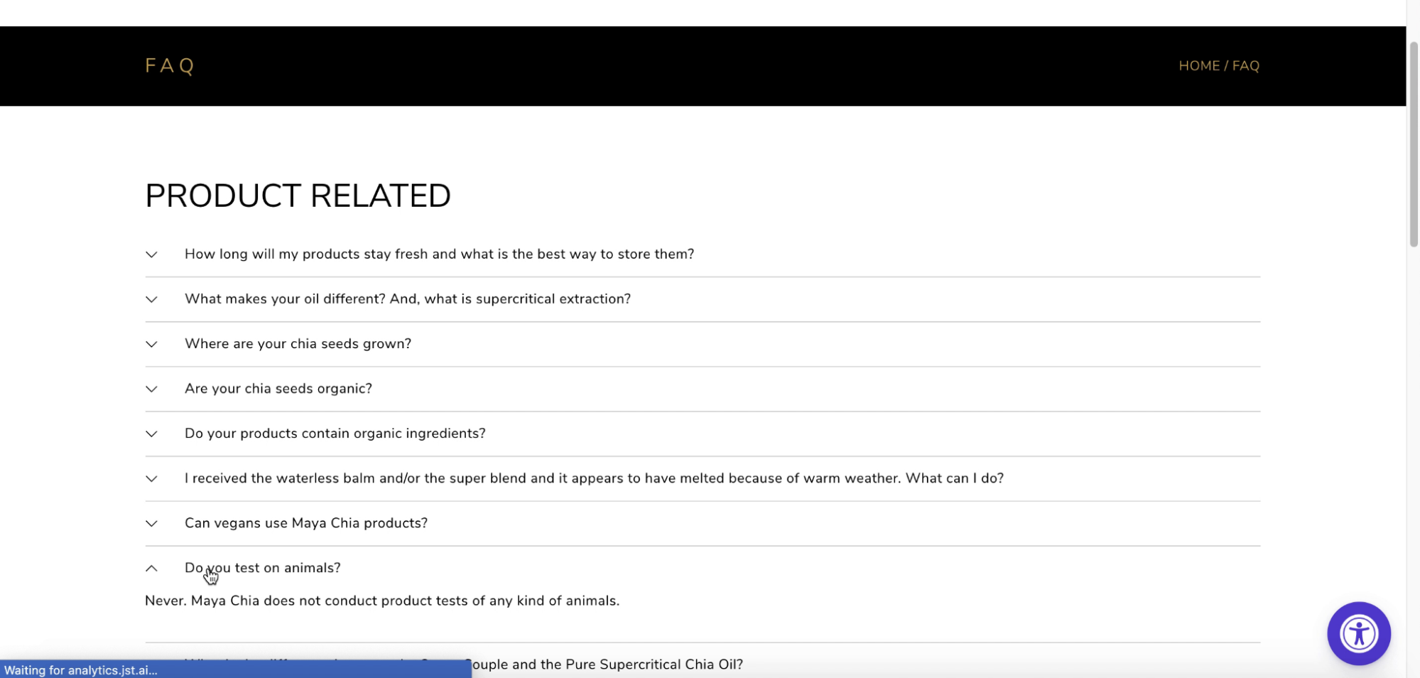
The test participant navigating the Maya Chia site wondered whether their products were cruelty-free. The answer is included on the FAQ page.
To answer common questions quickly, provide comprehensive sitewide FAQs covering topics like shipping, return policies, and general brand details.
Users will likely scan your FAQ, so make it easy to glance through the page by using concise language and providing visual elements like bullet points and text treatment.
12. Ensure Text That Overlays Images Is Legible (Guideline #290
When you position text on top of images, colors and textures can interfere with the words and make them difficult to read. This is a common and avoidable layout bug on ecommerce sites.
Ensure legibility by manually verifying text that overlays images, or consider using a semi-transparent background overlay.
13. Don’t Link to the Page the User Is Currently On (Guideline #255)
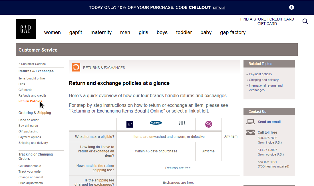
At GAP, you can see the user is currently on the “Return Policies” page because of the styling of the link. The link is also disabled.
Users may get confused if they click on a link to a page they’re already on, only to have the page simply reload.
Disable link styling and hover behavior for any links pointing to the page the user is currently on. Consider indicating the user’s current position within the menus by styling the relevant link.
14. Show Appropriate Keyboard Layouts on Mobile (Guideline #1100)
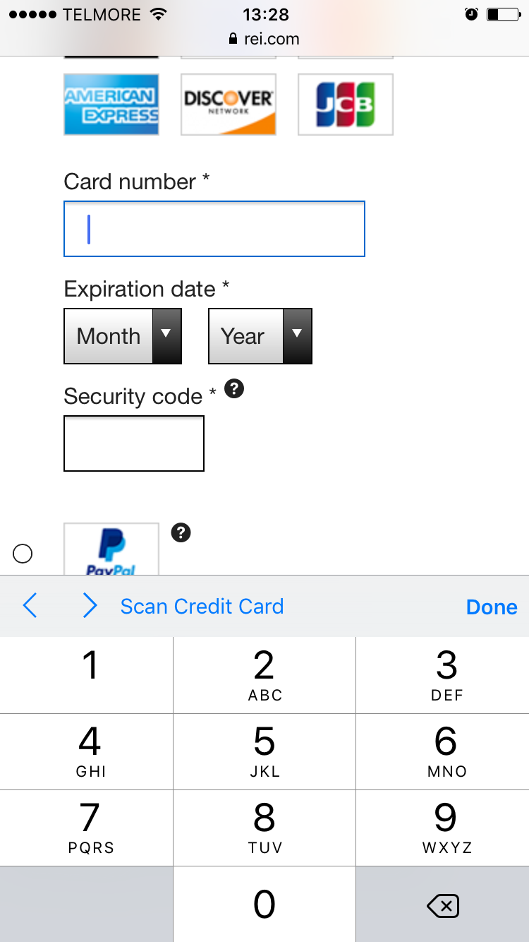
On REI, users enter information in the “Card number” field using a special numeric-optimized keyboard. This special keyboard features a set of buttons that are larger than the numbers on the standard keyboard.
By changing attributes in your input fields, you can instruct a user’s phone to automatically show a specific type of touch keyboard that is optimized for a particular type of input. For example, you can display an email keyboard for a user to input their email address.
To save users time and minimize typos, invoke specialized keyboards for numeric, phone, and email inputs where appropriate.
15. Make Sure Tappable Elements Are Clear (Guidelines #1083 and #1094)
Insufficient hit areas create issues for mobile UX. When the tap target is difficult to hit, it can result in unregistered, unintended, or erroneous taps. Sometimes, the user can become completely disoriented on the site or app.
Every mobile UI hit area should be at least 7mm x 7mm, including navigation menu items, text links, and form fields. Provide a minimum of 2mm spacing between tappable elements, but consider more space (e.g., ~10 mm) for crucial site elements. Avoid placing elements at the very edge of the screen.
16. Include Only Mobile-Optimized Pages and Content (Guideline #1095)
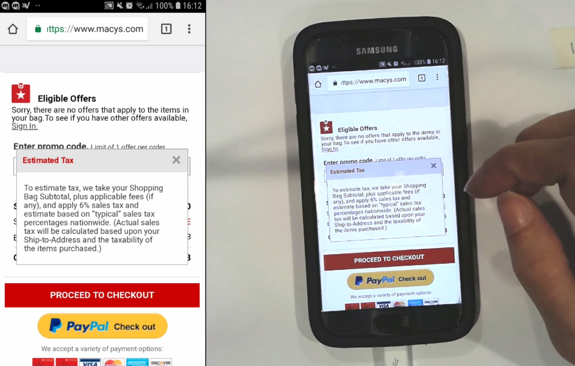
At Macy’s, a test participant tapped a tooltip for information on taxes, and the resulting text was easy to read.
Displaying web pages that aren’t optimized for mobile slows down users and delays decisions on calls to action.
Make sure all pages are optimized for mobile devices by using appropriate font sizes and layouts.
17. Support Pinch-to-Zoom on Mobile (Guideline #1142)
During Baymard’s usability testing, participants often pinched the main product image to zoom and inspect it. When users can’t pinch to zoom, they can’t complete a thorough visual evaluation of a product and will often click away to other options.
Ideally, support pinch-to-zoom functionality sitewide. At a minimum, enable pinch-to-zoom on your product pages or in image gallery overlays.
18. Invest in High-Quality Design and Imagery (Guideline #238)
Yes, your users will judge a book by its cover. They will make a snap decision about your site or app based on how it looks. Make a great impression with high-quality images and spectacular design, particularly on the homepage.

Ralph Lauren draws users in with enticing styling and a design that fits their brand.
19. Disable Auto-Capitalization Where Appropriate on Mobile (Guideline #1103)
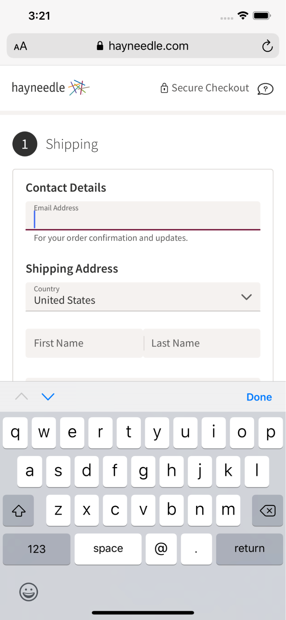
Hayneedle has disabled auto-capitalization on the email field, creating a more seamless experience for the user filling out this form.
Many users assume their input into certain fields (like their email address) needs to be all lowercase, so auto-capitalizing text adds unnecessary friction to the typing process on mobile.
Disable the auto-capitalization function where appropriate; for example, on URL or email address fields.
Interested in More Usability Best Practices?
We’ve covered some of the most important sitewide usability best practices in this article, distilled down from over 200,000 hours of research.
Implement the most impactful usability improvements for your site by digging into the insights from our usability testing.
To find out how your UX performance stacks up against the world’s leading ecommerce sites, check out Baymard Premium.
Research Director and Co-Founder
Christian is the research director and co-founder of Baymard. Christian oversees all UX research activities at Baymard. His areas of specialization within ecommerce UX are: Checkout, Form Field, Search, Mobile web, and Product Listings. Christian is also an avid speaker at UX and CRO conferences.