The current COVID-19 crisis is affecting all of us, both in private and professionally. Our sympathy goes to everyone affected by this crisis.
A consequence of countries, cities, and physical retail stores temporarily closing down is that a lot of that physical retail spending has now moved online instead. We get reports that several e-commerce industries currently are up 10–40% over normal sales levels, while online groceries and household essentials have unsurprisingly exploded.
From a UX research perspective, this COVID-19 context does, however, set some special requirements for e-commerce sites, as users have special needs and often behave differently during these times. While Baymard hasn’t done testing specifically during the COVID-19 crisis (as large-scale usability research simply takes too long to respond), the informational challenges users are facing right now have strong similarities to the informational challenges also observed during seasonal shopping events, where there are also logistical challenges and hence related user concerns.
In this article we’ll discuss the test findings from our large-scale Premium UX research related to why and how users are best reassured when it comes to their general concerns over product availability, shipping, returns, customer support, and similar topics.
In particular, we’ll discuss 6 general UX improvements to make, that are even more relevant with the ongoing COVID-19 crisis:
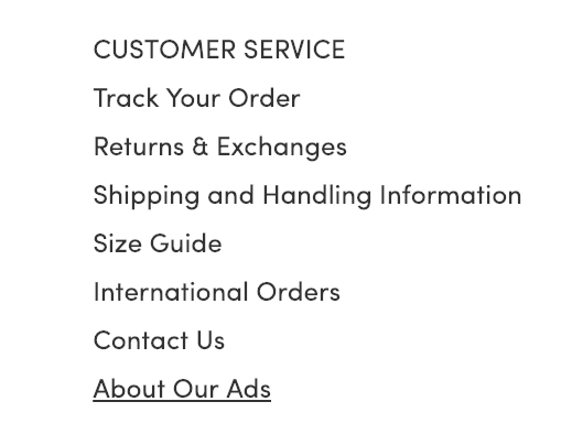
- Have direct links to “return policy” and “shipping info” in the footer (20% don’t)
- Support non-product search (15% don’t)
- Allow users to purchase temporarily “out of stock” products by increasing the delivery time (68% don’t)
- Show “estimated shipping costs” on the product page (43% of sites don’t)
- Use “delivery date” not “shipping speed” (35% don’t)
- Integrate all order tracking info and events within the e-commerce site itself (56% don’t)
1) Have Direct Links to ‘Return Policy’ and ‘Shipping Info’ in the Footer (20% Don’t)
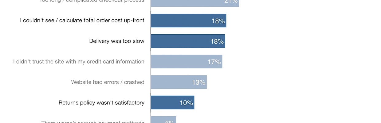
Shipping and returns info are crucial to users’ purchase decisions — our quantitative study finds that 18% of users abandoned a checkout because they couldn’t easily find the total order cost, 18% abandoned because of slow delivery, and 10% abandoned due to an unsatisfactory returns policy. Making this information as accessible as possible can help users find answers to their questions regarding shipping and returns info.
Many users are highly concerned about a site’s shipping costs and return policies before buying online — our quantitative study of reasons for checkout abandonments shows that return policy and shipping–related issues are a direct cause for abandonments.
Furthermore, our large-scale qualitative usability testing revealed that a subgroup of users will consistently look in the footer when seeking shipping and return information. We observe this both for mobile and desktop users (although more frequently with desktop users).
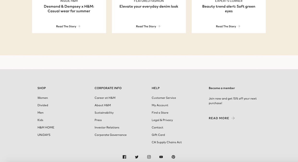
H&M doesn’t include direct links to either shipping or return info in the footer — failing to meet the expectations of users who will assume the links will be there.
When there are no immediate paths in the footer to shipping information and the return policy, users must go “information hunting”, which, depending on how easy it is to find the information elsewhere on the site, results in an often substantial delay in product browsing.
Some sites may assume having links to this information on the product page, or a link in the footer to “FAQ/Help”, is enough. However our testing finds that not all users search the product page for this information, and users scanning the footer for shipping and returns info are actively looking for links that include the keywords “return” and “shipping” (and thus many skip over “FAQ” or “Help” links).
During the COVID-19 crisis, many users will be new to your site and many of these new users will immediately try to determine what the site’s shipping and return policies are. Returning users may similarly have a desire to check and see if your shipping and return policies have changed during COVID-19. If this information isn’t easy to find in the footer some will abandon before they’ve even started.
See our full article for a more in-depth discussion of this issue.
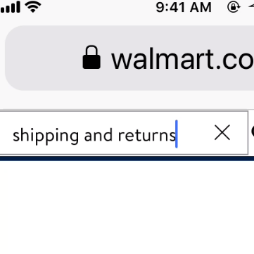
2) Support Non-Product Search (15% Don’t)
As established above, it can be difficult for users to find information about site return policies and shipping info, as well as other non-product content — especially if the information isn’t where they assume it will be.
![“If I had [the tracking number] I thought I’d be able to search everything on the site itself and be able to locate it”. A user at Best Buy gets no relevant results when entering the order-tracking number for an order. Failing to support a variety of non-product search queries forces users to find the information they’re looking for using other means — which may or may not be successful.](https://baymard-assets-cdn.imgix.net/research/media_files/attachments/37522/original/research-media-file-b6b14c18e736bf7f7c0846b65142e71c.jpg?auto=format&dpr=2&fit=max&q=50&w=880)
“If I had [the tracking number] I thought I’d be able to search everything on the site itself and be able to locate it”. A user at Best Buy gets no relevant results when entering the order-tracking number for an order. Failing to support a variety of non-product search queries forces users to find the information they’re looking for using other means — which may or may not be successful.
During our Accounts & Self-Service usability testing 34% of users tried to search for non-product content, (e.g., “return policy”, “unsubscribe”, “cancel my order”, etc.).
Yet our benchmark reveals that at 15% of sites users will hit a dead end when trying to find non-product content through search — with many subsequently assuming the content simply isn’t available. If it’s crucial content (e.g., the return policy) some of these users will then abandon.
Therefore it’s crucial to support non-product search queries.
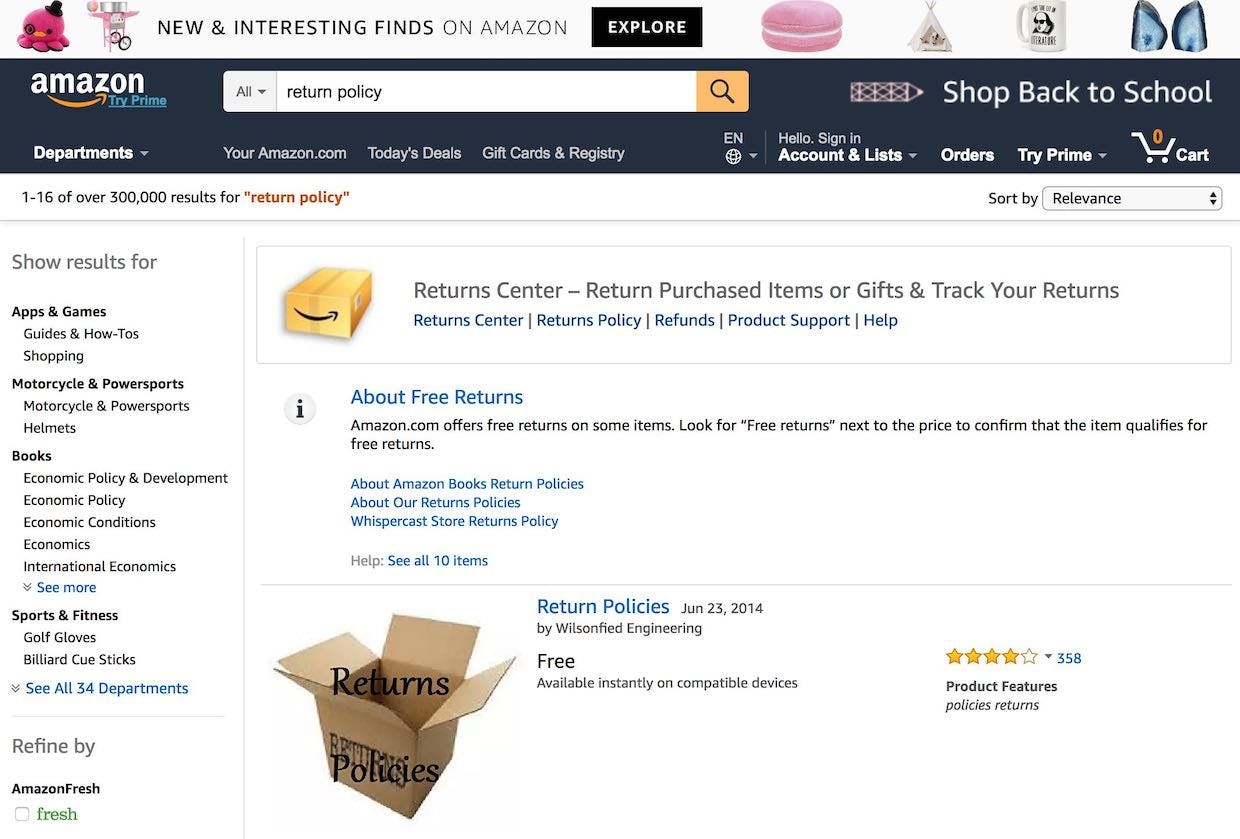
Searching for “return policy” on Amazon yields return center links, as well as a short description of the return policy along with a set of links to relevant help sections.
Supporting these non-product content queries can take the form of either (1) including the content as part of the search results (along with relevant products) or (2) taking the user directly to the relevant content (e.g., directly to the “Return Policy” page) if there’s sufficient confidence in the match.
During the COVID-19 crisis, non-product content search queries are likely to spike as users attempt to find information on shipping, returns, order cancellation, or even your warehouse safety measures. Guest users, or users who’ve recently created an account, often won’t know where to find this information through, for example, the main navigation, and thus will turn to search to “do the work” for them. If non-product search isn’t supported some will be unable to find the information they looking for.
See our full article for a more in-depth discussion of this issue.
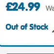
3) Allow Users to Purchase Temporarily ‘Out Of Stock’ Products by Increasing the Delivery Time (68% Don’t)
During our usability testing of product pages users would sometimes stumble on products that were listed as “out of stock”. What’s clear from testing is that if users are simply told a product or product variation is out of stock, some will look for alternative products on the site but 30% are likely to abandon to look for the product elsewhere.
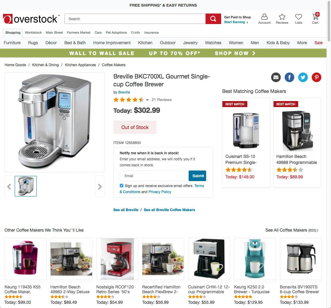
Telling users a product is out of stock and removing the “Add to Cart” button, as is the case here at Overstock, brings them to a complete halt and prevents the user from purchasing the item.
Presenting users with text that simply states a product is “out of stock” is a UX dead end: users can’t go any further on a site if they are truly set on purchasing that particular product.
Furthermore, it’s perhaps easy to forget that users assume they’ll have to wait for a product when shopping online.
This gap of time, from when users first place the order to when they expect to actually receive it, can be taken advantage of by allowing users to place orders for items that are only temporarily out of stock.
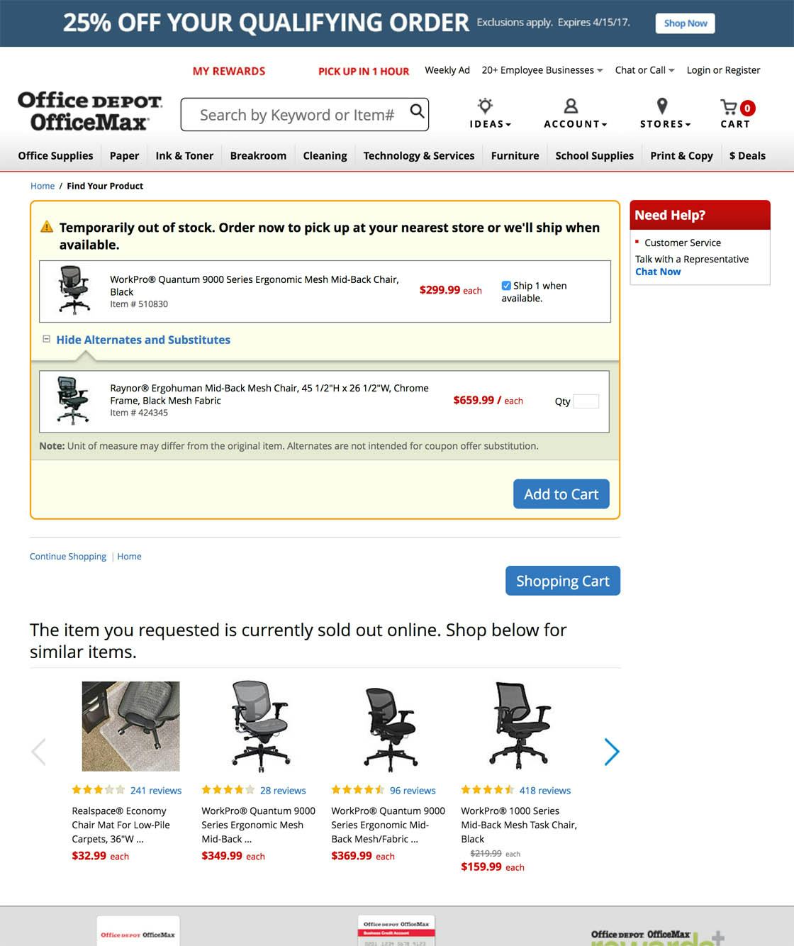
Office Depot allows users to purchase the out of stock chair but also promotes alternatives for users to consider. Users are given multiple options for adding a suitable product to the cart and finding a chair they like on the site.
If a product or a product variation is temporarily out of stock at the moment when the user is attempting to purchase it, but is expected to be replenished soon, then sites can allow users to place an order for the out of stock product and simply increase the delivery time.
(If, on the other hand, a product has been discontinued or deprecated, then it is truly unavailable and users should be informed of that fact by clearly marking the product as “discontinued” or “deprecated” — and cross-sells should be heavily promoted.)
During the COVID-19 crisis, both the surge in demand and supply chain issues often lead items to be listed as “out of stock”. But, if a user is simply “stocking up” and doesn’t need the product immediately, they may be willing to wait a week or more to receive the item — especially if that allows them to avoid a trip to a physical store.
See our full article for a more in-depth discussion of this issue.
4) Show ‘Estimated Shipping Costs’ on the Product Page (43% Don’t)
As described in #1 above, 18% of users abandoned an order because they couldn’t find or calculate the total order cost upfront — a large portion of which is typically the shipping cost.
Furthermore, our Product Page study reveals that 64% of users looked for shipping costs on the product page, before deciding to add a product to the cart.
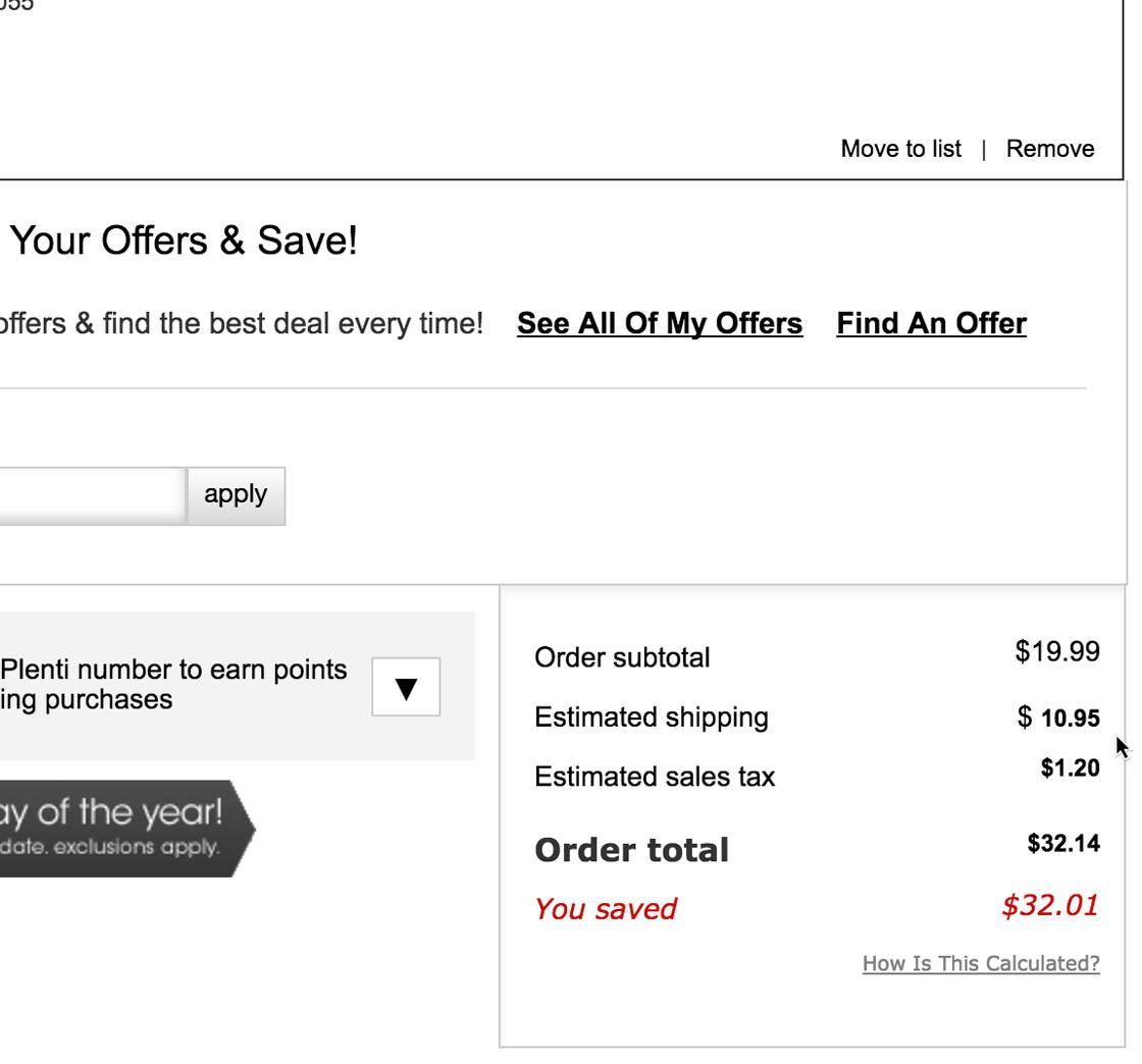
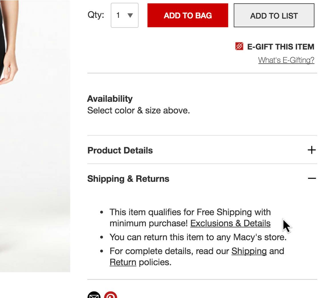
In the cart Macy’s uses IP geo-targeting to estimate a user’s shipping and tax costs — a good thing in itself (first image). However, this estimate isn’t presented to users on the product page, despite having a section reading “Shipping” (second image).
For this majority of users, having an idea of the full order cost is crucial to their ability to make a purchase decision — many won’t wait until the checkout to decide.
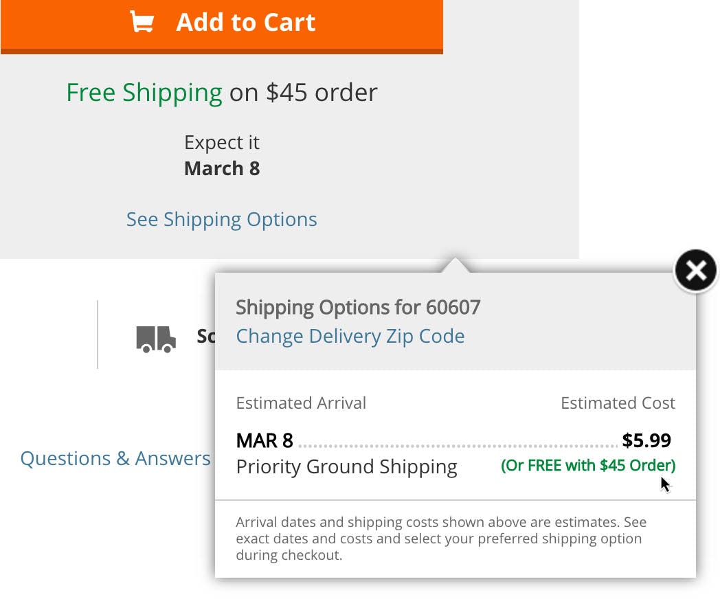
The shipping tooltip at Home Depot makes it clear both how much shipping is estimated to cost and what the threshold is for free shipping — testing clearly revealed that users need both pieces of information to evaluate if it’s worthwhile to reach the free shipping threshold.
There are multiple ways to calculate the estimated shipping costs on the product page. In order of best-to-worst performing (UX wise), these include the following:
- If flat-rate shipping is used, simply display the lowest shipping cost available (as users are mainly interested in knowing the lowest total order cost they can get away with).
- Use IP geotargeting to gauge the user’s location and, based on that, calculate a shipping cost estimate.
- Use a user’s prior-shipping destination if they are signed in to an account.
- Show a price range of the lowest-possible shipping fees — for example, “Standard Shipping: $5–$8 (depends on destination).” While not as good as an actual cost or a single number estimate, it will give users a rough cost estimate, allowing them to better evaluate if it’s worthwhile to proceed to get the accurate cost.
During the COVID-19 crisis, it’s important that, once a user has spent the time exploring the site to find a product they’d like to purchase — particularly if previously desired products have been “out of stock” (see #3 above) — the site provides them with the crucial shipping cost information on the product page, which can be the deciding factor when they’re making a purchase decision.
See our full article for a more in-depth discussion of this issue.
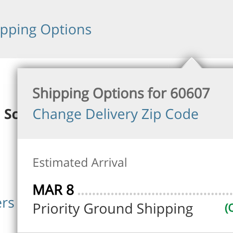
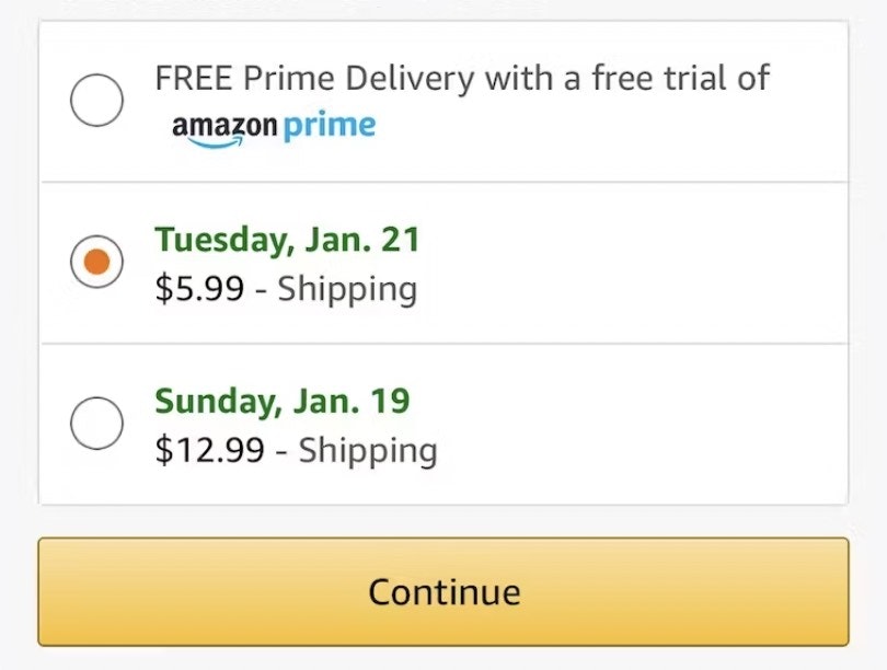
5) Use ‘Delivery Date’ Not ‘Shipping Speed’ (35% Don’t)
When it comes to shipping, our Checkout study shows that what users really care about is “When will I receive my order?”
Users at Macy’s will have a difficult time assessing when they might receive their order, as they’ll simply have to guess Macy’s processing times as well as account for holidays and weekends to convert the transit business days into an estimated date of delivery.
Our benchmark reveals that 35% of sites provide a business-centric shipping speed to attempt to supply that information; for example, “Standard shipping: 5–7 business days”.
However, during testing the problem with providing only shipping speeds quickly became evident: it forces users to calculate a number of conditional variables (e.g., current weekday and time, order-processing time, and nondelivery days such as holidays and weekends) to determine the value they actually care about (i.e., when they can expect to receive their order).
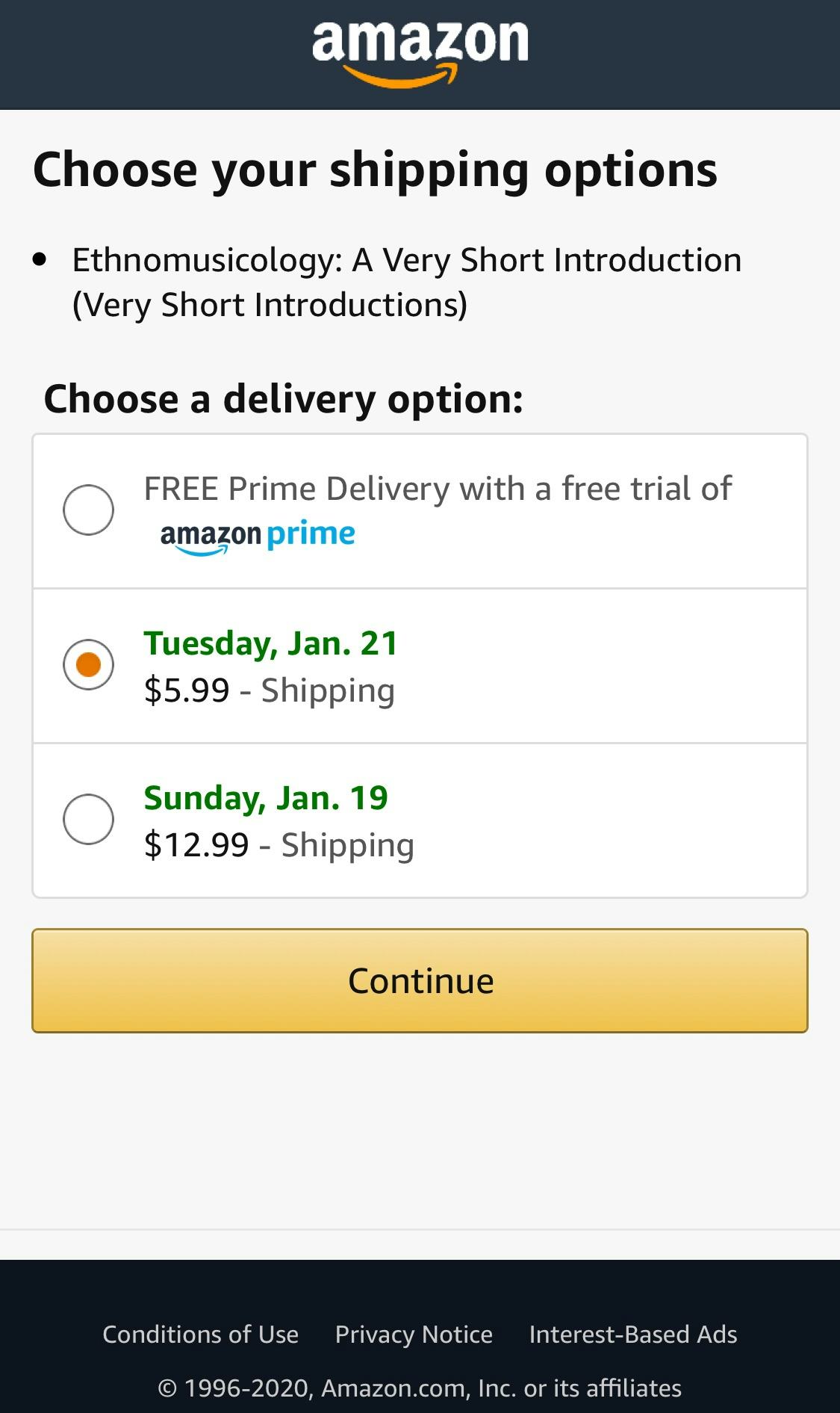
Amazon knows users don’t care if their order is being shipped via “Standard” or “Premium” delivery: users are instead provided simply with the date they can expect to receive their order.
Instead, providing a delivery date (e.g., “Delivered by May 4th”), or a date range (e.g., “Delivered May 4th–6th”), was observed during testing to perform much better for users.
Note, however, that users will take the delivery date (or range) as a promise to deliver by that date. It’s therefore crucial that the date is accurate, whether it’s supplied by a third-party (e.g., a postal service API) or calculated by the site itself.
During the COVID-19 crisis, with the increased strain on inventory, product deliveries are being delayed on many sites. Providing a date or date range — even if it’s weeks into the future — will give users the peace of mind to know when they can expect their order, without having to calculate this information by themselves. In addition to providing a wider delivery range than what you’d normally be able to, consider also offering an additional explanation of the extent to which customers can expect further delays (e.g., in a tooltip). If you have no interruptions or delays, then it’s also a good idea to state that directly, as users still will have the concern.
Furthermore calculating the delivery date gets more difficult as delivery dates get further away. For example, it’s much easier for users to know when to expect your delivery when the speed is “2 business days” compared to “15 business days” — with a longer delivery window users must account for multiple weekends and potentially holidays as well, and many will struggle to calculate the actual delivery date accurately (if they even bother to try).
See our full article for a more in-depth discussion of this issue.
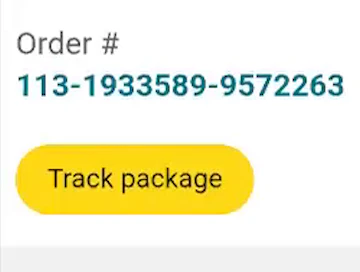
6) Integrate All Order Tracking Info and Events within the E-commerce Site Itself (56% Don’t)
Our large-scale Accounts & Self-Service study revealed that users track their order at many different times — ranging from immediately after completing the checkout (e.g., to see if it’s processing) to several days after submitting the order (e.g., to check on the status and learn when to expect it).
However, when the order-tracking information was provided via third-party tracking or shipping sites — rather than being integrated within the e-commerce site itself — users during testing found it harder to access, understand, and navigate the order-tracking details.
Indeed, by not providing tracking information on the site itself, sites are giving up control over the end user experience — which our testing revealed is often poor on third-party tracking sites.
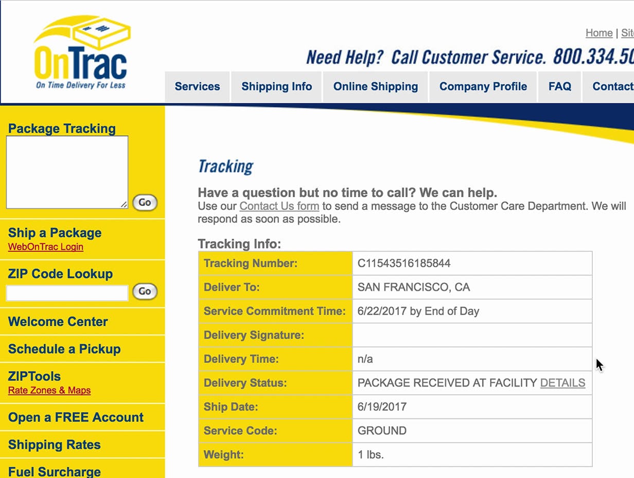
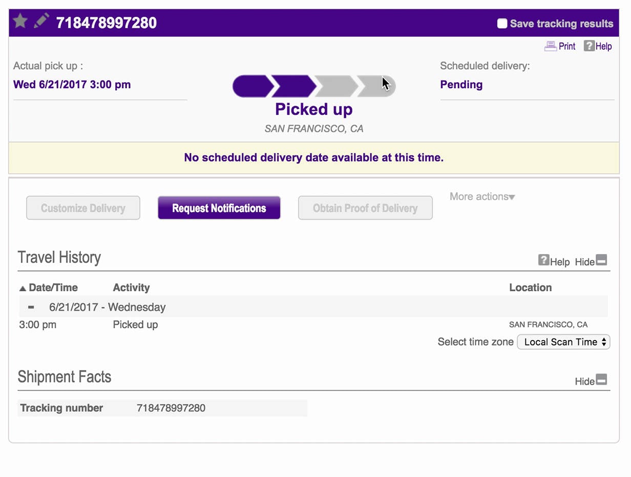
Both the layout and the terminology on third-party tracking sites is out of the e-commerce site’s control, so any UX issues here will essentially be the e-commerce site’s UX issues, but without any option for the user to resolve it. For example, the interface for OnTrac uses industry jargon like “Service Commitment Time” (instead of the more normal “Delivery/Arrival Date”), and the delivery date is difficult to see (first image). On FedEx (second image), a user during testing was confused by some of the descriptions, saying, “‘Picked Up’ vs ‘Pending’…It says it is picked up? It says it’s pending? I am really confused”.
In particular, users often struggle with missing information, disconnected information, or simply an incoherent user experience when trying to navigate third-party tracking pages — with the end result being for many users that they don’t have the information they need to understand the status of their order.
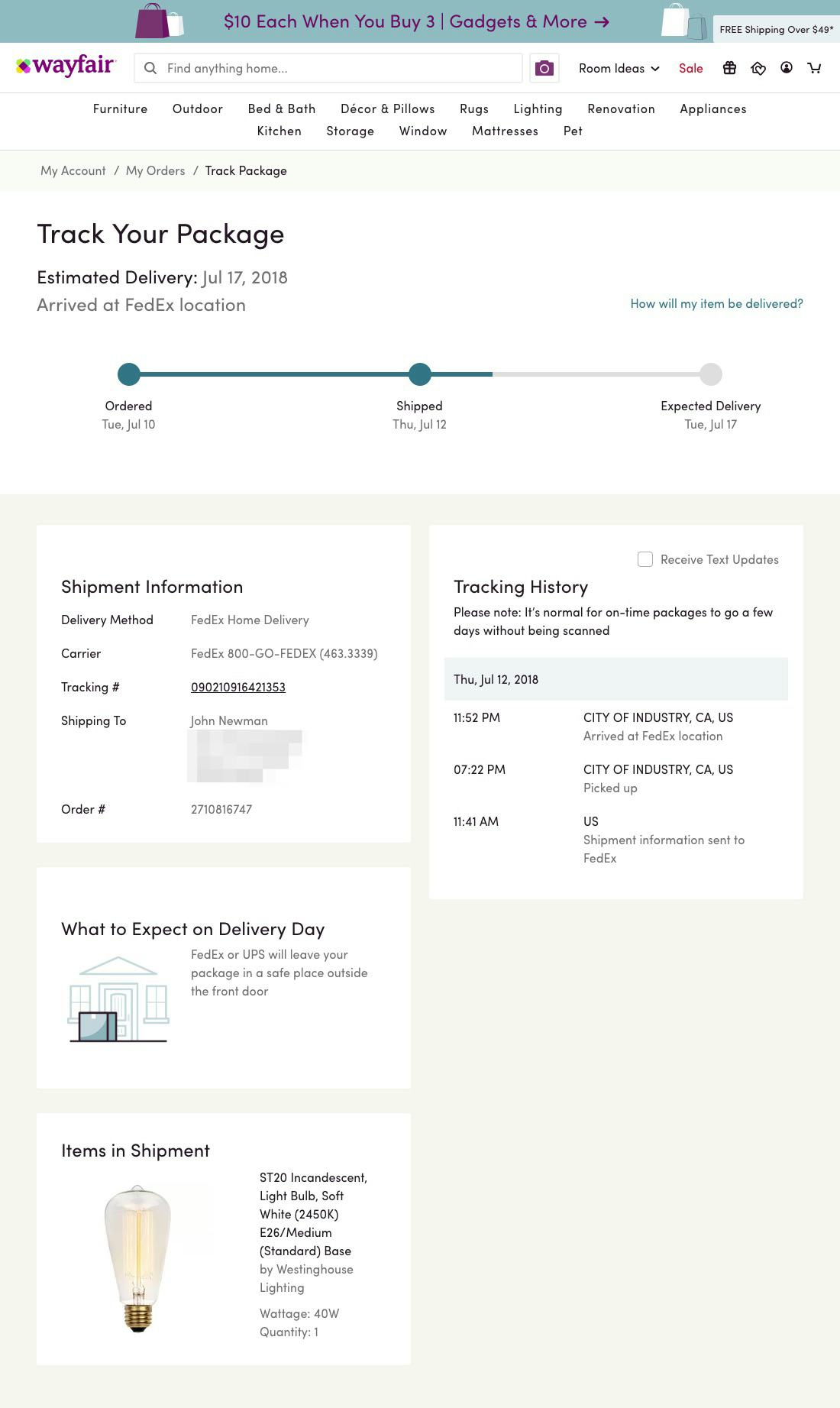
At Wayfair, tracking information is integrated in the site, allowing users to get the tracking information they need, as well as additional delivery details (e.g., “What to Expect on Delivery Day” — especially useful when receiving large or oversize items such as furniture) and general order information.
For a better order-tracking experience, sites can provide all the tracking details that users would need, such as delivery date, courier name, and shipment subevents, on their own order-tracking page. Sites then control the experience from beginning to end, offering a seamless user experience.
During the COVID-19 crisis, it may be challenging for a site to consider integrating order-tracking information on the site itself — many sites are struggling to simply keep up with order demand and fulfillment. Yet indications are that the crisis — and the shift in consumer purchasing to e-commerce over physical stores — will be with us for months if not years to come, in which case the benefits of developing and implementing your own order-tracking feature may be worth the costs.
See our full article for a more in-depth discussion of this issue.
Provide Users with the Information and Options They Need during Anxious Times
Baymard Premium has the full list of 58 UX guidelines that are especially important to consider during the COVID-19 crisis.
Above we provided 6 ways to improve the user experience during the COVID-19 crisis:
- Have direct links to “return policy” and “shipping info” in the footer (20% don’t)
- Support non-product search (15% don’t)
- Allow users to purchase temporarily “out of stock” products by increasing the delivery time (68% don’t)
- Show “estimated shipping costs” on the product page (43% of sites don’t)
- Use “delivery date” not “shipping speed” (35% don’t)
- Integrate all order tracking info and events within the e-commerce site itself (56% don’t)
These are only a handful of the guidelines we’ve singled out as being particularly important for sites to consider during the COVID-19 crisis. There are 52 more that should be considered to ensure users are able to successfully browse and purchase products in the current uncertain environment.
Furthermore, under these special conditions of the COVID-19 crisis our general guideline recommendations should often be scaled up. For example, while our research strongly recommends (during normal times) to address shipping time and costs on the Product Details page (#4 above), during this crisis addressing this on the homepage would be prudent (along with on the PDPs).
Ideally, there will also be a dedicated COVID-19 page stating your company’s general status and measures to address the particular issues your users may be facing due to the crisis.
Stay safe.
This article presents the research findings from just 1 of the 710+ UX guidelines in Baymard Premium – get full access to learn how to create a “State of the Art” e-commerce user experience.