Key Takeaways
- Users often struggle to associate dimensions with the parts of the furniture product they describe
- Most users uncertain about the dimensions will abandon the product, while others will misjudge the fit, increasing the likelihood of a return
- Providing a “Dimensions” image gives users confidence in the accuracy of their assessment of the product size
In Baymard’s large-scale UX testing of Furniture & Home Decor sites, most participants needed exact measurements to feel confident a furniture or home decor product would physically fit in their home.
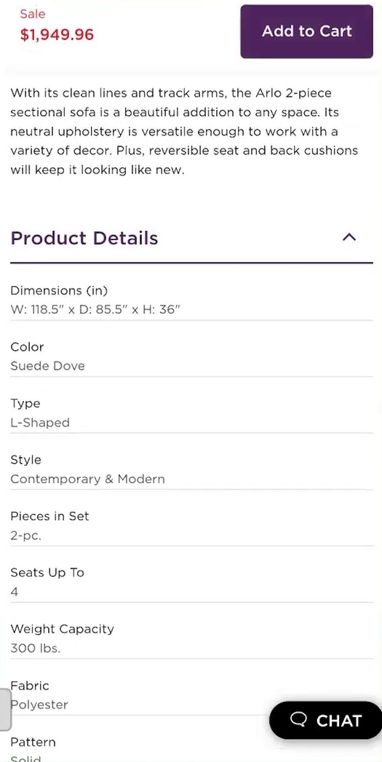
But during testing some struggled to associate those dimensions with corresponding parts of the furniture.
To help users accurately determine if a product will fit, sites should offer “Dimensions” images that visually link each measurement to its location on the product.
Yet our e-commerce UX benchmark reveals many furniture sites fail to provide this image, causing users to misjudge whether products will fit or to abandon them altogether.
This article will discuss our latest Premium research findings on supporting users as they assess the size and dimensions of furniture and home decor products:
-
Why product measurements provided only in text format are difficult to interpret
-
How “Dimensions” images help users assess product size more efficiently and accurately
-
Why ensuring measurements are sufficiently readable is critical
Why Product Measurements Provided as Text Are Difficult to Interpret
“I’m not good at math. I don’t know what any of this means.” A participant at Pottery Barn struggled to connect the written dimensions with the corresponding parts of the couch she was considering.
When participants were provided only textual dimensions during testing, almost all had trouble connecting the measurements to the corresponding parts of the product.
As product complexity increases, so does the number of dimensions, making it even more challenging to interpret the product measurements precisely when accuracy is most critical.
“Height is obvious, but the width could be very different depending on what part you’re looking at since it is an L shape. So I would like to have seen a photo with dimensions on it versus just like this.” This participant at Raymour & Flanigan struggled to associate the various parts of the couch (first image) with the written measurements they corresponded to (second image).
“‘Apron to floor’…I don’t know what those words mean.” This participant at Ashley Furniture wanted to buy chairs to match the dining table she liked. However, she couldn’t interpret the dimensions, so she couldn’t confirm that the chairs would fit with the table. She ultimately purchased the table but not the chairs.
Users can be further hindered by unfamiliar terminology (e.g., “apron” to describe a table overhang), or vague spatial indicators (e.g., “length” on an L-shaped product).
Faced with dimensions described in unclear terms, users often have no way to resolve their confusion.
As a result, many will abandon the product rather than risk purchasing — and potentially needing to return — an item that might not fit.
How “Dimensions” Images Help Users Assess Product Size More Efficiently and Accurately
“It’s giving me a photo with the measurements put in, [this is] super important because you’re going to talk to a dummy like me, you want to make it as simplistic as possible.” A participant at Article on Android found the “Dimensions” image directly adjacent to the written dimensions useful.
“This is perfect because it tells you what it is, it shows you a picture. So I like this a lot and I can screenshot it if I wanted to send it to my boyfriend for him to also look at.” This participant at IKEA on Android was pleased to see both the listed and visual dimensions information visible in a single viewport.
“Fantastic, this is exactly what I love to see on websites”, a test participant on Android at Lamps Plus exclaimed after coming across a “Dimensions’’ image featuring the lamp he was considering. “The other websites they gave dimensions [but] didn’t really specify what they were measuring, what parts I guess. Here it’s very detailed and thorough. The presence gives me confidence in the purchase.” Here the “Dimensions” image removes the mental overhead for the user of associating the various dimensions with the corresponding part of the product.
In testing participants were able to assess product size more efficiently and were more confident in their judgment when “Dimensions” images were provided.
By visually associating each measurement with the part of the product it relates to, the “Dimensions” image reduces the risk of misinterpretation.
Thus providing a “Dimensions” image for each size product variation helps users increase their confidence that the item will fit in their space.
“I appreciate that they show exactly what they’re measuring and where too, just because it’s easy to misinterpret those things if you’re just seeing them listed on a site, as opposed to showing exactly what they’ve measured within each piece of the furniture.” This test participant at IKEA felt more confident in her understanding of the written dimensions with a corresponding visual to reference.
Even users who recognize and understand all the terminology used to present dimensions will benefit from a “Dimensions” image, as it increases confidence in their interpretation of the measurements.
And since space constraints or existing furniture force nearly all users to consider product size when shopping for home decor, implementing a “Dimensions” image can have a broad impact.
Why Ensuring Measurements Are Sufficiently Prominent Is Critical
On the product page for a couch at Blu Dot on mobile (first image), the “Dimensions” image is not legible at its default size (second image).
The benefits of a “Dimensions” image can be negated if the text within the image is too small to read without zooming, especially on mobile devices.
Therefore, sites should embed legible text in the “Dimensions” image, optimizing the text size so it’s readable without requiring any user-initiated zoom on mobile.
This approach ensures the same image can then be utilized on desktop with no modifications.
Sites should also position the image close to the text dimensions so equivalent information is immediately available to users of assistive technologies, and include descriptive alt text explaining the image’s intent.
Help Furniture Users Feel Confident Products Will Fit in Their Home
“It has a bunch of information here, but…[it] doesn’t really make that much sense to me ‘cause I don’t know what a ‘leaf’ is, or ‘leaves’, or ‘overhang’ and ‘thickness’ of something.” A participant at Room & Board recognized the comprehensiveness of the “Dimensions” section, but ultimately couldn’t connect the written measurements to the corresponding physical features of the table.
As our research has shown, it’s essential for users to know whether a piece of furniture or decor will fit in their home before purchasing.
So having access to clear measurements presented in an easily digestible format is critical.
Yet many sites fail to offer features that help users understand and interpret product dimensions, leading to uncertainty and abandonment.
By offering a “Dimensions” image, furniture and home decor sites can reduce the likelihood of users abandoning a product because it’s hard to determine if it will fit.
Getting access: all 500+ Furniture & Home Decor UX guidelines are available today via Baymard Premium access.
If you want to know how your furniture or home decor desktop site, mobile site, or app performs and compares, then learn more about getting Baymard to conduct a Furniture & Home Decor UX Audit of your site or app.


![“It’s giving me a photo with the measurements put in, [this is] super important because you’re going to talk to a dummy like me, you want to make it as simplistic as possible.” A participant at Article on Android found the “Dimensions” image directly adjacent to the written dimensions useful.](https://baymard-assets-cdn.imgix.net/research/media_files/attachments/120051/original/research-media-file-8bb2fd82fdd28b3aad16bbac6f52b2c8.jpg?auto=format&dpr=2&fit=max&q=50&w=880)

![“Fantastic, this is exactly what I love to see on websites”, a test participant on Android at Lamps Plus exclaimed after coming across a “Dimensions’’ image featuring the lamp he was considering. “The other websites they gave dimensions [but] didn’t really specify what they were measuring, what parts I guess. Here it’s very detailed and thorough. The presence gives me confidence in the purchase.” Here the “Dimensions” image removes the mental overhead for the user of associating the various dimensions with the corresponding part of the product.](https://baymard-assets-cdn.imgix.net/research/media_files/attachments/120053/original/research-media-file-7e2ed3437dd30246390118e011845bb1.jpg?auto=format&dpr=2&fit=max&q=50&w=880)

![“This little graphic is very helpful so I don’t have to interpret [the written measurements]…it could be a little confusing if I was just looking at [the text]…it just makes it a lot easier looking at the picture.” This iOS participant at Wayfair was much more confident that he interpreted the written dimensions correctly when they were presented adjacent to a “Dimensions” image.](https://baymard-assets-cdn.imgix.net/research/media_files/attachments/120055/original/research-media-file-eaccf6768761f96ed1bce0fb5fd8882f.jpg?auto=format&dpr=2&fit=max&q=50&w=880)


![“It has a bunch of information here, but…[it] doesn’t really make that much sense to me ‘cause I don’t know what a ‘leaf’ is, or ‘leaves’, or ‘overhang’ and ‘thickness’ of something.” A participant at Room & Board recognized the comprehensiveness of the “Dimensions” section, but ultimately couldn’t connect the written measurements to the corresponding physical features of the table.](https://baymard-assets-cdn.imgix.net/research/media_files/attachments/120062/original/research-media-file-46c32c39ac3c1c7ba15f53f4d64ab34e.jpg?auto=format&dpr=2&fit=max&q=50&w=880)


