Key Takeaways
- Users are often reluctant to provide their phone number during checkout due to privacy concerns, fearing marketing calls or misuse of their data
- When required to provide a phone number without explanation, some users will provide false information or abandon the checkout process entirely
- Providing a short, inline explanation, making the field optional, or removing it completely can alleviate user concerns and reduce checkout abandonment
Key Stats
- 14% of online shoppers are reluctant to provide their phone number
- 14% of online shoppers are reluctant to provide their gender
- 27% of online shoppers are reluctant to provide their date of birth
- 39% of sites in our benchmark require a phone number without any explanation
Video Summary
Baymard’s large-scale UX testing consistently reveals that users are concerned about the security and confidentiality of their personal information online.
A common point of hesitation is the request for a phone number during checkout.
This reluctance stems from concerns ranging from receiving unwanted marketing calls to fears of identity theft.
When confronted with a required phone number field without any explanation, some participants in our testing provided false information or abandoned the checkout process altogether.
This not only undermines the integrity of customer data but also leads to lost sales.
The solution is straightforward: sites should clearly explain why a phone number is required, make the field optional, or remove it entirely.
Yet 39% of sites in our ecommerce UX benchmark require users to provide their phone number without any sort of explanation.
In this article, we’ll discuss our Baymard research findings related to requesting users’ phone numbers during checkout:
- Why users are reluctant to provide their phone number
- How to build user trust by explaining why the information is necessary
- How this transparency applies to other requests for personal data
Users’ Reluctance to Share Their Phone Number Can Disrupt Checkout
”‘Continue to payment.’ Oh, ‘Phone Number’.” This participant checking out at Apple skipped the ”Phone Number” field, preferring to avoid providing this personal detail, but received an error message because it was required.
Across multiple rounds of large-scale UX testing, a subgroup of participants consistently voiced privacy concerns when required to provide their phone number.
As one participant stated, “Normally I wouldn’t fill in something like ‘Phone Number’…I simply can’t see what they need that for”.
Participants generally expected order communications to be handled via email, making the phone number requirement seem suspicious.
Many assumed the site would use their number for unwanted marketing purposes.
Hence, this request for what is perceived as unnecessary personal data can cause users to hesitate, and for more privacy-conscious individuals, it can be a direct cause of site abandonment.
Our quantitative study of 1,026 online shoppers shows that 14% of users would never provide their phone number to an online store.
Likewise, in our quantitative study of 1,026 online shoppers, we see that users are reluctant to provide a variety of personal details.
Specifically for phone number, 14% of the respondents replied that they would ”…never give an online store this information”.
While sites may not think of a user’s phone number as highly sensitive information that users would be reluctant to provide, for these users, this is clearly a “deal breaker”.
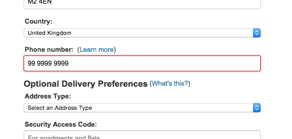
“Arhh. Well now they get a phone number. I do this very often. I don’t want to be called by some sales dude. That happens sometimes and…it turns me off completely. They aren’t allowed to do that, I’ve provided my phone number because of the order, then they are not supposed to call me [with a sales call]. But now I’ve learned to type ‘9999’…” In an earlier round of testing, this user typed in a fake number when required to provide a phone number by Amazon.
Furthermore, when users feel forced to provide information, some will find creative ways around the requirement.
During testing, we observed several participants enter a false phone number to proceed with their purchase.
This practice is highly problematic, as it undermines the legitimate reasons for collecting the number, such as for courier services or credit card validation.
A fake number can lead to nearly unresolvable card validation errors, very likely causing users to abandon their purchase.
Build Trust by Explaining Why a Phone Number Is Needed
”’In case there’s a billing issue’, let me see…‘Don’t worry, we never share a number with anyone’. This is helpful, like they’re just saying in case I need to contact you, you have your number entered.” Checking out at American Eagle, this participant appreciated the explanation detailing how the ”Phone Number” was used to verify the credit card payment.
Crate & Barrel explains how details such as ”Email” address (first image) and ”Phone Number” (second image) are used, which can help convince users to provide them.
To address users’ privacy concerns and avoid the problems caused by fake data, sites should clearly explain why a phone number is required and what it will be used for.
Our checkout testing has consistently shown that providing an explanation for why a phone number is being collected alleviates the vast majority of users’ privacy concerns.
Simply providing a short, inline explanation of what the phone number is used for is enough to alleviate the vast majority of privacy concerns. Here, Everlane explains that the phone number will be used “in case of delivery questions”.
One well-performing implementation is providing a short, inline explanation placed in close proximity to the field.
Simple descriptions like “Used for payment validation” or “In case we need to contact you about your order” help put users’ minds at ease.
One participant, upon seeing such an explanation, noted, “This is helpful, like they’re just saying in case I need to contact you, you have your number entered.”
For longer descriptions, the explanation can also be located within a tooltip.
Note that on mobile devices, it’s important to ensure proper spacing and hit areas for tooltips to avoid interaction issues.
At Our Place, the ”Phone” field is clearly labeled as optional and also displays an explanation of what this information is used for.
Another solution is to make the phone number field explicitly optional.
This allows the vast majority of users who have privacy concerns to simply skip the field and continue with their checkout without issues.
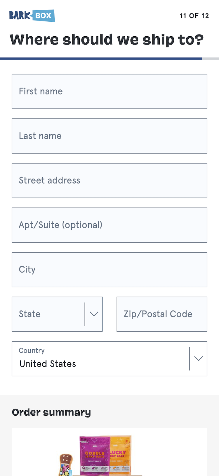
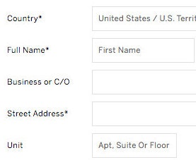
Barkbox (first image) and Dollar Shave Club (second image) don’t ask for a ”Phone Number” at all, removing a field that is likely to cause some users to hesitate.
Finally, it is worth asking if a phone number is truly necessary to collect in the first place.
If order or customer service issues can be managed via email, it may not be necessary to ask for a phone number at all.
Removing the field entirely is an effective way to streamline the checkout form and eliminate an obstacle that could otherwise lead to abandonment.
Reconsider or Explain Requests for Other Personal Information
If asking for personal data is a legal requirement, ask only for what the law requires. For example, the brewing company Carlsberg needs to ensure users are over 18, and consequently only asks users for their birth year. This will most likely provoke far-fewer privacy concerns than asking for the full date of birth (and is faster to complete). Users who type a year in which they could be both above and under the required age then get a follow-up field for month, and then one for day, if necessary.
Personal data such as “Date of Birth” and “Gender” are considered to be highly personal by many users; hence, supplying the information should always be optional, or there should be a “de facto optional” option. Here, at Etsy, a “Rather not say” option is provided.
While the “Phone Number” field was the most common concern observed in testing, participants also hesitated when asked for other personal information like date of birth and gender.
Our quantitative study confirmed this, showing 27% of users are reluctant to provide their date of birth and 14% are reluctant to provide their gender (see graph above).
Any data request that seems irrelevant or overly invasive can cause users to question if continuing is worth the risk and effort.
As one participant asked when prompted for a date of birth, “I’m wondering why it’s doing all this stuff…like, why are you asking for my date of birth?”
Therefore, sites should consider making these fields optional or, ideally, removing them from checkout entirely.
If the information is required, for instance, for legal age verification, sites should collect it in the least invasive way possible.
For example, a site that must verify a user is over 18 can ask for a birth year instead of a full date of birth, which is less likely to trigger privacy concerns and is faster for the user to complete.
Alleviate Users’ Privacy Concerns and Reduce Checkout Abandonment
On Zazzle, the phone number field is both clearly marked as “optional” and an explanation is provided via a tooltip. Thus, users are prompted to provide their phone number, while they can simply elect not to provide this information.
Asking for a user’s phone number during checkout may seem like a standard request, but our research shows it can be a significant point of friction.
Users’ concerns about privacy are valid, and requiring a phone number without justification can damage trust and lead directly to lost sales.
Still, 39% of ecommerce sites require users to provide their phone number without any explanation.
The solution is both simple, low-cost, and yet impactful.
By providing a clear, concise explanation for why the information is needed, making the field optional, or removing it altogether, sites can address the users’ privacy concerns head-on.
This small adjustment to the checkout process demonstrates respect for the user’s privacy, fosters trust, and ultimately helps create a smoother path to a completed purchase.
This article presents the research findings from just 1 of the 700+ UX guidelines in Baymard – get full access to learn how to create a “State of the Art” ecommerce user experience.
If you want to know how your desktop site, mobile site, or app performs and compares, then learn more about getting Baymard to conduct a UX audit of your site or app.


