
45 Homepage & Category UX Articles
These articles are based on observations and test findings from our usability research on homepage, category and navigation design.

Homepage and Category Navigation UX 2025: 67% of Mobile Sites Have Mediocre-to-Poor Performance
Our latest Homepage & Category Navigation UX benchmark reveals that the performance for up to 67% of leading US and European sites is “mediocre” to “poor”. Here are 11 UX best practices.
Featured
Mobile UX Trends 2026: 10 Best Practices
July 14, 2026 (Updated)Popular
Mobile App UX Trends: The Current State of Ecommerce App UX (11 Common Pitfalls & Best Practices)
April 14, 2026 (Updated)Popular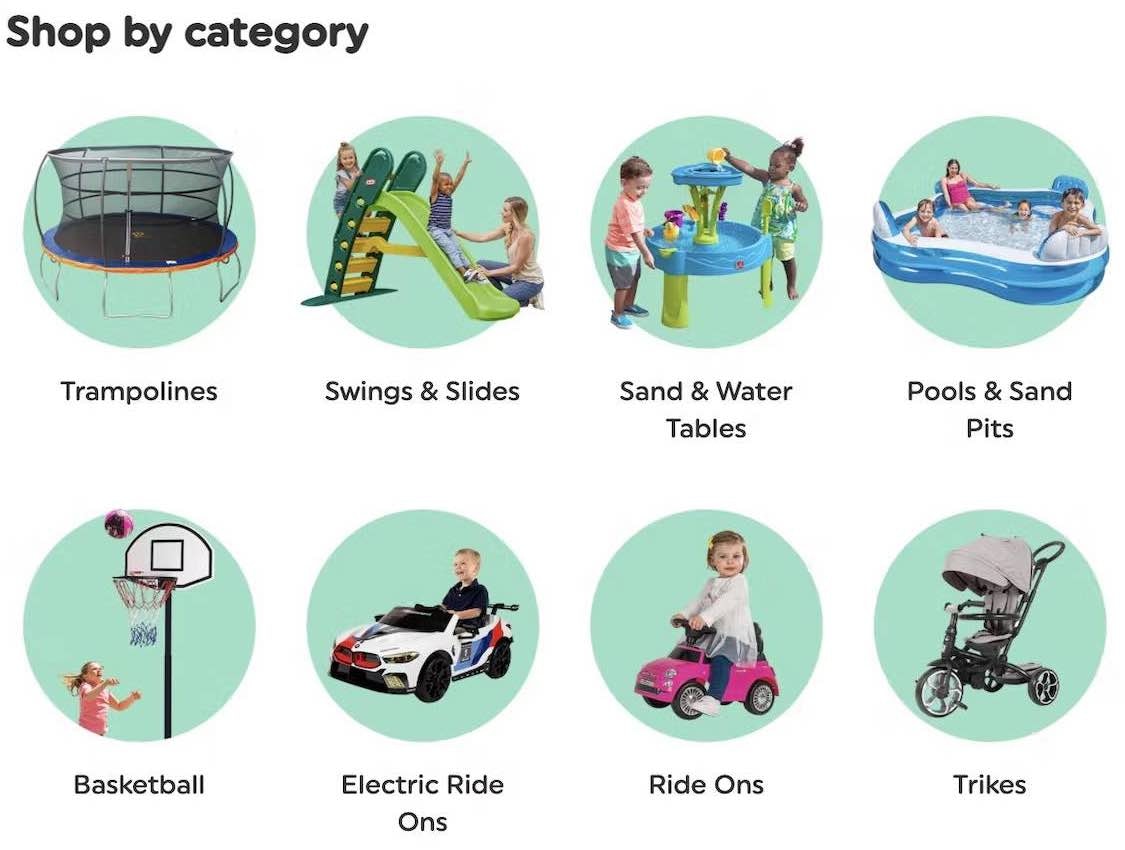
Homepage and Category Navigation UX 2025: 67% of Mobile Sites Have Mediocre-to-Poor Performance
September 30, 2025 (Updated)Popular
4 Ways to Improve UX for Ecommerce Mass Merchant Sites
April 29, 2025
5 Best Practices for Communicating Sustainability in Ecommerce
April 22, 2025 Popular

10 UX Requirements to Follow for a User-Friendly Homepage Carousel Design
46% of all homepage carousels on ecommerce sites have performance issues. Learn 10 ways to improve your carousel UX so users don’t overlook key content — or use a simpler alternative.
Featured
Ecommerce Homepage UX: Can Users Infer the Breadth of Your Product Catalog?
April 10, 2025 (Updated)Popular
10 UX Requirements to Follow for a User-Friendly Homepage Carousel Design
April 3, 2025 (Updated)Popular
Desktop UX Trends: 10 Common Pitfalls & Best Practices
March 6, 2025 Popular
2024 E-Commerce Product Finding: Expanded and Updated Research Findings
September 17, 2024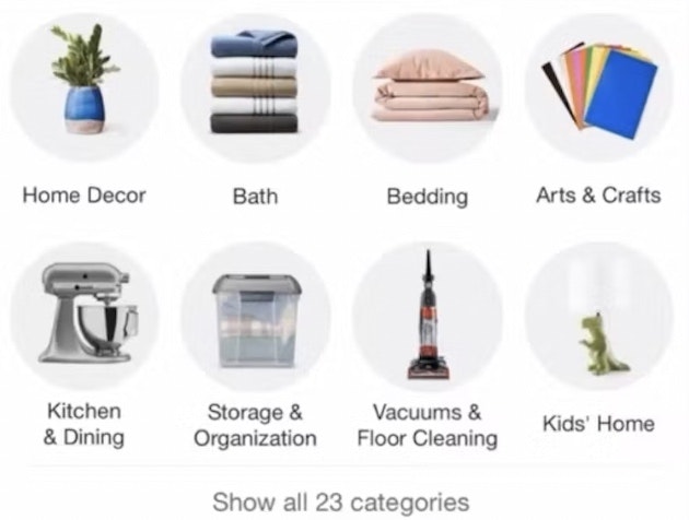
Consider Providing “Intermediary Category Pages” (13% Don’t)
March 7, 2023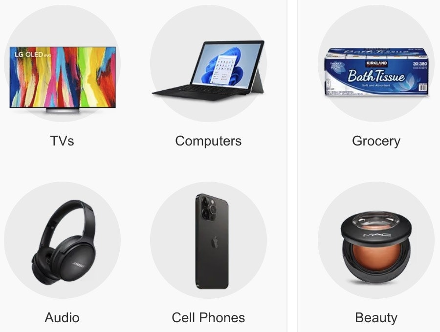
New 2023 Homepage & Category UX Benchmark with 3,000+ Performance Scores and 2,500+ Best Practice Examples
February 28, 2023
Provide a Hover Delay of 300–500 MS for Hover-Based Drop-Down Menus (60% Don’t)
January 31, 2023 Popular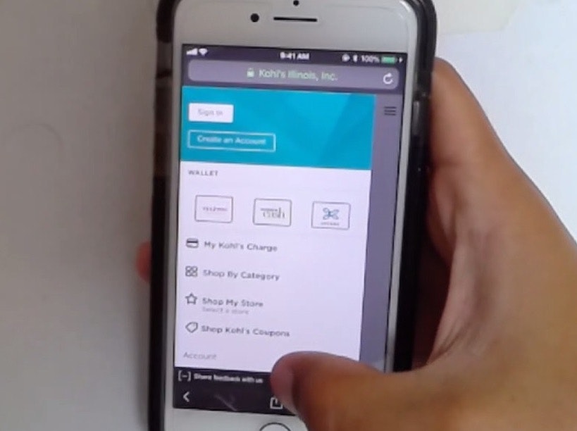
Make Product Categories the Top-Level Navigation Items on Mobile Sites (33% Don’t)
January 24, 2023 Popular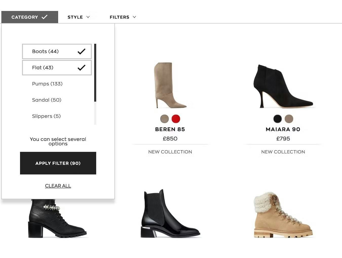
Overcategorization of the Product Catalog Can Lead to Abandonment (Yet 75% Get It Wrong)
January 3, 2023 Popular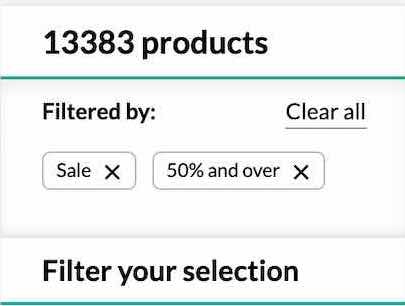
Consider Having a “Sales” or “Deals” Filter-Based Category (32% Don’t or Have Implementation Issues)
December 7, 2022
Have a “View All” Option in the Main Navigation at Each Level of the Mobile Product Catalog (Only 24% Get It Right)
November 16, 2022
DTC UX: Avoid Intermediary Category Pages
August 23, 2022
Make It Clear Where Hit Areas in Visual Elements Lead: 33% of Sites Don’t
May 30, 2022
Direct-to-Consumer UX Benchmark: 5 Common DTC Pitfalls
February 22, 2022
250+ New Examples Added from Large-Scale Testing on European Sites
November 9, 2021
Always Provide the Full Scope for Links on Mobile Homepages (58% Don’t)
August 3, 2021
The Current State of Homepage UX – 8 Common Pitfalls & Best Practices
July 13, 2021
Direct-to-Consumer Research: 5 Effective Ways for DTC Sites to Tell Their ‘Brand’ & ‘Product’ Stories
June 22, 2021
New Research Study on “Digital Subscriptions” (SaaS) UX
May 11, 2021
6 Important Aspects of Well-Performing Mobile Product Page Breadcrumbs
September 21, 2020 Popular
Inspirational Images Should Link to All Depicted Products (9% of Sites Don’t)
September 8, 2020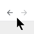
4 Design Patterns That Violate “Back” Button UX Expectations – 59% of Sites Get It Wrong
July 20, 2020 Popular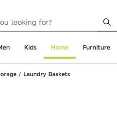
Highlight the User’s Current Scope in the Main Navigation (66% of Sites Don’t)
May 19, 2020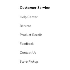
Footer Links Should be Divided into Distinct Semantic Sections (13% of Sites Don’t Use These Footer Best Practices)
October 30, 2019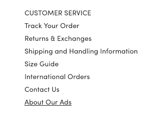
Have Direct Links to ‘Return Policy’ and ‘Shipping Info’ in the Footer (20% don’t)
January 16, 2019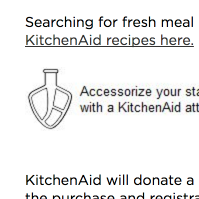
7 Navigational Implementations that Make Kohl’s Best-in-Class
February 28, 2017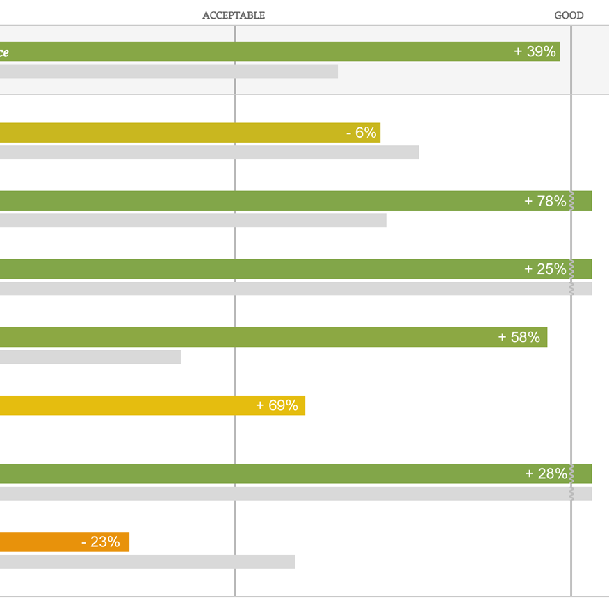
The Current State of Homepage & Category UX (Performance Is Up 39% Since 2013)
February 7, 2017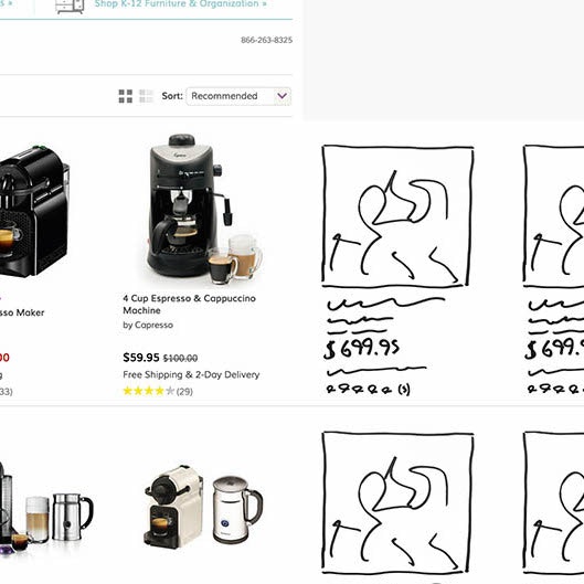
Responsive Upscaling: 11 Ideas for Large-Screen E-Commerce Design
August 18, 2015 Popular
6 Guidelines for Truncation Design
May 21, 2014 Popular
Avoid Inline Scroll Areas (26% Get it Wrong)
May 6, 2014 Popular
Avoid These 5 Types of E-Commerce Graphics
March 4, 2014 Popular
Sub-Sub-Category Links: a Vital Feature in E-Commerce Navigation (52% Get it Wrong)
February 18, 2014
Featured Products Should Also Link to Their Categories (43% Get it Wrong)
January 21, 2014
Inspirational Images Should Link to All Depicted Products
January 7, 2014
E-Commerce Sites Need 2 Types of Breadcrumbs (68% Get it Wrong)
December 10, 2013 Popular
External Article: 7 Guidelines For Better Navigation And Categories
November 11, 2013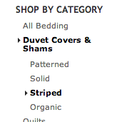
E-Commerce Navigation: Show Sibling Categories for Easy Scope Adjustment (47% Get it Wrong)
October 29, 2013
Homepage & Category Usability: Exploring the Customer’s Product Finding Experience
October 15, 2013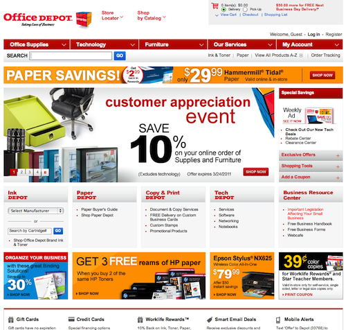
Home Page Strategy: Category vs. Product
March 22, 2011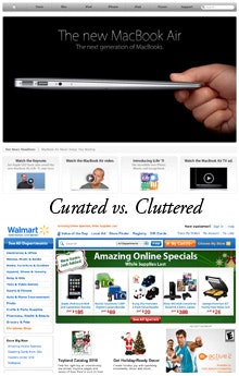
E-Commerce Home Page Focus
December 14, 2010
Want to learn more about this topic?

Explore Other Research Content

334 top sites ranked by UX performance.

18,000+ annotated designs for systematic inspiration.

Code samples, demos, and key stats for usability.