Key Takeaways
- 73% of top-grossing e-commerce sites have accessibility issues with links
- Some sites lack HTML markup that is accessible to screen readers
- A majority of sites lack sufficient information regarding link destination and purpose for users with screen readers — resulting in a trial-and-error navigational method.
- Some sites have insufficient link contrast with surrounding text — making it hard for users with visual impairments and scanning users to locate links.
Our rating of 33 top-grossing sites, conducted during our research on Accessibility in e-commerce, reveals that 73% of e-commerce sites have broad compliance issues when it comes to links — resulting in a subgroup of users being unable to use links to navigate site contents and resources.
Indeed, fully 67’% of sites have compliance issues related to inadequately describing the link destination or purpose — information that most sighted users can understand from contextual information.
Moreover, 9% of sites have specific compliance issues with regards to link text maintaining a sufficient contrast ratio with the surrounding text, which can lead to users with visual impairments struggling to identify and operate links.
Being unable to easily find and use links to navigate a site will result in users being incapable of finding a product or completing a purchase and can likely lead users with visual impairments and those who rely on assistive technology — such as screen readers — to abandon the site out of frustration.
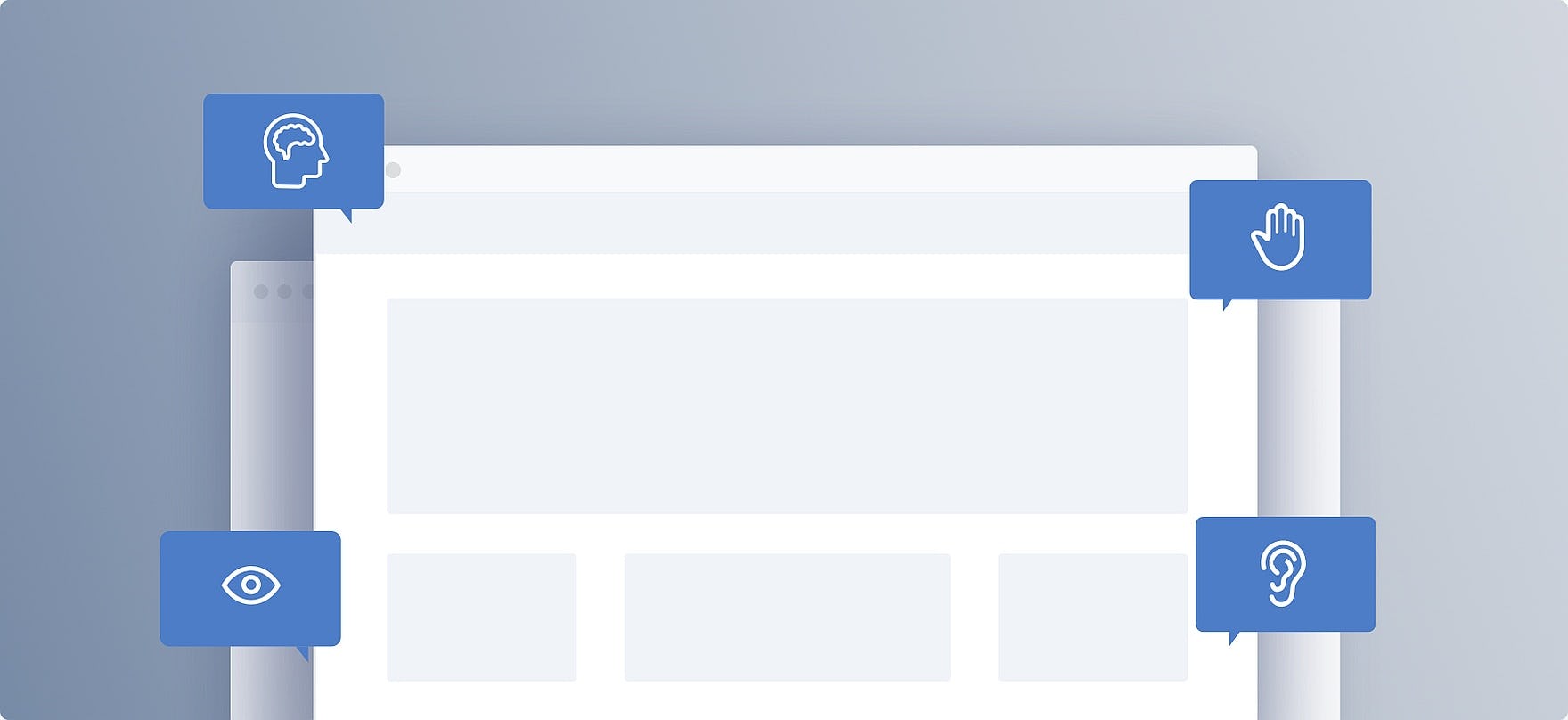
In this article, we’ll discuss 3 key methods for making links accessible to all users:
- Identify links to screen readers using accessible markup (9% of sites don’t)
- Include sufficient contextual information to convey the purpose or destination of a link (67% of sites don’t)
- Use visually distinctive link styling (9% of sites don’t)
Identify Links to Screen Readers Using Accessible Markup (9% of Sites Don't)
For users who require screen readers to even begin navigating an e-commerce site it’s critical that all site links are properly identified as a link in the site’s markup language so that assistive technologies can recognize them as navigational elements.
Typically, this is done either through the use of native HTML elements (e.g., an <a> tag containing a valid href attribute) or through specific Accessible Rich Internet Applications (ARIA) attributes (e.g., ARIA role="link").
The native HTML approach has the dual benefit of being both simpler to implement and is often supported by older technologies. Using HTML, link text should be placed inside an <a> element with a valid href value containing the link destination.
For example, a properly coded link in HTML should look similar to this:
<a href="https://www.rei.com/c/winter-boots">Winter Boots</a>
Links identified using ARIA attributes — which are specifically designed for users with disabilities — should be marked with the role="link" attribute in cases where a page element acts as a link that leads to a separate page or area of the site.
Note that the ARIA role="link" attribute functions similarly to the ARIA role="button" attribute; however, the “button” role is recommended for page elements which perform discrete actions (e.g., “Add to Cart”, “Like”, etc.), whereas the “link” role is typically reserved for navigation.
For example, a properly coded link using the ARIA role="link" attribute should look similar to this:
<span role="link" tabindex="0" data-href="https://www.rei.com/c/winter-boots">Winter Boots</span>
For both of these methods, it is important that accessible text labels are included along with links.
When screen readers encounter links without text labels, it is common for them to announce the link’s full alphanumeric URL destination (e.g., “https colon forward-slash forward-slash…”) — which is not only a frustrating waste of users’ time but also requires users who employ screen readers to wait for the URL to be read out.
Screen readers typically look for link text labels in order of priority starting with the aria-labelledby attribute first, before moving on to check for an aria-label attribute. If no ARIA attributes are present, screen readers will search between HTML <a> elements — which is where a visible text label would typically be located.
While placing text labels within an <a> element is most often advised — due to being supported by older user agents — aria labels can be helpful when links are implemented in nontraditional ways, such as in a <span> element.
Additionally, using shortened or otherwise more readable URLs (e.g., written in plaintext or relatively short links) can entirely replace the need for link titles — or merely act as a secondary backup.
A Note on Image Links
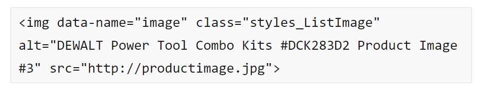
As covered in our previous Accessibility article, when images are used as links (i.e., “Functional” images) alt text content fulfills the function of link text in being accessible to screen readers.
However, the image’s alt text does not have to include the fact that the image is a link, as that will be announced by the screen reader — except in the special case of nontext links (e.g., icons, etc.), which need to be designated as links in the alt text to alert users aided by screen readers that they may be activated.
Include Sufficient Contextual Information to Convey the Purpose or Destination of a Link (67% of Sites Don't)
In contrast to sighted users — who can take in most of the visual elements surrounding a link at once — users aided by screen readers must rely on listening to link descriptions being announced to them before they can make navigational decisions.
Consequently, when users with visual impairments come upon a list of links, the titles can often lack necessary contextual information.
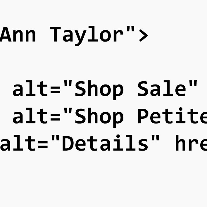
For example, a site may have numerous links simply labeled “Details” or “See More” back-to-back on a page — which sighted users would be able to contextualize based on the link’s visual surroundings.
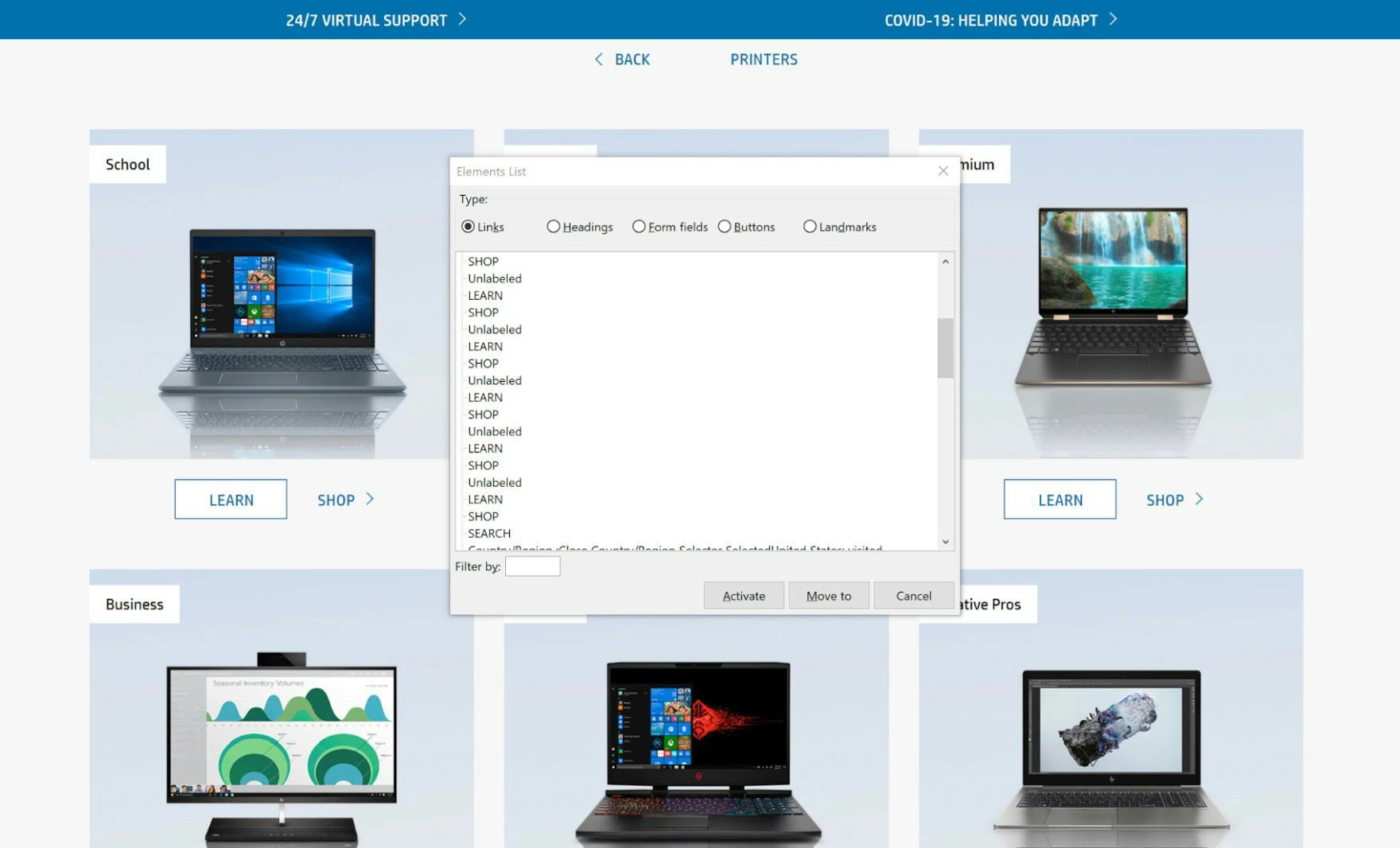
At HP, a screen reader displays the list of available links on the site. Each category has the same two buttons — “Learn” and “Shop”. While sighted users can visually associate these with the category images for “School” and “Business”, users aided by screen readers will just hear a repetitive list of the same two links, each leading to a different location.
However, users aided by screen readers will have no idea where these generically titled links will take them (unless preceded by a sufficiently descriptive alt text image).
Further, link labeling must remain consistent across the site, especially when there are multiple links which lead to the same destination. For example, avoid labeling a link as “Men’s Apparel” in one location and “Men’s Clothing” in another, when both links lead to the same destination.
Conversely, it often can occur that similarly titled links will actually lead to radically different destinations based on their contextual placement (e.g., a list of identical “Learn More” links). In these cases, context-independent labeling must be employed which doesn’t rely on nearby visual information.
For example, where sighted users would see a link labelled “Details” near an image advertising a sale, users aided by screen readers will hear the more descriptive “Link, Promotional Details”, or “Link, 50% Off Sale Details”.
Additionally, link titles rendered in all caps should be avoided as screen readers will not read out the full words but instead spell out each letter of the word separately. Also, nonstandard characters (e.g., ASCII characters or certain extended dashes) should be avoided for link titles as well.
A Note on Especially Long Lists of Links
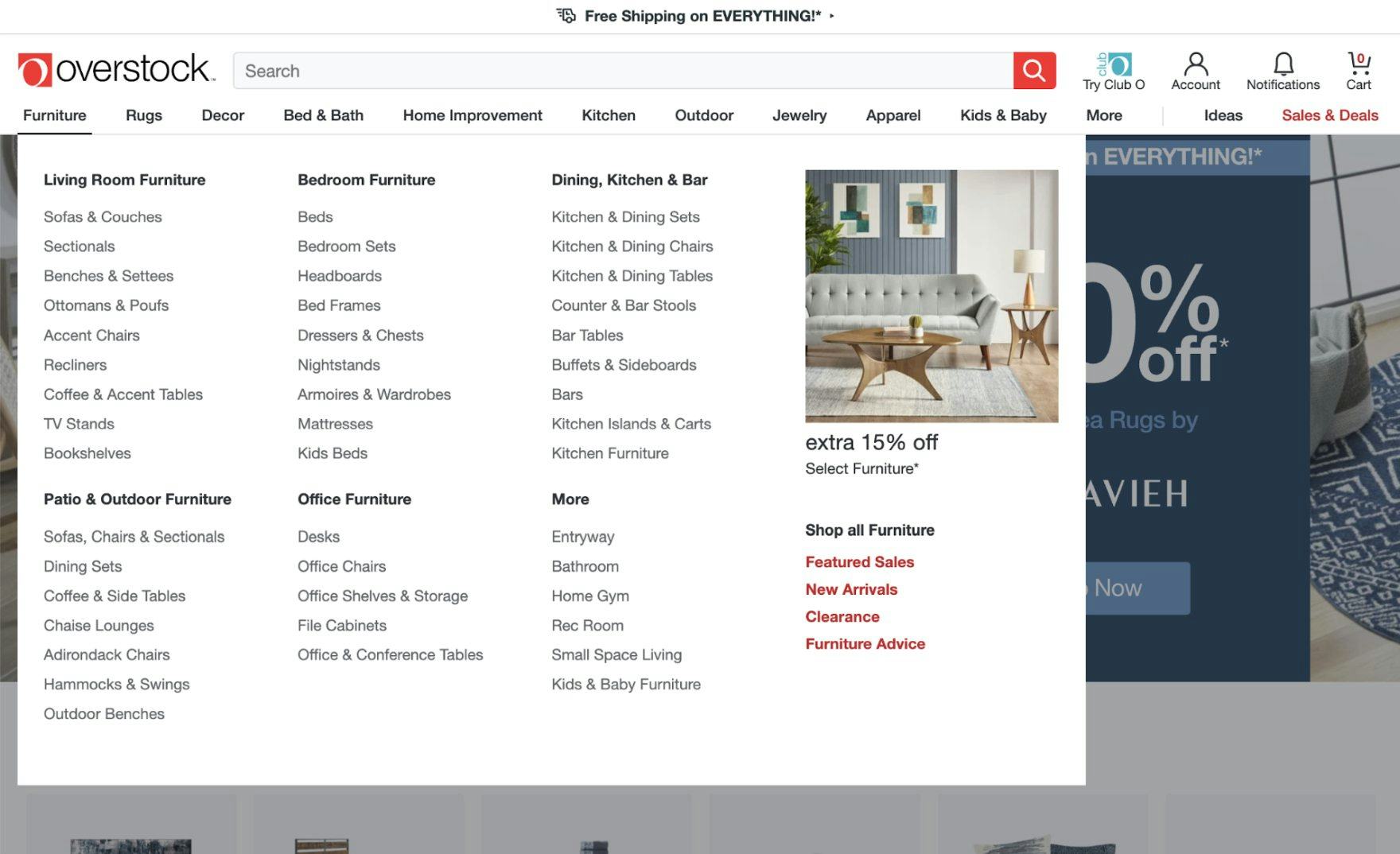
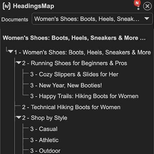
At Overstock, the top navigation for “Furniture” opens a subcategory list which is broken up with various headers. While sighted users will be able to scan the list quite easily, users aided by screen readers have to rely on the sequential announcement of category and subcategory titles. When coded properly, screen readers can navigate through each successive level of information — starting with reading the top nav categories, then moving on to the chosen category’s headers, before finally listing the subcategories within the chosen category.
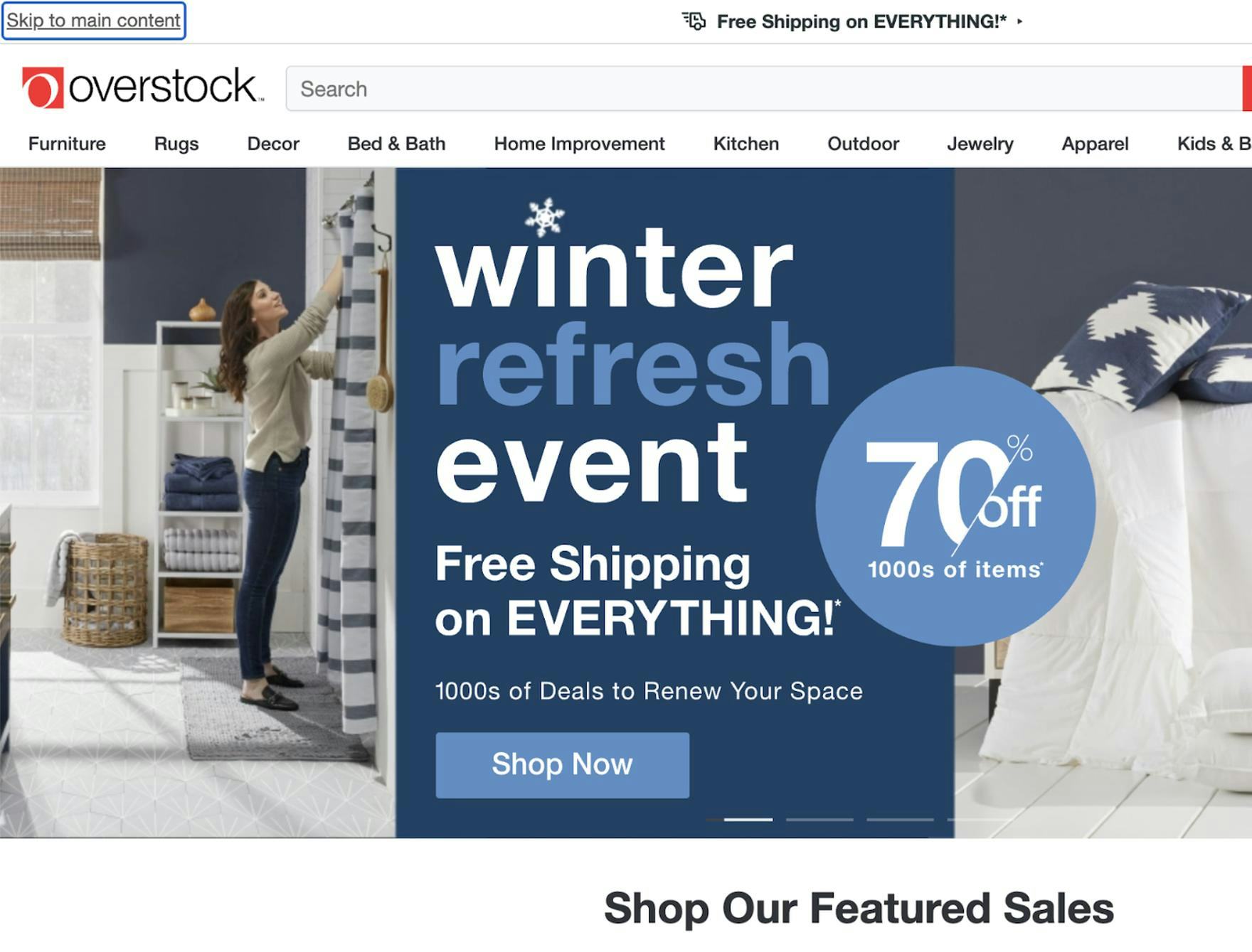
A link is presented allowing users aided by screen readers to skip over all the navigational links in the top nav and jump directly into the main content of the site — “Skip to main content”. Allowing users aided by screen readers to skip around the page navigation architecture provides them with the same flexibility as sighted users scanning a page.
Excessively long lists of links — such as you’d find in the page footer (e.g., “About”, “Returns & Exchanges”, “Contact”, etc.) — can easily become cumbersome to listen to for users aided by screen readers. Unlike sighted users, users aided by screen readers have to rely on short-term memory instead of just visually scanning the list.
This can be especially frustrating when the long list of links appears in the middle of other content, forcing the user to sit through irrelevant navigational information before getting back to what they were interested in.
One method to get around this problem is simply to have well-structured information hierarchies and then provide a “Skip” link at the top that allows users aided by screen readers to skip over the list of links and jump to the main content below, as in the Overstock example above.
On pages where the main content is navigational content (e.g., a table of contents), such a solution is probably unnecessary. However, in many cases, users will have less trouble understanding long lists of links if the lists are broken into smaller chunks with descriptive headings (as is recommended for long PDP descriptions).
The smaller information chunks present a lower cognitive load on all users, but can be especially beneficial to users with cognitive disabilities.
Use Visually Distinctive Link Styling (9% of Sites Don't)

At Thousand Fell, a subject was confused by the button-like styling of the page text. After examining the page for a few seconds, the subject wondered aloud, “Where do I go?” Having distinct visual styling for links — and buttons — can go a long way towards helping sighted users, and those with limited visual acuity, navigate a site.
Whether or not users with visual impairments are being aided by an assistive technology like a screen reader, users with limited visual acuity — such as those with poor eyesight, contrast issues, or color blindness — may still rely on visual cues to broadly identify and navigate to links on a site.
Indeed, during testing we have observed users with no visual acuity issues sometimes struggle to identify what is and what isn’t a link on a site.
This being the case, it is important that links are implemented in such a way as to be visually distinguishable from other site text or other elements.

Only color is used to differentiate between a link and the surrounding text. Additionally, the contrast between link text and nonlink text is only 3.2:1. For smaller text — such as those for links — the ideal contrast ratio is at least 4.5:1.

In this example, both color and underline are used, and the contrast between link text and nonlink text is 4.5:1. There’s also a 4.7:1 ratio between the white background and the link text, so it passes that test as well.

Here, even though the color contrast is not as pronounced as it should be, the underline is sufficient enough to differentiate between the link and nonlink text — assuming it’s not used as styling for any other page elements elsewhere on the site.
The simplest way to achieve this effect is for the link text to maintain at least a 4.5:1 contrast ratio with the surrounding text so that, even if the link is not immediately understood as a link, it is at least identified as being special in some way or should otherwise be considered separate from the surrounding text.
However, when the text is larger (e.g., headings, titles, etc.) it is acceptable to decrease the minimum contrast ratio to a still noticeable 3:1. Note that link text must also maintain a minimum 4.5:1 contrast ratio with its background as well.
Additionally, as links are often differentiated from surrounding text by the use of a dedicated link color (which sometimes changes based on whether the link destination has been previously visited by the user), users with color blindness will likely have difficulty interpreting their meaning.
Since color blindness comes in a variety of types, links may still be differentiated by color for sighted users but, in order to be made accessible to users with color blindness, they must also be differentiated using a color-independent method as well.
To ensure proper accessibility, regardless of color choice, link styling has to be unique in some way and not shared by any other page element.
Typically, this is implemented by an underline — which is either static (which is advised, as it doesn’t require user interaction) or visible as a focus action or a hover action on desktop computers.
Additionally, a particular font or sizing could be associated with links to further differentiate link elements from the rest of the page text.
Accessible Links Improve E-commerce UX For Everyone
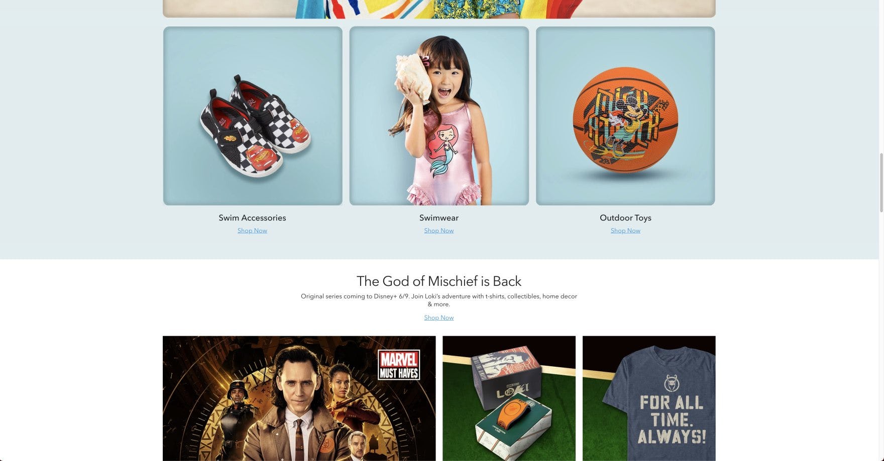
At the Disney Store, the small blue “Shop Now” links have inadequate contrast against the light-blue background (2.7:1 ratio). This lack of contrast can make it difficult for users with visual impairments to locate and navigate to the category page.
Given the crucial role links play in allowing users to navigate a site, it’s important to ensure that links are
- programmatically identified to screen readers (9% of sites don’t),
- descriptively titled in a way that doesn’t rely on visual context (67% of sites don’t), and
- highly visible within the context of a page (9% of sites don’t).
In the end, the goal for link accessibility is to ensure users who use screen readers or other assistive technology can have the same rich experience as others.
Yet 73% of sites have broad image-compliance issues — indicating the vast majority of e-commerce sites are failing their users when it comes to link accessibility.
All e-commerce accessibility guidelines are available today via Baymard Premium access. (If you already have an account, open the Accessibility study.) See our E-Commerce Accessibility Audit service if you might be interested in getting Baymard to audit your site.