Key Takeaways
- The “price per unit” is essential to help users compare prices across product lists
- We found that 86% of e-commerce sites fail to provide “price per unit”, causing users to abandon suitable items
- Providing both the total package price as well as the “price per unit” allows users to easily compare multiquantity items
Video Summary
In Baymard’s large-scale UX testing of Product Lists & Filtering, price has repeatedly been observed to be one of the most important product attributes to users.
While the basic or total package price should be easy to compare across items in product lists, multiple rounds of testing have shown that when quantities or volumes varied and only the total package price was shown, it became needlessly difficult to work out which items offered the best value.
To assist users in their product evaluation and comparison process, sites should display a “price per unit” in addition to the total package price in list items.
However, our e-commerce UX benchmark shows that an astonishing 86% of sites don’t display a “price per unit” for their products offered in different quantities or volumes, with users missing out on the best prices or rejecting good-value items — or even abandoning their purchase — as a result.
This article will discuss our latest Premium research findings on how to display “price per unit” for your product list items, where the quantities (whether individual counts or other measurements such as volume) vary across the list items:
-
Why providing only the total package price makes it difficult for users to compare prices accurately
-
How displaying “price per unit” for multiquantity items helps users make an informed decision
Why Providing Only the Total Package Price Makes It Difficult for Users to Compare Prices Accurately
“I just divided [$42 by 4], because all the servings are the same across all the boxes. And so that’s like $10.50. That’s a little under $10, and then that’s a little under $10 [for the other box] again.” At Oceanbox, the total cost is visible for the subscription box service’s plan options; however, the participant had to do the “per-serving” price calculation mentally.
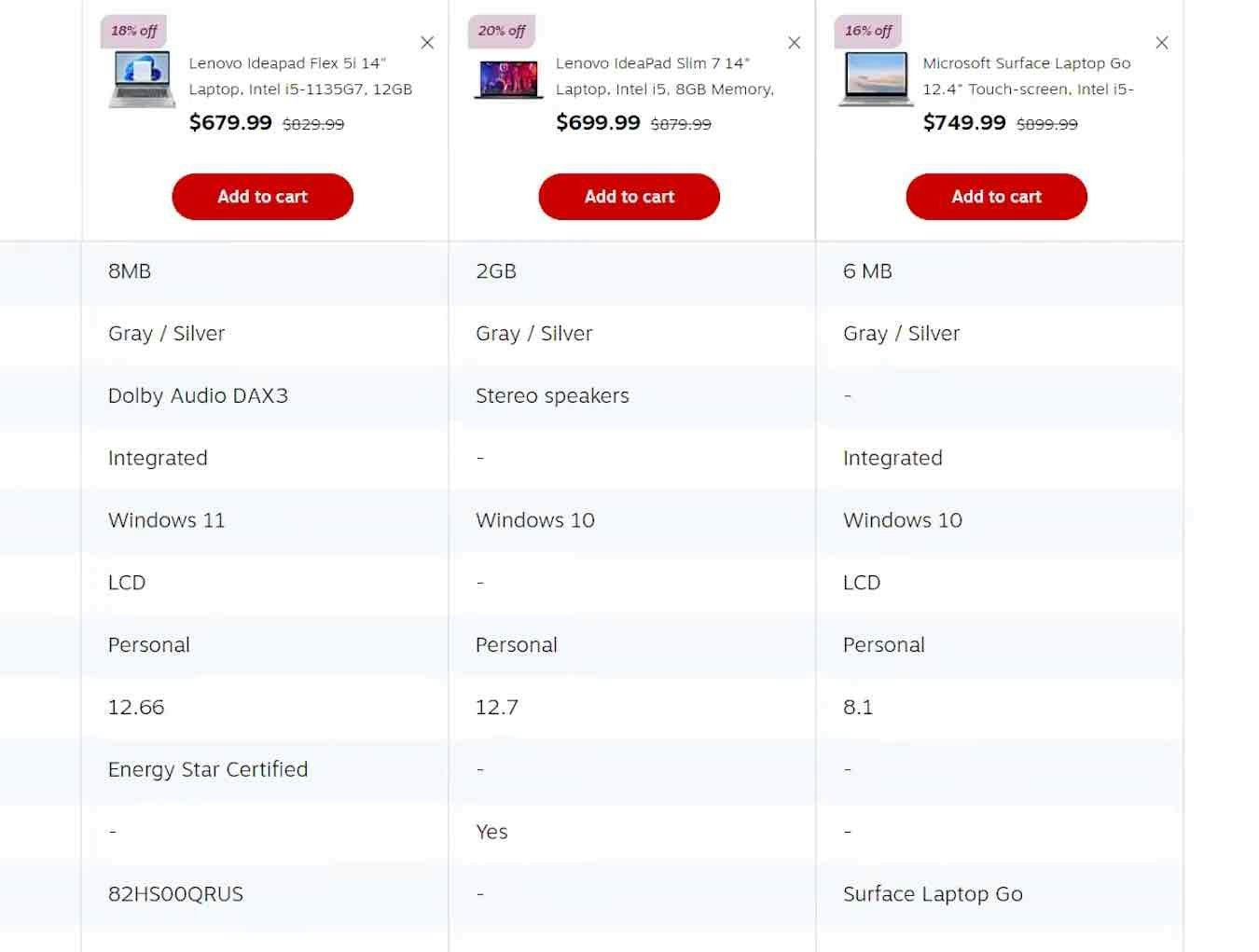
During testing, it grew clear that when participants compared items that were offered in different quantities or volumes, and only the total prices were displayed, it became needlessly difficult to work out which items offered the best value.
This can quickly grow challenging when deciding among several different products; moreover, users aren’t always correct in their calculations, which can lead them to abandon products that would have suited their needs.
(See What Information to Display in Product Listings for more on what to show in product lists, and Always Provide Comparison Features for Spec-Driven Industries for how to provide comparison features for spec-driven industries).
In addition to “price per count”, another very common quantity-related issue with pricing observed in testing was when items in the same product list were sold in different volumes.
Similar to the “price per count”, users in this situation have to calculate the unit price before comparing products to work out which offers the best value.
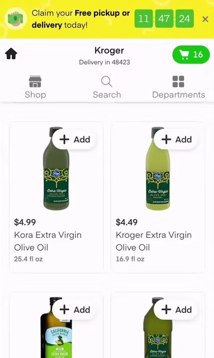
For example, when shopping for bottles of olive oil, users trying to compare one with a capacity of 25.4 fl oz at $4.99 and another with a capacity of 16.9 fl oz at $4.59 will have to spend time calculating which is the better bargain.
This is not an easy calculation, and if users don’t have the patience to work it out they could well miss out on the best value product.
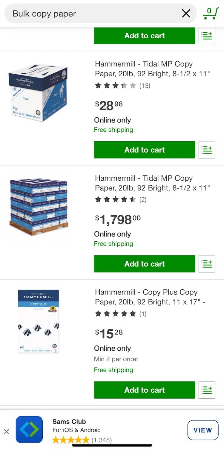
Comparing prices of bulk purchase deals — where the number of products included is higher even than in multipacks — can also be troublesome.
Usually, bulk pack sizes differ more than multipacks — for example, 100 reams of copy paper vs. a pack of 5 — and therefore the need to find out which option represents the best value is even more important.
This makes it more likely that users will try to perform basic calculations to find bargains — and if the pack sizes don’t lend themselves to simple math (for example packs of 10 vs. packs of 75), users could waste significant time trying to figure out which item is the best value.
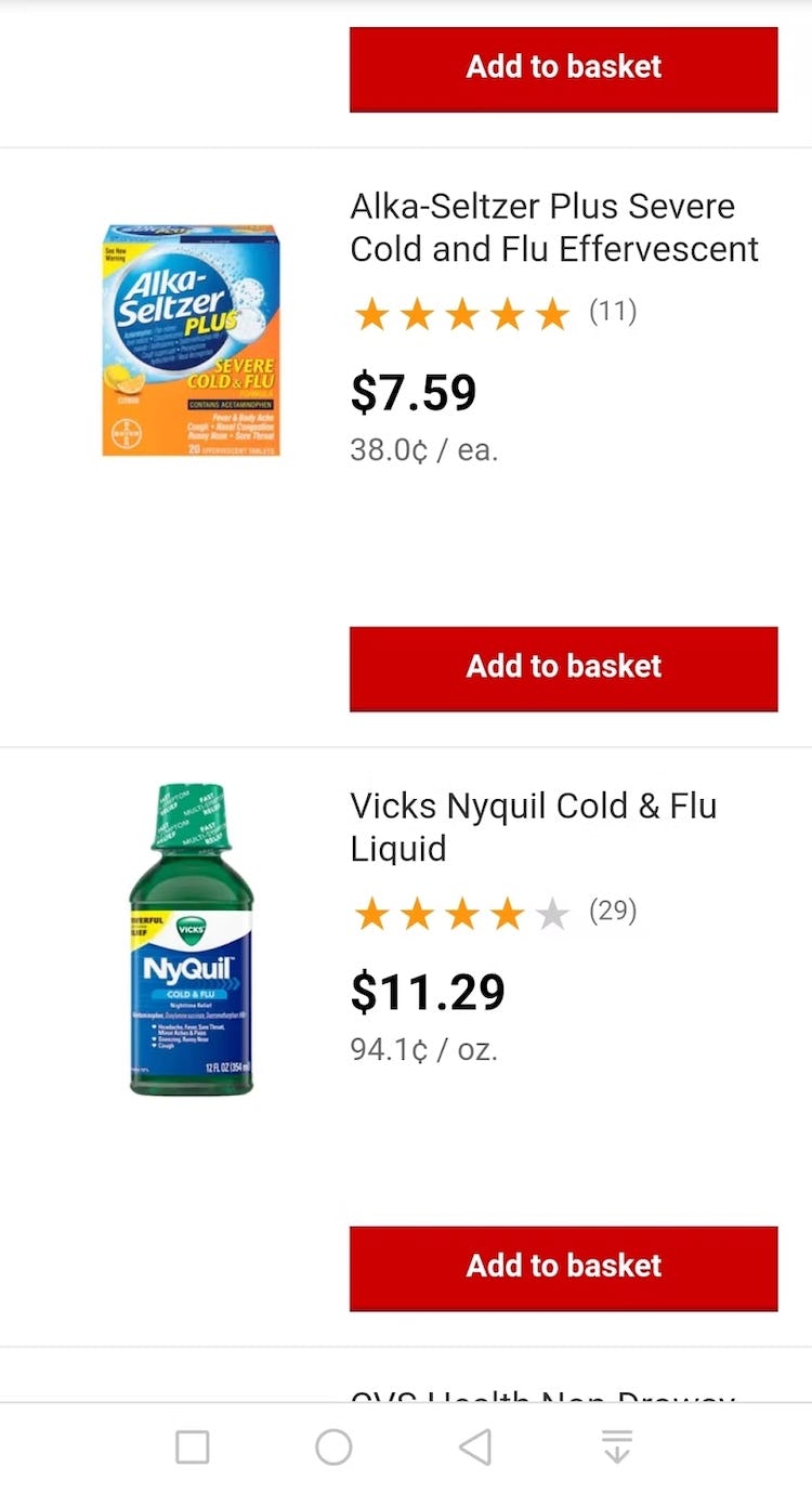
Finally, units may not be comparable, or the same units may require different levels of usage and thus not be directly comparable.
For example, two cough syrups may both come in 100ml bottles, but if one requires double the dosage of the other, that will greatly impact the unit price of the product (see also Combine Variations of Products into One List Item).
Whenever a test site didn’t display “price per treatment”, participants only bothered to evaluate and compare a handful of products — it was simply too much hassle to work out and memorize the unit cost for even more products.
How Displaying “Price Per Unit” for Multiquantity Items Helps Users Make an Informed Decision
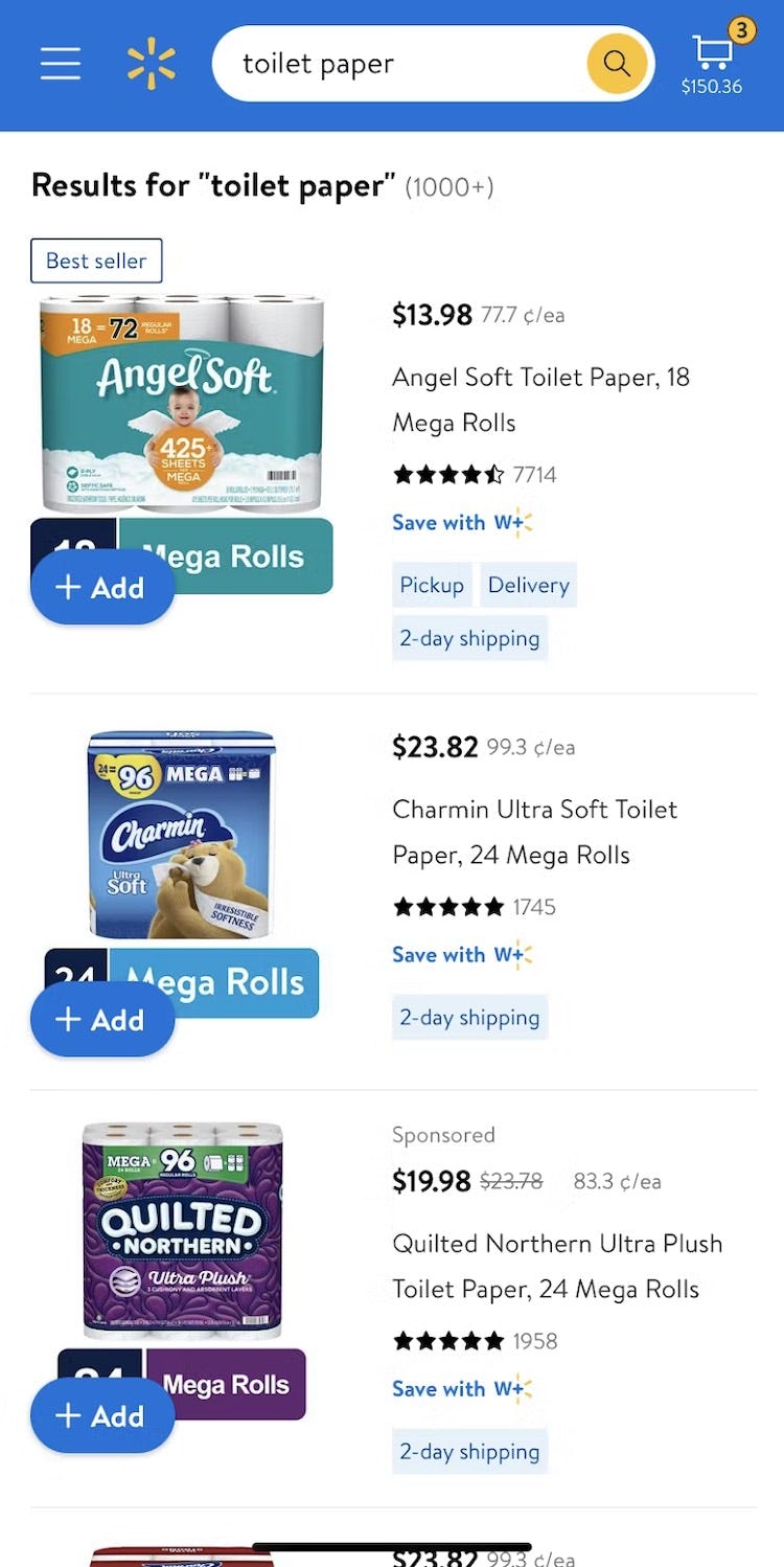
On Walmart, list item prices for toilet paper are accompanied by the cost per roll (e.g., “77.7¢ ea”), giving users the most important criterion for comparing similar items by price.
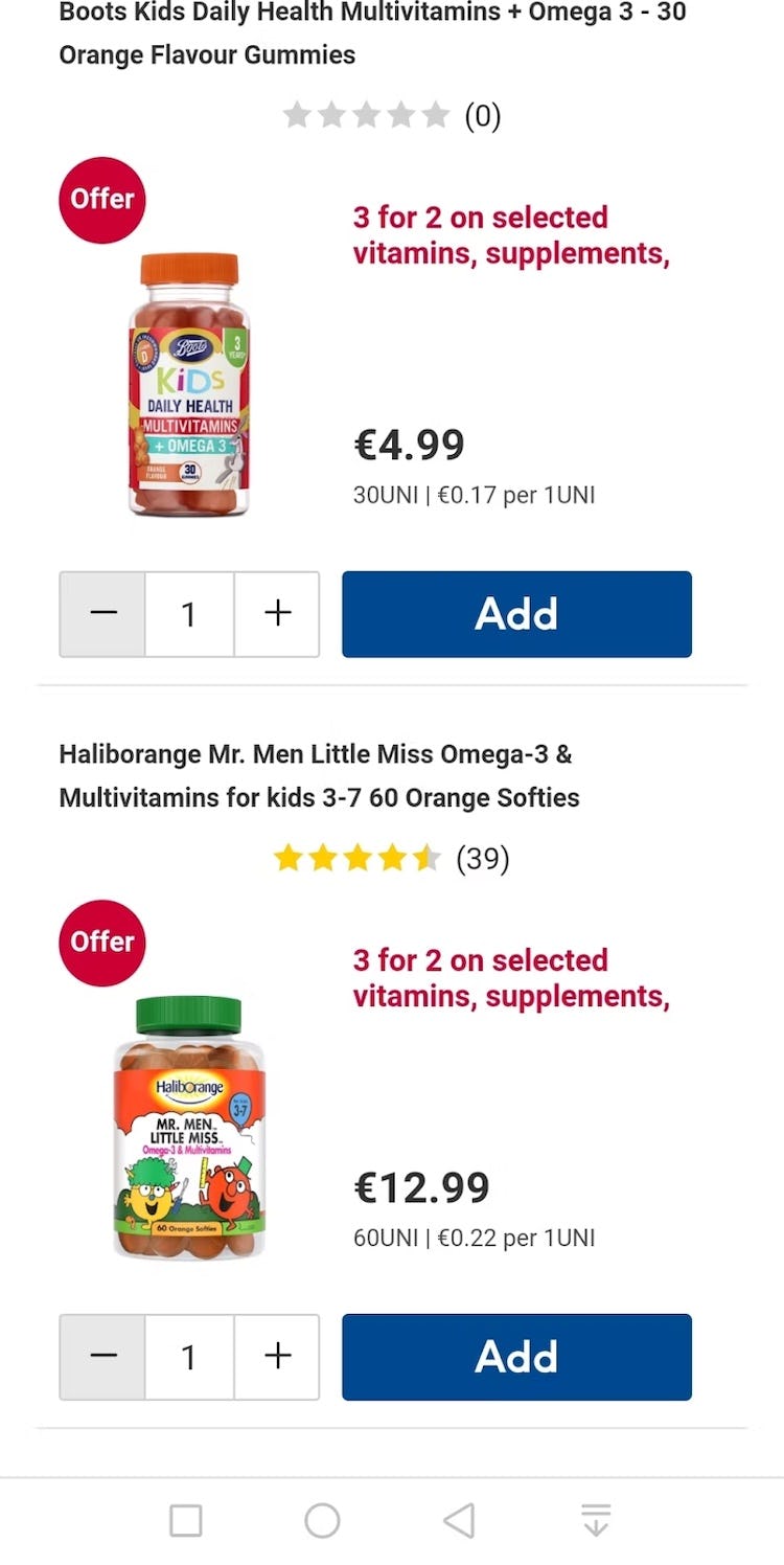
On Boots UK, the total price is easy to see at a glance, while the per unit price (e.g., €0.22 per 1UNI) is less prominent but still easy to see for users who need this information.
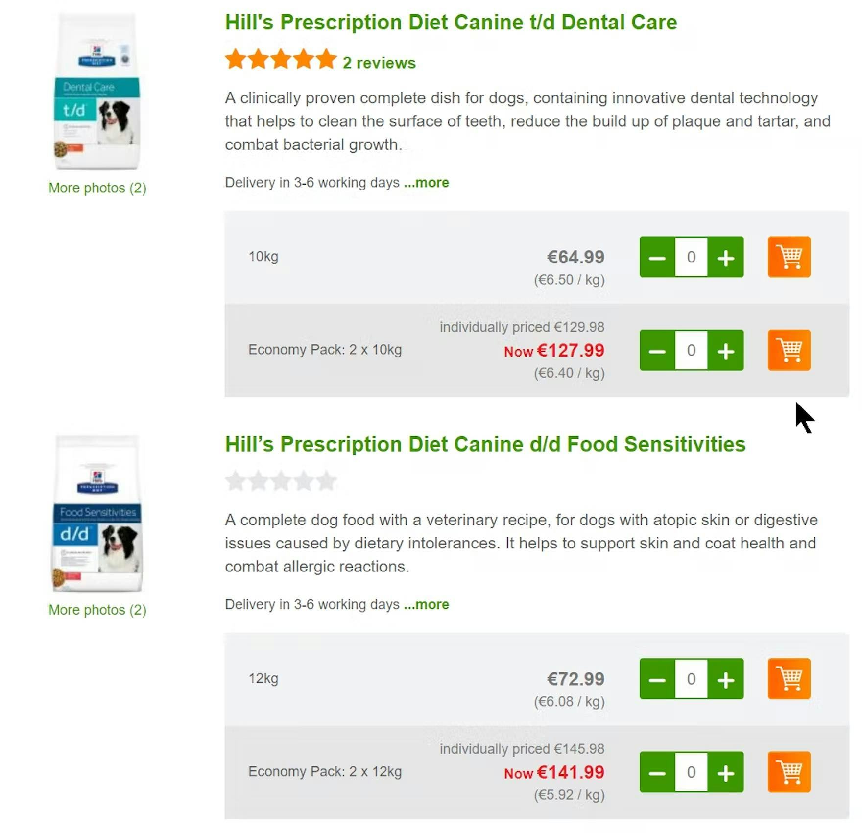
By providing unit costs such as “€6.40 / kg”, Zooplus makes it easier for users to select between pack sizes. Users don’t have to spend time calculating unit prices so the comparison process is easier and quicker.
To avoid users unwillingly cutting short their comparison process if they feel unable to make an informed decision, sites should calculate and display the price per unit.
Of course, the total package price should still be displayed — price per unit should be an additional piece of information in the list item, assisting users in evaluating and comparing products.
(For more on how to display additional information in product lists, see Display Extra Product Info and Images on Hover.)
Multiquantity items should therefore have two important price points — the total package price and the “price per unit”.
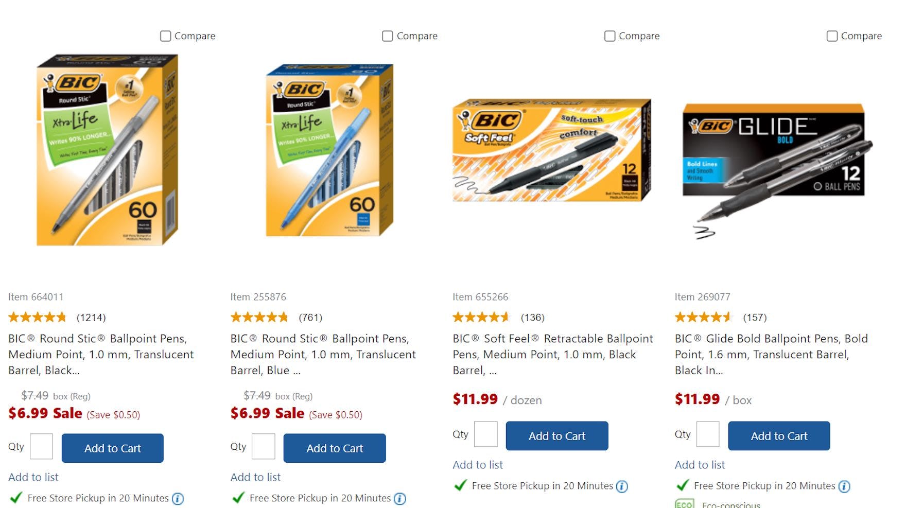
For example, if bars of soap are sold individually and also offered in multipacks, or pens are sold in different pack sizes, users should be provided with the cost of each individual bar of soap or pen for each item pack of interest.
Provide Users with the Price Points They Need to Select Relevant Items
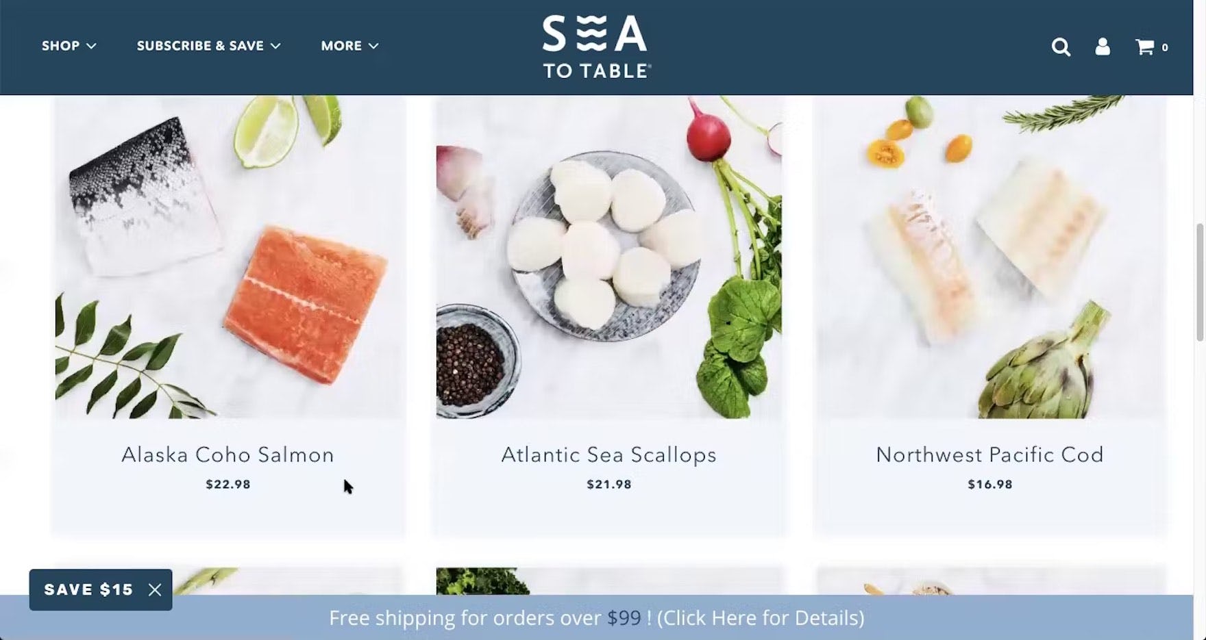
“I’m assuming it’s price per pound. So that’s an assumption on my part…I would’ve liked to have seen that it’s ‘$22.98 a pound’”. At Sea to Table, participants are given the price of the product, but not the “price per unit” — or in this case “price per serving”.
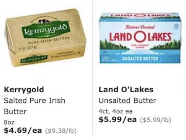
Displaying the price per unit in addition to the basic package price will vastly assist users trying to compare multiquantity items — such as items sold in individual or bulk multipacks, or in different volumes or treatment units.
Without the “price per unit”, users will have to calculate this price themselves and memorize it in order to compare items across product lists — a tedious process that can end in abandonments.
The total price should be styled so that it stands out clearly, while the per unit price should be styled so that it doesn’t dominate the list item but is easily findable by users who need it (see 3 Key Design Principles for Product Listing Information for more on how to design and present product list information).
Furthermore, given that price is a crucial selection parameter for users interested in grocery and other bulk purchases, and that steering users toward bulk purchases can lead to higher-value orders, providing price per unit can be good for business.
Yet 86% of sites fail to display the “price per unit”, leaving users without the information they need to accurately compare prices in list items — thus increasing the risk of order abandonment.
This article presents the research findings from just 1 of the 700+ UX guidelines in Baymard – get full access to learn how to create a “State of the Art” ecommerce user experience.
If you want to know how your website performs and compares, then learn more about getting Baymard to conduct a UX Audit of your site.

![“I just divided [$42 by 4], because all the servings are the same across all the boxes. And so that’s like $10.50. That’s a little under $10, and then that’s a little under $10 [for the other box] again.” At Oceanbox, the total cost is visible for the subscription box service’s plan options; however, the participant had to do the “per-serving” price calculation mentally.](https://baymard-assets-cdn.imgix.net/research/media_files/attachments/90288/original/research-media-file-258ae4c075ddcd16f80381c6deaf89b3.jpg?auto=format&dpr=2&fit=max&q=50&w=880)
![“This is something that we do too, [looking at] the price of one avocado to see if it’s cheaper than a bag of avocados, because a lot of times if you get one, it’s like a dollar, $2, but you can get a bag for $3. So it’s a little bit cheaper. But I just need six of them this week.” This participant shopping at Walmart paused to calculate the difference in pricing between avocados sold individually and those sold in a larger bag, interrupting his product exploration. Eventually, he calculated, “So it looks if I get one at 86 cents, that three of them will be about $2.10. So four of them will be about three bucks. So it’s about the same price. So I’ll go with the whole bag.” Comparing different list items is difficult when both quantity and price vary.](https://baymard-assets-cdn.imgix.net/research/media_files/attachments/90197/original/research-media-file-13e19a4b0c52d7c6e90adaeeebd6dc07.jpg?auto=format&dpr=2&fit=max&q=50&w=880)
