Key Takeaways
- Product variations, such as colors, can be displayed as separate list items or combined into one list item
- Testing has shown that there are major usability issues with displaying variations as separate list items
- Combining product variations in single list items makes it easier for users to get an overview of the product catalog and to find all variations of a product
Certain products have variations that users need to be aware of when browsing product lists.
Examples of variations include colors of clothing and consumer electronics items, and exterior finishes of home appliances like refrigerators.
These variations encourage users to explore products further as they offer choices that increase the likelihood of finding a suitable item.
There are two ways to display these product variations in product lists:
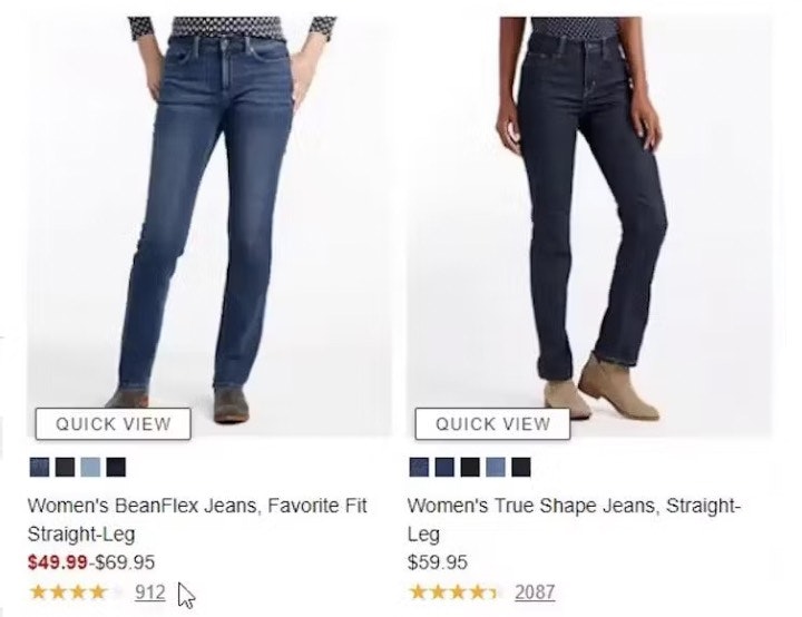
- Variations are combined into a single list item, with the variations often indicated using swatches below the thumbnails
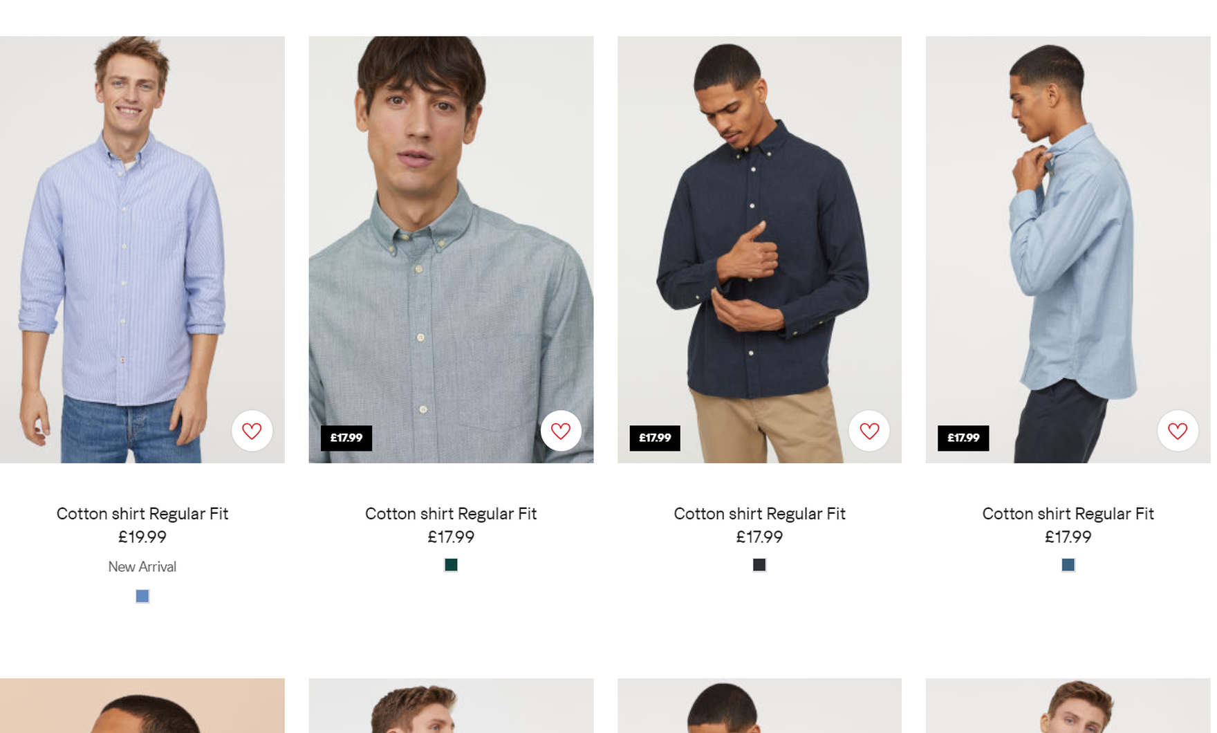
- Variations are displayed separately, with each variation — for example, shirts in different colors — having its own list item
During multiple rounds of testing it became clear that there are two major usability issues associated with product variations displayed as separate list items:
- Product lists can become cluttered with variations of products, overwhelming users and making it harder for them to get an overview of the product range
- If the variations are spread throughout the product list, many users will struggle to find a particular variation of a product
In fact, these issues are so serious that they will cause some users to abandon the site, assuming that the site doesn’t offer what they’re looking for.
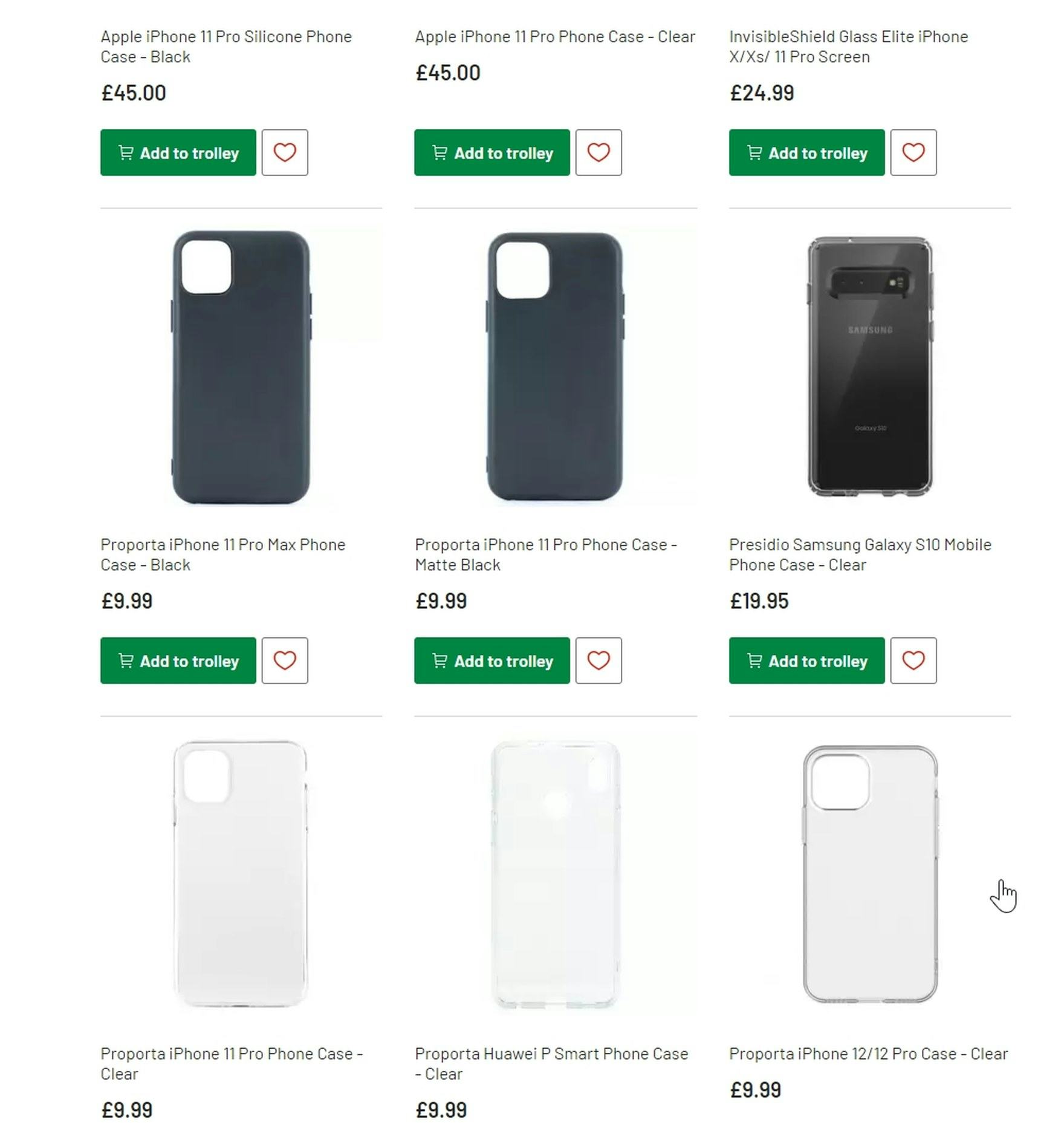
Given the severity of this issue it’s surprising that 12% of our benchmarked sites don’t combine variations of products into one list item.
In this article, we’ll discuss the following:
- Why it’s difficult to get an overview of the product list if variations are separate list items
- Why it’s difficult to locate all variations of products if variations are separate list items
It’s Difficult to Get an Overview of the Product List if Variations Are Separate List Items
During testing, many users in product lists became overwhelmed with the number of variations of products when listed as separate list items and found it difficult to work out how many unique products were available.
On H&M, color variations of shirts are shown separately. Also, each item has a color swatch even though there is only one color available — this can be misinterpreted.
On Argos, the product list is cluttered with separate list items for the same products in different colors, making it difficult for users to get clear overview of how many unique phone cases are available for each model of phone.

“It’s giving me too many choices in colors!” On JBL, this test user was overwhelmed by the many list items that were variations of the same product. When users have to scroll through variations of one product, it is very difficult to work out how many unique products there are and how they differ.
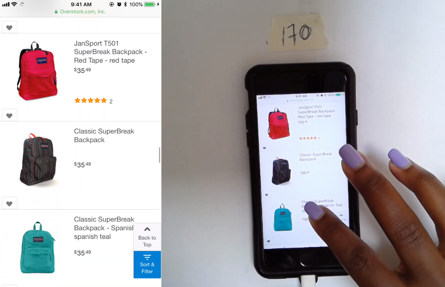
On Overstock, different color variations of the same backpack made it hard for test users to get an overview of the product range (this site lists over 3,000 backpacks). This issue is compounded by the fact that the thumbnails are shot from different angles, increasing the likelihood that users might think that the thumbnails are depicting different products rather than variations of one product.
When there are separate list items for each variation, the product list becomes cluttered — in effect, the ratio of unique products in the list drops.
As a result, users will need to spend more time scrolling through list items to find unique products than they would if variations were combined in one list item.
And if the variations don’t appear one after the other, users would need to continuously work out as they scroll through the list which products are different to those viewed already.
Furthermore, if users discard a particular product based on a variation, the other unwanted variations of that product in the list make it harder for them to find a product of interest.
Such users will need to wade through repeated instances of unwanted items while looking for suitable products.
And if a suitable product is pushed too far down the product list by variations of unwanted products, they may never see the suitable product and leave the site to seek it elsewhere.
We also observed in testing that when the product variations in separate list items seemed similar at first glance, users either thought that they were the same product or, if the product interested them, had to divert to multiple product pages to see what the differences were.
This can occur, for example, when the visual change is so subtle that users fail to notice the differences in the thumbnails — for example, a backpack where the only change is a small team logo, or different but very similar color variations (e.g., light grey and grey).
If the list items are superficially identical, then users may not bother to investigate what differentiates them, assuming that the thumbnails actually depict the same product.
On the other hand, if users notice a slight difference between the list items, and they like the product, they would have to pogo-stick between product pages to find out what sets each list item apart.
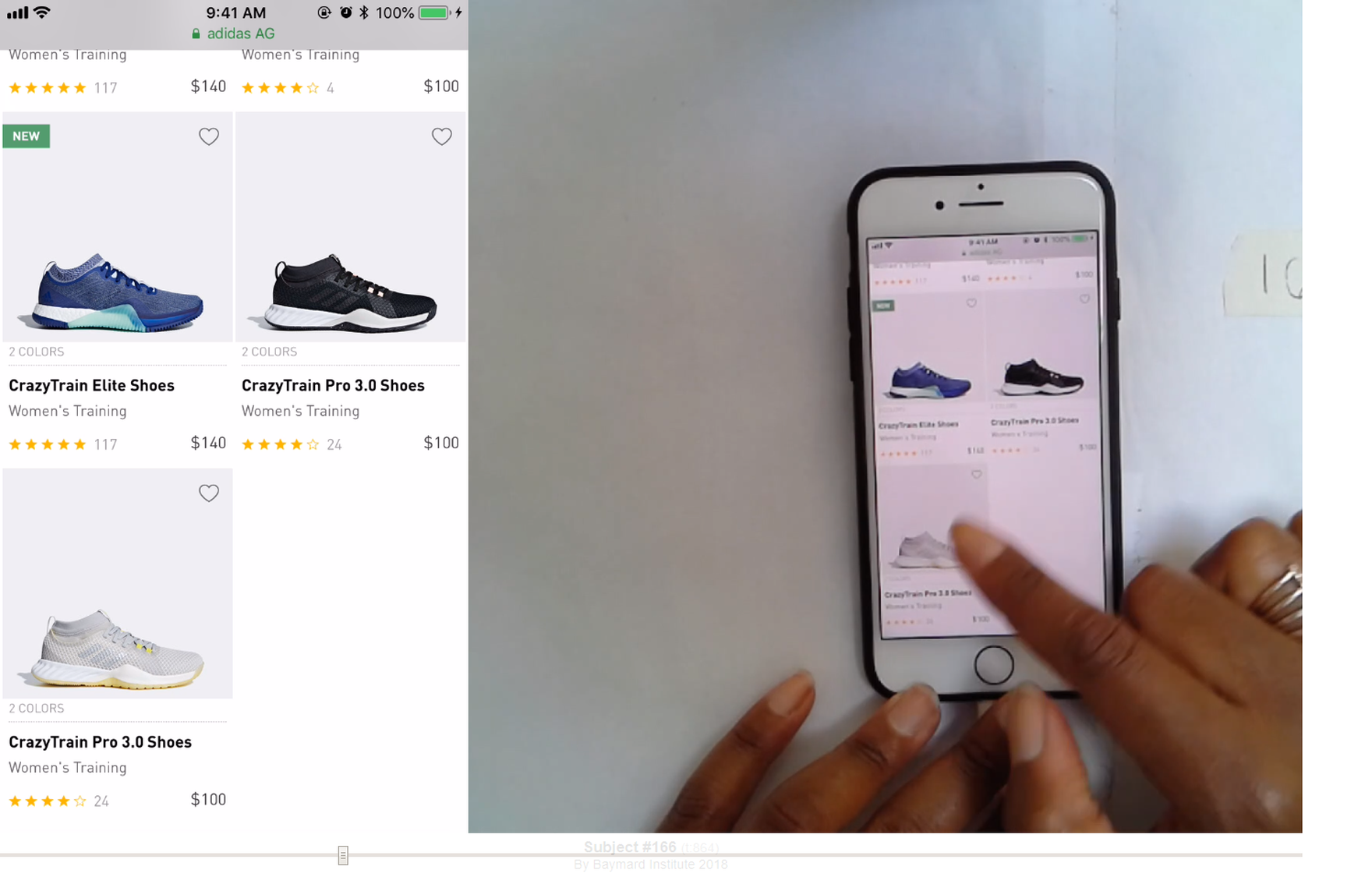
“These two are the same shoe… I don’t like that.”. At Adidas, two color variations of one type of shoe were listed separately. Each variation takes up a significant proportion of the mobile viewport, which forces users to scroll past multiple variations of products that are not of interest.
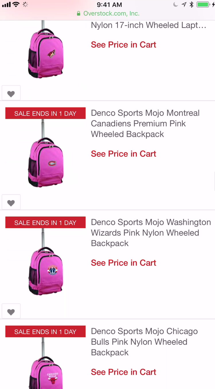
“All these wheeled ones I don’t like at all…there are so many! I wouldn’t shop here”. The pink backpacks shown here on Overstock looked very similar, with the only difference being the small team logo on the front. If users can’t see at a glance differences between list items, they could easily assume that the products are all the same.
The issue of clutter is even more severe on mobile devices if there are separate list items for product variations.
Because the viewport on mobile devices is significantly smaller, fewer list items are visible at once.
As a result, getting an overview of products is even more difficult than on desktop devices, and users will find it harder to judge the diversity of the product catalog.
Compared to desktop, users on mobile sites will also have to rely more on memory to judge whether list items are different products or variations of the same product that’s previously been viewed.
It’s Difficult to Locate All Variations of Products of Interest if Variations Are Separate List Items
The second issue with having variations of a product in multiple list items is that users who are interested in a particular product will have a harder time finding a variation they like.
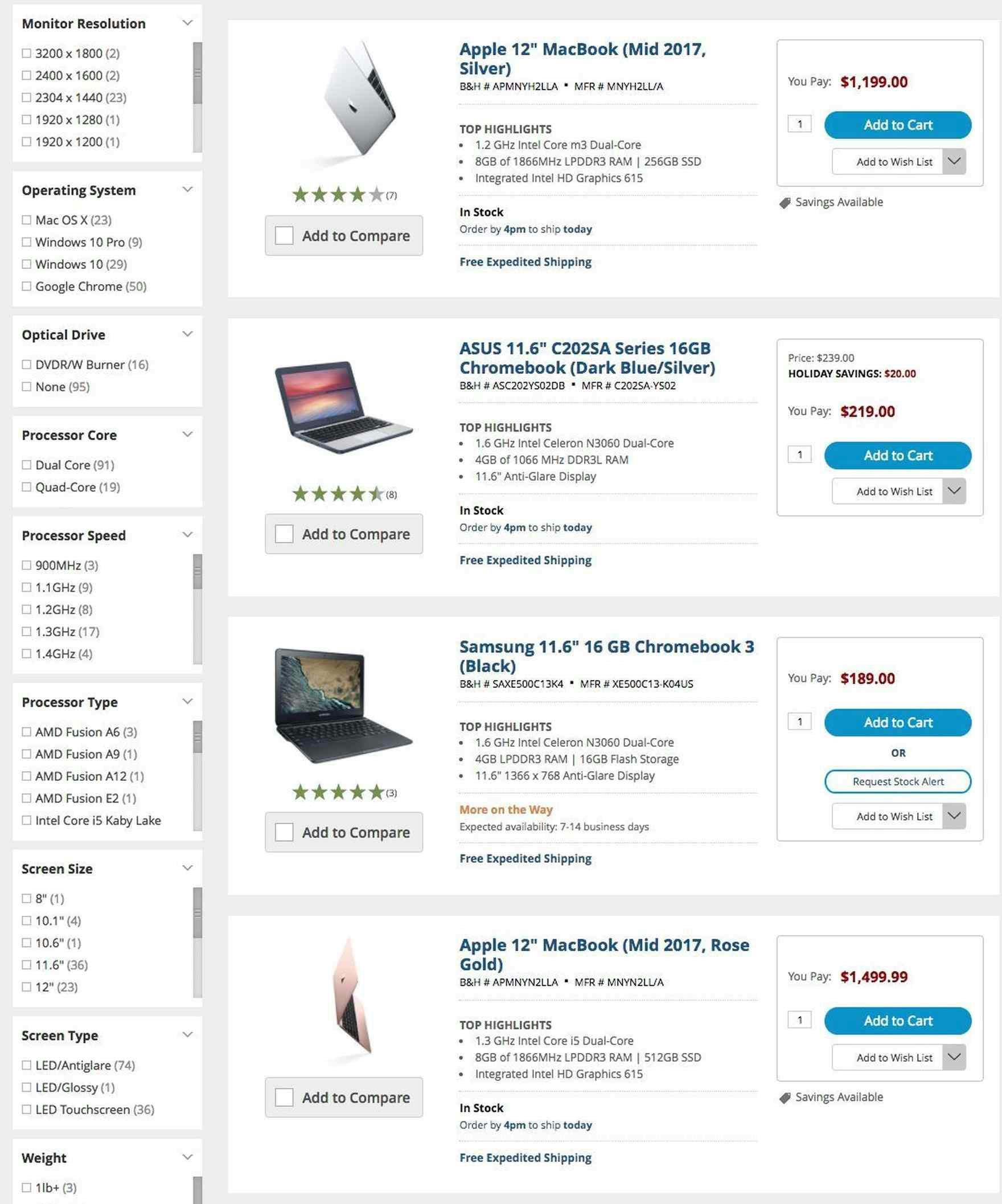
Variations of the same basic product, for example the Apple 12” Macbook, are not displayed together on B&H Photo. There are two further variations above the top list item shown, making it likely that the last item shown would be overlooked.
For example, if a user sees a dress she likes, but doesn’t like the red variation she sees at the top of the product list, she’ll need to hunt through the list to find a color that suits her needs, working out as she scrolls which items are variations of the item she likes and discarding other products.
It’s true that some (though certainly not all) users will go to the product details page to find product variations.
However this rapidly becomes a tedious exercise in pogo-sticking if users have a few products they’re comparing — not to mention those users who never go to the product page, and therefore are reliant on the product list to find the variants.
This issue becomes even more tedious if users aren’t returned to the same place in the product list when returning from the product page.
The worst-case scenario is if the user never finds the most suitable variation and abandons the site, assuming the variation they want is not available.
Again, due to the fact that mobile users have a smaller viewport, they will have even more difficulty finding separate variations of the same product in a product list, as there is less likelihood that more than one variation of a product of interest will be visible in one viewport.
Additionally, users in a product list that see too many variations of unwanted products could conclude that the product catalog is less diverse than it actually is (see also this article for more on diversity in product lists).
For example, if a user looking for a dress just saw multiple variations of a few dresses on the first couple of pages of the product list, she might think that there are fewer dresses available than there actually are, and never see those on subsequent pages.
Help Users to Easily Find Product Variations in Product Lists
Neiman Marcus combines color variations into single list items. As a result, the product list is not cluttered with color variations, allowing users to get a good overview of the product catalog.
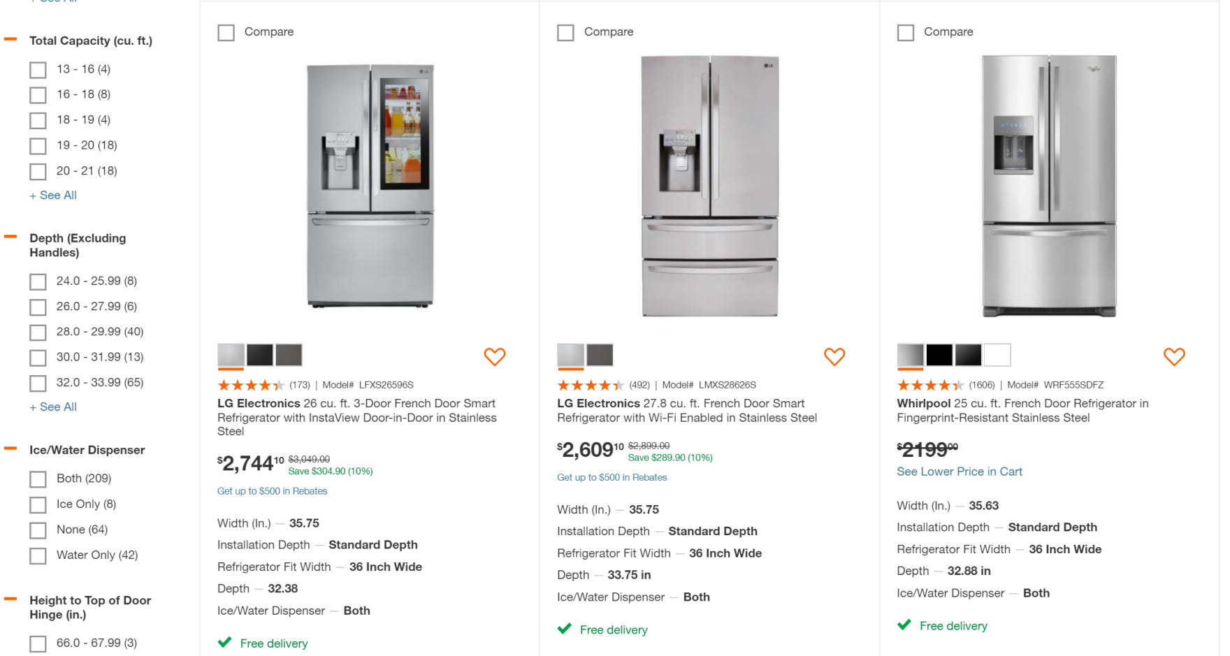
Different color options for fridges on Home Depot are combined in list items with variations indicated in swatches below the thumbnails. Users can tell from list items if the fridges come in colors that will suit their needs.
When product variations are displayed in separate list items, users find it hard to get an overview of the product range, and finding related variations becomes needlessly difficult.
On the other hand, when product variations are combined, product lists contain only unique products, which helps users get an overview of products more easily, and users are far less likely to overlook a variation that would suit their needs.
An important prerequisite for combining variations in single list items is that the variations must be linked in the product database.
Therefore to ensure consistency, sites that sell products from multiple vendors should post-process product data to link variations of unique products.
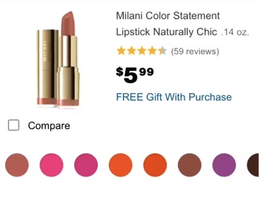
Additionally, one implementation detail to consider when combining list items is that the number of variations should be indicated clearly in the thumbnail or list item info.
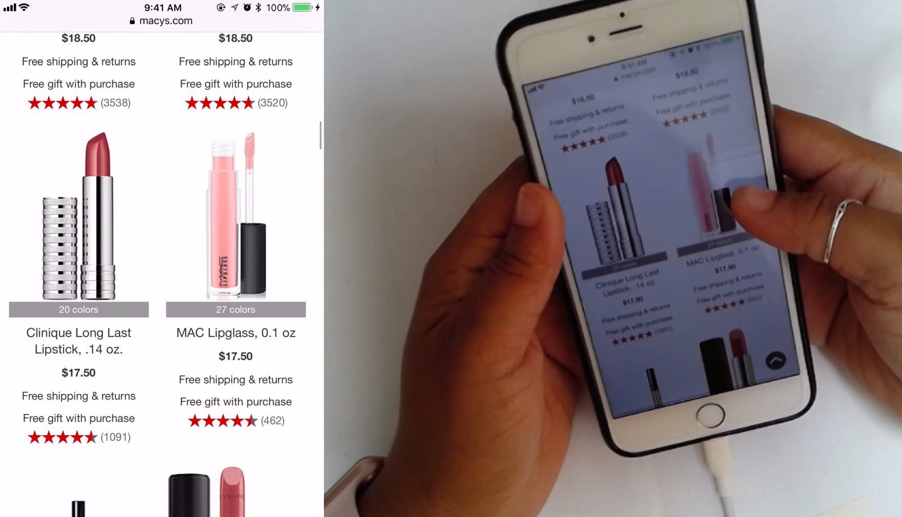
On Macys, the number of different lipstick colors is indicated by text just below the thumbnails. Users therefore have more information about each particular product, which can inform their decision on whether to visit the product details page.
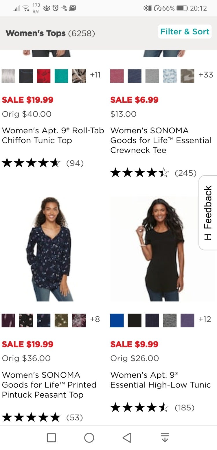
Kohl’s combines color variations in single list items, with prominent swatches and indications of how many colors have been truncated. This makes it easy even on mobile devices to get a clear overview of the product range, and users will be confident that they won’t overlook variations.
Without knowing how many variations the product has, users won’t be able to make an informed decision about visiting the product details page to learn more.
For example, a t-shirt with 20 color variations would likely be a more attractive proposition than one with just three variations because it would be more likely that a suitable color would be available.
Therefore, the number of variations should be clearly displayed using swatches and text.
Despite the fact that combining variations of products in one list item makes finding these variations considerably easier, 12% of our benchmarked sites sites don’t do so — risking having users become overwhelmed by product lists, or never finding a suitable product.
This article presents the research findings from just 1 of the 700+ UX guidelines in Baymard – get full access to learn how to create a “State of the Art” ecommerce user experience.