Key Takeaways
-
Comparison features can be an intimidating and overwhelming interface if not properly designed
-
Testing revealed 4 design details that can improve the performance of comparison features for end users
During our large-scale testing, comparison features for spec-driven product types were found to be critical to users considering spec-heavy products.
Yet simply having the feature available isn’t enough — to be useful to users comparison features have to get several details right when it comes to the design of the feature.
Otherwise, testing revealed that users will struggle to use comparison features — in some cases, exiting the feature entirely due to their frustration.
As a result, some users will fail to find a relevant product — and abandon the site without completing a purchase.
In this article, we’ll discuss our Premium research findings related to the design of comparison features, and how to improve their scannability.
4 Ways to Optimize the Comparison Feature for Scanning
The following 4 design details were observed during testing to facilitate users’ ability to use comparison features:
- Remove identical attributes
- Group attributes by category
- Persist column headings during scrolling
- Use horizontal styling to define rows
1) Remove Identical Attributes
Comparison features allow users to directly compare individual product attributes across multiple products.
Yet the benefits provided by this ability to do a close comparison are significantly reduced when many or most of the individual product attributes are exactly the same across products, as it’s not easy to discern how products differ.
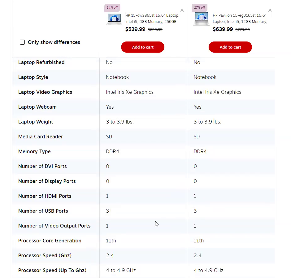
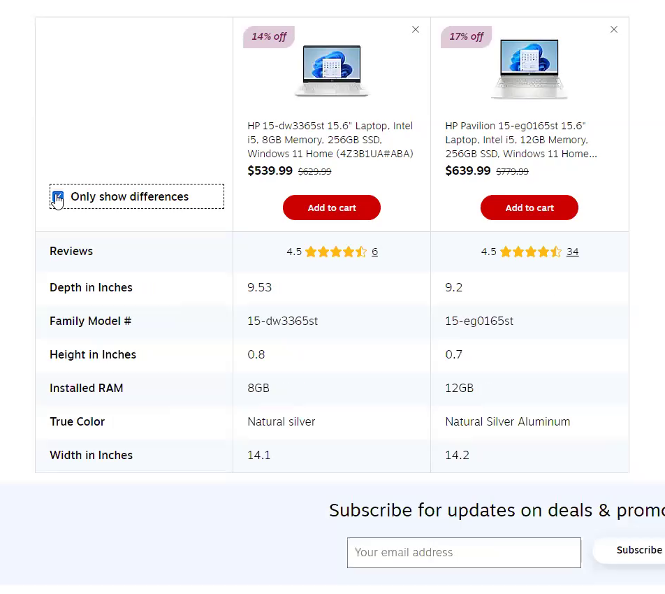
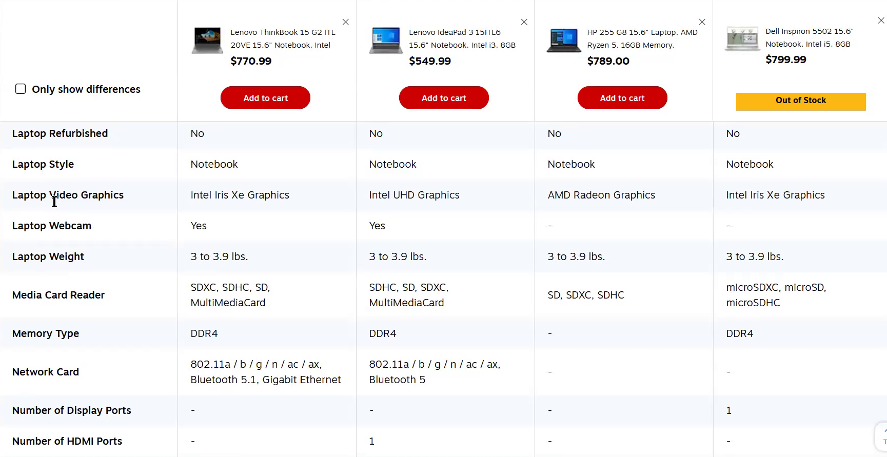
“Oh, you can even do ‘Only show differences’. Some of these differences don’t even matter. The big one is the RAM.” Before this test user noticed the “Only show differences” button on Staples, he spent awhile scrolling through the specs (first image). After he hid the specs that the two products shared (second image), he found the process of comparison much easier.
Therefore, it’s important to allow users to hide attributes when they’re the same for the products being compared.
On sites where rows with specs shared by all products can be hidden, users can instead focus only on differences, cutting down the time needed to decide which product is most suitable.
As one test participant evaluating printers put it, “Okay so I like this right here where it says, ‘Only show differences’. It makes it easier for me to see which will be better just by looking at less details, but helpful information. So I find that really helpful”.
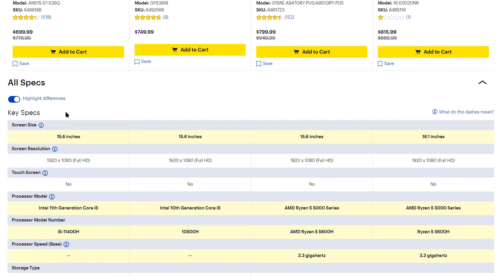
“Yes, and this one has the option to highlight the specific differences, like they all don’t have touch screen, screen resolution, and it doesn’t matter. The things that really matter are highlighted…the real differences.” Highlighting differences, as is done on Best Buy, is also helpful as this test user found, but doesn’t isolate the differences as much as when the common specs are hidden.
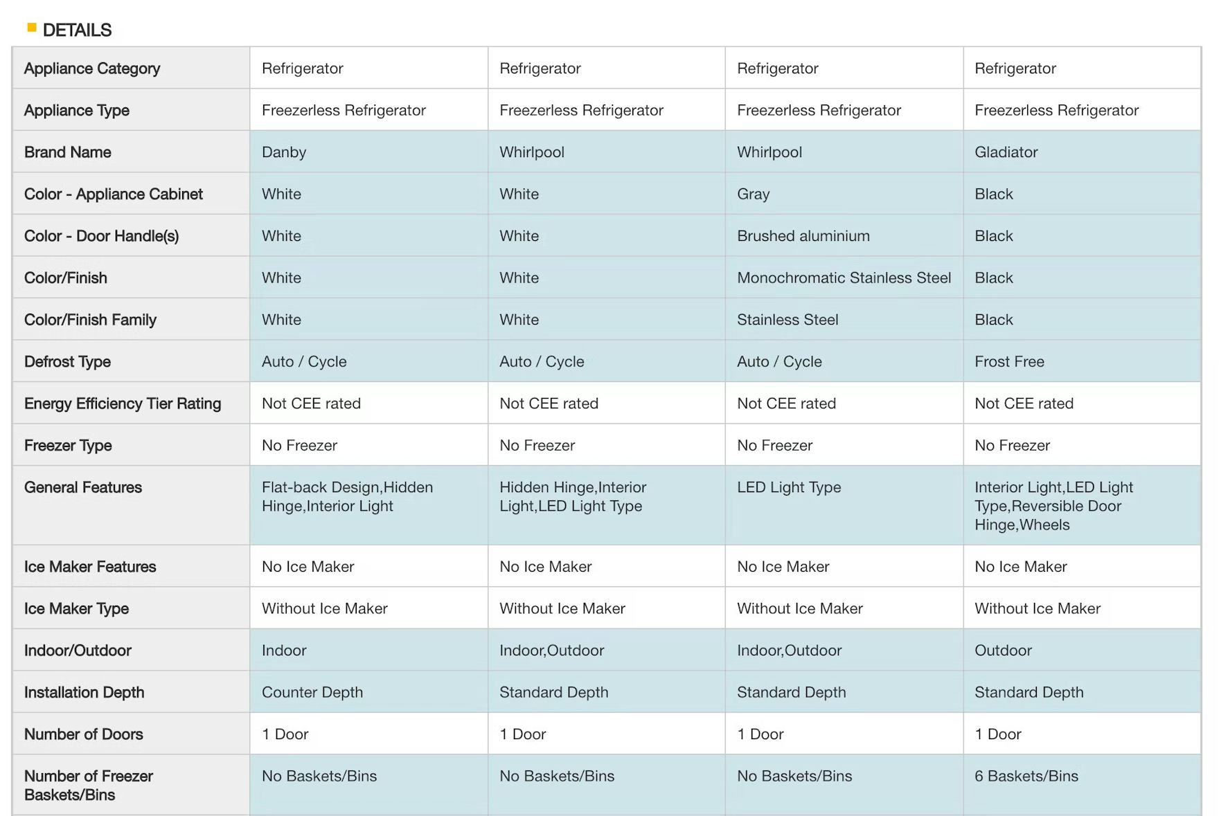
Home Depot uses blue shading to highlight attributes that differ between products, allowing users to quickly assess those that vary across items.
Some sites, instead of hiding identical specs, highlight differences by shading rows where differences occur.
While this is more helpful than not emphasizing differences at all, it still requires effort to work out which specs differ.
As one test participant commented, “It’s a little bit overwhelming…it’s a lot to scroll through. I’d really like it if they were able to not even show the information that is not different to be able to just get rid of it somehow.”
Another test participant also preferred it when only differences were shown: “Then there’s a ‘Highlight differences’, which is nice. But hiding is more helpful, so you could kind of parse out the differences faster that way.”
However, highlighting differences is an acceptable alternative if an “Only show differences” option can’t be provided for the comparison feature.
2) Group Attributes by Category
During testing, 2 different methods of ordering the attributes in comparison features were observed: listing attributes alphabetically or grouping them into categories.
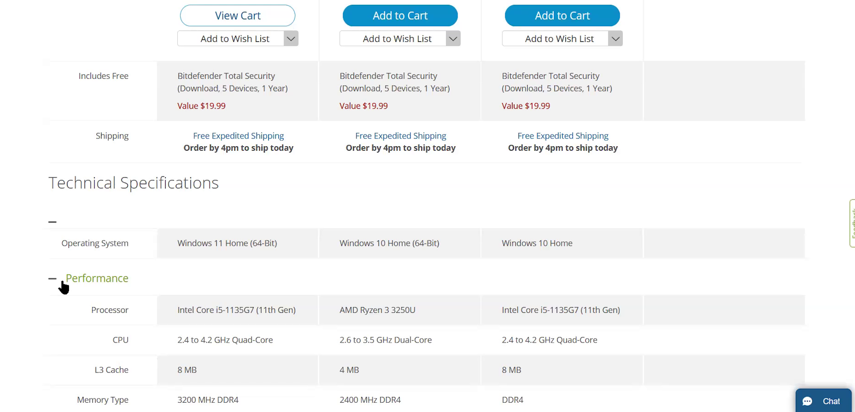
In Staples’s comparison feature with an alphabetical list of attributes, some attributes are worded in ways that could cause users to look in the wrong area of the list — for example “Laptop Weight” instead of just “Weight” — potentially slowing down the process of locating all attributes of interest. Furthermore, users looking in particular at memory-related attributes, such as “Memory Type” and “L3 Cache”, won’t be able to view all of them at once, having instead to scroll up and down to view each one.
Although ordering attributes alphabetically in one long list sounds like a reasonable approach, the inconsistent naming conventions can slow the process of locating those of interest.
For example, on one site during testing the graphics card was named “Laptop Video Graphics”, while on another it was named simply “Graphics”.
As a result of the lack of common naming conventions across sites, users will not be sure where they need to scroll to find the feature they need to locate.
Because of these inconsistencies, a subset of users may have to scan the whole list, looking for a feature of interest.
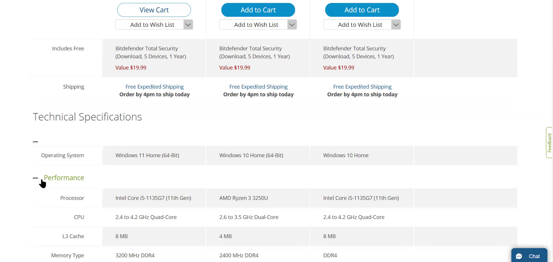
“B&H categorizes each of these features in its own subheading, like ‘Performance’ and ‘Display’. I like that more than the Staples way with an alphabetical order…I’m just better able to organize in my head what features I’m actually looking at right now.” For this test participant and many others, organizing features into categories made it much easier to locate specs of interest than if the attributes were simply listed alphabetically.
“It’s breaking it down by a subcategory, which is nice. So if you were a super technical consumer, you’d be able to drill down to what specs you wanted to look at and really make an informed decision.” Likewise, this participant felt that grouping related attributes together made it easier to focus on a broader feature (such as “Storage and Expansion”) when all related attributes were visible at once.
Instead, the method that performed best for test participants was when attributes were organized into categories.
Having related features grouped together allows users to see them all at once, making it easier to get an overview of more general attributes; for example, everything to do with screens (e.g., size, resolution, touchscreen) or speed (e.g., CPU speed, memory type, cache).
It’s also quicker to find specific attributes because users just need to find the right category heading, rather than scroll through the full table scanning each row.
The groupings and subheadings also have the added benefits of making the table less intimidating by breaking up the long list of features and ensuring related features are always presented together.
Attributes nested under groups can then be organized by popularity or alphabetically — neither method fared better or worse during testing.
3) Persist Column Headings during Scrolling
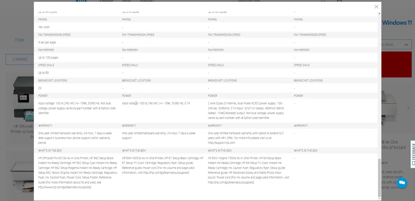
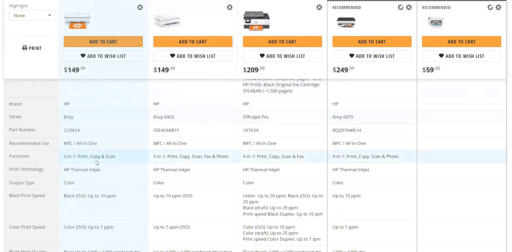
When product names and prices disappear when users scroll down the comparison feature, as they do here on HP, they’ll have to scroll back to the top to see which product a particular spec applies to and how much it would cost. If there are many specs of interest across a handful of products, identifying the most suitable item would require a lot of scrolling.
The length of most comparison tables will make maintaining visibility to column headings — usually containing the product name, thumbnail, and price — impossible.
Losing visibility to these details places an unnecessary cognitive burden on users to remember them as they compare products.
At the same time, this lack of visibility of product names, thumbnails, and prices increases the overall scrolling efforts for users who don’t remember these details, as they are required to return to the top of the table each time they identify a significant difference among the items.
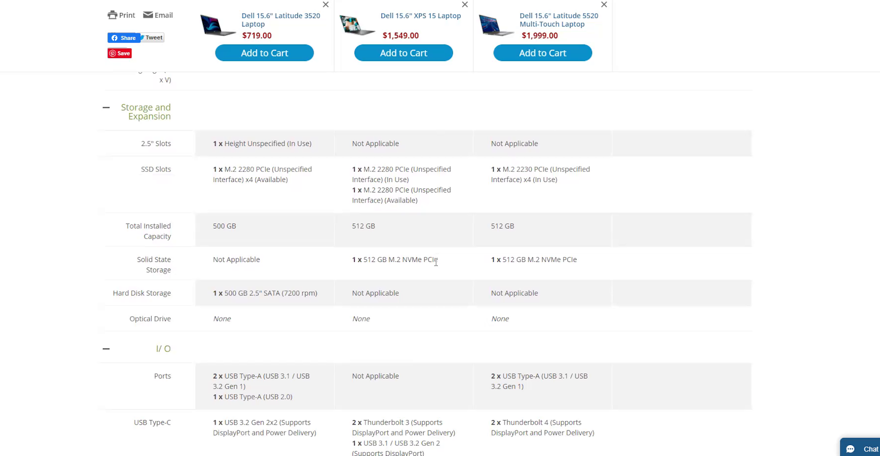
“Oh, I like that it keeps that. It freezes your column at the top with the item, that’s good.” “Sticky column headings”, as provided on B&H Photo, allow users to keep the product title, price, and thumbnail visible at all times. This makes the comparison process easier for users as they don’t have to scroll to see these important attributes.
Instead, testing showed that “sticky column headings”, which attach the product names, thumbnails, and prices to the top of the table as it’s scrolled, resolves this issue entirely.
Having sticky column headings provides much-needed access to details that are essential to the comparison process.
4) Use Horizontal Styling to Define Rows
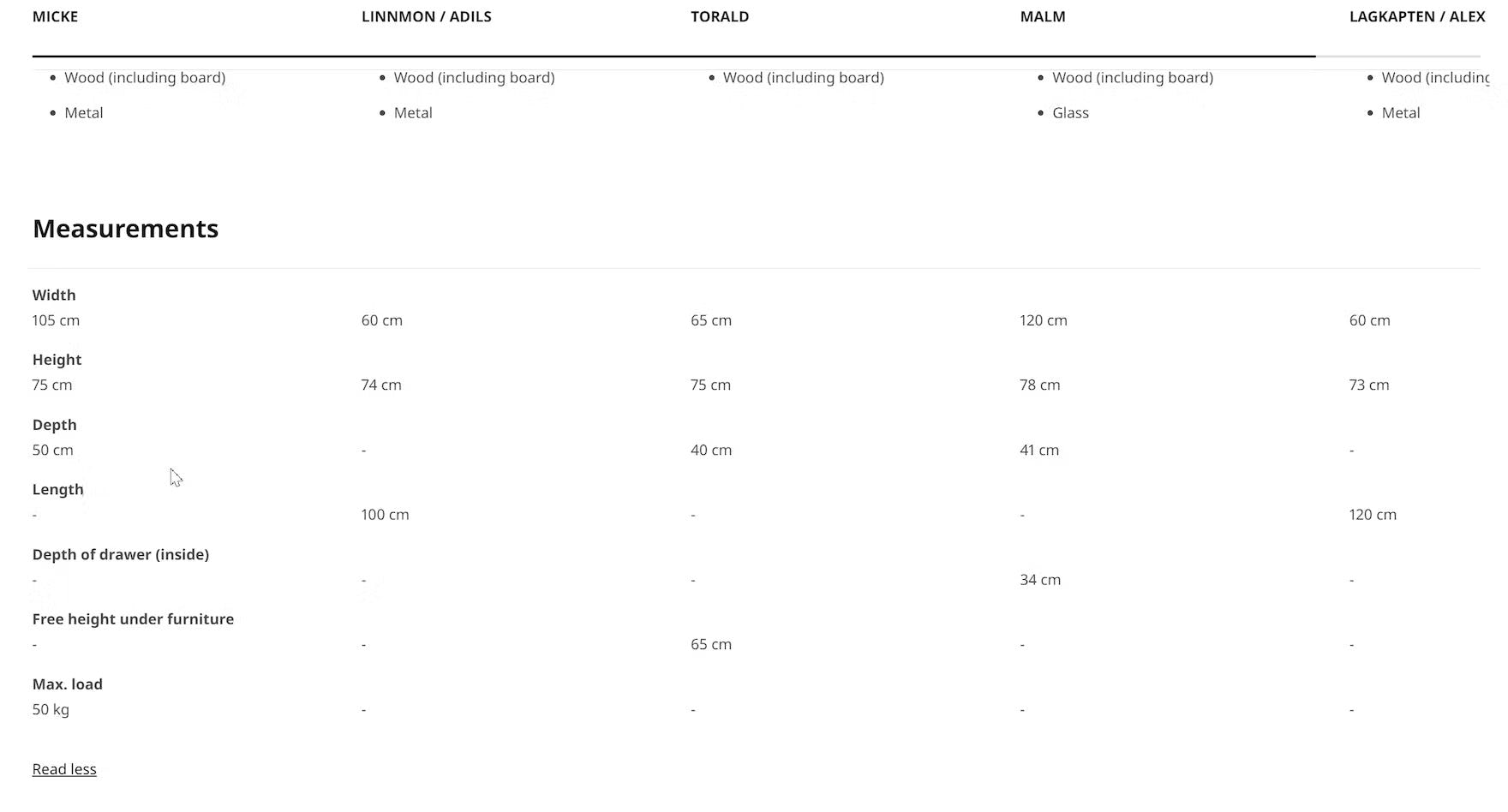
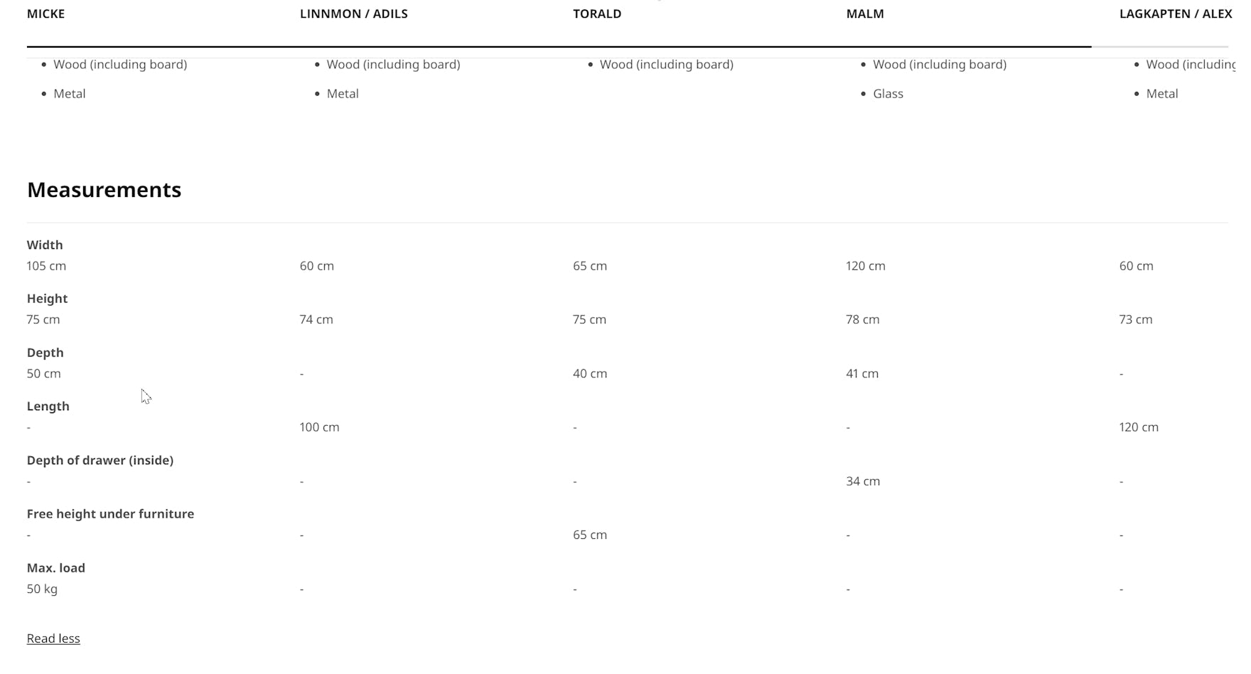
The rows in Ikea’s comparison feature lack horizontal styling, increasing users’ scanning efforts. In this table, the lack of data in some cells makes it slightly harder for users to follow the line across, for example, the “Length” row because of the absence of any design element to guide the eye.
Comparison features without any default horizontal styling can make it needlessly difficult for users to scan and interpret the specs correctly.
For example, without horizontal lines or alternate colors to visually separate the rows, users are more likely to lose their place as they scroll and try to trace attribute labels on the left to associated values in columns on the right.
Consequently, users are required to scan the table more slowly or employ the cursor to assist with tracing horizontally.
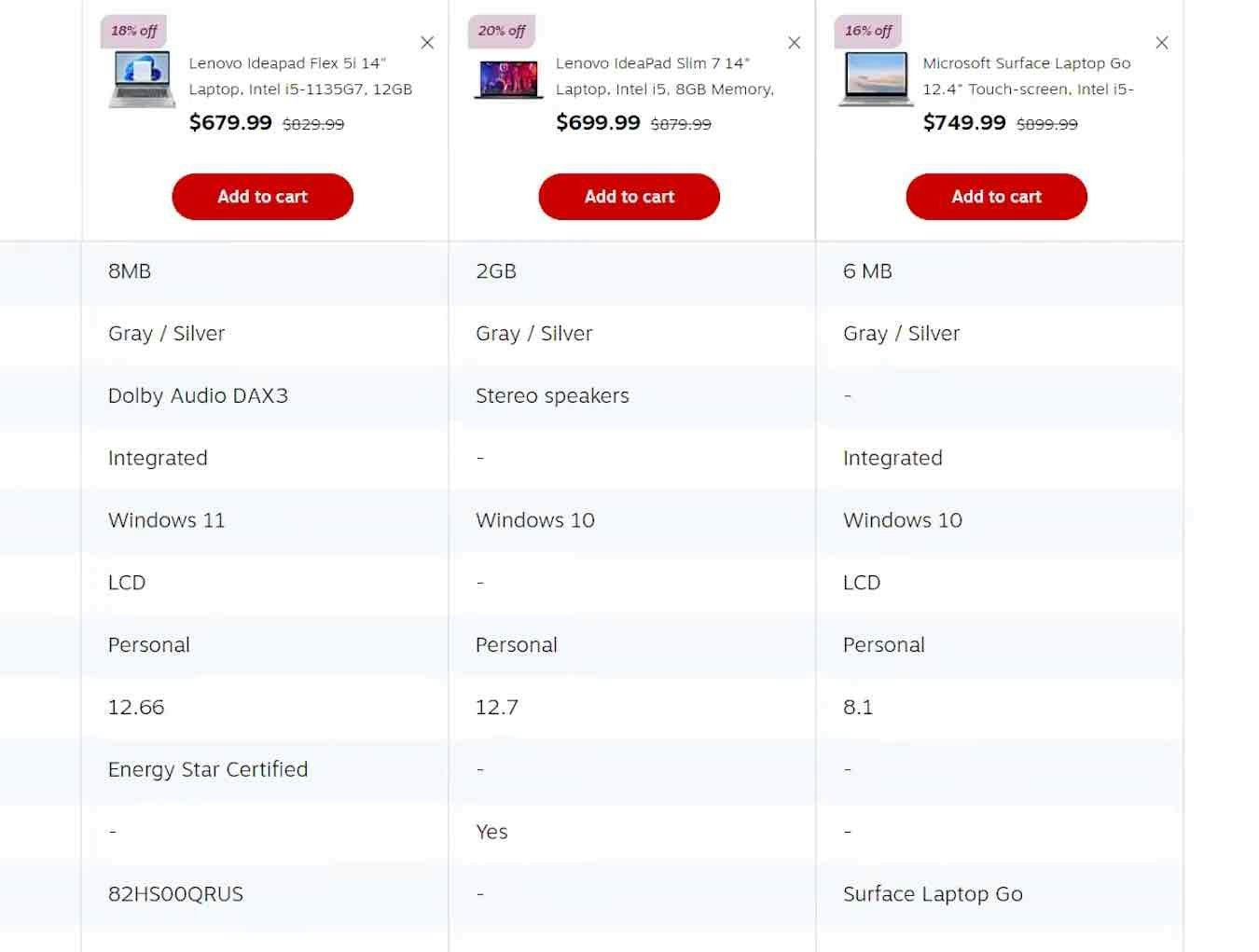
The alternating shading of rows on B&H Photo allows users to easily scan across the table to compare specs for each attribute.
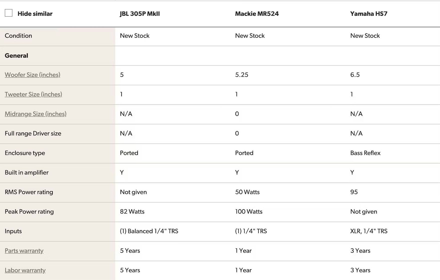
On the other hand, Crutchfield uses separating lines to define the rows in its comparison feature to assist users scanning across the columns.
Fortunately, nearly all of the test sites’ comparison features included horizontal styling — either separating lines or alternating background colors — to visually define the rows.
These subtle styling details not only enhance users’ ability to scan the table but also aid in visually breaking up an otherwise text-heavy list.
On-hover highlighting, as shown here on Newegg, helps users focus on particular attributes. Ideally, however, the lines between the rows would be thicker to help define them more clearly when users are scanning the table without highlighting any row on hover.
On desktop, providing on-hover highlighting can further reduce users’ scanning efforts.
However, the technique should not be used instead of default row highlighting as, without users knowing about hover effects, the rows won’t be defined enough to facilitate faster scanning.
Ensure Your Comparison Feature Is Optimized to Support Users’ Needs
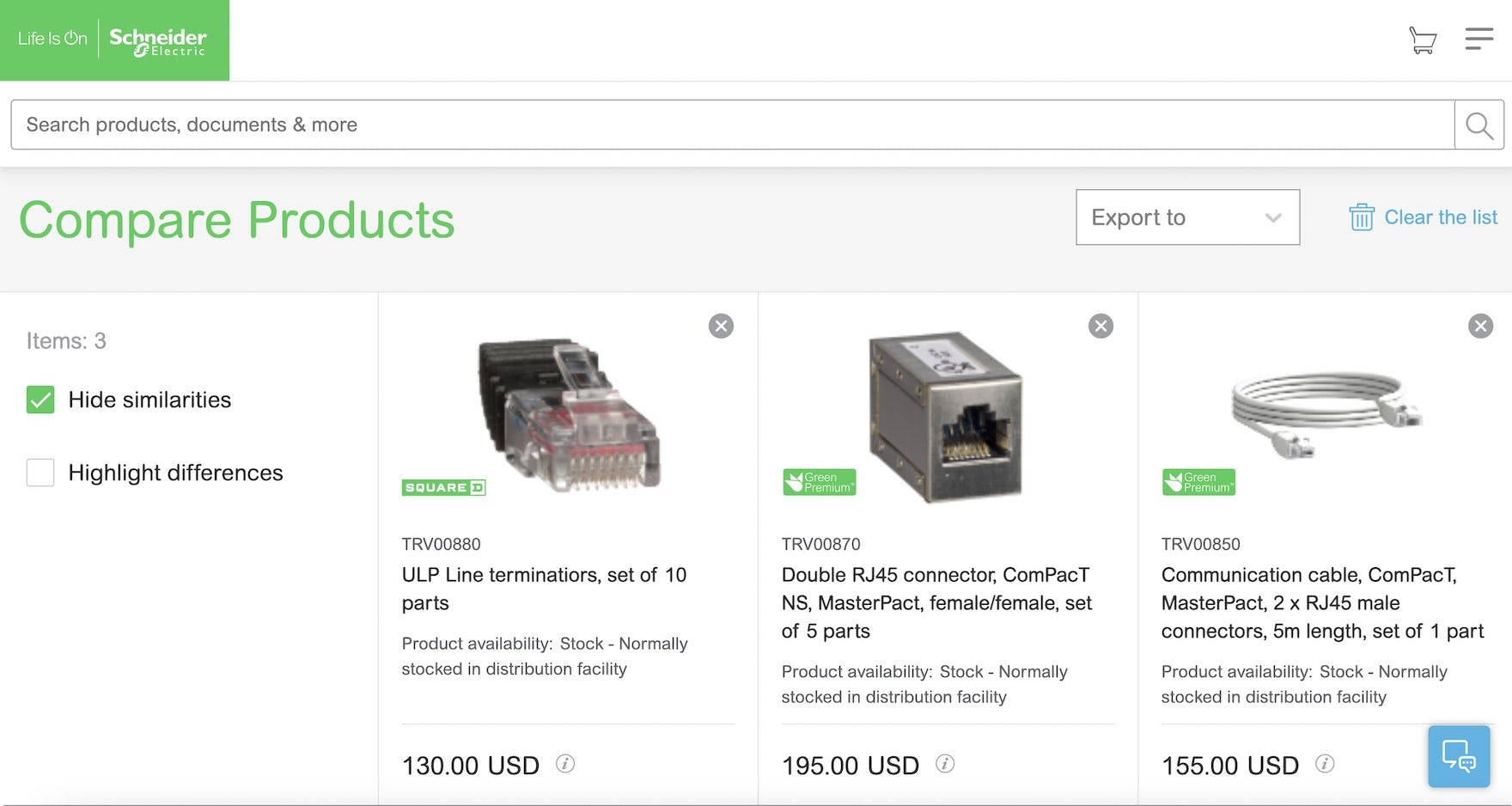
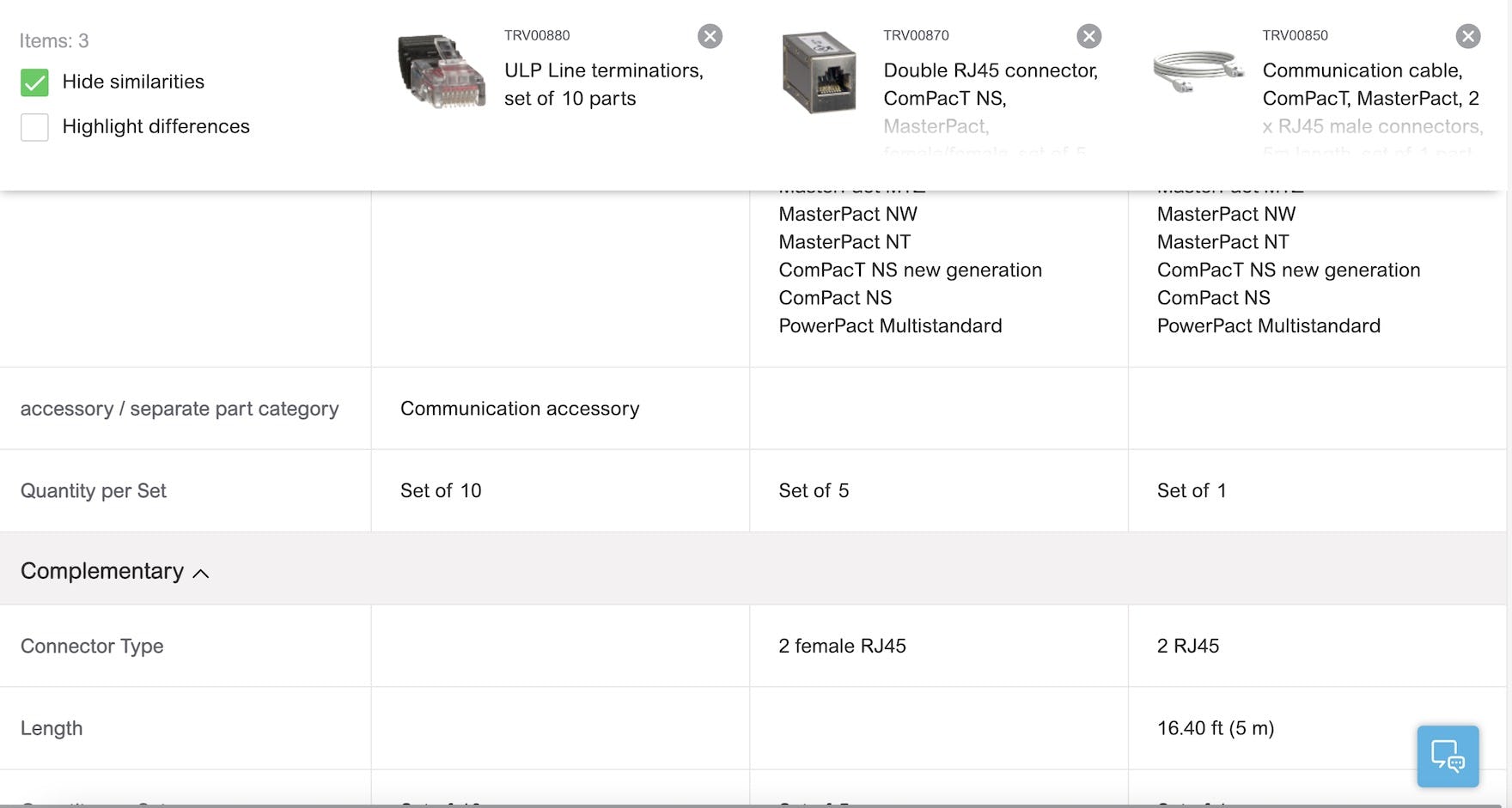
At Schneider Electric, the comparison feature allows users to “Hide similarities”, attributes are grouped by category, column headings are persisted as users scroll down, and horizontal lines help define rows. For B2B electronic components and machinery sites, comparison features are likely highly used and relied on, and thus it’s even more important to get the details right to ensure the feature performs well.
Providing a comparison feature for spec-driven product types is a good first step to helping users explore products.
Yet to ensure the comparison feature performs well for users, it’s key that the following 4 design details are implemented:
- Remove identical attributes
- Group attributes by category
- Persist column headings during scrolling
- Use horizontal styling to define rows
A high-performing comparison feature is one that’s more likely to be used by users — who are consequently more likely to find a suitable product.
This article presents the research findings from just 1 of the 700+ UX guidelines in Baymard – get full access to learn how to create a “State of the Art” ecommerce user experience.
If you want to know how your website performs and compares, then learn more about getting Baymard to conduct a UX Audit of your site.

