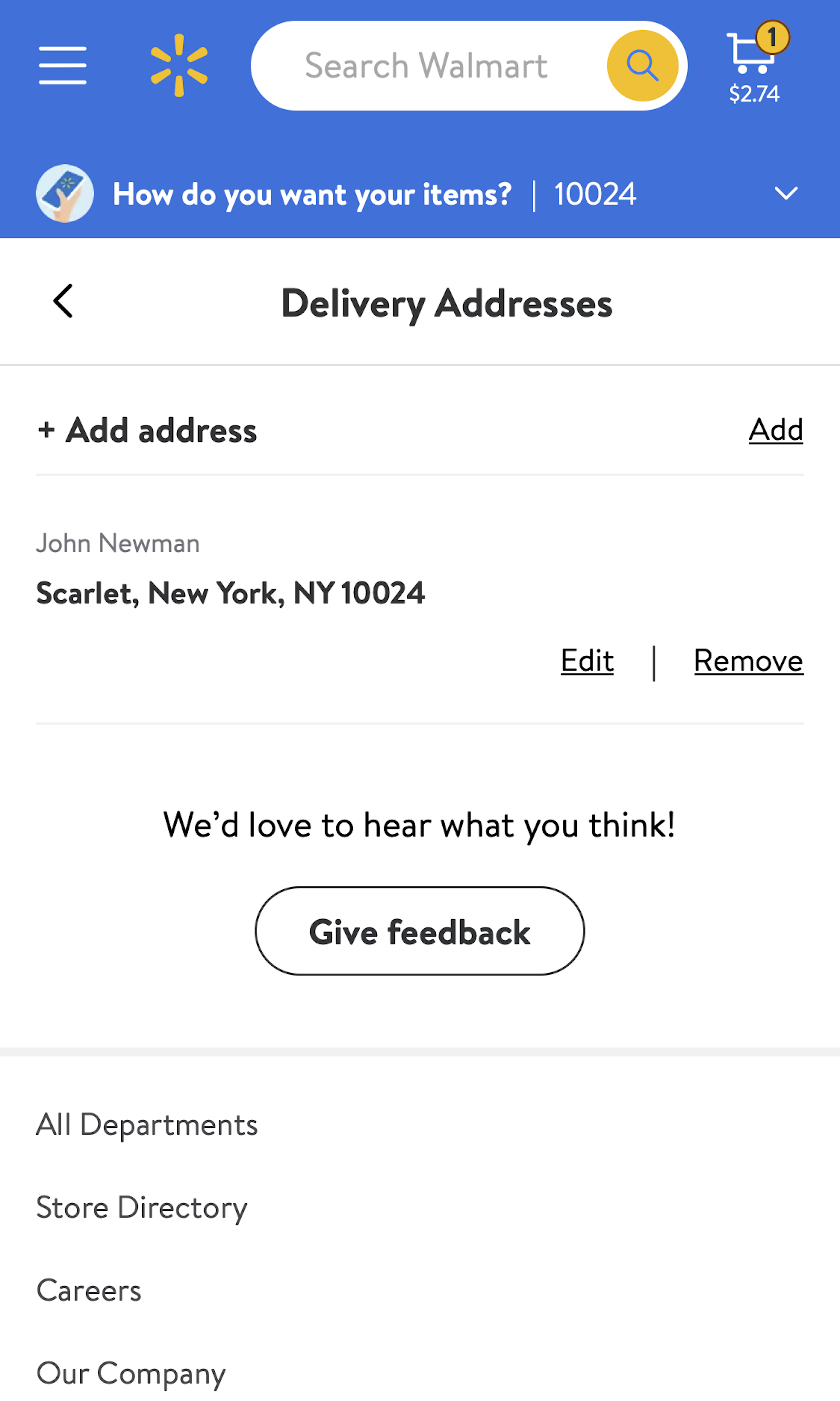
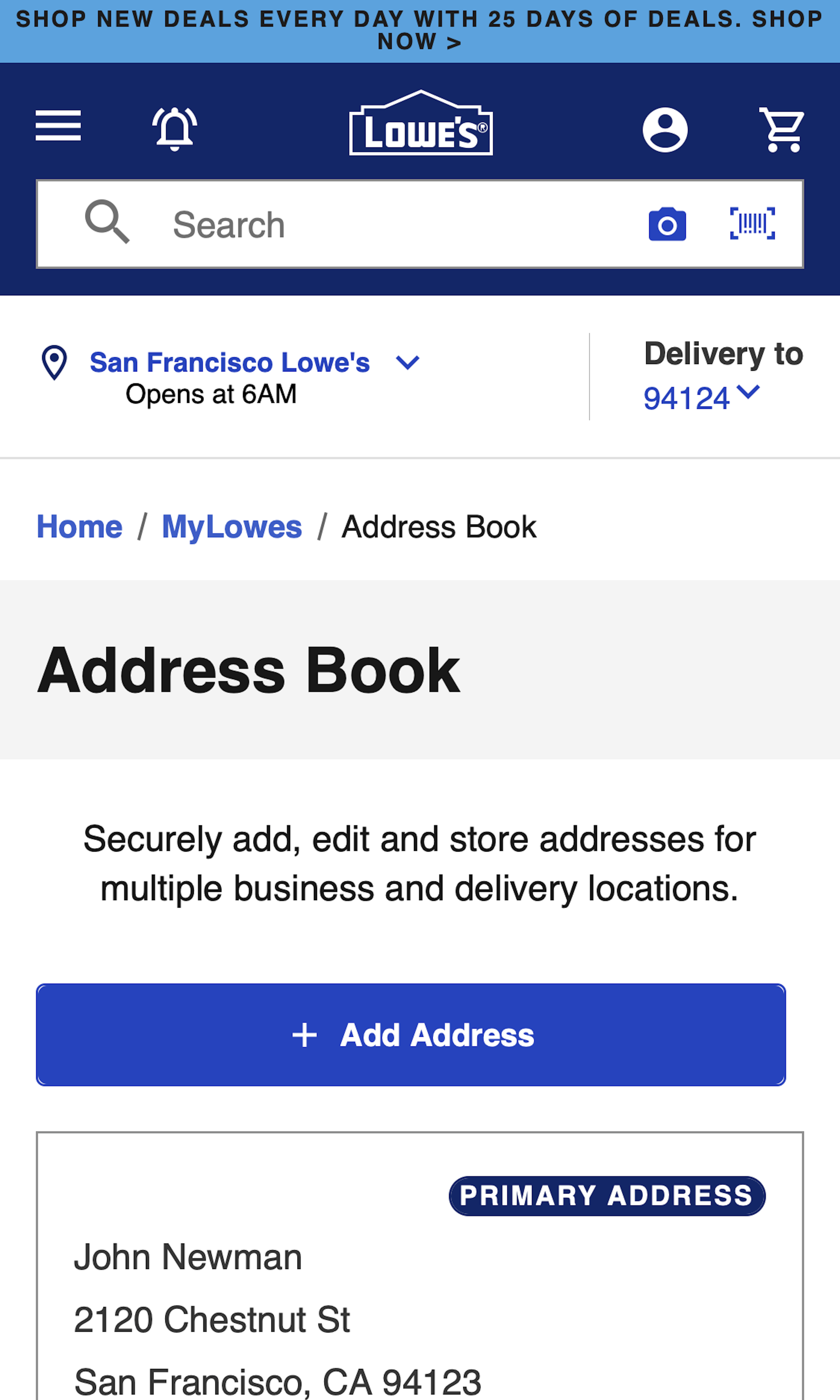
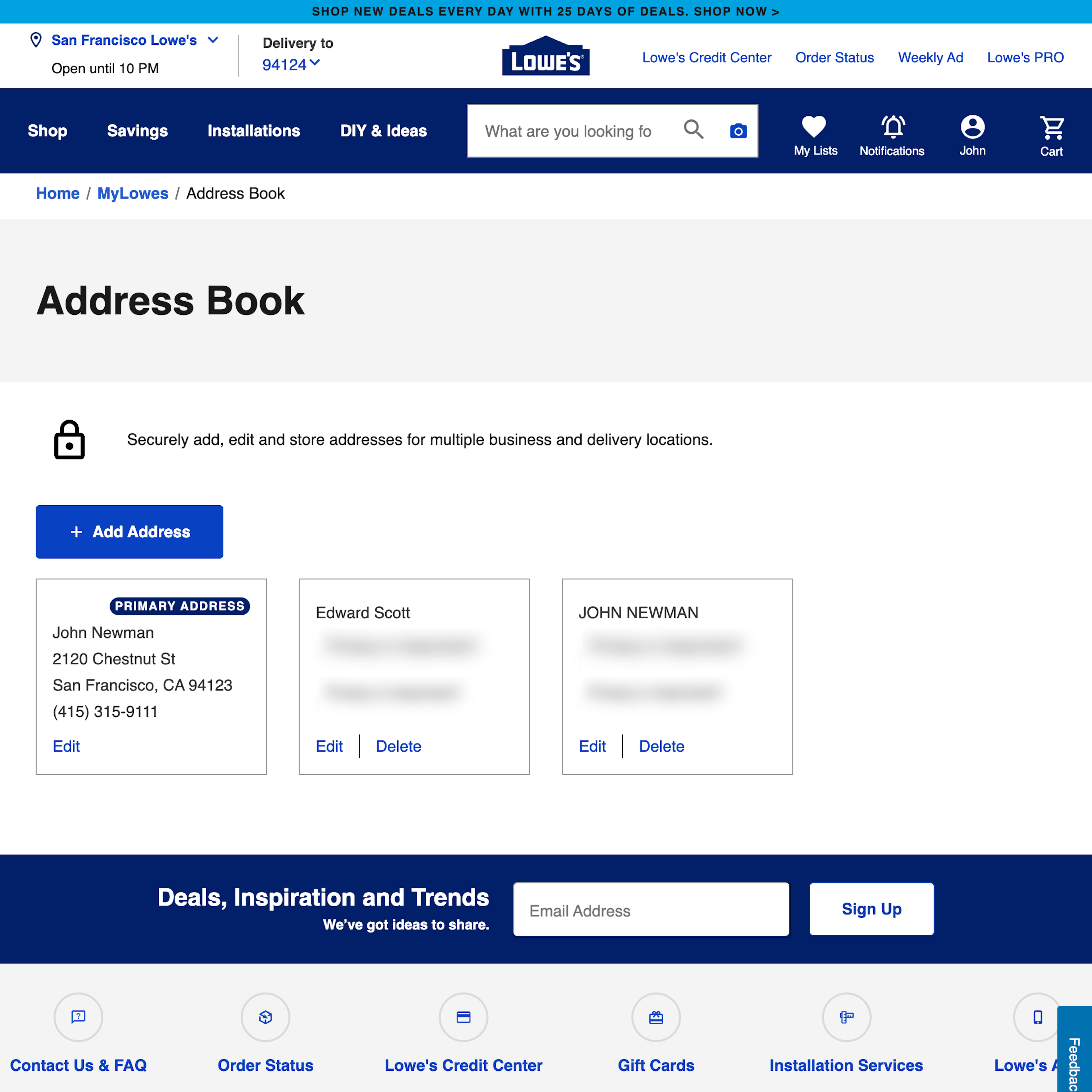
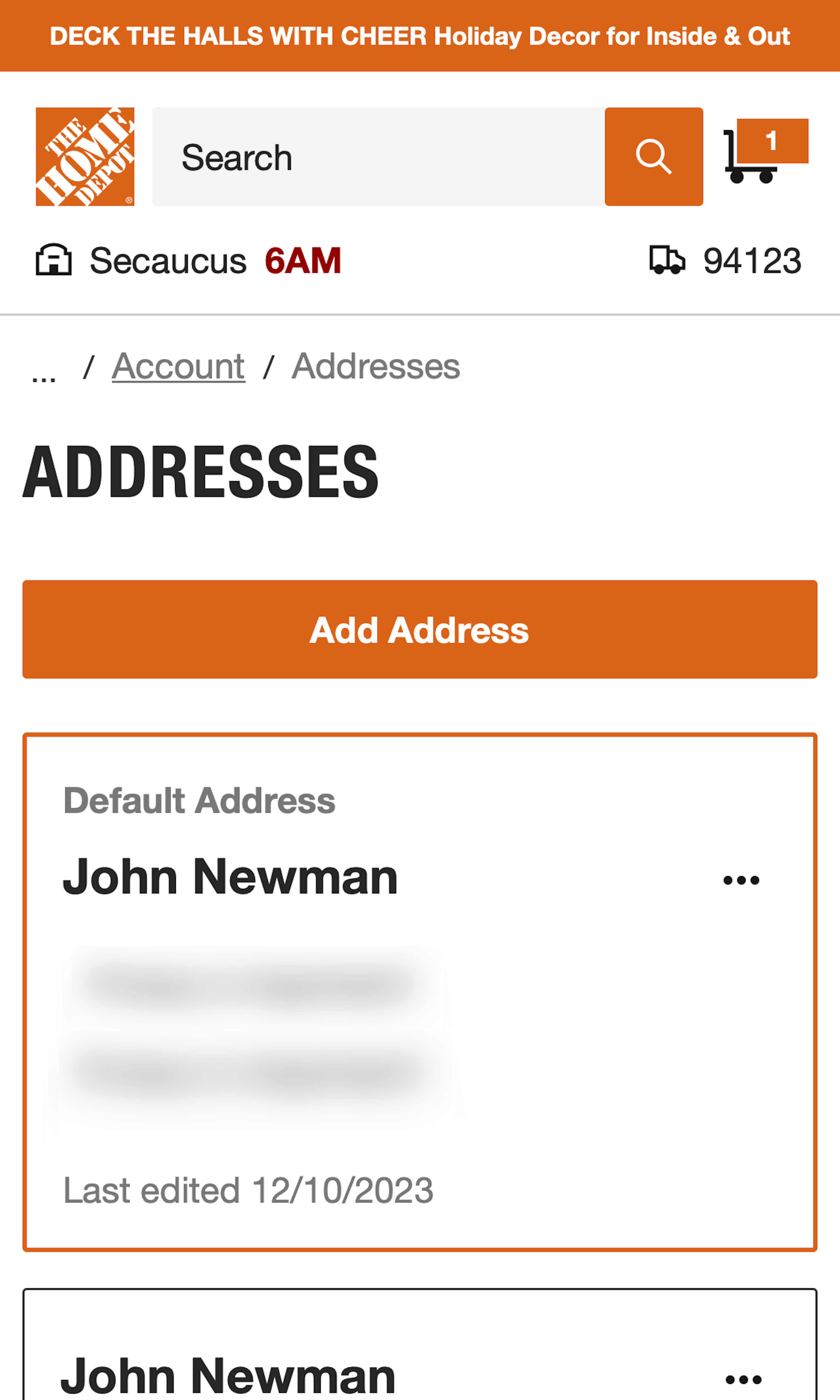
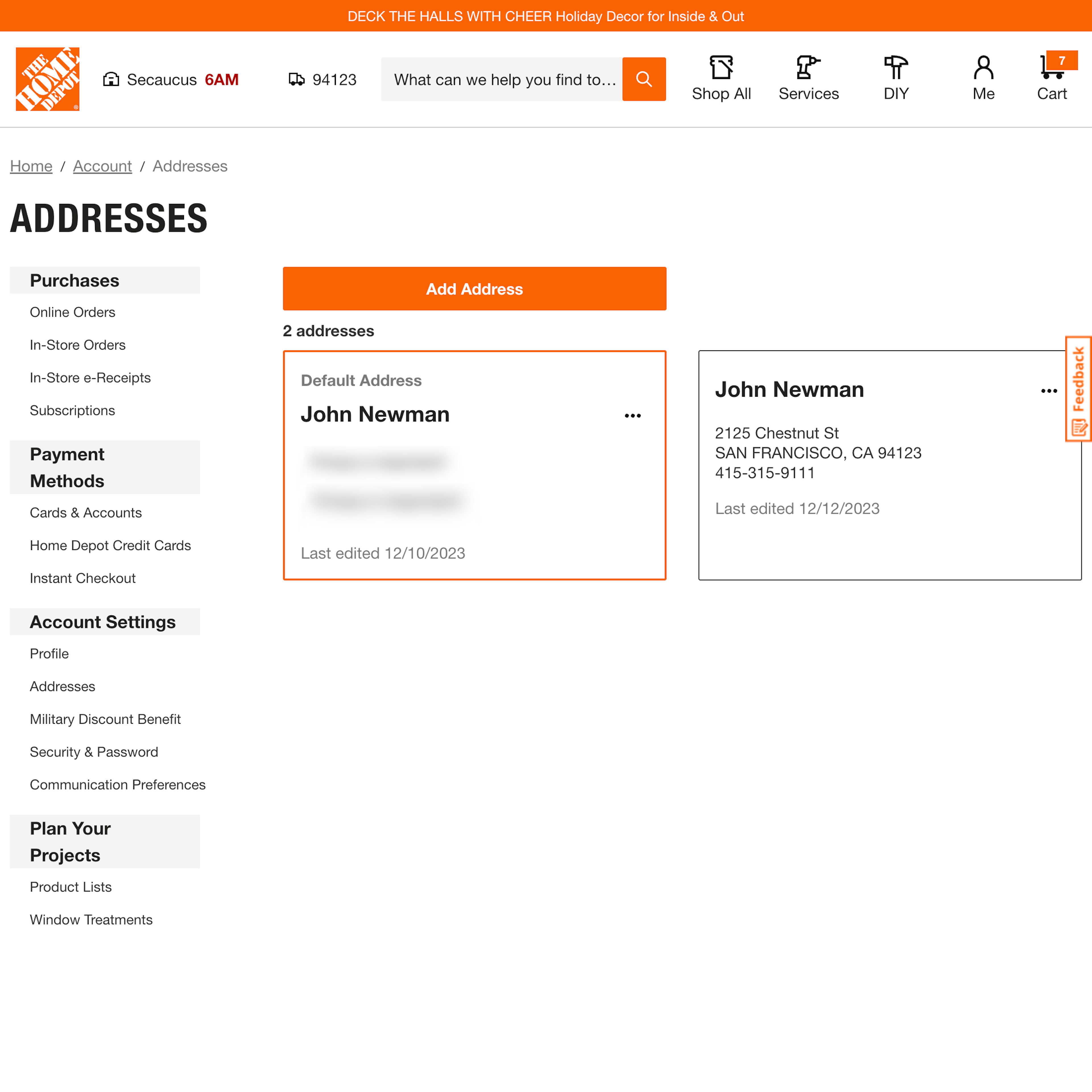
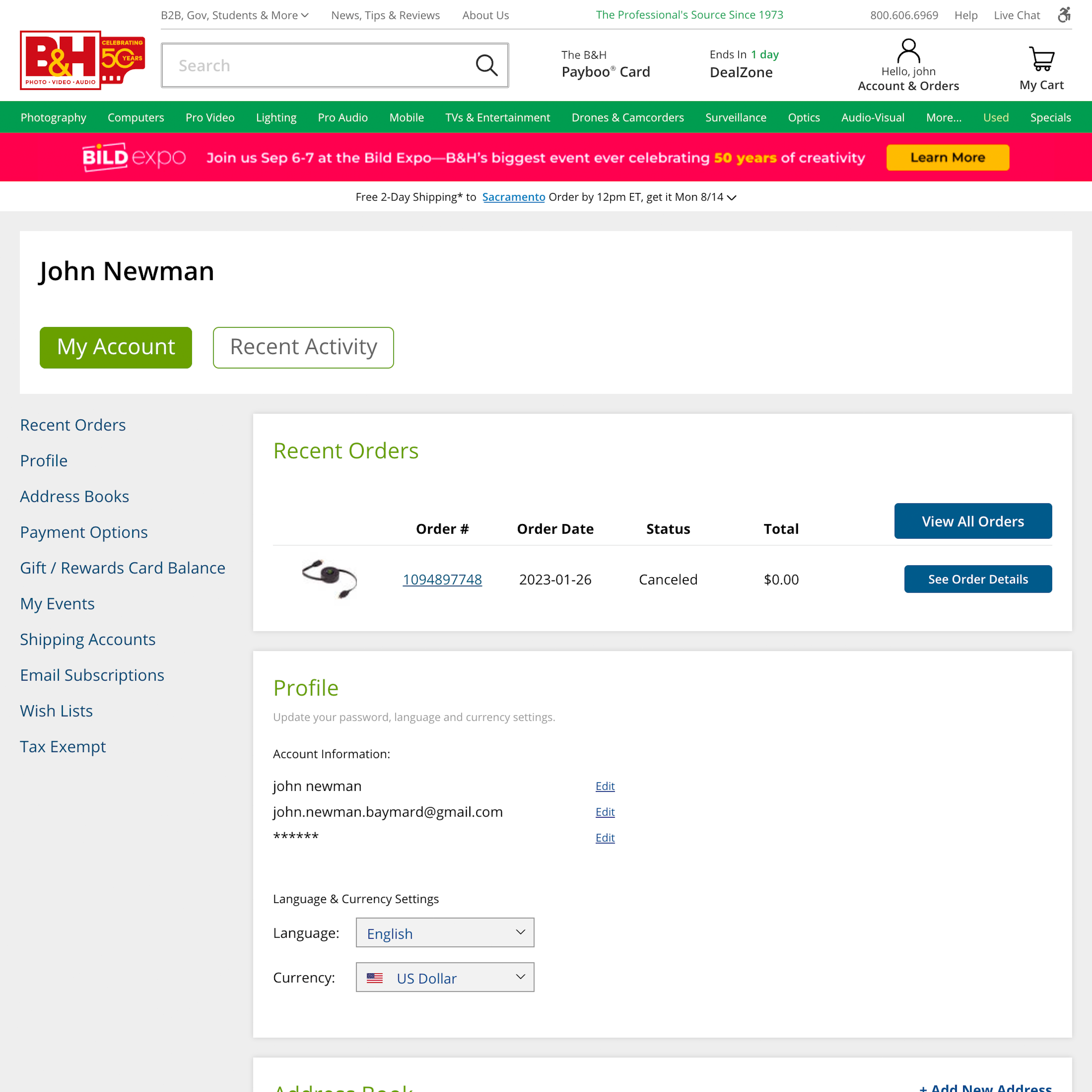
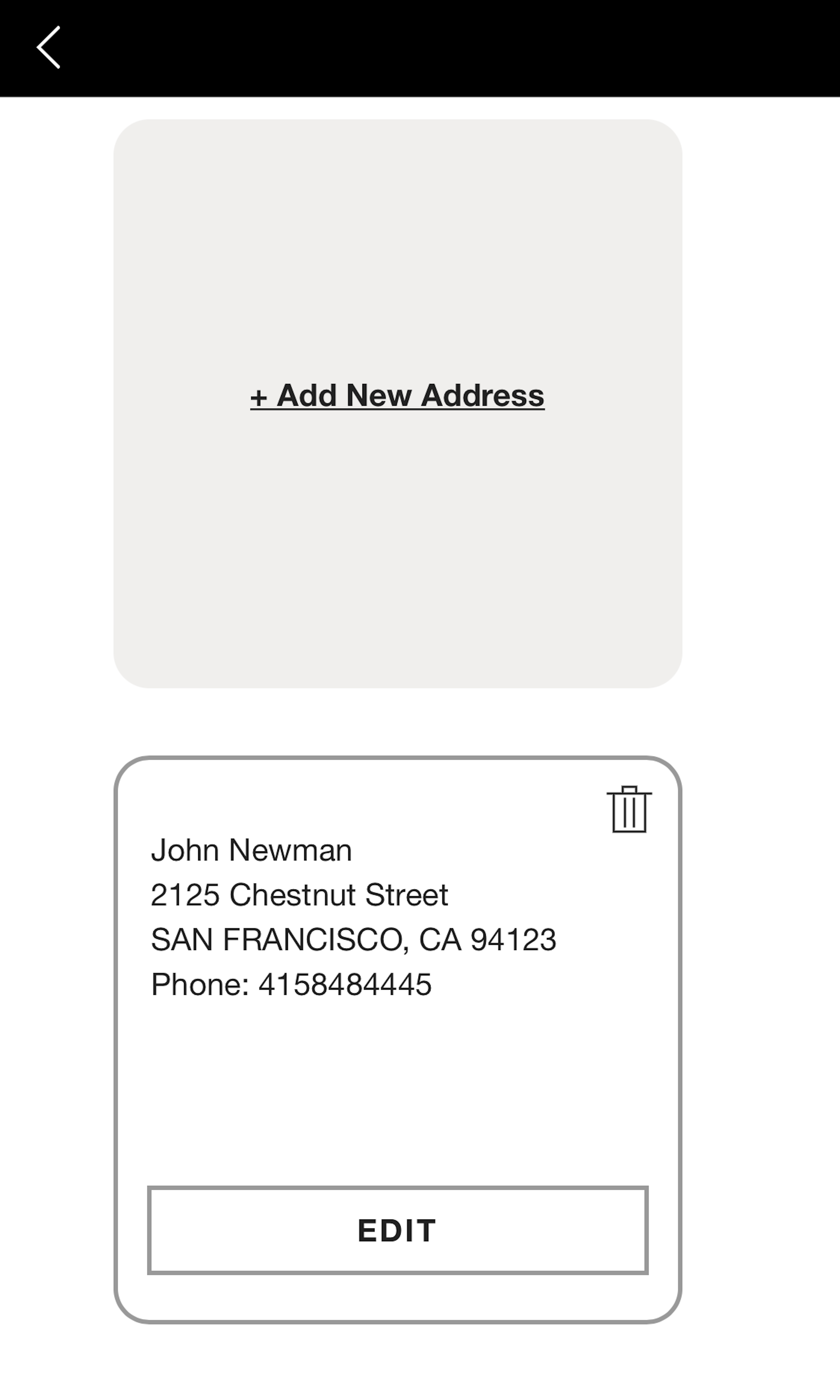
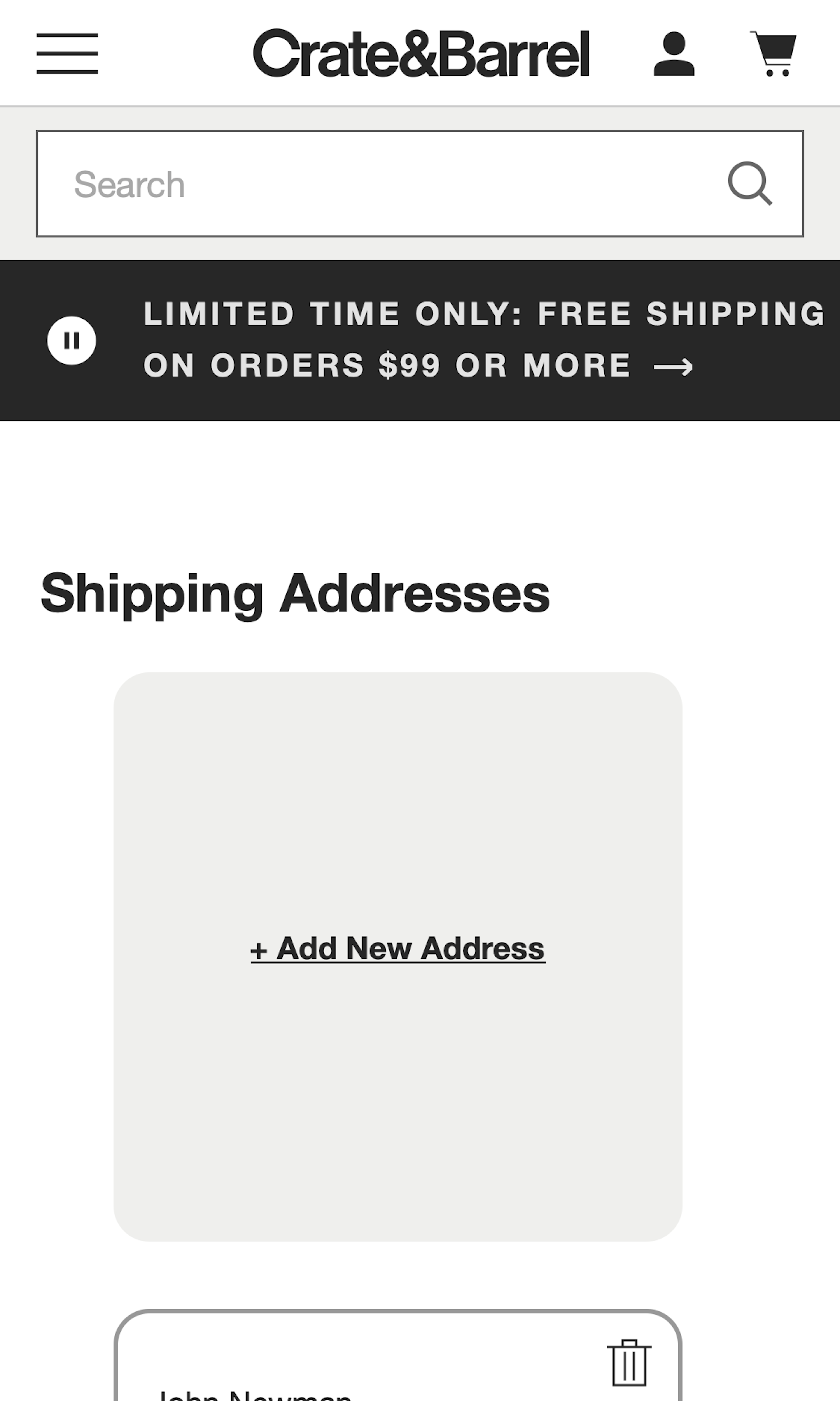
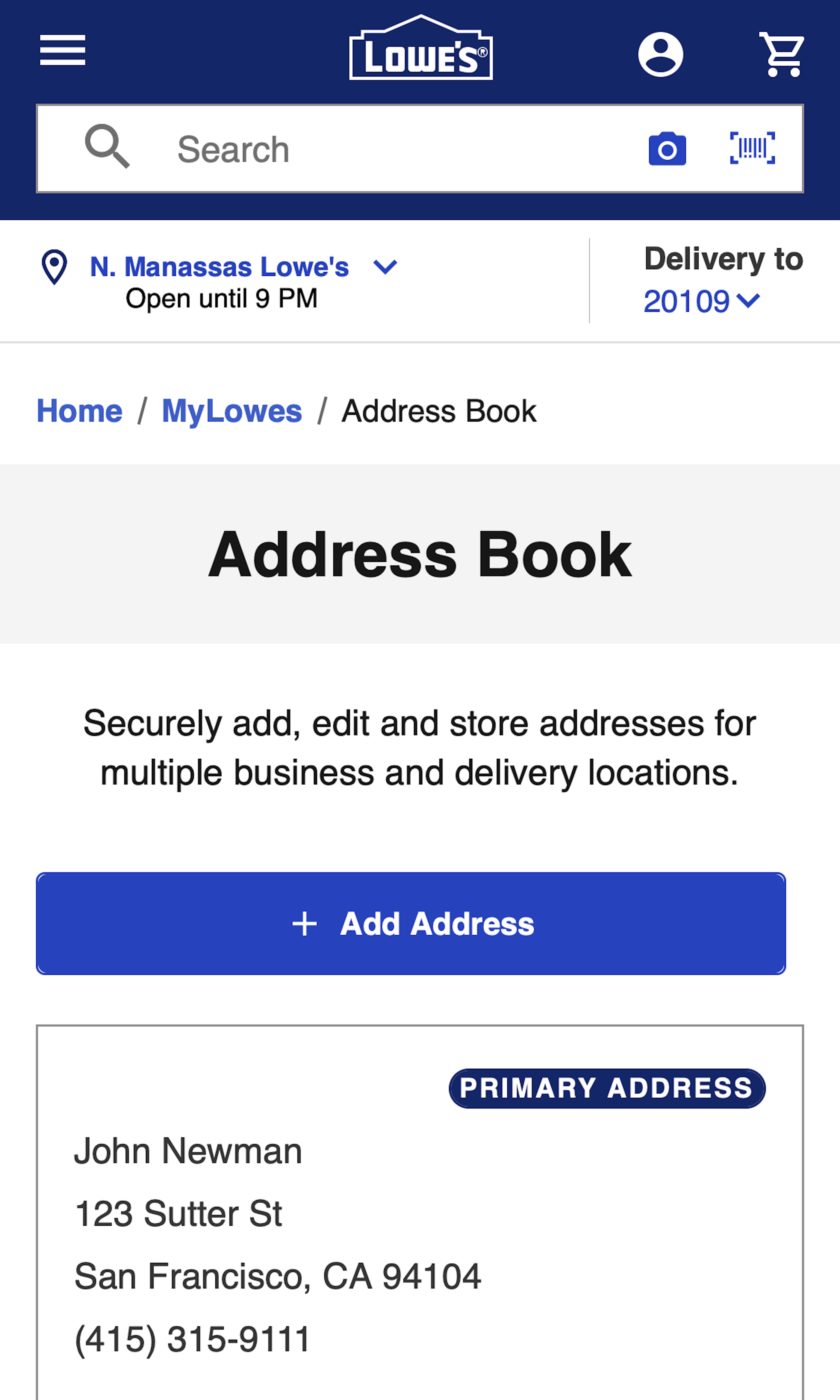
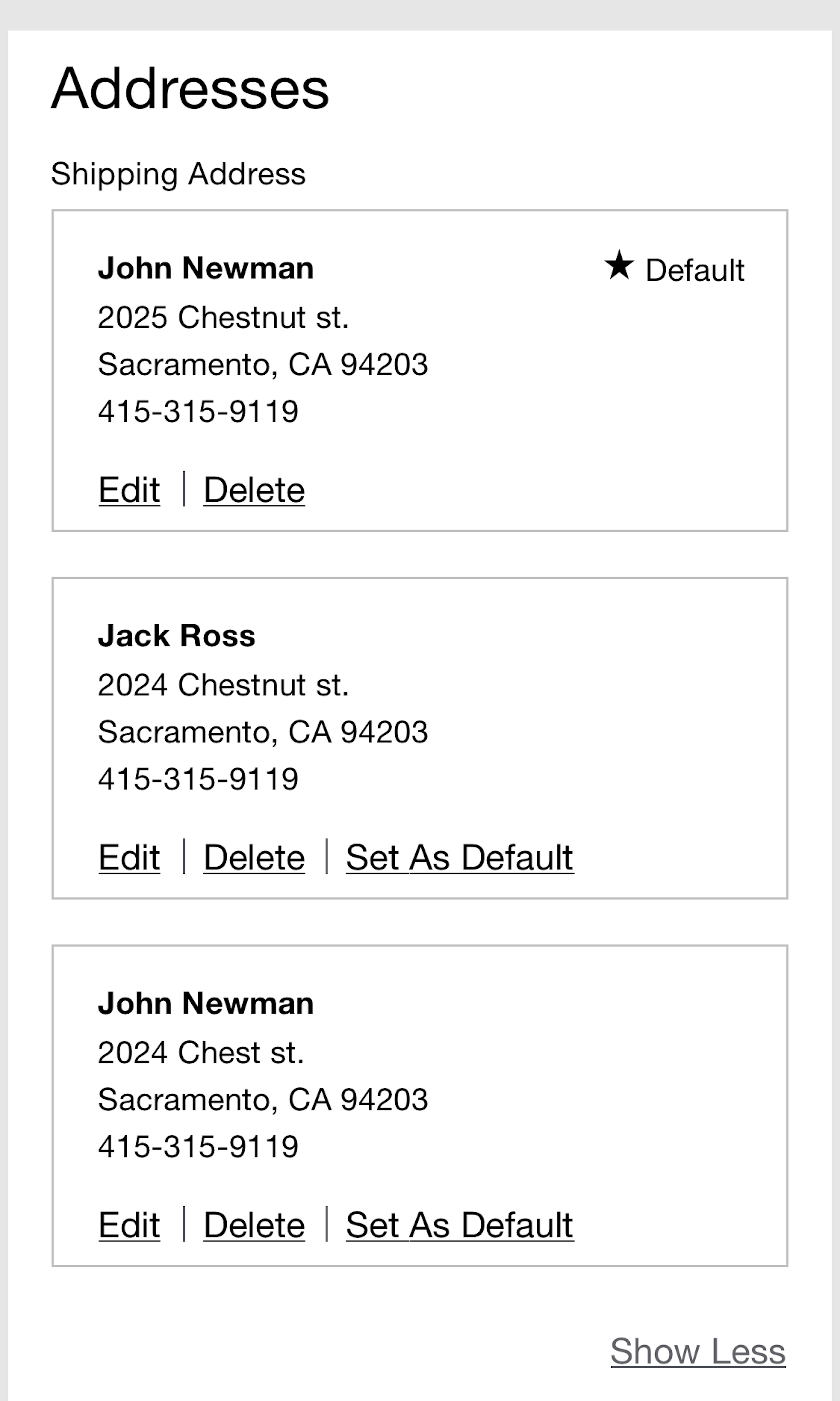
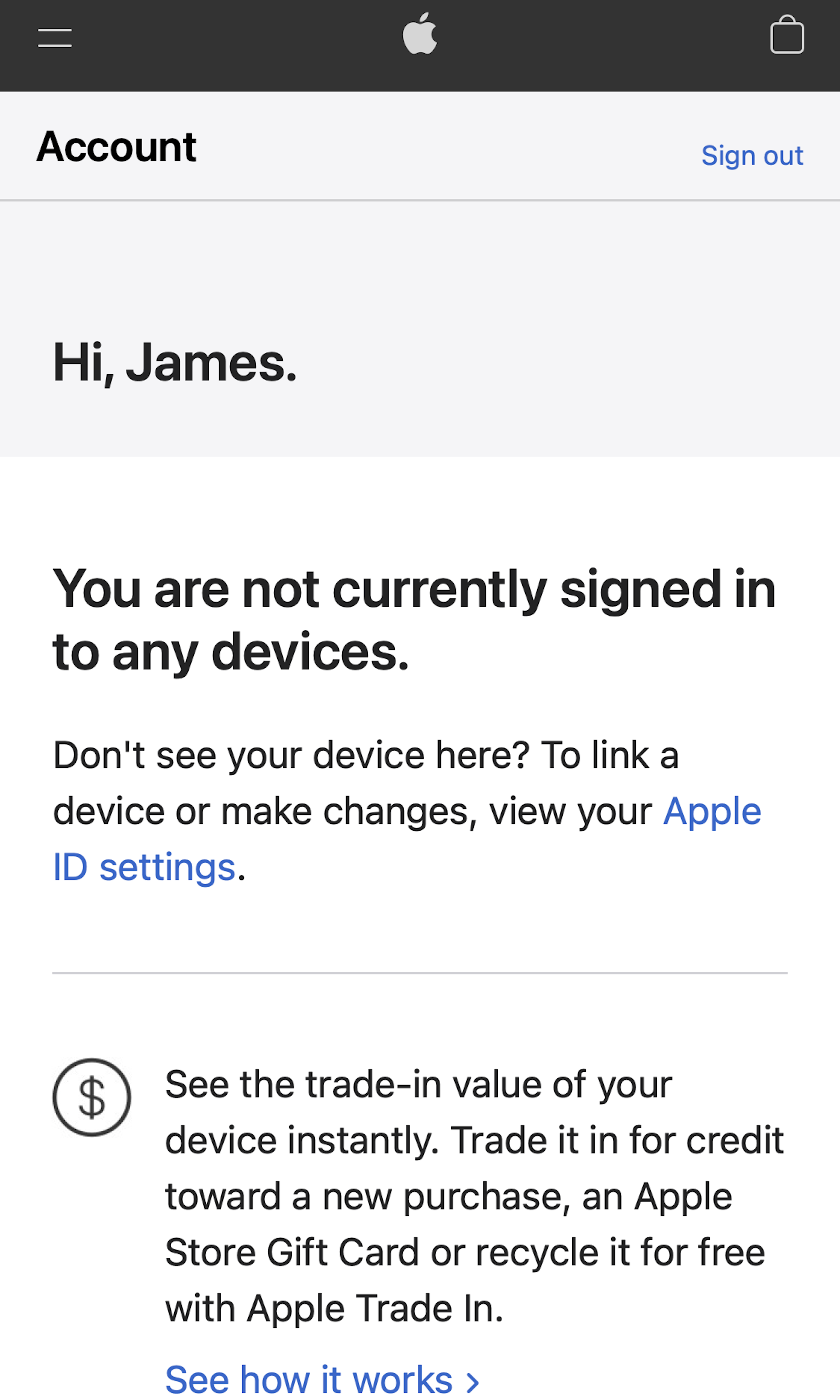
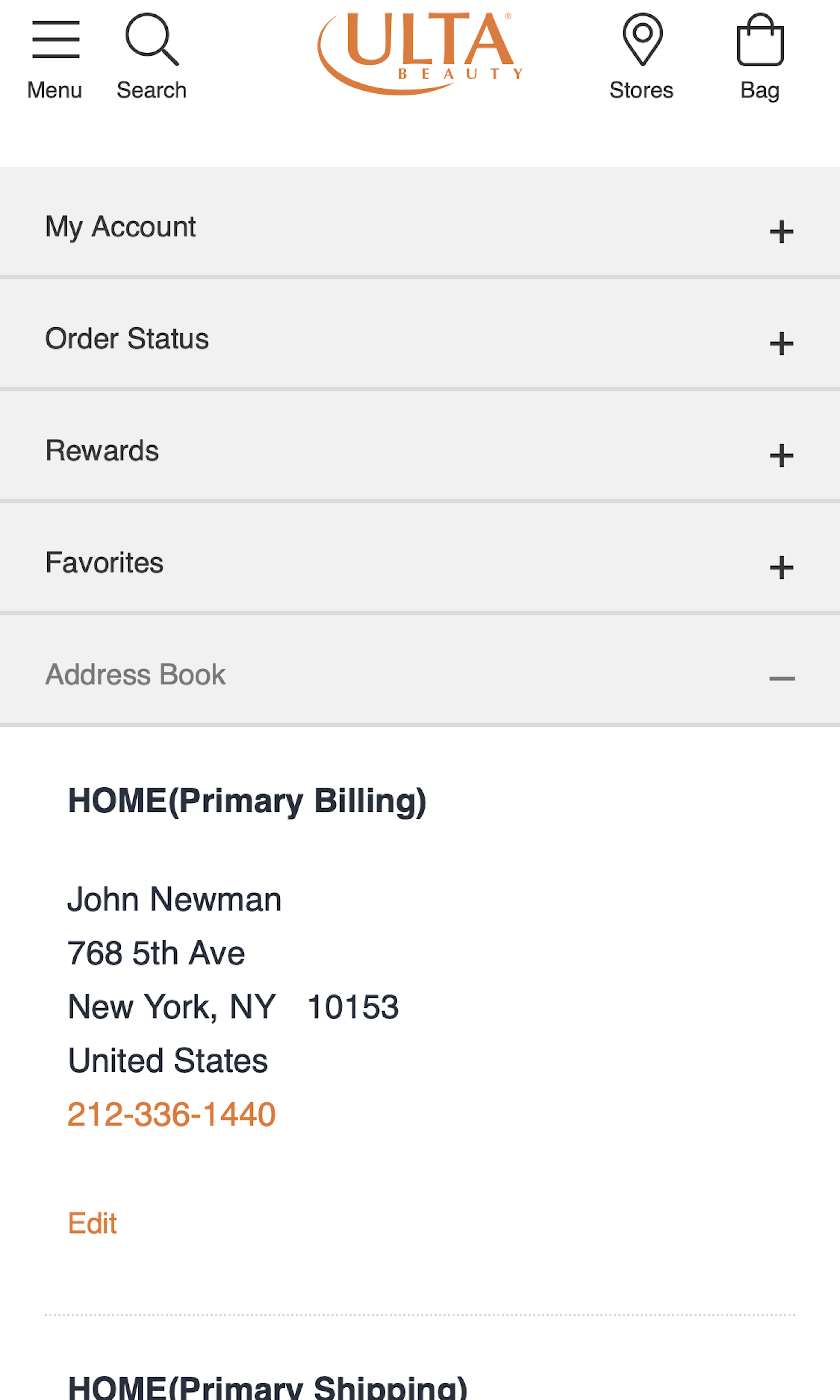
723 ‘Address Book’ Design Examples
Also referred to as: Stored Addresses
What’s this? Here you’ll find 723 “Address Book” full-page screenshots annotated with research-based UX insights, sourced from Baymard’s UX benchmark of 327 e-commerce sites. (Note: this is less than 1% of the full research catalog.)
The concept of ‘Stored Addresses’ and address books are somewhat unique when it comes to e-commerce account features, because users can both manage the stored addresses while within their Self-Service account area (i.e., in the address book feature), or they can manage their stored addresses directly during the checkout flow.
In practice, this means that most of the addresses in a user’s ‘Address Book’ haven’t been added from within that interface, but rather during the checkout flow. During our large-scale usability testing of Accounts & Self-Service UX this special context was observed to set forth a series of requirements for ‘Address Book’ designs – particularly in regards to editing an existing address vs. adding a new address, and setting a “default address”.
Our large-scale usability testing also revealed that while ‘Address Book’ is the term often used by web professionals for this feature, normal web users have issues recognizing this terminology. Likely as most users didn’t add their addresses themselves, it was automatically added during checkout – hence the feature should generally not be labeled ‘Address Book’ in the account interface.
More ‘Address Book Design’ Insights
-
During testing we also observed that some sites nudge users to either “edit” or “add” an address, rather than present the options equally in the interface. As a result, users who are nudged to, for instance, “Add” rather than “Edit” an address tend to accumulate outdated addresses, increasing the chance that the user will select the wrong address during subsequent checkout.
-
Learn More: Besides exploring the 723 “Address Book” design examples below, you may also want to read our related articles on “New Research Findings on ‘Accounts & Self-Service’ UX”, “‘Cards’ Dashboards Must Be Highly Consistent and Appropriately Styled”, “Form Field Simplification”, or see the related page design examples for “Shipping Address” step during Checkout flows.
-
Get Full Access: To see all of Baymard’s design guidelines on Accounts & Self-Service pages and features you’ll need Baymard Premium access. (Premium also provides you full access to 200,000+ hours of UX research findings, 650+ e-commerce UX guidelines, and 275,000+ UX performance scores.)
User Experience Research, Delivered Weekly
Join 60,000+ UX professionals and get a new UX article every week.

User Experience Research, Delivered Weekly
Join 60,000+ UX professionals and get a new UX article every week.

Explore Other Research Content

300+ free UX articles based on large-scale research.

327 top sites ranked by UX performance.

Code samples, demos, and key stats for usability.


