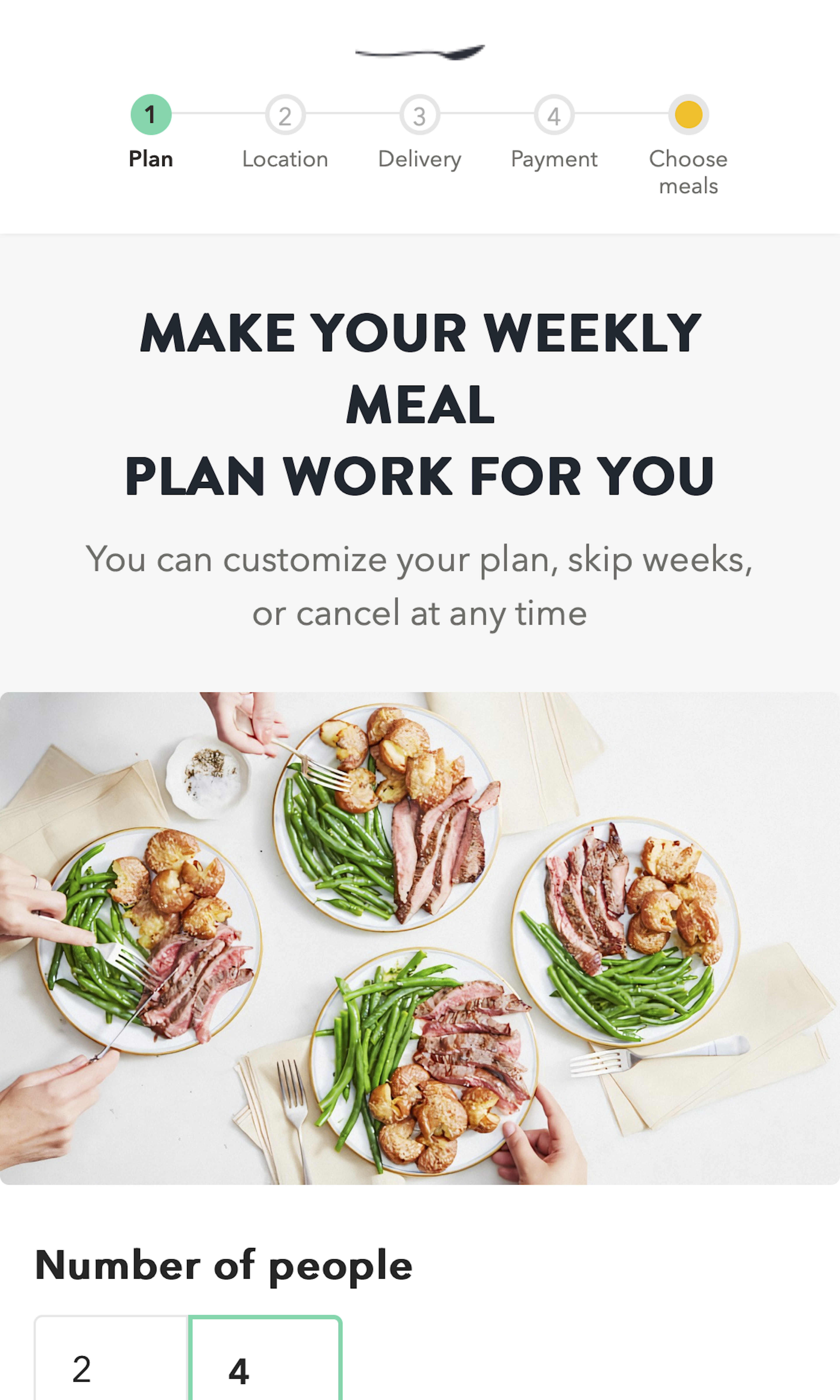
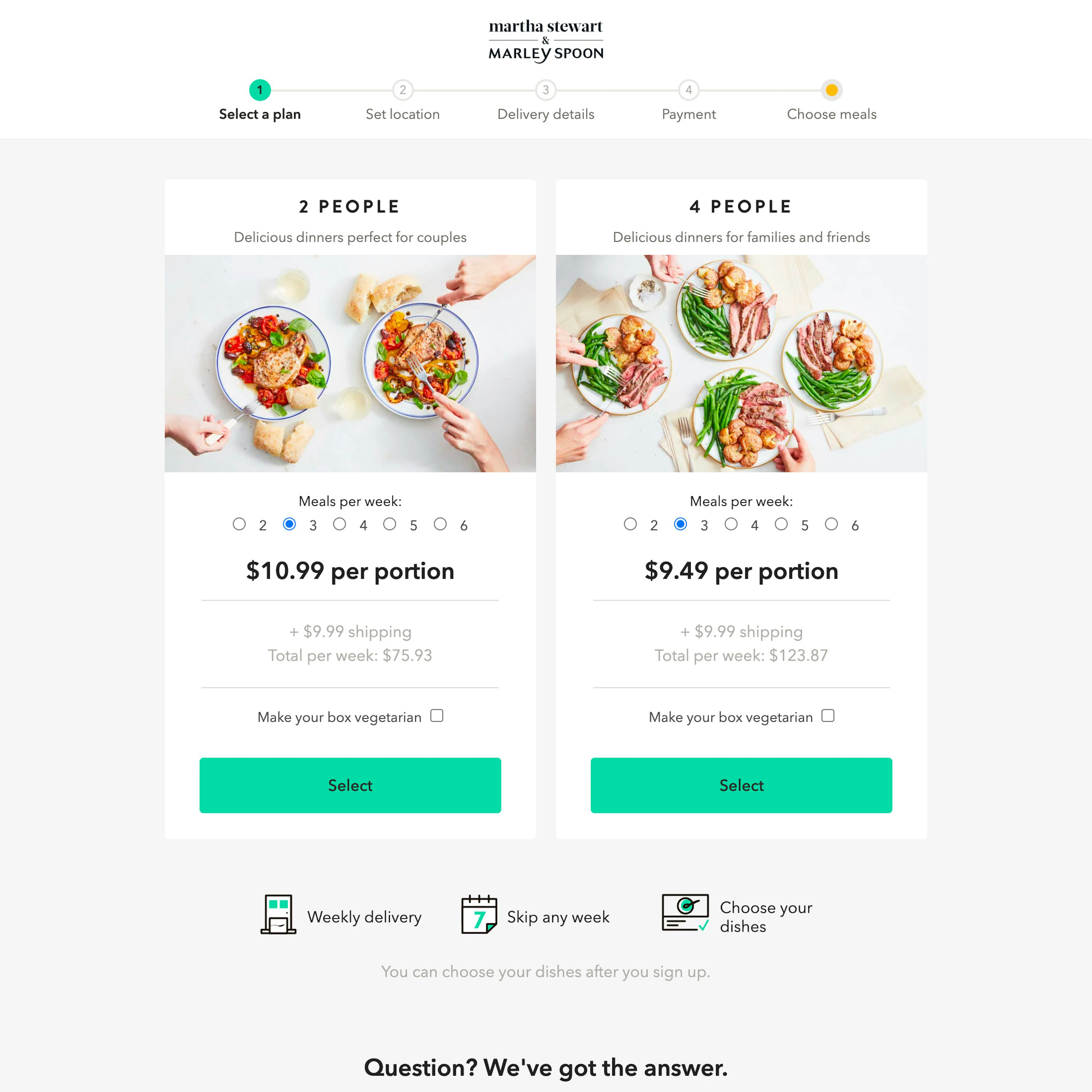
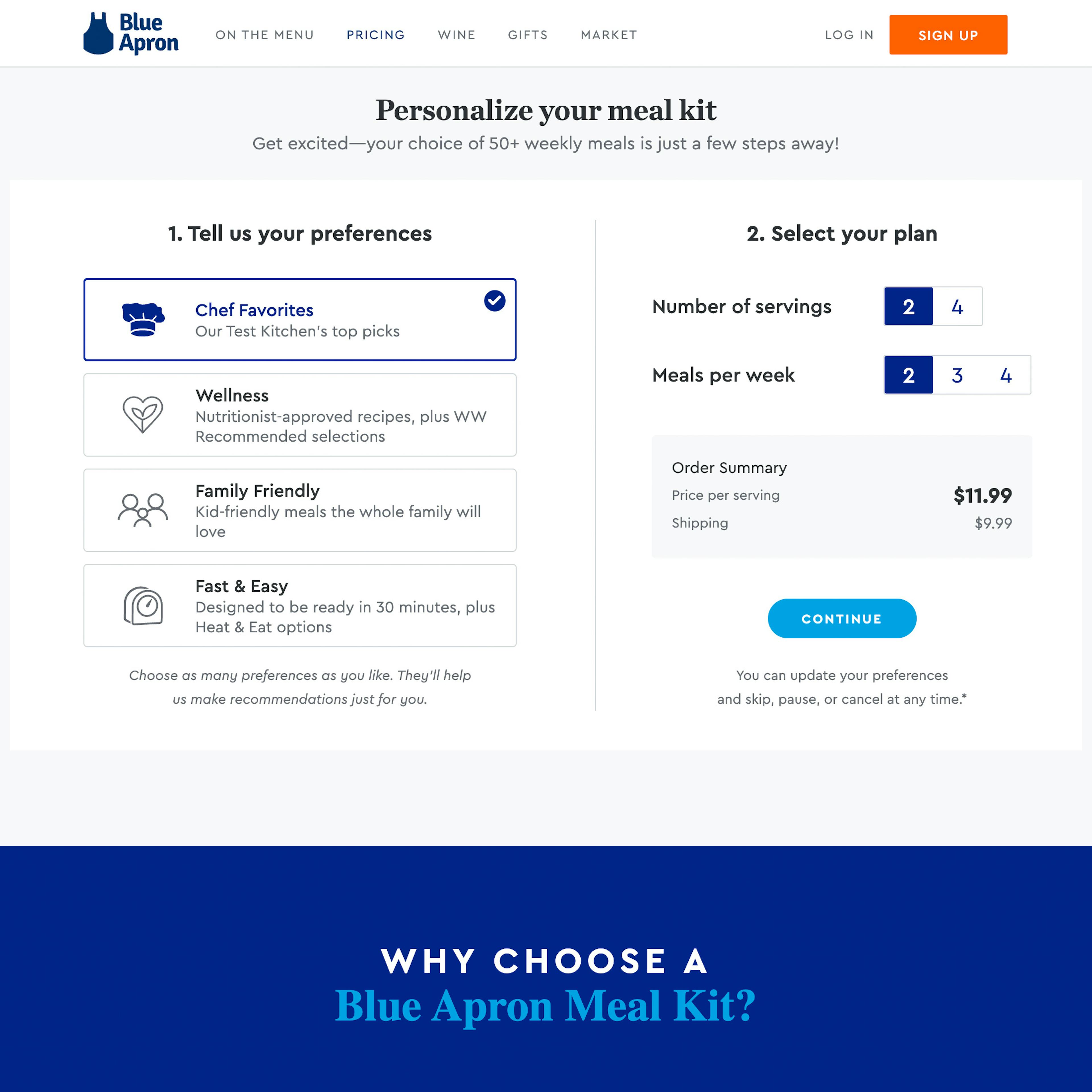
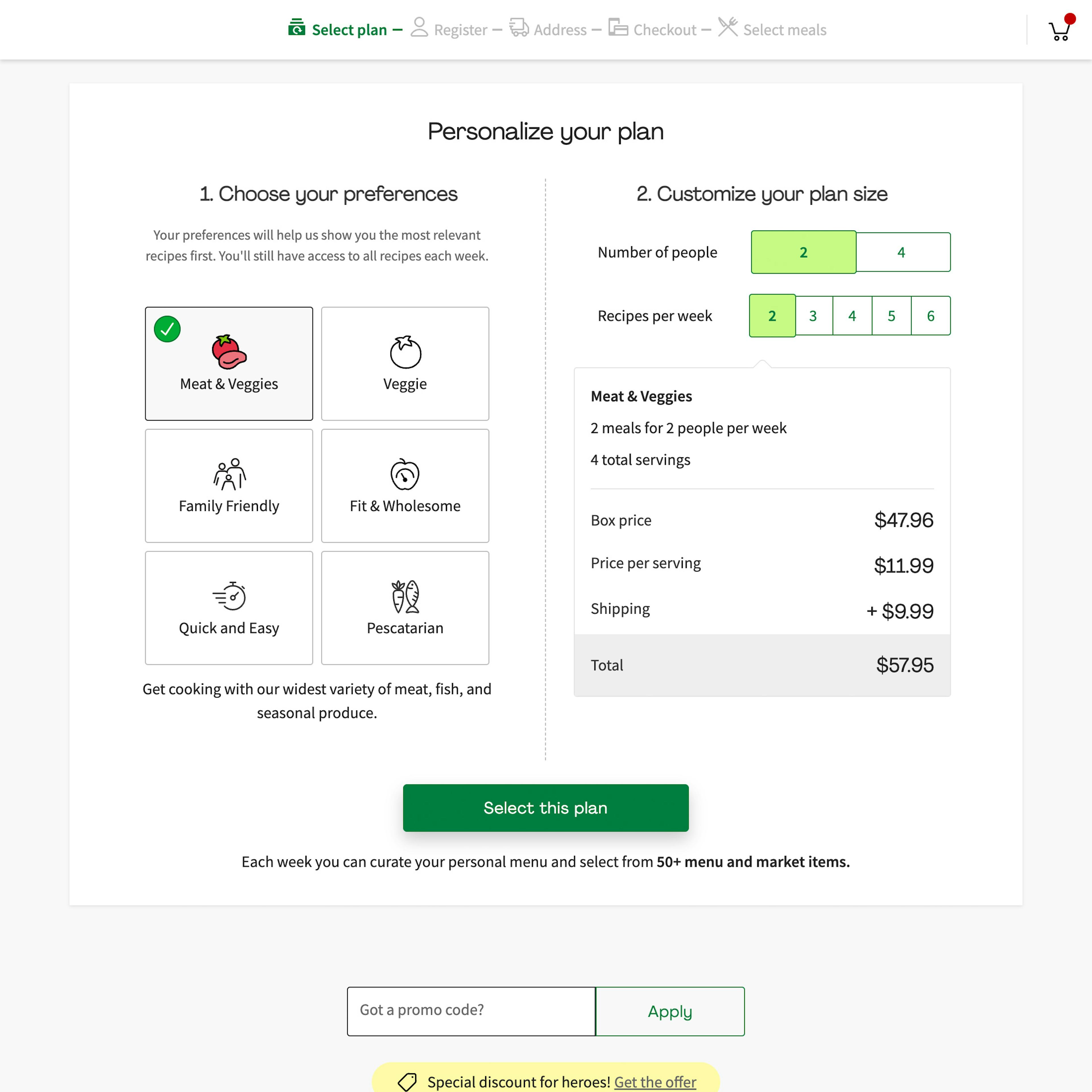
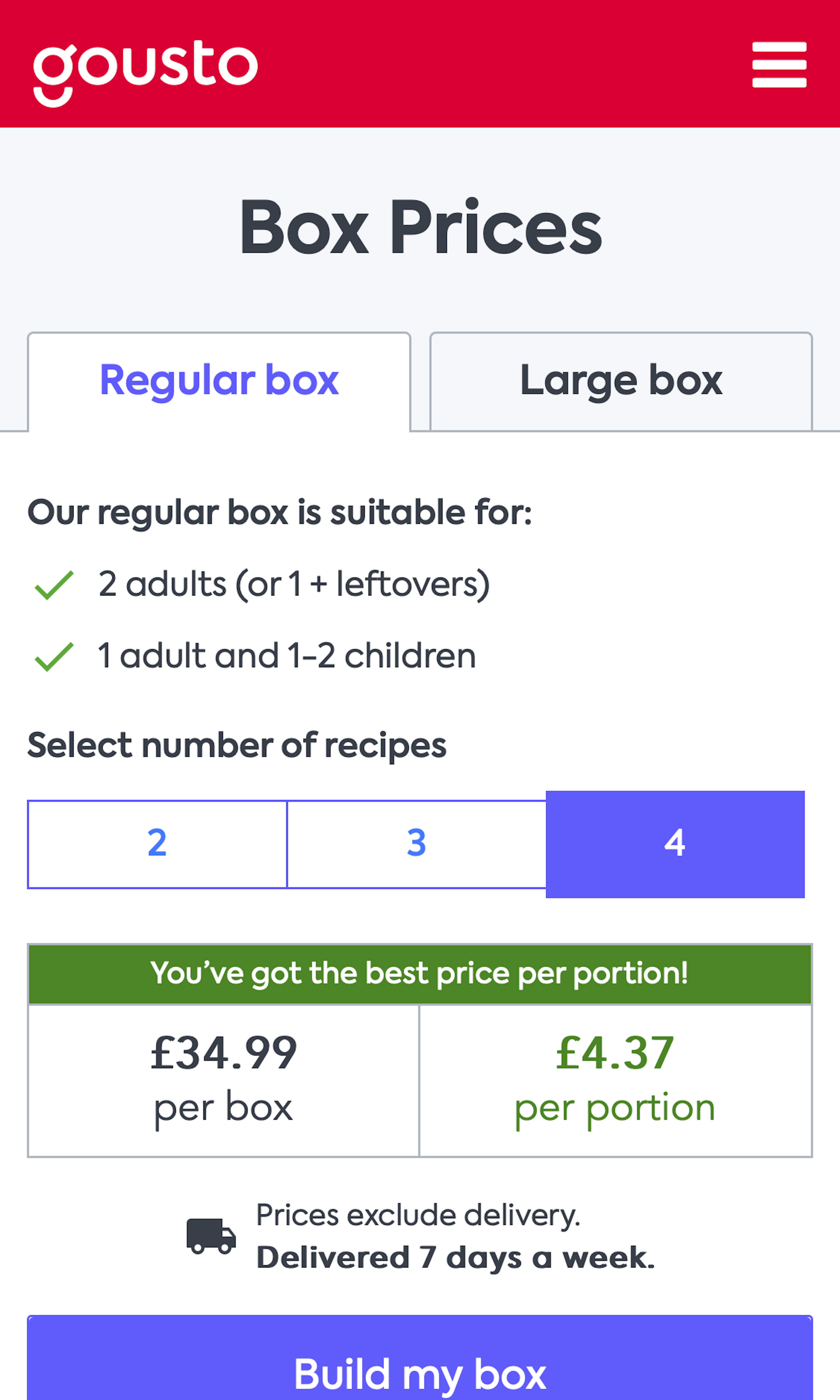
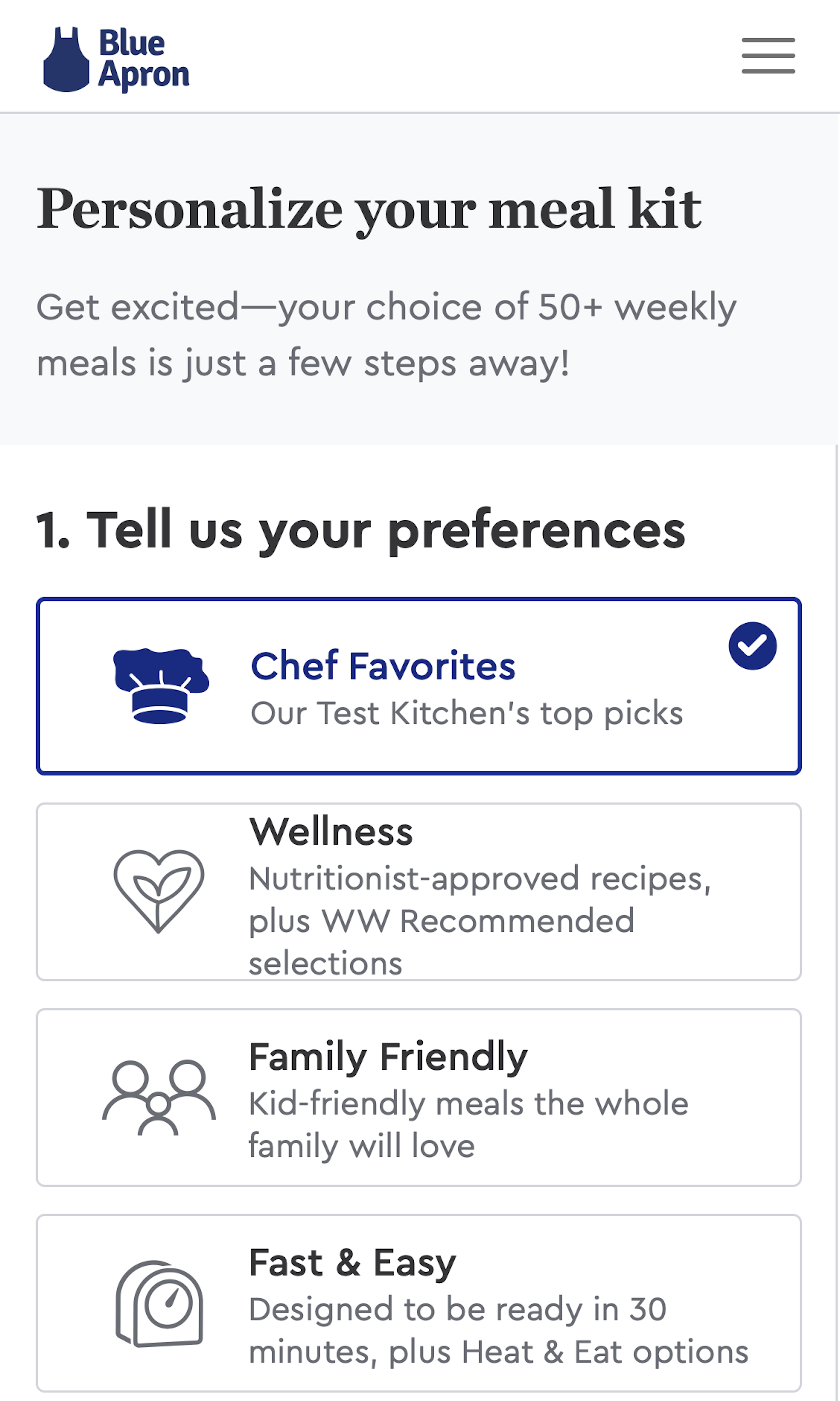
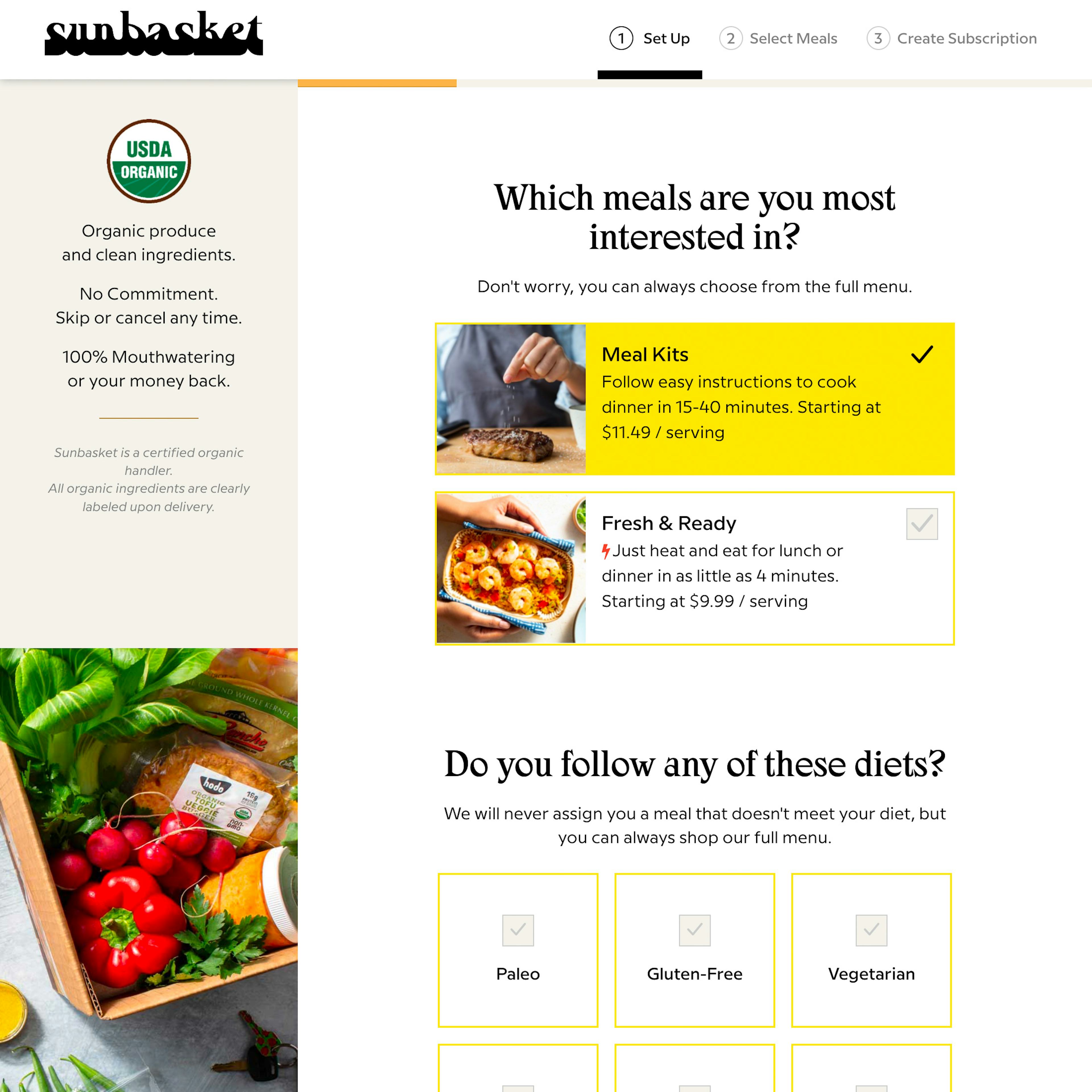
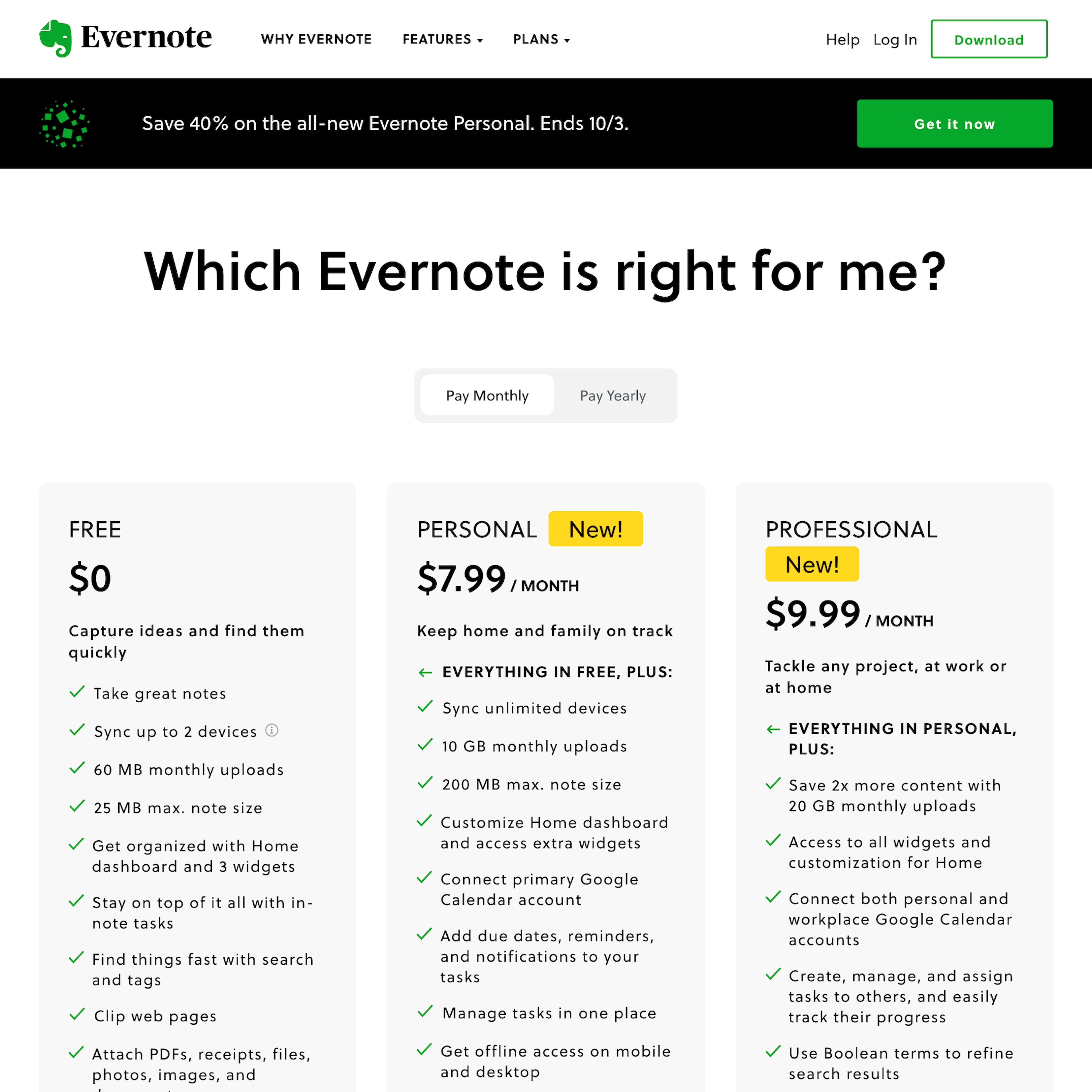
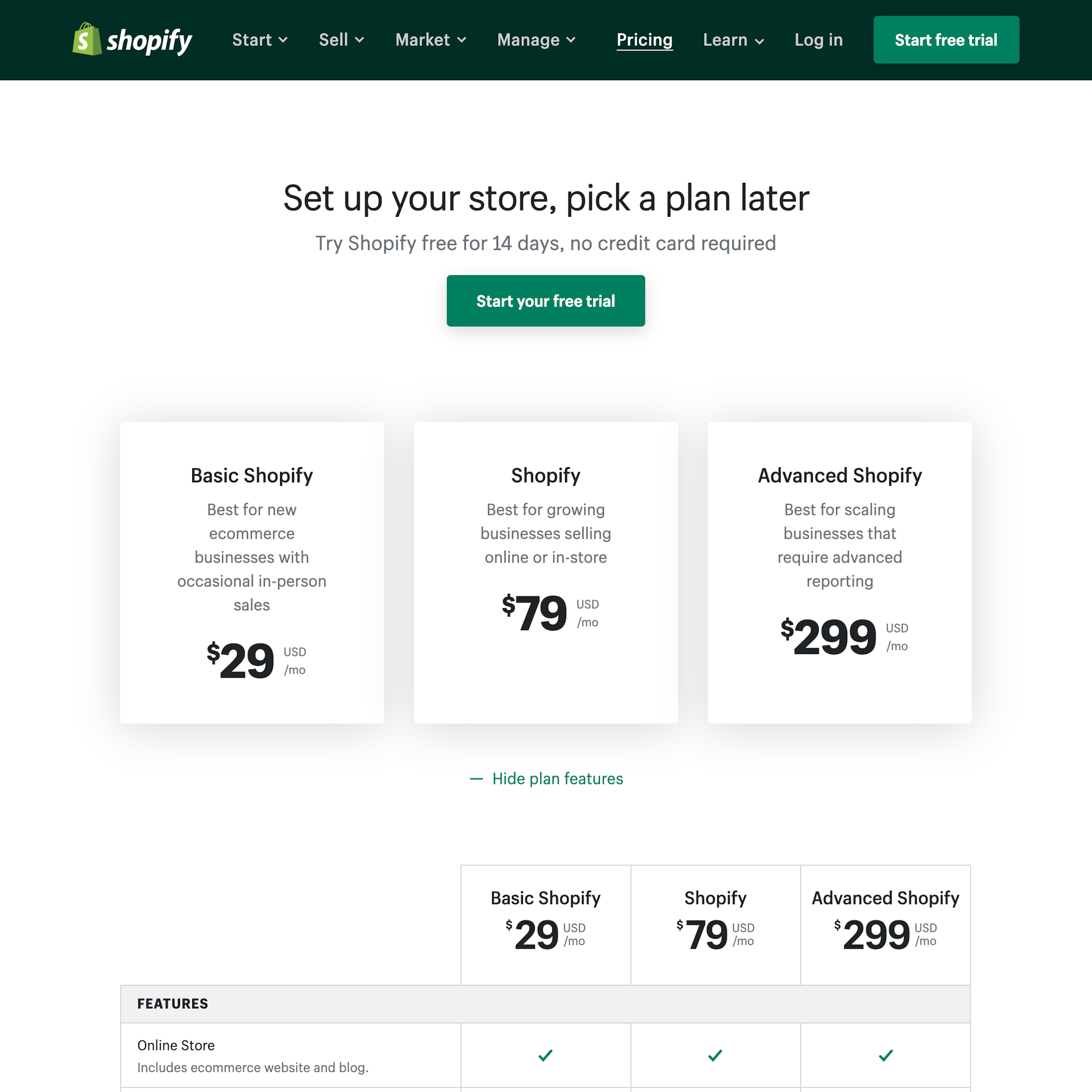
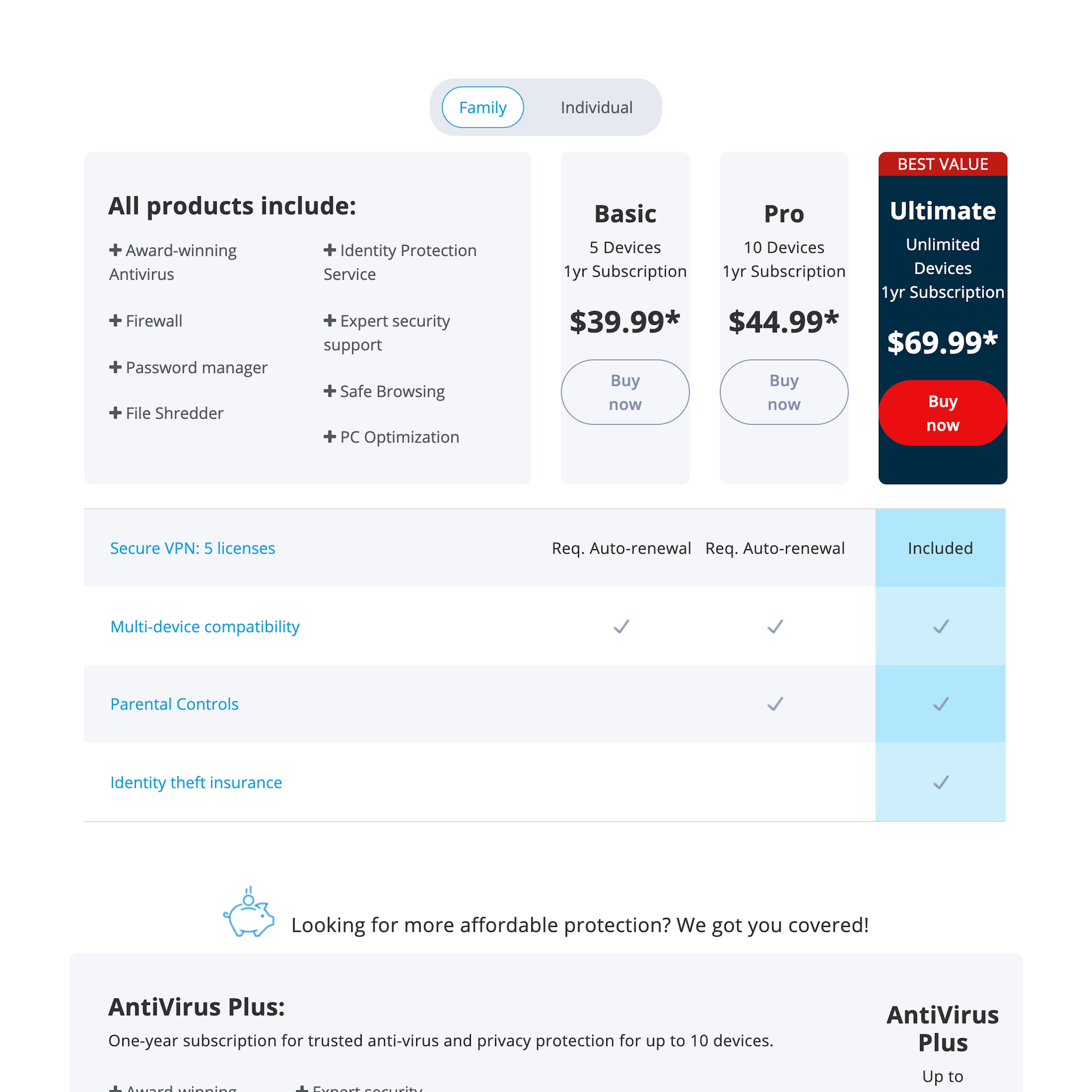
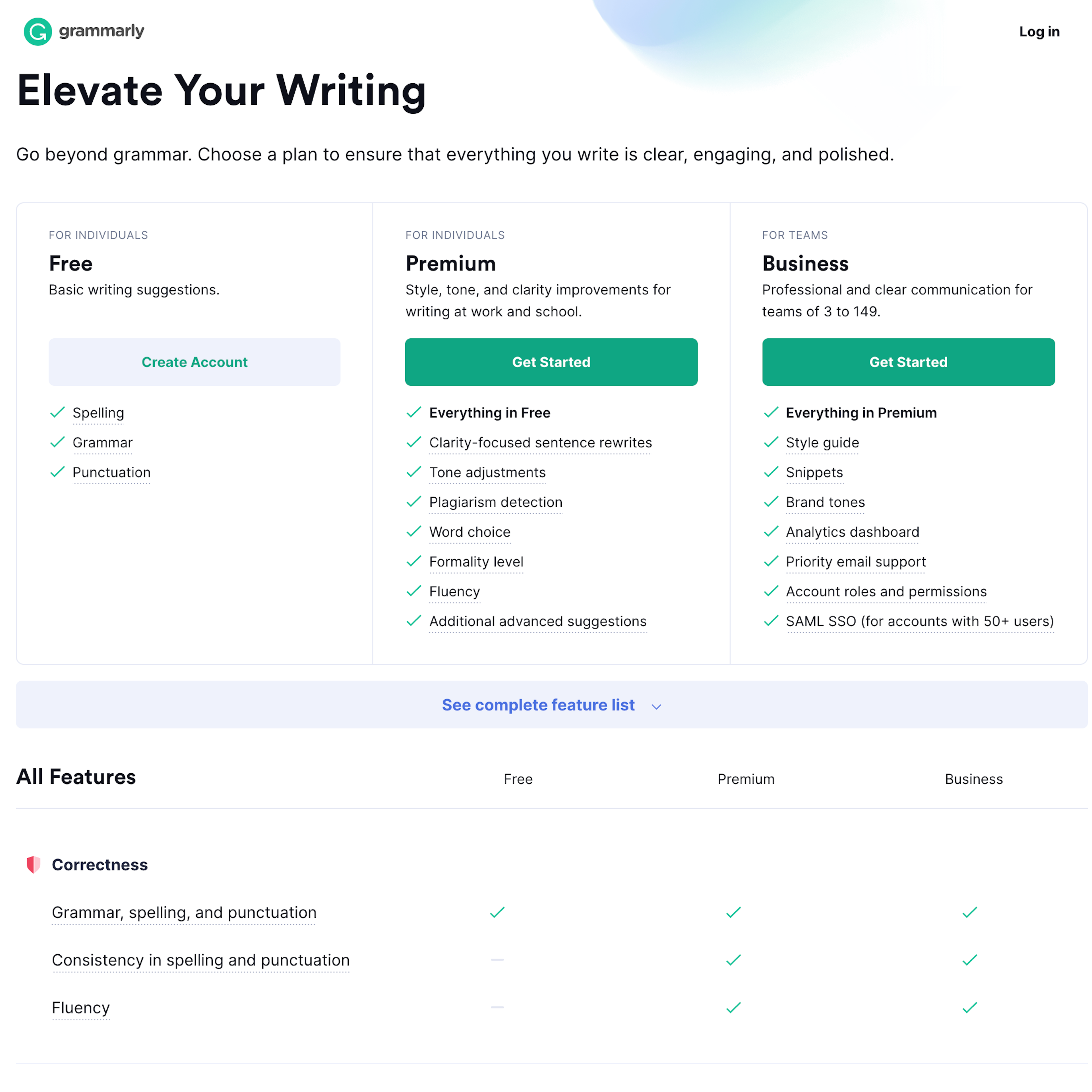
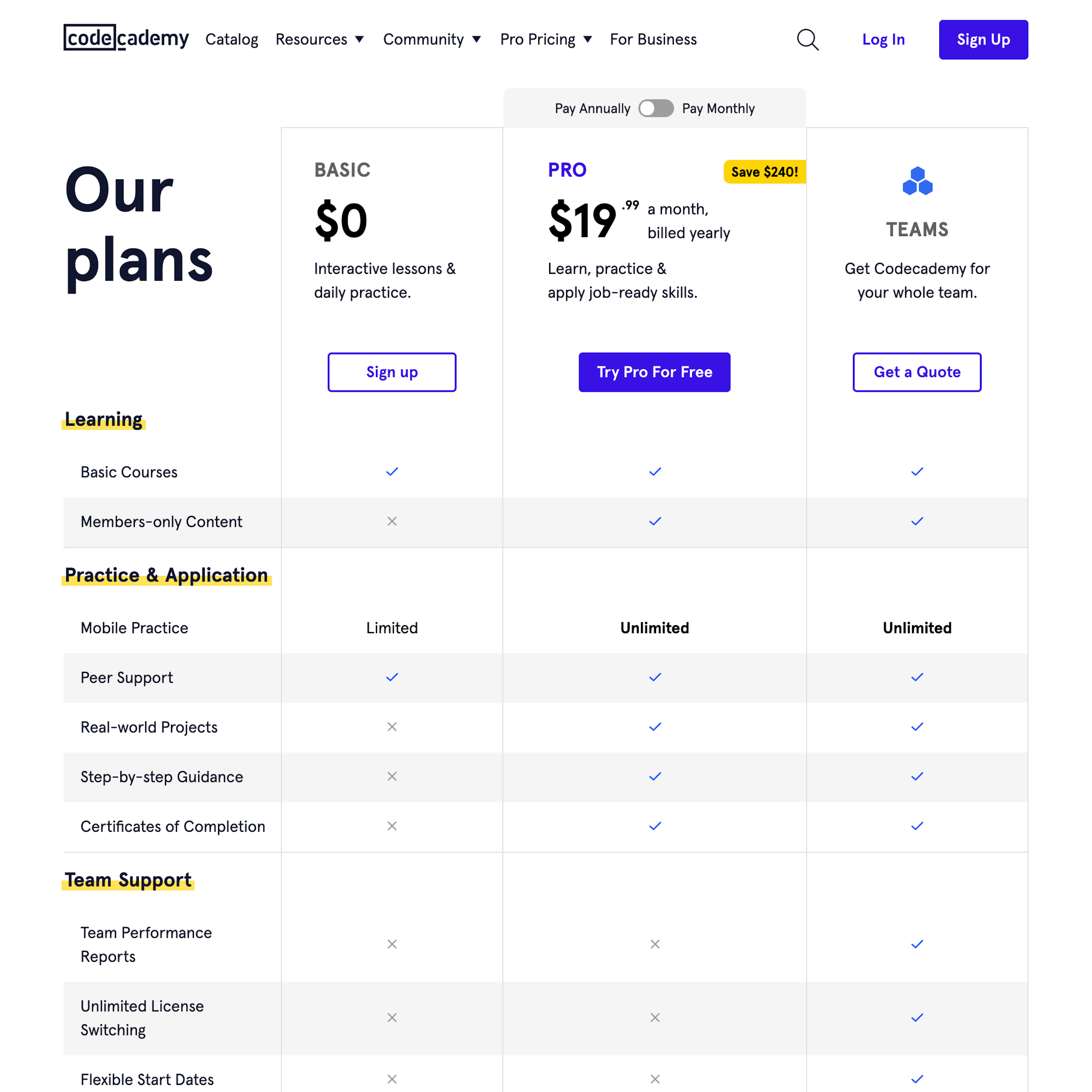
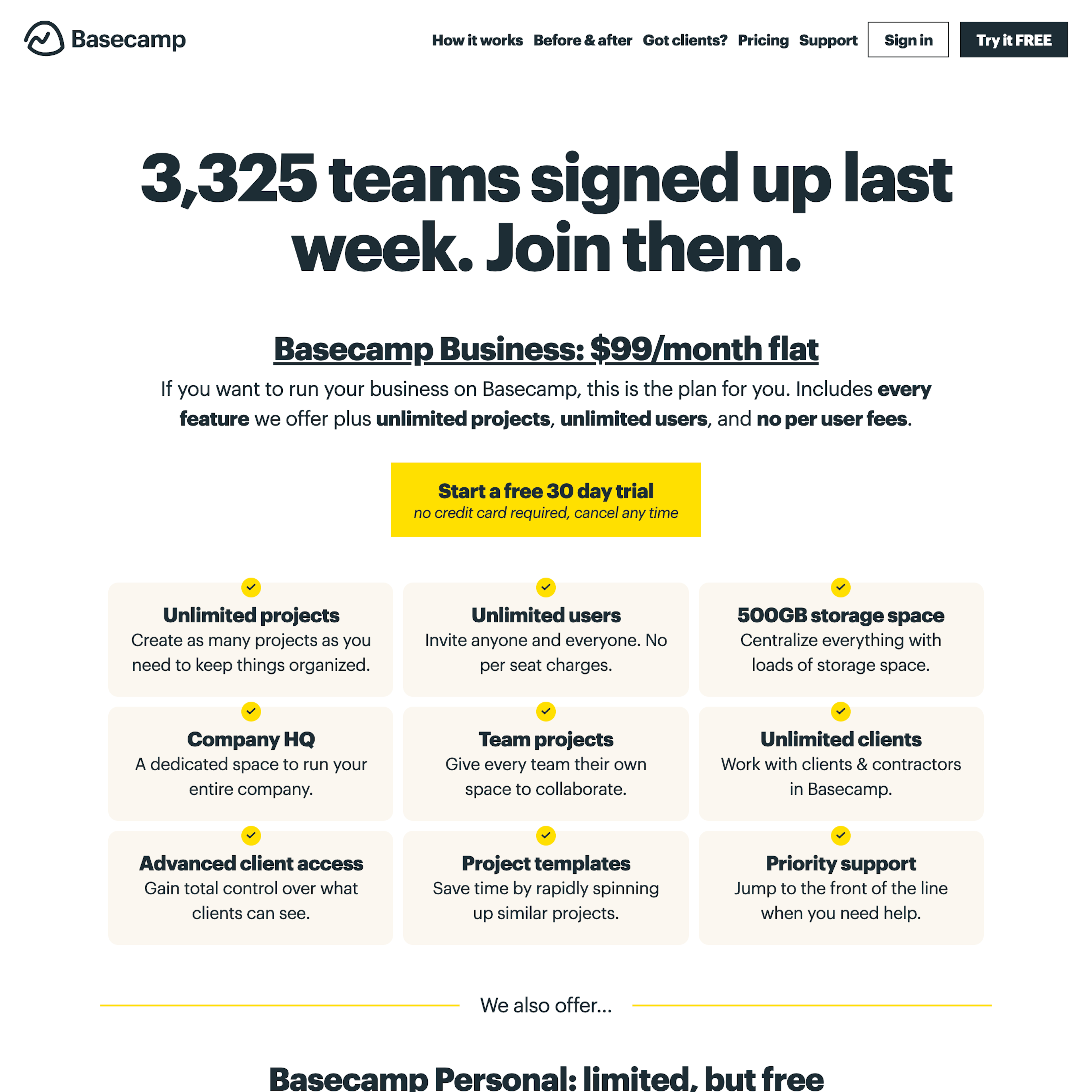
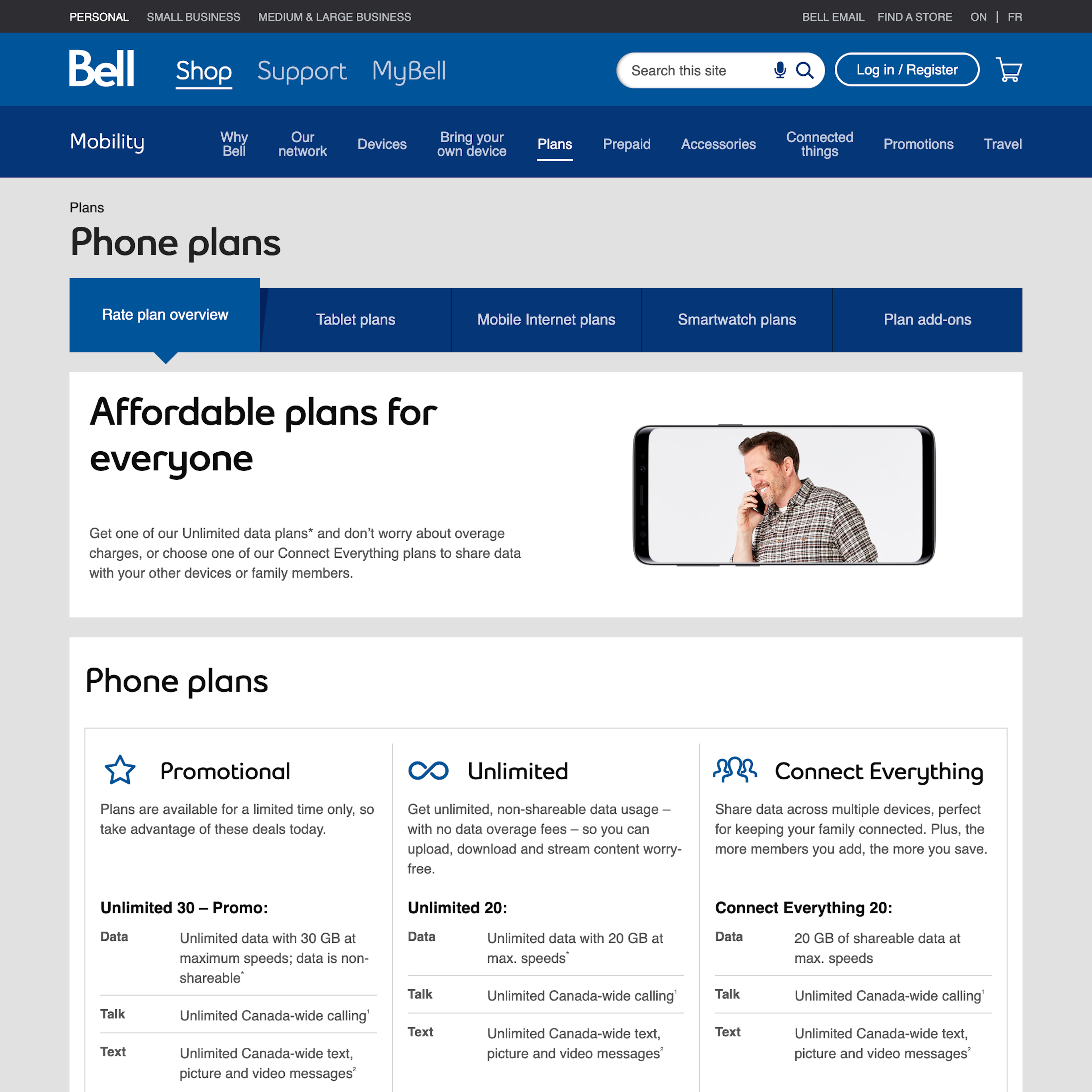
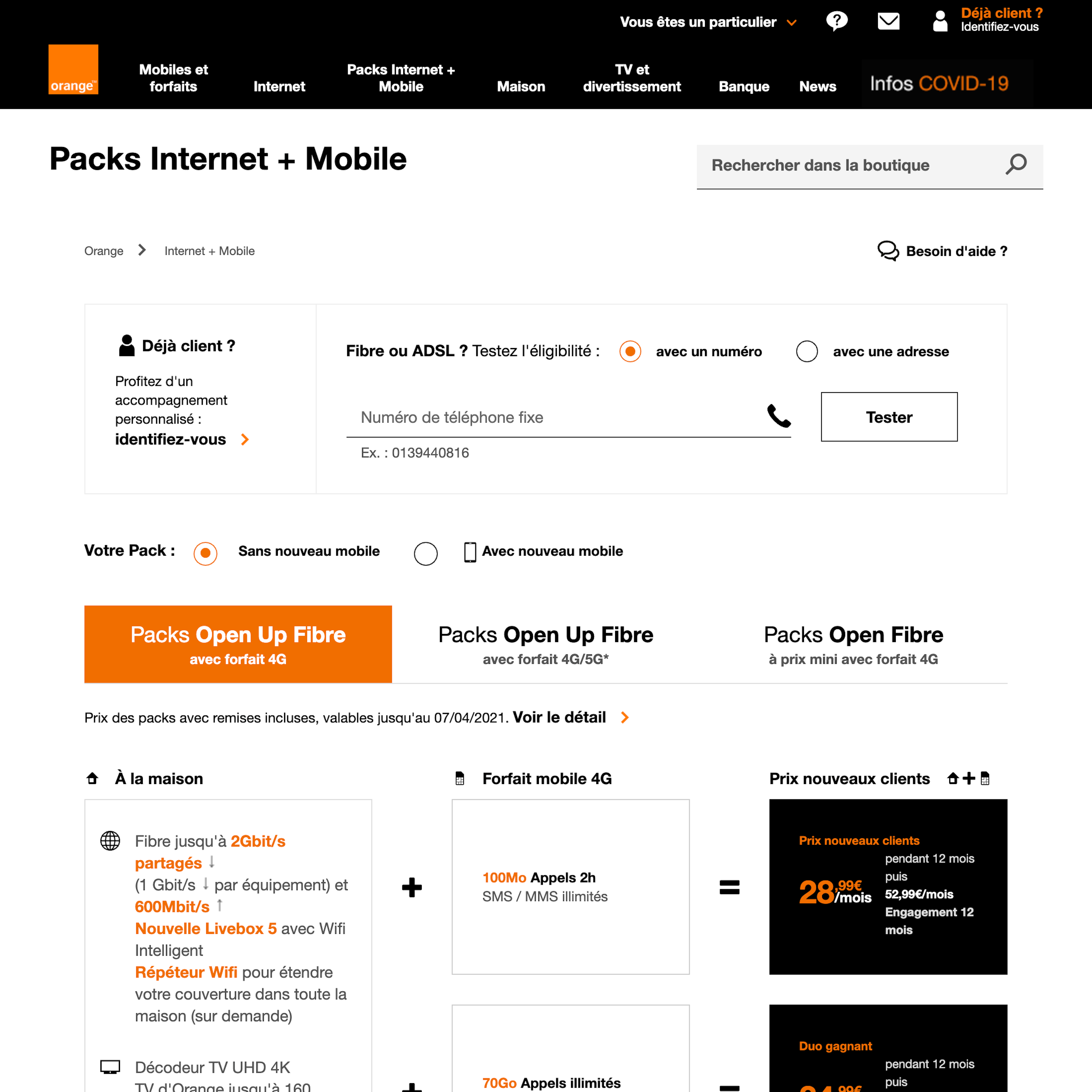
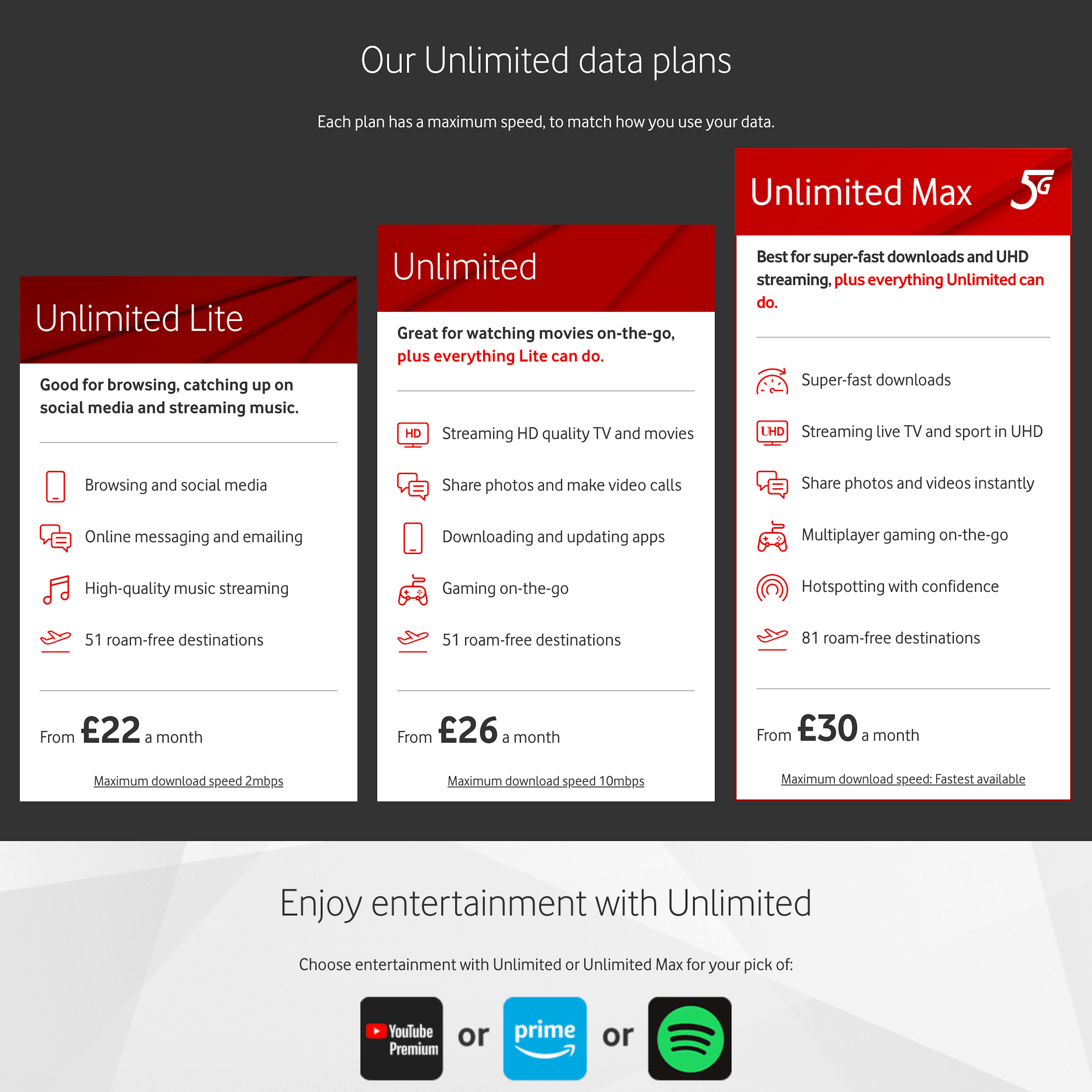
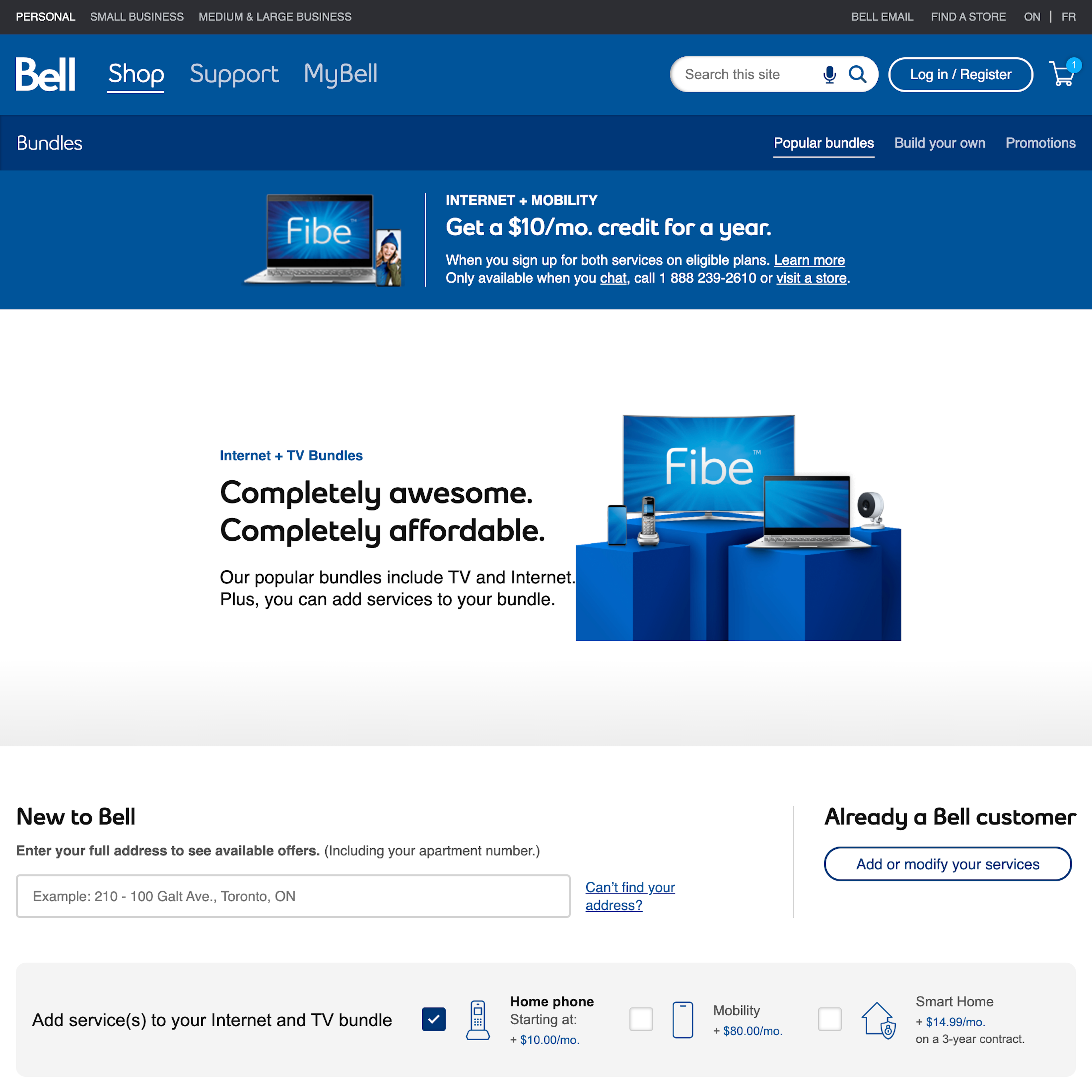
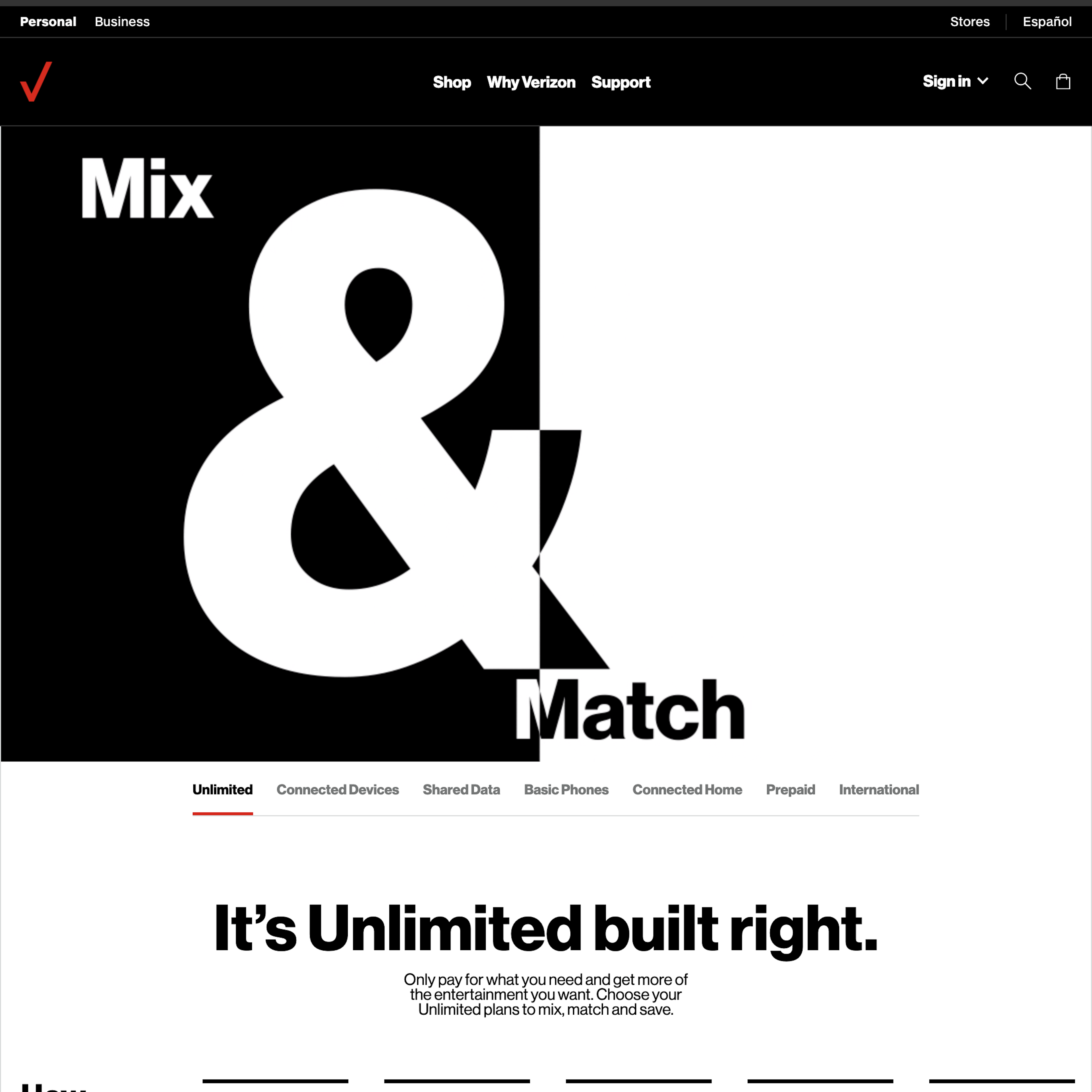
79 ‘Plan Matrix’ Design Examples
Also referred to as: Pricing Page, Subscription Plans, Plan Selector, Plan Options
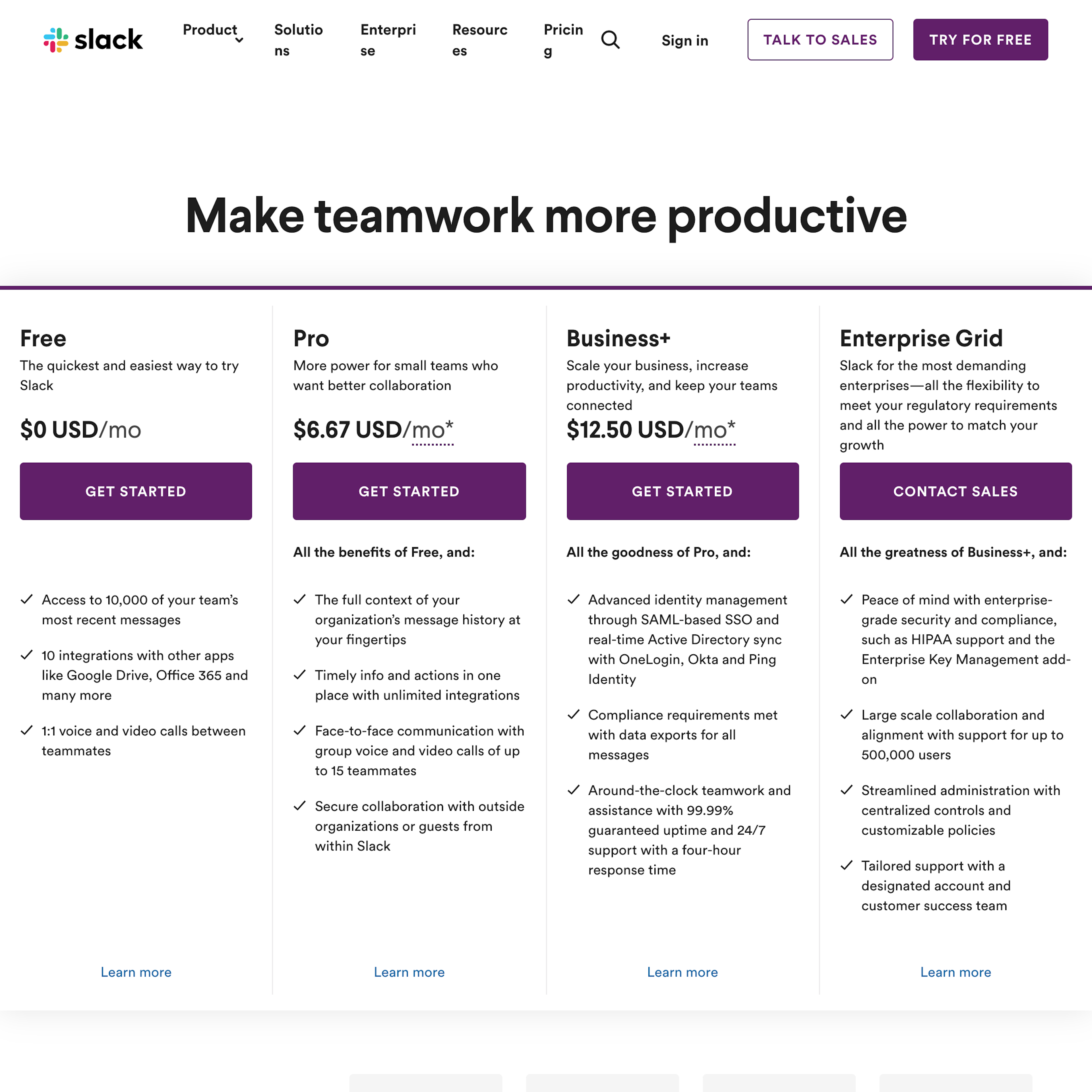
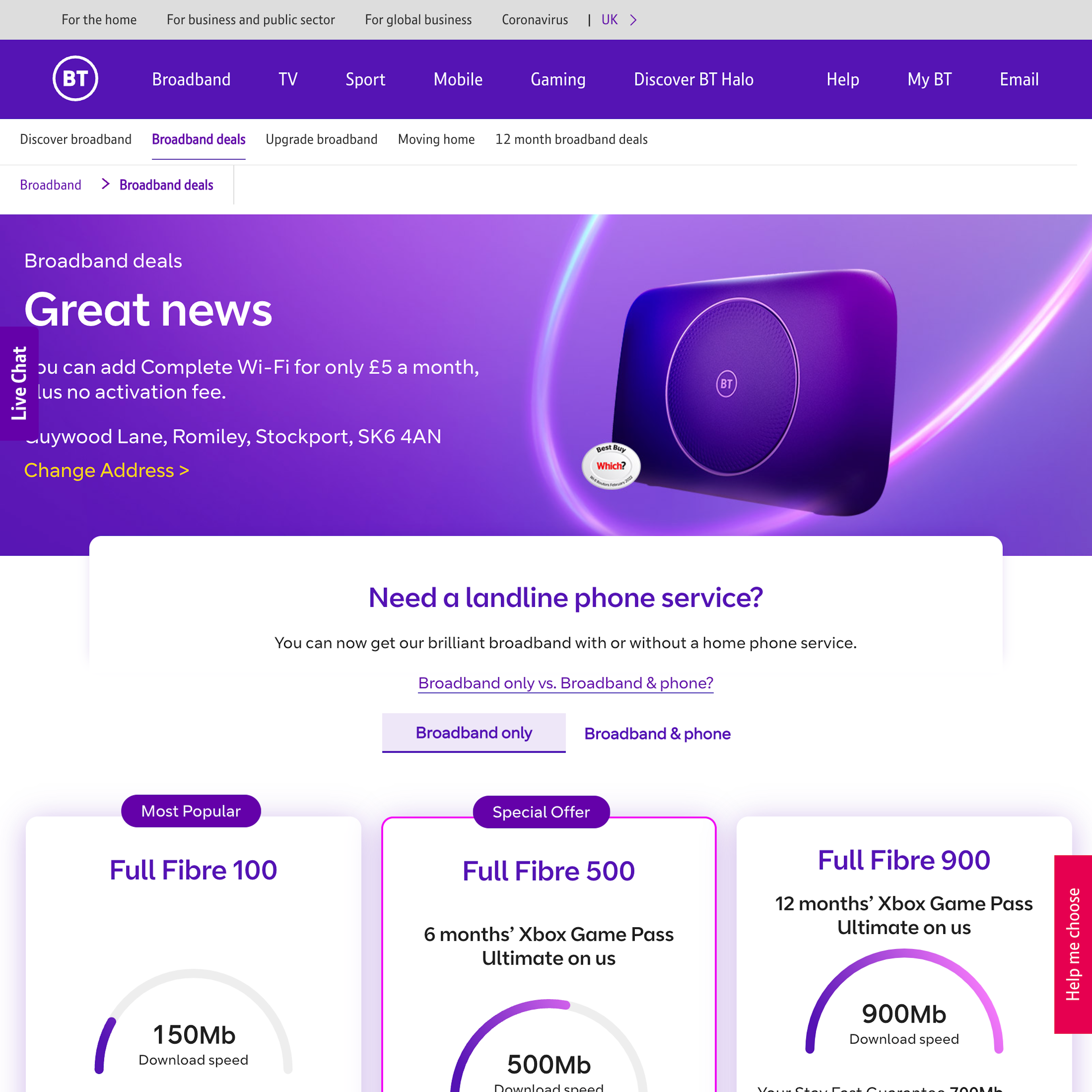
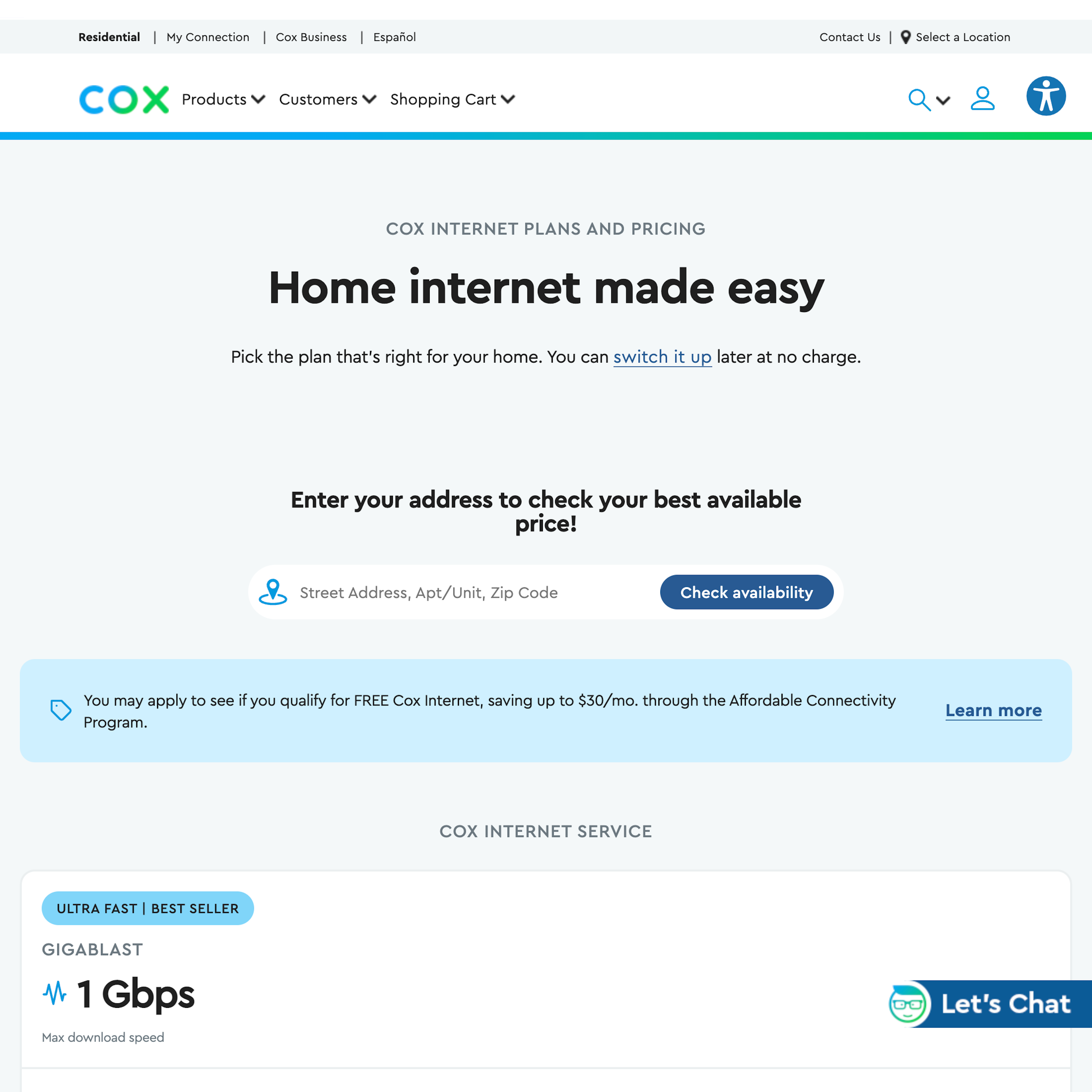
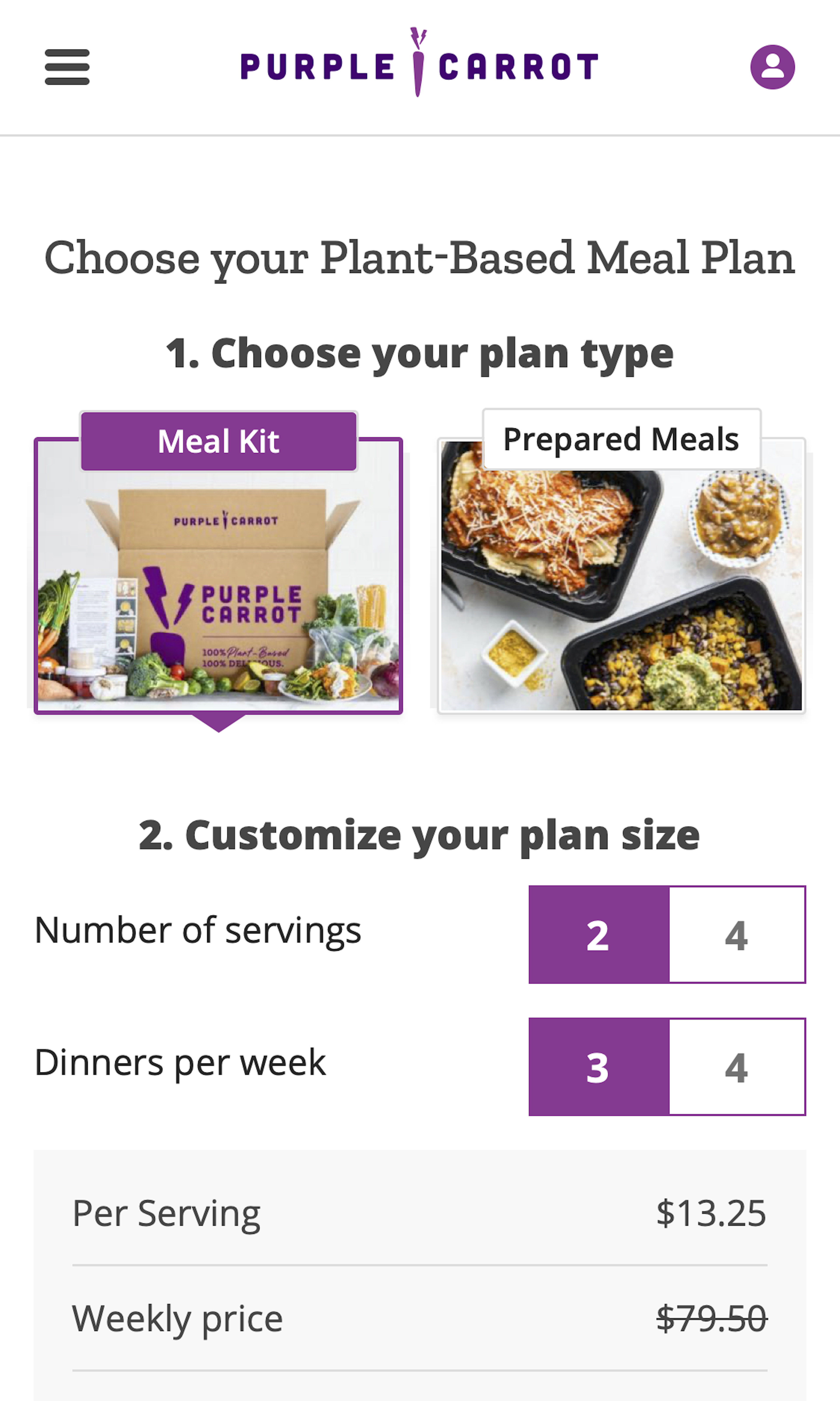
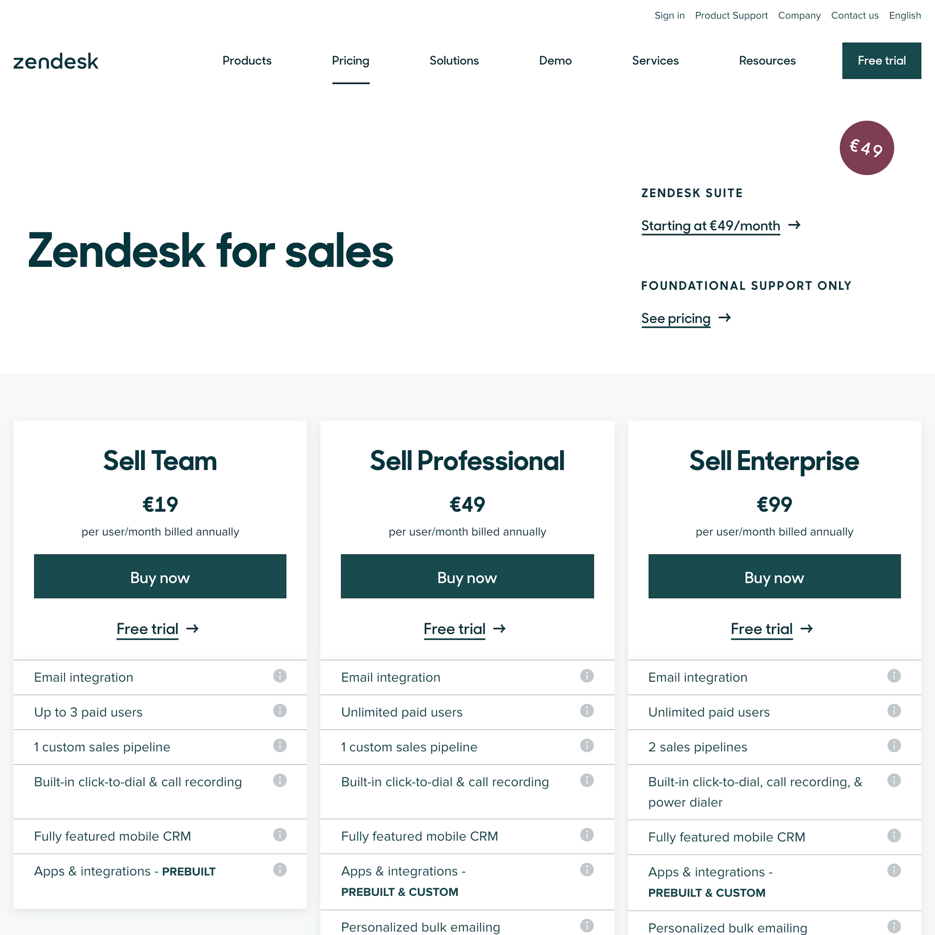
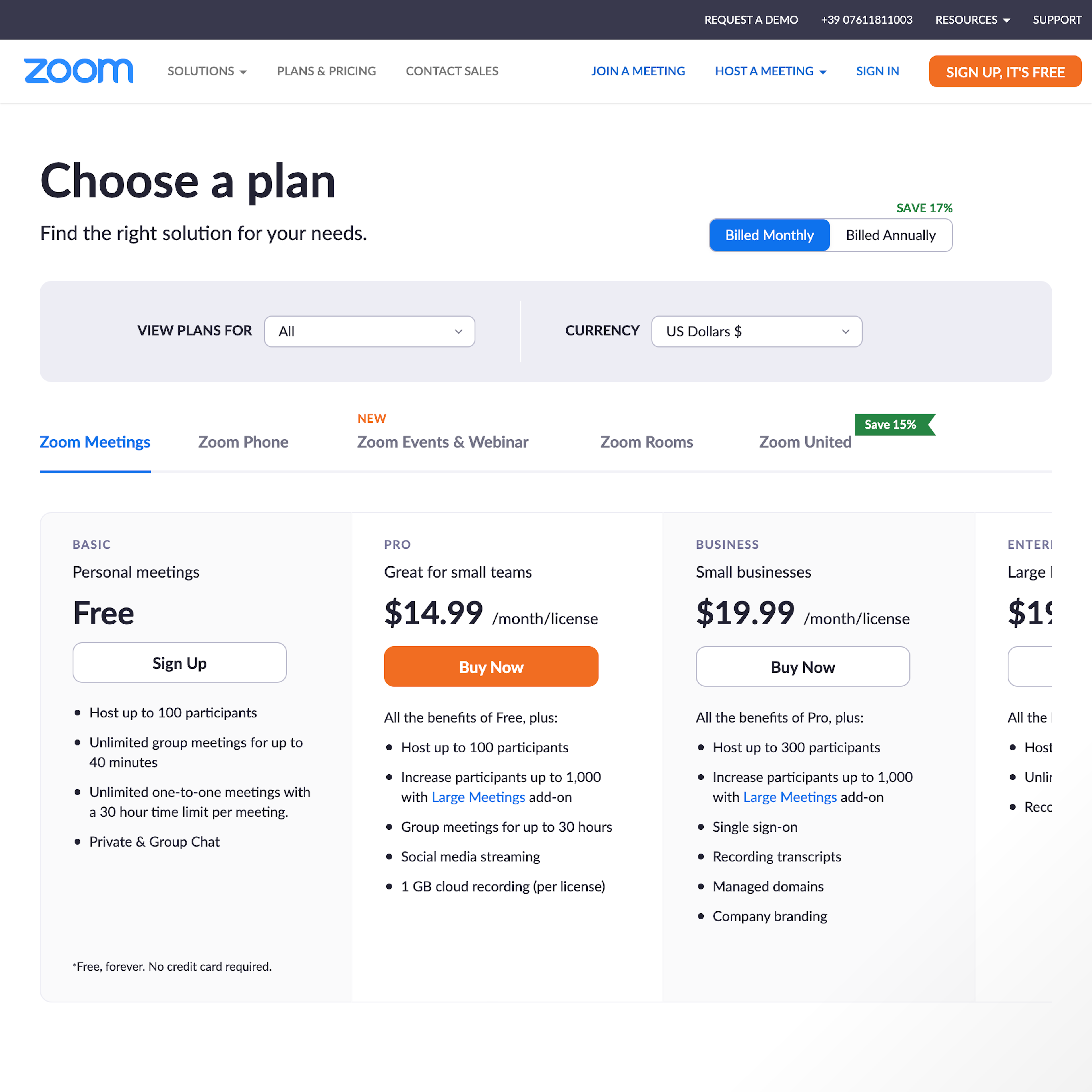
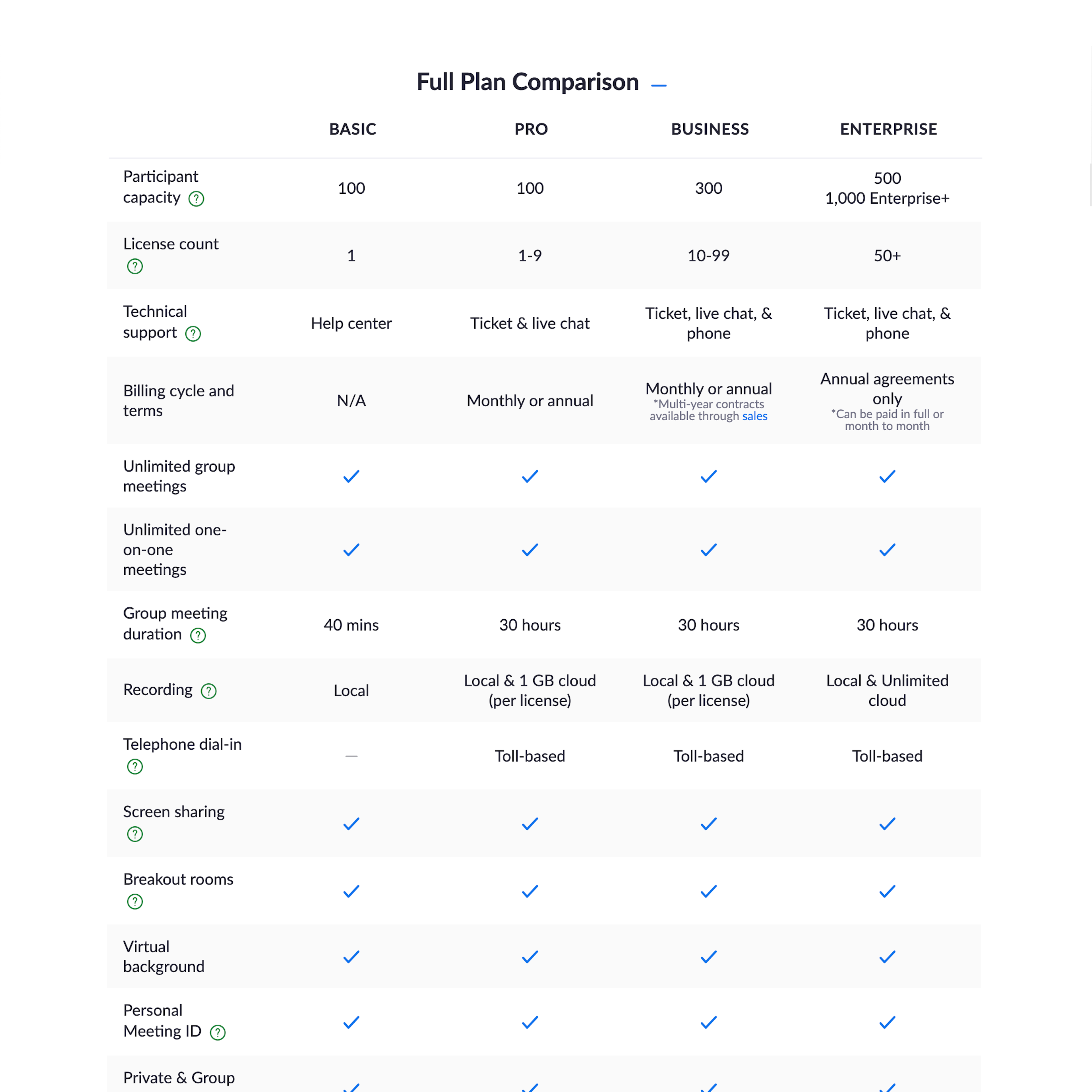
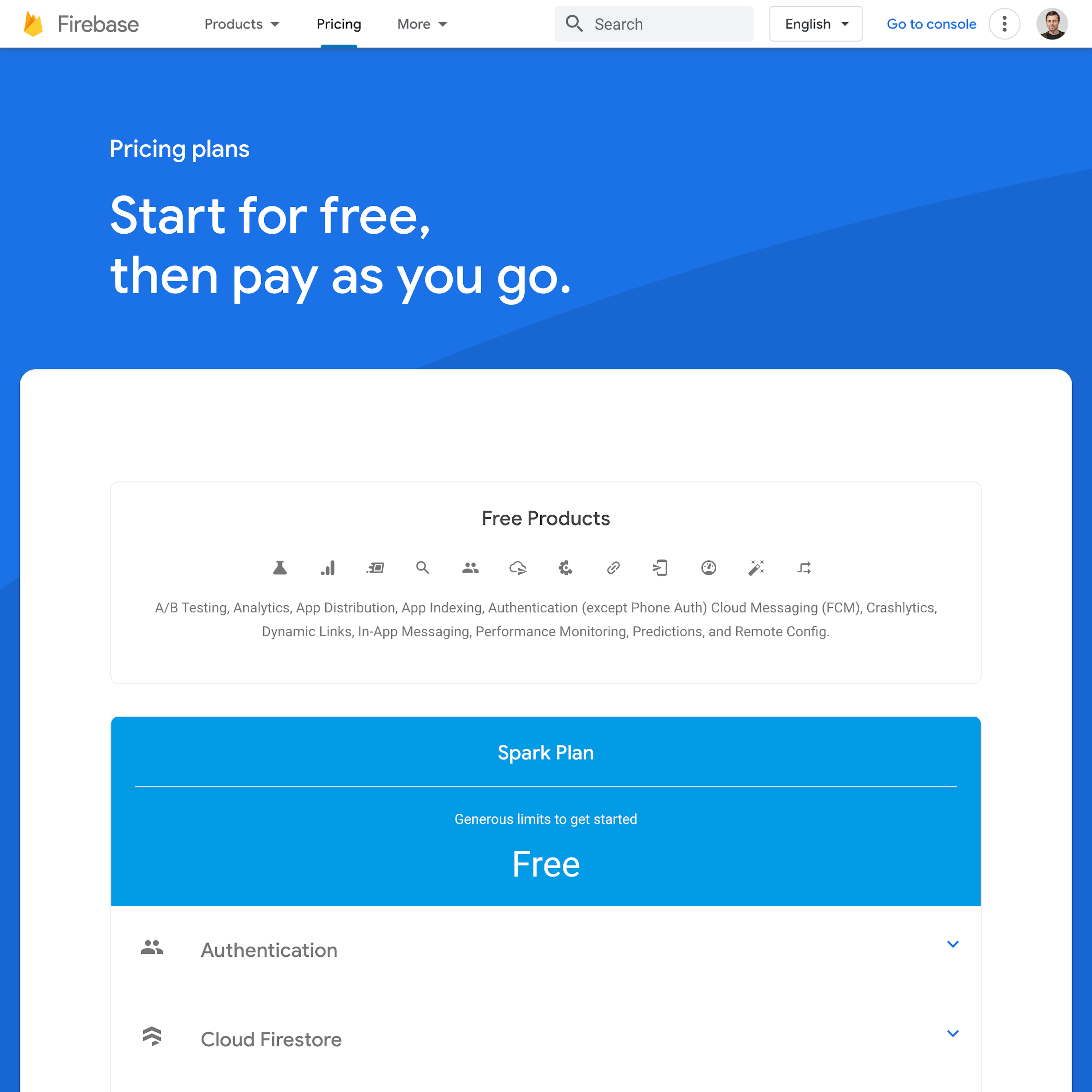
What’s this? Here you’ll find 79 “Plan Matrix” full-page screenshots annotated with research-based UX insights, sourced from Baymard’s UX benchmark of 325 e-commerce sites. (Note: this is less than 1% of the full research catalog.)
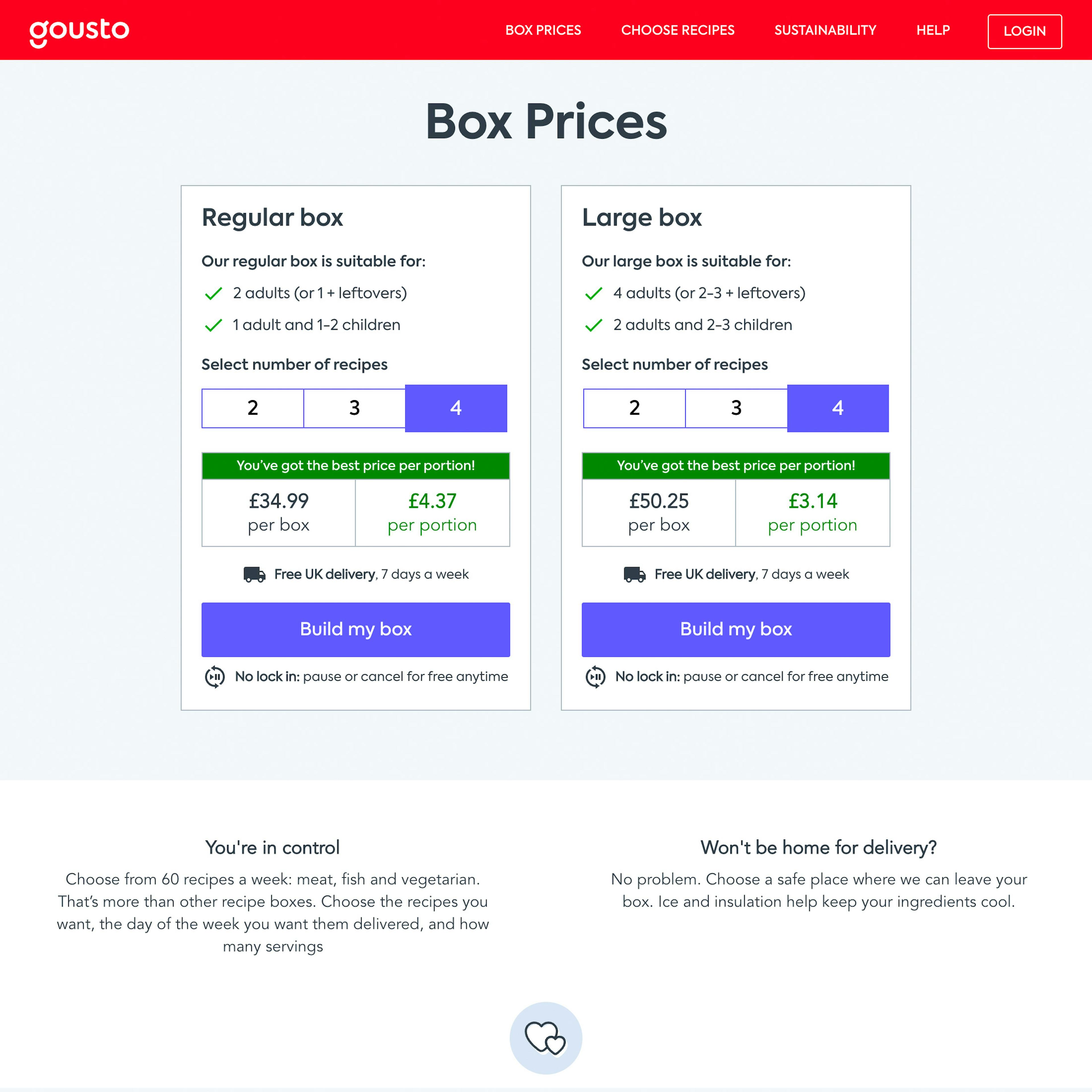
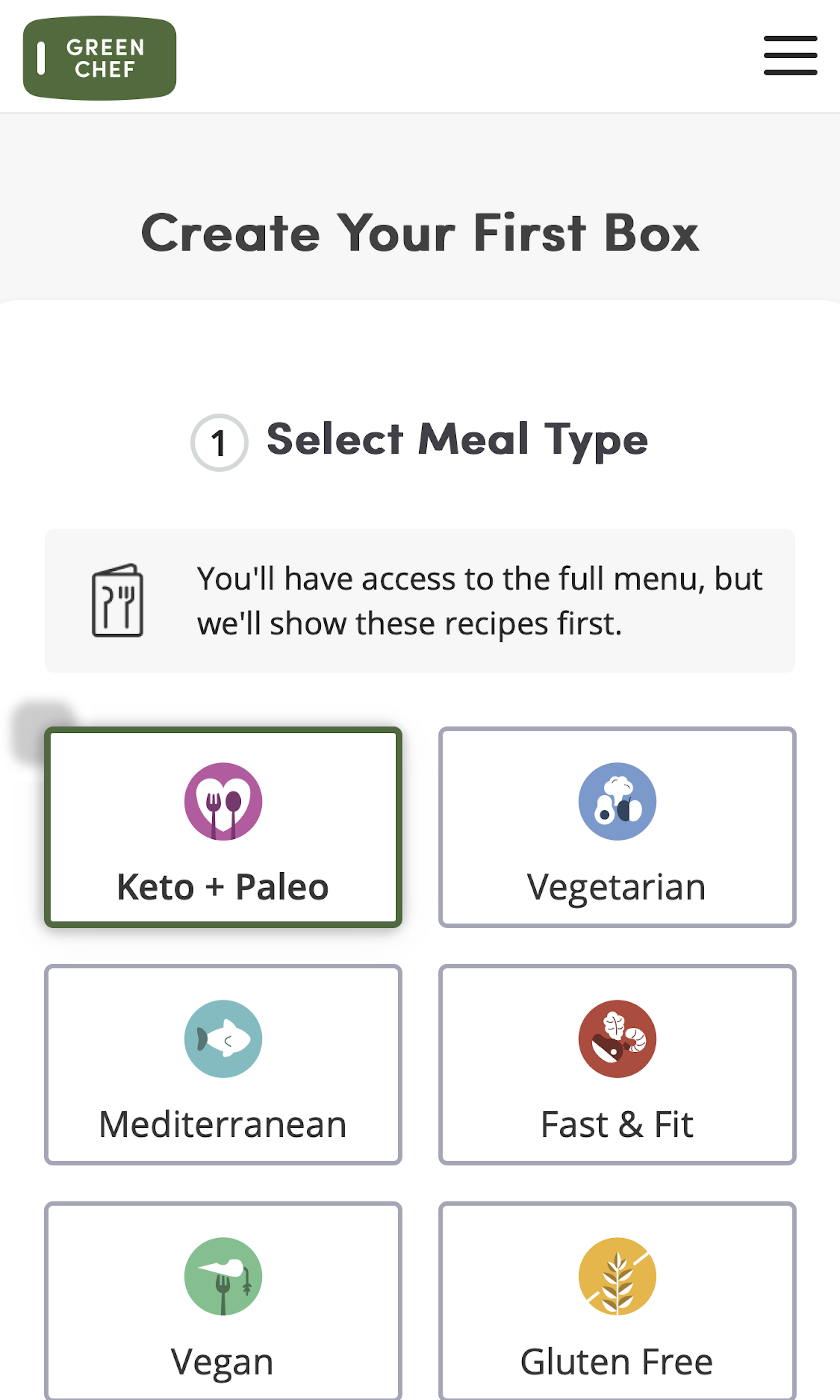
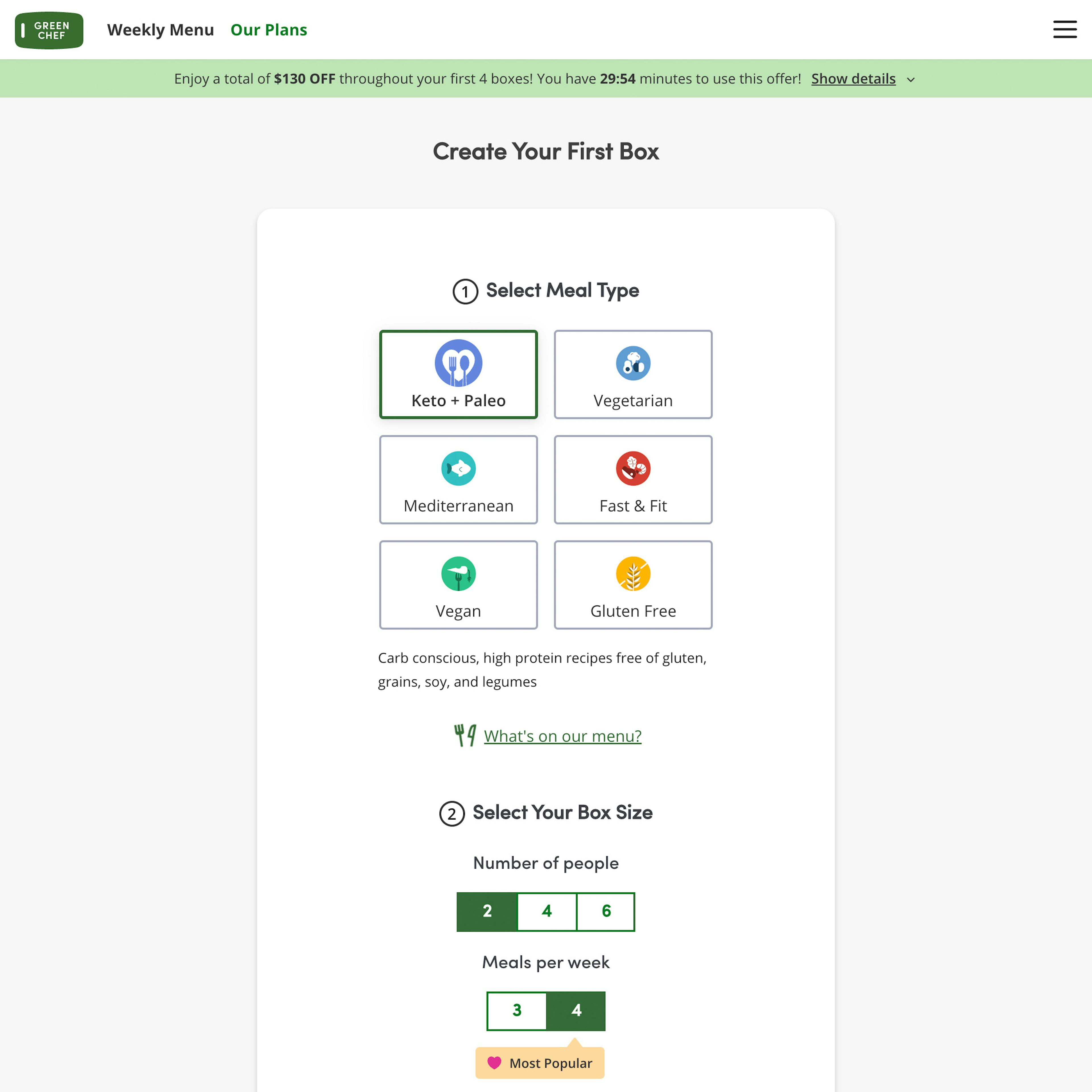
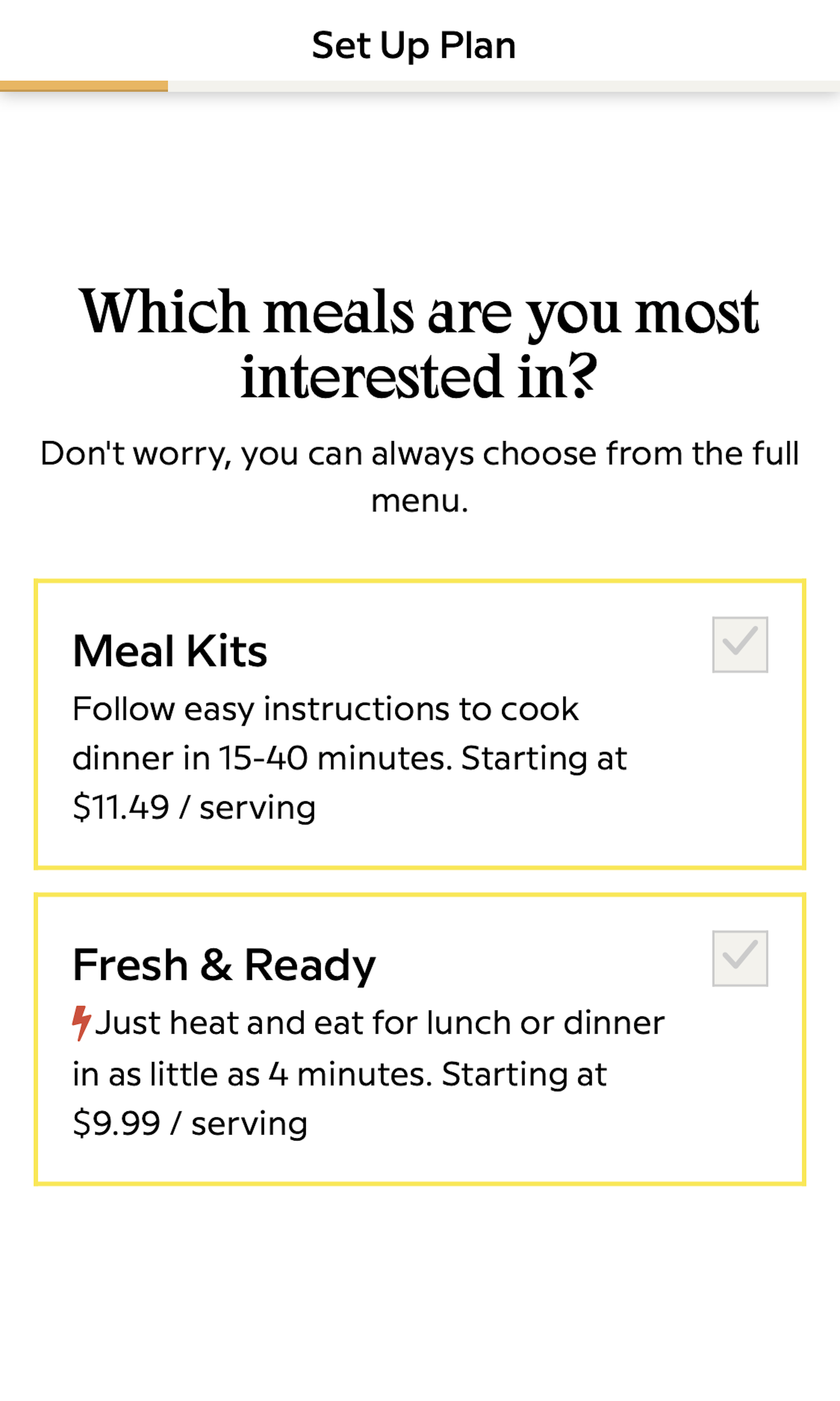
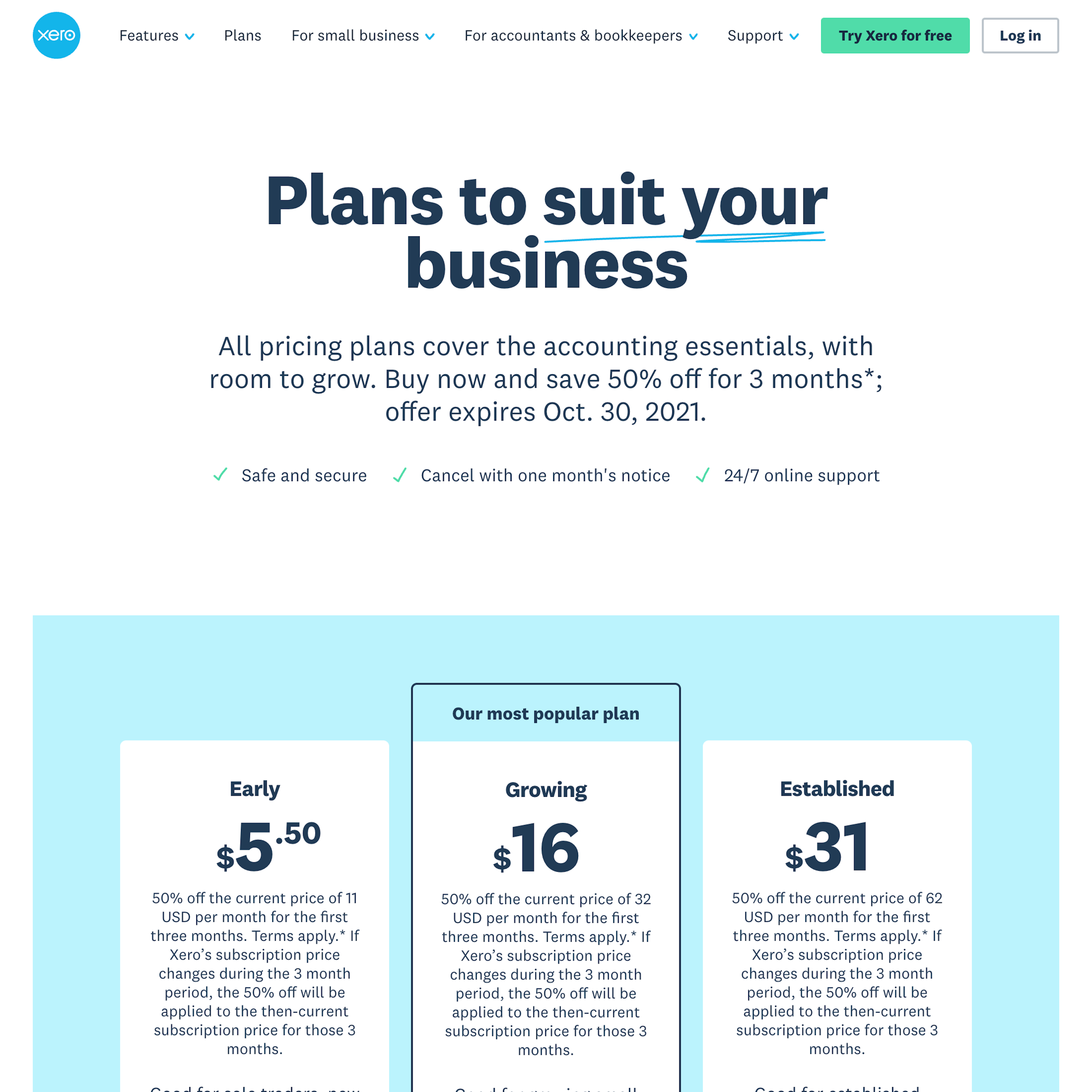
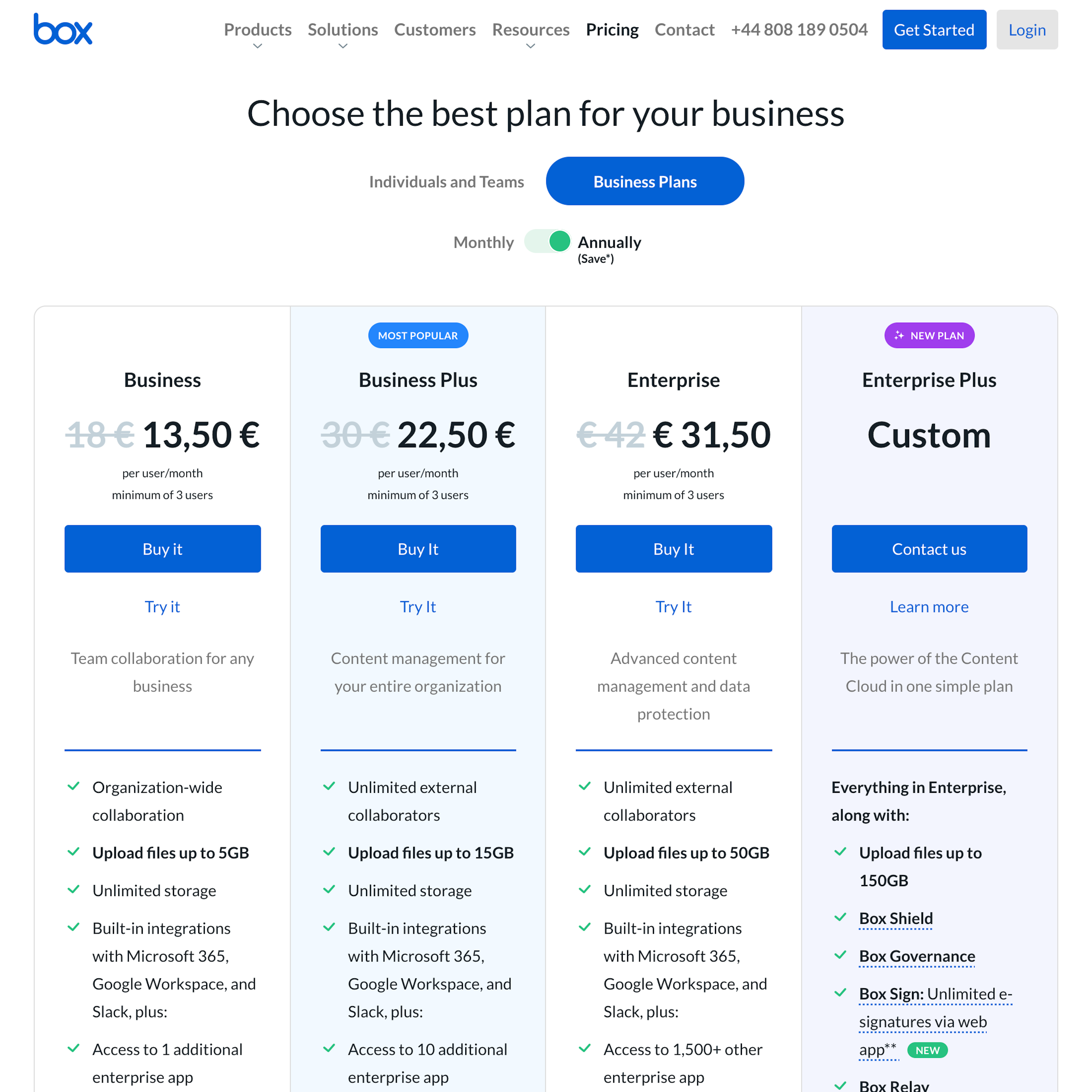
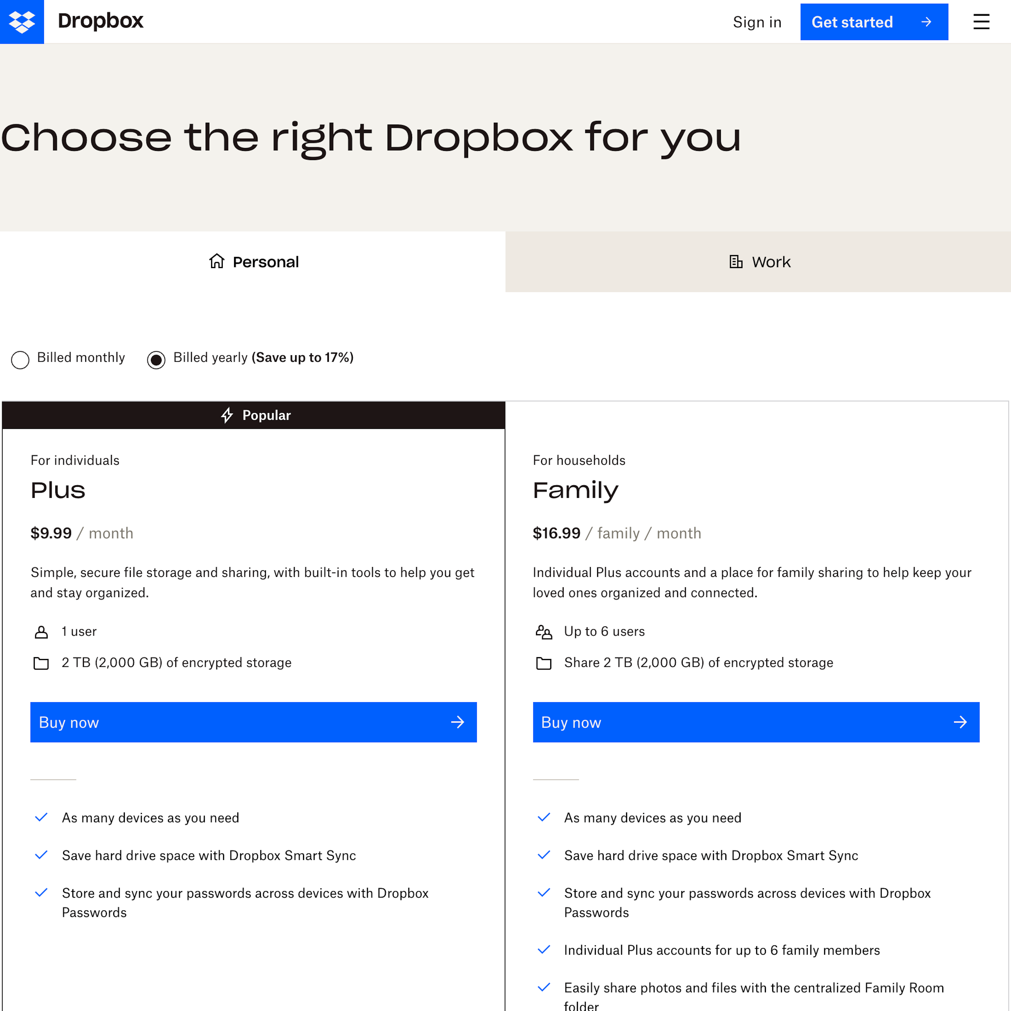
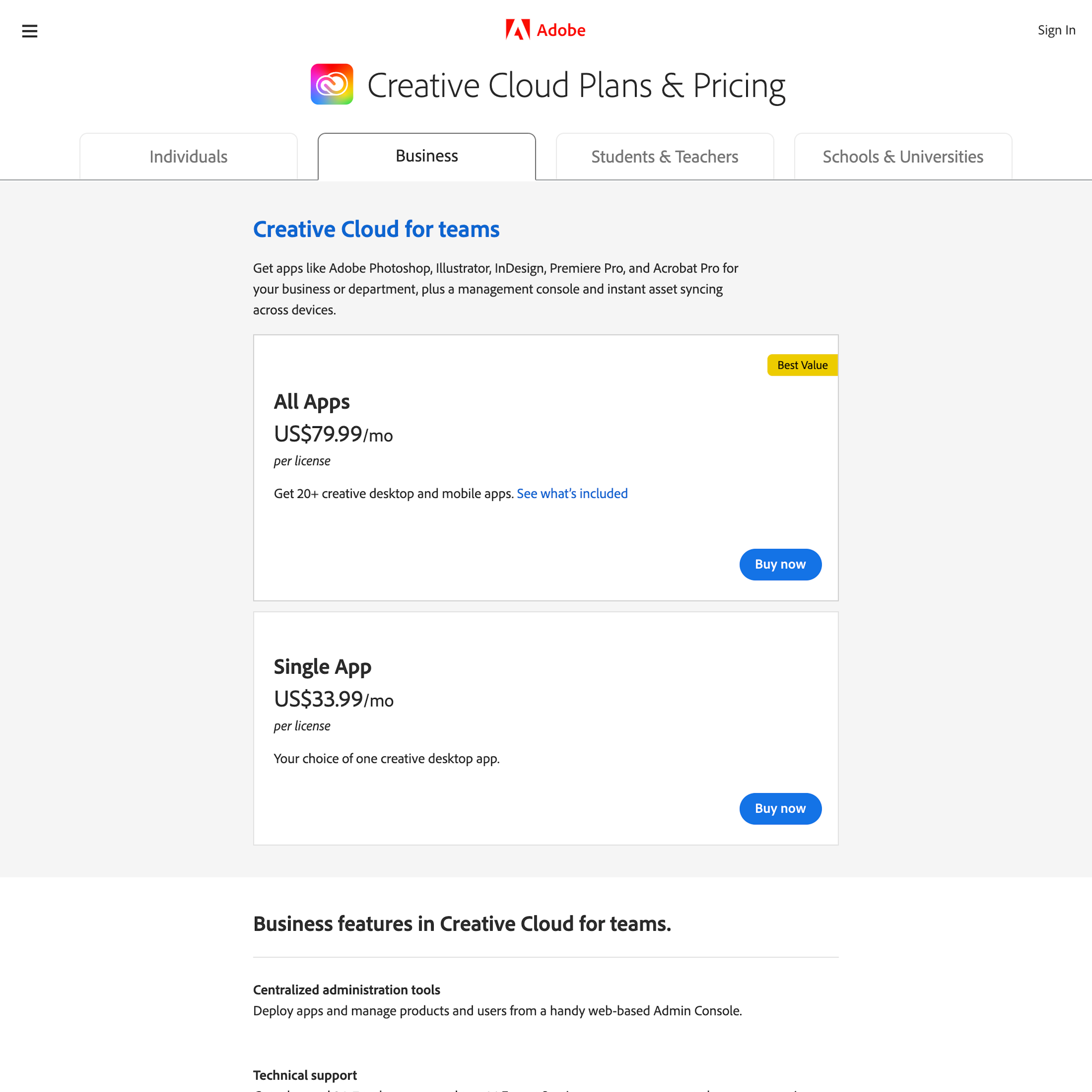
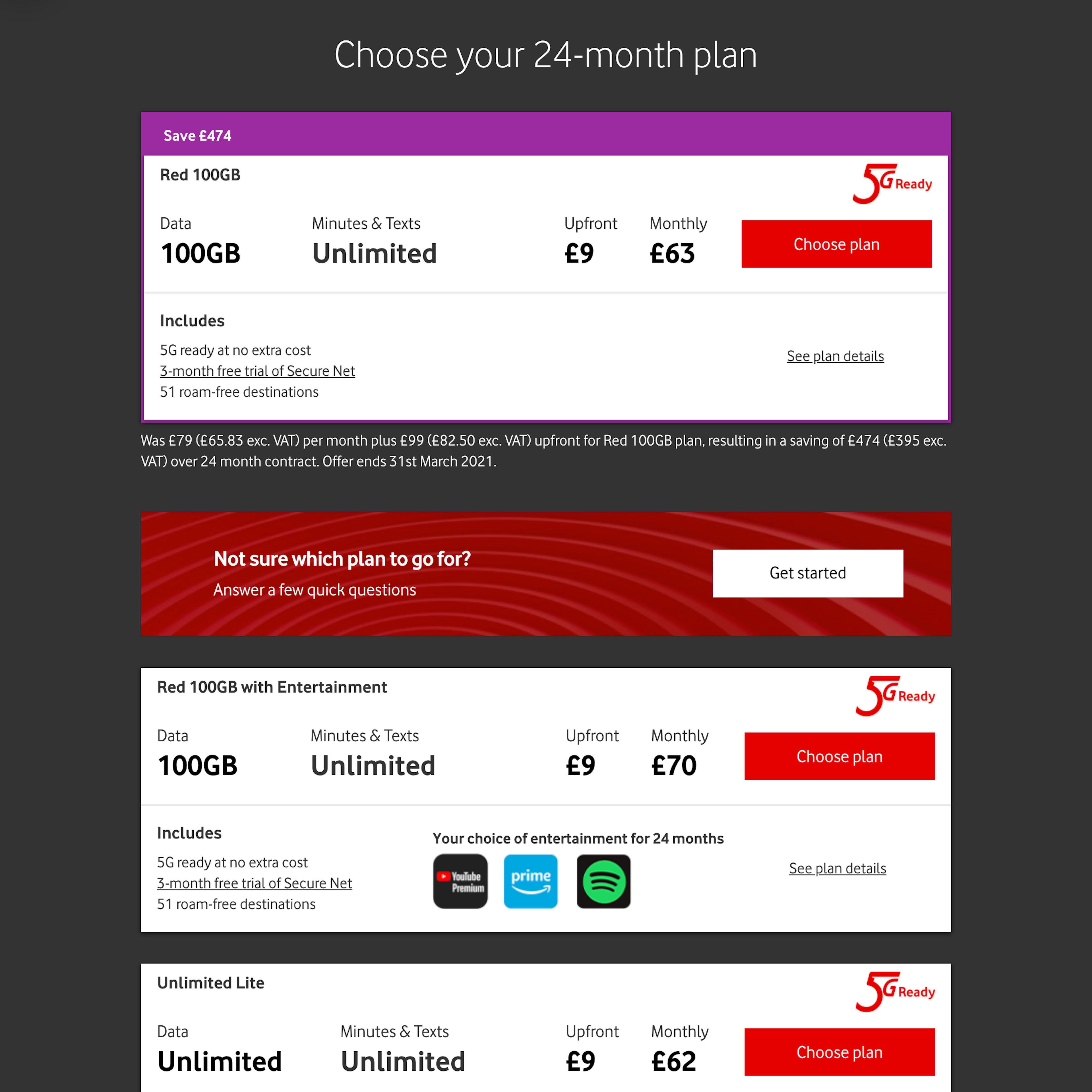
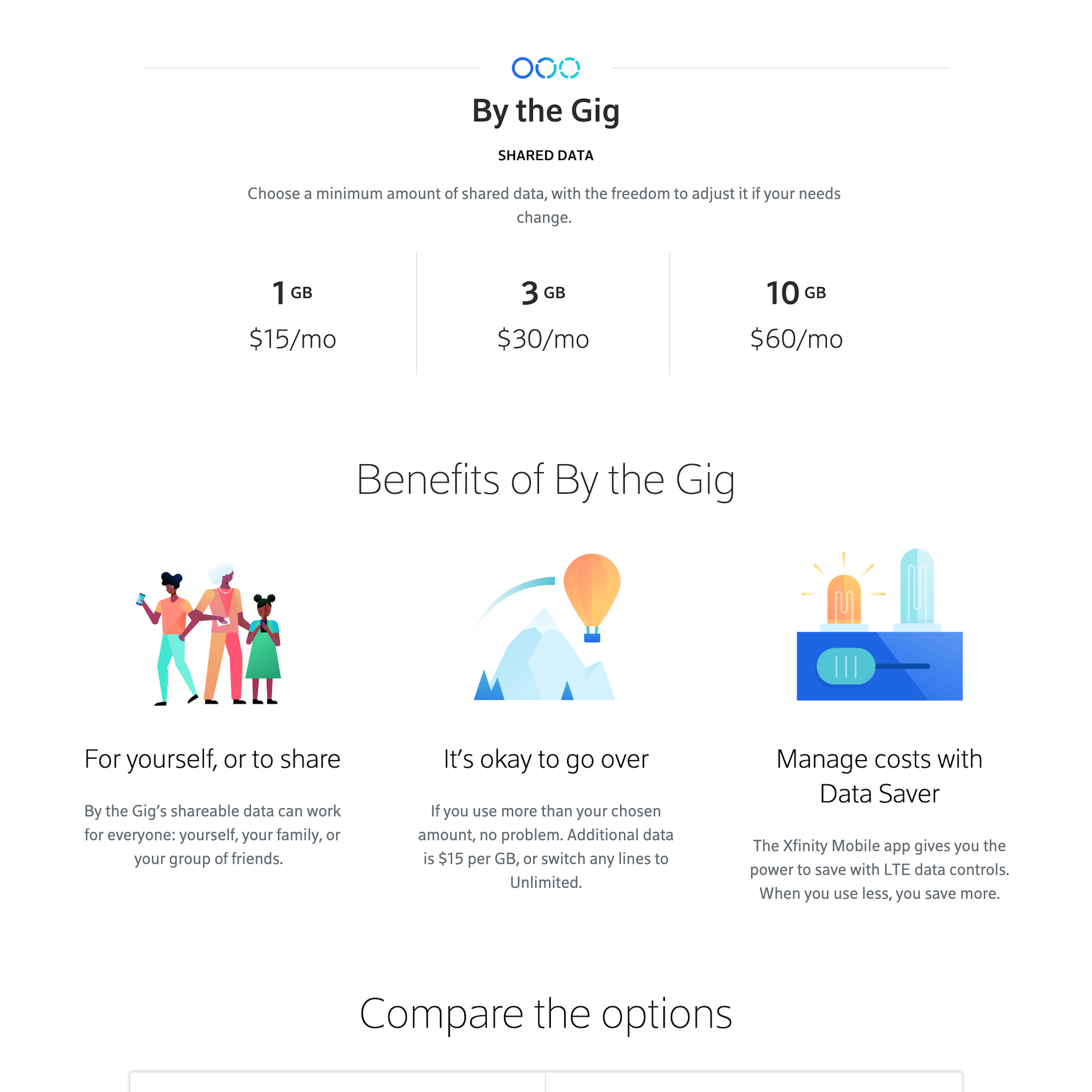
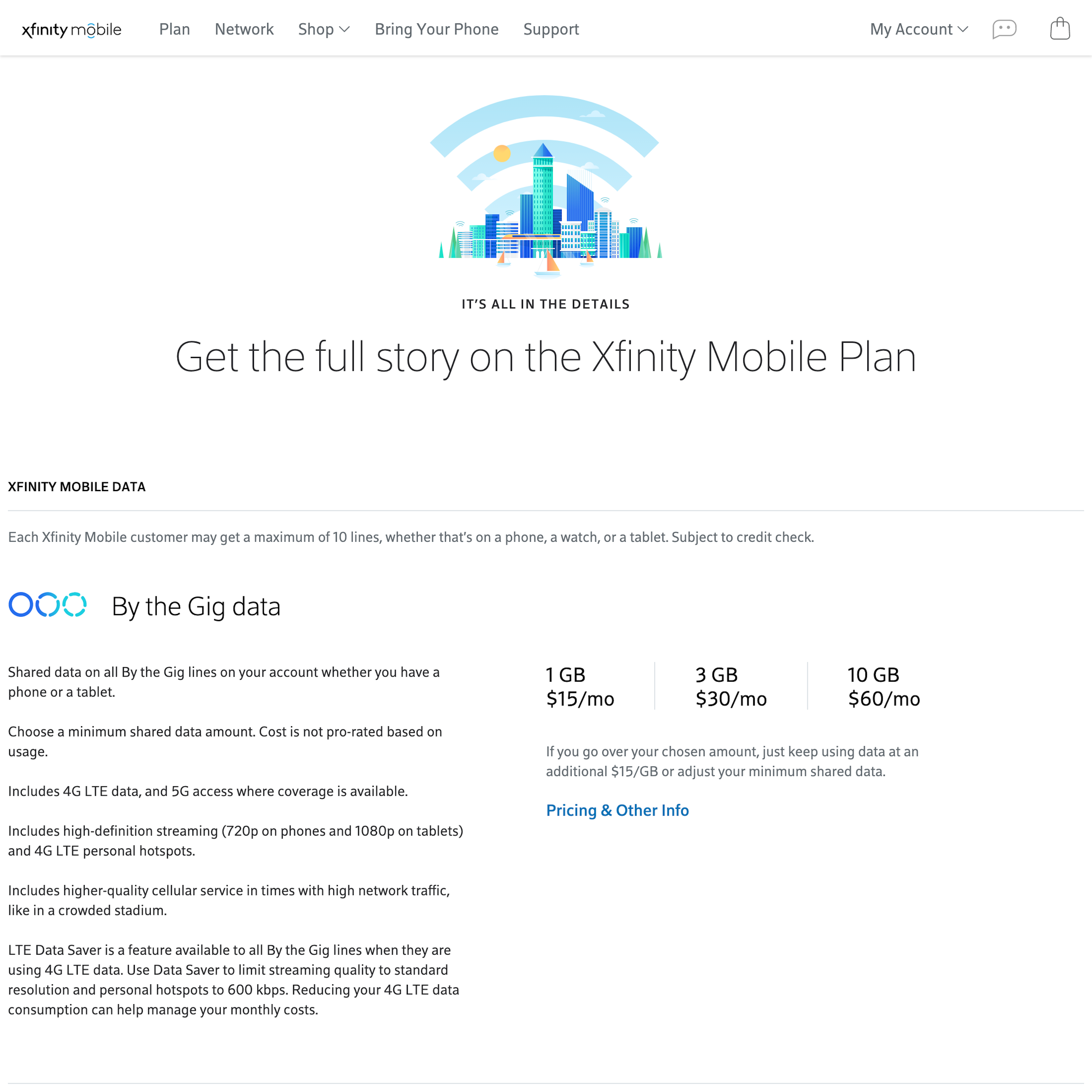
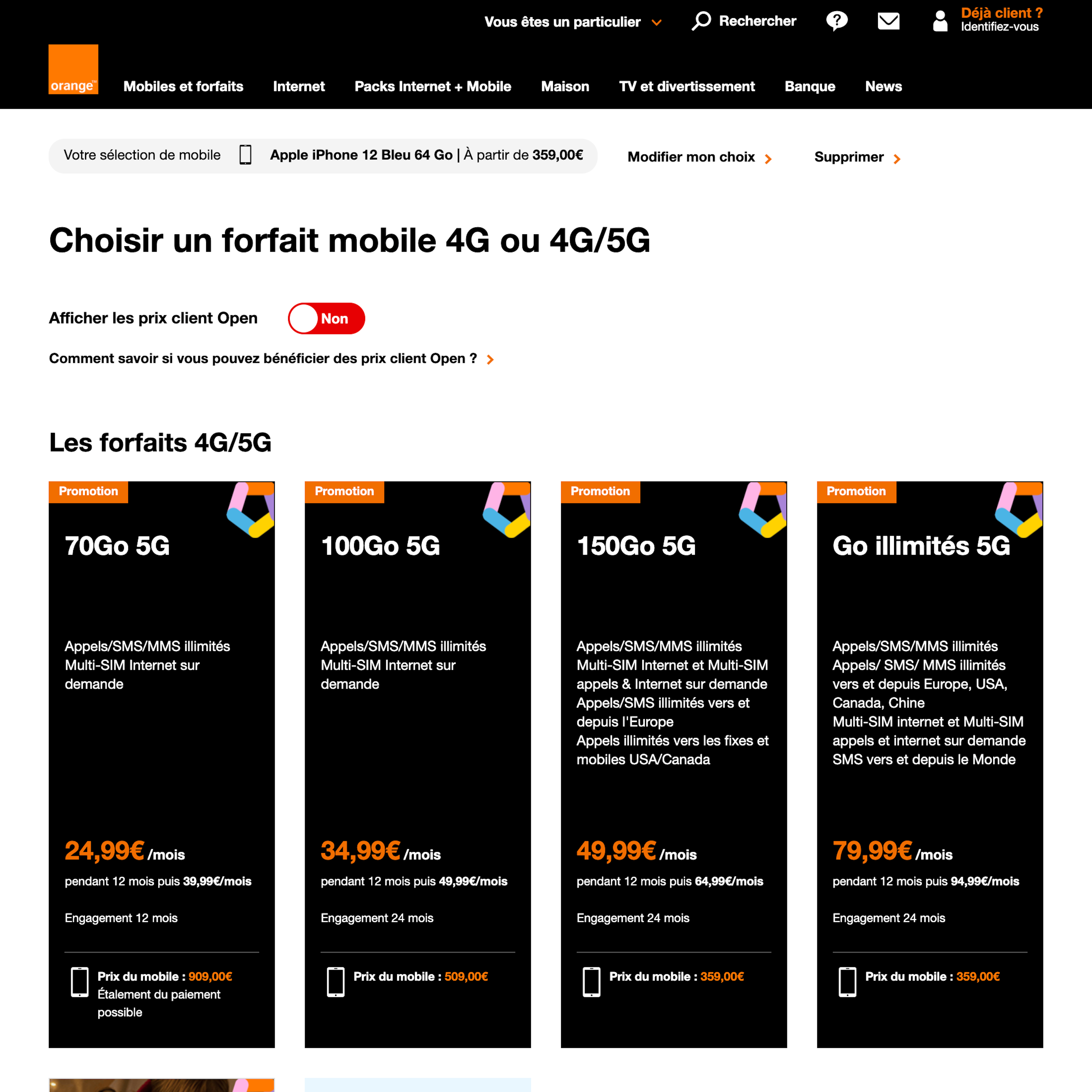
The plan matrix page is a primary destination for users considering a digital services subscription, as it allows for a side-by-side comparison of plan pricing and features. The plan matrix helps quickly identify and evaluate meal kit plan information, including subscription basics like shipping and cancellation information. Accordingly, the plan matrix layout, design, and features greatly impact users’ success in identifying the most suitable plan for their specific business or individual needs and, therefore, their purchase decision.
More ‘Plan Matrix’ Insights
-
Our research reveals users often arrive on the plan matrix page with specific plan feature requirements. However, users who cannot quickly and easily locate specific features that are critical to their business or individual needs will be more likely to conclude those features are not offered with any of the plans and drop the site’s service from consideration altogether.
-
Learn More: Besides exploring the 79 “Plan Matrix” design examples below, you may also want to read our related articles “New Research Study on “Digital Subscriptions” (SaaS) UX” and “3 High-Level UX Takeaways from 950+ Hours of Testing Leading Meal Kits Sites”.
-
Get Full Access: To see all of Baymard’s “Plan Matrix” research findings you’ll need Baymard Premium access. (Premium also provides you full access to 200,000+ hours of UX research findings, 650+ e-commerce UX guidelines, and 275,000+ UX performance scores.)
User Experience Research, Delivered Weekly
Join 60,000+ UX professionals and get a new UX article every week.

User Experience Research, Delivered Weekly
Join 60,000+ UX professionals and get a new UX article every week.

Explore Other Research Content

300+ free UX articles based on large-scale research.

325 top sites ranked by UX performance.

Code samples, demos, and key stats for usability.


