AT&T UX Case Study
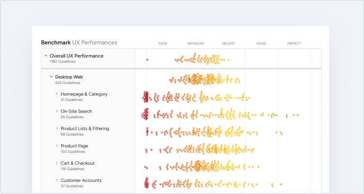
This is a case study of AT&T’s ecommerce user experience (UX) performance. It’s based on an exhaustive performance review of 364 design elements. 318 other sites have also been benchmarked for a complete picture of the ecommerce UX landscape.
AT&T’s overall ecommerce UX performance is xxxx xx xxxxxxxxx xxxxxx xx xxxx xx xxxx xx-xxxx xxxxxx xx xxxxxxxxxx, xxx xxxxxxxxx xx xxxxxxxxx xxxxxx xx xxxxxxx xx xxxxxxx xxxxxxxx & xxxxxxxxx xxxxxxxxxxx Upgrade to access AT&T’s case study.
First benchmarked in February 2023.
AT&T’s UX Performance upgrade

This competitor benchmark report is only available on a paid plan
Sign up to a Baymard paid plan to get instant access to 250+ Detailed UX benchmark reports for your industry competitors and leading brands.
Want to find out what Baymard access can do for your team? Get access to 5% of our research, including 50 Best Practice Guidelines, with a Free Plan today!

To learn how we calculate our performance scores and read up on our evaluation criteria and scoring algorithm head over to our Methodology page.
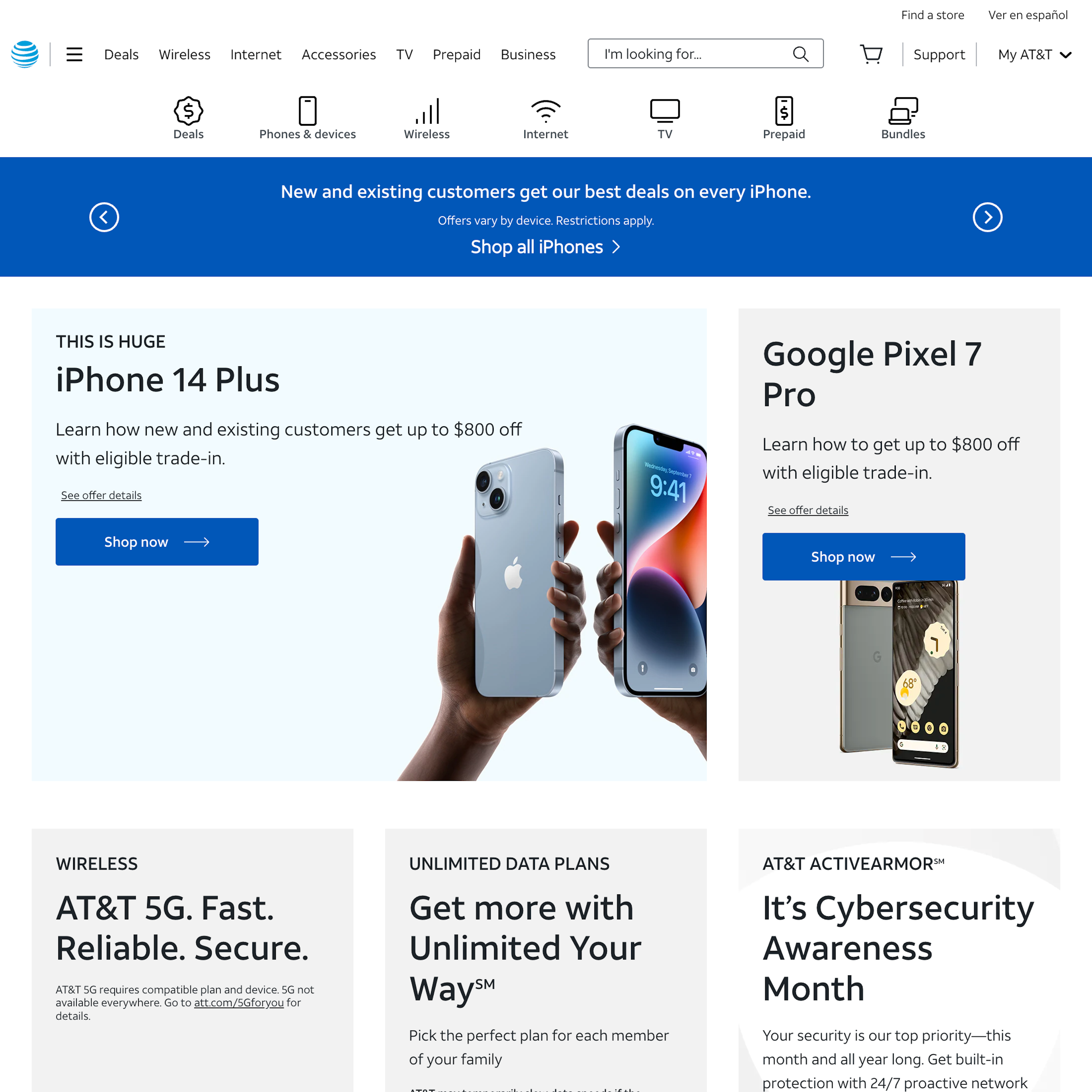
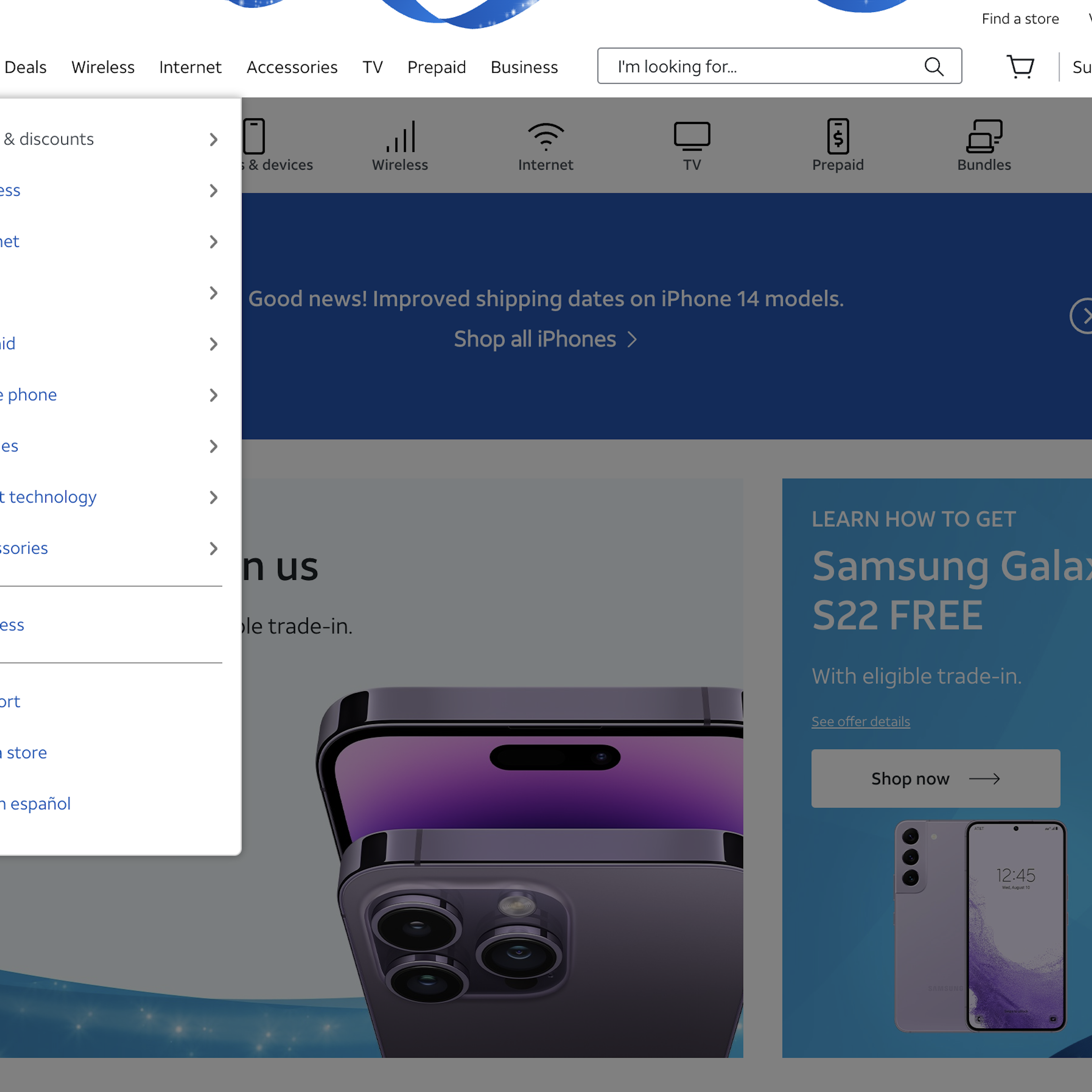
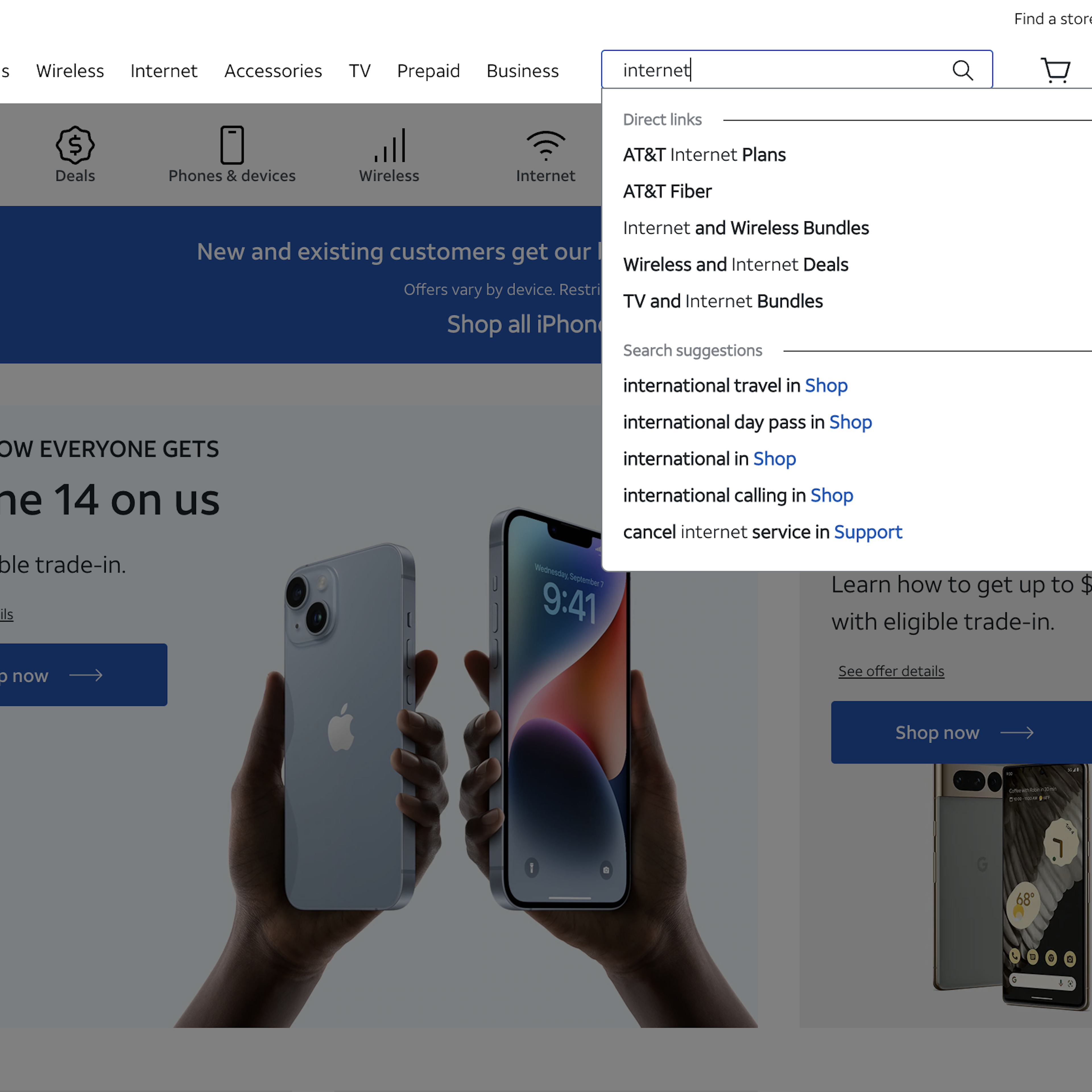
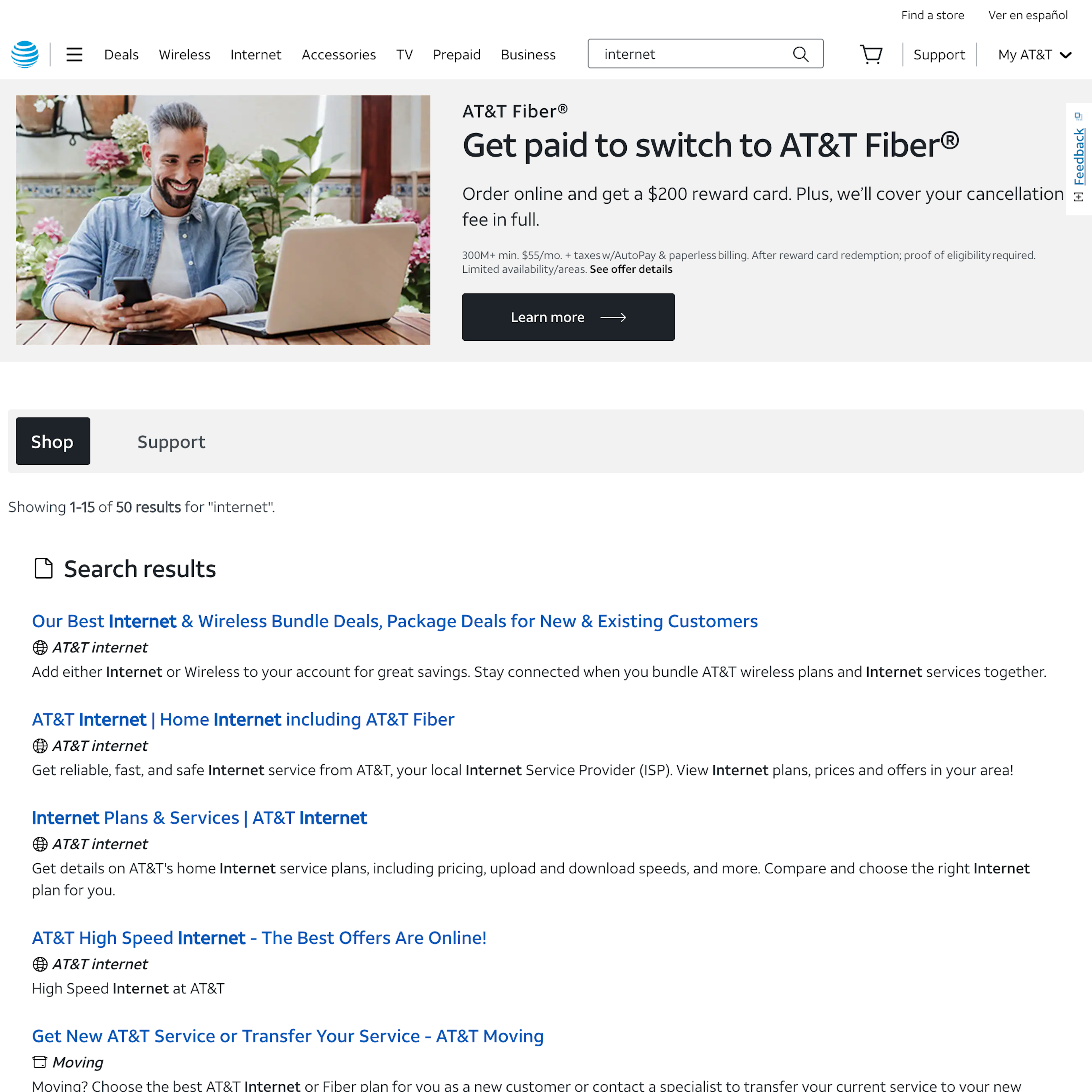
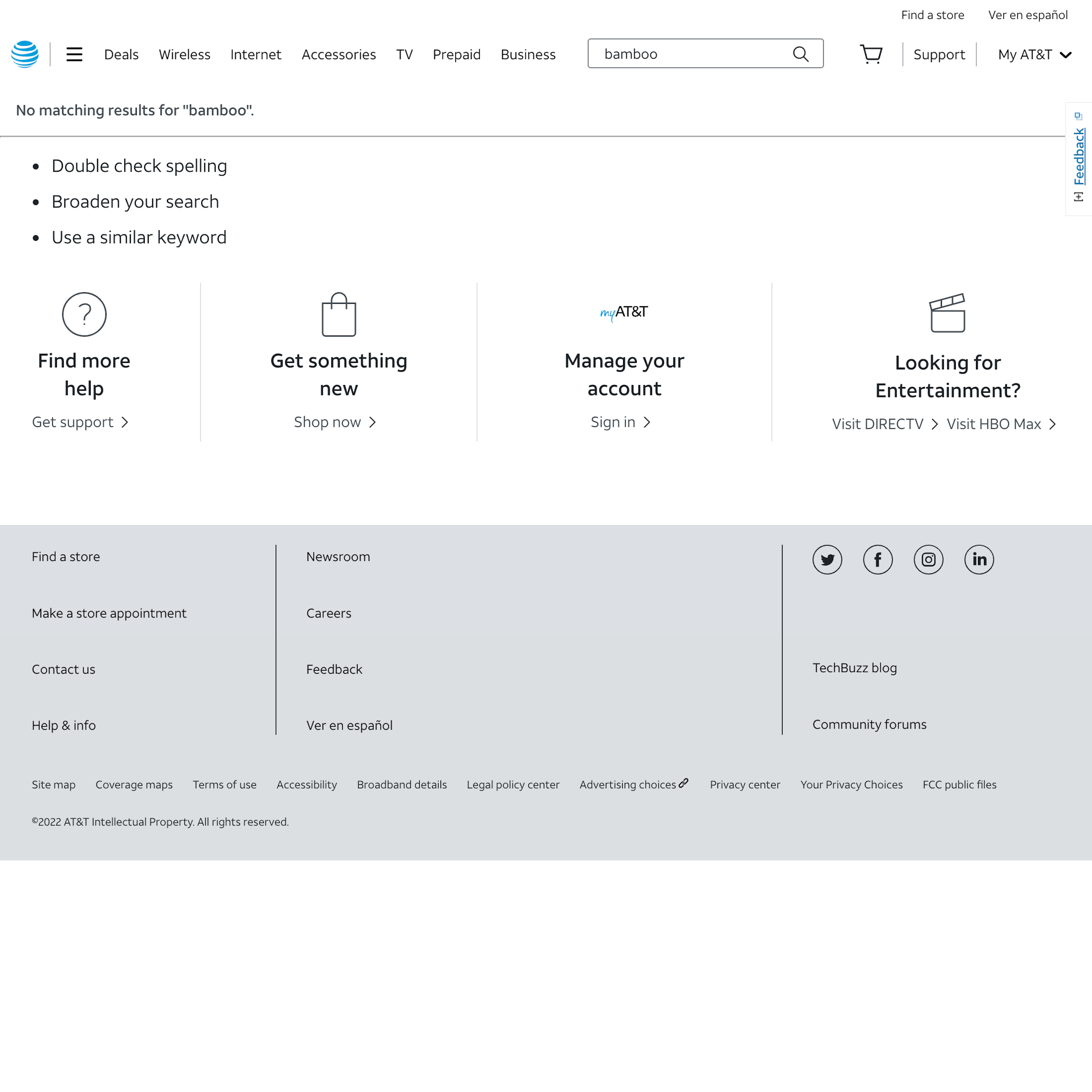
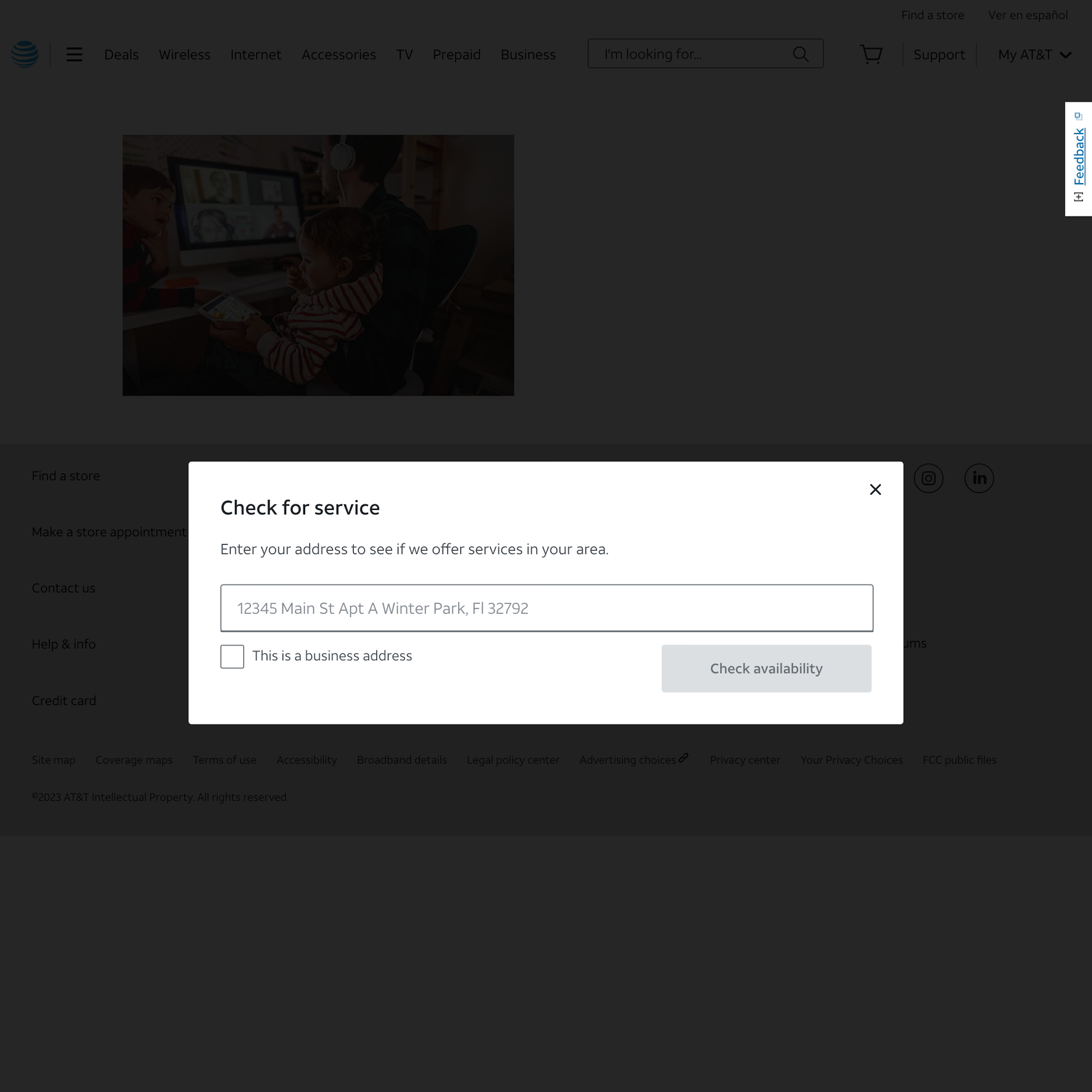
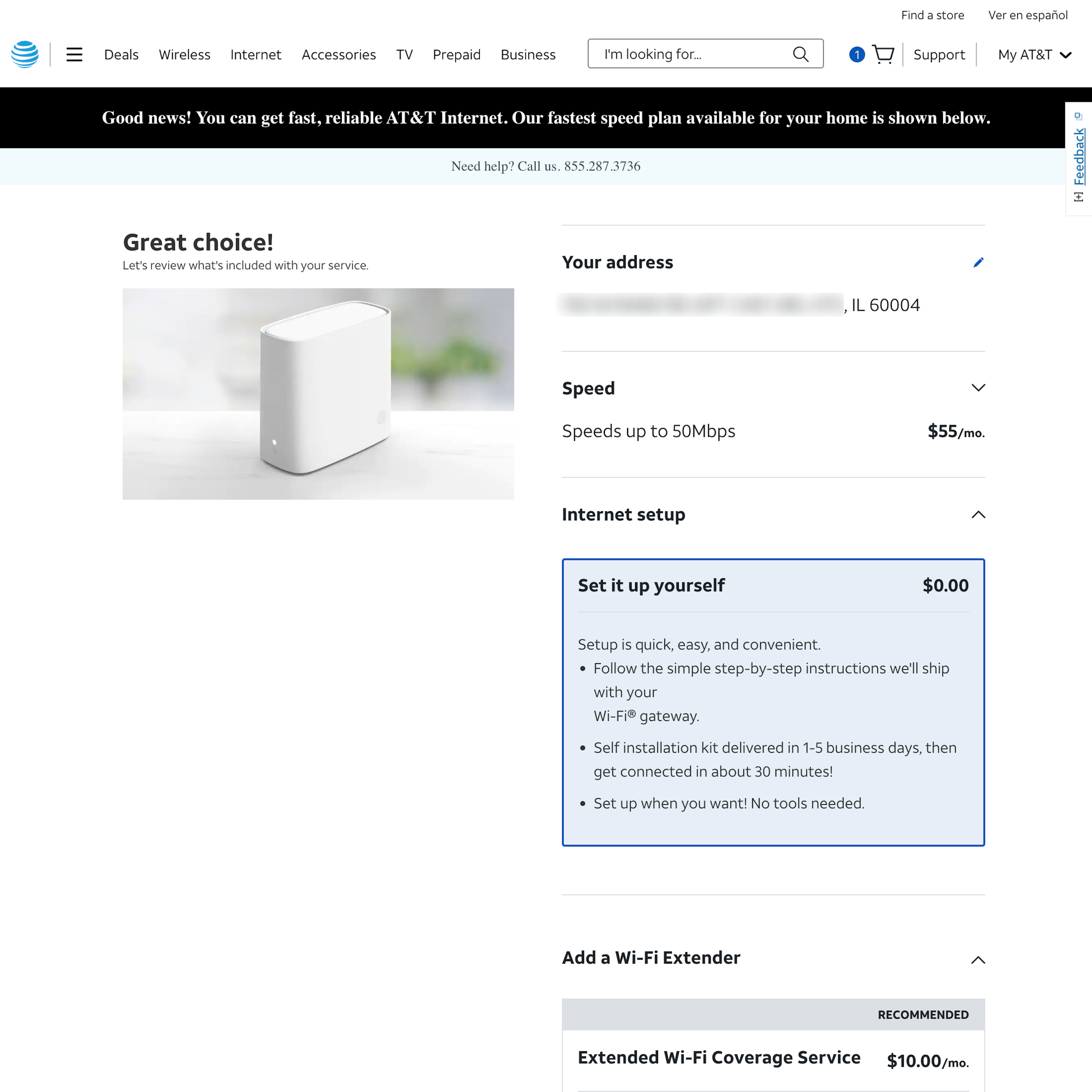
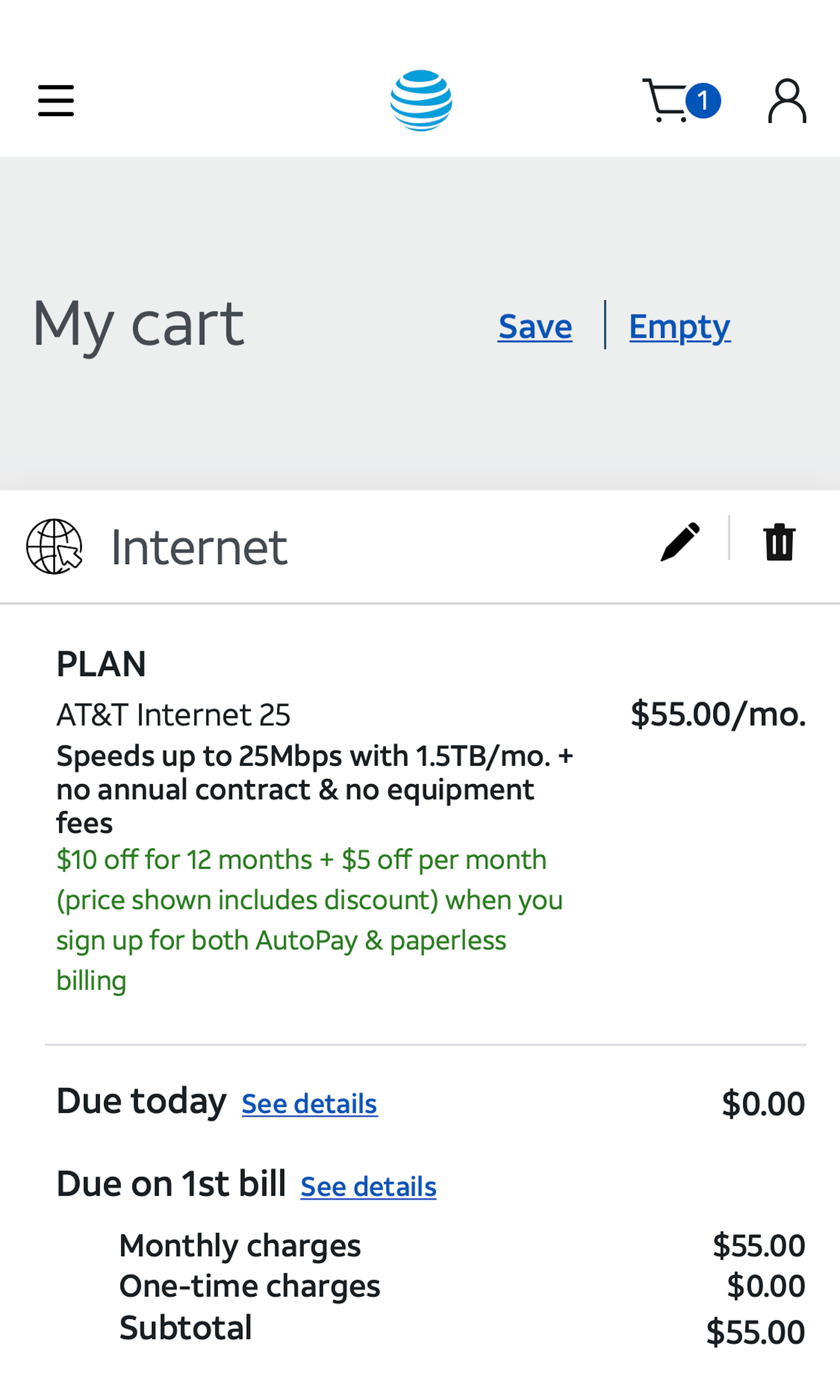
AT&T’s Desktop Web Ecommerce Design
18 pages of AT&T’s ecommerce site, marked up with 119 best practice examples:


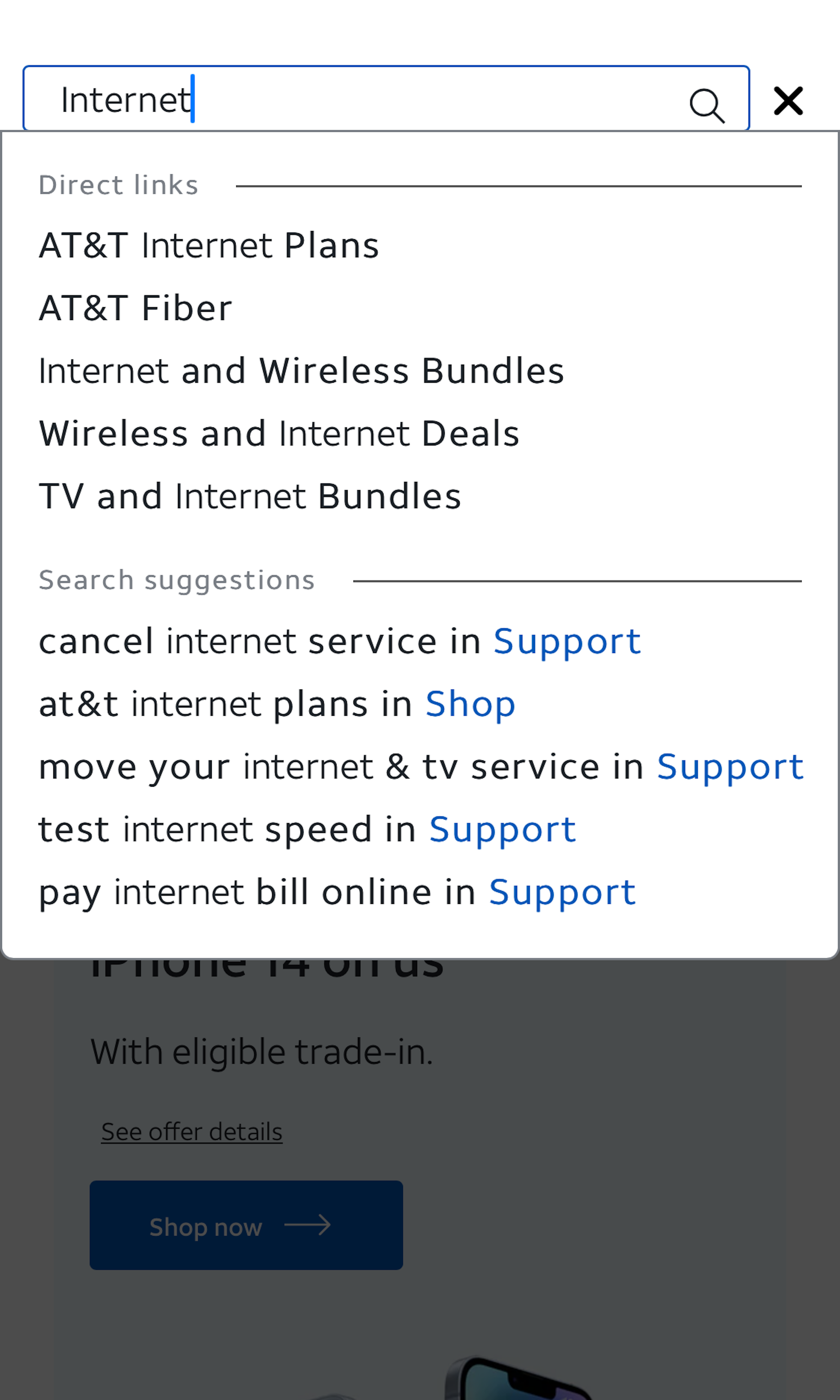
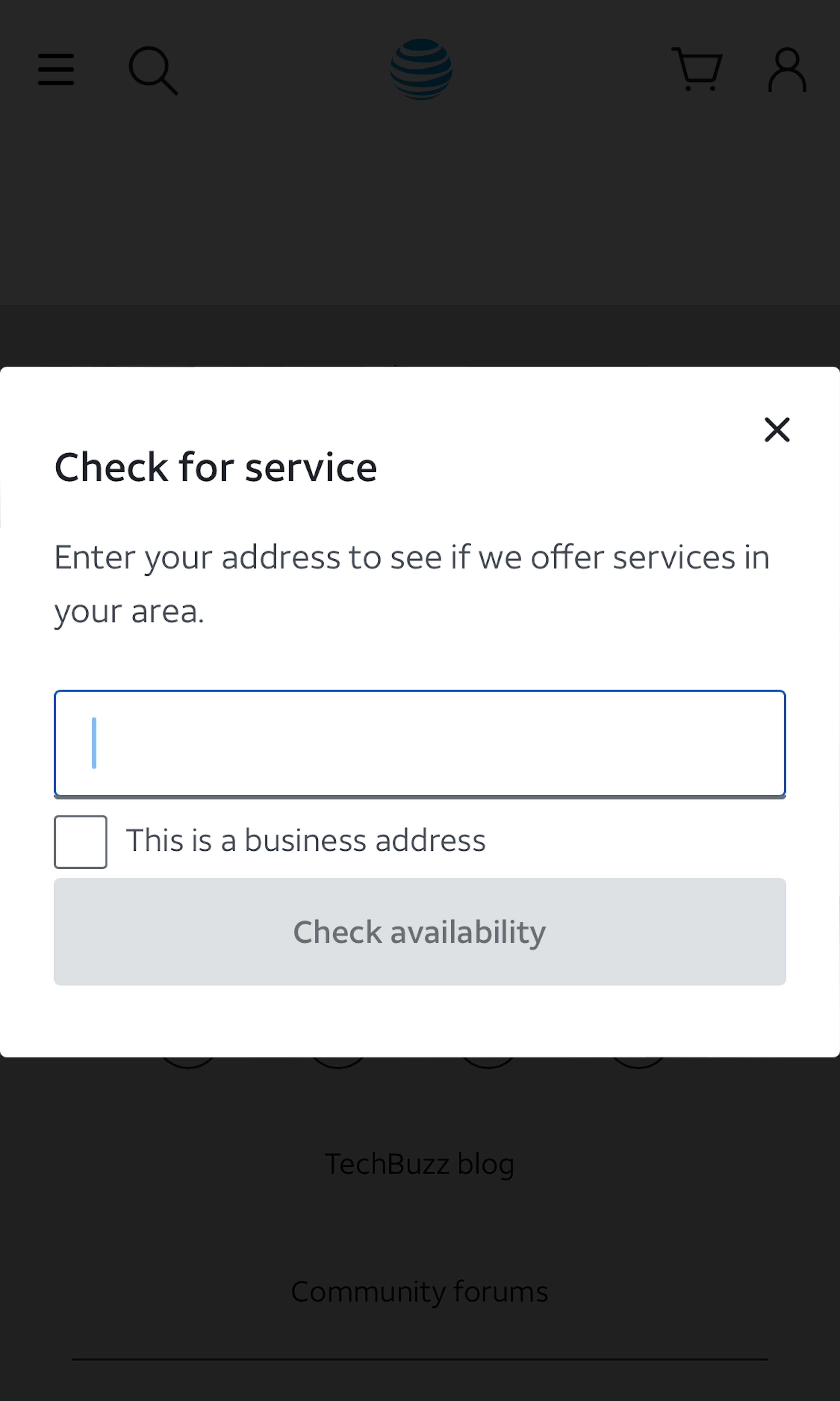
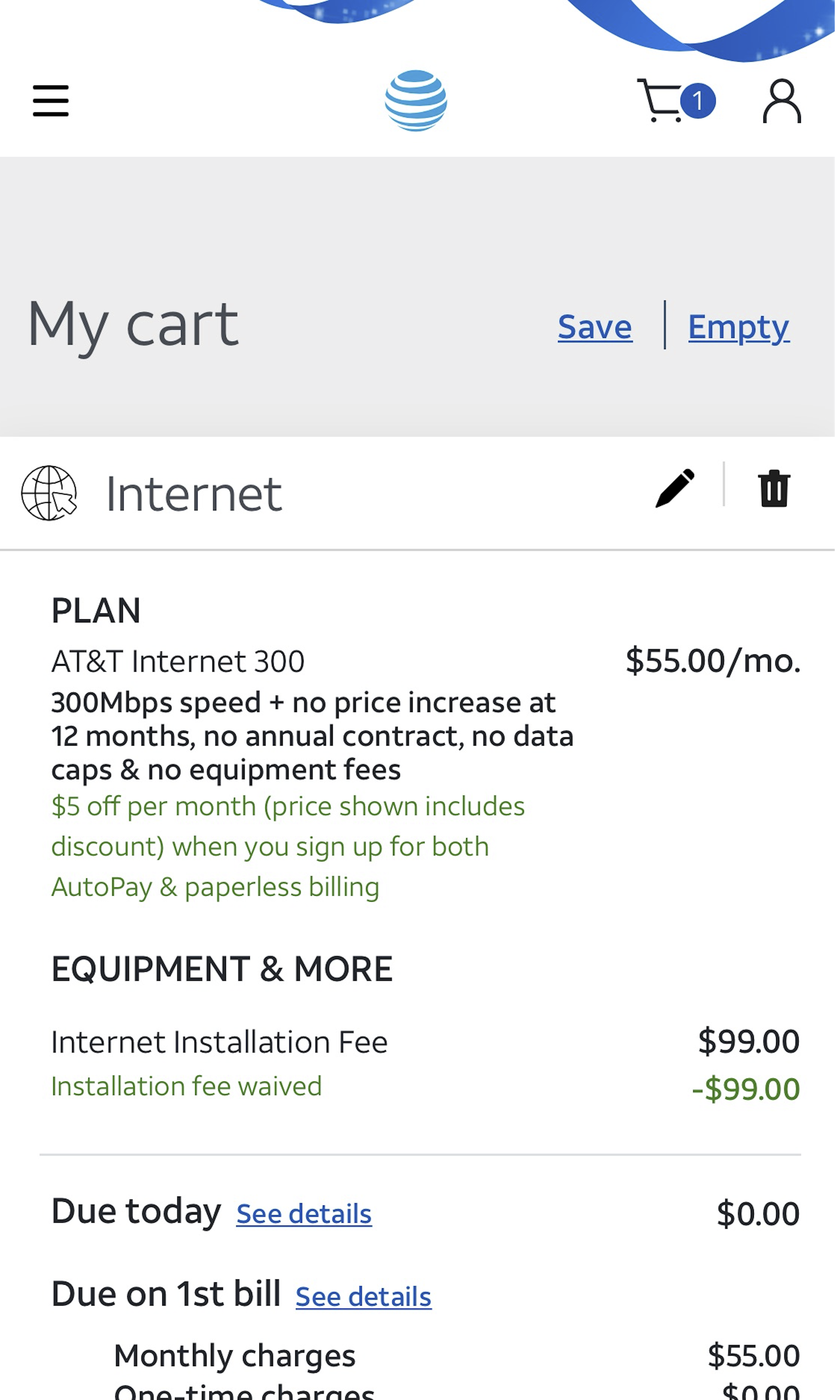
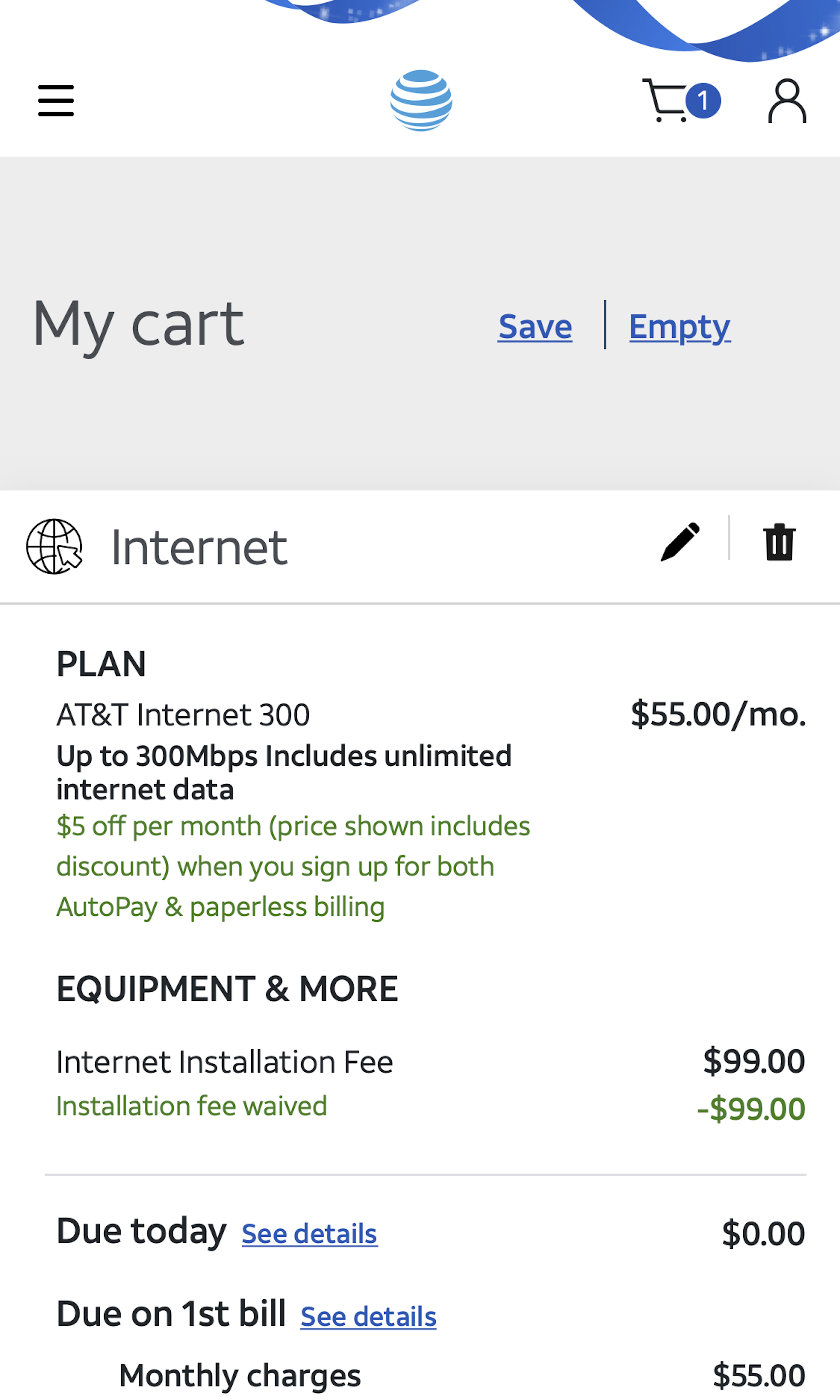
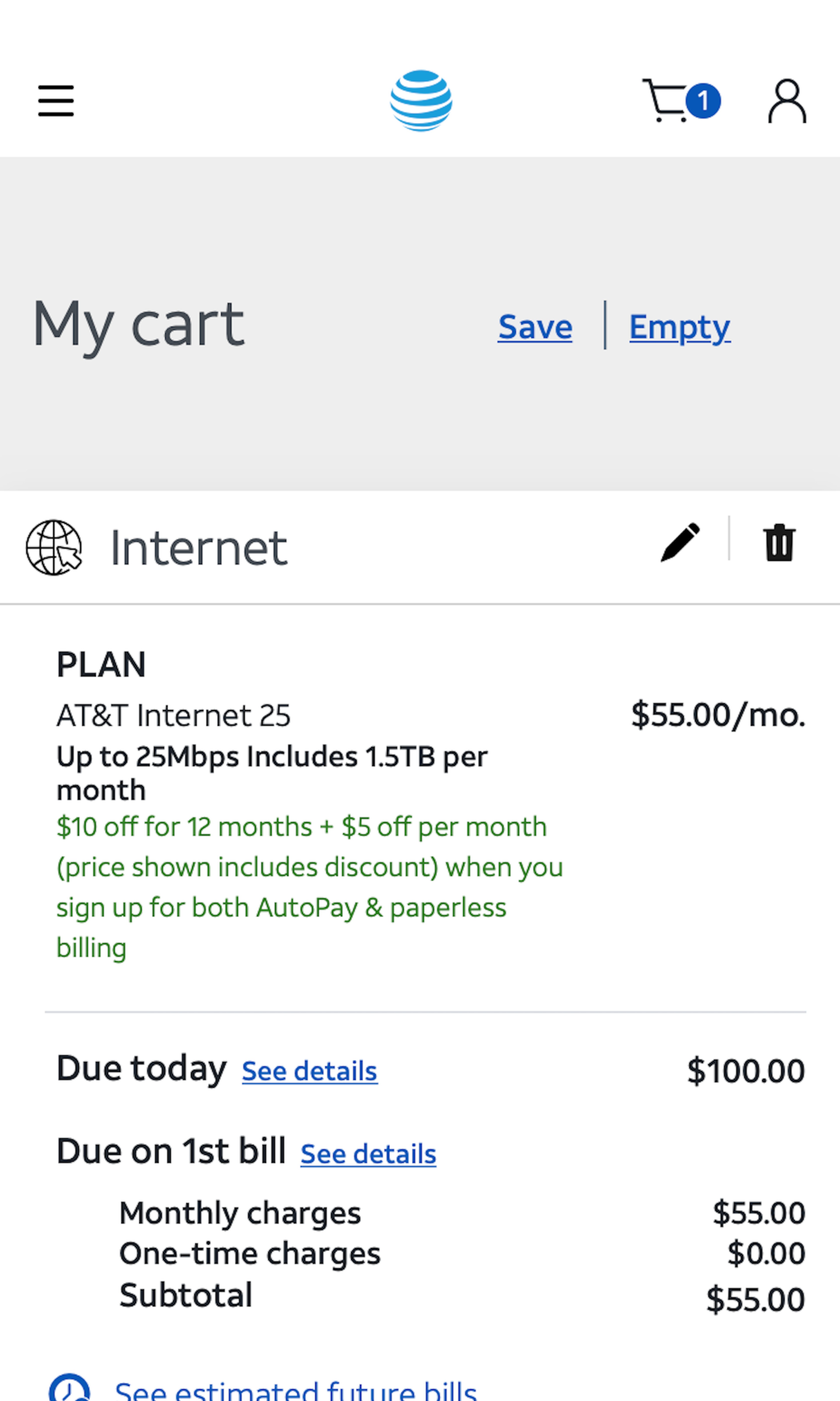
AT&T’s Mobile Web Ecommerce Design
17 pages of AT&T’s ecommerce site, marked up with 109 best practice examples:


Explore Other Research Content
Every week, we publish a new article on how to build “state of the art” ecommerce experiences — here’s 5 popular ones:

Drop-Down Usability: When You Should (and Shouldn’t) Use Them
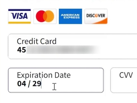
Format the “Expiration Date” Fields Exactly the Same as the Physical Credit Card (72% Don’t)

PDP UX: Core Product Content Is Overlooked in ‘Horizontal Tabs’ Layouts (Yet 28% of Sites Have This Layout)
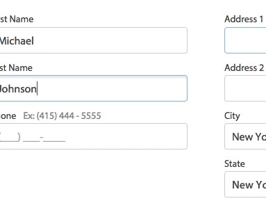
Form Field Usability: Avoid Extensive Multicolumn Layouts (16% Make This Form Usability Mistake)
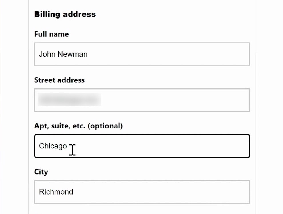
Form Usability: Getting ‘Address Line 2’ Right
See all 426 articles in the full public archive.