
Pep Boys UX Case Study
This is a case study of Pep Boys’ ecommerce user experience (UX) performance. It’s based on an exhaustive performance review of 516 design elements. 333 other sites have also been benchmarked for a complete picture of the ecommerce UX landscape.
Pep Boys’ overall ecommerce UX performance is xxxx xx xxxxxxxxx xxxxxx xx xxxx xx xxxx xx-xxxx xxxxxx xx xxxxxxxxxx, xxx xxxxxxxxx xx xxxxxxxxx xxxxxx xx xxxxxxx xx xxxxxxx xxxxxxxx & xxxxxxxxx xxxxxxxxxxx Upgrade to access Pep Boys’ case study.
First benchmarked in March 2023 and reviewed once in January 2026.
Pep Boys’ UX Performance upgrade

Benchmark Chart
Get Baymard access
This UX performance chart is part of Baymard's premium UX research. Create a free account to preview selected research, or compare plans to unlock full access for your team.
Included with access
- Interactive benchmark performance charts across leading ecommerce sites
- Industry and competitor performance comparisons grounded in Baymard's research
To learn how we calculate our performance scores and read up on our evaluation criteria and scoring algorithm head over to our Methodology page.
Pep Boys’ Desktop Web Ecommerce Design
18 pages of Pep Boys’ ecommerce site, marked up with 177 best practice examples:


Pep Boys’ Mobile Web Ecommerce Design
18 pages of Pep Boys’ ecommerce site, marked up with 182 best practice examples:


Explore Other Research Content
Every week, we publish a new article on how to build “state of the art” ecommerce experiences — here’s 5 popular ones:

Drop-Down Usability: When You Should (and Shouldn’t) Use Them
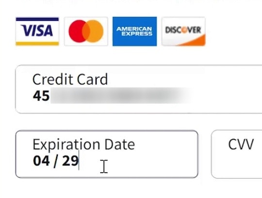
Format the “Expiration Date” Fields Exactly the Same as the Physical Credit Card (72% Don’t)

Avoid Using “Horizontal Tabs” for the Main Product Page Sections (29% Don’t)
Form Field Usability: Avoid Extensive Multicolumn Layouts (16% Make This Form Usability Mistake)
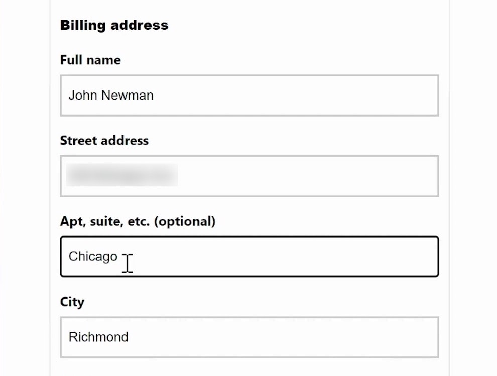
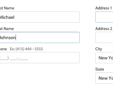
Form Usability: Getting ‘Address Line 2’ Right
See all 456 articles in the full public archive.