At first glance, a “Horizontal Tabs” Product Details Page (PDP) layout may appear to be an efficient way of grouping product page content.
Indeed, by hiding content in separate tabs, product pages can often be shorter, or the space saved can be used for highlighting other featured content.
However, our large-scale Product Details Page usability testing reveals that 27% of users overlook the hidden content — which can have dire consequences.
Content that is hidden in “Horizontal Tabs” layouts will often be crucial to a user’s purchase decision — e.g., user reviews, specs, FAQs, cross-sells, manuals, etc. Our testing shows that some users who are unable to locate this content — despite actively looking for it — will abandon a product or a site as a direct result of this perceived lack of information.
In this article, we’ll discuss the test findings from our Product Details Page usability study related to “Horizontal Tabs” product page layouts, including:
- The severe issues caused when users miss content in “Horizontal Tabs” layouts
- How even when “Horizontal Tabs” layouts are found by users they still cause issues by failing to provide sufficient information scent, being prone to misinterpretation, and discouraging exploration
- Other product page layouts that are verified to perform better
Content That Is Never Found May as Well Not Be There
It should be noted that the majority of users during testing did find the content hidden within horizontal tabs. For this group, the tabs were observed to be an efficient in-page navigational anchor.
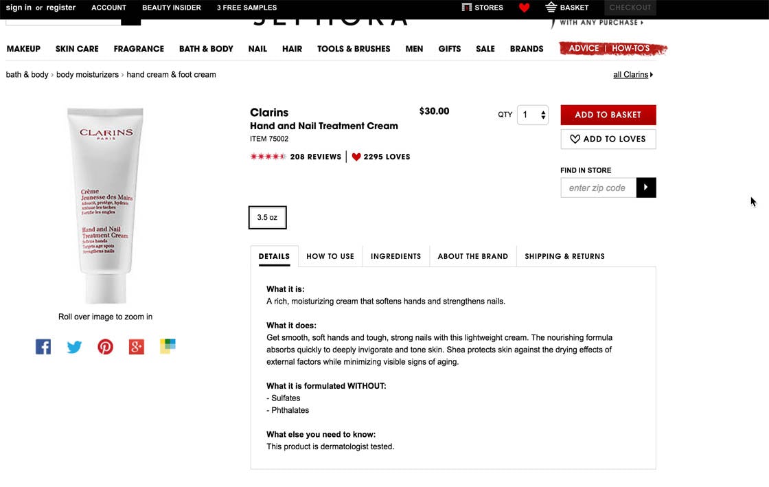
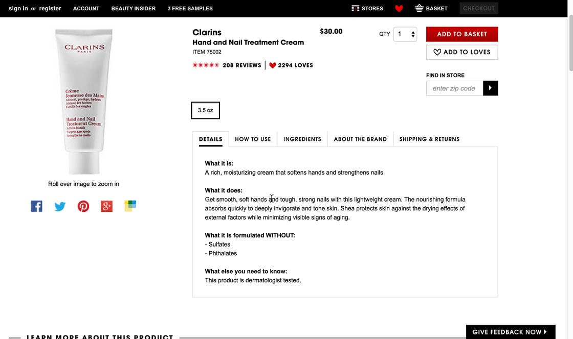
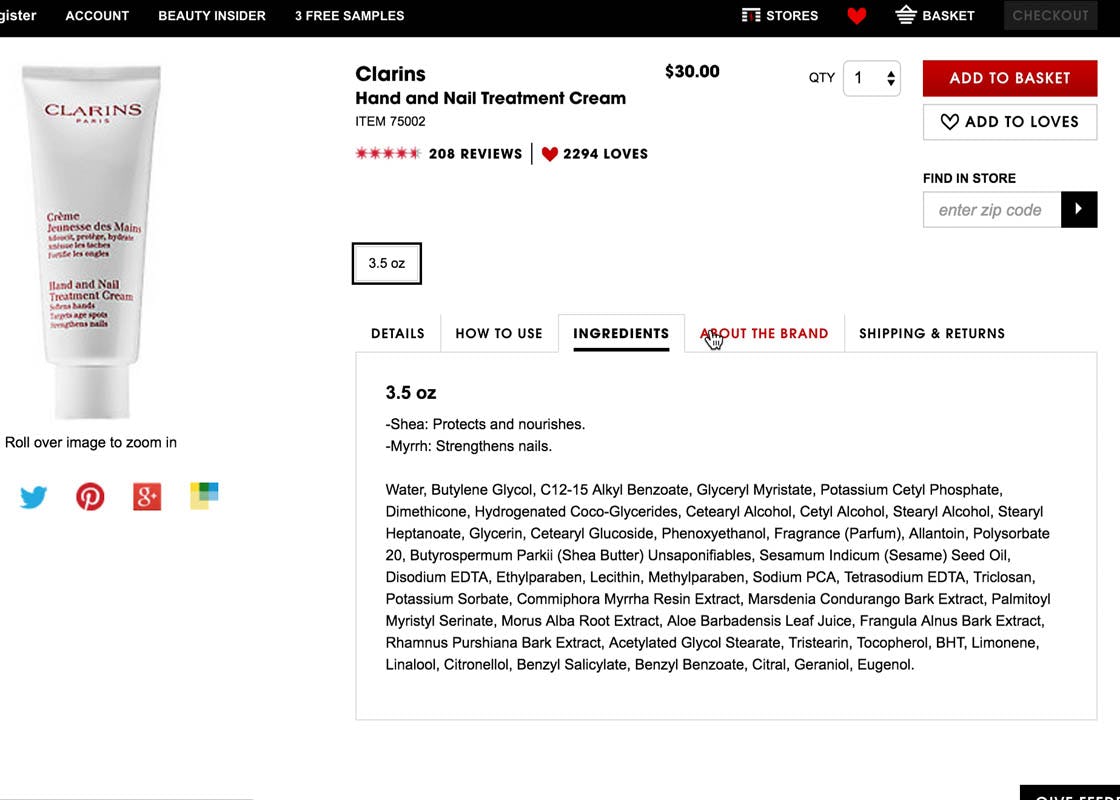
“It doesn’t say unless I’m missing it. They must have a thing about shipping”, a user said after extensively looking for shipping info on the product page. She completely overlooked the content in the horizontal tabs, including the content in the “Shipping & Returns” tab where the answer was provided. Additionally, despite talking extensively about how important ingredients were to her, she didn’t explore the content in the “Ingredients” tab. At Sephora, 18% of all users overlooked the tabs, despite trying to find the very content the tabs contained.
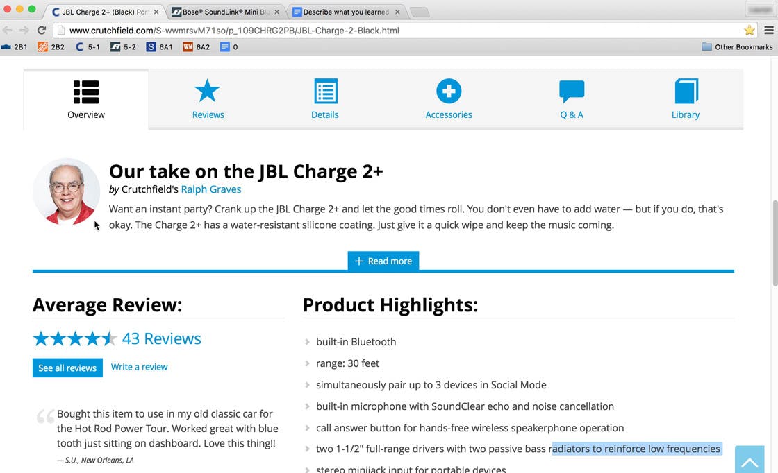
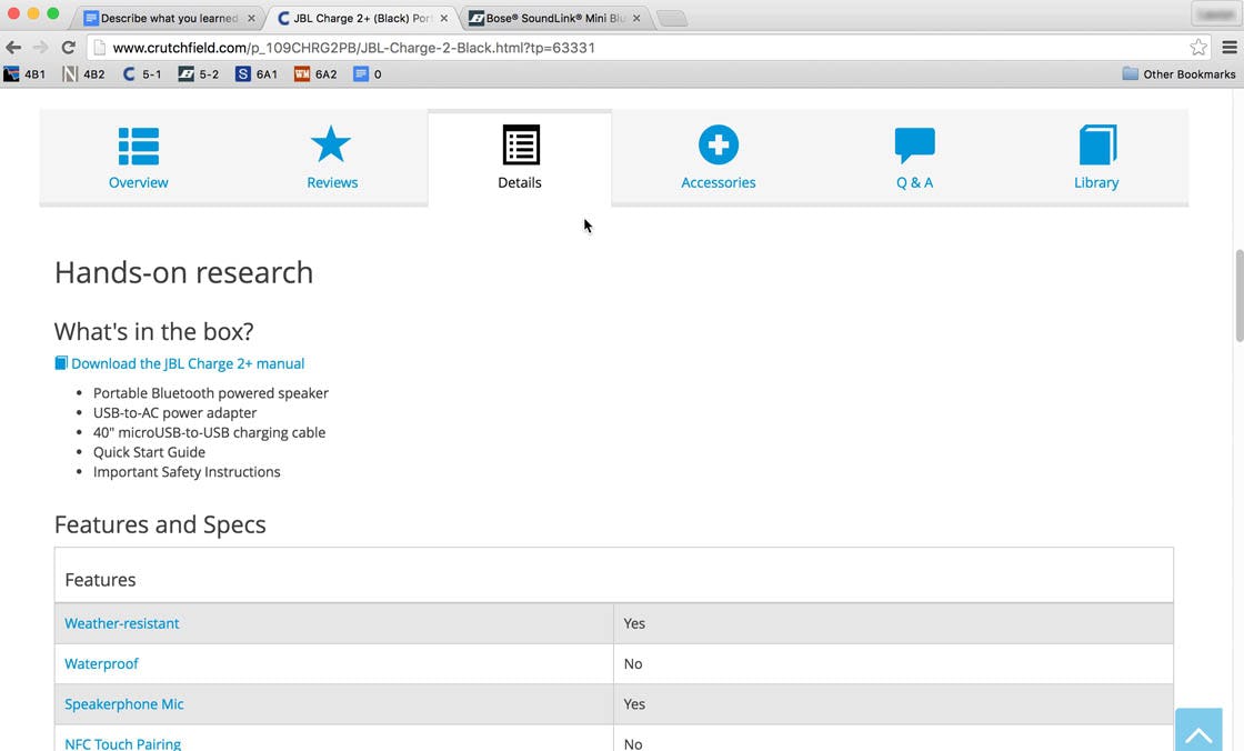
When testing Crutchfield, 21% of users overlooked the horizontal tabs, despite looking for the very content placed within the tabs (which even have icons, theoretically increasing their visibility). Additionally, several users “just” overlooked the tabs for an extended period of time, and were initially highly displeased with the apparent lack of detailed information.
However, during our product page testing the 27% of users who never found the content were understandably frustrated, perplexed, and upset.
It was demonstrated time and again during testing that users need more than product images and a brief description to make a decision on a product. Users considering products will need to dive into product details at a more granular level by considering specs, a full product description, reviews, and even manuals and other auxiliary content. Hence when they are unable to find this content, they end up frustrated or confused.
Furthermore, this has consequences for not only how users perceive the current product they’re viewing, but, even worse, how they perceive the site.
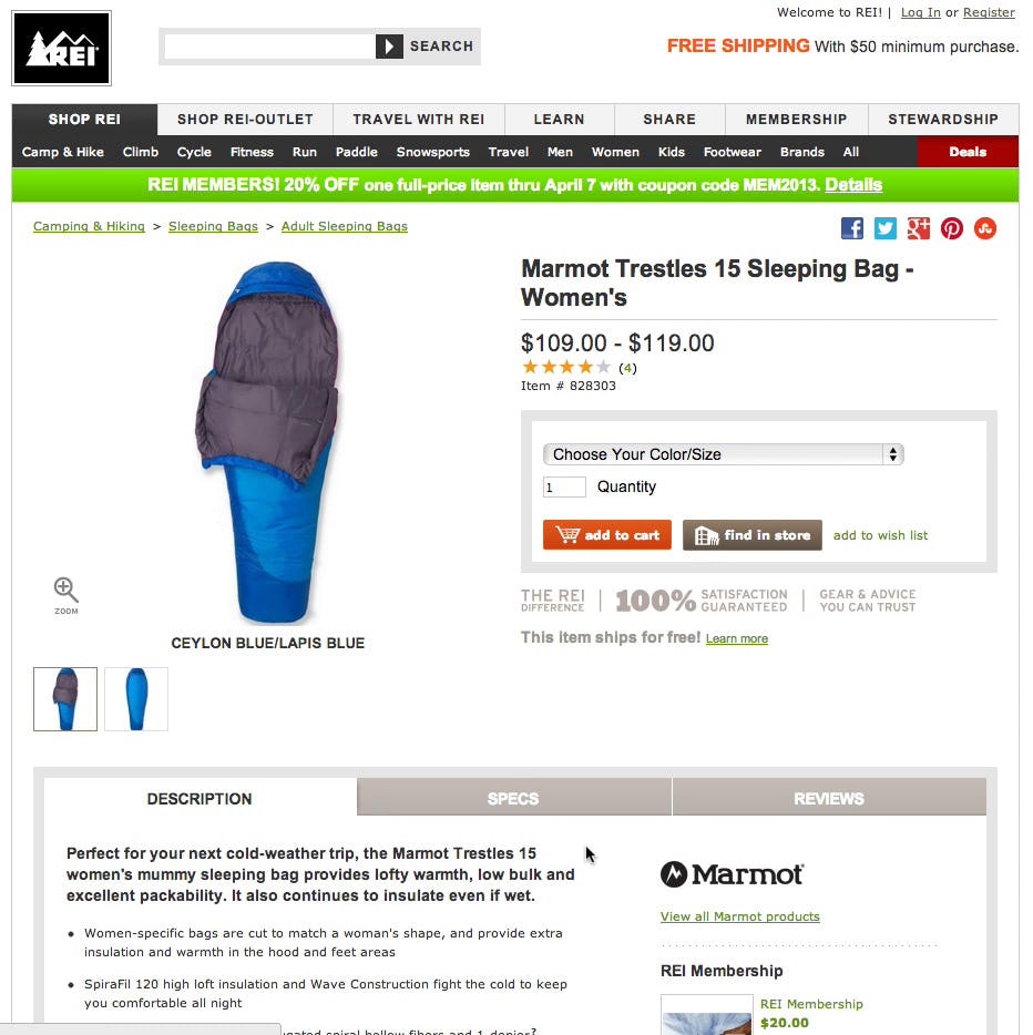
“I’m just looking for a number [the temperature rating]. This is crucial to buying a sleeping bag”, a user said before abandoning REI in anger. At REI 43% of users completely overlooked the horizontal tabs, despite actively searching the page for information only available within the “Specs” and “Reviews” tabs.
If users cannot find the product information, some will assume that this site simply doesn’t have much information available for their products. Which can ultimately make them likely to leave the site and go to a competitor if the information is crucial enough, such as user reviews.
Other Issues Caused by ‘Horizontal Tabs’
Besides the severe issue of a subgroup of users overlooking the tabs, horizontal tabs were also observed to have a number of other intersecting issues.
During testing, a user noted one difficulty caused by content hidden in horizontal tabs: “It used to be for websites that there was just one block of copy and now websites are kind of tabbing it out, so I was looking to see…how much extra information is on these tabs before I bother going too far into it”. When content is collapsed, it can be difficult for users to get an overview of how much product page content is actually available.
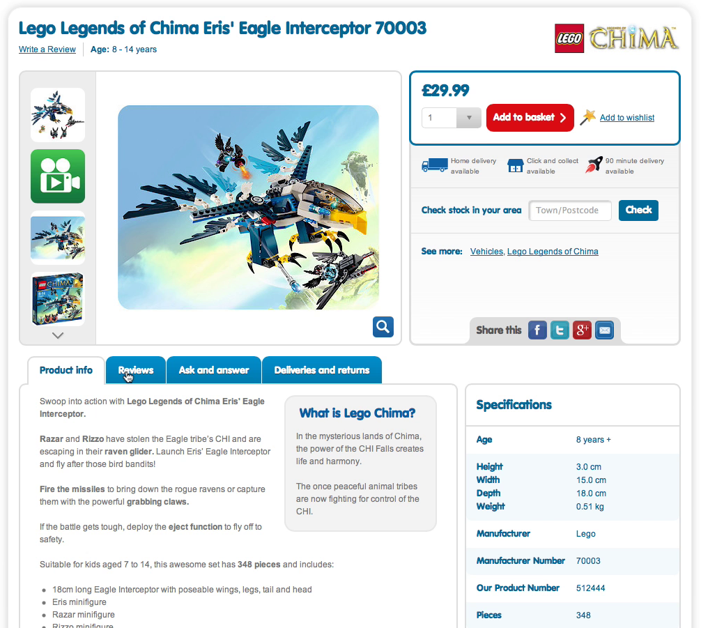
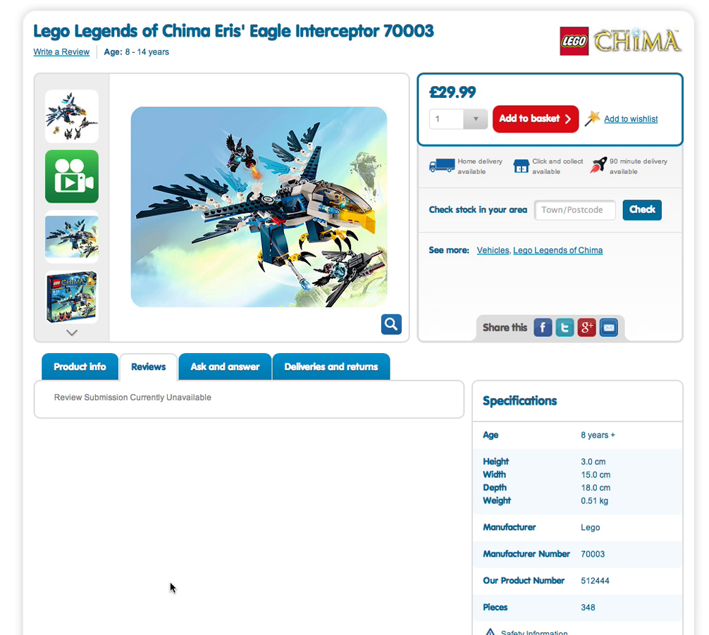
“I could then go and look at these reviews”, a user said, clicking the “Reviews” tab (first image). However, finding no content in the “Reviews” section, the user was disappointed: “Well, there aren’t any of those. That was a shame. I’d expected those to be there”.
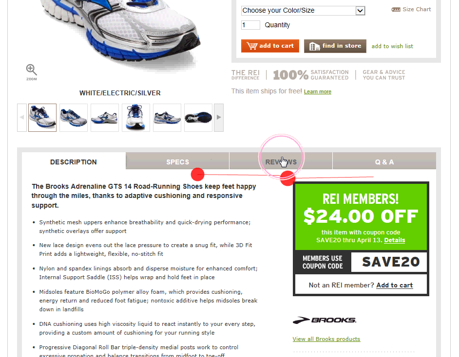
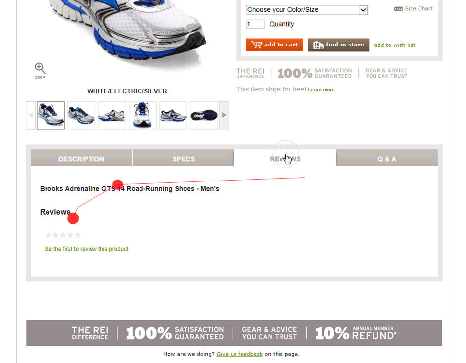
Here, a user, after having scanned the product description in the default tab, considered both the “Specs” and “Reviews” tabs (shown in the first image by the gaze plot data). He chose the latter section, only to reach a dead end, as there are no reviews (second image).
Unclear Return on Investment. Hiding product page content in “Horizontal Tabs” makes it difficult for users to know whether it’s “worth it” to click to open a particular section. As a result, some users won’t click to open content, even though if they had seen the content it would have helped answer a question they had about a product. Other users click to open the content, only to be disappointed when there is no content available, or it’s too meager to be useful.
“‘About The Brand’ isn’t really that interesting to me”, a user said at Sephora without exploring the tab content.
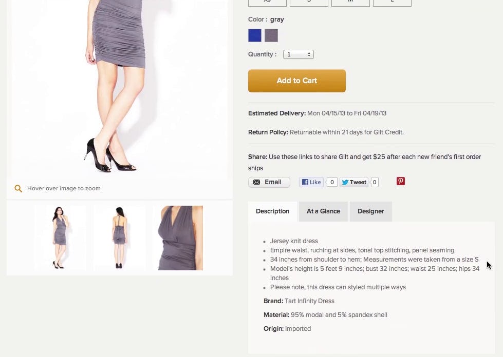
At Gilt, tabs were also skipped: “I don’t care about the ‘designer’, just about how it looks”, a user said, never exploring the content within “At A Glance” or “Designer”. In particular, “accidental discovery” is observed to be lower on product page layouts where the content sections are collapsed, especially in “Horizontal Tabs” layouts.
Hindrance to Exploration. When content is hidden in “Horizontal Tabs” layouts it’s very difficult for users to “stumble” onto content that could end up being extremely valuable to their purchasing decision — for example, a fuller description of the materials used, or a discussion of production ethics (both of which were observed to be happy “accidental discoveries” some users had when exploring product pages).
Users have to actively choose to click to view content, which they often choose not to do when they only have the title alone to influence their decision.
“This is worse than Bose”, a user said after having arrived at Crutchfield and clicking the “Details” tab, trying to find info on “ease of use”. However, that info is only available within the “Overview” tab. Later, when asked by the test facilitator if she explored the “Overview” tab, she found the content, saying, “That changes everything, they do actually tell you more”. Other users similarly went for the “Details” tab when looking for product information (e.g., when trying to find speaker dimensions — also only available within “Overview”).
Misinterpretation of Titles. Hiding product page content places more strain on the title of the section, which must be both enticing and descriptive enough to get users to click.
As horizontal tabs are placed next to each other, they have a limitation in terms of the width they can consume. In practice, this has the side consequence of horizontal tab titles often ending up being too short — leaving them open to misinterpretation and allowing users to read their own meaning into the short one-to-three-word tab titles.
To resolve the issue caused by limited horizontal tab width (i.e., to provide longer titles), sites might be tempted to place some product page sections outside the tabbed interface.
However, moving some of the content sections outside of the main product page navigation was observed to perform very poorly during testing. This is due to a combination of some users overlooking the content placed outside the “primary” product page content, while others will suffer from the increased complexity caused by having two different navigational patterns on the same product page.
Other Product Page Layouts to Consider Instead
During testing, two product page layouts were observed to generally perform well across product types and industries. These are “Vertically Collapsed Sections” and “One Long Page with a Sticky TOC” layouts.
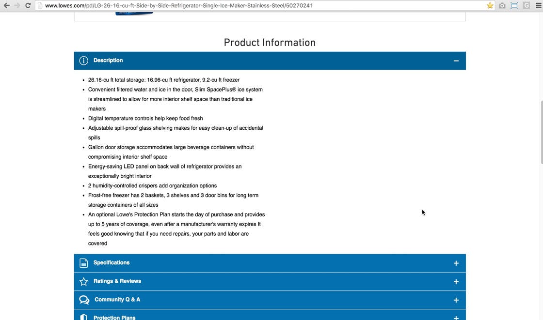
“Vertically Collapsed Sections” layouts, as seen here at Lowe’s, proved to perform well during testing, as they provide users a good overview of the product page sections without suffering from a subgroup of users overlooking content.
“Vertically Collapsed Sections”. Vertically Collapsed Sections offer many benefits, including providing users with a good overview of product page content and ensuring a high discoverability of the hidden content, and additionally is the pattern we observe to generally perform best on mobile sites. Two pitfalls to avoid, however, are (1) not using the pattern consistently for all the product page content, and (2) failing to provide descriptive and intriguing titles for sections.
The titling issue is shared with “Horizontal Tabs” layouts. However, in “Vertically Collapsed Sections” layouts it’s typically less of an issue, as longer, more descriptive section titles can provide more information scent.
Crucially, in testing “Vertically Collapsed Sections” only 8% of users overlooked this content (compared with 27% for “Horizontal Tabs”).
For implementation details and a much deeper discussion of this product page layout, see guideline 751 in Baymard Premium.
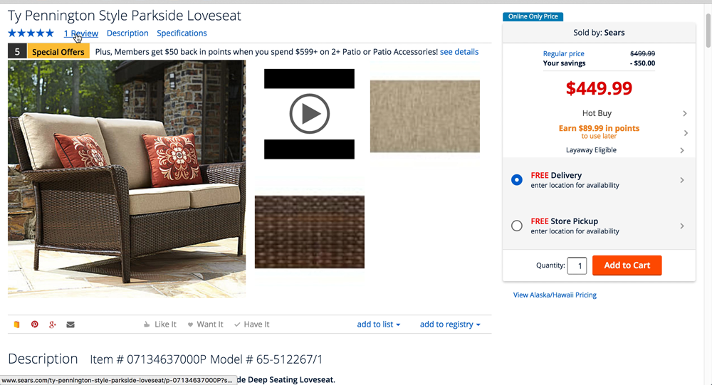
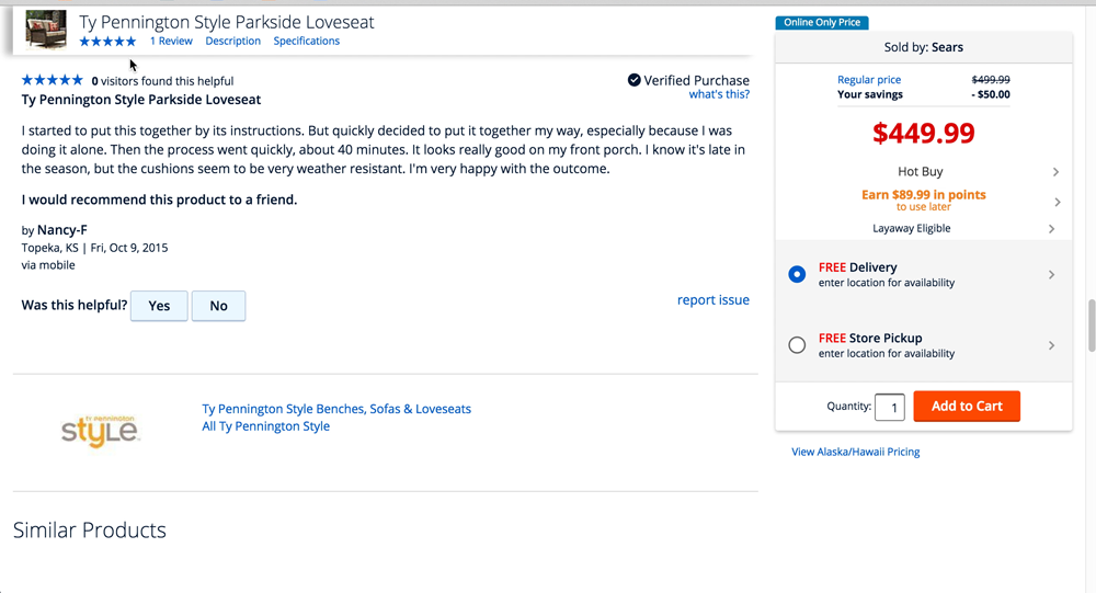
At Sears, the majority of users instantly grasped that the three navigational links at the top of the product page were links to content sections. This gave them a very good start by providing an immediate overview of the page content. The links also acted as navigational shortcuts, allowing users to jump to the corresponding content sections. For example, here, a user, immediately after first exploring the image gallery, jumped straight to “Reviews”, then jumped to the “Description”, and lastly to “Specs”.
“One Long Page with a Sticky TOC”. Similarly to “Vertically Collapsed Sections”, “One Long Page with a Sticky TOC” layouts offer users a good overview of page content. Additionally, the permanently visible TOC offers easily accessible links to different sections, even as users scroll down the page.
Furthermore, even if users happen to miss the sticky TOC (which isn’t likely — only 7% of users in testing overlooked sticky TOCs on product pages), the fact that all sections are expanded by default offers a good fallback, as users will see the sections as they scroll down the page.
(Note: “One Long Page” layouts, without a sticky TOC, were only observed to perform well for simple products that offer primarily visual content — see guideline 757 in Premium.)
For implementation details and a much deeper discussion of this product page layout, see our guideline on Sticky TOC layouts and our guideline on Sticky TOC layout implementation details in Baymard Premium.
Ensure Users Are Able to Find Product Page Content
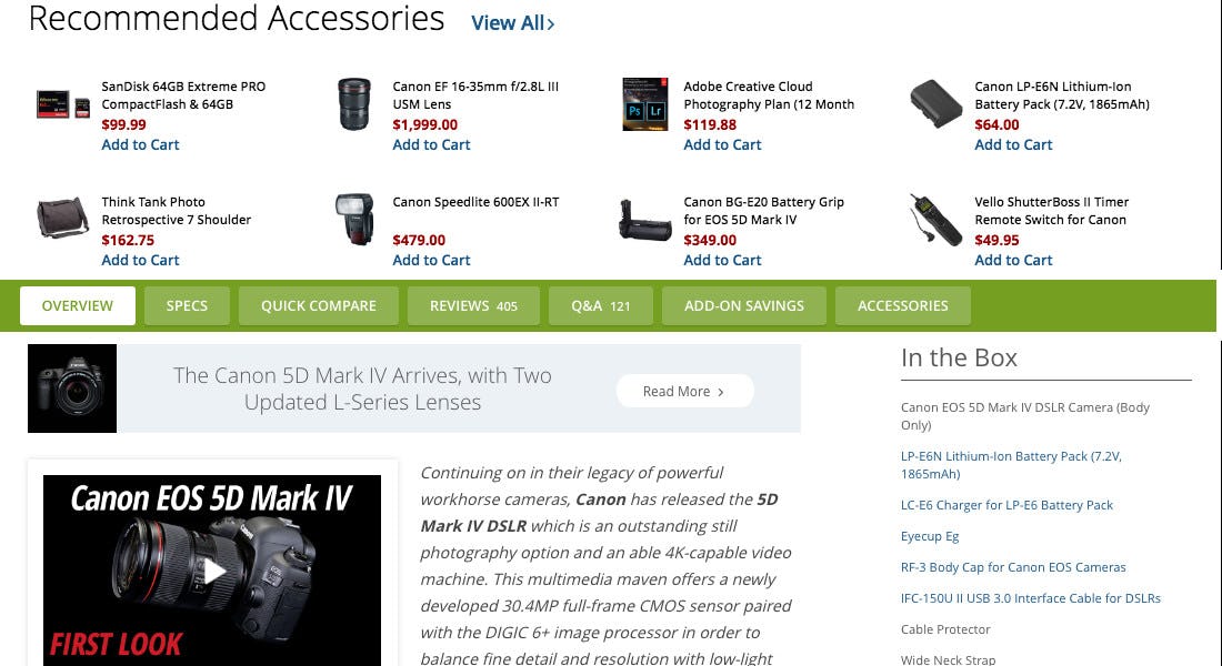
Users who fail to spot the hidden sections in this “Horizontal Tabs” layout at B&H Photo would be missing out on a wealth of content, including specs, a comparison feature, reviews, Q&As, upsells, and cross-sells. It should be noted that B&H has attempted to address the information scent issue to some extent by providing the number of reviews and Q&As there are in each section — but this won’t help users who simply overlook the content entirely.
According to our UX statistics, 28% of sites still use a “Horizontal Tabs” layout, despite the issues that were identified during testing with using this layout — primarily that a significant subset of users will completely miss the tabs.
That issue alone is grave enough that sites in general should avoid such layouts entirely.
This is especially true given that there are better alternatives available in “One Long Page with a Sticky TOC” and “Vertically Collapsed Sections” layouts — assuming the multiple implementation details for each layout are adhered to.
Adopting a layout that has a higher discoverability for core product content will help ensure users can find this crucial content — and won’t decide to go elsewhere to look for it.
This article presents the research findings from just 1 of the 650+ UX guidelines in Baymard – get full access to learn how to create a “State of the Art” ecommerce user experience.

