Key Takeaways
- Grocery users typically add products to the cart in the product list
- Grocery users also have large orders, with dozens of products
- Providing a static “Add to Cart” button limits users’ ability to efficiently fill their cart
Most users shopping for groceries plan to add more than a handful of items to their cart.
Indeed, if they’re doing their “weekly shopping” users can easily end up with dozens of items.
Moreover, it’s easy to forget which items have been added after adding many different groceries across different categories (e.g., fresh fruit, meat, etc.).
During Baymard’s large-scale grocery testing, as participants explored different food categories and added products to the cart, they would sometimes lose track of what they had already added to the cart.
As a result, users in the product list will be forced to visit the cart again and again in order to confirm items that have been added, adding significantly to the time it takes to complete the order, and introducing the chance of errors.
In this article, we’ll discuss our Premium research findings for “Add to Cart” buttons in grocery product lists:
- How it’s easy to get confused when adding items on grocery sites
- How updating the “Add to Cart” button streamlines the shopping process
How It’s Easy to Get Confused when Adding Items on Grocery Sites
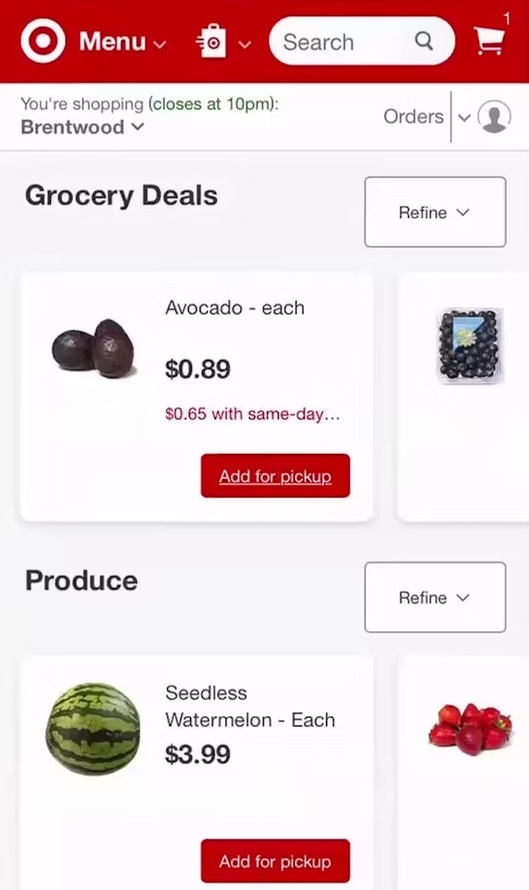
“Oh my God, how do I tell if I added it? I don’t even know what I’m doing.” At Target, this participant added an avocado to her cart, but there was no indication of that on the list item. If it’s not clear by examining list items what products have been added to cart, users will have to make unnecessary trips the cart to find out.
When users are in the process of assessing grocery items in product lists, keeping track of what they have already added to the cart is not easy.
If the items in the list look reasonably similar, with only small differences between them (e.g., different types of apples, sweet vs. yellow onions), it would be quite easy to lose track of which item was already chosen.
The task becomes more challenging as more and more products are added to the cart — which is typical for grocery orders.
Furthermore, a more serious issue could occur if users, unable to see which items in the product list are already in the cart, end up unintentionally adding the same item to the cart more than once.
In the end, the process of reviewing the order is more challenging, and there is a risk users will end up purchasing more of an item than they had intended.
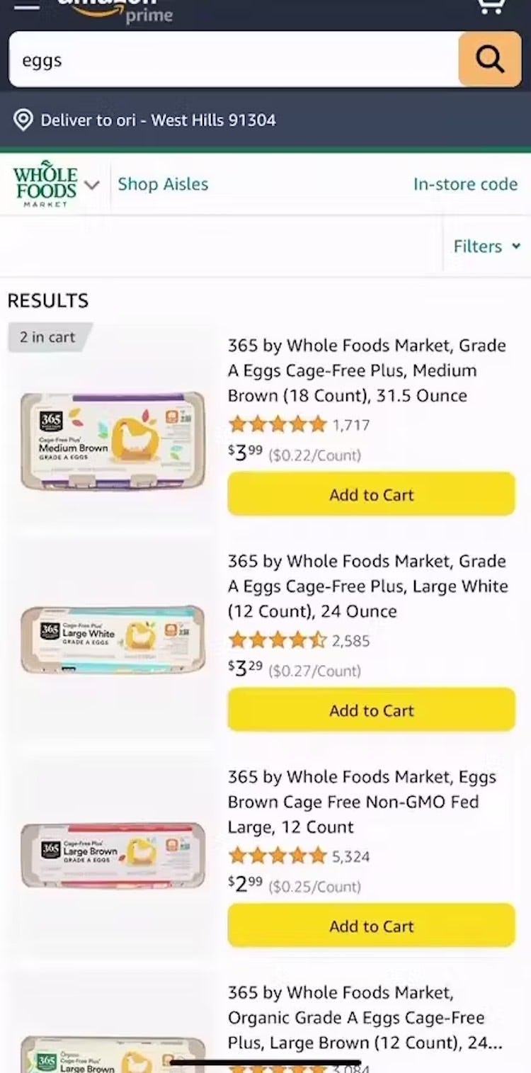
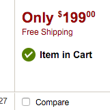
“Did that add to the cart? Because I pressed it. Oh, it did, ‘2 in cart’.” When labels are added to confirm that items have been added to the cart, as they are here on Whole Foods, it can be unnecessarily difficult for users to tell at a glance what items are already in the cart.
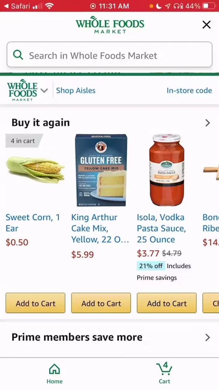
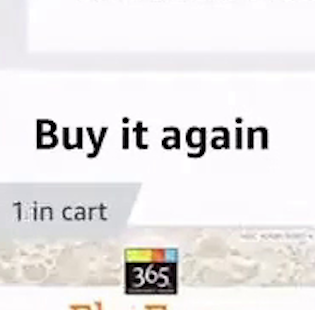
“So it would be nice here if I could add, like if there was a total, like a ticker for the amount, for how many. So I…could adjust the amount like that.” At Amazon Whole Foods, a participant initially failed to notice that she had added corn to the cart. The label on the list item, “4 in cart”, wasn’t sufficiently prominent for her.
Additionally, during testing some sites indicated an item was in the cart with labels or badges — for example, a label reading, “4 in cart”.
However, if only a label is used, a subgroup of users will initially miss this notification, especially if they’re on a mobile device where small labels can be easily overlooked.
Even if the notification is noticed, making a change to the quantity sometimes requires navigating to the cart — an arduous process for a user quickly adding many grocery items to their order.
How Updating the “Add To Cart” Button Streamlines the Shopping Process
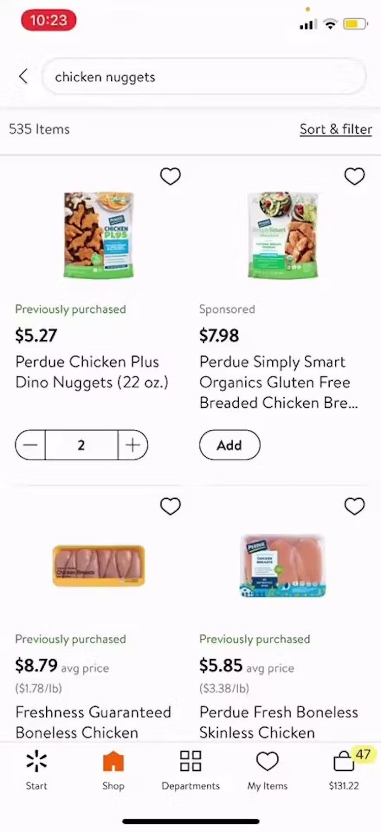
“We already have one of these.” A participant at Walmart quickly added 2 chicken nuggets items to her cart using the “Add to Cart” button, which turned into a quantity picker. An “Add to Cart” button that changes to a quantity picker is the most efficient way for grocery users to add items to the cart in the product list.
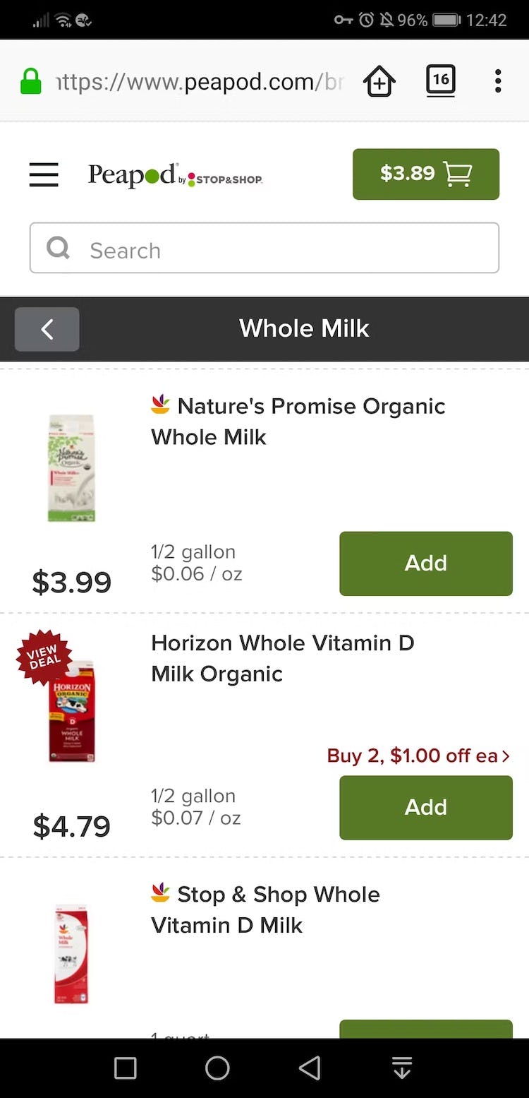
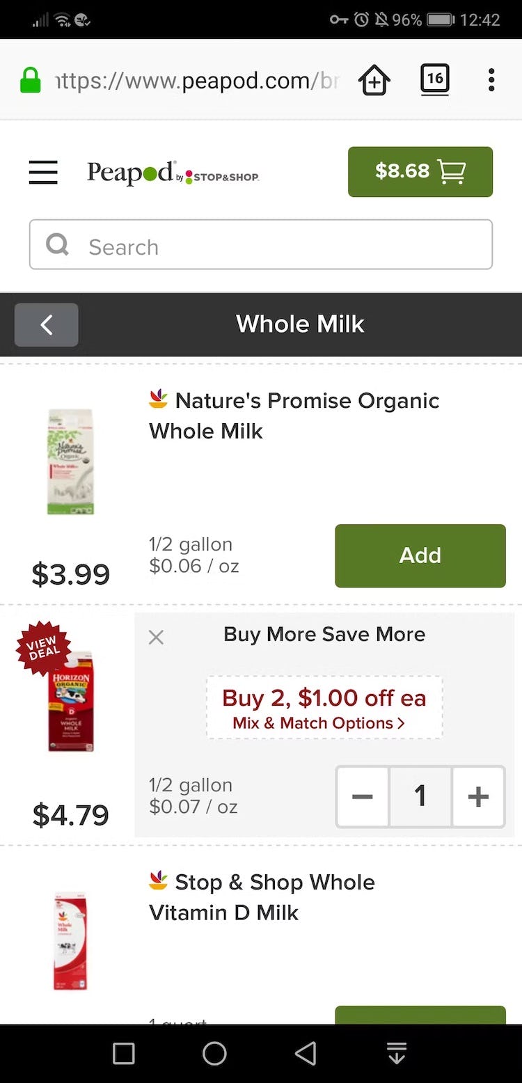
On Peapod, the “Add” buttons are replaced by quantity pickers when items are added to the cart. It’s easy, therefore, to spot the items that have been added to the cart in the product list.
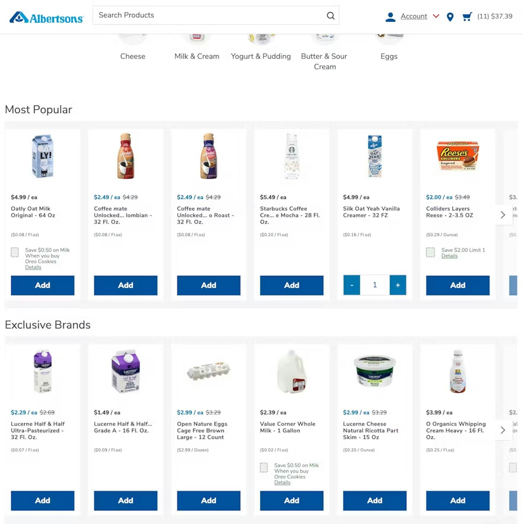
On Albertsons’, products already in the cart are highlighted within the product list, making it easy to add more or remove the item from the cart.
To ensure grocery users know what’s been added to the cart, change the “Add to Cart” button to a quantity picker once users have added an item to the cart.
During testing on grocery sites, this was intuitively understood by users, who received immediate confirmation that their item had successfully been added to the cart.
Additionally, changing the button to a quantity picker allows users to quickly increase or decrease the quantity of an item in the cart — a frequent task for grocery users, who may initially want 7 oranges, but then decide 5 is enough.
To optimize this design, consider also making the quantity an open text field, so that users can quickly add, for example, 6 avocados, instead of having to tap a button six times.
Finally, another benefit to highlighting items already added to the cart is that users get a more personalized experience while in the product list.
Seeing list items change as they are added to the cart will make users feel that the site is responsive to their actions, which can result in more confident and pleasant product browsing.
Adjust the Grocery Experience to the Needs of Grocery Users

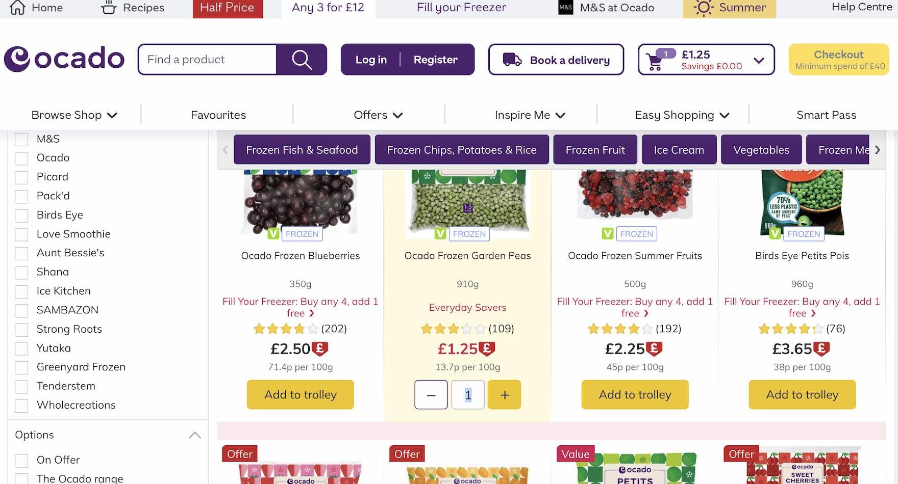
At Ocado, the “Add to trolley” button changes to a quantity picker when clicked. Moreover, the quantity is implemented as a text field that allows users to make larger adjustments, rather than having to click the “plus” and “minus” buttons.
For general e-commerce sites, “Add to Cart” buttons are often unnecessary to display for each list item.
Yet they’re important for grocery users, as grocery users typically add a much greater number of products to their order and furthermore they often have no need to go to the product page — the info they need is already in the product list.
But the button shouldn’t be static — it should dynamically update as users tap it, by changing into a quantity picker.
By doing so users are provided with a more seamless grocery user experience — somewhat akin to the rapid way shoppers grab items off the shelves in physical grocery stores.
Getting access: all 400+ Groceries UX guidelines are available today via Baymard Premium access. (If you already have an account open the Groceries study.) If you want to know how your Grocery desktop website, mobile website, or app performs and compares, then learn more about getting Baymard to conduct a Grocery UX Audit of your site or app.)