Key Takeaways
- At Baymard, we’ve conducted 650+ hours of new Online Grocery research, for a total of 1,700+ hours across multiple Online Grocery studies
- Our new research has uncovered 670+ new usability issues specific to the ecommerce Groceries experience, adding up to a total of more than 1,200 issues observed across Grocery sites
- The research has resulted in new and updated Grocery guidelines that describe the issues, as well as design patterns verified to perform well for users
- We’ve added 8 new Grocery guidelines to our existing Grocery UX research catalog
Our Baymard research team has spent 650+ hours usability testing and researching Online Grocery features, layouts, content, and designs — enhancing and expanding our existing research on this industry and bringing our total to 1,700+ hours of Grocery UX research.
The research is based on 70 qualitative user/site usability test sessions following the “Think Aloud” protocol (1:1 remote moderated testing).
This study included a mix of pure grocery sites and mixed grocery/mass merchants for a total of 8 sites.
-
Pure grocery sites included: Safeway, ALDI, Kroger, and Stop & Shop.
-
Mixed grocery/mass merchants included: Target, Dollar Tree, Walgreens, and CVS.
During Baymard’s testing the users encountered 670+ medium-to-severe Grocery usability issues.
These issues have subsequently been analyzed and distilled into 400+ UX guidelines, all of which are available as part of our Baymard research findings.
The 400+ guidelines cover most aspects of Grocery UX, at both a high level of general user behavior as well as at a more granular level of specific issues users are likely to encounter.
In this article, we give you the top-level highlights of this new research study.
Expanded and Updated Grocery Research
This latest round of large-scale Grocery testing provides the following:
- A comprehensive review and reverification of all of our existing Grocery research
- New examples from usability testing highlighting user issues on test sites, as well as test site implementations that were verified to perform well for users
- New insights into user behavior during online grocery shopping, discussed in particular in 8 new Grocery and Fulfillment guidelines
1) A Comprehensive Review and Reverification of All of Our Existing Grocery Research


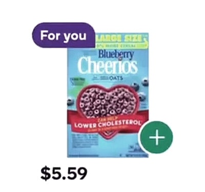
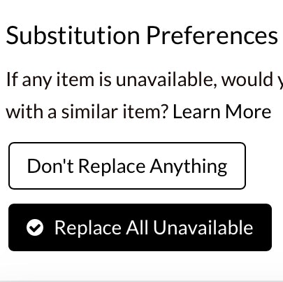
”I mean, I genuinely don’t see anywhere to do that on here. Let me go back to the top, I guess…go all the way back to the bottom. Um, no, I don’t know.” This participant on CVS’s mobile site scrolled up and down the cart but could not find any way to specify substitute items (first image). In fact, this feature was only available during checkout (second image) — risking some users abandoning before ever finding it (see our Grocery Substitutions article and guideline #3303.

”If I know that I’ve purchased it in the past, I would go to my cart here.” To add a previous purchase to her cart, this participant on Target’s mobile app navigated to her cart and scrolled to the bottom, swiping through the “Buy again” feature until she found the item she was looking for (see our Past Purchases article and guideline #3285).
This 2026 Grocery research ensures that our existing Grocery research — first conducted in 2022 — remains robust and up-to-date with the latest UX findings.
This large-scale study dedicated 550+ research hours and added 70 qualitative user/site usability test sessions solely to investigating Grocery UX.
As a result, we’ve verified our previous observations and validated the user behavior — and subsequent design recommendations — made in our existing Grocery guidelines.
2) New Grocery UX Test Examples


”Oh, there’s no time slots available, gosh darn it…and it says, ‘Please try again tomorrow’, so you can’t pick a future time slot, it has to be a time slot for today.” This participant on ALDI’s mobile site moved forward from her cart, which displayed no fulfillment details (first image), only to discover that her selected location had no available time slots left (second image) (see guideline #1955).

”I do not see that there is a way to save that item for later.” This participant on Stop & Shop’s mobile site was unable to save an item in his grocery cart for later purchase (see guideline #622).
Along with validating our existing Grocery research, we’ve also updated our Grocery research catalog with hundreds of new examples.
These examples are from the test sessions at the 8 test sites listed above, as well as from our ecommerce UX benchmark (desktop, mobile, and app).
In general, the new examples help illustrate how a UX issue identified in 2022 still exists today — only the interface has undergone heavy changes as a result of new UI design schemes and preferences.
In short, it’s further support for the idea that just because an example from user testing may look dated, it doesn’t necessarily mean the underlying user issue no longer exists.
3) New Insights into Grocery Shopper Behavior


”I instinctively would think that it would be right here with this ‘Change’ button, but all that’s bringing is other pickup locations…it doesn’t appear there’s a way to do that.” This participant on Stop & Shop’s mobile site tapped the “Change” link at the top of the cart, expecting to be able to change from pickup to delivery (first image), only to find that she could only change her pickup time and location — not her selected fulfillment method (second image) (see guideline #3300).

”Honestly, I know that I could probably — if I was looking for a particularly unique item, I could go to ‘order history’…However, I would not do that. That is entirely too many clicks…because then I’d have to remember what order it was in.” This participant on Kroger’s mobile app briefly considered the “Purchase History” page as a way to find previously purchased items but quickly became overwhelmed at the prospect. With such large orders as are typical for groceries, getting a clear overview of what is included with each one is difficult (see guideline #3285 and our Past Purchases article).
Finally, while many user issues and design patterns persist, there are always some genuinely new issues that arise, as well as new approaches to resolving these issues.
As such, we’ve added 8 new Grocery guidelines based on this latest 2026 test data.
These new guidelines reflect the changing landscape of Online Grocery and provide specific design guidance on the complexities of issues such as fulfillment method selection, providing substitutions, and locating commonly repurchased items.
550+ More Hours of Grocery Specific Research


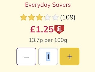
”It only gives you two options, and if you don’t want that option, you don’t get to pick…I don’t like that this is how the substitutions are done. This is my least favorite part of the whole thing. It should have been in the cart, and then after that it should give me suggestions, and then if I don’t like those suggestions, it should allow me to pick what I want. Now I just feel tied into this, and this would truly turn me off from shopping from here. It would make me feel like I couldn’t get what I want if this was out, like I just have to get whatever you suggest. That doesn’t seem like a smart way to do that.” This participant on CVS’s mobile site wanted to opt for substitutions (first image) but found she could only decide between two site-selected alternatives for each item in her cart (second and third images). Wanting different substitutions, she described how this limitation would deter her from shopping at CVS (see guideline #3303).
In conclusion, this latest study both validates and expands our research on Online Grocery UX.
To start exploring our Grocery research, be sure to check out our Grocery guidelines — a few of which are available for free as published articles (see articles on 4 Grocery UX Best Practices, Grocery Substitutions, Past Purchases, and Adding to Cart). If you have access, go to our Groceries UX guideline page.
Additionally, see our Online Grocery UX benchmark of 10 sites and apps, which includes over 7,000 performance ratings, and our Online Grocery page designs, which includes over 6,500+ desktop and mobile Grocery UX worst and best practices.
Getting access: all 400+ Grocery UX guidelines are available today within Baymard. (If you already have access through an account, open the Groceries Study.)
If you want to know how your Grocery desktop site, mobile site, or app performs and compares, then learn more about getting Baymard to conduct a Grocery UX Audit of your site or app.