Key Takeaways
- Our benchmark of 10 Grocery sites and apps shows that Online Grocery retailers have a generally “poor” UX
- In particular, Cart & Checkout performs especially poorly
- The 4 common UX issues discussed in this article can be a direct cause for users abandoning Grocery sites and apps
Key Stats
- 700+ research-based parameters used to generate a holistic picture of Grocery UX
- 7,000+ weighted UX performance scores included in our Grocery benchmark
- 6,500+ best practice examples provided in our Grocery research study
While Online Grocery sites (and apps) may at first glance appear similar to traditional ecommerce sites, an important difference is a user’s increased frequency on Grocery sites — and their potential for long-term loyalty.
With fresh items needing to be ordered regularly on a weekly basis, users have a tendency to use a particular Grocery site with much greater regularity than, say, an apparel or electronics site.
However, to become a long-term customer, a user has to find their first initial site interactions satisfactory.
Otherwise, Baymard’s large-scale testing shows that if they’re initially underwhelmed by the site performance, users may look elsewhere to find a site that better accommodates their needs and saves them time.
Indeed, as the number of brick-and-mortar Grocery stores that are beginning to offer their goods online increases, users will have more opportunity to find a better experience at a competing site or app.
With that in mind, to begin to assess how Grocery sites and mobile apps stack up when it comes to the ecommerce user experience, at Baymard we’ve recently published a new in-depth Online Grocery UX Benchmark.
This database contains UX performance rankings for 10 Grocery sites and apps: Safeway, Albertsons, Kroger, Aldi, HEB, Stop & Shop, Sainsbury’s, FreshDirect, Ocado, and Morrison’s.
These sites have been manually assessed by Baymard researchers across 700+ research-based UX parameters relevant for Grocery sites and apps, resulting in 7,000+ weighted UX performance scores exclusively for Online Grocery ecommerce.
Additionally, the database contains 6,500+ best-practice examples from leading Grocery sites and apps.
In this article we’ll analyze this dataset to provide you with an overview of the UX performance of Grocery ecommerce, and outline 4 Grocery best practices based on our in-depth Baymard research findings applicable to nearly all Grocery ecommerce sites and apps.
Grocery UX Performance Overview
For this analysis, we’ve summarized the 7,000+ Grocery usability scores across desktop and mobile sites and Grocery apps.
The summarized scores for each of the 10 benchmarked sites and apps are plotted in the scatterplot above.
The top row is the total Grocery UX performance, which reveals that all Grocery sites have a “poor” UX performance.
This falls short of ecommerce UX performances in general, which have an average “mediocre-to-decent” performance.
Drilling down to specific ecommerce themes, we see that Grocery sites performed the worst in Cart & Checkout across desktop and mobile sites and Grocery apps, with nearly all sites having a “poor” performance (except 1 site that has a “medicocre” app performance for Cart & Checkout).
On the other hand, Search generally performed the best across all 3 platforms, with one Desktop site even at a “near-perfect” performance level.
Yet the average site Search performance is still only “mediocre-to-decent”.
Clearly, Grocery sites and apps have a ways to go to ensure their users are having even a “decent” overall experience.
Below, we focus on the worst-performing subarea of our Grocery benchmark across mobile and desktop platforms: Cart & Checkout.
Grocery Cart and Checkout
Once users have added all of their Grocery list items and enter the Cart & Checkout flow, there are unfortunately significant issues across all benchmarked sites, resulting in the lowest-performing area on both desktop and mobile sites, as well as one of the worst-performing areas on apps.
As users would likely have to go through this checkout on a weekly basis, it needs to be as smooth as possible.
Most of the issues are related to customer and address information, order review and confirmation, form page and design, and the overall flow back and forth through the checkout steps.
In particular, 4 best practices were identified during benchmarking, which are also commonly missed opportunities found on most ecommerce sites.
1) Hide the “Coupon Code” Field
Our eye-tracking test sessions confirm all our other think-aloud checkout usability test findings: empty form fields draw a disproportionate amount of user attention.

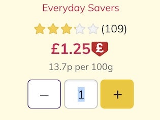
At Stop & Shop the “Promo Code” is visible in the cart — which will distract a subgroup of users from their primary task of completing their food order.
Promotional fields, like “Coupon Code”, will get noticed immediately by all users if shown by default within the normal flow of form fields — yet the field only likely needs to be seen by a subgroup of users.
Moreover, we consistently see during testing that “coupon hunting” is a persistent issue.
Once users notice the coupon field, they will often feel like they are overpaying or, as one participant complained, “I find it slightly annoying that they’re flashing these coupon code fields as much as they do, because it is like, ‘You should have a coupon, you could get this cheaper if you knew this code’…I don’t”.


At Albertsons (first image) and Safeway (second image), the promo code is hidden behind links. Users can focus more clearly on completing their purchase, as opposed to going “coupon hunting”.
The main component in reducing the amount of needless attention drawn to promotional fields is hiding the promotional fields (and any “Apply” buttons) behind a link.
We observed this to perform well during testing, as empty form fields in the checkout are generally seen by users as a potential task that has to be completed.
Removing the form field from the default checkout flow will therefore greatly reduce the amount of needless attention it receives.
At the same time, testing also showed that those users who do need the field, because they have a code to enter, will all find the link, as getting their discount is top of mind before they complete the checkout.
2) Luhn Validate the Credit Card Number Field
Typing the typically 15- or 16-digit credit card number string, without errors, can be difficult for users.
One aspect that more easily allows users to correctly input their credit card number is allowing them to type spaces and autoformatting the spaces embossed on the card (typically breaking the long input into more manageable 4-digit chunks).
However, even when broken into smaller chunks, the 15–16 digits still have to be typed perfectly to avoid payment validation errors.

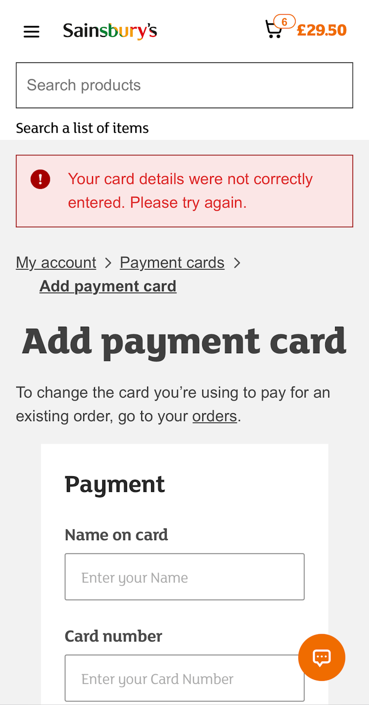
At Sainsbury’s, the credit card number isn’t Luhn validated — no error message appears after having typed an invalid card number and exiting the field (first image). Moreover, the card data is cleared (second image), forcing users to retype all their card data — a tedious and error-prone process on mobile.
When a user’s card number input isn’t checked for typos before it’s submitted to the payment processor, needless data-loss validation errors are likely.
Participants in testing experienced checkout flow delays and site abandonments when they had issues with the credit card number input.

At Morrison’s users are given an error after leaving the “Card number” field if the typed number can’t be correct.
Therefore, to further aid users typing in their credit card number, it’s important to Luhn validate the user’s input before the entire card dataset is submitted (front-end validation).
Luhn validation works to check to see if the card number entered by a user is plausible — all credit card numbers follow a pattern that will allow a simple Luhn/Modulus 10 checksum validation.
Note that the check doesn’t submit and verify the card data with the payment processor.
In other words, the Luhn validation can’t say if the card is valid, has sufficient funds, etc. — it can only tell if the typed card number sequence has been incorrectly typed, which gives users a chance to correct their error immediately after they’ve made it.
3) Mark Both Required and Optional Fields
What information users are required to provide during a checkout flow is highly inconsistent across sites.
For example, some sites require users’ phone numbers, others don’t. Some require a cardholder name, others don’t, etc.


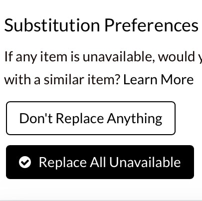
At Ocado (first image) and FreshDirect (second image), no fields are marked as “required” or “optional”, leaving it up to users to figure out what fields must be filled out to complete checkout.
Therefore, most users have few preset expectations on what information is required and what may be optional.
So while it might seem obvious to site designers that the phone field isn’t required on their site, but all the other payment fields are, this will by no means be obvious to the average user.
Users simply have no way to intuitively know a particular site’s requirements beforehand.
They need to figure it out on a site-by-site basis for each and every form they fill out.
On Aldi, optional and required fields are marked, leaving no doubt in users’ minds what must be completed.
To avoid this issue, and make it completely clear to users what information they need to provide in checkout, it’s important to always label both required — and optional — fields on forms.
During testing, it was verified that using an asterisk was sufficient to indicate required fields, while the optional fields can be marked as “Optional” after or close to the field label.
4) Provide a Load Indicator
Load performance should always be optimized.
Yet how quickly steps or features load during checkout is partly outside of a site’s control, since a user’s location and connection greatly affect the speed.
Furthermore, checkout steps and features are generally slower than most other page types, as they rely on slightly slower HTTPS connections, and often use one or more third-party dependencies (most noteworthy being the payment-processing requests, which can be very slow).

At Stop and Shop, there were instances of slow-loading features and pages. Yet there was no load indicator provided. Users will get impatient when they’re faced with slow-loading times and no indication that the site is “working”.
While most checkout steps and features load fairly swiftly most of the time, participants during testing got either anxious or, more commonly, impatient as soon as load times began to approach 4–5 seconds or longer.
Some participants during testing clicked primary buttons multiple times to try and move the process along.
However, this can result in serious errors if, for example, a user clicks “Submit” multiple times and inadvertently submits multiple orders.

Ocado’s mobile site provides a load indicator, which will help users waiting on the site by encouraging them to be patient.
Therefore, it’s important to provide load indicators when loading a new step or feature.
This was observed to make users feel less anxious and like “something was happening”.
Moreover, the “Place Order” button should be disabled during loading to avoid multiple clicks from impatient users.
Finally, consider updating the load indicator with a message if a request takes 20+ seconds to load, as even the most patient users will start to get antsy after 20 seconds.
Help Grocery Users Transition to Repeat Visitors
Our benchmark has revealed that Grocery sites in general have a poor UX — it’s clear that there’s much room for improvement.
Adhering to the 4 best practices described above is the first step toward improving users’ Online Grocery experience:
- Hide the “Coupon Code” Field
- Luhn Validate the Credit Card Number Field
- Mark Both Required and Optional Fields
- Provide a Load Indicator
Additionally, this high-level analysis of the Online Grocery UX focuses on only 4 of the 80+ Grocery Cart & Checkout guidelines included in our Grocery Research Study.
Moreover, our full Grocery Benchmark includes 7 additional themes (390+ guidelines in total), including “Recipe Pages”, “On Site Search”, and “Product Page”, which together describe the full user’s journey in terms of Grocery UX.
These 7 additional themes should be reviewed as well to gain a comprehensive understanding of Grocery UX, and to identify additional site-specific issues not covered here.
To learn more about our Grocery research, head to our Grocery Research page.
Getting access: all 390+ Grocery UX guidelines are available today within Baymard. (If you already have access through an account, open the Groceries Study.)
If you want to know how your Grocery desktop site, mobile site, or app performs and compares, then learn more about getting Baymard to conduct a Grocery UX Audit of your site or app.