
In previous articles we’ve examined the e-commerce search engine logic (12 query types), autocomplete suggestions (8 design patterns), and the actual search results (contextual snippets) – but what about the search field? In this article we’ll go over our research findings on the design of the search field, and showcase how it can directly influence the user’s entire shopping and search behavior at your site.
The search field represents the initial step of the user’s search process (they must interact with it to even see the search results page), and the search field design is therefore a key aspect in crafting a great search experience. However, our recent large scale e-commerce search usability study shows that the design of the search field is instrumental at an even more fundamental level – the field design can influence the user’s entire approach to how they find products on the site.
To a large extent users see the prominence of the search field as an indicator of how strongly the site “recommends” search as a way to find products, versus the alternative of navigating categories via the site menus. During our usability testing the subjects adopted search as their primary product finding strategy much more frequently on sites that had a very prominent search field, while the test sites with a muted search field design saw increased category navigation.

Etsy features a large search field in the very center of the page header – a design that encourages users to search.
How Prominent Should Search Be?
In other words, the search field’s prominence (determined by its design and placement) influences the user’s likelihood of adopting search as their primary product finding strategy. It’s therefore paramount to ensure that the field’s prominence aligns with the importance of search to your site.
In industries where search is the preferred product finding strategy, it can be beneficial to “promote” the search field with a prominent design and placement, especially on the user’s landing page (e.g. the homepage). Meanwhile a more subdued search field is warranted on sites where category navigation is preferred. This is obviously highly unique to each site, though the preference for search vs category browsing typically falls as follows:
- Search is preferred when .. the user already knows the specific item they want (e.g. “I want a Toshiba Satellite C55-B5246”) or the sites with a very extensive product catalog (e.g. mass merchants such as Amazon). This will typically be the case for spec-driven purchases, purchases based on extensive third-party research (e.g., via review sites), or purchases based on price comparison shopping.
- Category browsing is preferred when .. the user doesn’t yet know the exact product they want (e.g. “I want a laptop”) or the site’s hierarchy is very flat. During testing, visually-driven industries such as apparel and home decoration in particular saw a clear bias toward category navigation – both in terms of the subjects’ initial preference and their subsequent success rate.
In terms of design and implementation, there are multiple ways to visually subdue or emphasize the search field in your overall layout. The exact method to employ will vary from site to site, depending greatly on the context the search field appears in (i.e., the overall site design). Let’s look at three examples, ranging from a highly subdued search field to a dominating one.

Urban Outfitters has hidden the search field altogether and simply show a loupe icon, clearly encouraging category browsing as the product finding strategy. This makes sense considering Urban Outfitter’s industry and their focused product catalog.
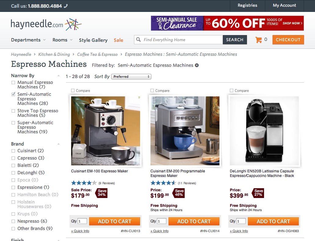
Hayneedle’s search field stands out a little more but with no clear preference between search and category browsing – they are equally prominent on the page. This is likely a function of some users knowing exactly the item they want (search preference) while others just know the type of product they are interested in and want to browse Hayneedle’s catalog first (category navigation preference).

Newegg offers up an example of a more dominating search field that nudge users towards adopting search as their primary product finding strategy. Given the size of Newegg’s product catalog and the type of products they carry, this seems a sensible design choice.
Tweaking Search Field Prominence
In terms of aesthetics, our e-commerce search study shows that site designers have a great degree of freedom so long as there’s agreement between the search field prominence and the importance of search as the primary product finding strategy.
In terms of design, there are three main factors that designers can tweak to increase or lower the search field’s prominence while still retaining a bespoke field design that matches the unique aesthetics of their brand:
- Position – Depending on where the search field is placed on the page it will either receive more or less focus. The most common search field placements are in the top-right corner of the header (typically gets less attention), in the center of the header (tends to get a lot of attention), or integrated into the navigation bar (amount of attention drawn depends highly on implementation and context). The other page elements surrounding the search field obviously has a major impact on the field’s prominence, so make sure to position it wisely.
- Contrast – The search field’s contrast may similarly be tweaked to increase or decrease the field prominence relative to other elements on the page. Increasing the contrast of the field’s border, input text, search button, etc. can make it pop out on the page, while subduing these elements can allow the field to recede into the overall page design, allowing other elements to draw the user’s attention.
- Size – The larger the search field (and input text), the more prominent it will appear, and the more users will perceive it as the site is encouraging a search strategy. Keep in mind that certain page positions may constrain the possible size of the search field (e.g. if the field is integrated into the main navigation bar alongside the top level categories).
Let’s look at a handful of “real-life” search field implementations to see how these three factors combined can influence the field’s prominence.

1) Position: A less prominent appearance can be achieved by placing the search field above the main navigation menu, as seen here at Williams-Sonoma with the search field located in the upper right corner of the header.

1) Position: Overstock draws more attention to the search field by placing it in the center of the header, next to their logo (which due to its graphical nature gets a fair degree of focus from users).

2) Contrast: The graphics of the search input field consist of many sub-elements such as the field’s border and background color, input font and size, placeholder font and size, etc. The more these sub-elements, as a whole, blend into the header, the more subdued the appearance – as is evident in this example from American Eagle Outfitters.

2) Contrast: While the search field on Dick’s Sporting Goods has a white background like the one at American Eagle Outfitters, the colored header background provides more contrast and the field consequently becomes a lot more prominent. Increasing the contrast between site header, search field and search button, is often one of the most effective ways to put emphasis on the search field while retaining a relatively calm header appearance (as opposed to, e.g. thickening the field border or making the input text bold, which tends to induce a more cluttered feel).

3) Size: By making the search field physically small, its visual prominence is greatly lowered, as seen here on Ann Taylor. This sends a strong signal to the user that category navigation is the preferred product finding strategy for this site.

3) Size: Toys’R’Us boasts one of the largest search fields among the top 50 US e-commerce sites. The search field stretches 60% of the 950-pixel-wide header layout. A field this wide yells “search” to the point that it’s likely that some users will interpret this as Toys’R’Us implying that search is the only viable product finding strategy on their site (essentially communicating “don’t use categories”).
As seen in these six examples, designers have a lot of freedom in terms of the aesthetics of the search field – what’s important is that the field’s position, contrast and size is tweaked, so the prominence of the search field is in tune with the site’s specific context (industry, scope of products, category hierarchy, etc).
Dynamically Adjust the Field’s Contrast
On the typical e-commerce site, some pages (such as the homepage) tend to be significantly more cluttered than other pages (such as a 2nd-level category page). Since the prominence of any given element is determined by its relative dominance to the other elements on the page, a search field which stands out on the less cluttered pages (i.e. nested category pages, help sections, etc) may be less obvious on the more busy pages (i.e. the homepage, product pages, etc).

“I didn’t see that [the search field, ed.] until now. Else I would have used it before, when I looked specifically for it. It’s very light. It almost disappears up there,” a subject explained, continuing, “That’s really odd I didn’t see it before. I’m absolutely sure that I looked for it up there.” The search field has trouble standing out on Gilt’s homepage due to the large attention-grabbing graphics.
This creates a dilemma when trying to design a search field with the appropriate level of prominence: should the field design be optimized for the busy pages (and thus stand out a little too much on the more calm pages)? Or should you design for the less cluttered pages but then suffer from a slightly too subdued search field on the livelier ones? Well, luckily we don’t have to trade one for the other: simply adjust the contrast of the search field dynamically so its relative prominence is always kept at the appropriate level to your site.

A mockup of how Gilt could dynamically tune the contrast of their search field to keep its relative prominence intact across calmer and busier pages on their site. One could easily imagine the top version being used on category pages while the bottom version would be suitable for product pages and the home screen.
Dynamically altering the field’s relative prominence on the homepage can be done by tuning things like borders and backgrounds ever so slightly, enhancing the field’s contrast a little so it can better “compete” with the many attention-grabbing graphics typically present on the homepage. Meanwhile category pages (which, if the user is here, also suggest that they have already chosen a category browsing strategy) can benefit from having the field’s contrast tuned down a little.
While position and size could theoretically be manipulated too, we don’t recommend dynamically adjusting these factors as they can potentially confuse users – the changes should be subtle and ideally not be consciously noticed by the user. If the search field suddenly changed position users may have trouble finding it, think the site is buggy, and the “new field” carries another function. Tuning the contrast of the search field, on the other hand, doesn’t fundamentally change its appearance on the site.
Designing the Search Field
When designing the site’s search field, there’s a lot of freedom in terms of its aesthetics – a unique visual style that suits the site’s general design and brand is perfectly fine.
However, because the prominence of the search field influences the degree to which users will adopt search as their primary product finding strategy, it’s important that there’s agreement between these, with the search field accurately indicating the “appropriateness” of search to this site’s particular context.
There are three main factors that you can tweak to adjust this dynamic while still retaining a unique search field design. They are: field position, contrast, and size. These factors can be manipulated to nudge users towards either search or category browsing. Search is typically preferred when users generally know the exact item they are looking for, while category browsing tends to be preferred when most users only know the type of product they are looking for.
Finally, in order to deal with the dilemma of varying levels of graphics across page types, you may want to consider dynamically adjusting the search field’s contrast to ensure its prominence is always kept at an appropriate level in relation to other page elements throughout the site.
Tip: you can browse the search field designs of 50 major e-commerce sites in the public part of our search benchmark database.
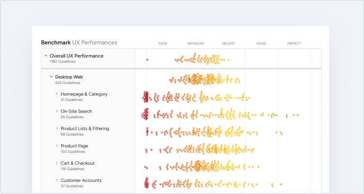
This article presents the research findings from just 1 of the 650+ UX guidelines in Baymard – get full access to learn how to create a “State of the Art” ecommerce user experience.