Key Takeaways
- Two-thirds of sites use unclear filtering terms that make it harder for users to find products
- Users who bypass useful filters or misapply unsuitable ones can produce unexpected product lists, some of which lead to site abandonment
- One method that helps users filter effectively is using images alongside text labels in filter options to illustrate attributes that are visually distinct
When users scan a list of filter types and options, they hope to narrow an existing list of products to something more specific and suitable.
However, many users struggle with filtering options for a variety of reasons: expected ones may not exist, some text labels are unfamiliar, and others may be simply misunderstood.
Often, the words users use to describe product attributes don’t match the terminology being used on the site.
Or, they may have a mental picture of said item or feature without even knowing what it is called.
Thus, users can fail to effectively filter large lists when text labels don’t meaningfully describe the feature or attribute, making it difficult to find products that often do exist on the site.
Baymard’s large-scale UX research into product lists reveals that users who struggle to effectively use filters with large product lists can become overwhelmed and, if unable to find suitable products, can abandon the site.
In this article, we’ll discuss Baymard’s Premium research findings that illustrate:
- Why unfamiliar or ambiguous filters cause confusion and unnecessary filtering problems
- How adding a photo or illustration to products with visually distinct attributes increases users’ chances of finding suitable products
Text Labels for Filter Options Insufficiently Describe Product Attributes
At REI, users shopping for a tent they’ve seen in the wild but can’t identify through words may have trouble effectively narrowing down this list of 421 items.
“‘Features’, none of these mean a ton to me. I don’t know what any of them actually truly are referring to.” This participant at Joybird was unfamiliar with the options offered in the ‘Features’ filter and was thus unable to use it to narrow down the product list further, forcing him to use less-preferred filters to reduce the number of options.
“‘Arm Style’. I thought it would have something simple but I don’t understand a lot of these”, another participant at Pottery Barn bemoaned as she struggled to choose between the ‘Arm Style’ filter options because she was unsure what each was describing.
In Baymard’s testing with product lists, we often observe participants struggle to use filter types and options to narrow down the items for large product lists.
When users encounter filters with unmeaningful names, some simply bypass them — even though filtering by that attribute would have better narrowed the list to suit their needs.
Further, testing reveals how insufficient text labels alone can be for products with distinct visual attributes, such as when multiple participants reach different conclusions about the same filter options (e.g., whether a checkerboard print sheet was considered “Striped” or “Patterned”).
Other participants weren’t able to associate the unfamiliar or ambiguous names for filter options with their visual forms; for example, not knowing what a “Traditional”-style dining table looked like.
When users can’t sufficiently visualize filter options, some will decide to skip the filters altogether and resort to less-than-ideal ways to narrow down the product list.
Others may still attempt to filter but risk selecting options that do not actually reflect their preferences, potentially excluding products that would meet their needs.
In both cases, site abandonments can occur if suitable products aren’t surfaced quickly enough.
Use “Visual” Filters for Visually Distinct Product Attributes
Shoppers at Build who are unfamiliar with the variety of ‘Faucet Holes’ for sinks can more quickly identify the type of sink they want using the thumbnails to narrow their list.
Techniques for clearing up industry jargon work well for terms or concepts easily explained via text, but images are the best way to describe visual attributes.
If a product has types or features that vary by visible characteristics, it is an ideal candidate for complementing the text label with a thumbnail image.
By adding a photo or illustration with the filter option, users can quickly identify those distinguishing attributes by sight without needing to know the words to describe them.
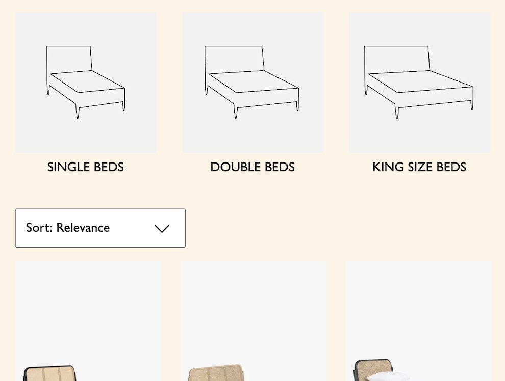
For example, thumbnails illustrating different luggage styles or sofa configurations enable users to discern differences at a glance without necessarily having had any prior experience with the product type.
Moreover, testing also found that either photos or graphical illustrations worked equally well in helping participants understand what the filter option represented.
By always using a high-quality visual depiction alongside the text for visually driven products, users can filter more efficiently and even discover new preferences along the way.
Note that the attributes of products that warrant a visual filter will vary depending on the product type, how easy it is to distinguish its characteristics visually, and the complexity of the product design (e.g., the number of variations).
Use Images in Filter Options When Product Attributes Can be Described Visually
While the different types of helmets at RevZilla are visualized in promoted filters at the top of the page, users who scroll down the page must contend with filters in the left panel that lack this visual support.
As the saying goes, pictures are worth 1,000 words, which makes them a reliable tool for conveying noticeably distinct product attributes.
Also, consider that users can compare visual filtering options at a glance, reducing the mental strain involved in conjuring up a mental image of each filter option as they read them one by one.
Keep these findings in mind:
- Even when filter options use plain language, users may still arrive without the same, or any, vocabulary for describing a product’s attributes.
- Images can be particularly powerful for concepts that are challenging to communicate via words but are understood immediately when presented visually.
- Visuals are less likely to confuse or mislead users.
Given that two-thirds of sites use unclear filtering terminology, users undoubtedly are challenged to find suitable products.
One way to help is to always pair text labels with visual thumbnails when filter options are visually distinct.
This article presents the research findings from just 1 of the 700+ UX guidelines in Baymard – get full access to learn how to create a “State of the Art” ecommerce user experience.
If you want to know how your desktop site, mobile site, or app performs and compares, then learn more about getting Baymard to conduct a UX Audit of your site or app.


![“‘Back Style’, I don’t know what that means…[expands filter]…Okay, so I’m going to probably choose [based on] just the picture really. Just the way it looks.” This iOS participant at Raymour & Flanigan didn’t realize he had preferences for the back style of his couch until he expanded the filter and used the included visuals to better understand what “Back Style” meant and what the different options looked like.](https://baymard-assets-cdn.imgix.net/research/media_files/attachments/107047/original/research-media-file-3ebf4e4c893a0b056fdb56542972d16d.jpg?auto=format&dpr=2&fit=max&q=50&w=880)


