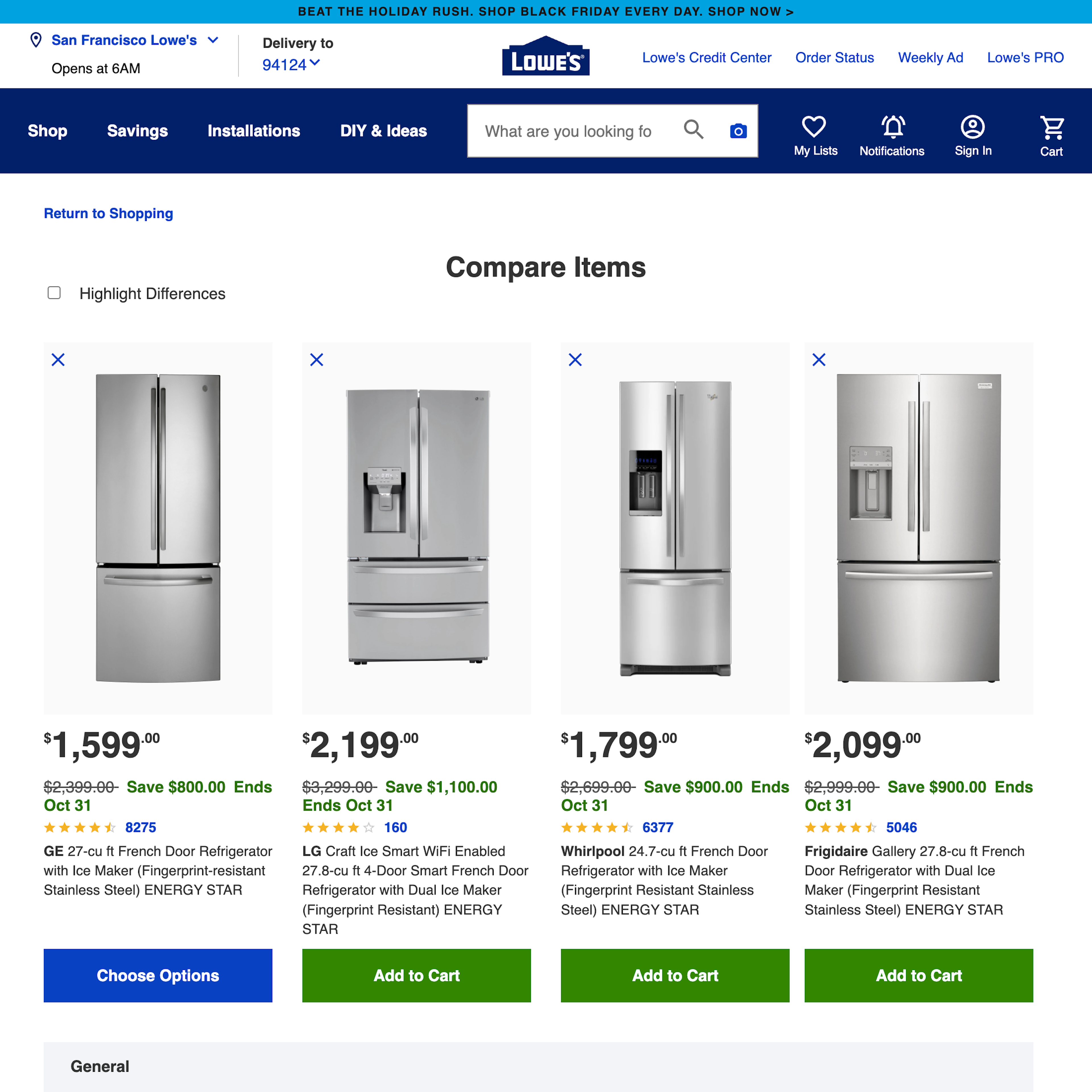
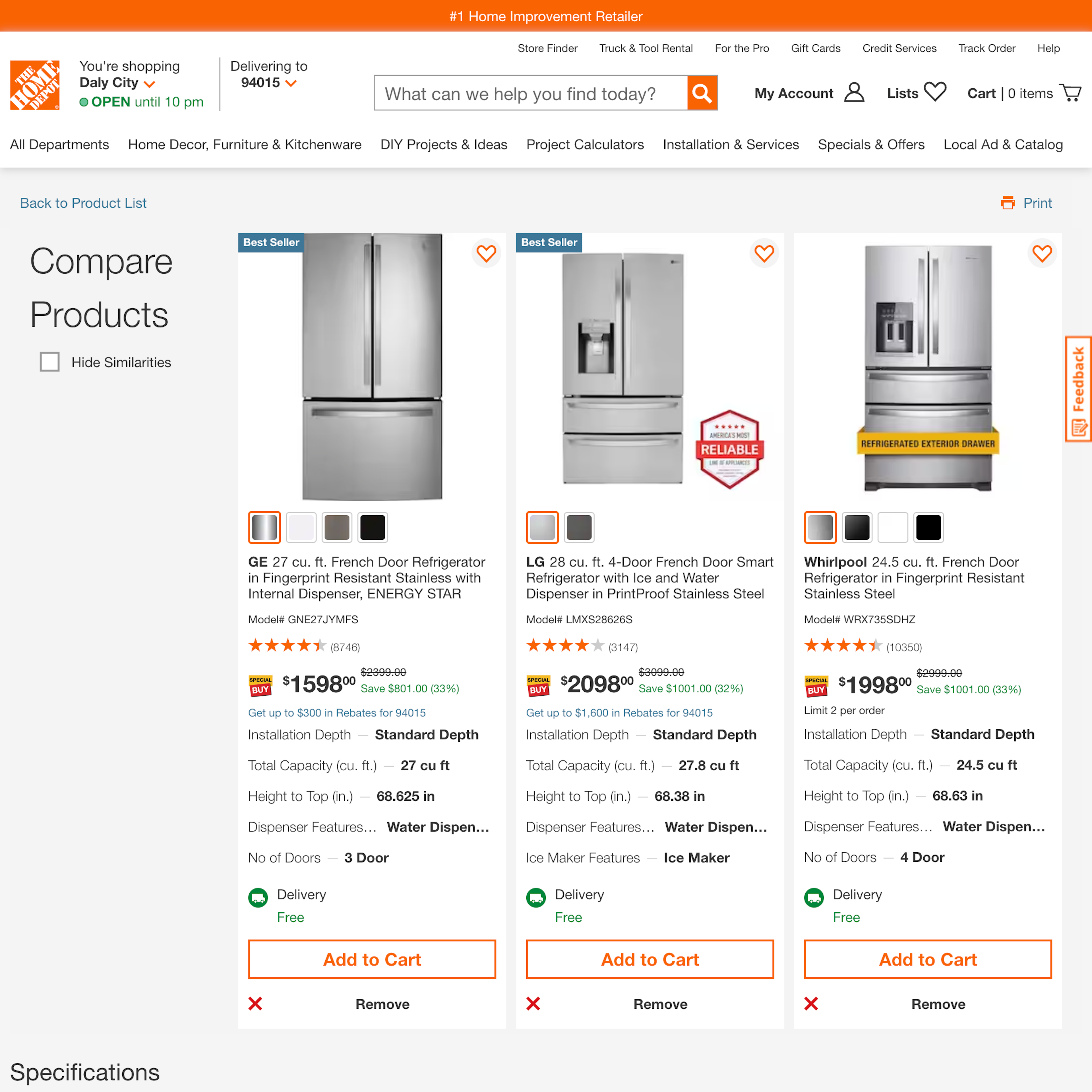
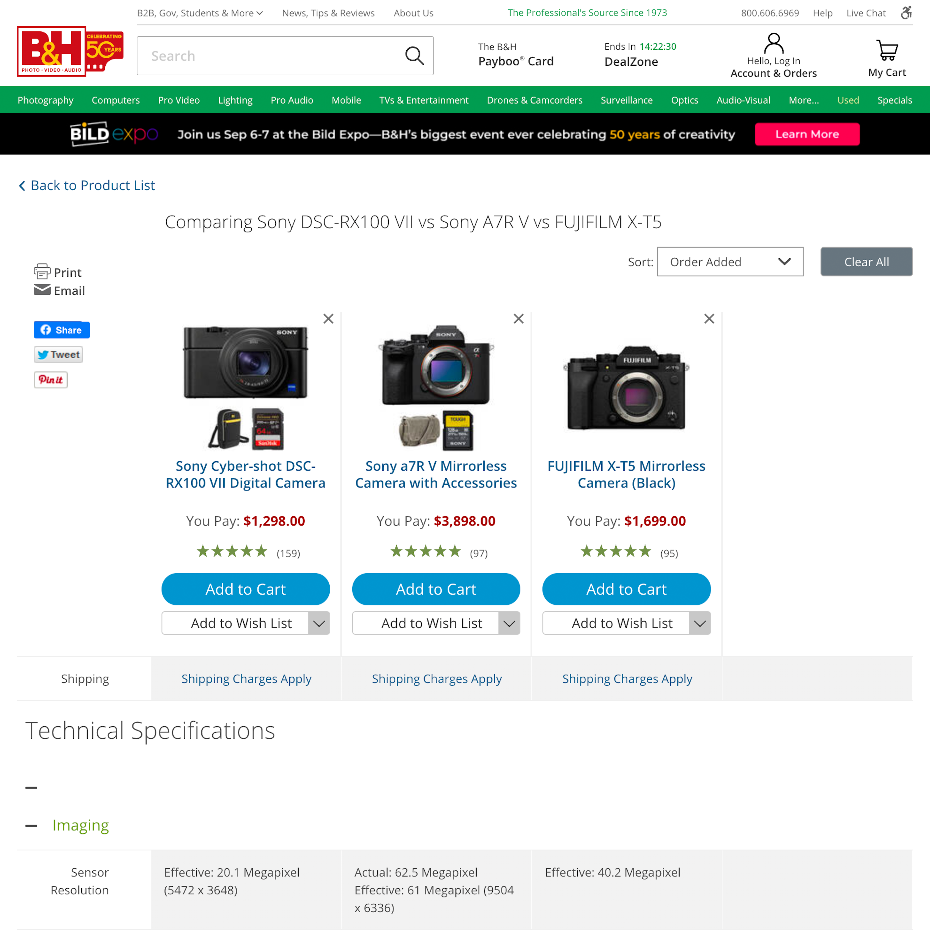
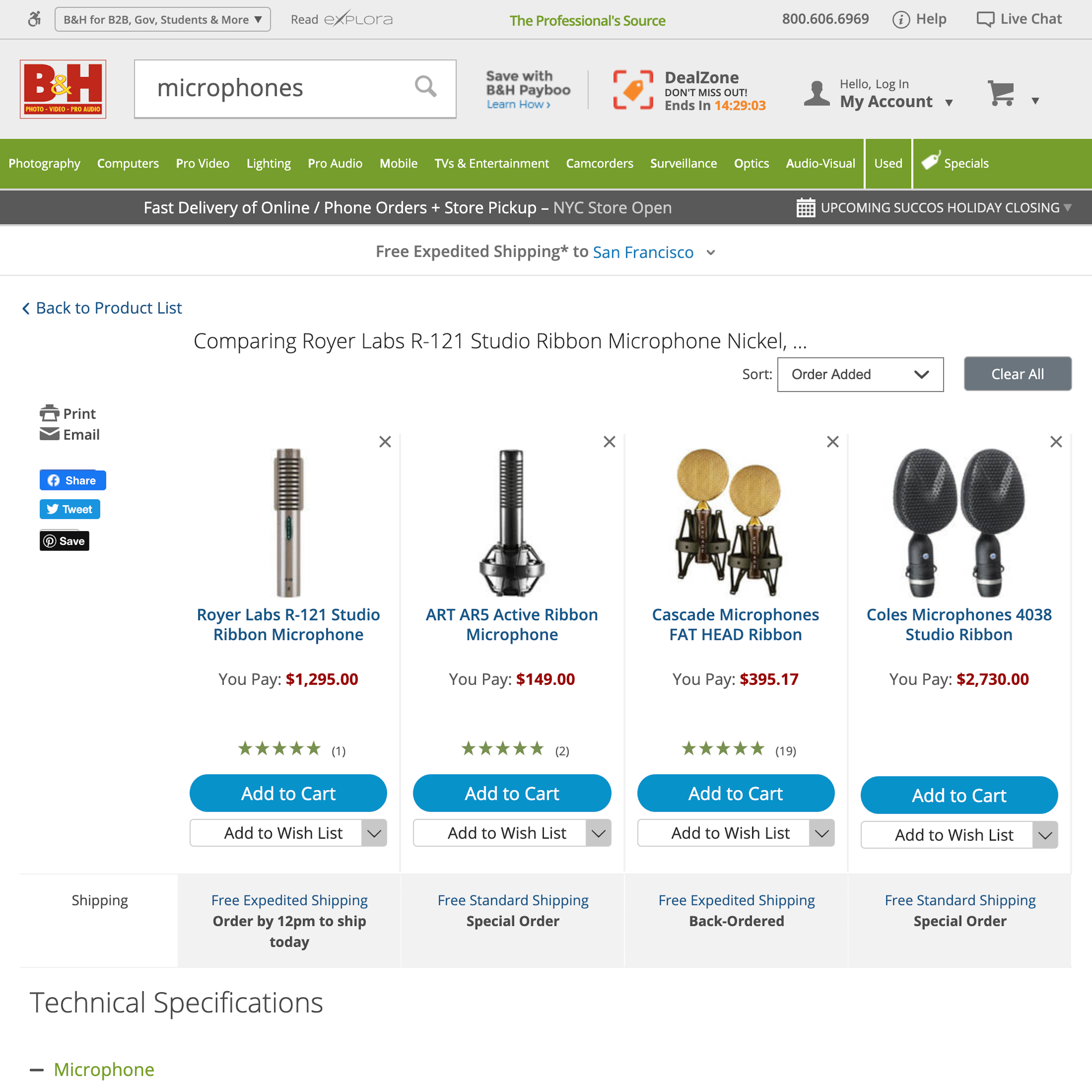
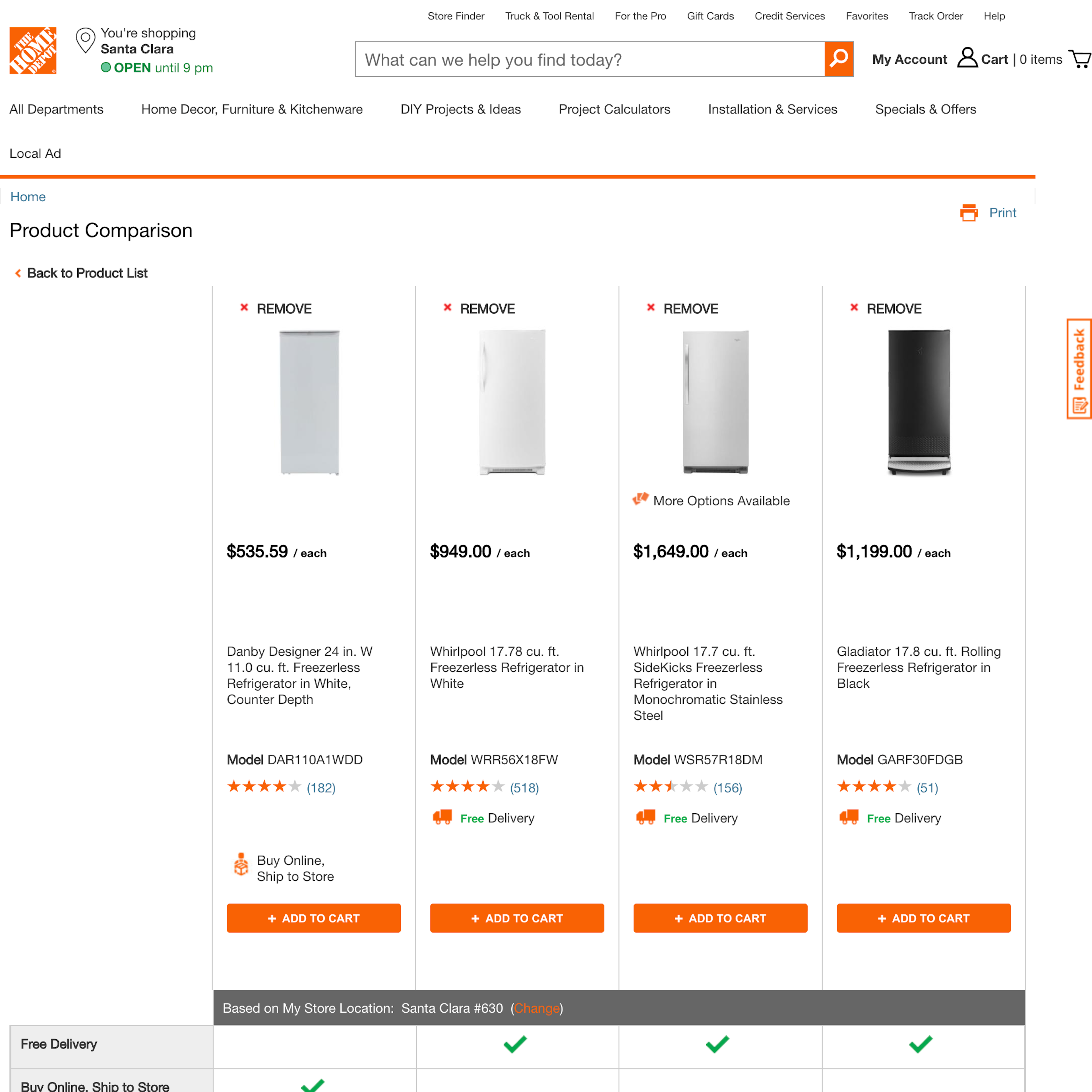
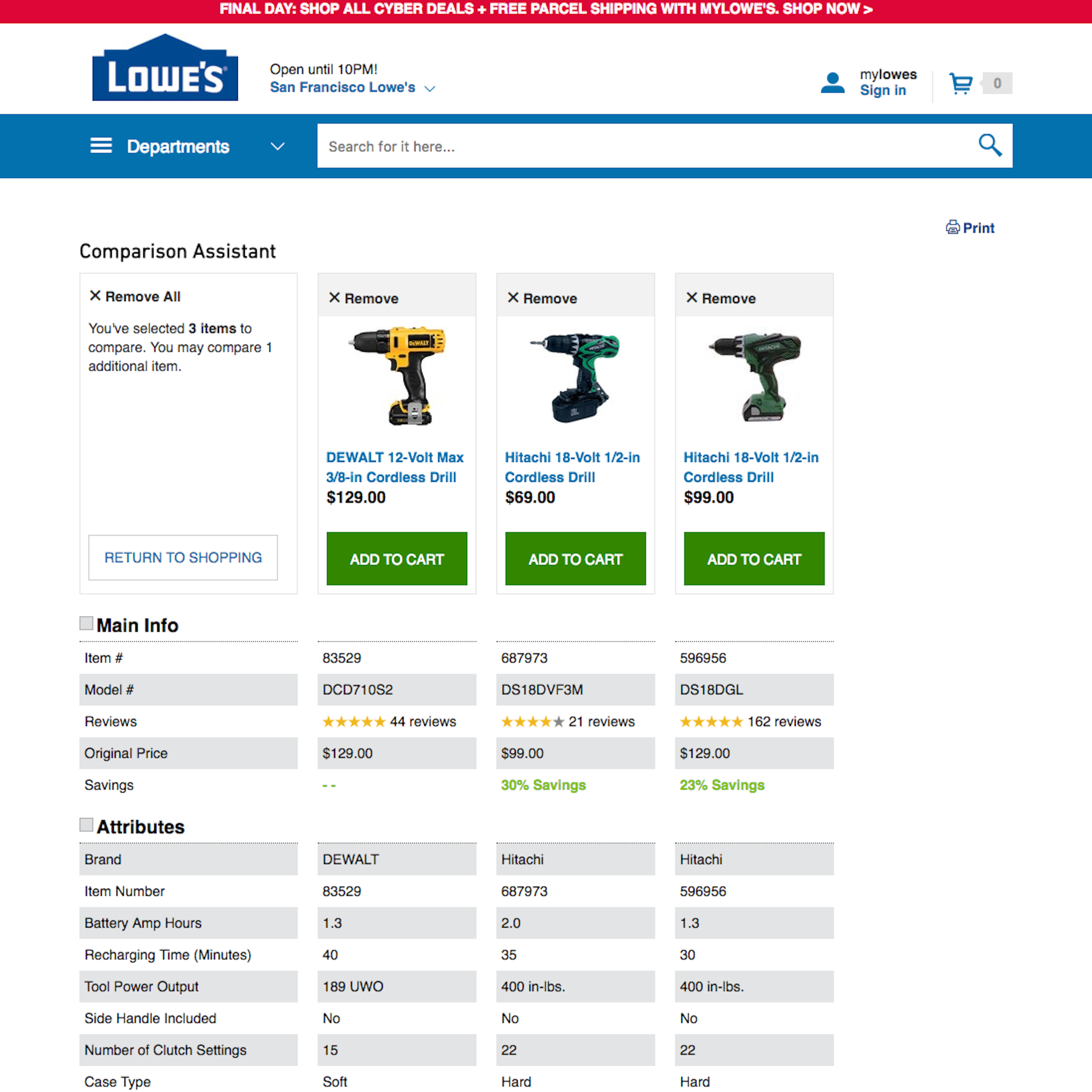
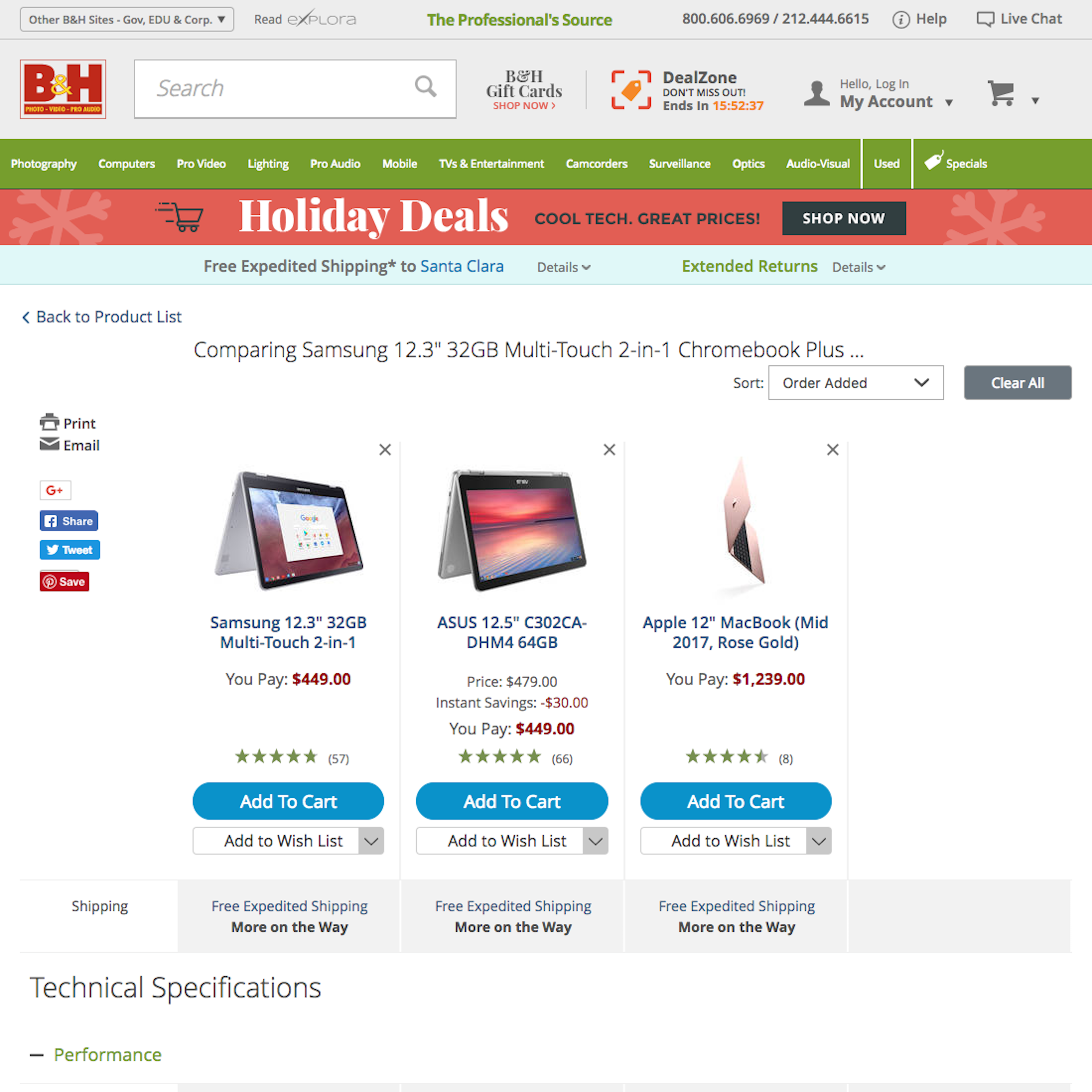
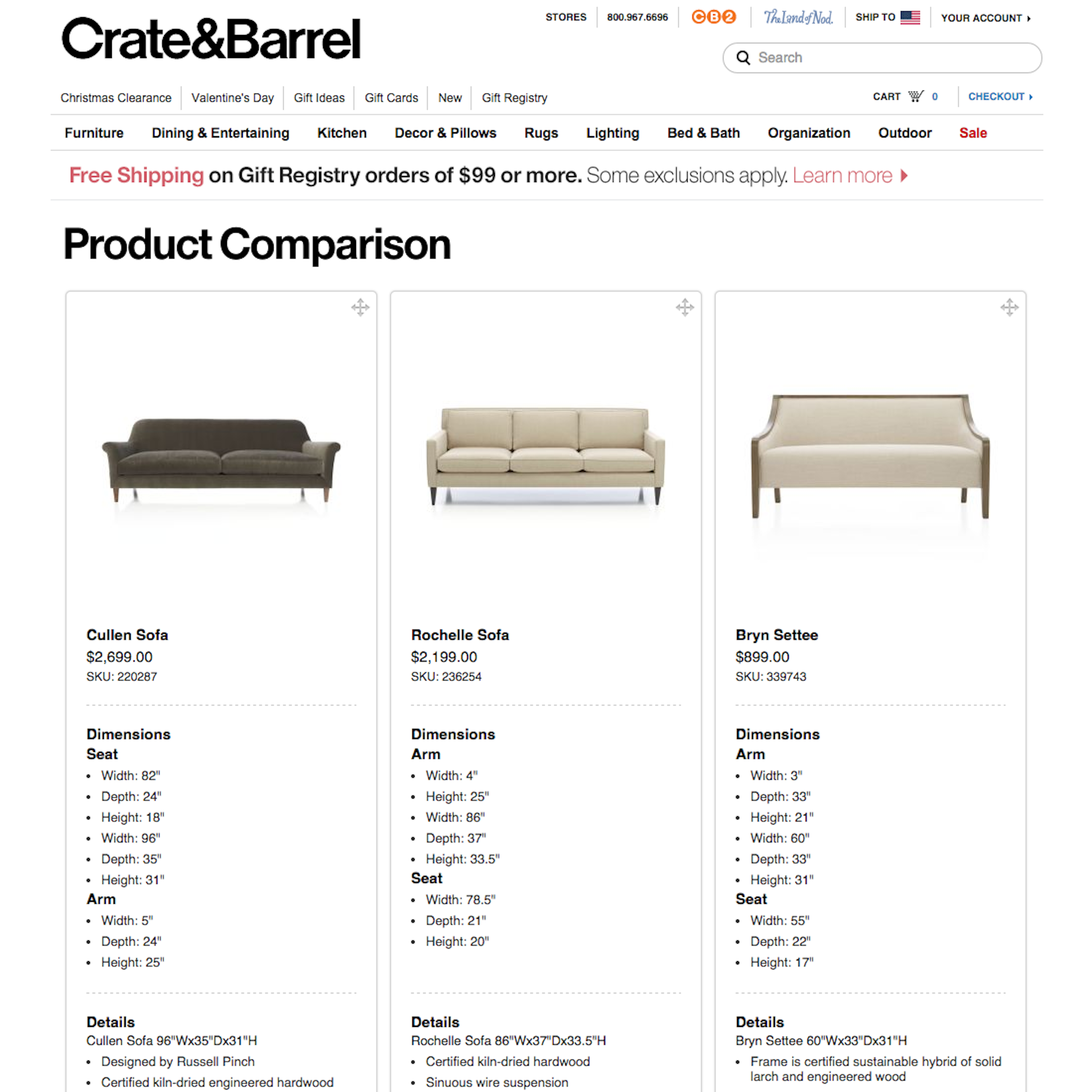
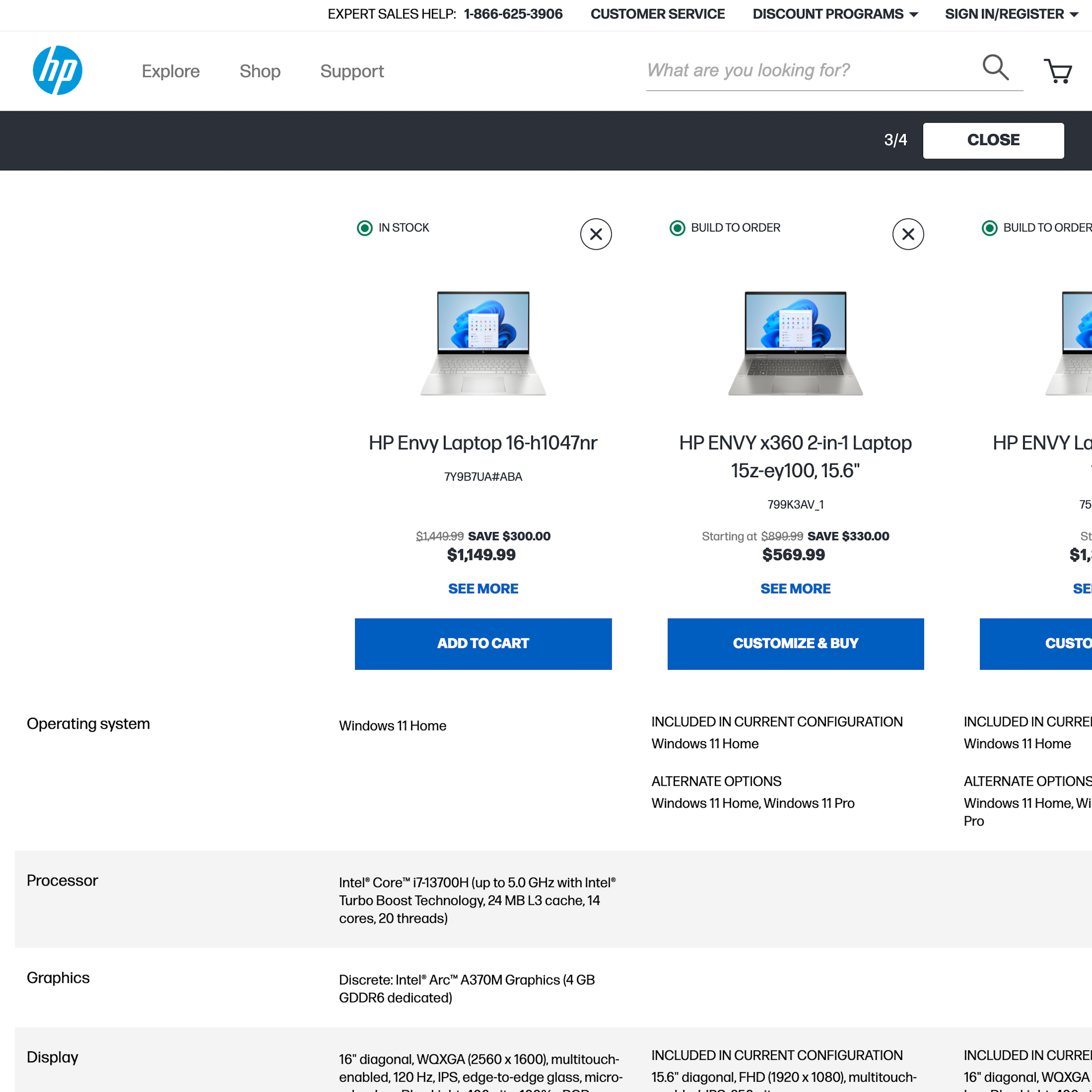
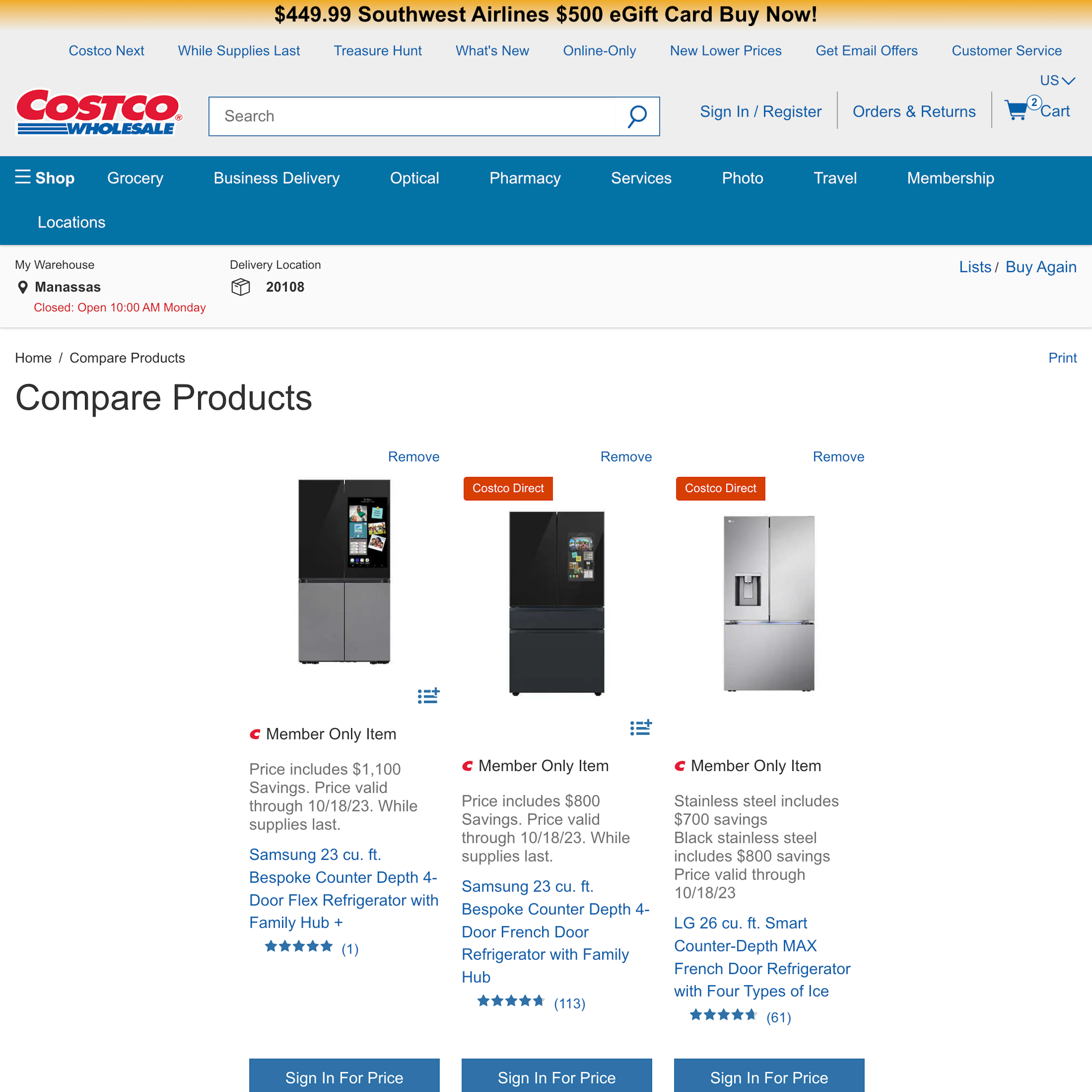
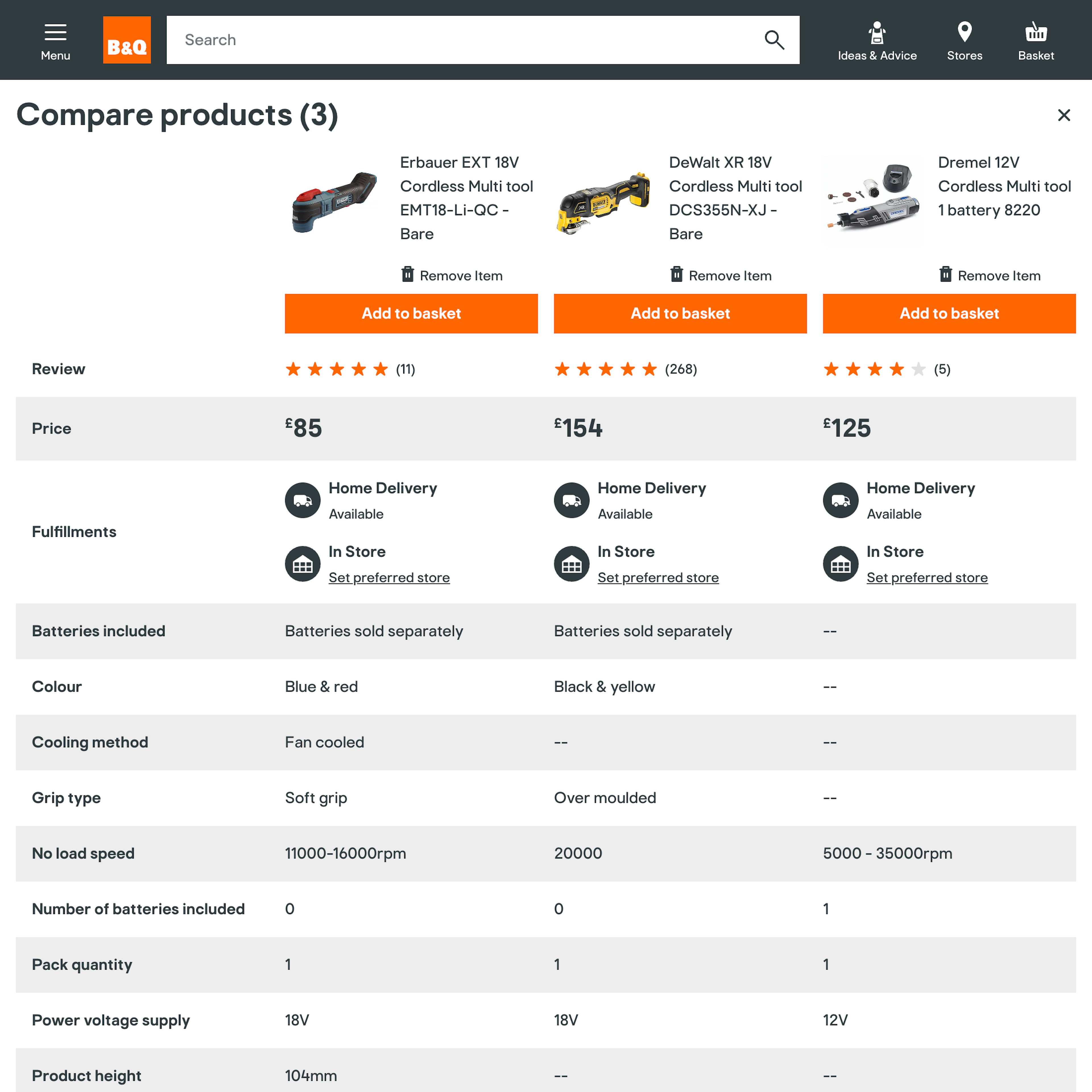
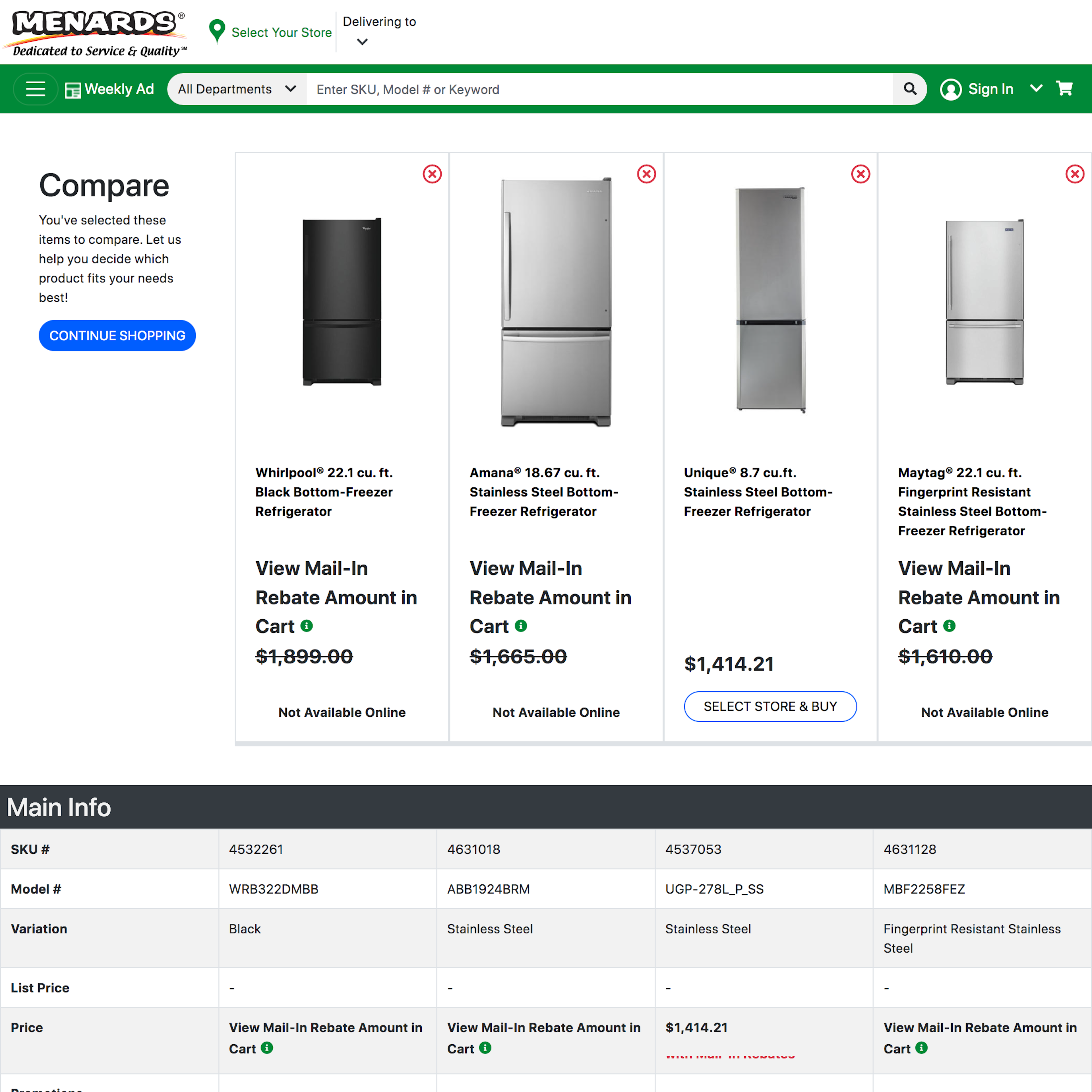
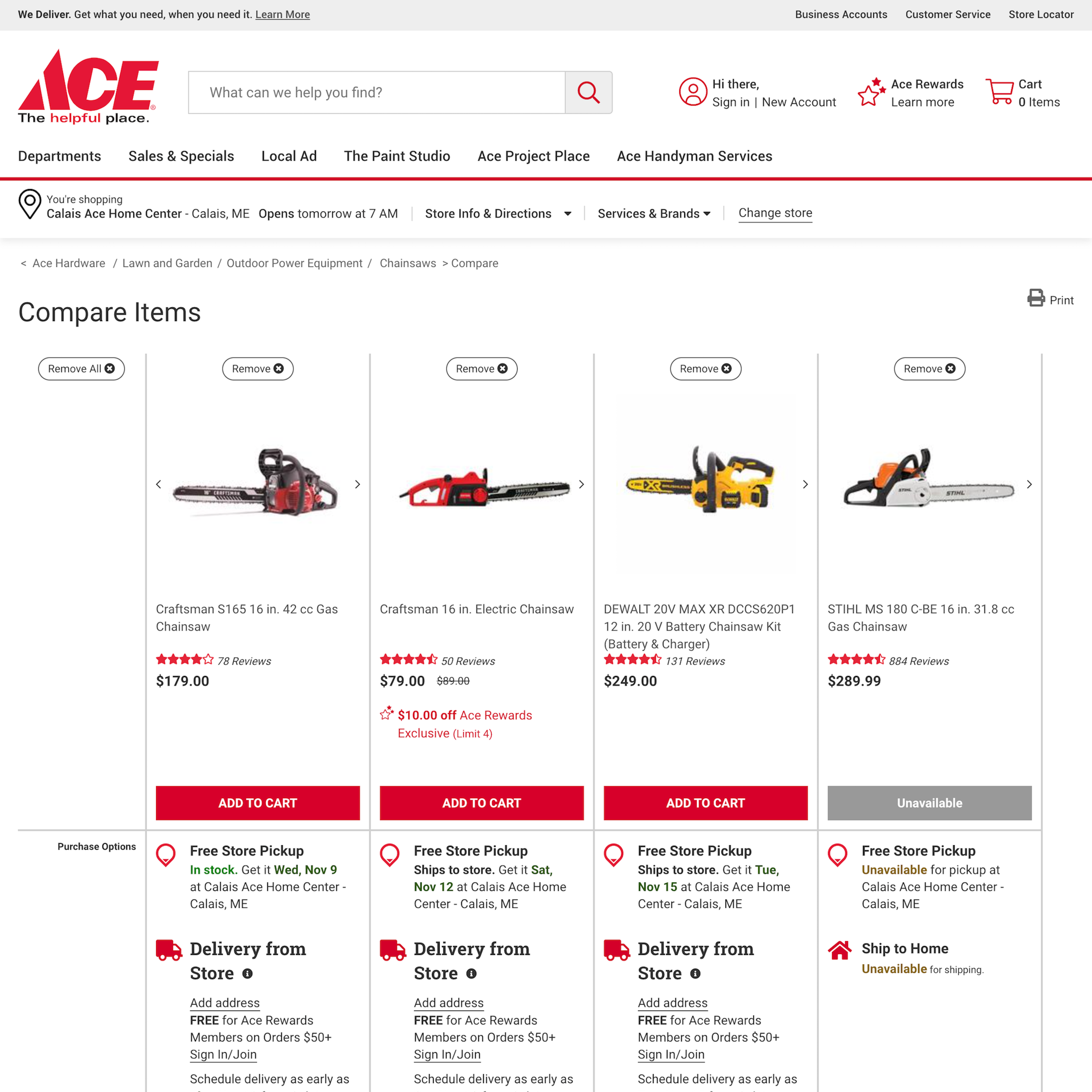
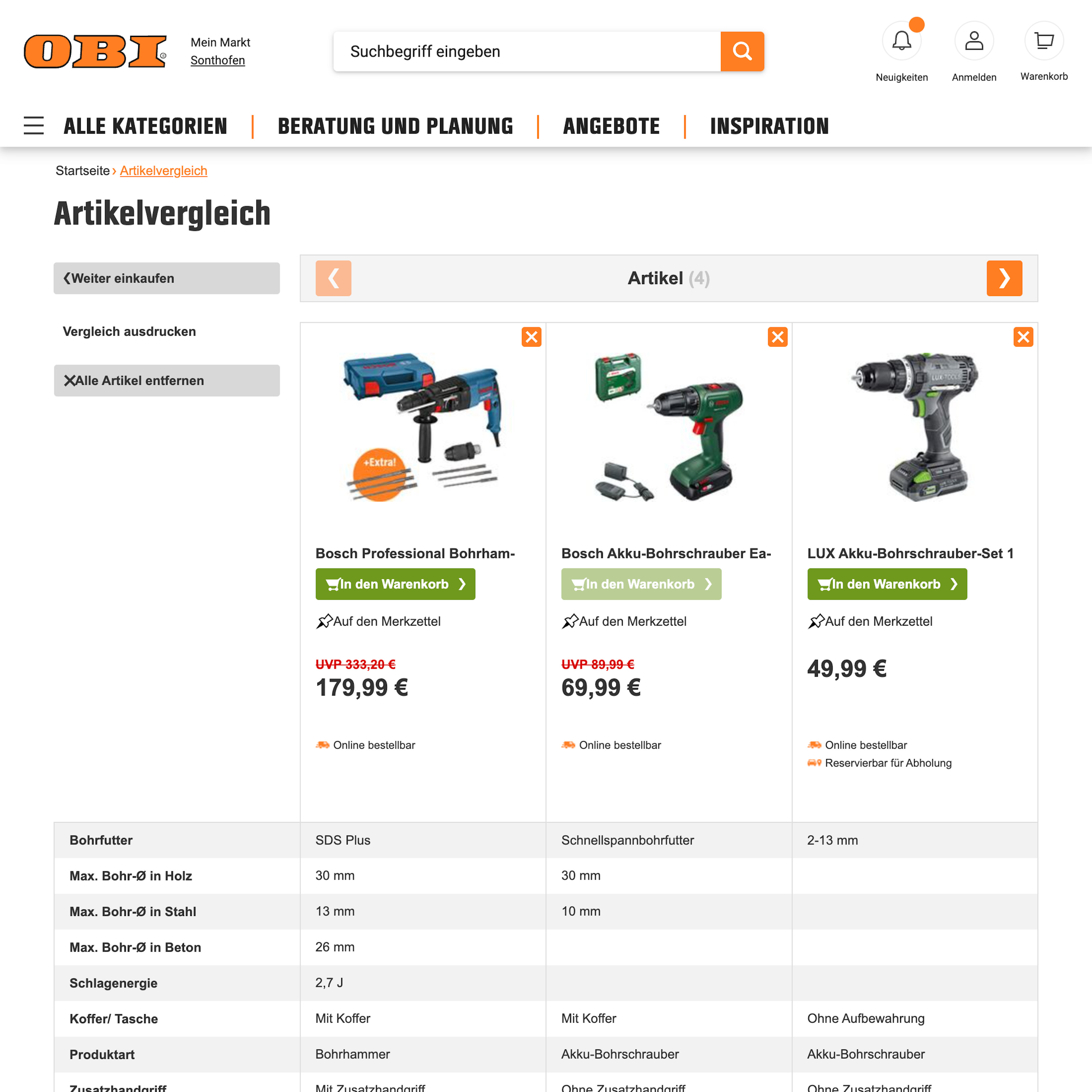
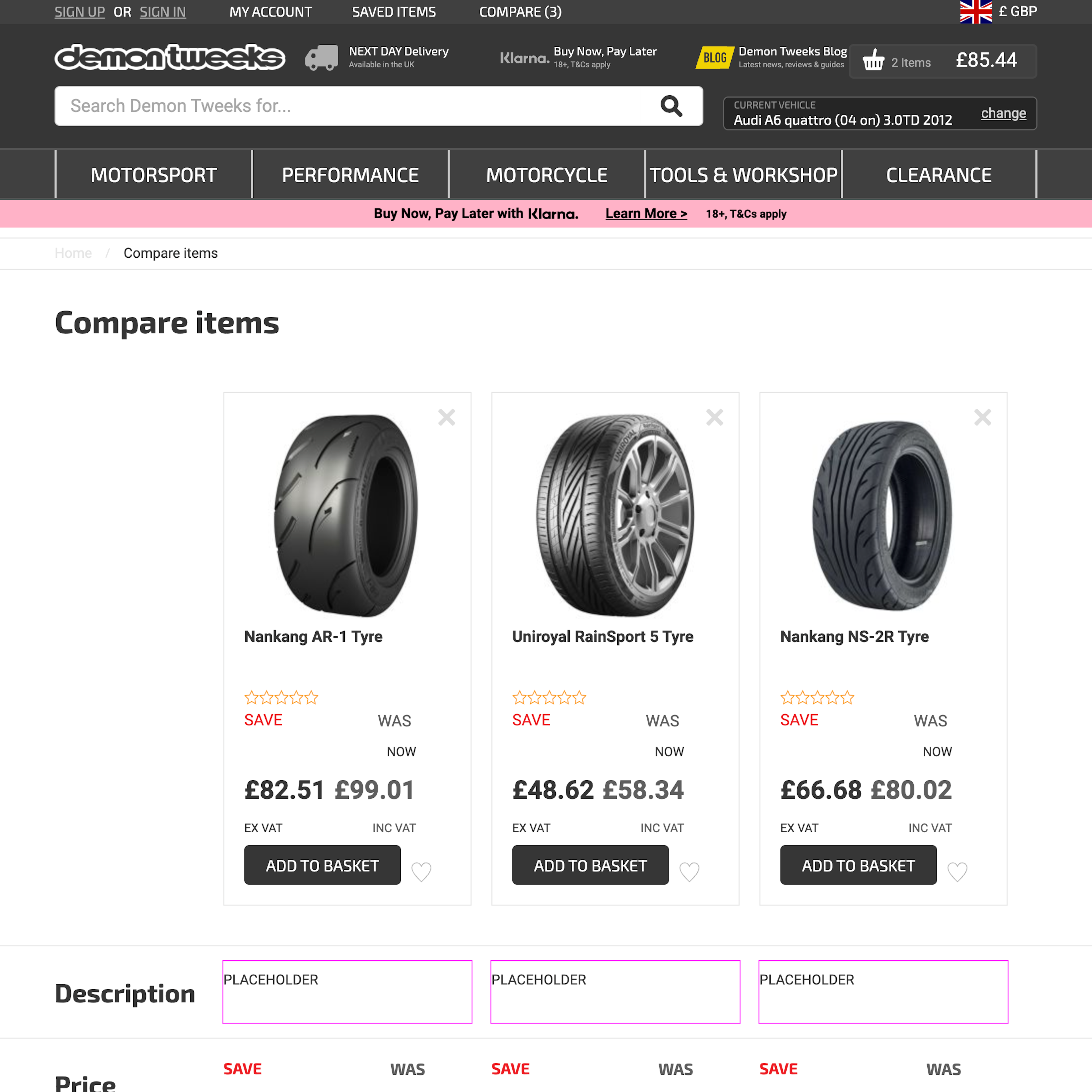
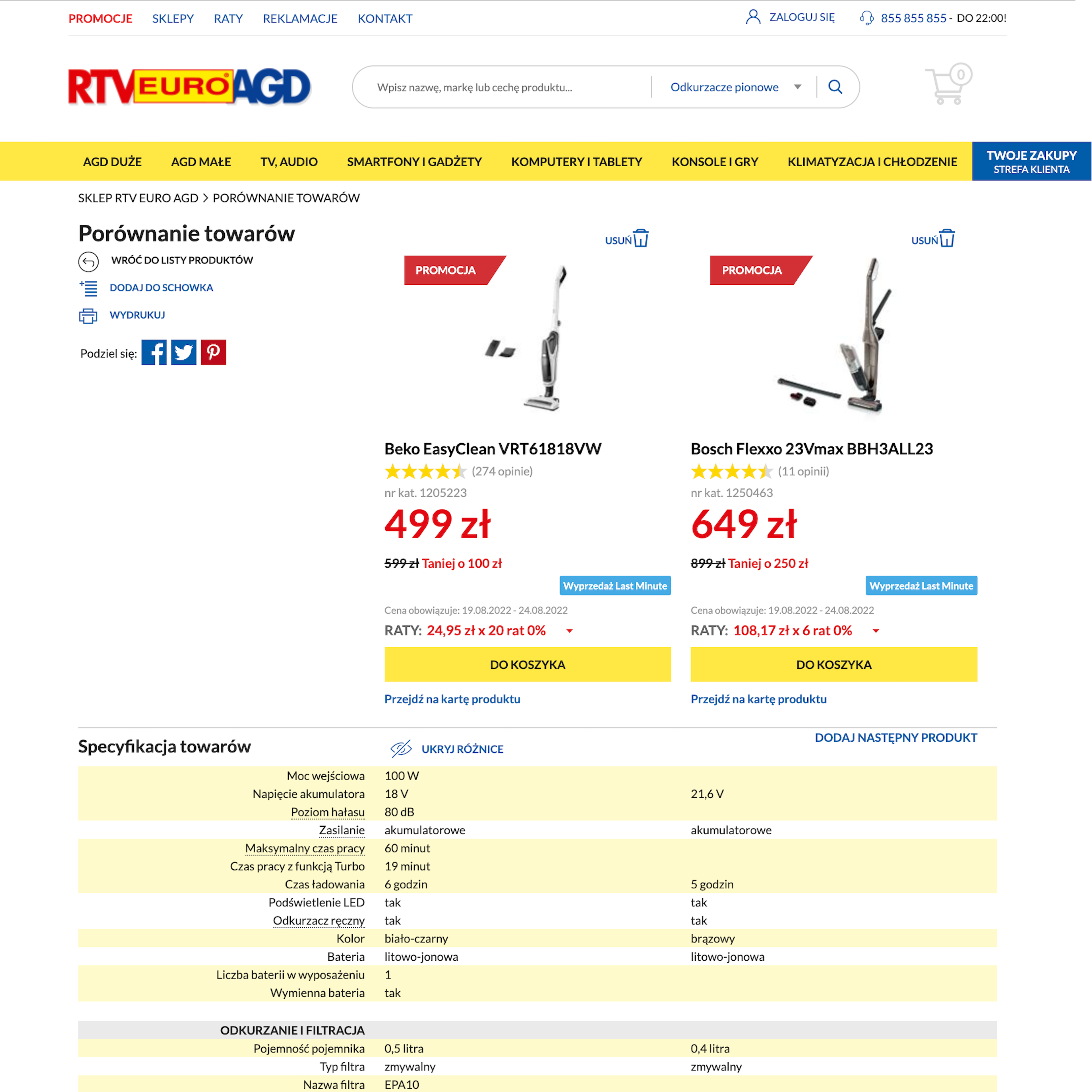
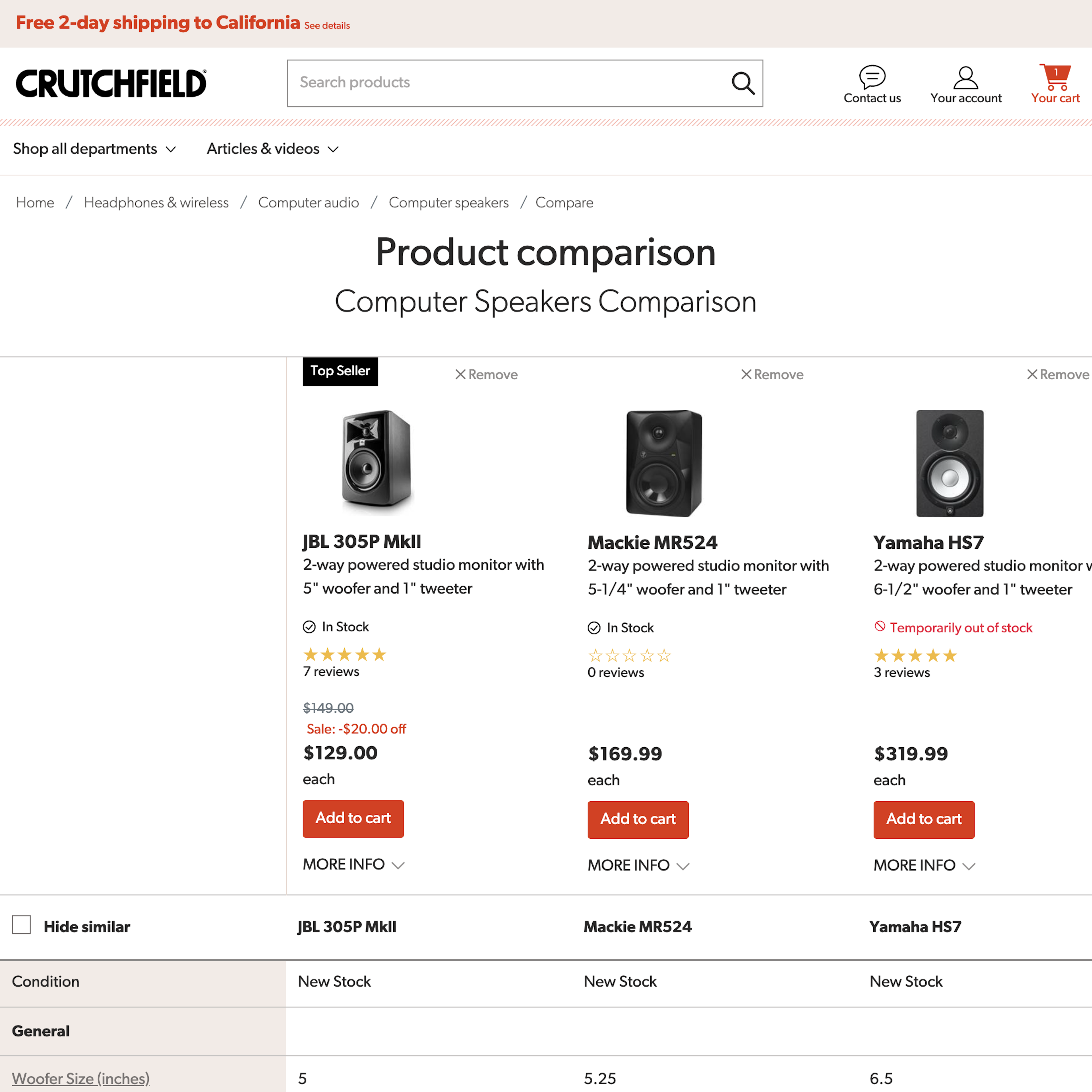
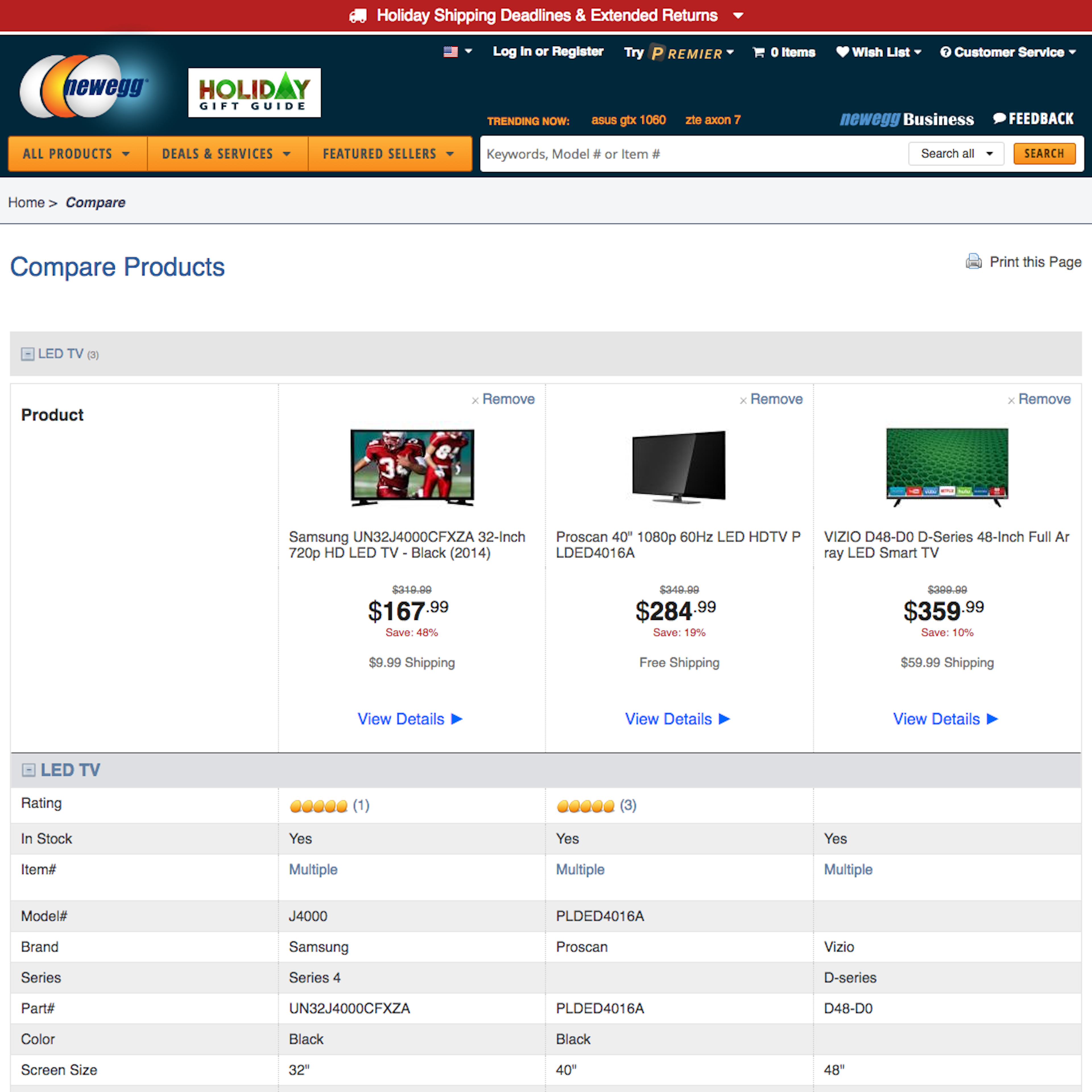
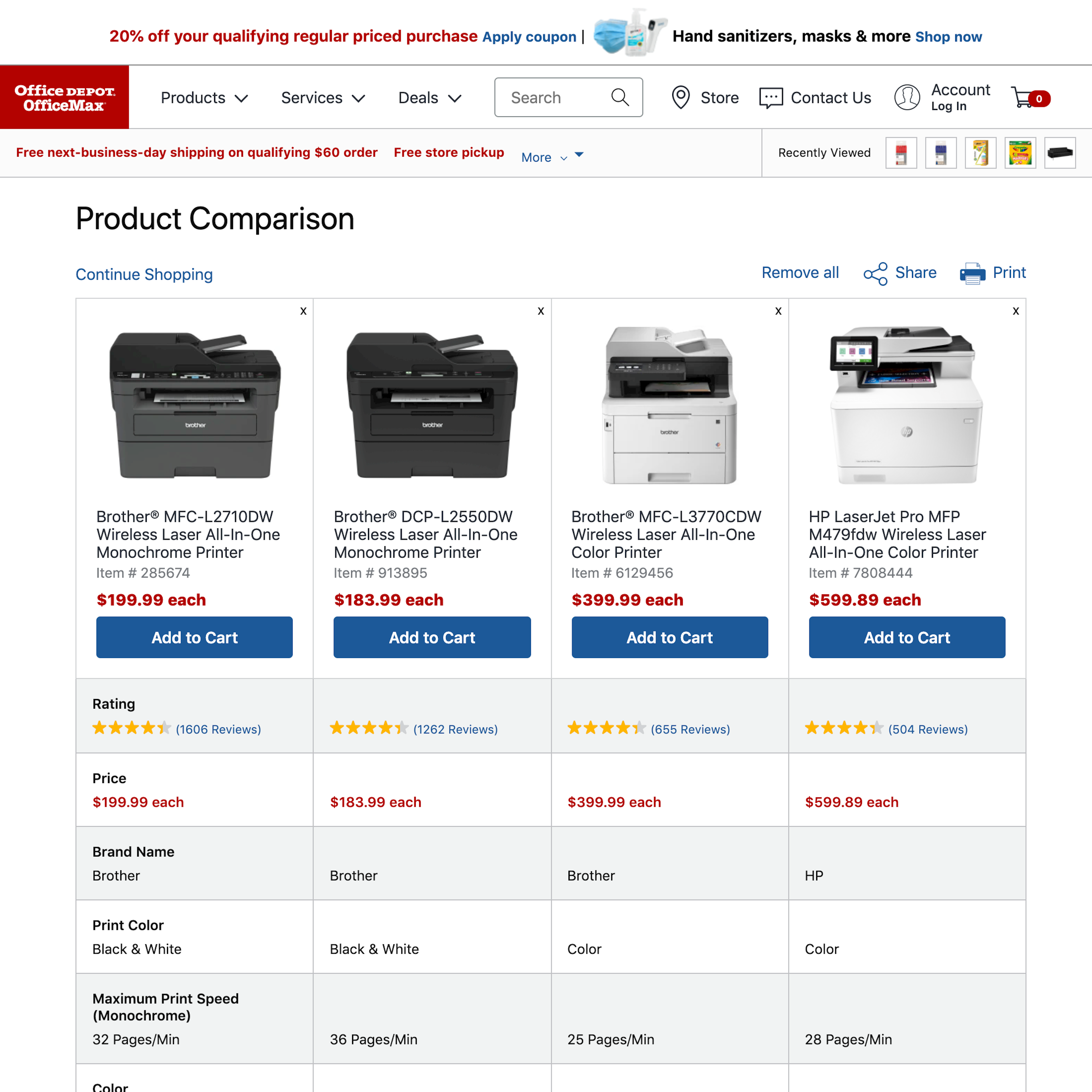
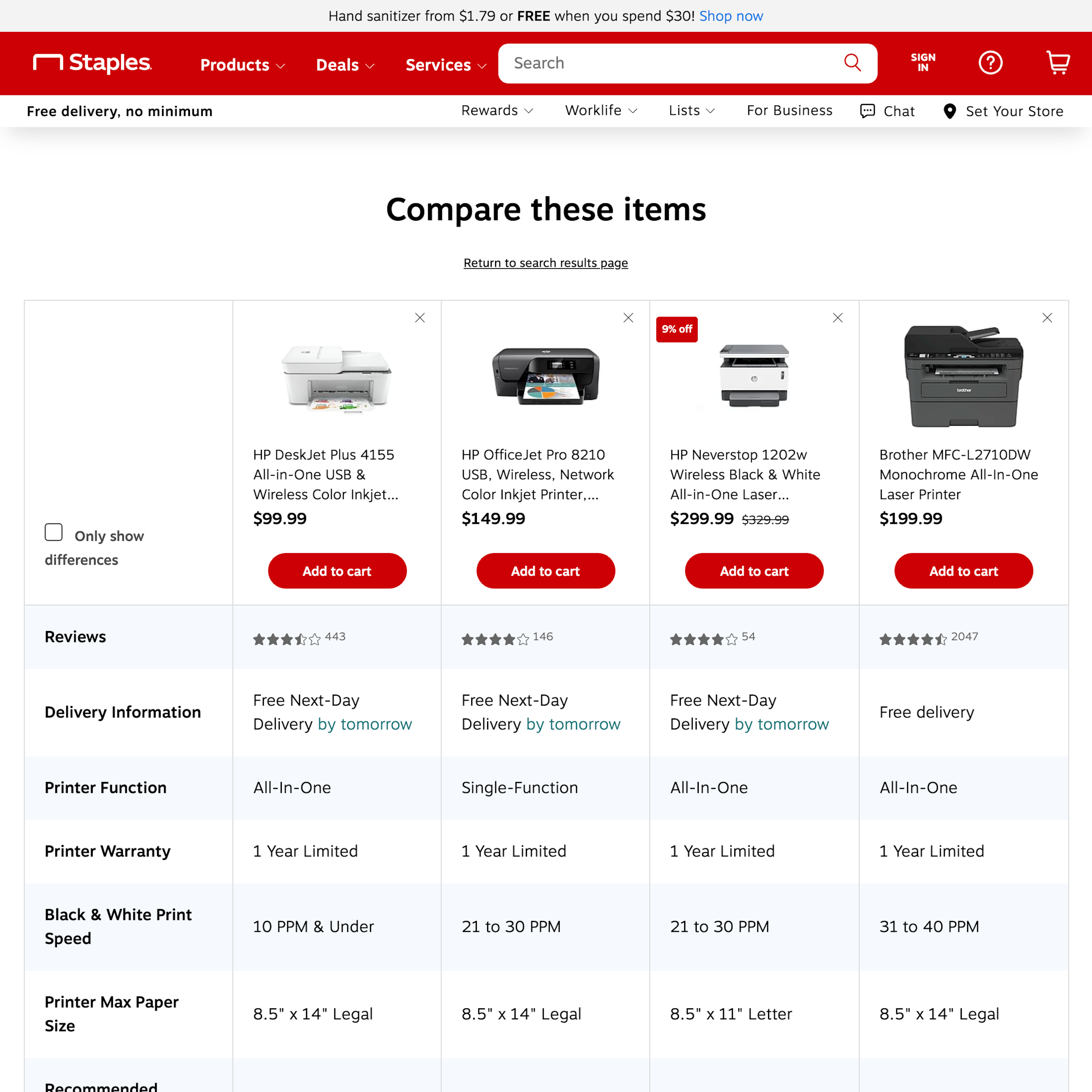
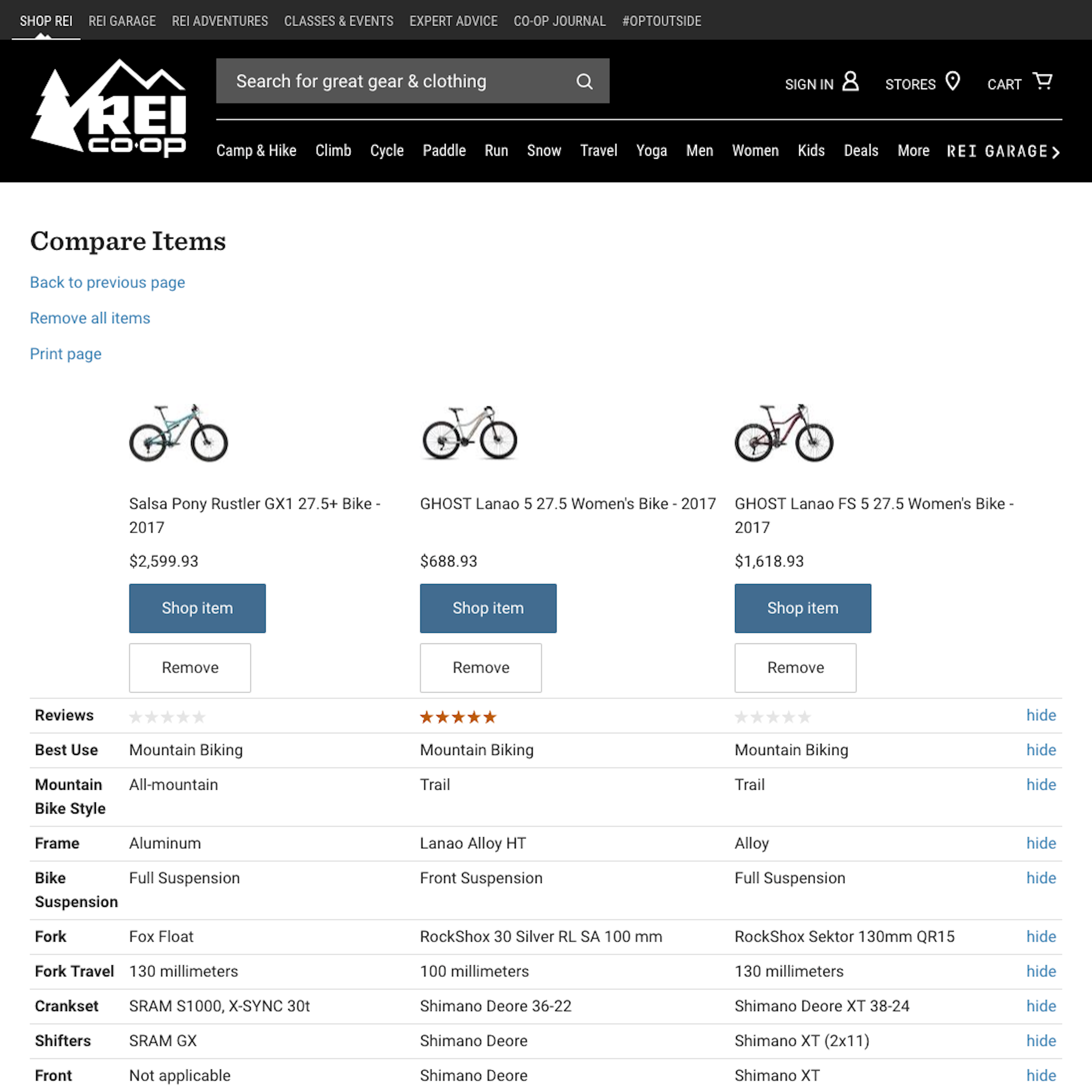
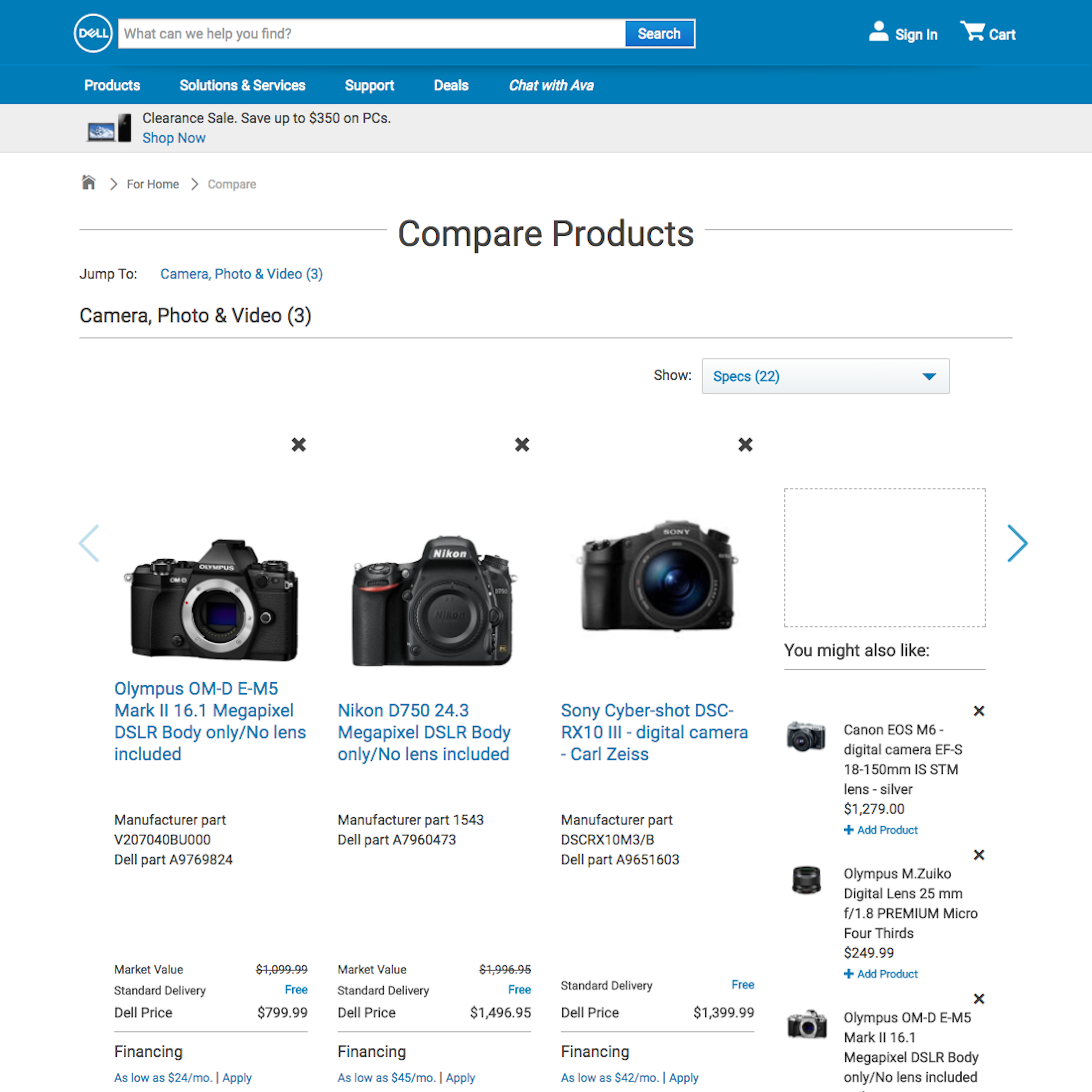
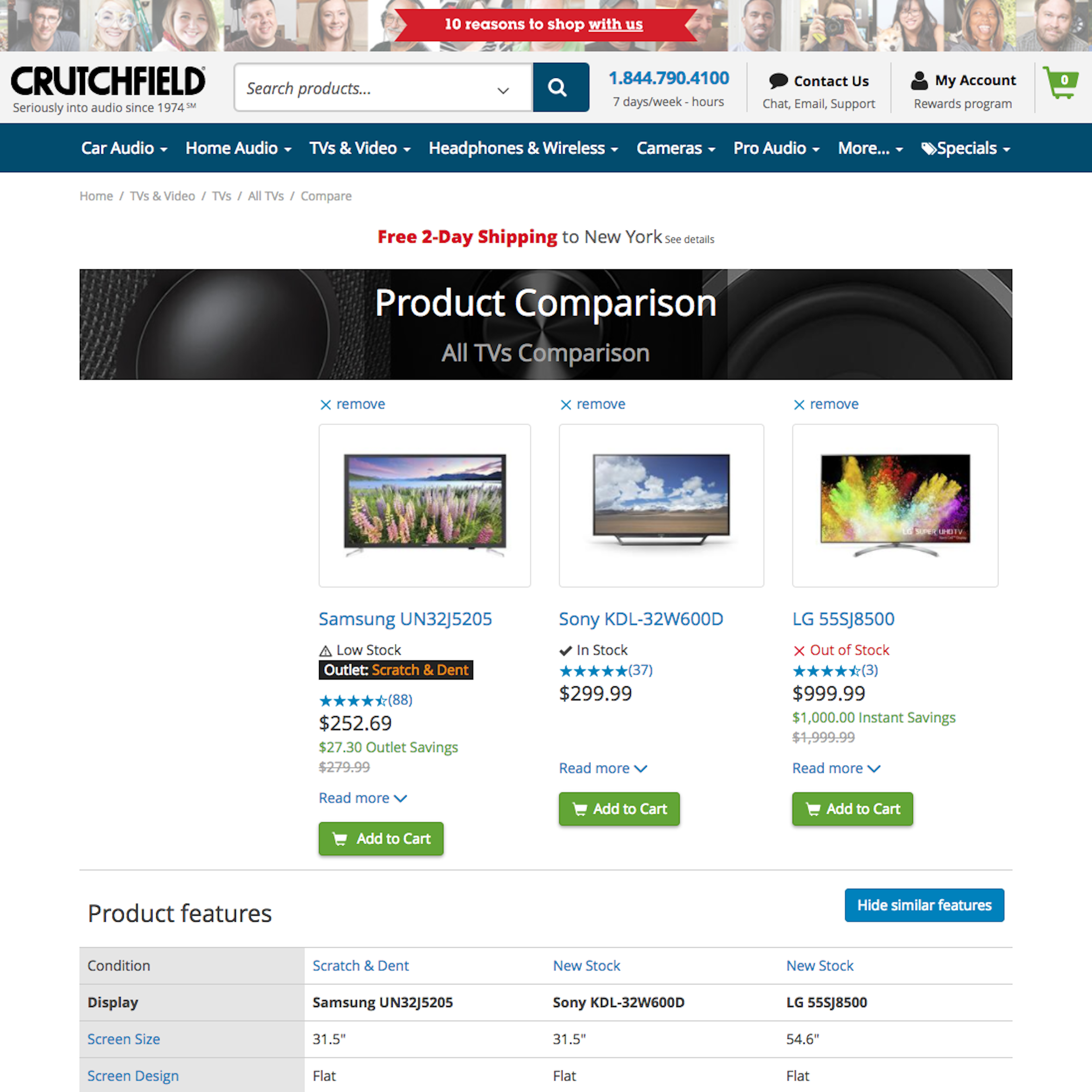
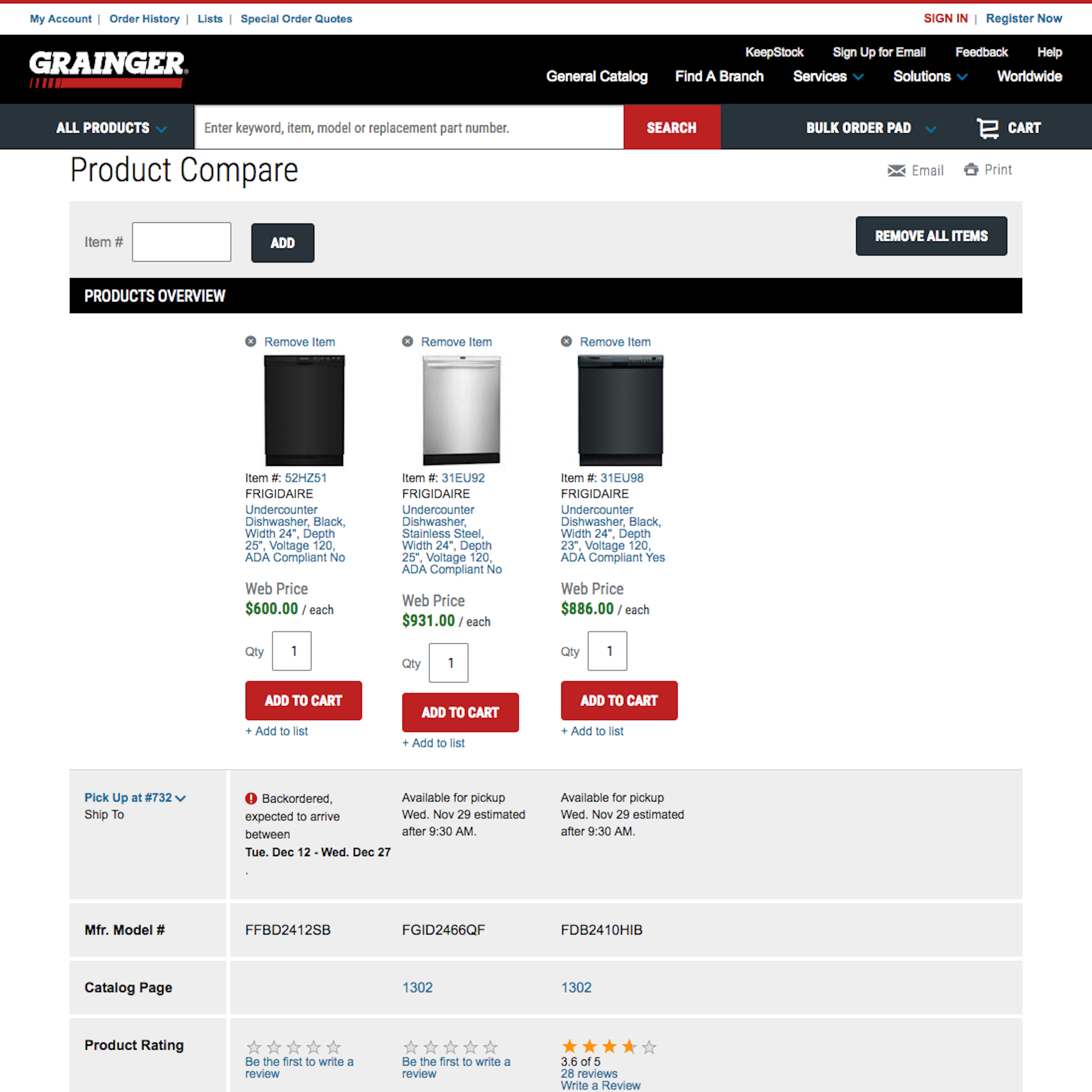
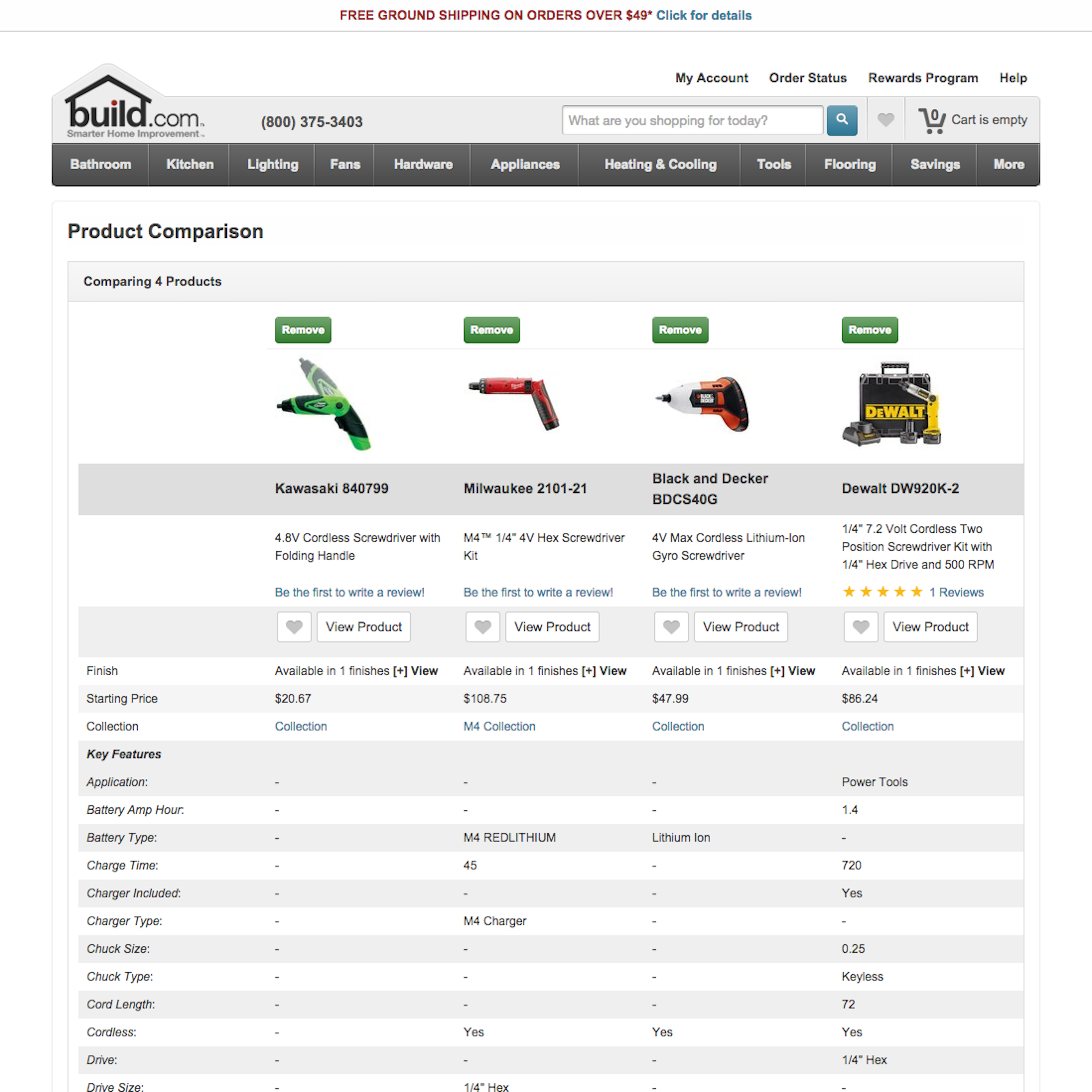
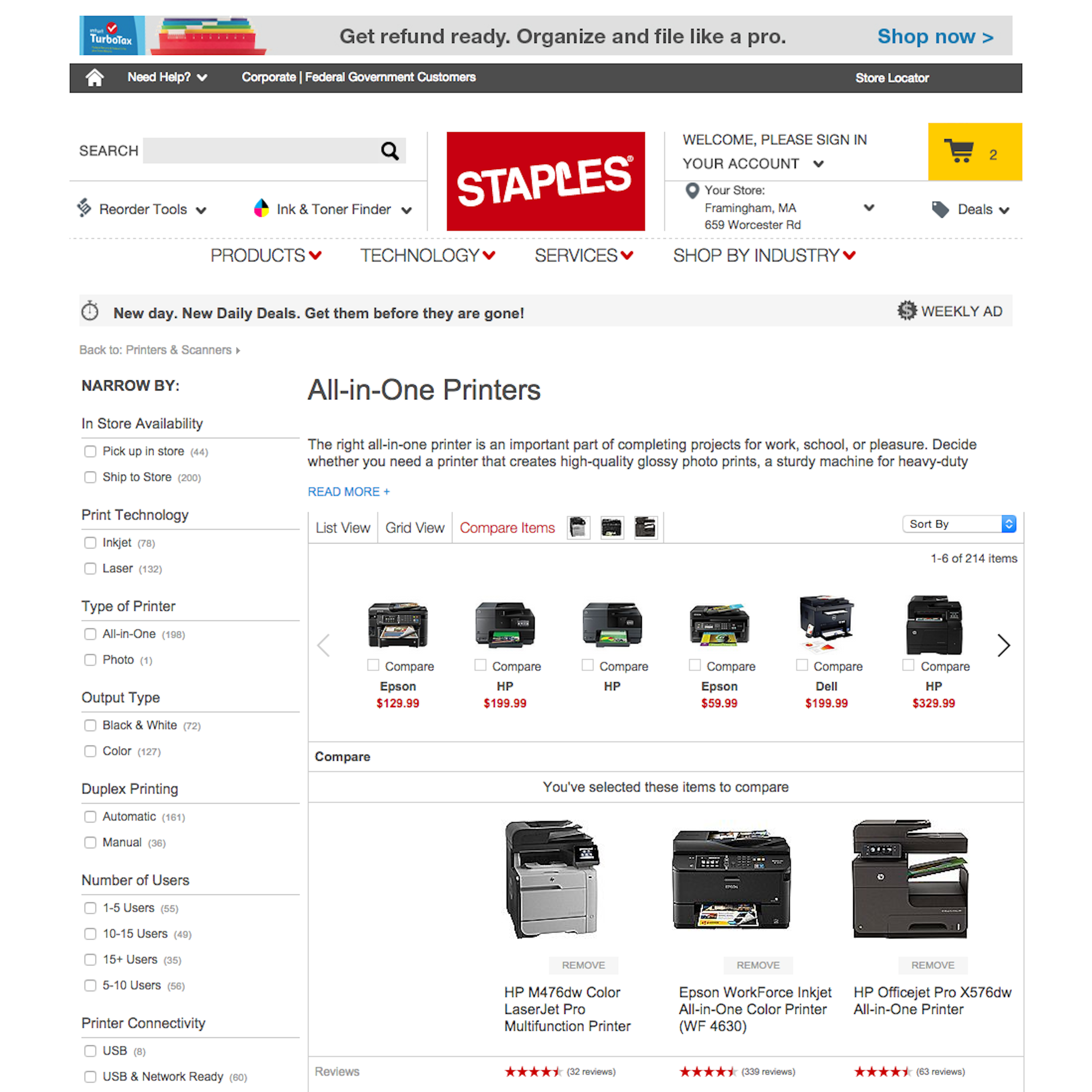
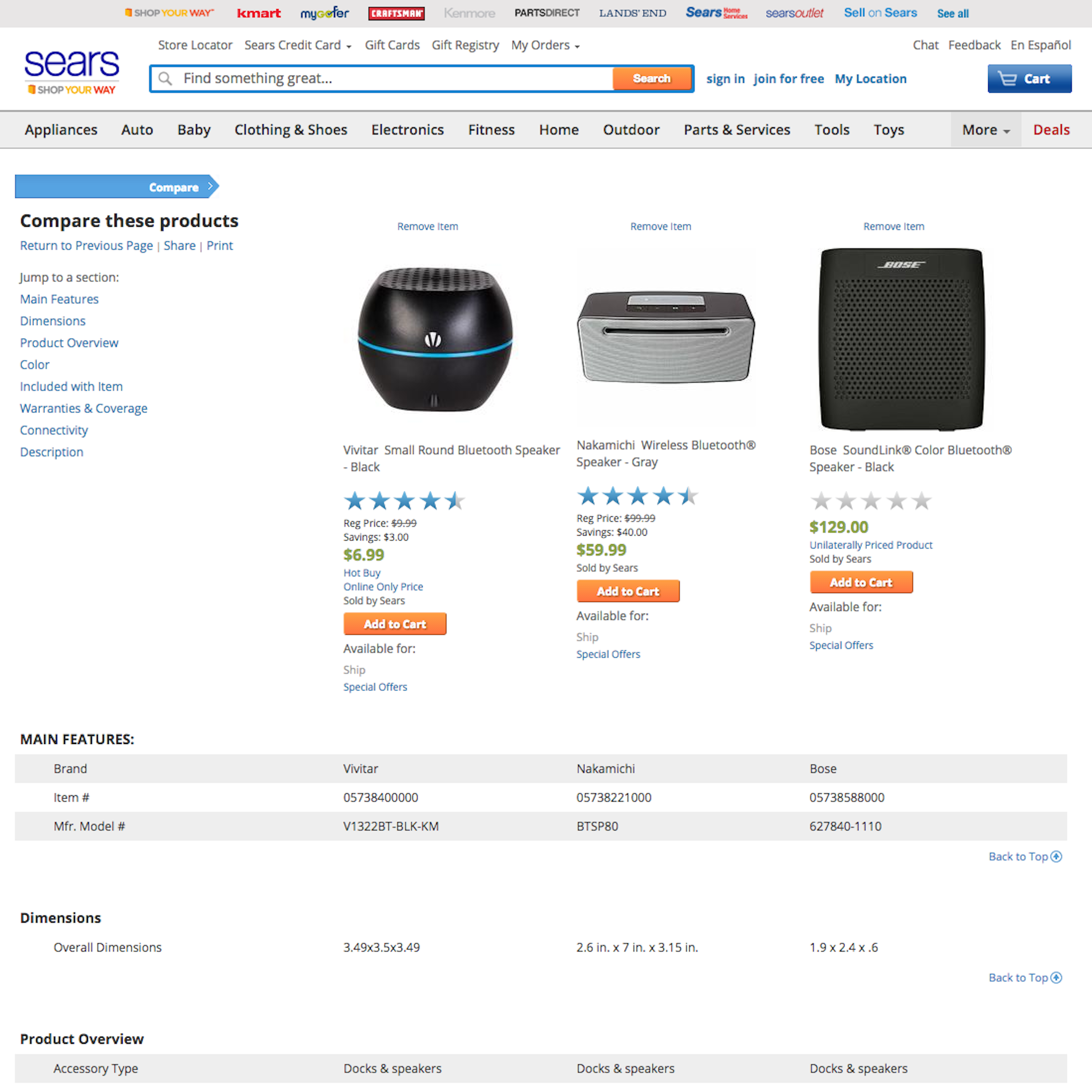
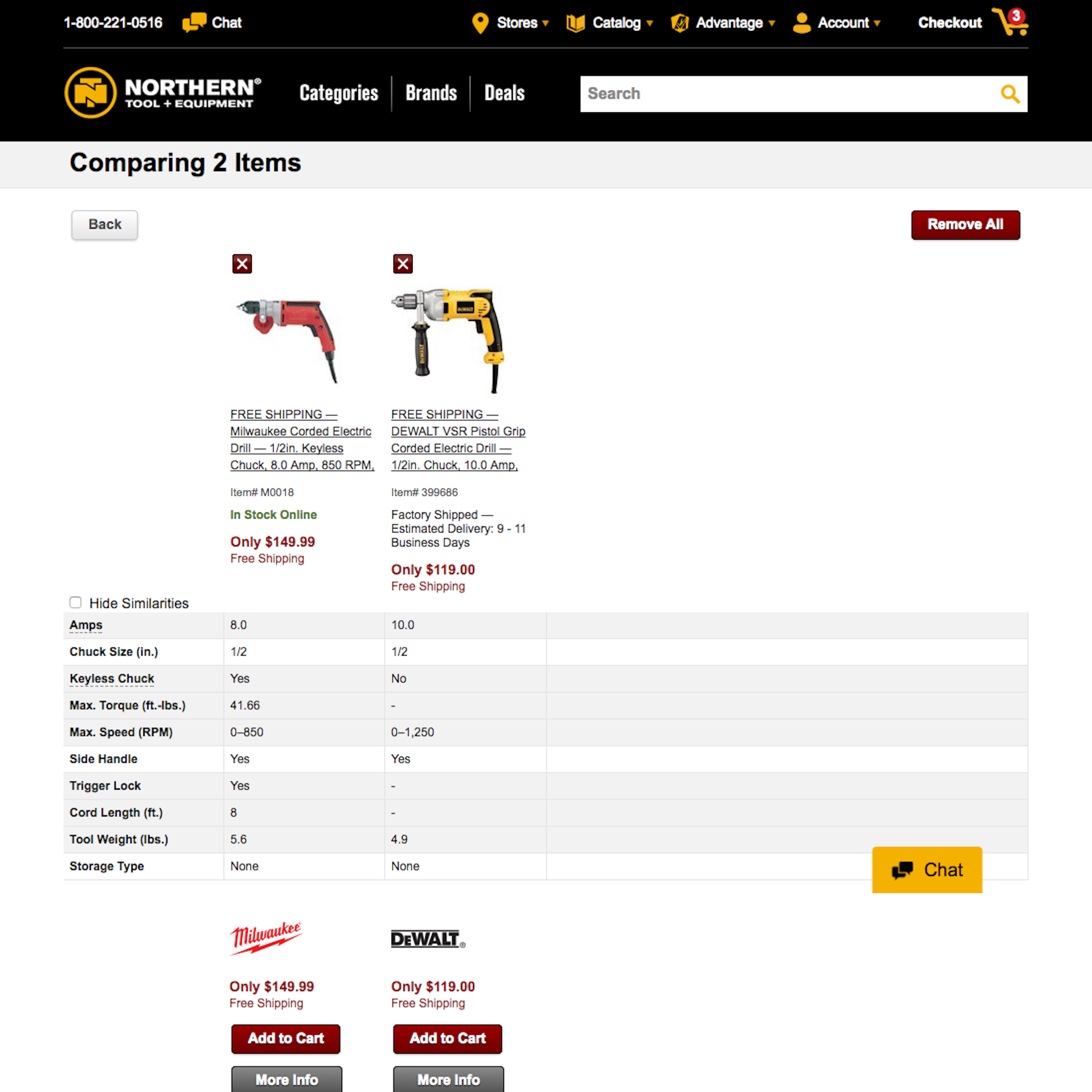
103 ‘Comparison Tool’ Design Examples
Also referred to as: Compare Feature, Comparison Table
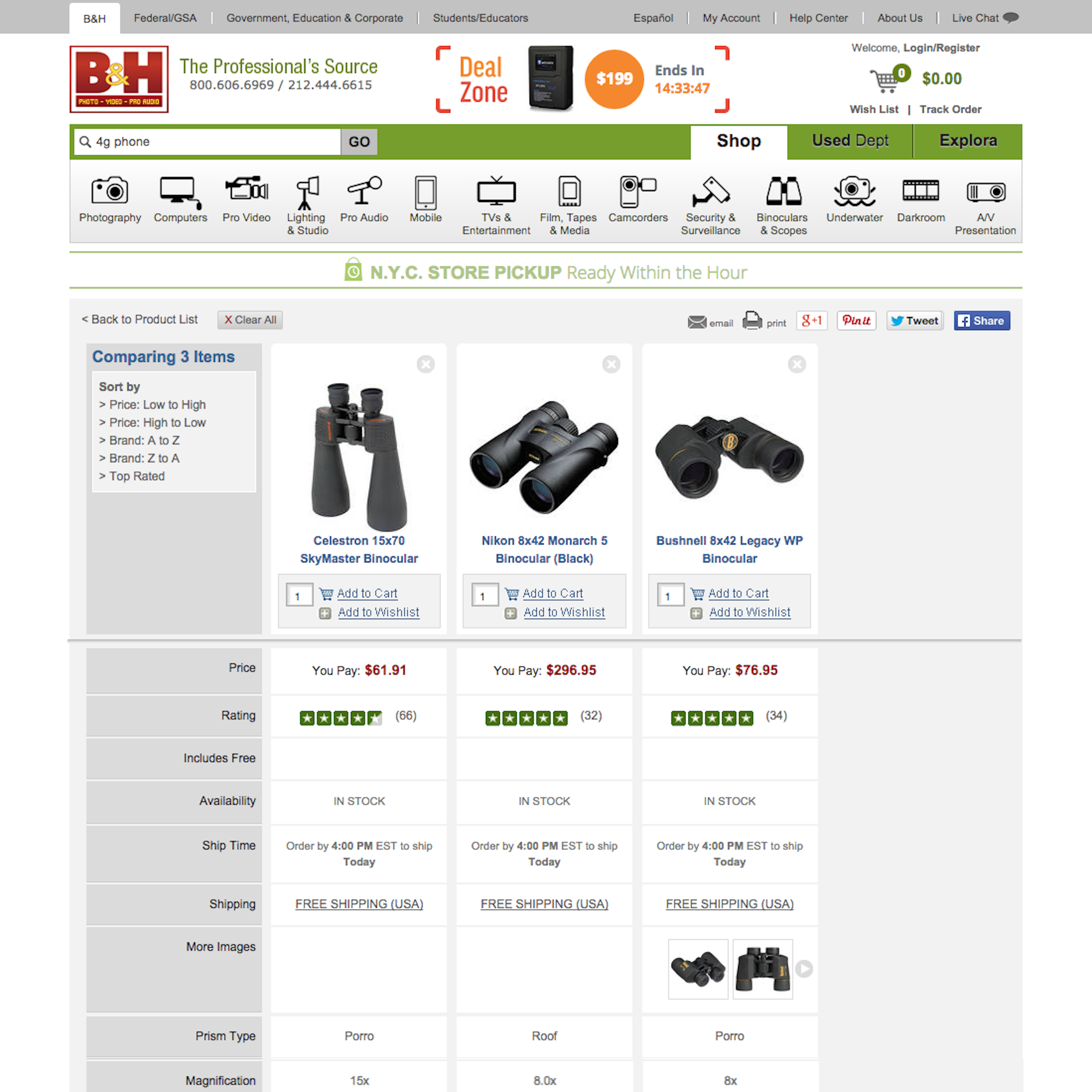
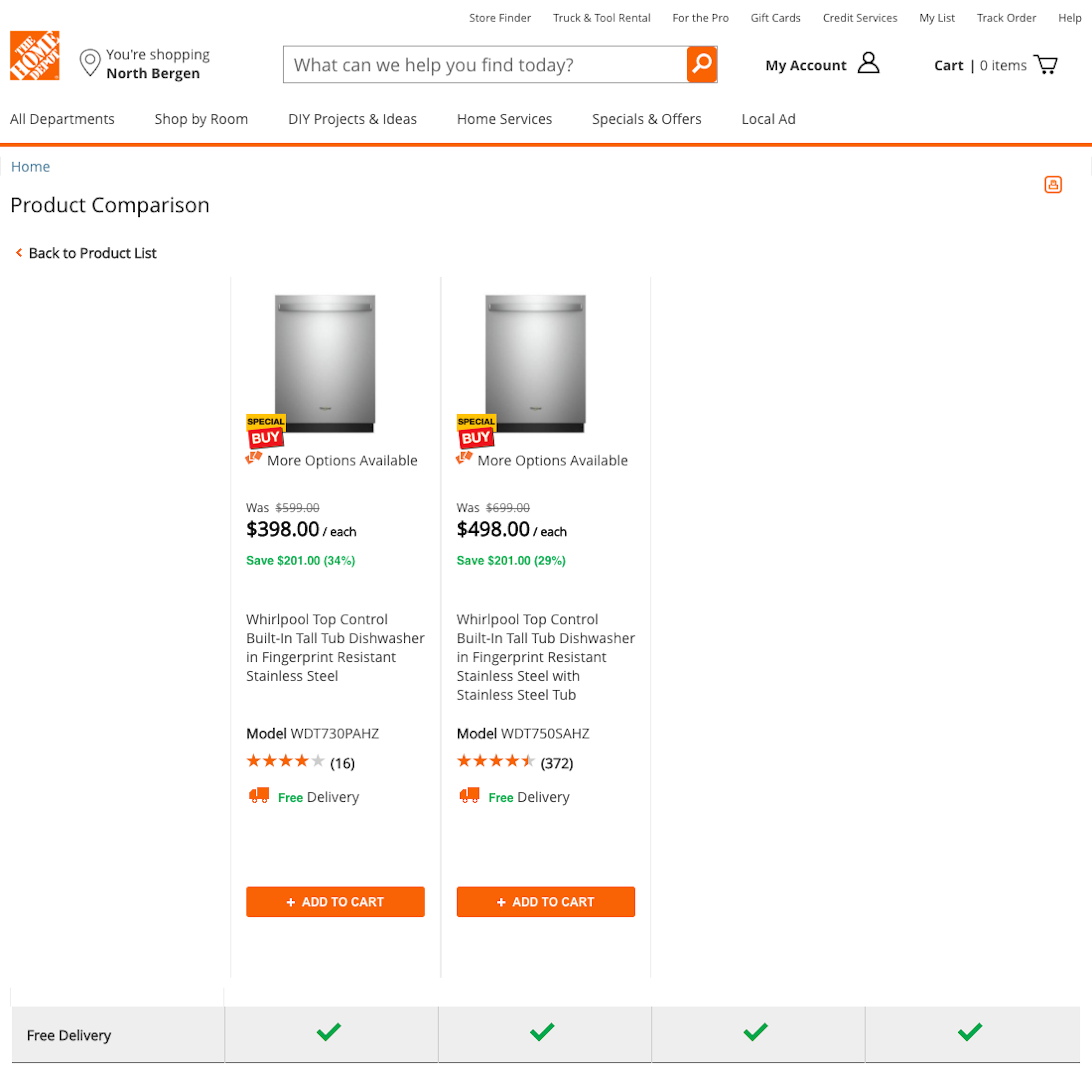
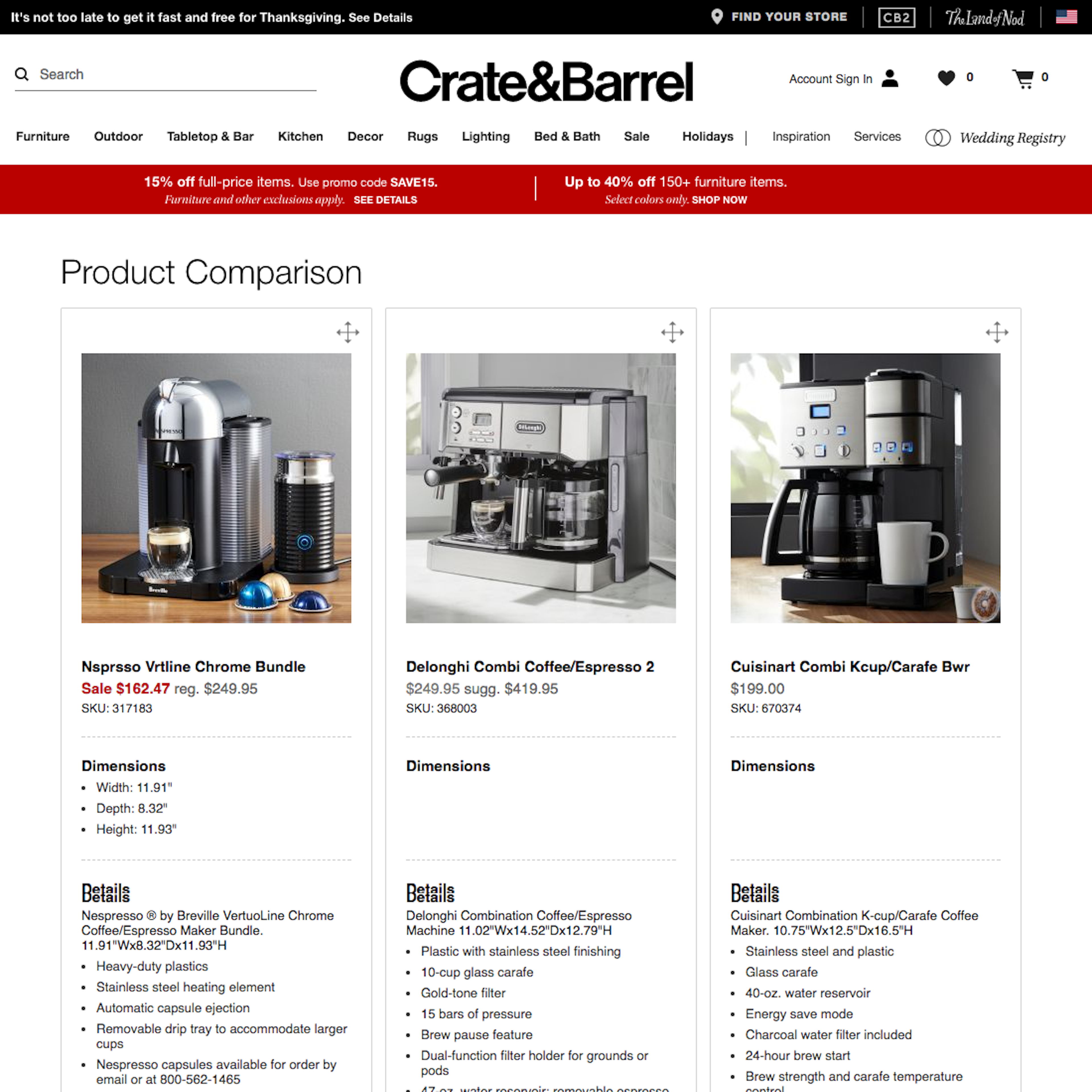
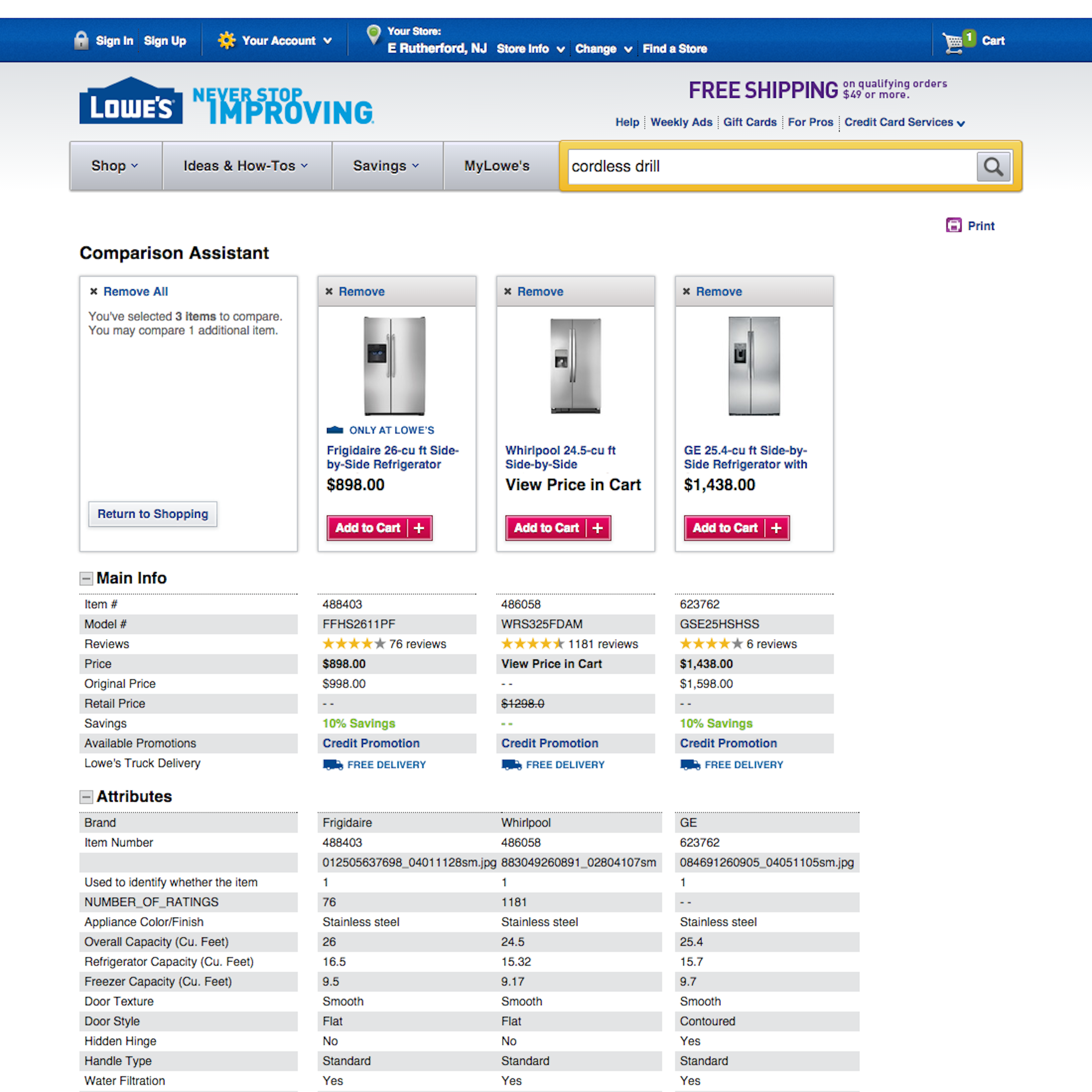
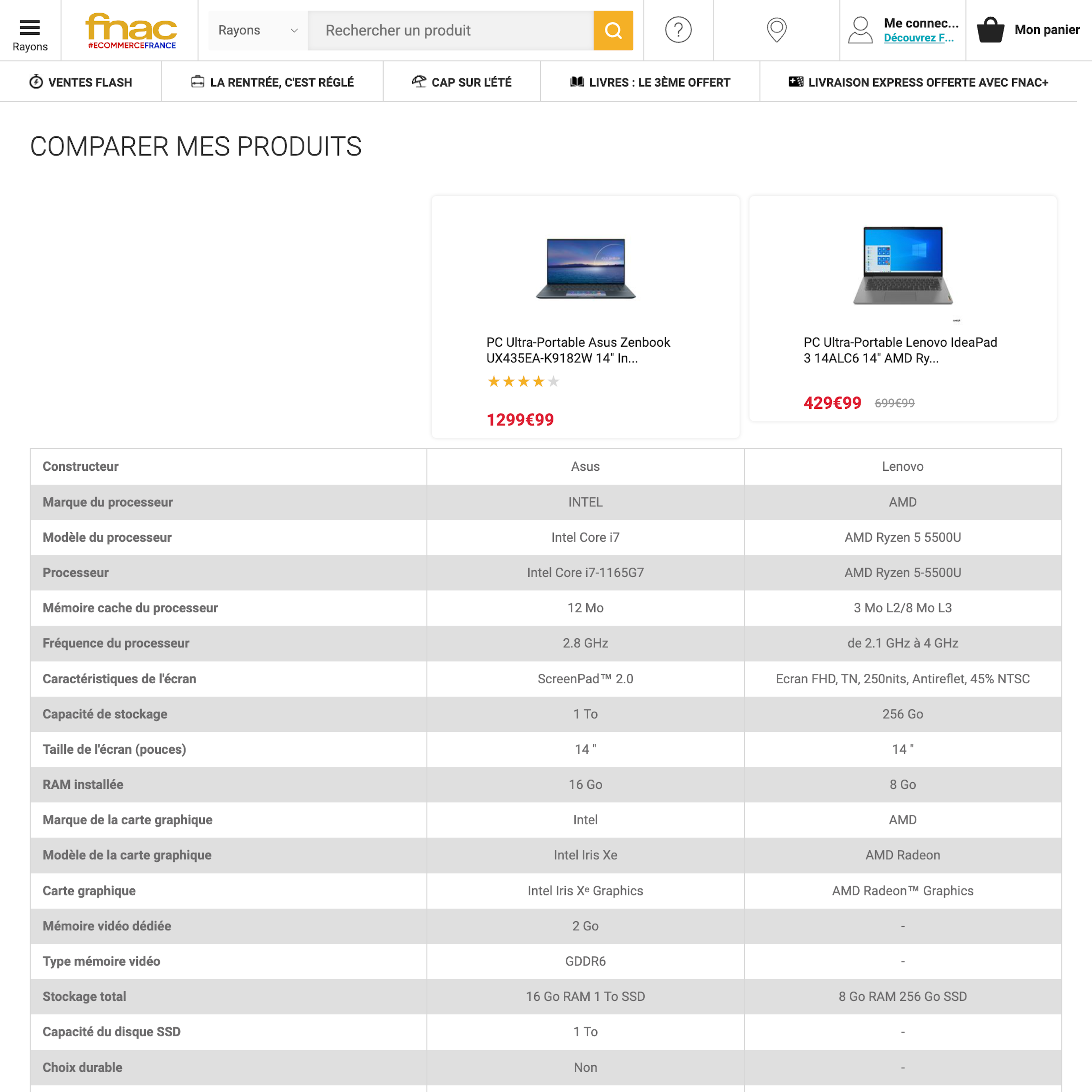
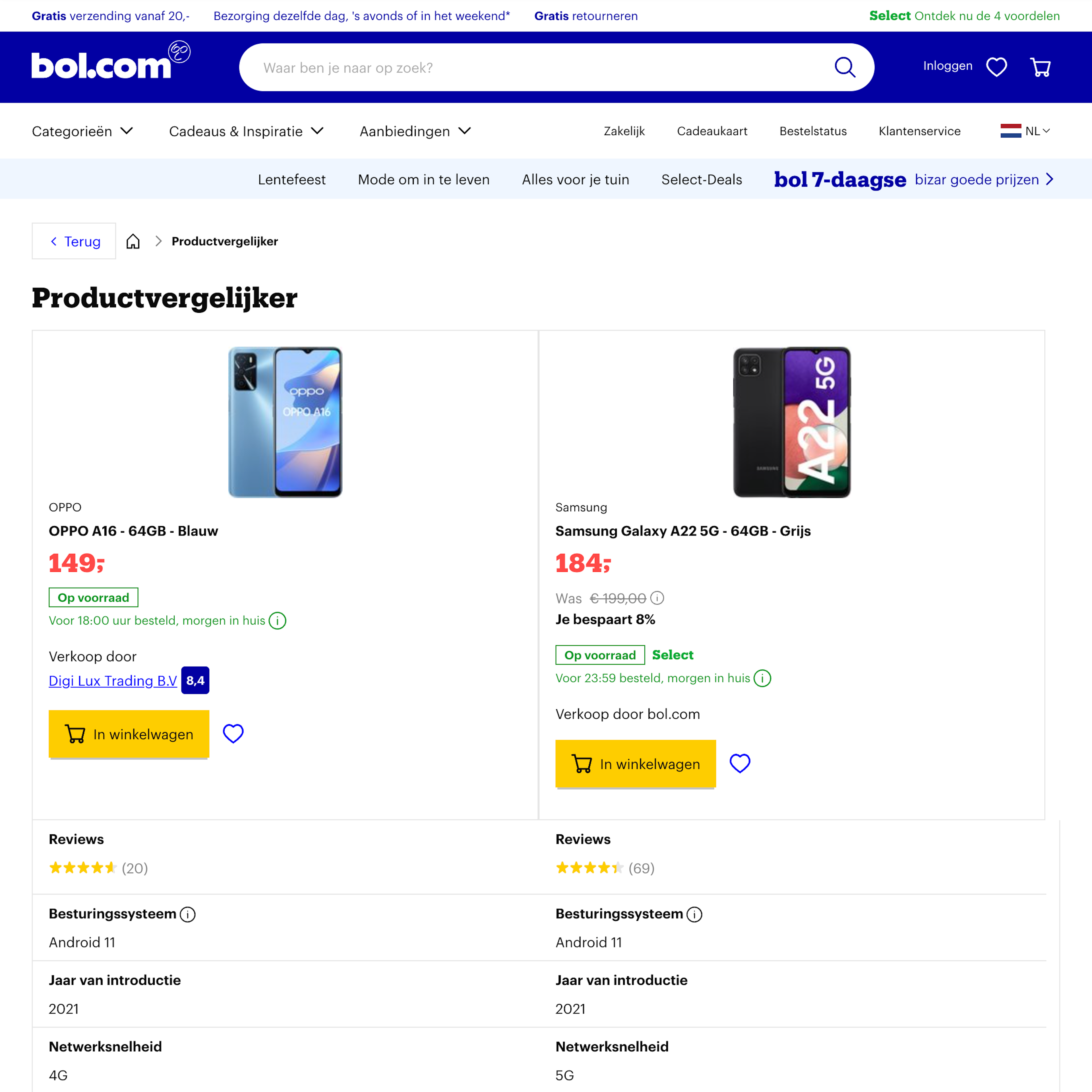
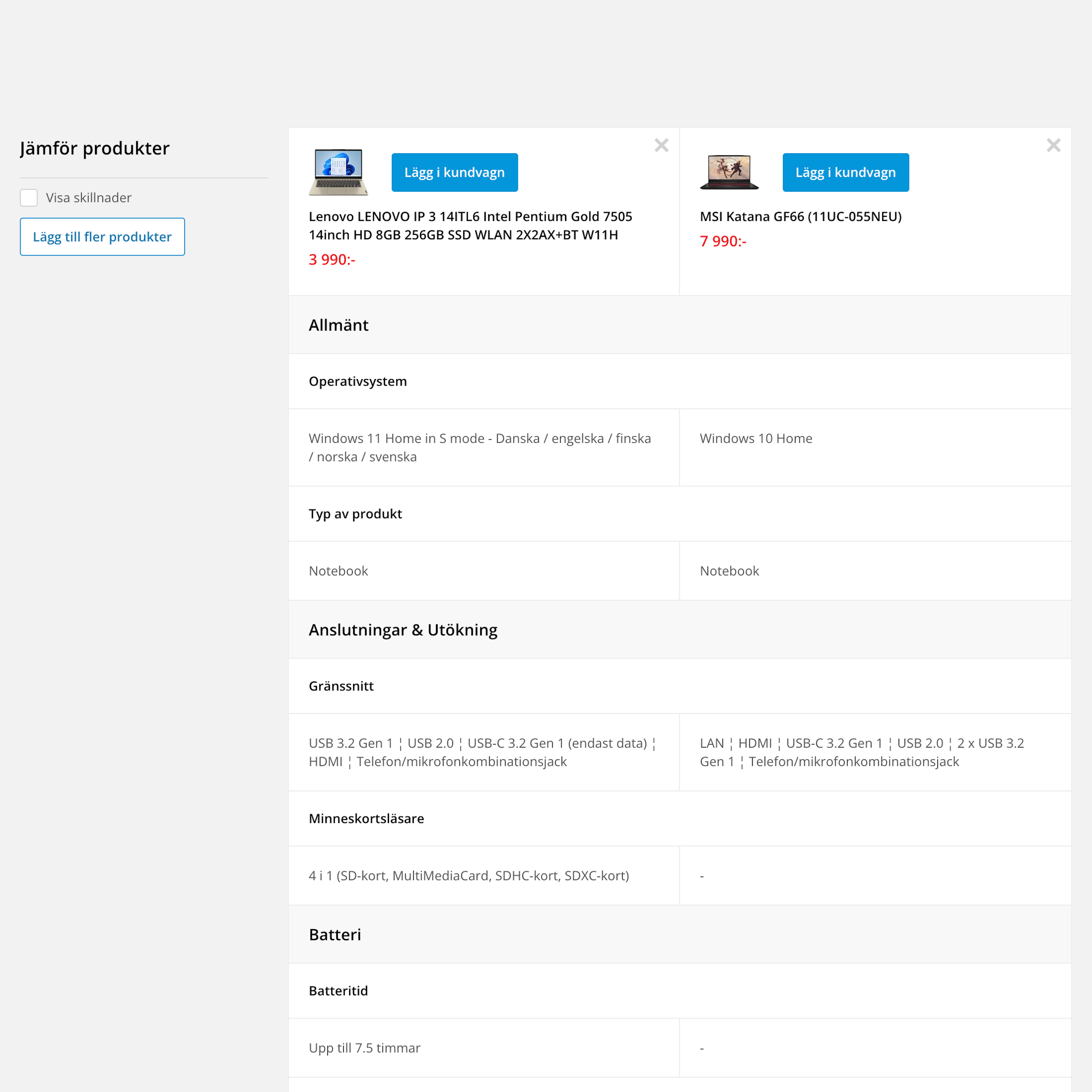
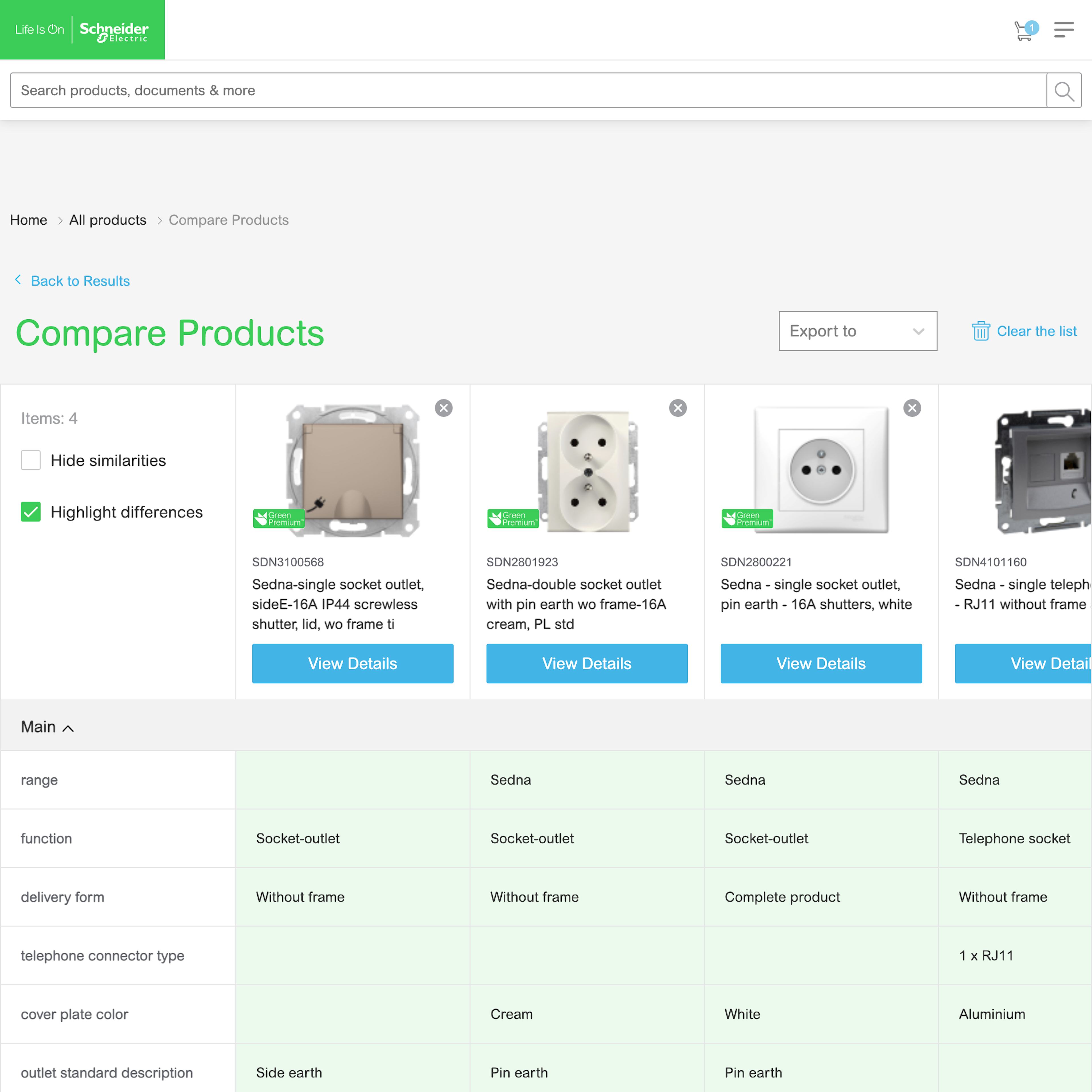
What’s this? Here you’ll find 103 “Comparison Tool” full-page screenshots annotated with research-based UX insights, sourced from Baymard’s UX benchmark of 327 e-commerce sites. (Note: this is less than 1% of the full research catalog.)
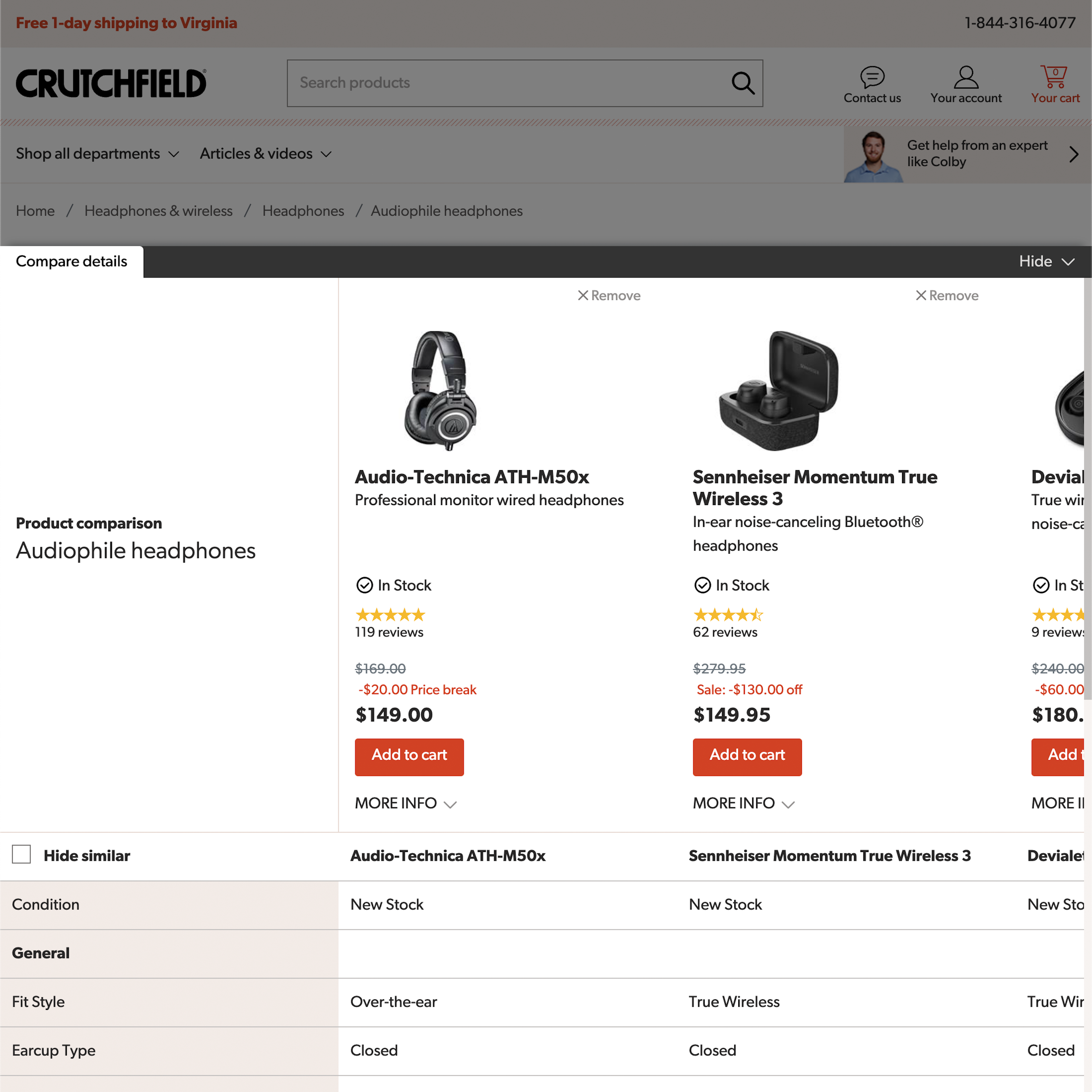
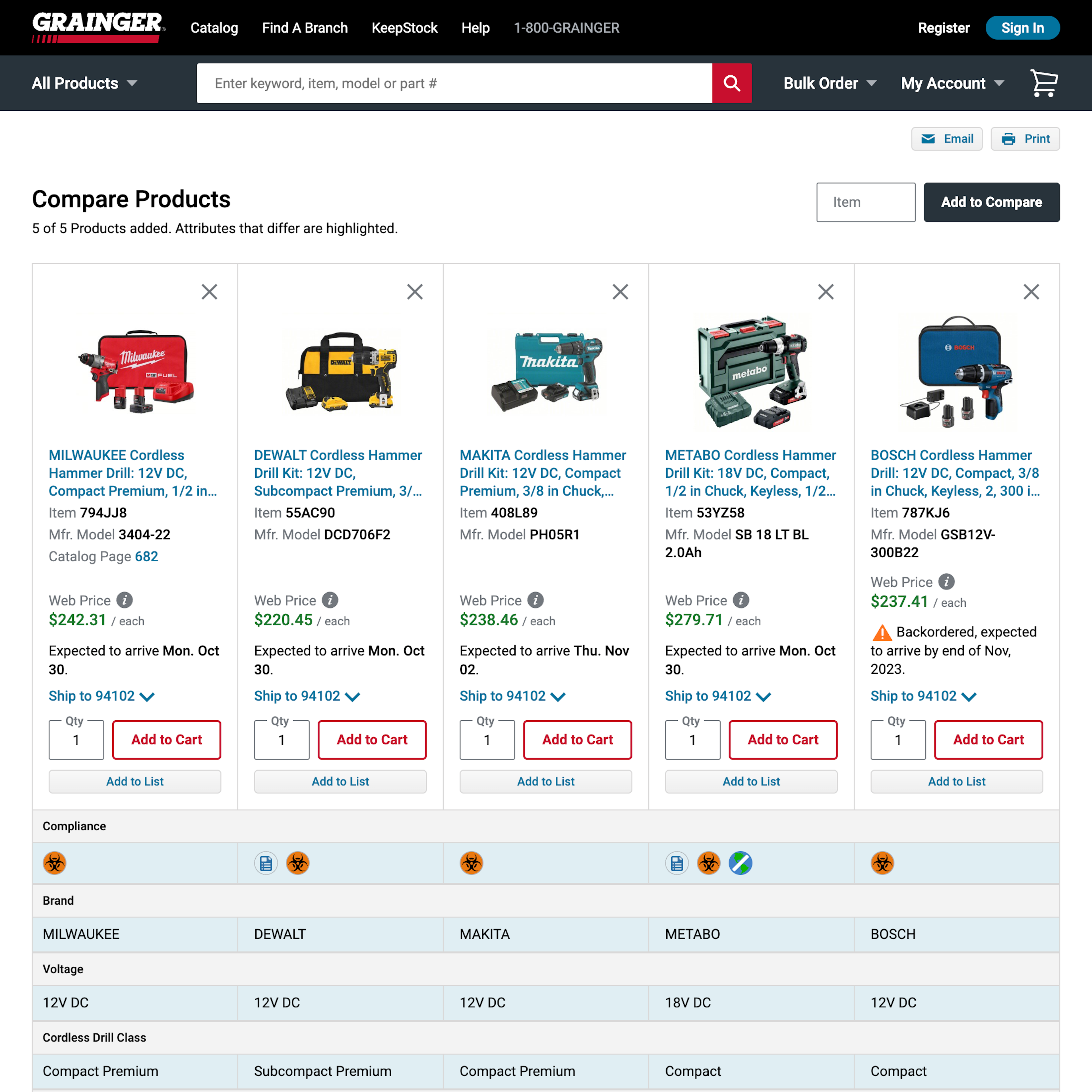
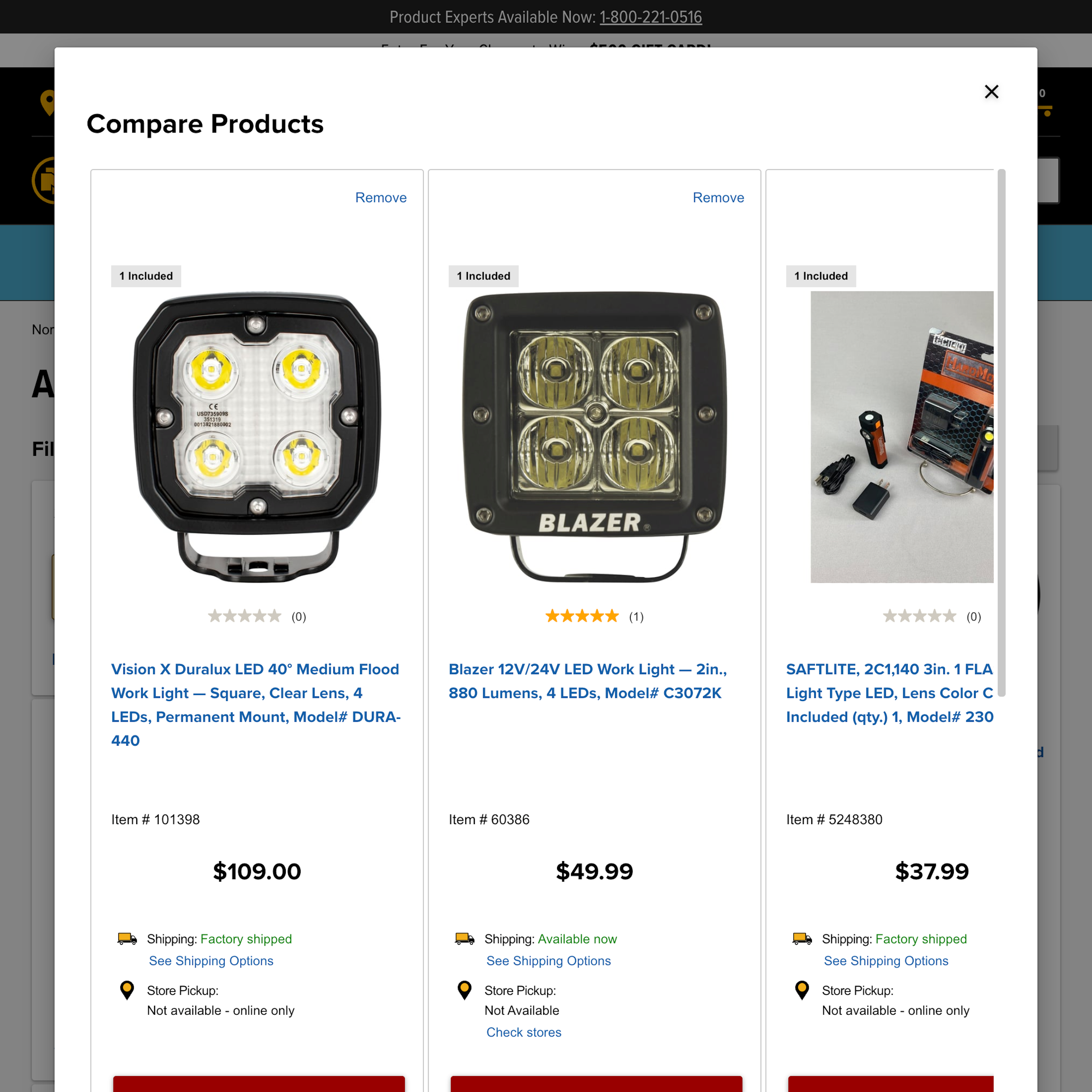
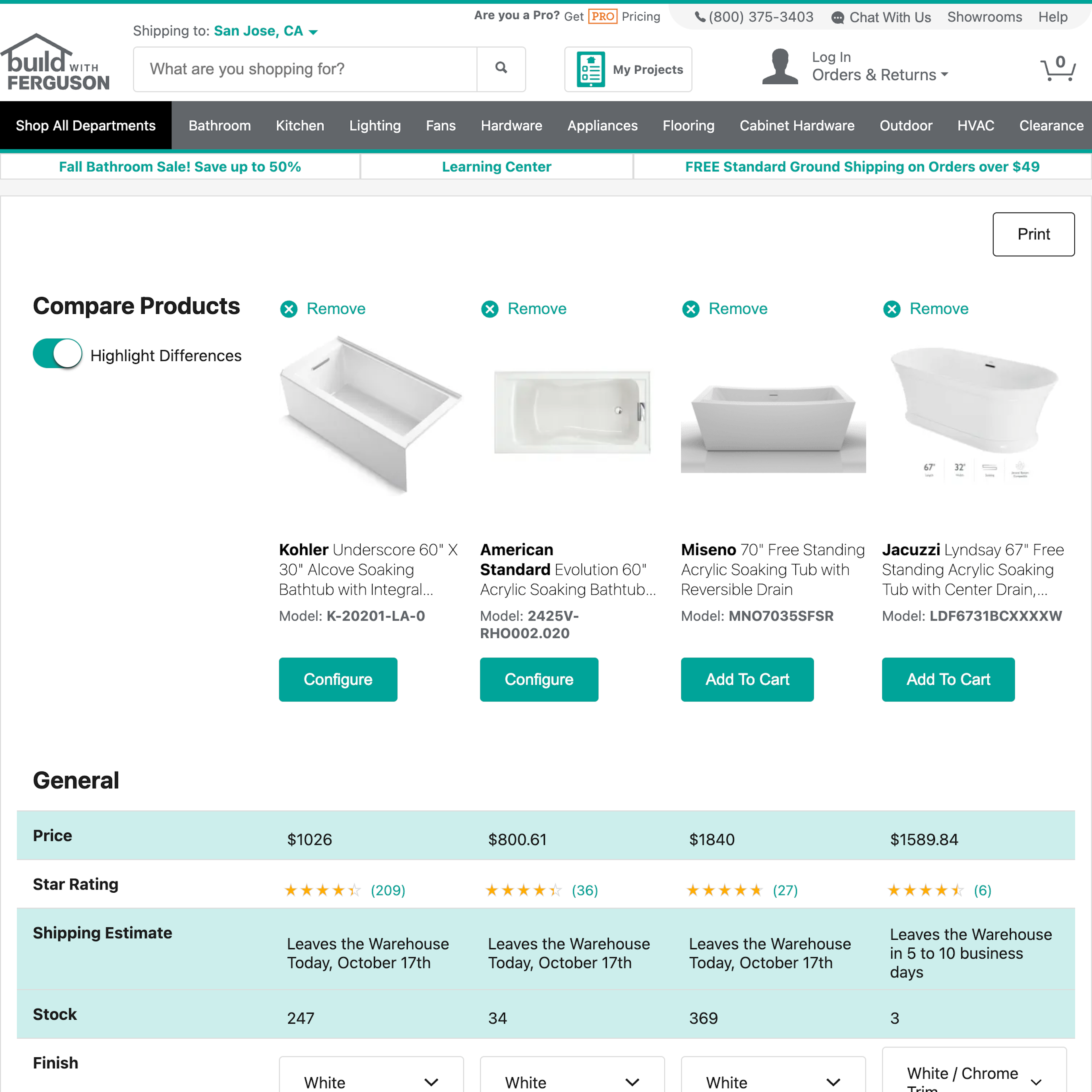
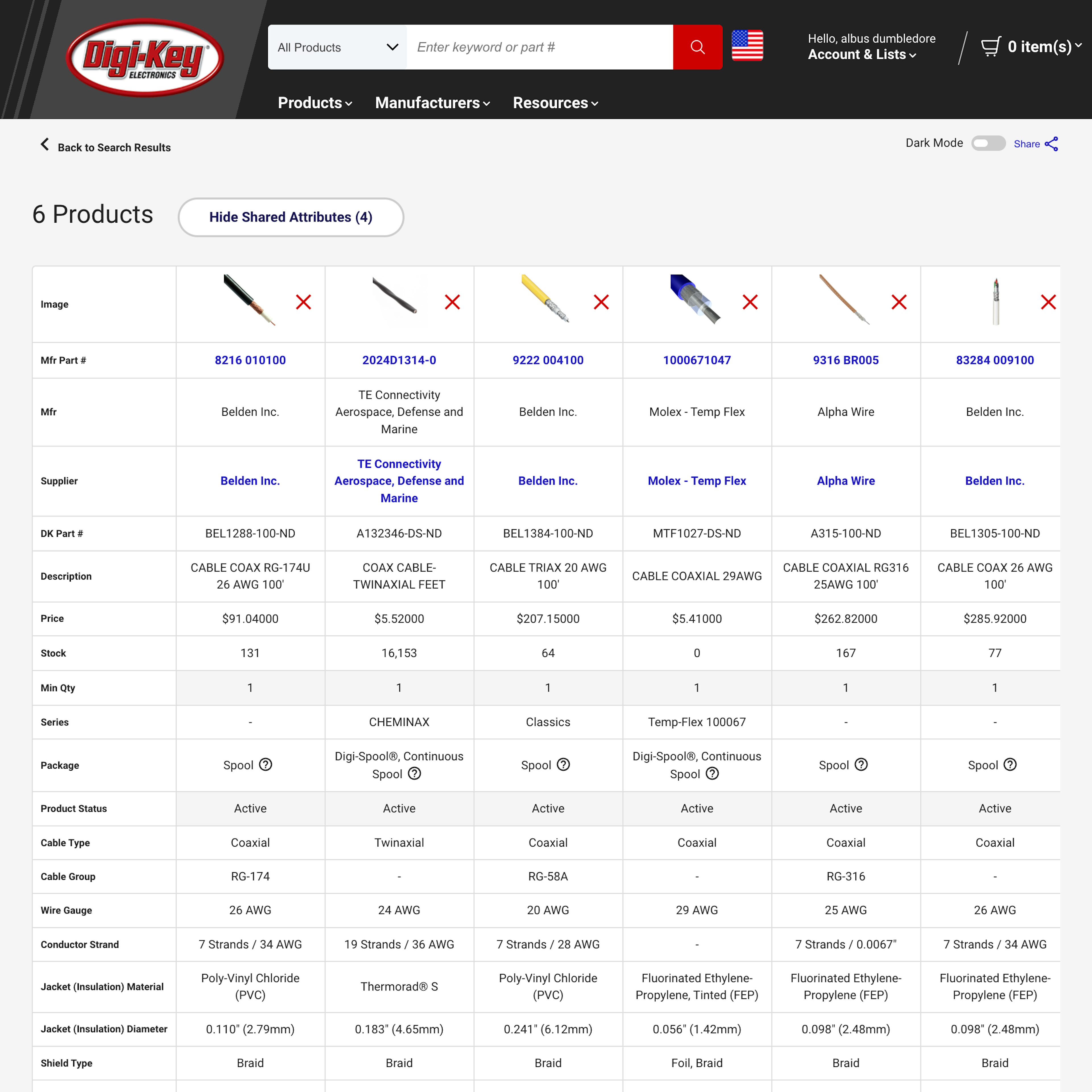
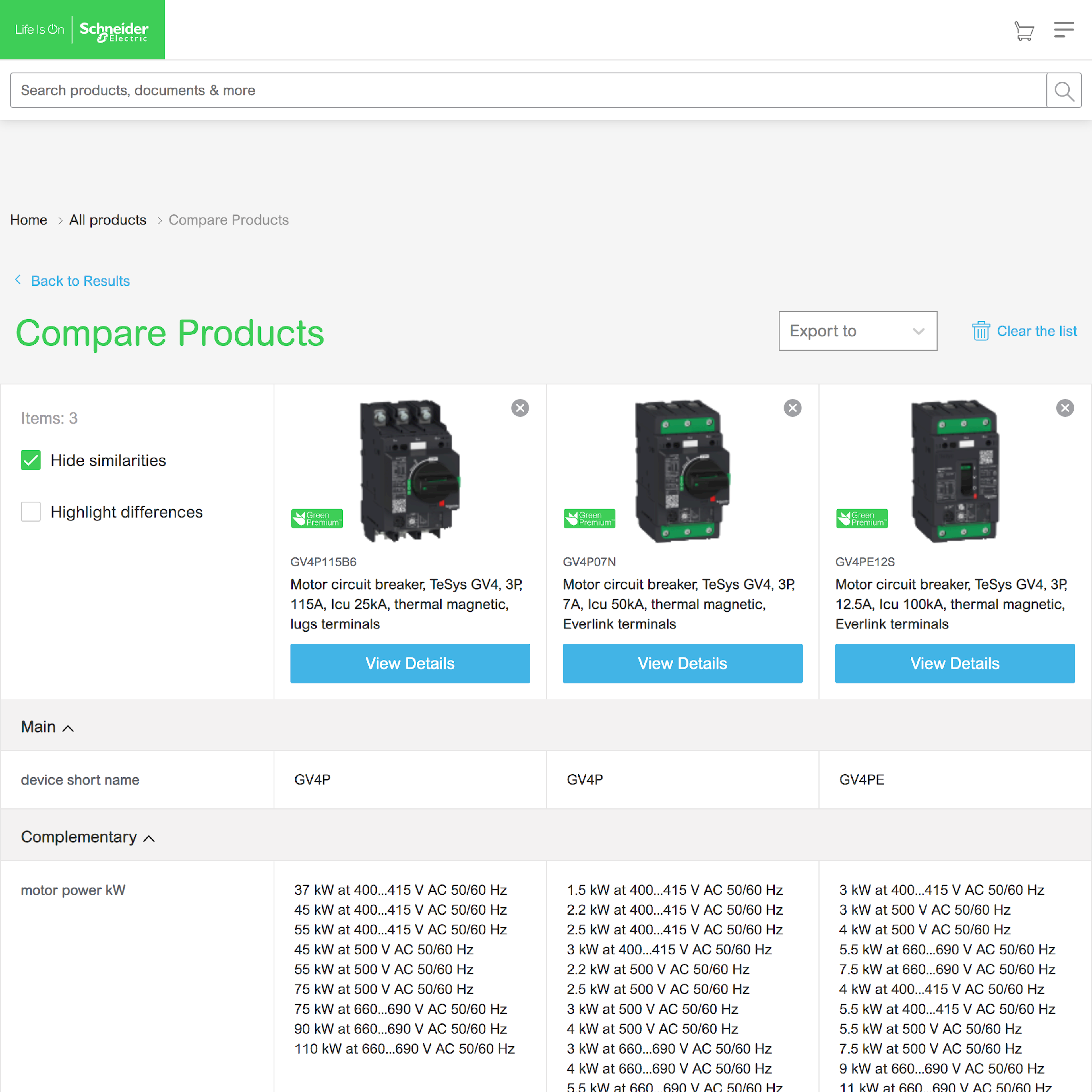
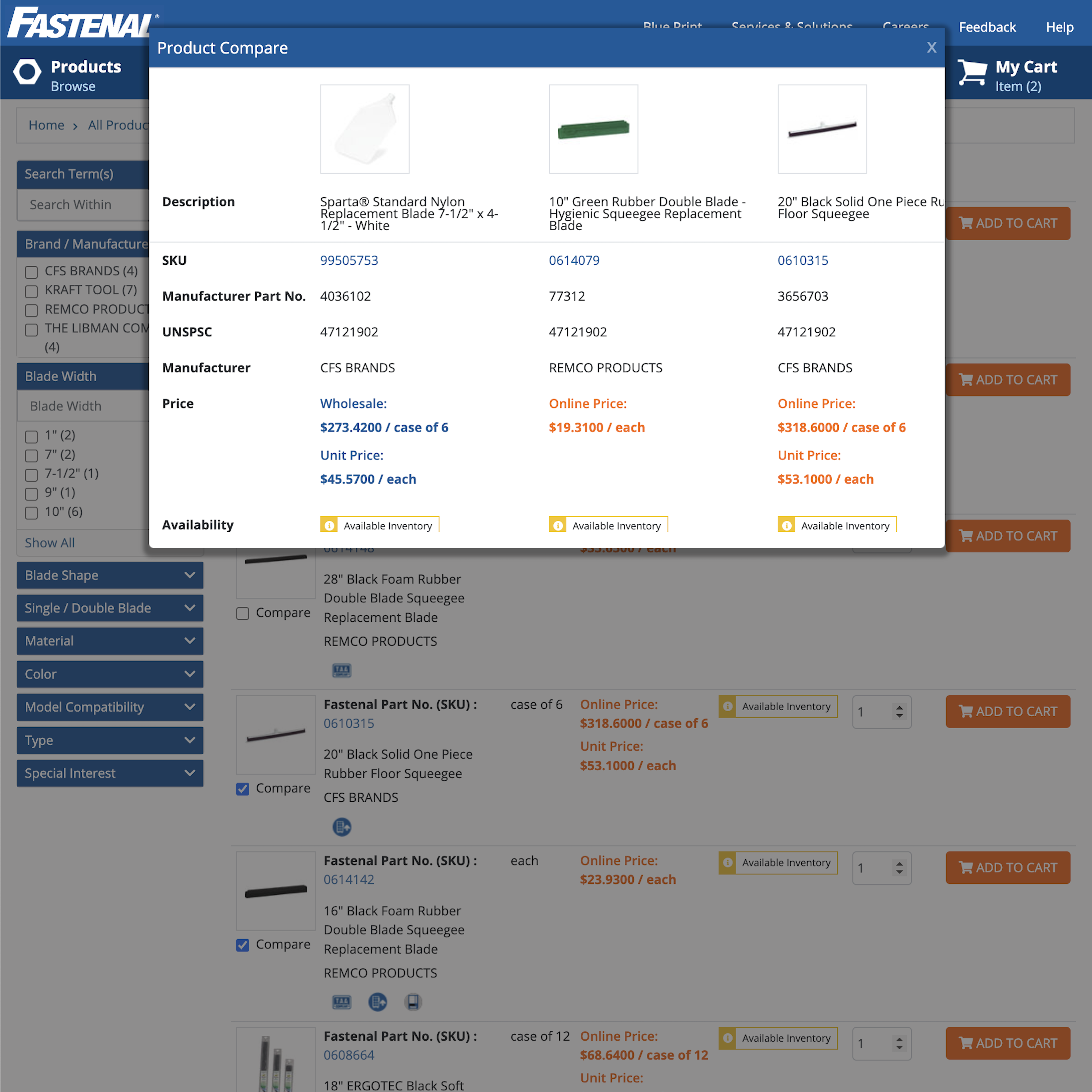
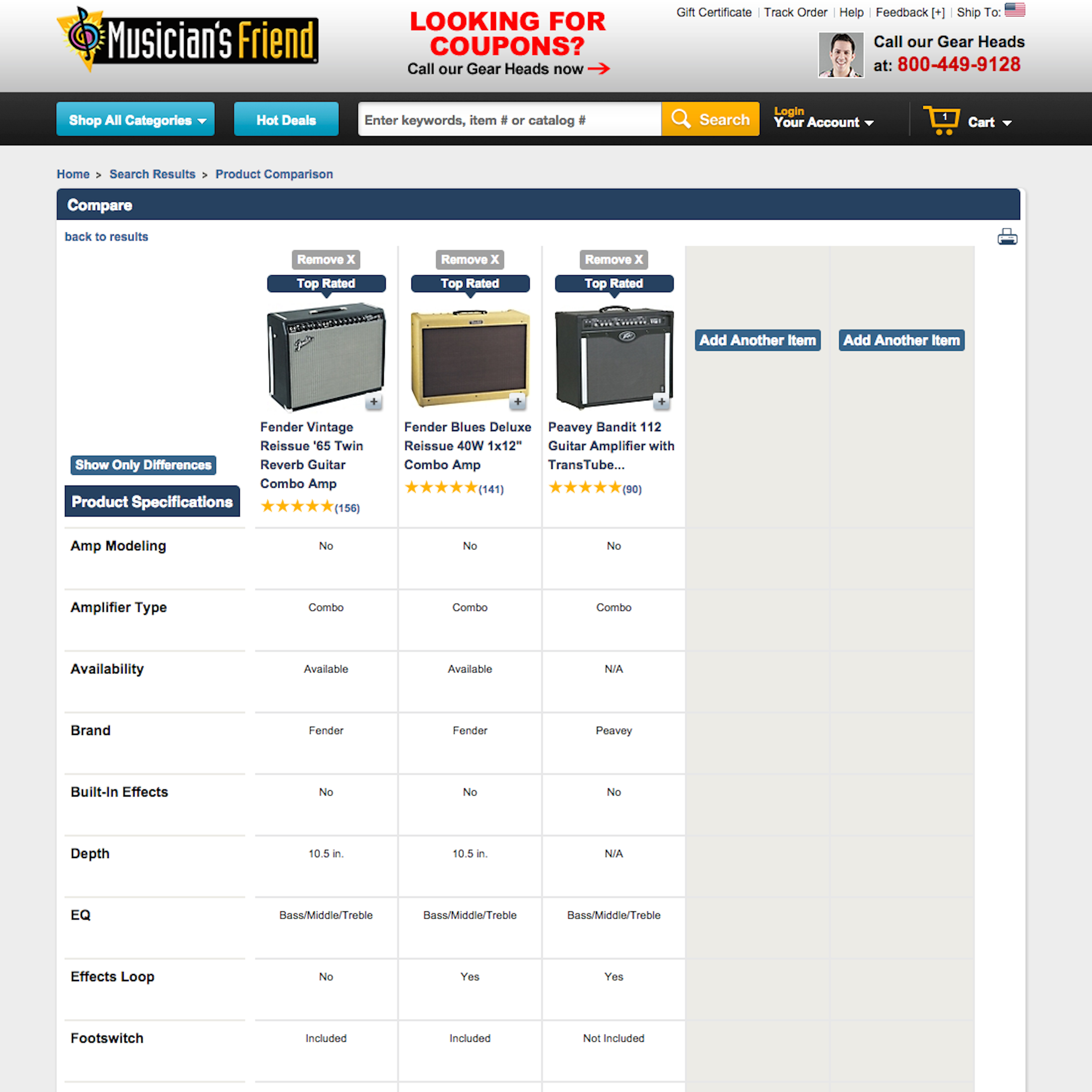
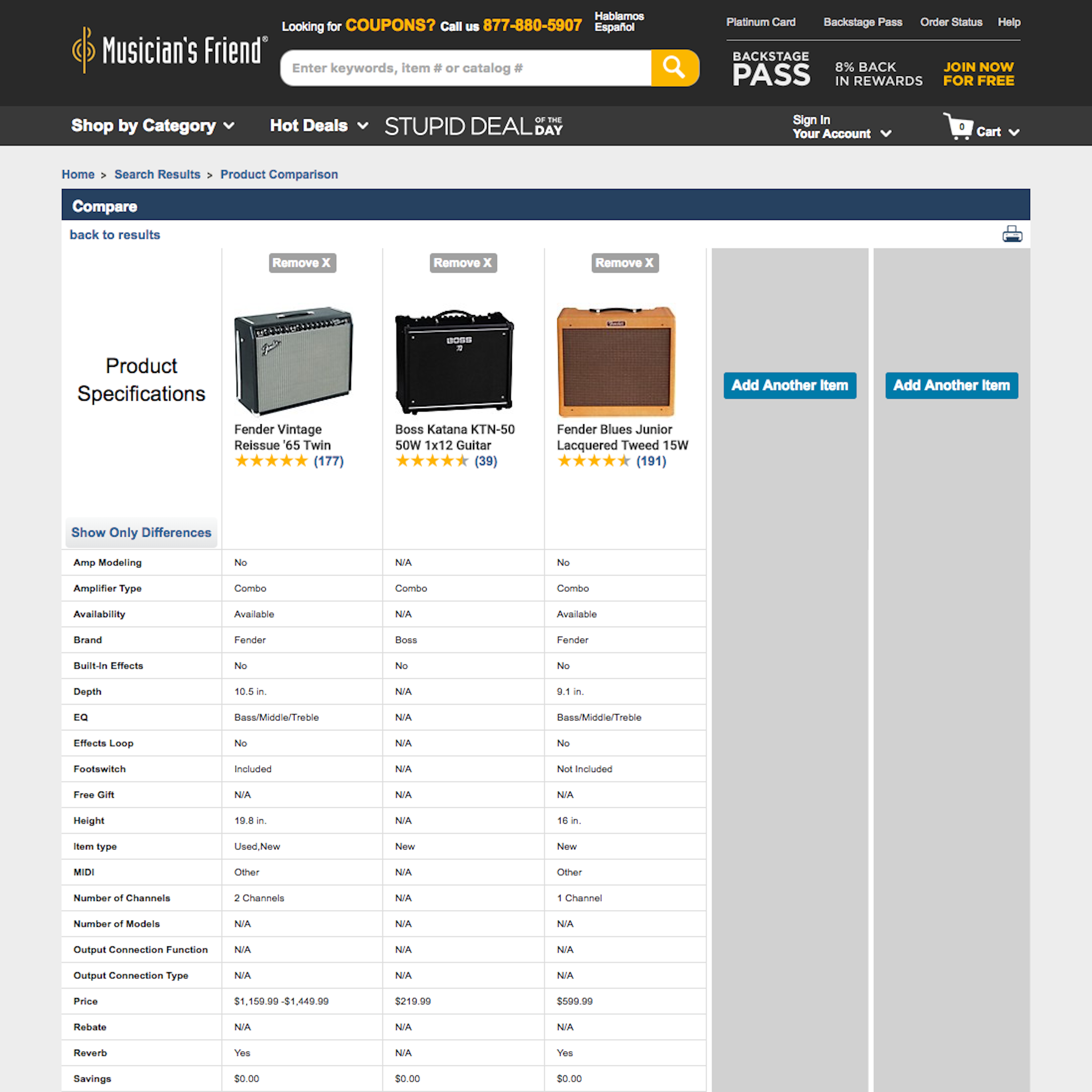
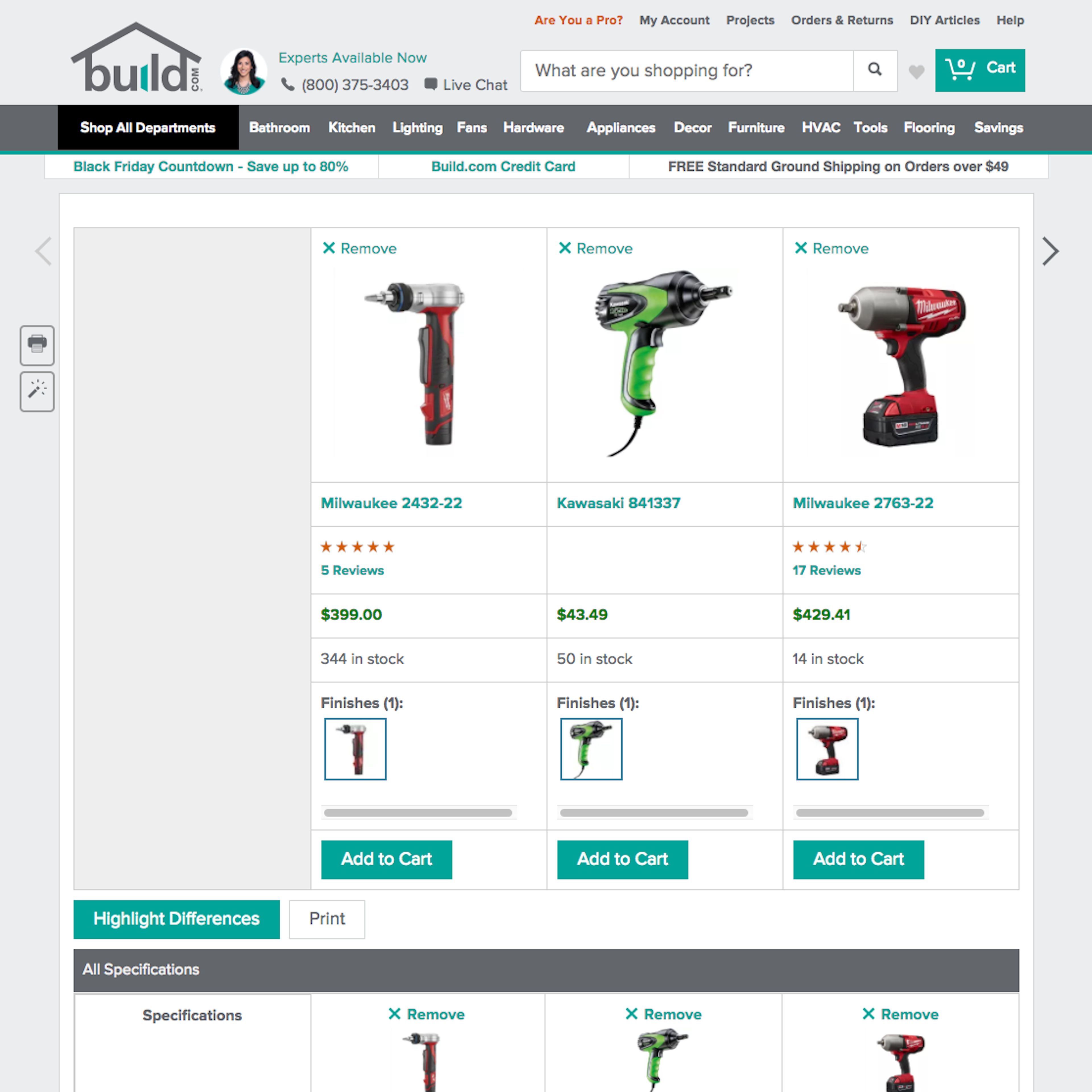
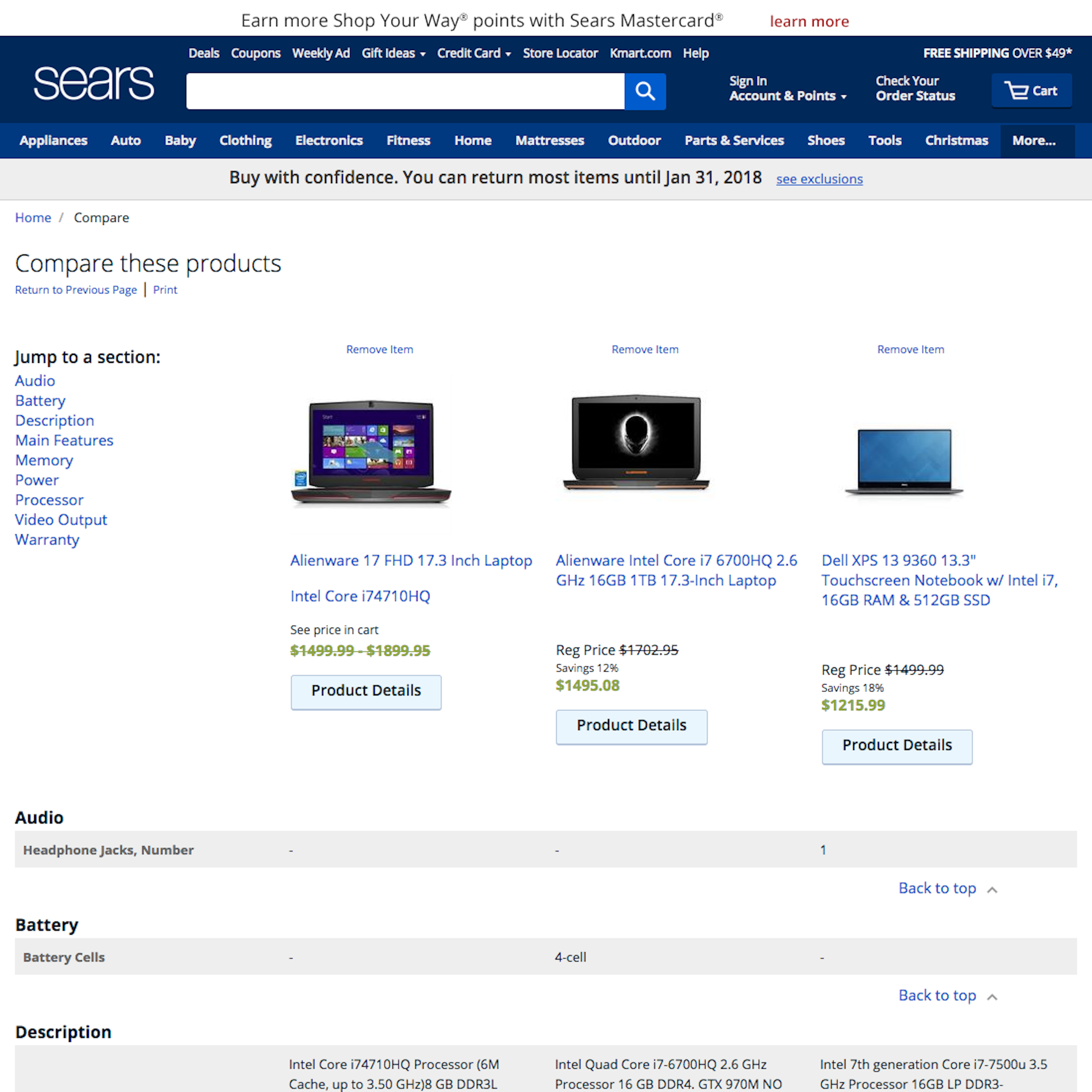
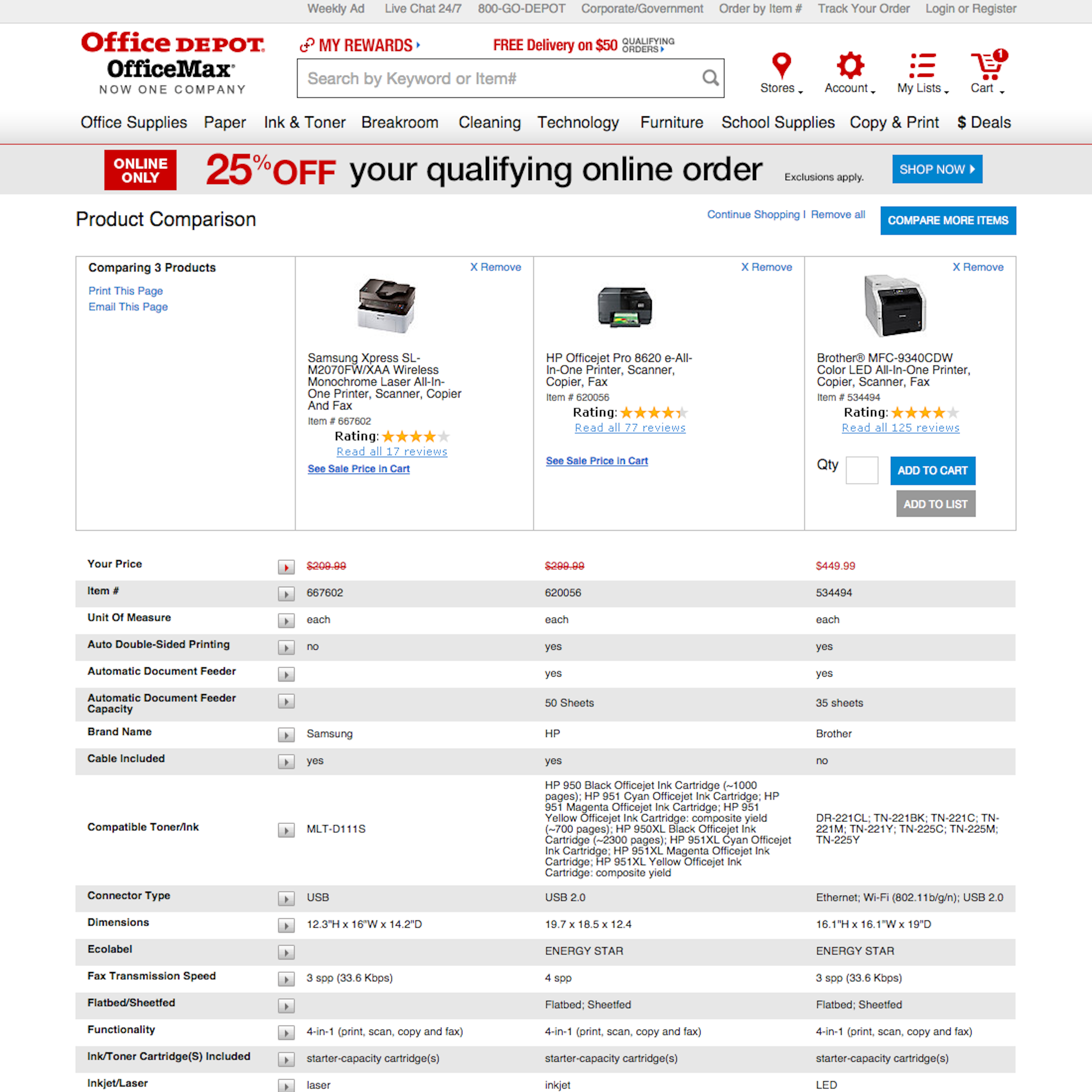
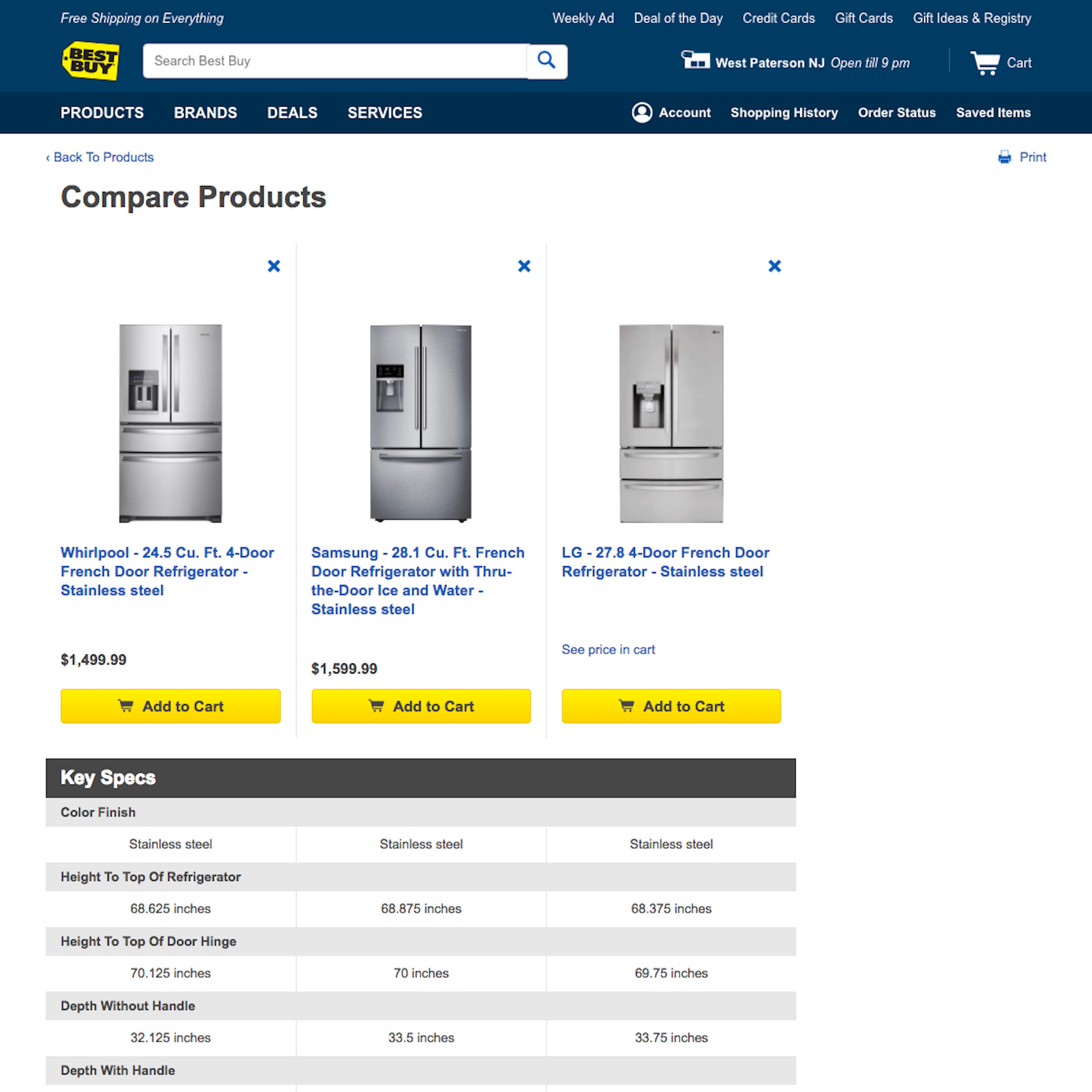
38% of the top 60 e-commerce sites have implemented a dedicated comparison tool that allows their users to select products they want to compare and then see detailed side-by-side comparison of each of the product’s specifications. However, our large-scale usability testing reveals that users have severe difficulties using these comparison tools, both when it comes to selecting the items for comparison at the product list and when comparing the product specs on the comparison page. Beyond the examples below, see our in-depth article “3 Product Comparison UX Implementation Details for ‘Compare’ Tools“.
More ‘Comparison Tool’ Insights
-
Our large-scale testing and benchmarking show that particular common pitfalls for e-commerce comparison features are inconsistently stored or formatted product specs (making comparison impossible) and a general lack of further explanations of the spec-heavy features in “common language” (in practice forcing users to either guess or go off-site to further research the exact meaning of the product features).
-
Learn More by exploring the 103 “Comparison Tool” page design examples below.
-
Get Full Access: To see all of Baymard’s product list and filtering research findings you’ll need Baymard Premium access. (Premium also provides you full access to 200,000+ hours of UX research findings, 650+ e-commerce UX guidelines, and 275,000+ UX performance scores.)
User Experience Research, Delivered Weekly
Join 60,000+ UX professionals and get a new UX article every week.

User Experience Research, Delivered Weekly
Join 60,000+ UX professionals and get a new UX article every week.

Explore Other Research Content

300+ free UX articles based on large-scale research.

327 top sites ranked by UX performance.

Code samples, demos, and key stats for usability.


