At Baymard, 2016 was all about the new checkout study and the benchmark redesigns. 2017 will bring new benchmark updates and a new Product Details Page usability study.
During 2016 we’ve published a completely updated checkout usability study based on 7 years worth of full-time checkout testing and analysis. Since testing checkouts was how we founded Baymard Institute nearly 8 years ago, it’s nice to see the positive reception for the new 718-page checkout study.
In 2016 we’ve also revised the baymard.com article design and the interface for the benchmark databases, along with helping noumerous e-commerce sites improve their UX via auditing – including seven new Fortune 500 clients.
In early 2017 we’ll be launching a benchmark update for the Homepage & Category usability study – this will provide you with 2,000+ additional best practice examples on the navigational experience from leading e-commerce sites. (Customers who purchase the H&C study now will get this upgrade for free.) In Q2 2017 we’ll also be launching a new study dedicated to the Product Details Page, with a lot of very interesting research findings to share.
We’d like to thank all of you who helped make 2016 yet another fantastic year of e-commerce usability improvements and UX research. We truly appreciate all of you who read, share and comment on our publications.
Here’s the most popular articles of 2016:
- Usability Testing of Inline Form Validation: 40% Don’t Have It, 20% Get It Wrong
- Over-Categorization: Avoid Implementing Product Types as Categories (56% Get it Wrong)
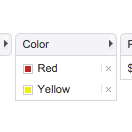
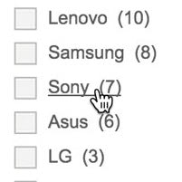
- Consider ‘Promoting’ Important Product Filters (80% Don’t)
- Product Listing UX: Highlight Items Already in the User’s Cart (96% Don’t)
- E-Commerce UX: What Information to Display in Product Listings (46% Get it Wrong)
- Product Listing UX: Use Synchronized Hover Effects & Unified Hit-Areas (76% Don’t)
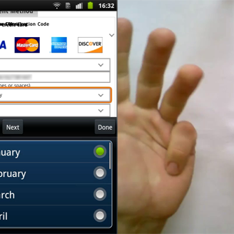
- UX Research: 7 Reasons B&H Photo’s Mobile Site is Best-in-Class
- Usability Testing Accordion-Style Checkouts: 2 UX Pitfalls that 75% of Sites Neglect
Looking forward to 2017!
- Christian H., Jamie A., Thomas G., Christian V., Edward S., and Lauryn S.


