During 2014 we’ve looked at how to improve the e-commerce on-site search experience, and seen how it represents one of the biggest opportunities for creating a competitive advantage in the e-commerce landscape. Especially the underlying search engine logic can be difficult for competitors to replicate, while the search interface is ripe with quick and easy wins.
Our 2014 articles weren’t just about e-commerce search, however, we also looked at category navigation and checkout usability. Below you’ll find the 15 most important and popular articles we released on these three topics.
In 2015 we’ll venture into the largely overlooked topic of Filtering & Sorting, and e-commerce product lists in general. We’ll also benchmark the mobile e-commerce shopping experience of top retailers, to establish a general industry performance and identify best practices (note: all existing M-Commerce report owners will receive this benchmark database upgrade for free). We may even find time for some additional UX research initiatives, to be announced later.
We hope you’ve had just as a delightful and busy year as we did. Happy New Year from everyone here at the Baymard team.
E-Commerce Search Articles
The 5 most important articles we’ve published on e-commerce on-site search, all based on the test findings from our large scale search usability study released during 2014:
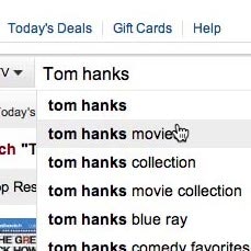
- Deconstructing E-Commerce Search: The 12 Query Types – The 12 types of search queries that we identified users rely on when performing on-site search at e-commerce sites, including thematic, feature and relational search queries. Yet, most e-commerce sites have very poor support for these, for example, 60% don’t support thematic queries, 22% don’t support feature searches on colors, while 60% don’t allow abbreviations or symbols (in. vs. inch vs “), and so on. (This is perhaps the most important article we’ve published to date.)
- Faceted Sorting - A New Method for Sorting Search Results – If users try to sort site-wide search results by anything other than “Relevance” completely irrelevant items tend to be propelled to the top of the list – something that during testing lead to numerous abandonments. “Select a category to enable sorting” is the first step towards solving the issue, but in this article we take things one step further with the concept of Faceted Sorting (not to be confused with faceted filters).
- 8 Design Patterns for Autocomplete Suggestions – Some autocomplete widget designs confuse and distract users as they type their search queries. Luckily, our search usability study also identified 8 design patterns for autocomplete query suggestions that ensured users a seamless experience.
- E-Commerce Sites Should Include Contextual Search Snippets – For more than a decade traditional web search engines have relied on search snippets to show users how their search results relate to the search query. Alas, only 4% of e-commerce sites currently take advantage of this. And that’s despite 57% of the test subjects during our search study at some point being unable to understand why the e-commerce search engine had deemed a product relevant to their search.
- E-Commerce Sites Need Multiple of These 5 ‘Search Scope’ Features – Search scopes are one of the key differences between e-commerce on-site search and general web search. Our testing verified 5 different types of search scopes e-commerce sites should present to their users.
To browse all 11 e-commerce search related articles, along with our benchmark database of the search experience at top 50 e-commerce sites, check out our E-Commerce Search overview page.
Homepage, Categories and Navigation Articles
The 5 most important articles published in 2014 based on findings from our Homepage & Category Navigation usability study:
- 4 Design Patterns That Violate Back-Button Expectations – These 4 modern web-design patterns often have a default technical structure which break user expectations, and severely clash with the user’s mental model for how the decade-old browser “back” button should work. Luckily the solution for aligning site behaviour with user expectations is technically relatively simple.
- Avoid Inline Scroll Areas (50% Get it Wrong) – Inline Scrollable Areas have been found to cause several low-level interaction issues for users, along with some more fundamental conceptual difficulties, and should therefore be avoided entirely on e-commerce sites for e.g. listing filtering values. Despite these multi-faceted usability issue, and the better “alternatives”](https://baymard.com/blog/truncation-design) available, our benchmark found that 50% of major e-commerce sites still rely on inline scrollable areas for displaying filtering values.
- Avoid These 5 Types of E-Commerce Graphics – Internal graphics, banners and ads for promotions and site features are fairly common on e-commerce sites and can be helpful for users. However, there’s 5 types of graphics that during testing were found to commonly cause severe usability and user experience issues.
- Homepage Usability: Can Users Infer the Breadth of Your Product Catalog? – First-time users will often rely heavily on the homepage content to determine the type of site they’ve landed on. It turns out that displaying a diverse selection of products on the homepage is vital, as these users may otherwise establish an overly narrow perception of the type of site (the case at 28% of the top e-commerce sites).
- Inspirational Images Should Link to All Depicted Products – Our research shows that bespoke imagery is one of the biggest factors in positively influencing the user’s initial perception of a site. Yet during testing we repeatedly observed the subjects grow frustrated when they spotted a product they wanted in an inspirational image yet weren’t able to navigate to it. In this article we present ways to avoid that.
To explore all 16 articles we’ve published on e-commerce homepage and category navigation, along with the benchmark database of the navigation experience at 50 top e-commerce sites, head to our Homepage & Category Usability overview page.
Checkout & Form Usability Articles
5 articles on checkout and form usability, based on our checkout usability study, including findings from testing mobile checkouts and our latest large-scale eye-tracking study of e-commerce checkouts.
- Form Usability: The Pitfalls of Inline Accordion and Tab Designs – When tab-style and inline accordion form layouts are used, users often can’t figure out which form fields will be submitted when clicking “save” or “continue”. This article highlights the issues that both inline accordion forms and tabbed form layouts produce, and touch upon some design alternatives. (This was our most popular article in 2014.)
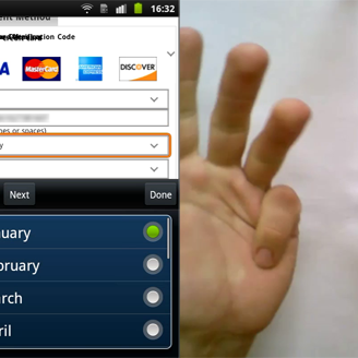
- Checkout Design: Payment Method Selection – How do you design a checkout process that gives the user plenty of payment methods to choose between without introducing needless friction and complexity, or triggering choice paralysis? This article covers the underlying usability issues of payment method selection, along with best practice examples and a set of design principles to follow.
- Form Usability: Validations vs Warnings – There’s a major difference between form validations and form warnings – one is restrictive, the other permissive. This article explores how e-commerce sites can provide a better “error experience” by adopting both techniques, and shows how overly restrictive form validations can completely block users from completing their purchase.
- Users Overlook ‘Store Pickup’ When Not Presented as a Shipping Option – Our usability research shows that users often overlook “Store Pickup” features due to a mismatch between where users typically expect to find the feature and where tends to be located on sites (e.g. when testing REI’s mobile site 83% of the subjects overlooked the “Find in Store” button on the product page). The article explores where omni-channel sites should place their “Store Pickup” to align with user expectations.
- Fixing Bugs – the Next ‘Big Thing’ in E-Commerce? – Users have no patience towards layout bugs, flawed interactive features and error pages – and encountering these will often lead to instant site abandonments. Yet, technical bugs are astoundedly common, and despite testing hundreds of e-commerce sites with millions (sometimes even billions) in revenue, we’ve stumbled upon technical bugs on nearly all of them. In this article we present 3 principles for working with technical bugs.
To explore all 32 articles we’ve published on checkout and form usability, along with a benchmark of the checkout experience at 100 top e-commerce sites, go to our E-Commerce Checkout Usability overview page.