Key Takeaways
- Our new research has uncovered 1,000+ new usability issues specific to the e-commerce Product Finding experience
- The research has resulted in 160+ new and updated Product Finding guidelines that describe the issues, as well as design patterns verified to perform well for users
- 24 new Product Finding guidelines have been added and 84 previously existing Product Finding guidelines have been heavily revised
Earlier this year, we announced that we’d completed a 2-year project updating our Checkout research findings.
Now, our research team has just spent 5,550+ hours usability testing and researching Product Finding features, layouts, content, and designs — leading to our revised and expanded Search, Homepage and Category, and Product Lists and Filtering research studies.
The research is based on 219 qualitative user/site usability test sessions following the “Think Aloud” protocol (1:1 remote moderated testing).
This Product Finding study focused on a mix of mass merchant and smaller sites, for a total of 12 sites: Staples, HP, Office Depot, Best Buy, B&H Photo, Newegg, GAP, H&M, AEO, Nordstrom, L.L. Bean, and Urban Outfitters.
During Baymard’s testing the users encountered 1,000+ medium-to-severe Product Finding usability issues.
These issues have subsequently been analyzed and distilled into 160+ UX guidelines all of which are available as part of our Premium research findings.
The 160+ guidelines cover most aspects of the Product Finding UX, at both a high level of general user behavior as well as at a more granular level of specific issues users are likely to encounter.
Expanded and Updated Product Finding Research
This latest round of large-scale Product Finding testing provides the following:
- An exhaustive review and reverification of all of our existing Product Finding research (only 3% of recommendations in the verified guidelines have changed)
- New examples from user testing highlighting user issues on the test sites, as well as test site implementations that were verified to perform well for users
- New insights into user behavior during product finding, discussed in particular in 24 new Product Finding guidelines and 84 heavily revised guidelines
- A more streamlined Product Finding research-consumption experience for Baymard Premium users
1) An Exhaustive Review and Reverification of All of Our Existing Product-Finding Research


Our latest round of large-scale product-finding research reverified guidelines in 3 Premium e-commerce themes: Homepage and Category Navigation, On-Site Search, and Product Lists and Filtering.
This 2024 Product Finding research ensures that our existing Product Finding research — first conducted in 2013 and periodically conducted since — remains robust and up-to-date with the latest UX findings.
This large-scale study dedicated 5,550+ research hours and conducted more than 219 qualitative user/site usability test sessions solely to investigating e-commerce Product Finding UX.
As part of that process, we’ve identified some Product Finding UX recommendations that we previously made, which we now have adjusted to account for changes in user behavior or broad, substantive shifts in design patterns.

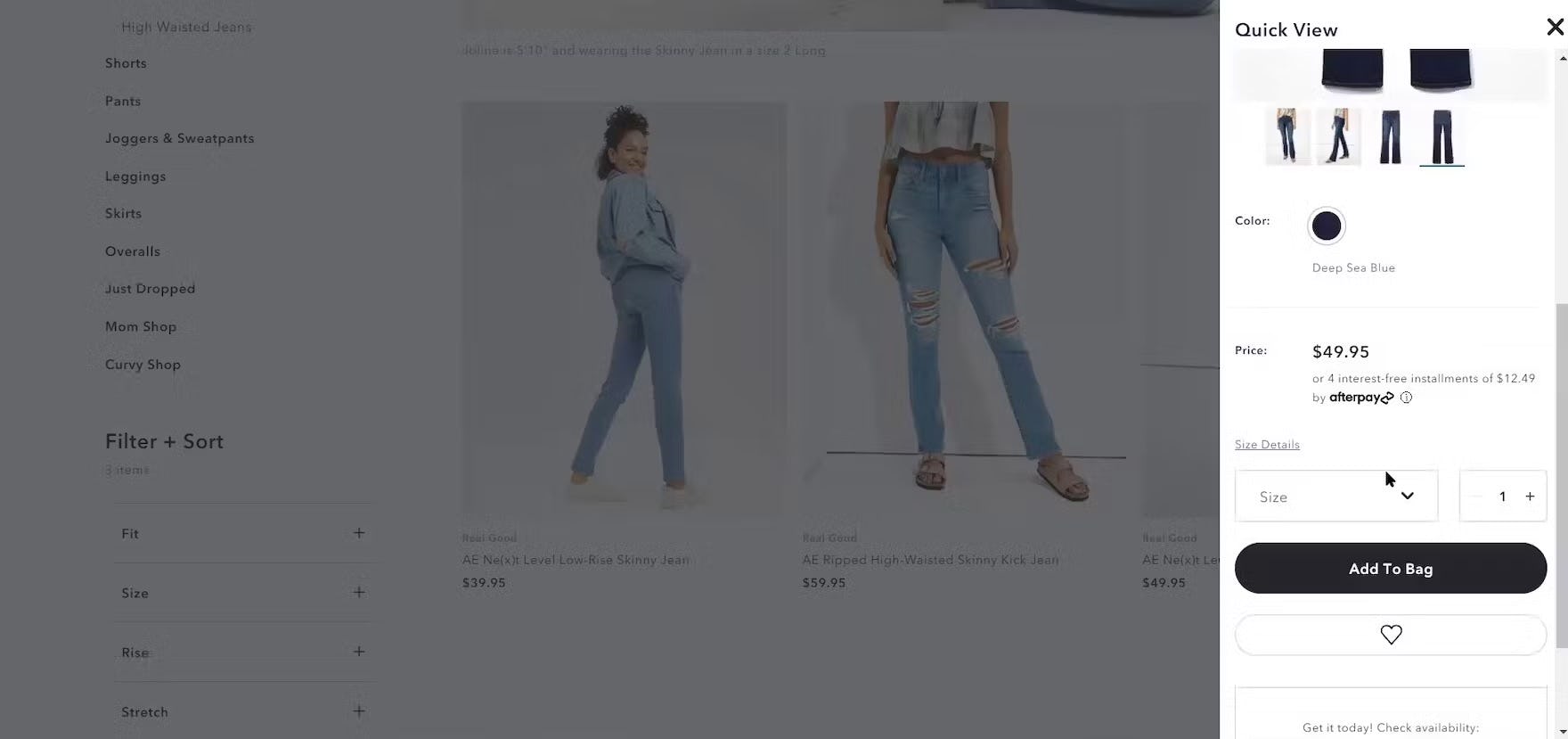
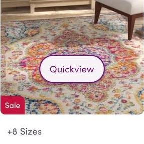
“So I like the “Quick Shop” option because I stay on that same page without moving to a different page. And so this way once I’m done choosing my size, I can just pick right up where I left off as opposed to having to go back to a different page.” This participant was able to choose a size without leaving the product list. “Quick Views” can save users a lot of time when they contain key attributes such as this one on American Eagle.
In particular, the following 6 Product Finding recommendations have been adjusted:
1. Allowing Users to Adjust the “items per page” for paginated product lists
- Old recommendation: avoid “items per page”
- New recommendation: “items per page” is acceptable (if likely underused) for a pagination-loading schema
2. “Quick Views” for visually driven products
- Old recommendation: generally avoid “Quick Views” (though with several caveats)
- New recommendation: “Quick Views” are helpful for visually driven product types (though still avoid for spec-driven product types)
3. Pagination as a product-loading schema
- Old recommendation: avoid and use “load more” instead
- New recommendation: “load more” is still preferred, though pagination can work okay, but there are many details to get right
4. Intermediary category pages
- Old recommendation: sites must provide intermediary category pages
- New recommendation: sites can skip providing intermediary category pages if there are reasons why these would be difficult to implement (though they would still benefit a subset of users if provided)
5. Making product categories the first level of the main navigation (e.g., as opposed to “Shop” or “Products” as the first level)
- Old recommendation: Avoid “Products” or “Shop” as a top-level menu item
- New recommendation: “Products” or “Shop” okay to have for desktop (though still it’s generally an extra navigational layer and slight amount of increased friction for end users); continue to avoid for mobile
6. Horizontal filtering toolbars
- Old recommendation: horizontal filtering toolbars should be provided in certain specific cases
- New recommendation: be cautious if implementing horizontal filtering toolbars (consider sidebar filtering instead)
Note that these 6 recommendation changes are only a small percentage (3%) of the total Product Finding catalog.
Also note that, despite the recommendation changing, in all of the above cases it’s generally fine if sites had implemented the recommendation — it’s just that the new research points to how to further optimize product finding for users, or clarified previous recommendations which were deemed as unnecessarily ambiguous.
2) New Product Finding Test Examples
Along with reverifying our Product Finding research, we’ve also updated our Product Finding research catalog with hundreds of new examples.
The examples are from the test sessions at the 12 test sites listed above, as well as from our e-commerce UX benchmark (desktop, mobile, and app).
In many cases, the new examples help illustrate how a UX issue identified in 2013 still exists today — only the interface has undergone heavy changes as a result of new UI design schemes and preferences.
Thus, it’s further support that, just because an example from user testing may look dated, it doesn’t necessarily mean that the underlying user issue no longer exists.
3) New Insights into Product Finding User Behavior
![“It’s annoying when you have to click [into the product page] just to visualize it or just to see it in another color…Like this one for instance, this one here has 11 options. If I’m going to be picky, I’d like to see all 11 of course.” When some swatches aren’t shown in mobile list items, as here on The Company Store (iOS), users have to go to product pages to see the full range — introducing more friction into the process of judging suitability.](https://baymard-assets-cdn.imgix.net/research/media_files/attachments/115137/original/research-media-file-9fba43810049f82db5e7951301b6ae61.jpg?auto=format&dpr=2&fit=max&q=50&w=880)
“It’s annoying when you have to click [into the product page] just to visualize it or just to see it in another color…Like this one for instance, this one here has 11 options. If I’m going to be picky, I’d like to see all 11 of course.” When some swatches aren’t shown in mobile list items, as here on The Company Store (iOS), users have to go to product pages to see the full range — introducing more friction into the process of judging suitability.

“I’m looking for…can I save it? Can I come back to it later where I can create a list?” During testing, this participant on Lamps Plus searched in vain for a way to save an item for later comparison and consideration. Not being able to keep track of potentially suitable items could cause some users to miss out on what they need.

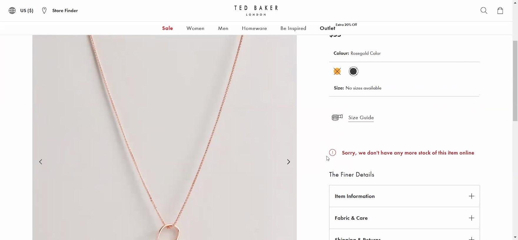
“Oh I like that. So I would click on it to get a better view. Oh! They don’t have any more of that. So that’s kind of a bummer — usually some websites have in red ‘Out of Stock’ or something so you don’t get excited and then click and then you have to find out it’s out of stock. So that’s kind of a bummer.” This participant on Ted Baker was enthusiastic about a particular necklace (first image), only to be disappointed when she found out on the product page that it was out of stock (second image). Raising hopes before dashing them not only makes a poor impression on users, but also wastes their time.
While many user issues and patterns persist from year-to-year, there are some genuinely new issues that arise, and new approaches to resolving these issues.
As such, we’ve added 24 new Product Finding guidelines based on this latest 2024 test data, some of which we’ve already published as articles (e.g., see “Use “Visual” Filters for Visually Distinct Product Attributes”, “If Providing Sidebar Filtering, Position the “Size” Filter near the Top and Expand It by Default”, and “Make All Color Swatches Available in Mobile List Items for Visually Driven Product Types (57% Don’t)”).
Additionally, 51% of our existing Product Finding guidelines that were reverified in this study have been heavily revised — meaning that, while the core issues observed and solutions recommended largely remain the same from the previous guideline, the revised guideline has added arguments, implementation details, additional considerations, and other content that provides for a more robust overall guideline.
4) A Streamlined Baymard Premium Experience
Finally, some of our Premium subscribers may notice that there have been some changes to the research catalog in the Product Finding theme (similar to changes that occurred for Checkout).

As part of our 2.5-year Product Finding research study we’ve identified 94 guidelines to archive to improve the overall experience for our Premium customers and clients.
In particular, we’ve archived 94 guidelines, for 1 of the following reasons:
- The guideline was originally written based on user issues that are no longer observed in this latest large-scale Product Finding research study (e.g., “Adjusting ‘Items Per Page’ Is Excessive”, “Drop-Down Menus Should Have Spatial Indicators”; 56% of the archived guidelines)
- The guideline had overlapping issues and solutions with another guideline or guidelines and thus was merged to improve understandability of the Product Finding research catalog on the whole (e.g., “Avoid Implementing Filter Attributes as Category Scopes”, “Display Customer Rating Filters Whenever There are Products with Sufficient Ratings in the List”; 34% of the archived guidelines)
- The guideline addressed a relevant Product Finding UX issue but was deemed to be so niche and unlikely to impact the vast majority of users or sites that the research findings were condensed and merged into other, related guidelines (e.g., “Numeric Product Specs Need Proper Labels and Units”, “Ensure Range Sliders Have Input Field Fallbacks”; 9% of the archived guidelines)
The remaining guidelines have been combed through by our research team to ensure they are not only valid but clear, actionable, and highly relevant to determine a particular site’s Product Finding UX performance.
In addition to archiving 94 guidelines, we’ve also improved the reading experience in Premium by updating topic titles and the overall organization of the catalog, and we anticipate that these changes will make for a more reader friendly and less intimidating experience for Premium users.
5,550+ More Hours of Product Finding Specific Research
At Baymard, we’re currently conducting large-scale research to reverify our 7 core e-commerce themes.
With this latest study, at Baymard we’ve now reverified and expanded 4 out of our 7 core e-commerce UX themes.
Next we’ll be updating our Product Page, Accounts and Self-Service, and Sitewide Design and Interaction themes with data from new test sessions (to come in Q3 2025).
For more Product Finding research, be sure to check out our Product Finding guidelines (many of which are available for free as published articles; see Product List articles, Search articles, and Homepage and Category Navigation articles), our Product Finding benchmark based on over 24,000 performance ratings, and our Product Finding page designs, which includes over 8,300 desktop and mobile Product Finding examples.
Getting access: all 165+ Product Finding UX guidelines are available today via Baymard Premium access.
If you want to know how your desktop site, mobile site, or app performs and compares, then learn more about getting Baymard to conduct a UX Audit of your site or app.