Key Takeaways
- 58% of sites provide links on the homepage to scoped product lists that result in users becoming disoriented
- The disorientation experienced by a subgroup of users can lead to them misinterpreting the site catalog
- Limiting homepage links to top-level categories or including the full scope in the link text mitigates the issue for users
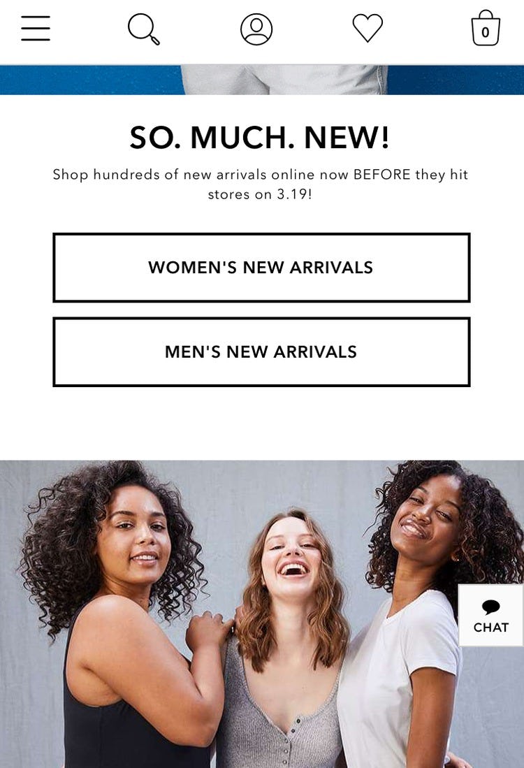
Promoting narrow scopes on the homepage (e.g., a featured subcategory or promoted filter, such as “Women’s New Arrivals” ) can help many mobile users access highly relevant product lists, without having to first dig through the category navigation or use search.
Indeed, providing immediate access to tailored lists of products can help alleviate some of the inherent problems of the mobile e-commerce experience.
Yet there’s a catch: if users fail to notice they’ve selected a scoped path, they can end up misinterpreting the product catalog entirely.
Our large-scale mobile usability research testing showed that, for some scoped paths, a subgroup of users will never notice that they’re viewing a narrow list of products (e.g., just “Kids’ picks for the holidays” instead of “Kids’ picks”).
Consequently, these users often abandoned the site, thinking that the site catalog didn’t have the products they were looking for.
Despite the seriousness of the issue, our benchmark shows that 58% of sites have paths on their mobile homepages that can be misinterpreted, leading to lost sales.
In this article we’ll discuss the following:
- How users can so severely misinterpret the site’s product offerings after selecting a scoped path on the homepage
- 2 ways to mitigate this issue
How Some Users End Up with Severe Misconceptions of the Site Catalog
On mobile sites and apps users are at risk of developing tunnel vision, as the small viewport limits their ability to gain an overview of their current location.
Our mobile checkout testing has shown that it’s crucial for field labels to be understandable when read out of context — for example, using the label “Billing Phone” instead of simply “Phone” — since many users have severe overview issues when attempting to complete checkouts.
Testing also revealed that users on mobile homepages and apps can similarly have overview issues when selecting a featured scope — for example, “Women’s > New Arrivals” — if the link to the featured scope fails to make it very clear that tapping on the link will result in a specific product list.
The consequences of this misunderstanding can be severe.
Multiple users during testing abandoned sites because they found the product selection unsatisfactory after tapping on a featured scope link on the homepage — yet they simply misunderstood where they were in the site hierarchy, and didn’t realize they were viewing a narrow product list.
Some users, even after spending several minutes within the scope, simply never realized they were viewing, for example, only the “New Arrivals” for women’s shoes — not all women’s shoes.
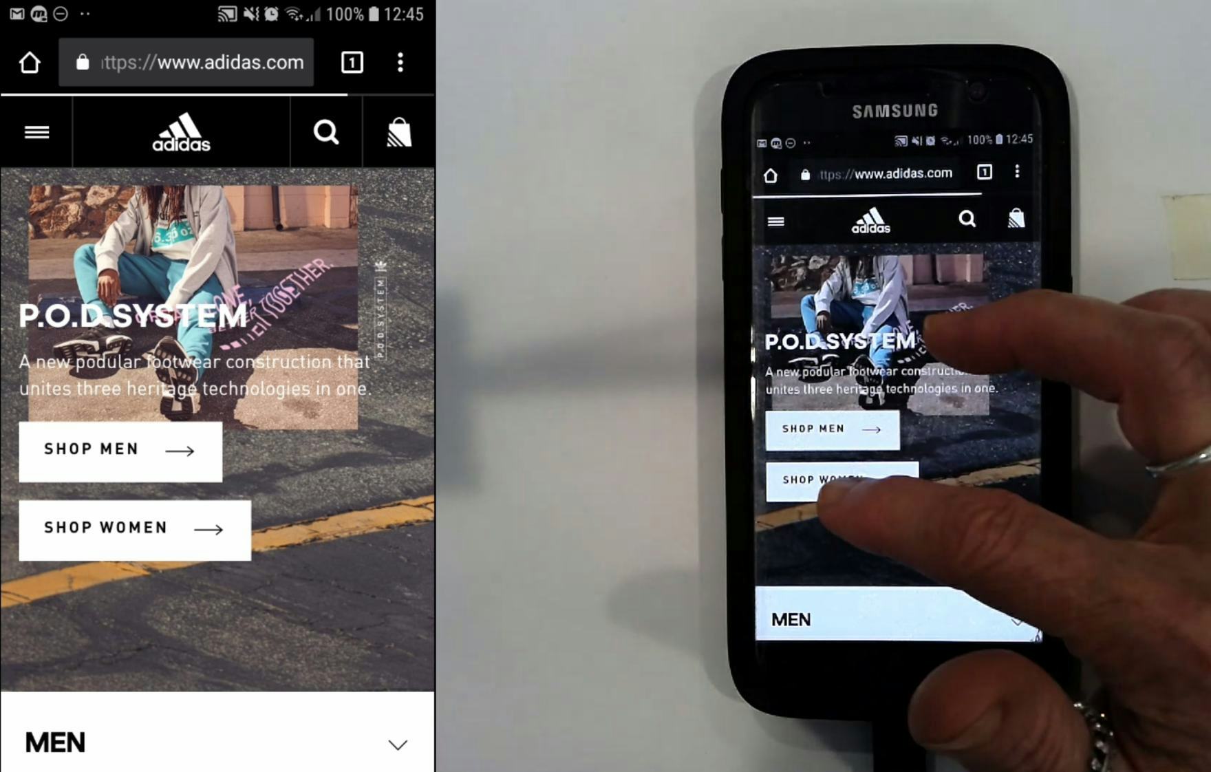
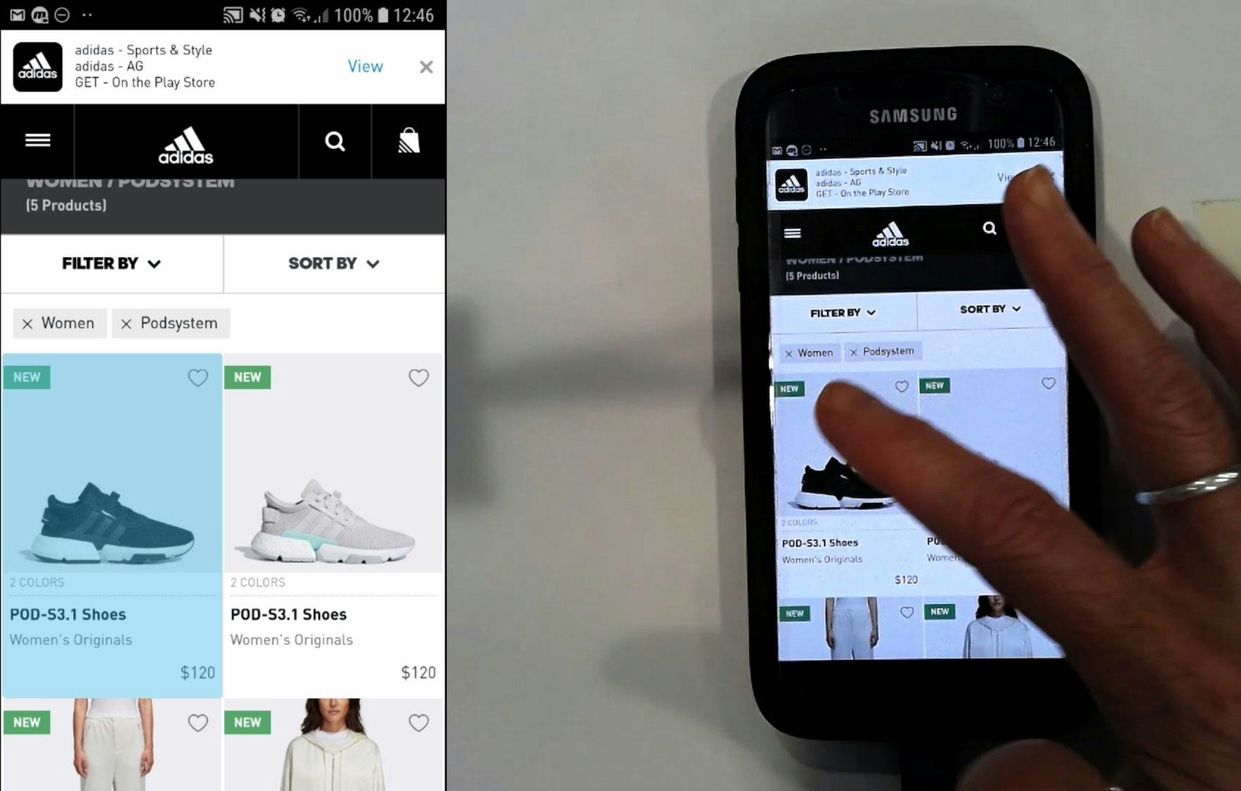
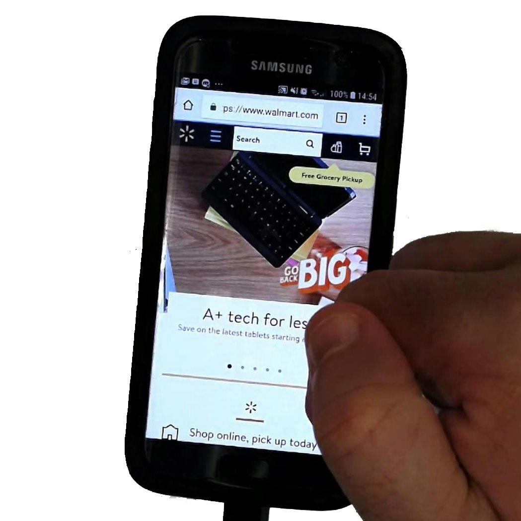
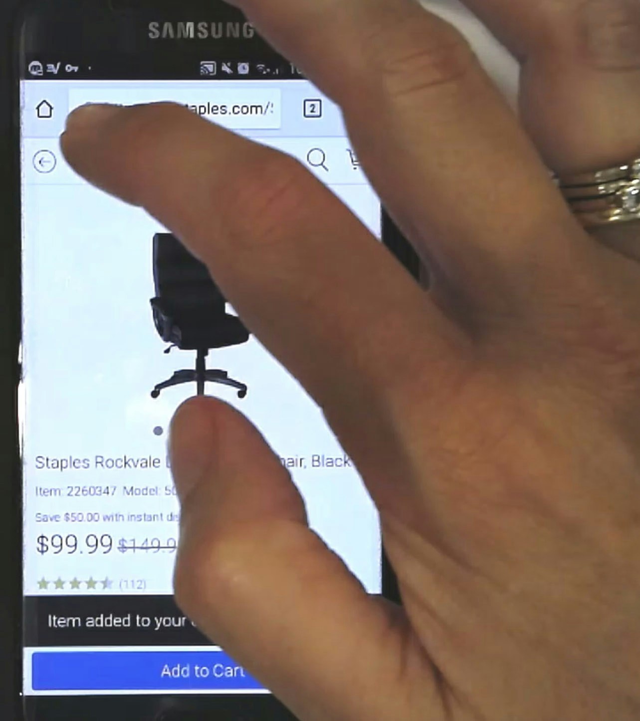
“[I’ll tap] ‘Shop Women’ straight away. That’s good…. [After spending some time browsing the resulting product list.] There are only two pairs of shoes on this website. Am I allowed to be upset about that? I am upset about that. So, I’ll go ‘No, I can’t be bothered’ and I’ll go somewhere else straight away.” A user at Adidas never realized she arrived in a product list that had the filters “Women” and “Podsystem” applied (second image) after tapping on the featured scope on the homepage (first image). She abandoned the site. Note how the relevant button on the homepage failed to make it clear that users were selecting a scope, as it simply read “Shop Women”.
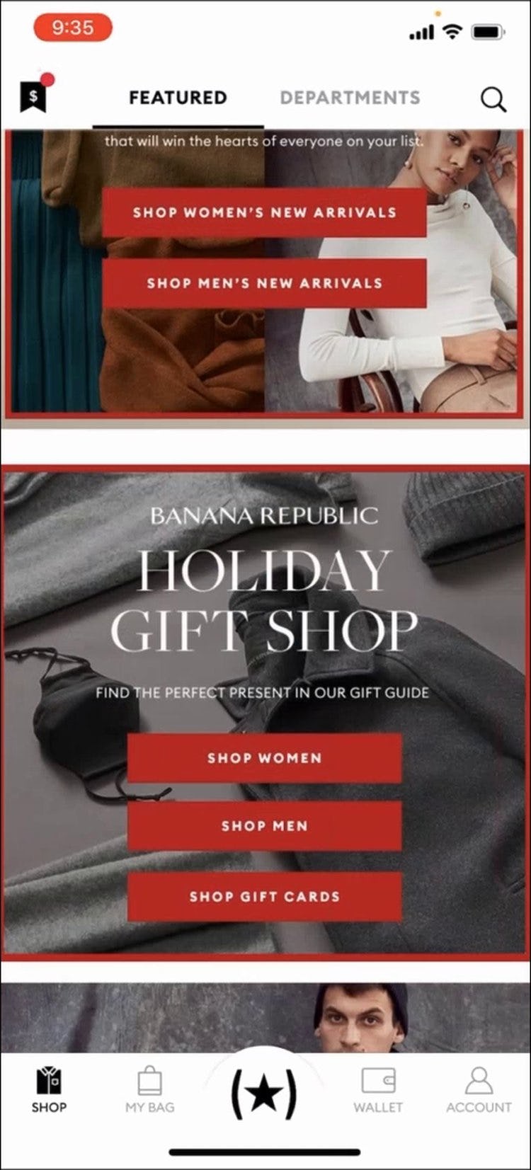
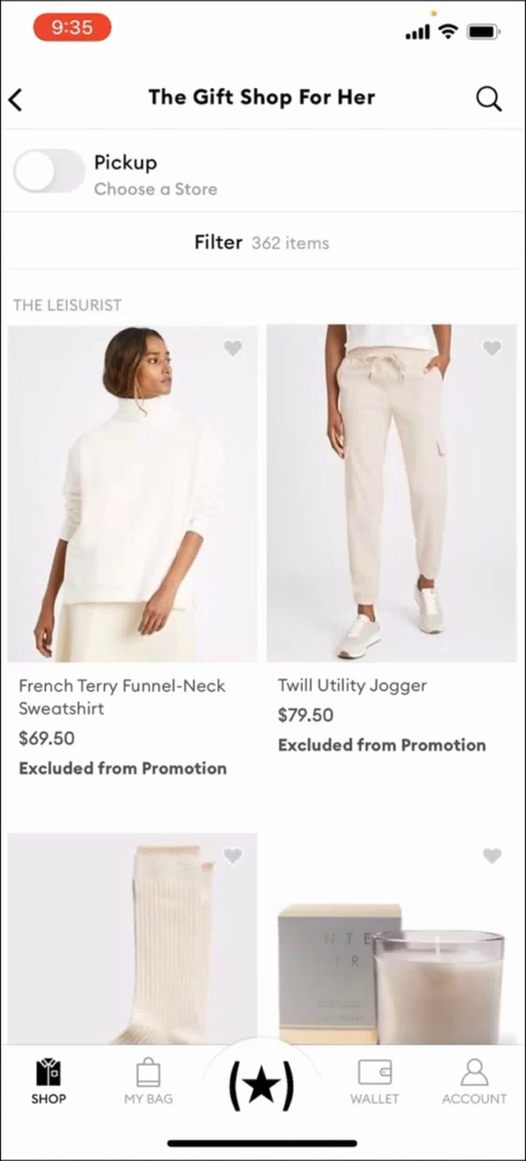
“So I would wanna go to just ‘Shop Women’, so I can see everything.” Not realizing that she had tapped “Shop Women” from within an ad for “Holiday Gift Shop” (first image), this test subject using the Banana Republic app mistakenly assumed that the resultant product list (second image) would contain all women’s clothing. Such a misunderstanding can cause users to underestimate the scope of the site catalog.
Consequently, when presented with only a handful of products, users will assume the site has a poor selection of the product type they are interested in and are likely to abandon.
Now, our desktop testing shows that users can be helped with getting started with their product browsing by suggesting scopes on the homepage. When users click a featured scope, they should arrive at a product list with the relevant filters preapplied (e.g., a “Women’s” scope with the “Shoes” and “New Arrivals” filters applied).
On mobile sites, however, the situation is slightly more complex, as testing revealed that some users will not notice that a relevant filter has been applied in the product list after tapping on a featured scope on the homepage.
Thus, these users don’t think to simply remove a filter to get a broader list of products — they misunderstand what products are actually available and assume the selection is much smaller than it really is.
It’s therefore not sufficient to simply preapply filters in mobile product lists after a user has tapped to view a featured scope — the narrow path has to be clarified upfront.
2 Ways to Mitigate the Issue
The observed misunderstandings of the site catalog doesn’t mean that scoped paths on the homepage must be avoided on mobile sites or apps.
Indeed, 2 design patterns were observed during testing that by and large helped users avoid the issue entirely.
1) Display Only Top-Level Scopes on the Homepage
Sites should display product categories on mobile homepages in order to help users infer the type of site they’ve landed on.
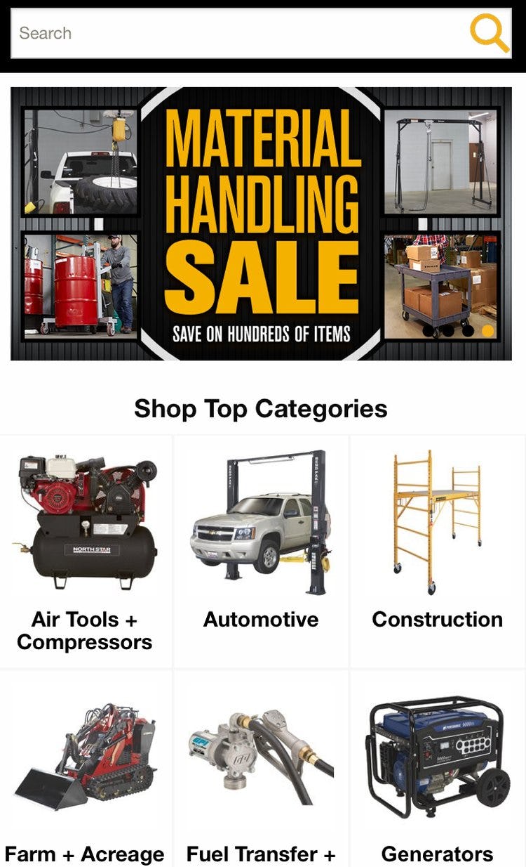
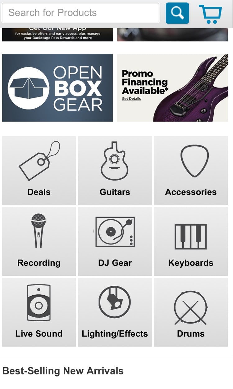
At Northern Tool (first image) and Musician’s Friend (second image) only top-level scopes are displayed on the homepage — users who tap the links won’t wind up in a narrower product list than they had intended to.
If the product categories are limited to top-level categories only, there’s much less of a chance that users will wind up in an overly narrow scope without realizing it.
Once users arrive at the product list or intermediary category page they can begin selecting subcategories or other, more narrow scopes. By navigating this way most will always have a good sense of where they are within the site hierarchy.
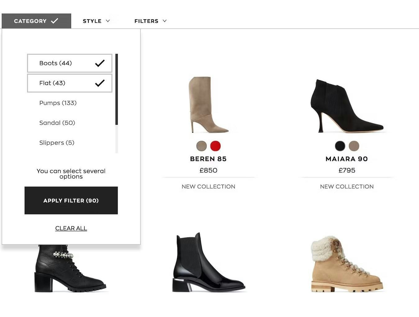
2) Include the Full Scope in the Displayed Link Text
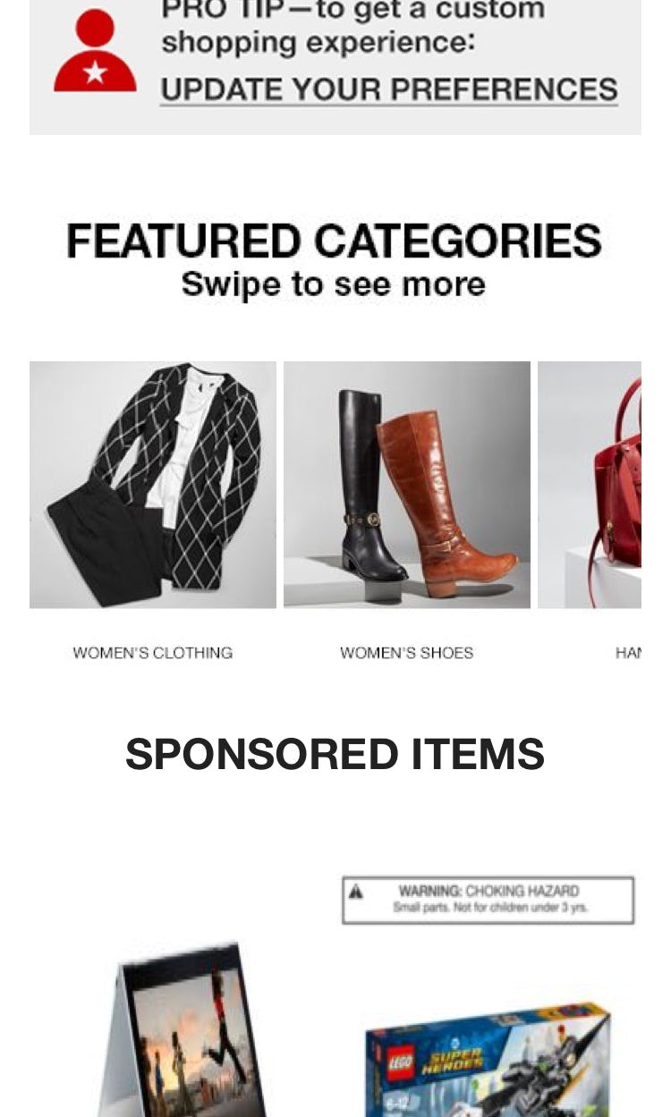
At Macy’s, featured scopes include the full scope in the same link text (e.g., “Women’s Shoes”), making it easier for users to understand their position within the hierarchy when going to the product list.
American Eagle includes the full scope as button microcopy, “Women’s New Arrivals”, achieving similar clarity.
If deciding to provide access to subcategories or product lists with filters applied, then include the full scope in the link text.
This means that for many links both the category and subcategory names will need to be included — for example, have “Women’s New Arrivals” as the button microcopy, rather than “New Arrivals” as a header and only “Women’s” as the button microcopy.
In practice this means that, when linking to a scoped product list from the homepage, the link should never be a single word.
As testing revealed that users can’t be relied on to read headers or mentally connect the header text to the corresponding links or buttons, this level of specificity is required to ensure users don’t lose their place in the site hierarchy after tapping on a featured scope on the homepage.
Help Users Get to Tailored Product Lists — Without Losing Their Place in the Hierarchy
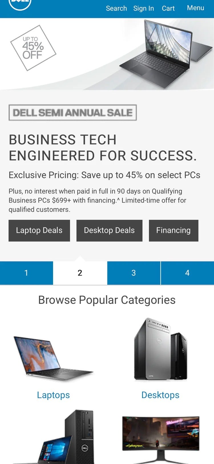
At Dell, narrow scopes such as “Laptop Deals” and “Desktop Deals” include the full scope in the link text, helping users keep these paths distinct from more general ones (e.g., “Laptops” and “Desktops”).
Maintaining an overview of one’s place in the mobile site hierarchy is always a challenging proposition.
Testing has revealed that mobile users are simply more at risk of becoming disoriented compared to desktop users.
Thus, mobile users need more support when it comes to fixing their place in the site’s hierarchy (e.g., through well-implemented breadcrumbs).
On the homepage, users can be supported by either providing the full scope in homepage link text or linking only to top-level categories.
Including the full scope in homepage link text allows sites to continue offering ways to access tailored product lists, while at the same time this also allows users to maintain a solid sense of where they are on the site.
Despite this being an essential part of a well-designed mobile homepage, 58% of sites fail to provide the full scope in homepage link text — leading to unnecessary abandonments by users who think the site doesn’t have what they’re looking for.
This article presents the research findings from just 1 of the 650+ UX guidelines in Baymard Premium – get full access to learn how to create a “State of the Art” e-commerce user experience.