
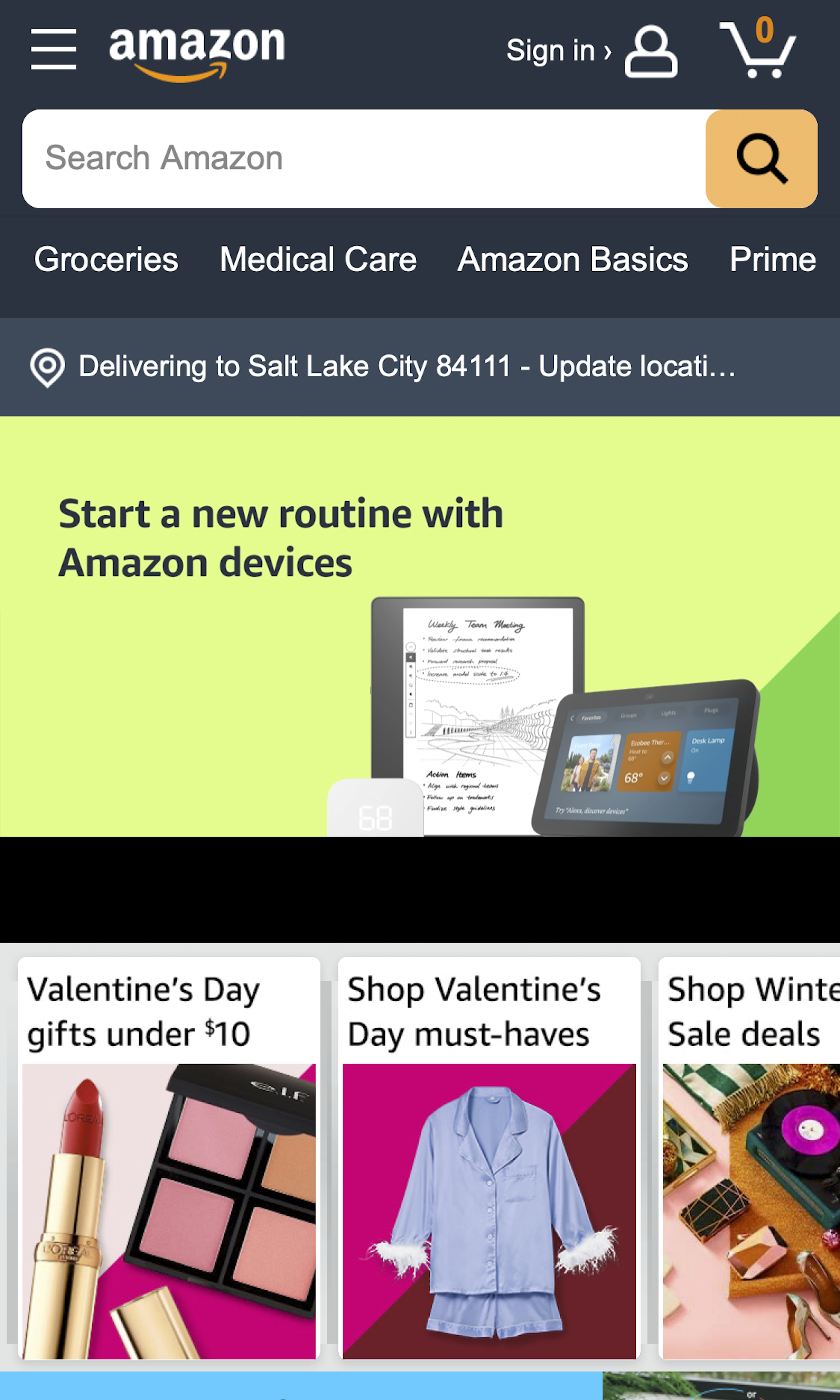
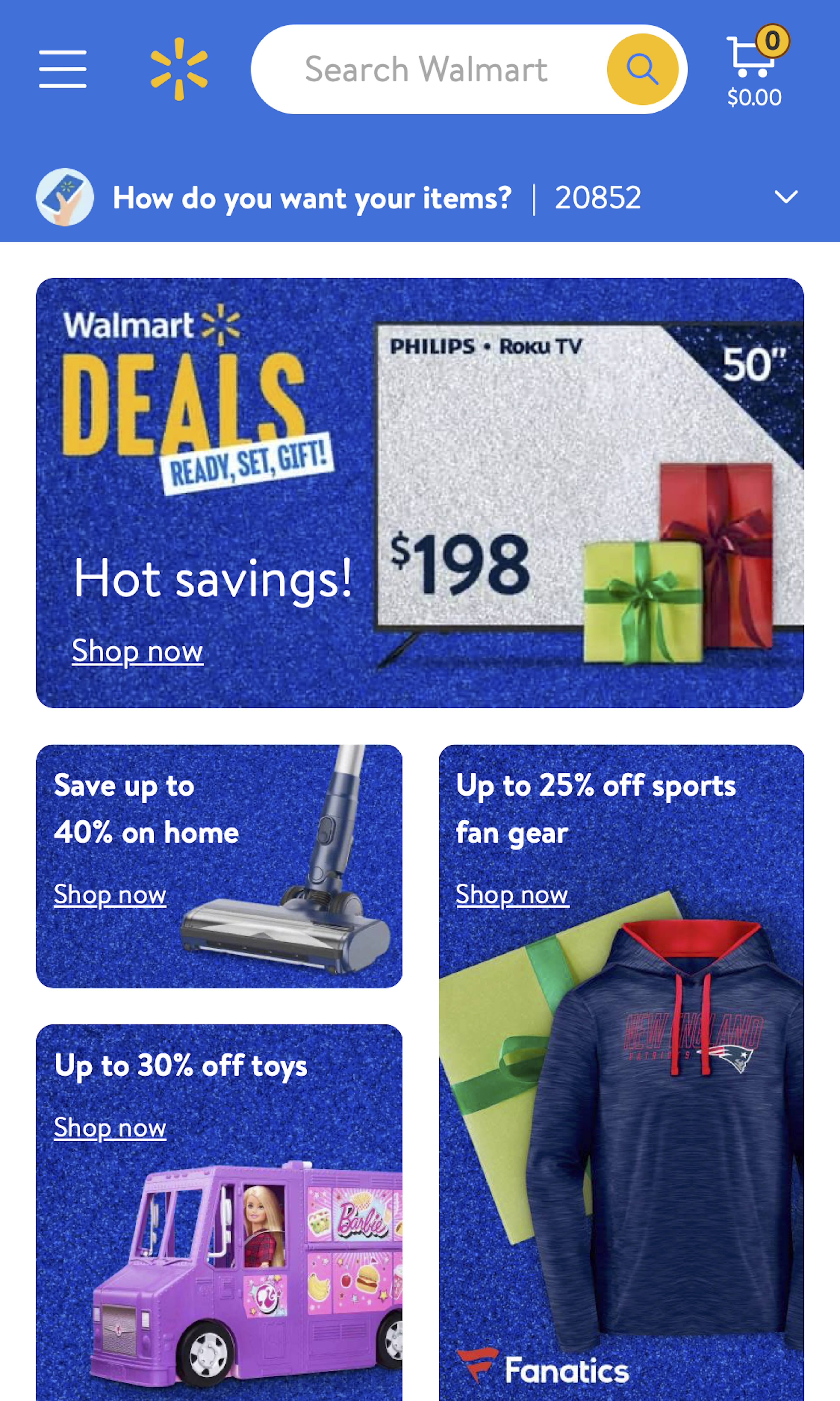
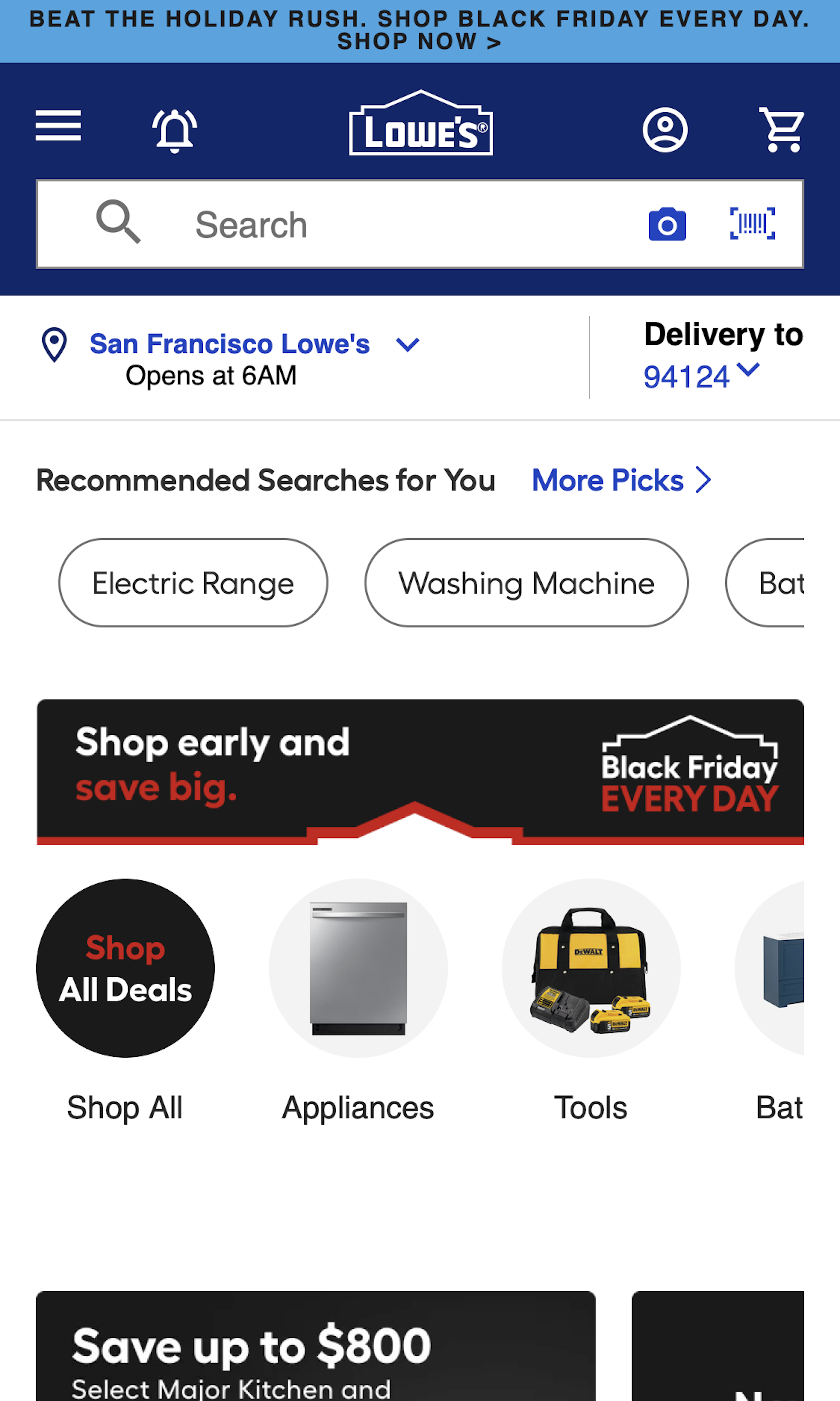
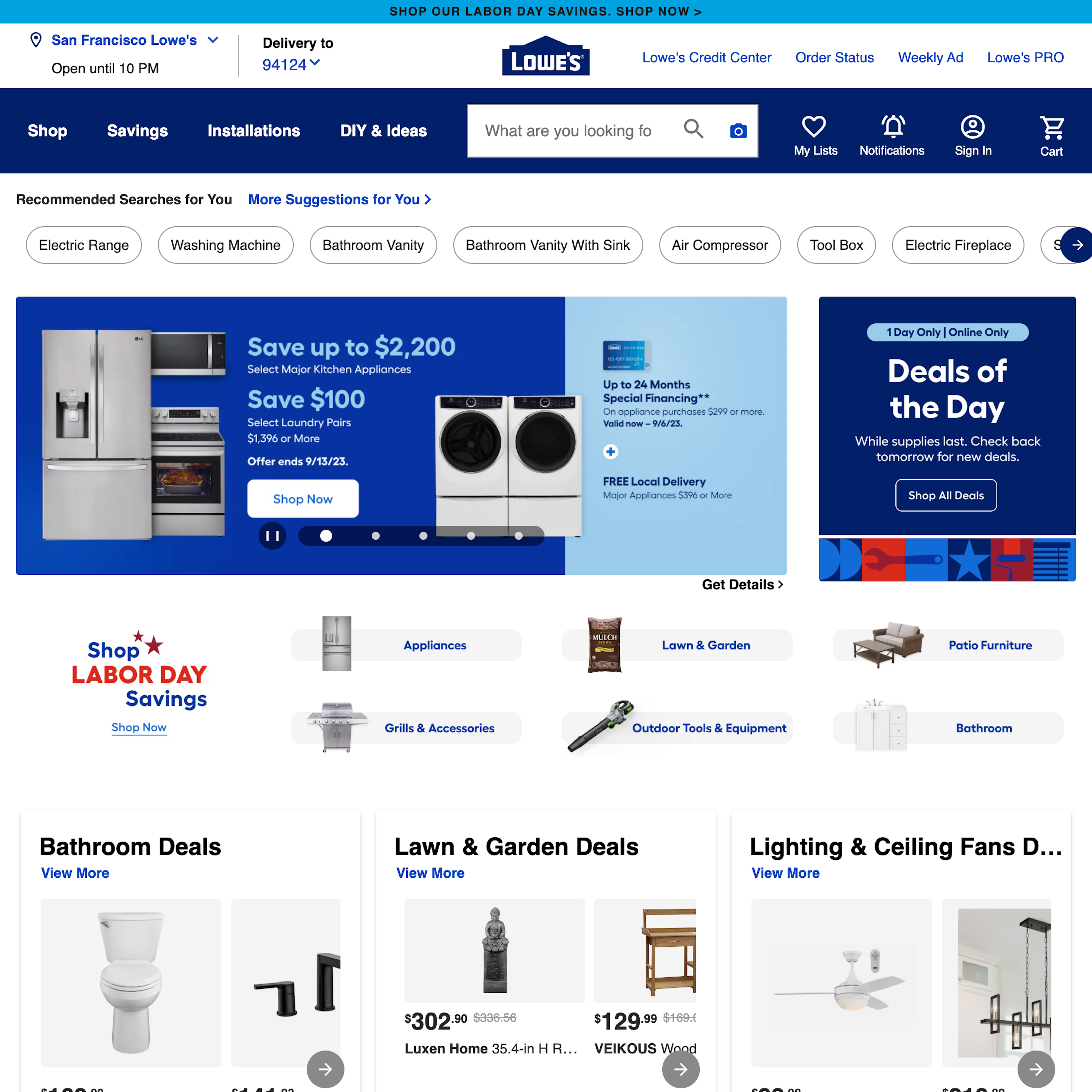
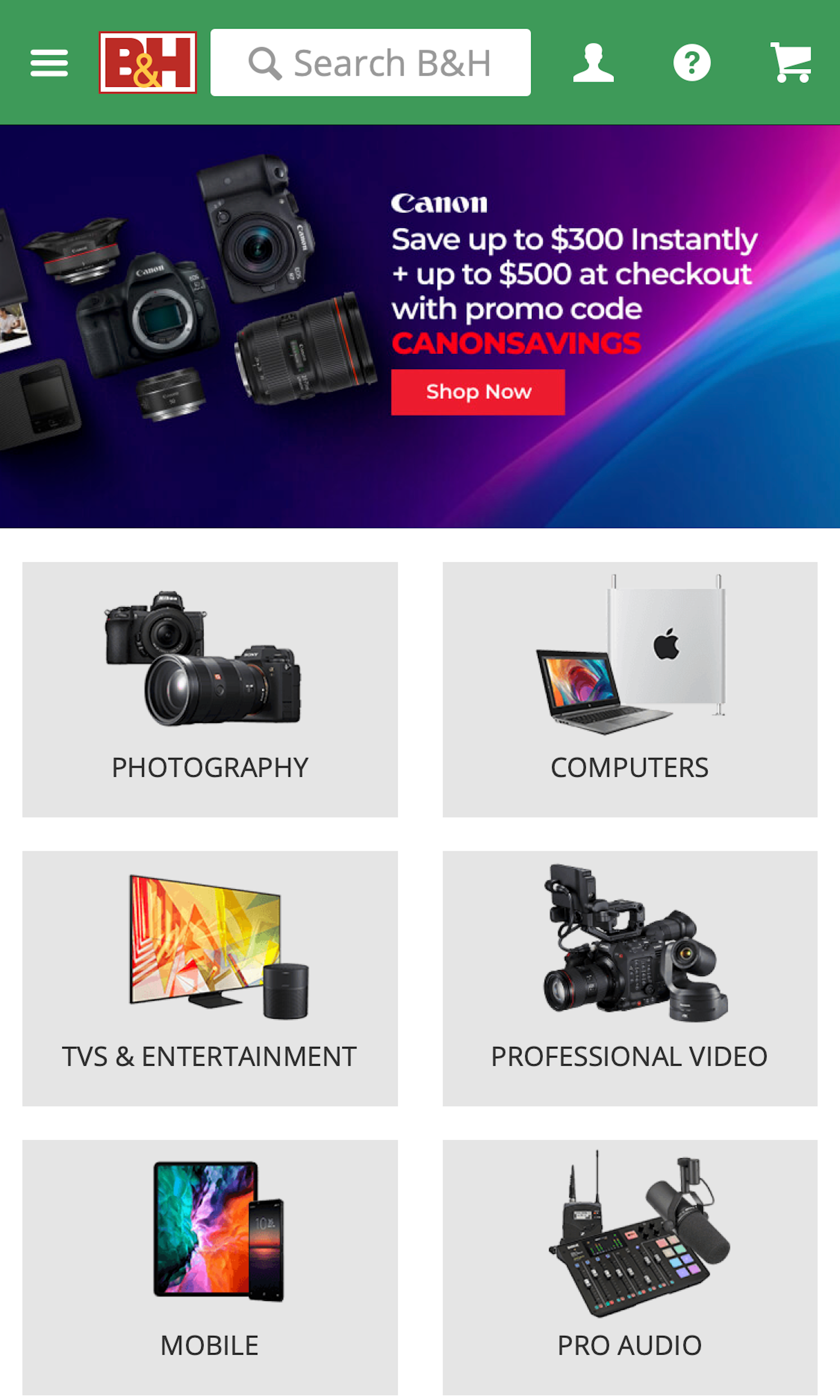
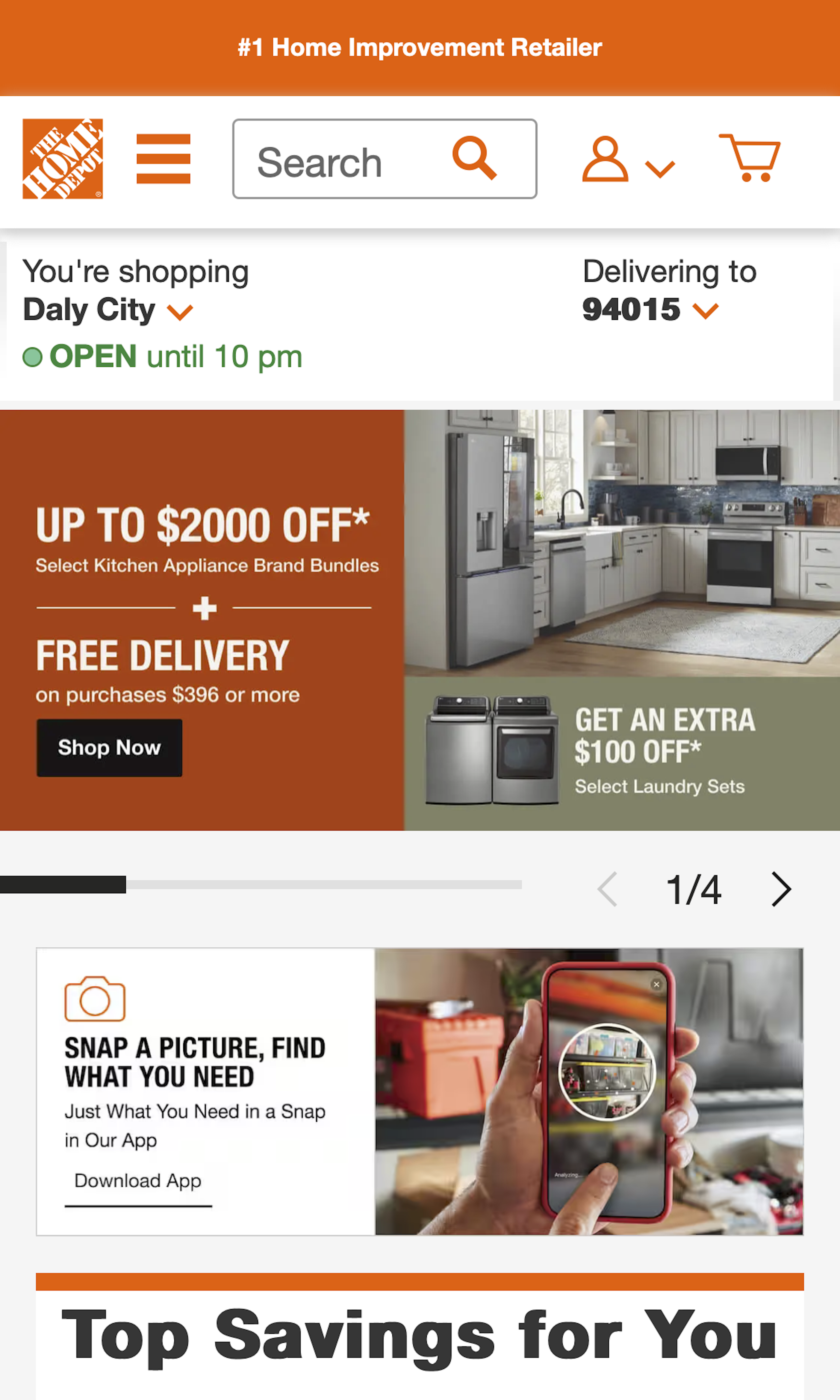
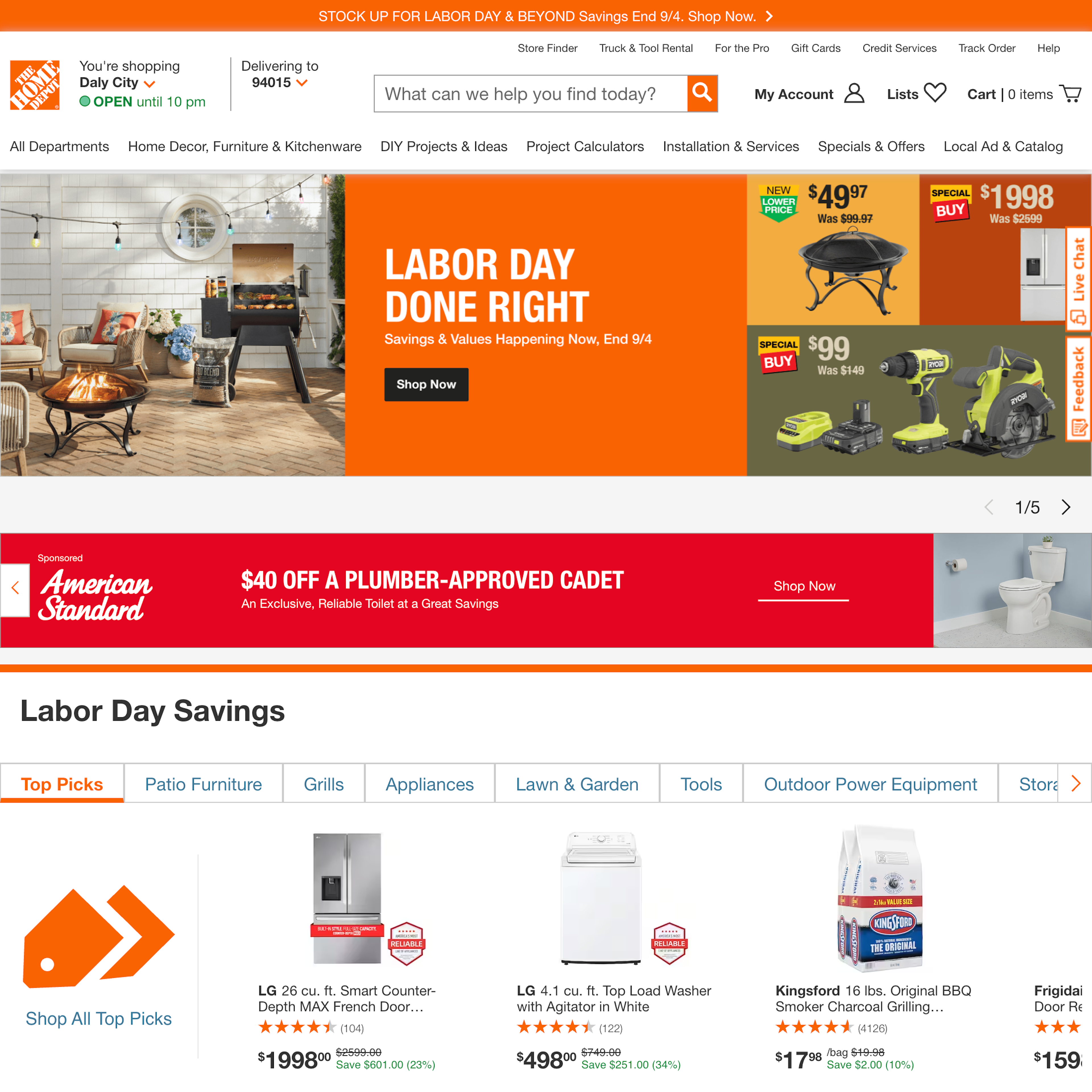
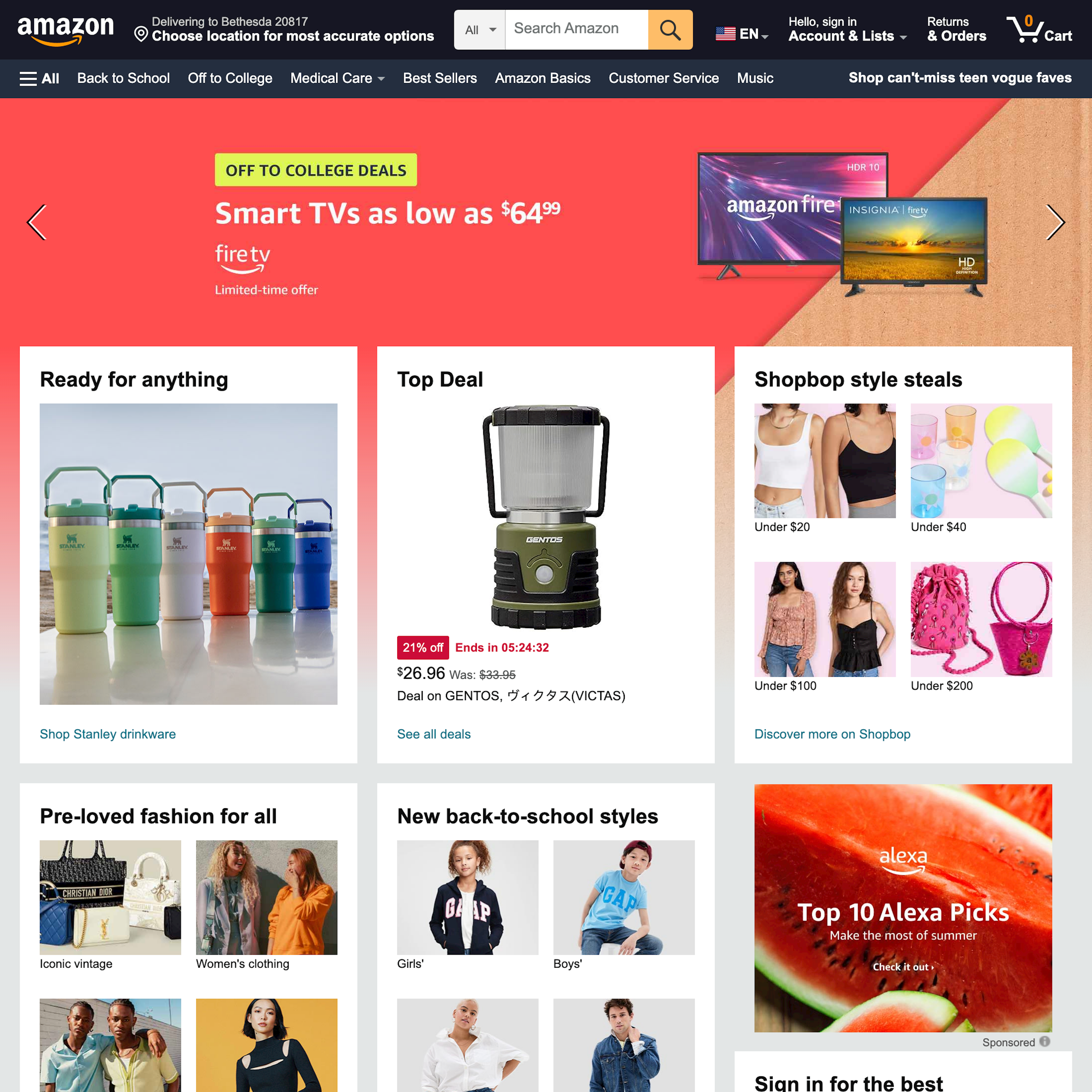
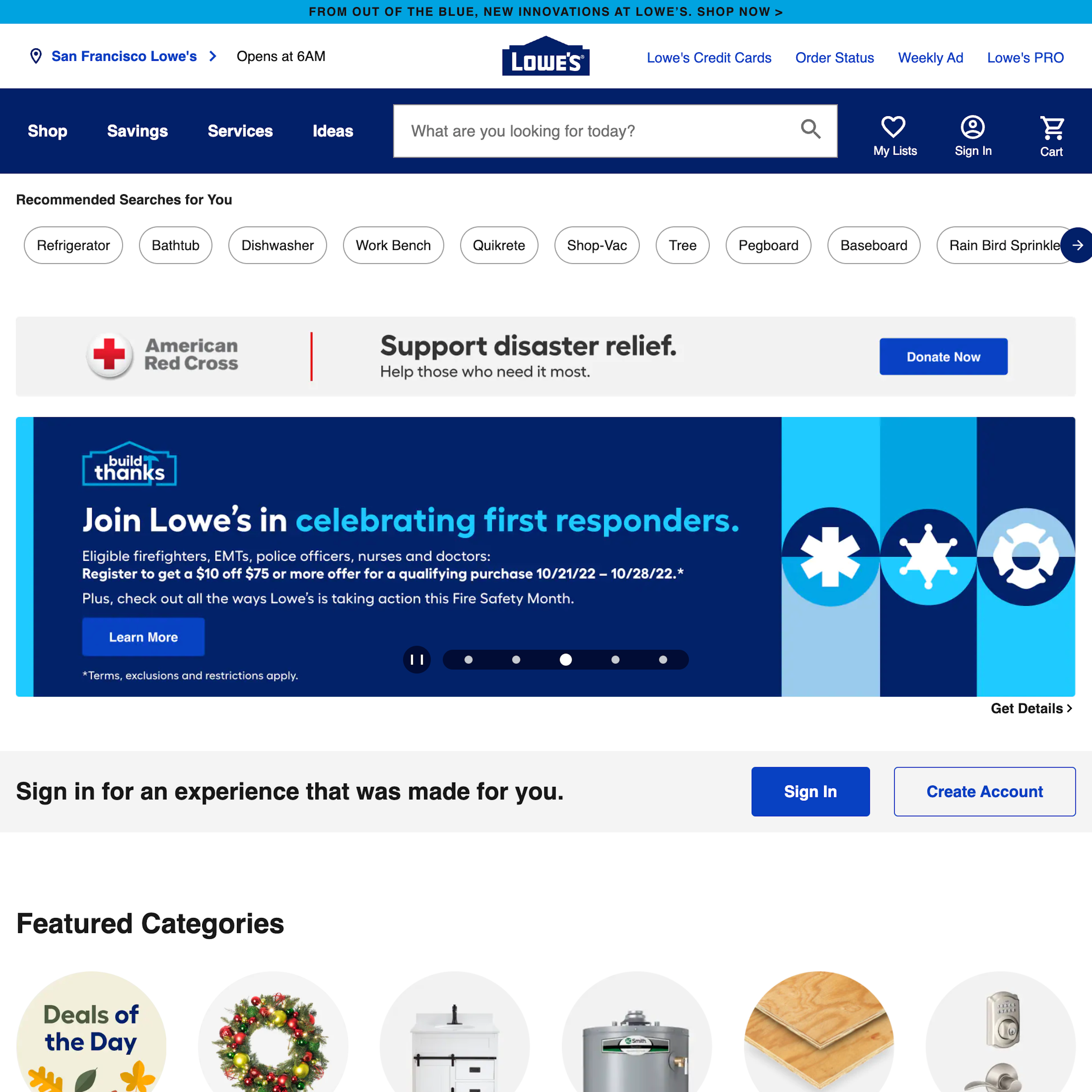
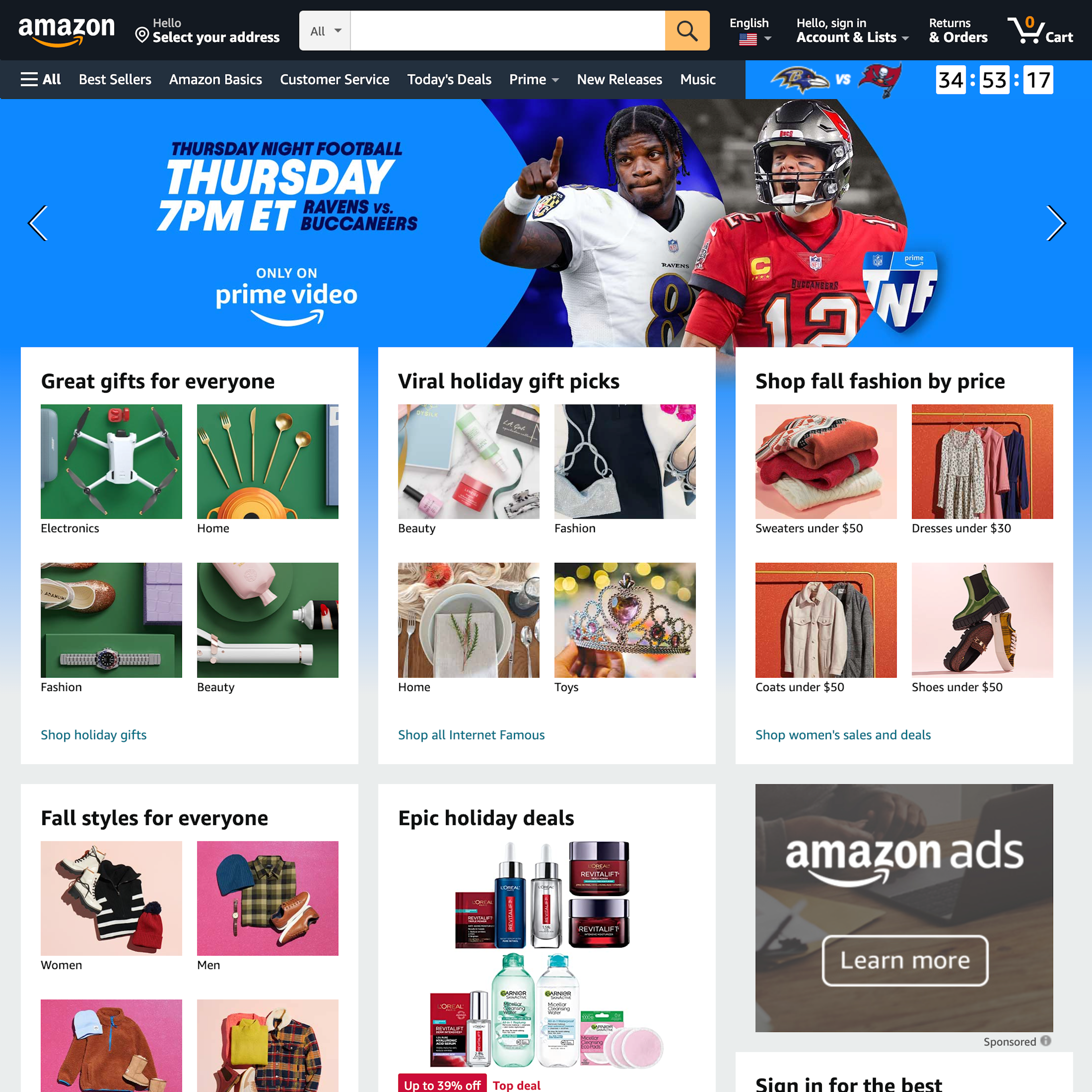
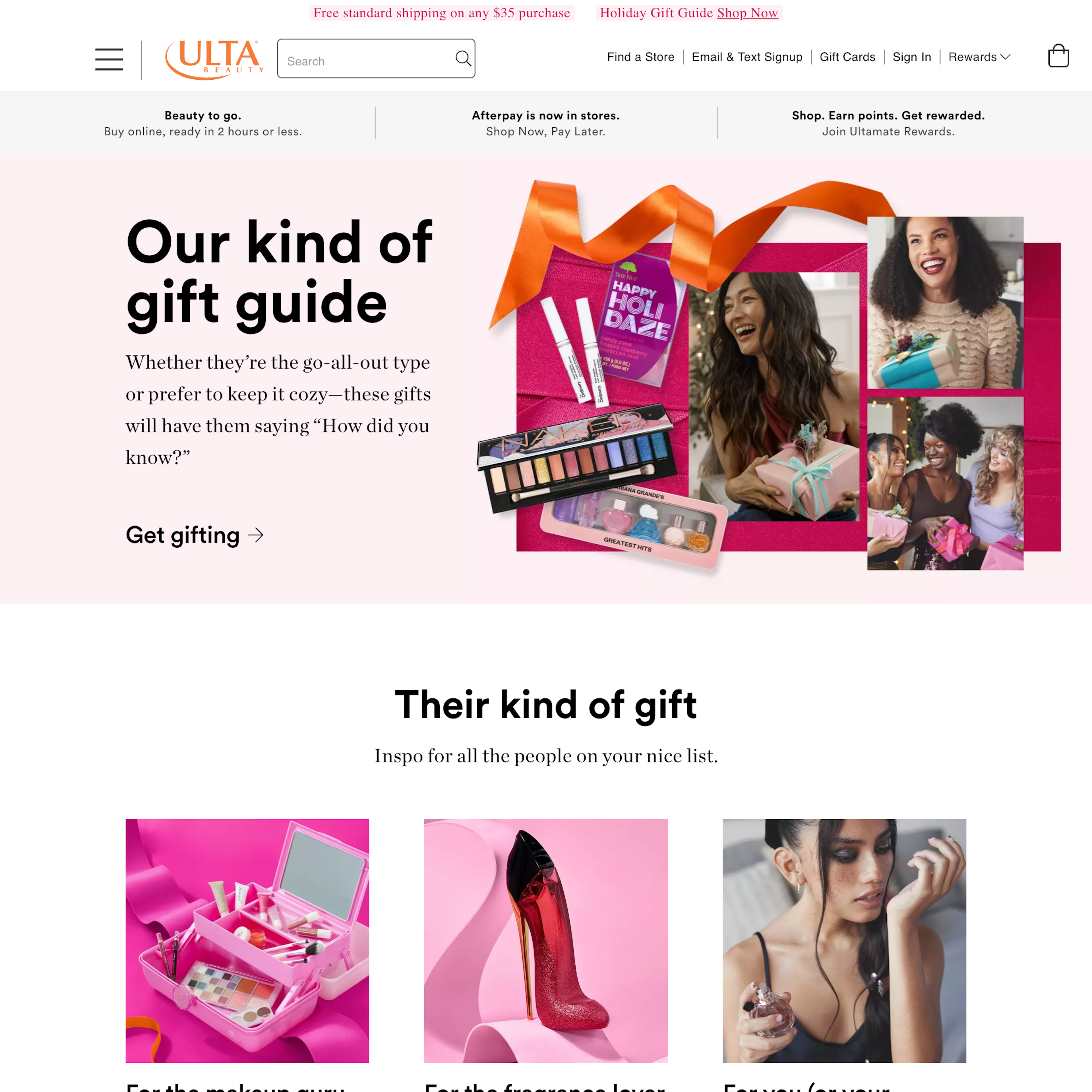
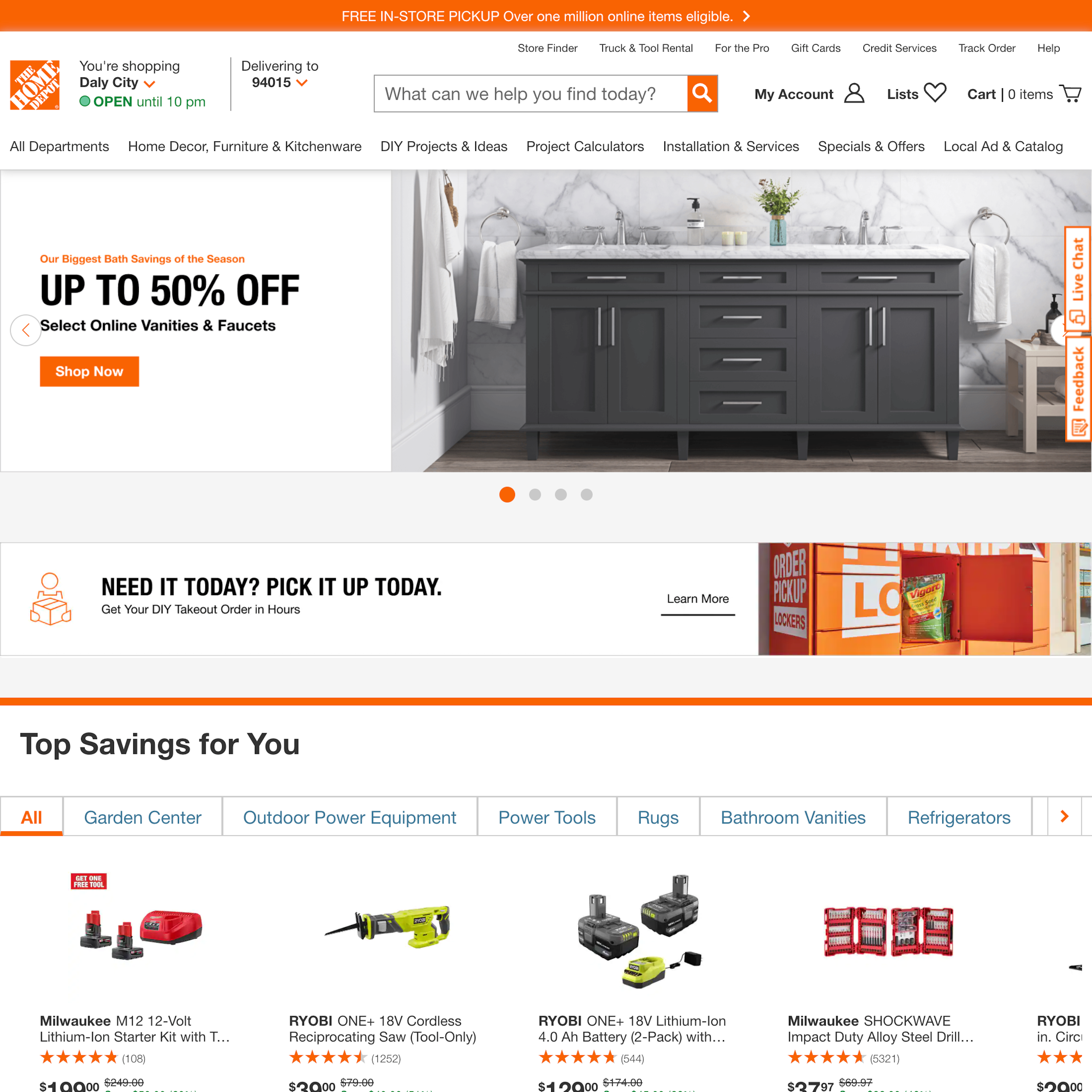
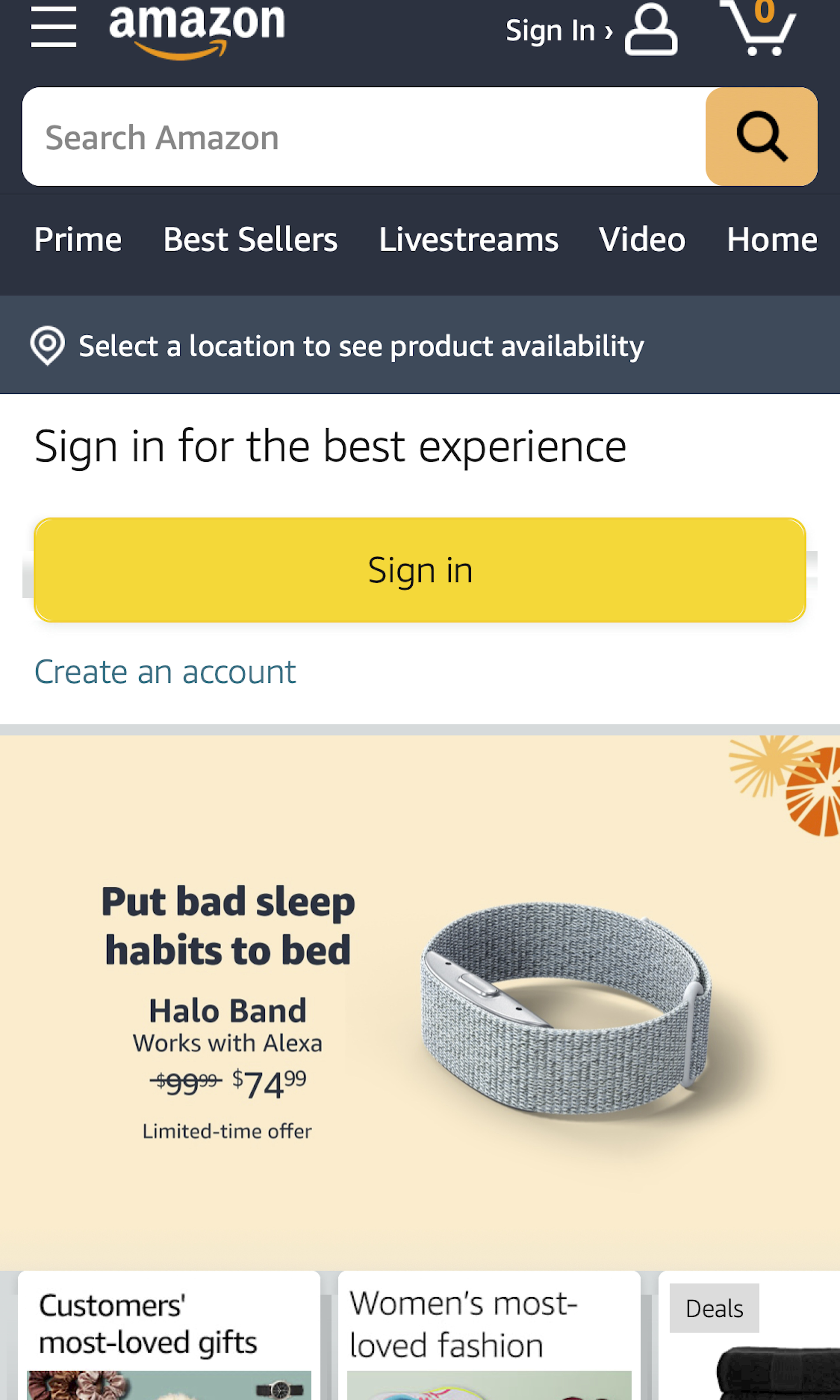
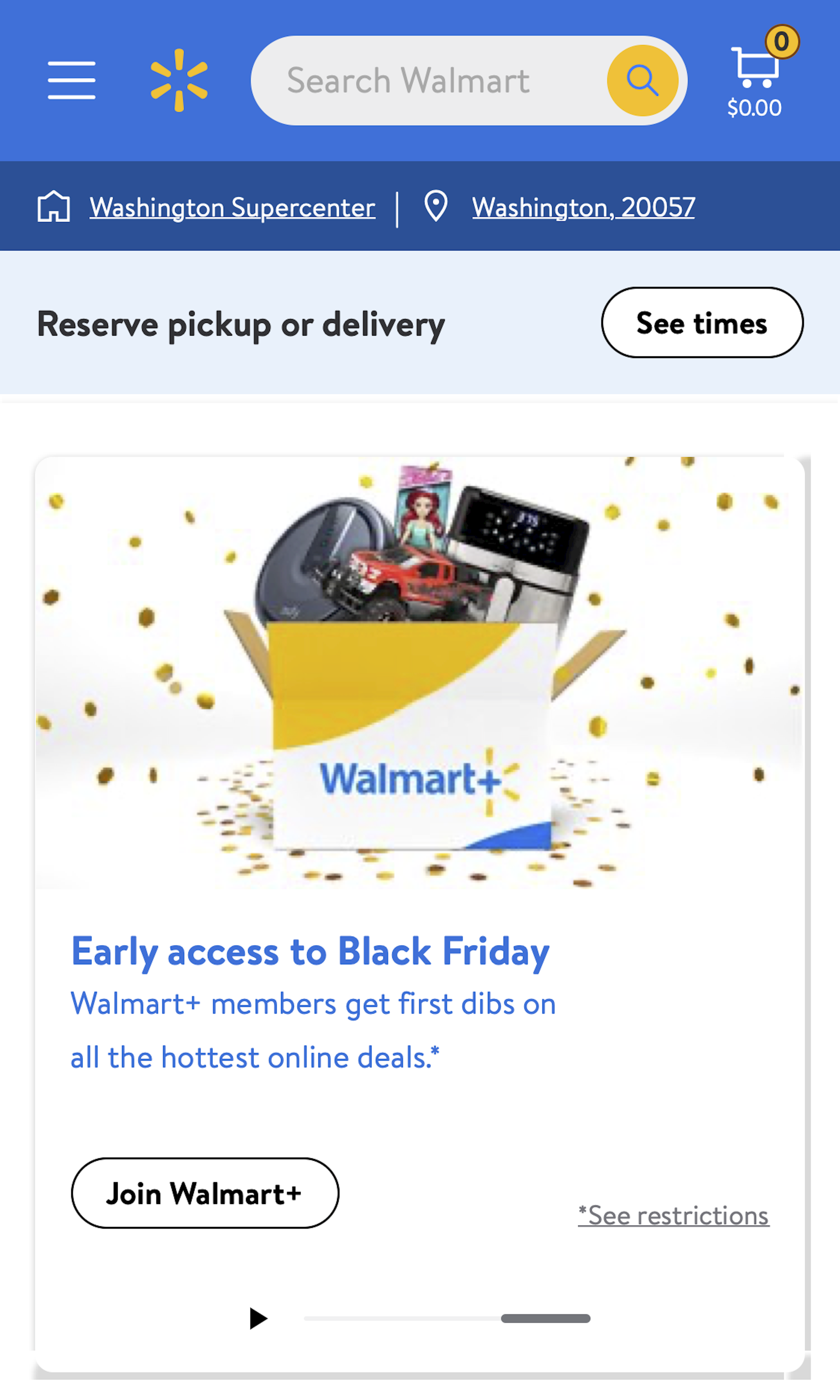
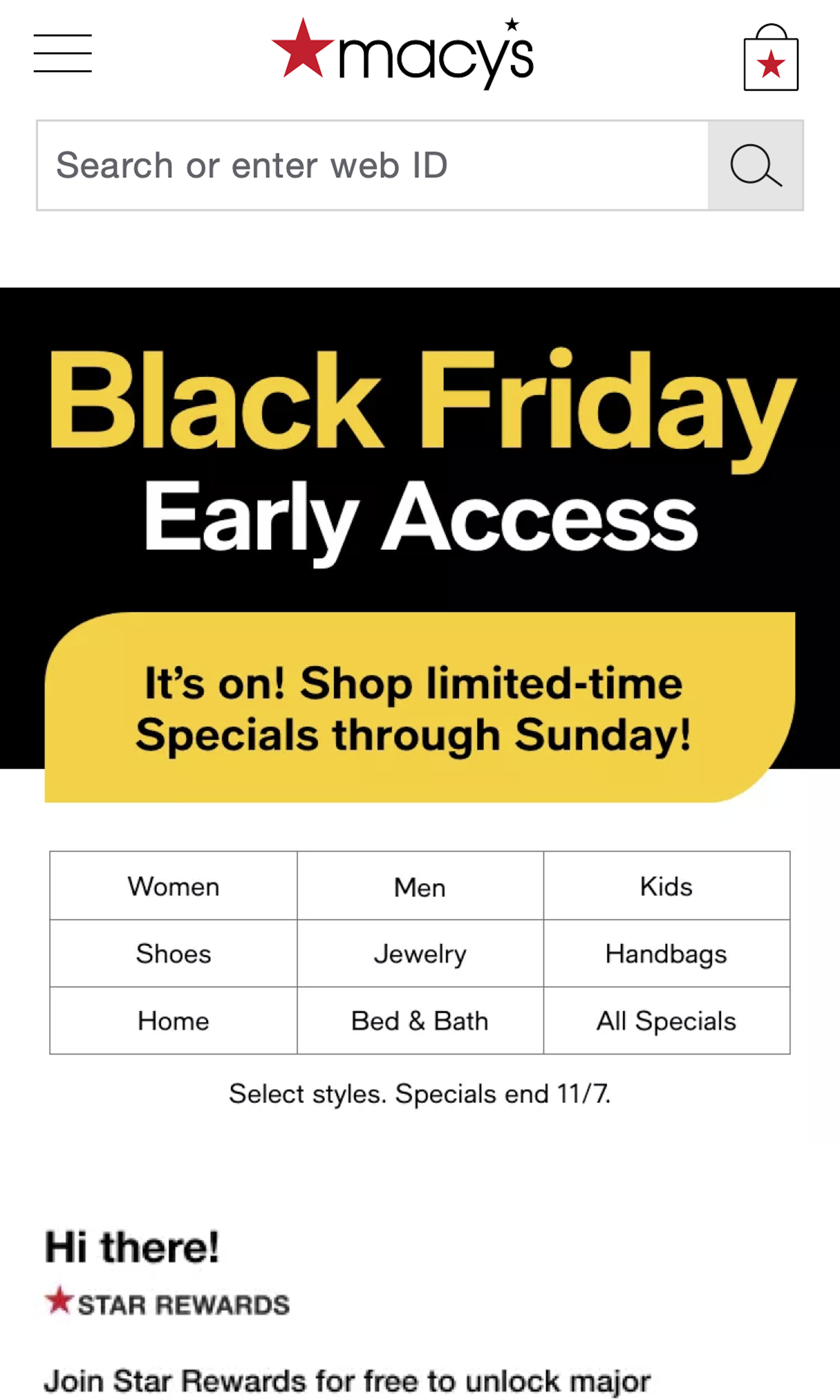
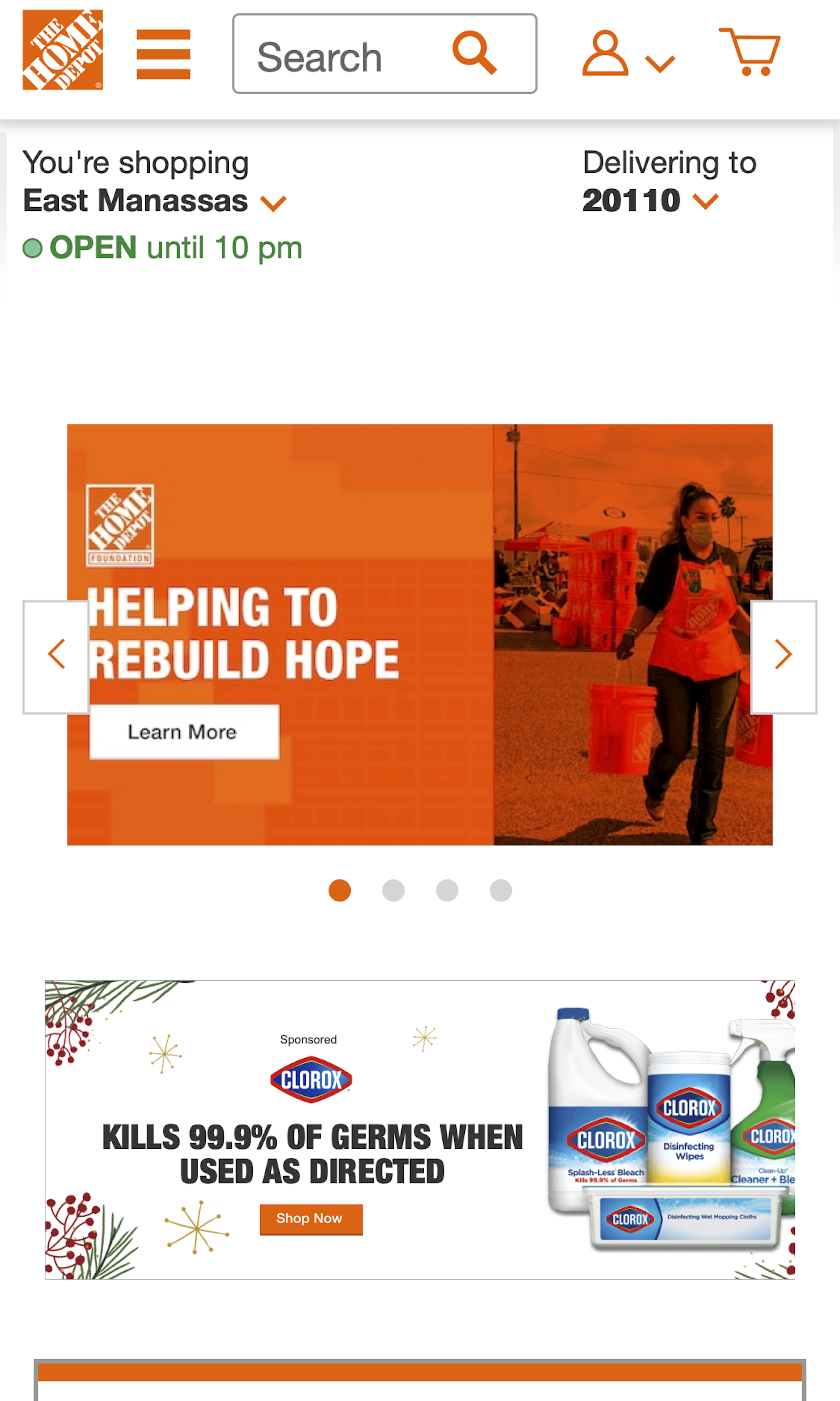
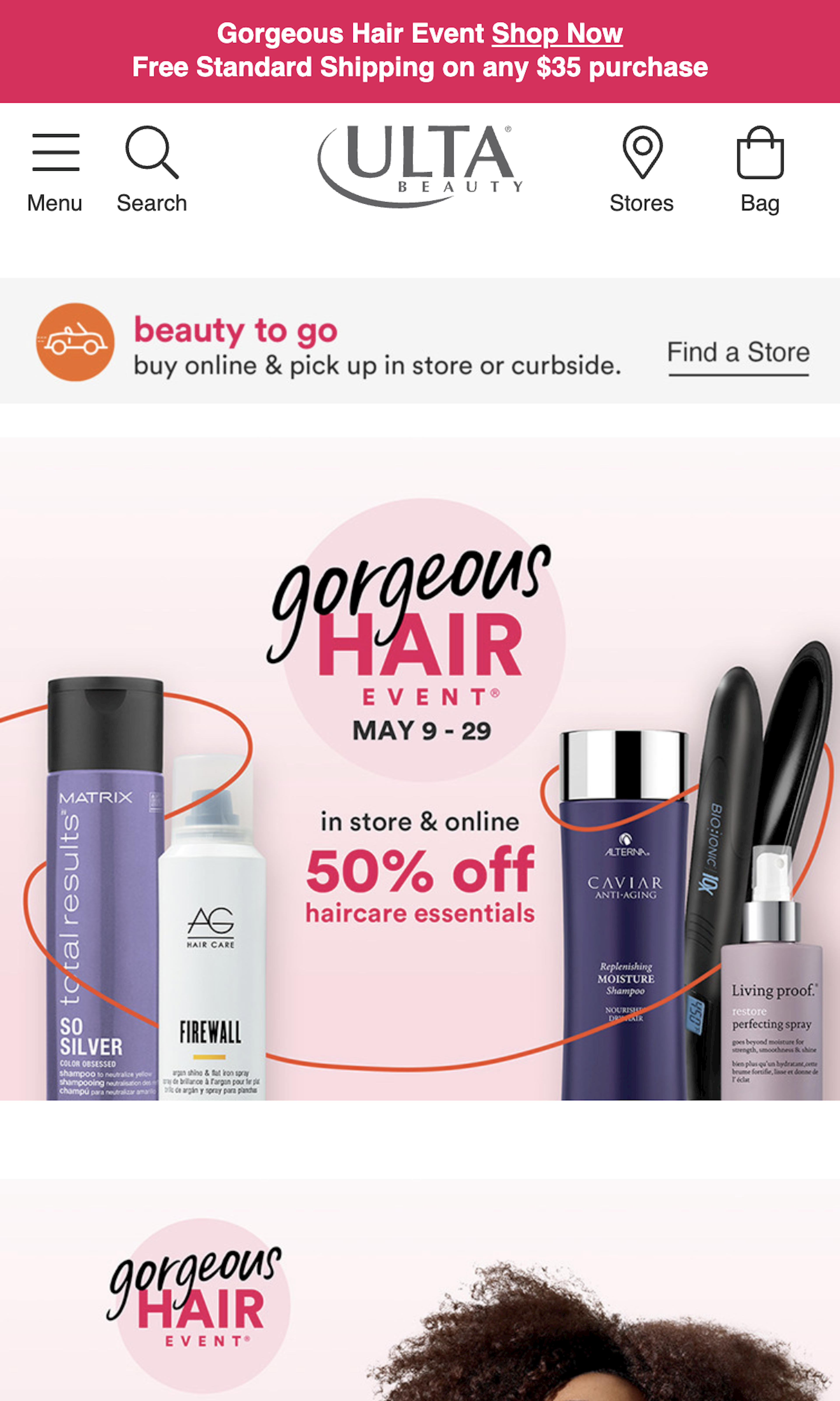
1369 ‘Homepage’ Design Examples
Also referred to as: Landing Page
What’s this? Here you’ll find 1369 “Homepage” full-page screenshots annotated with research-based UX insights, sourced from Baymard’s UX benchmark of 327 e-commerce sites. (Note: this is less than 1% of the full research catalog.)
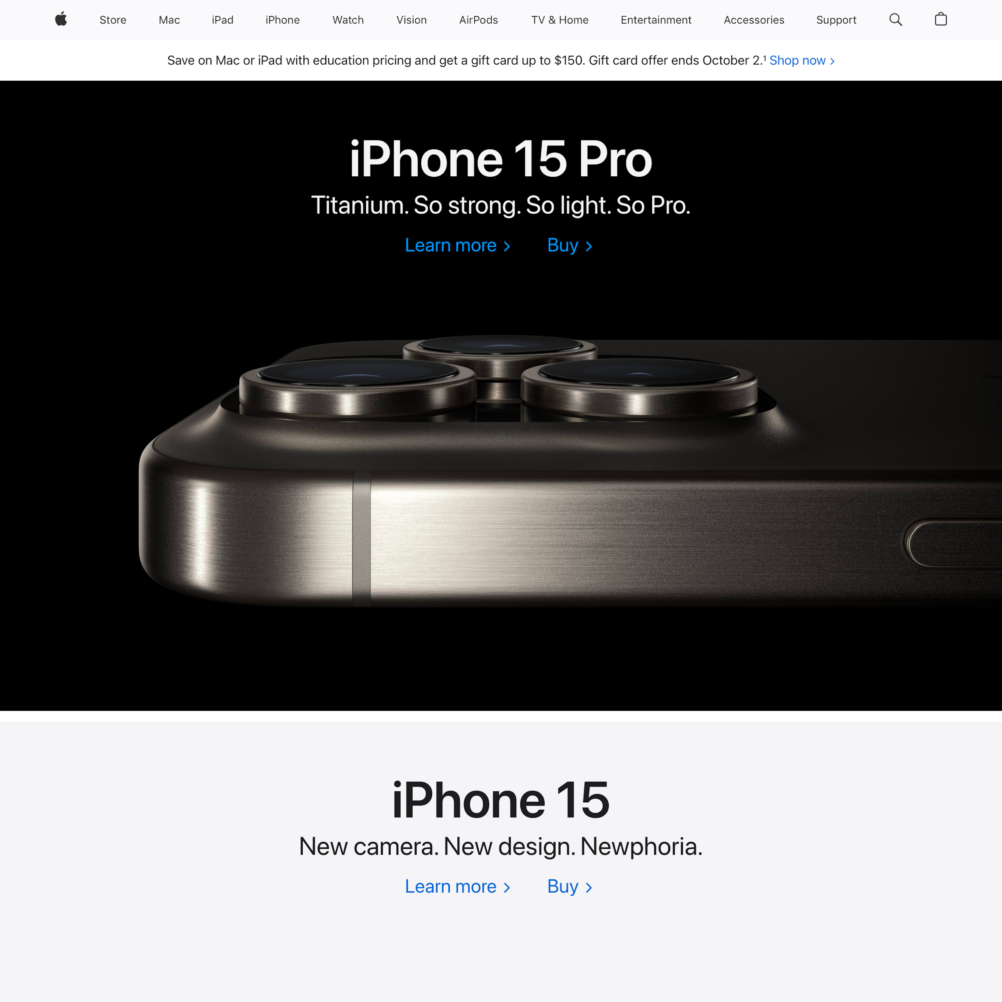
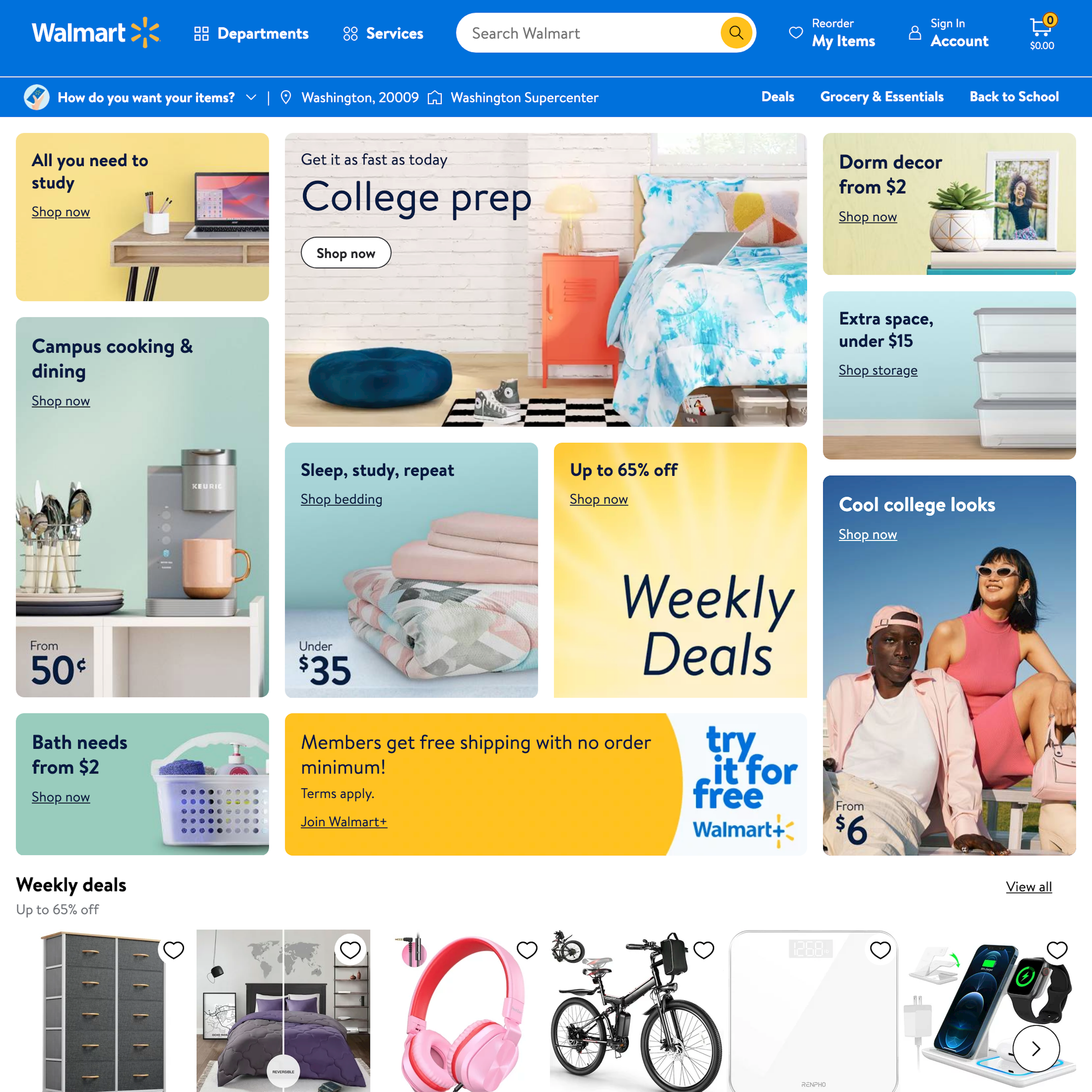
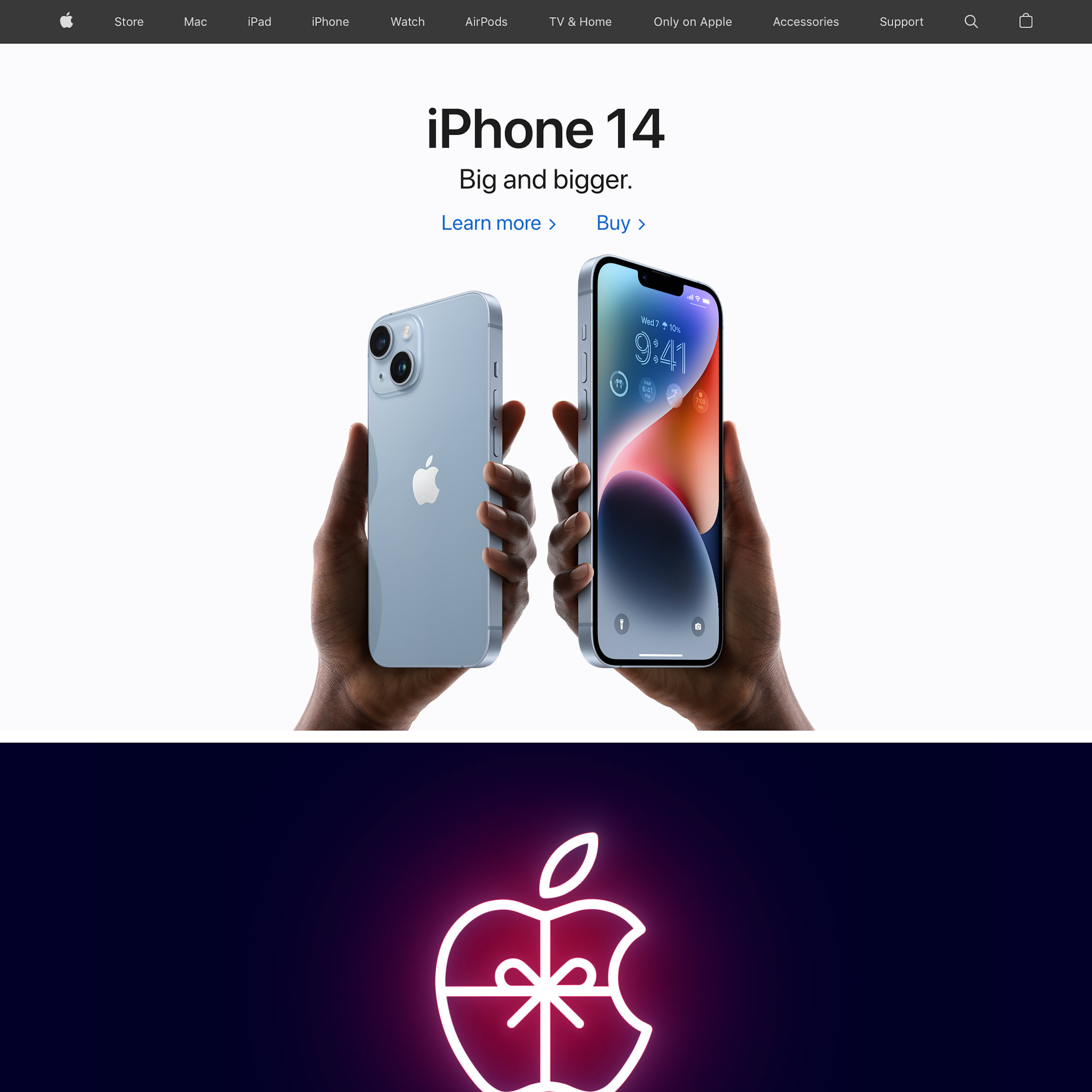
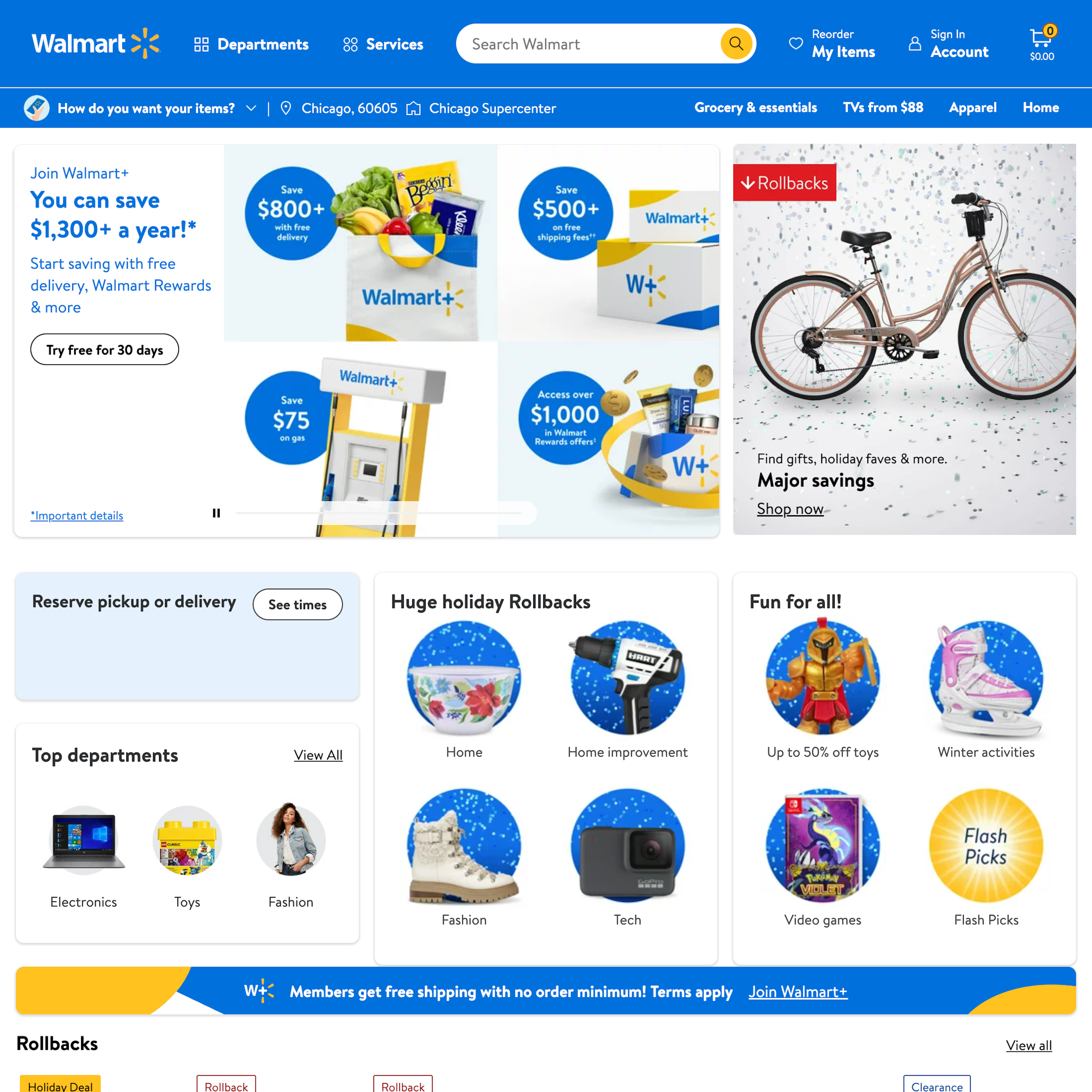
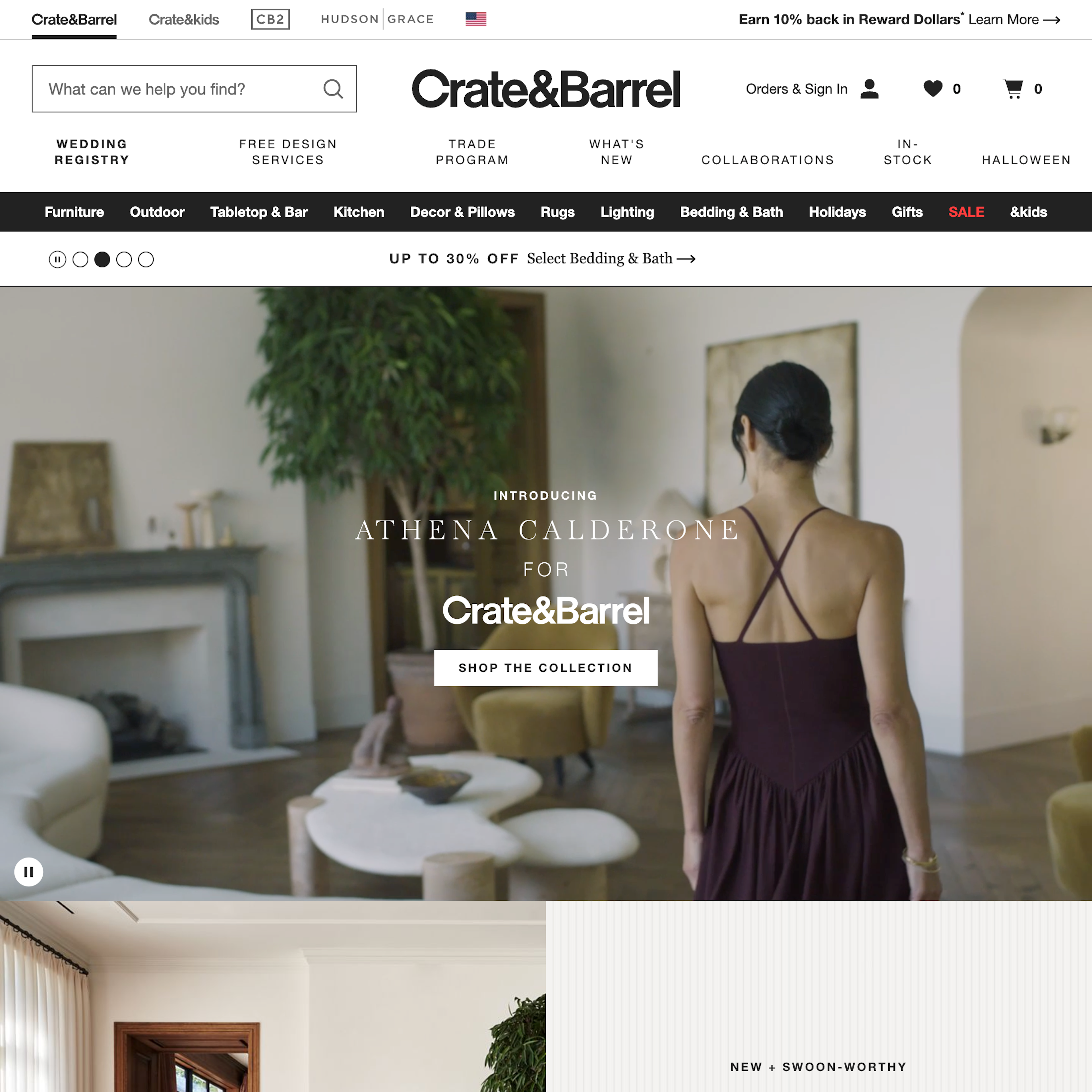
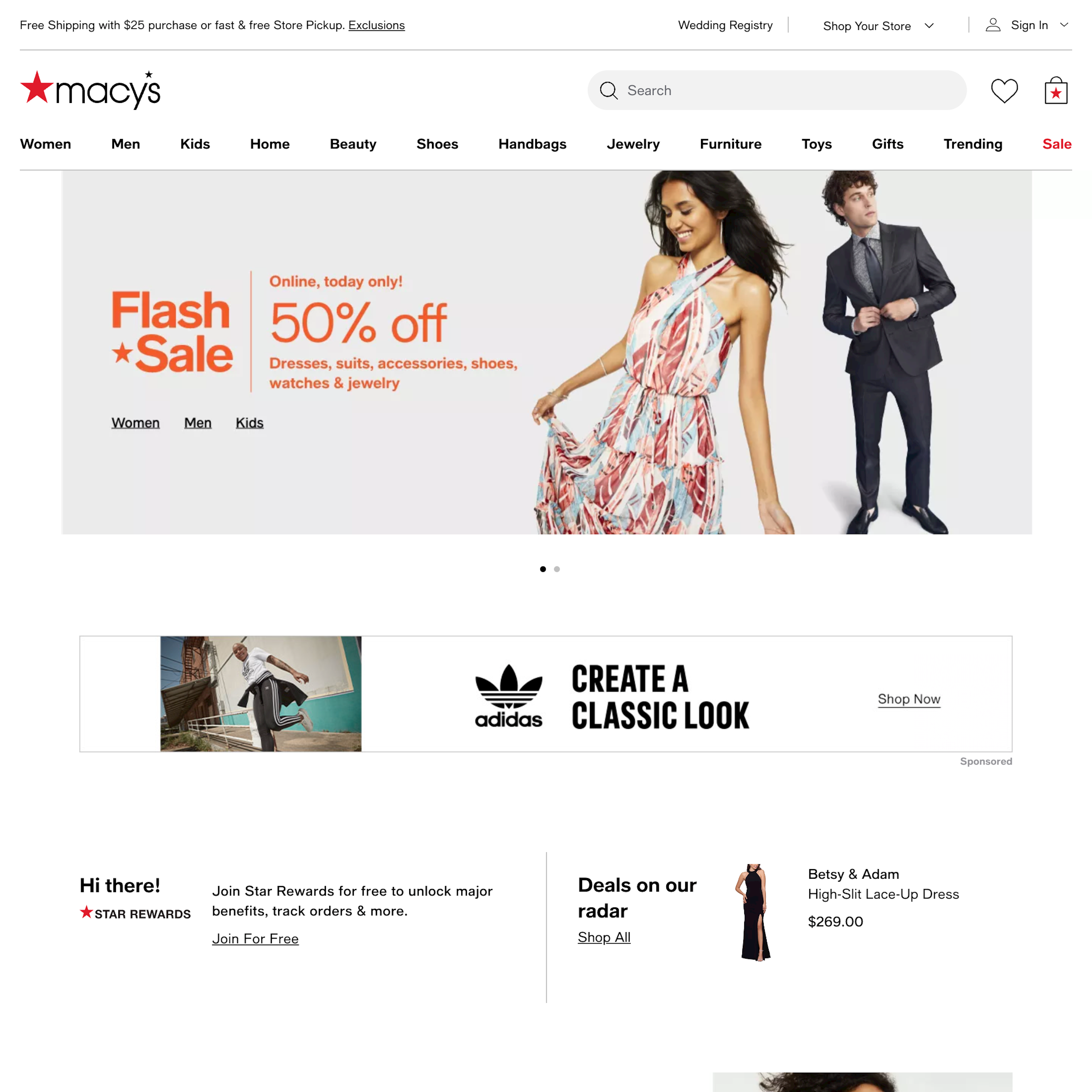
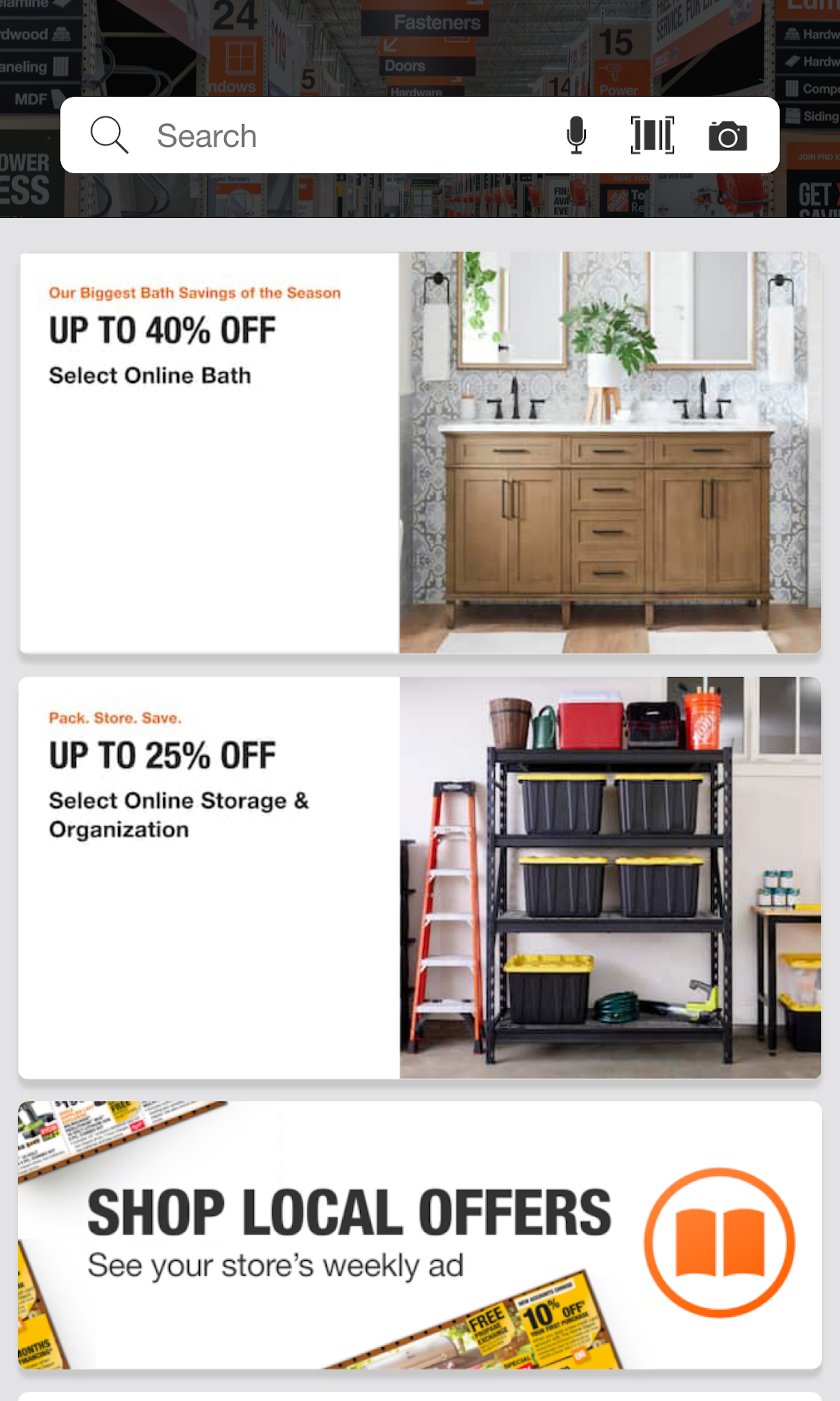
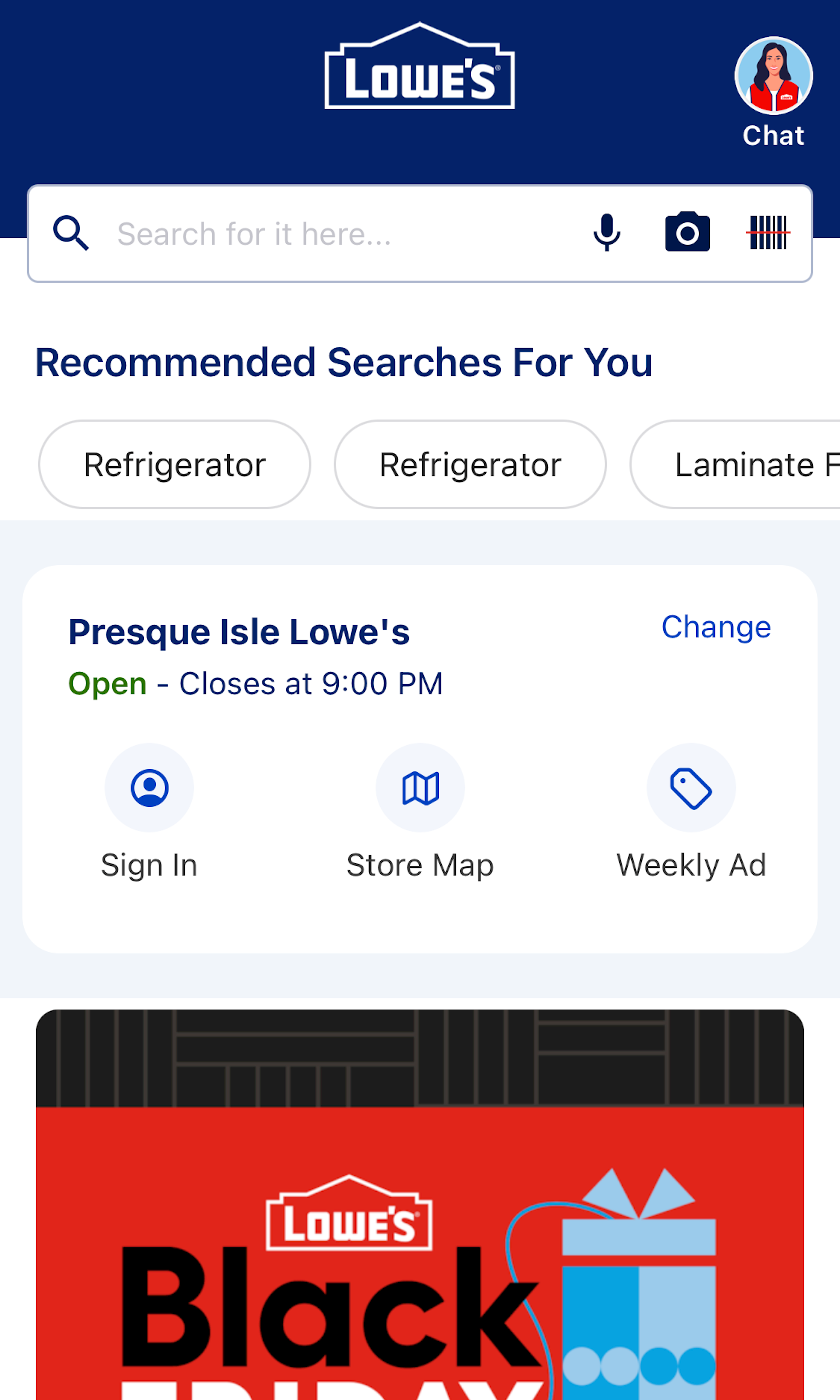
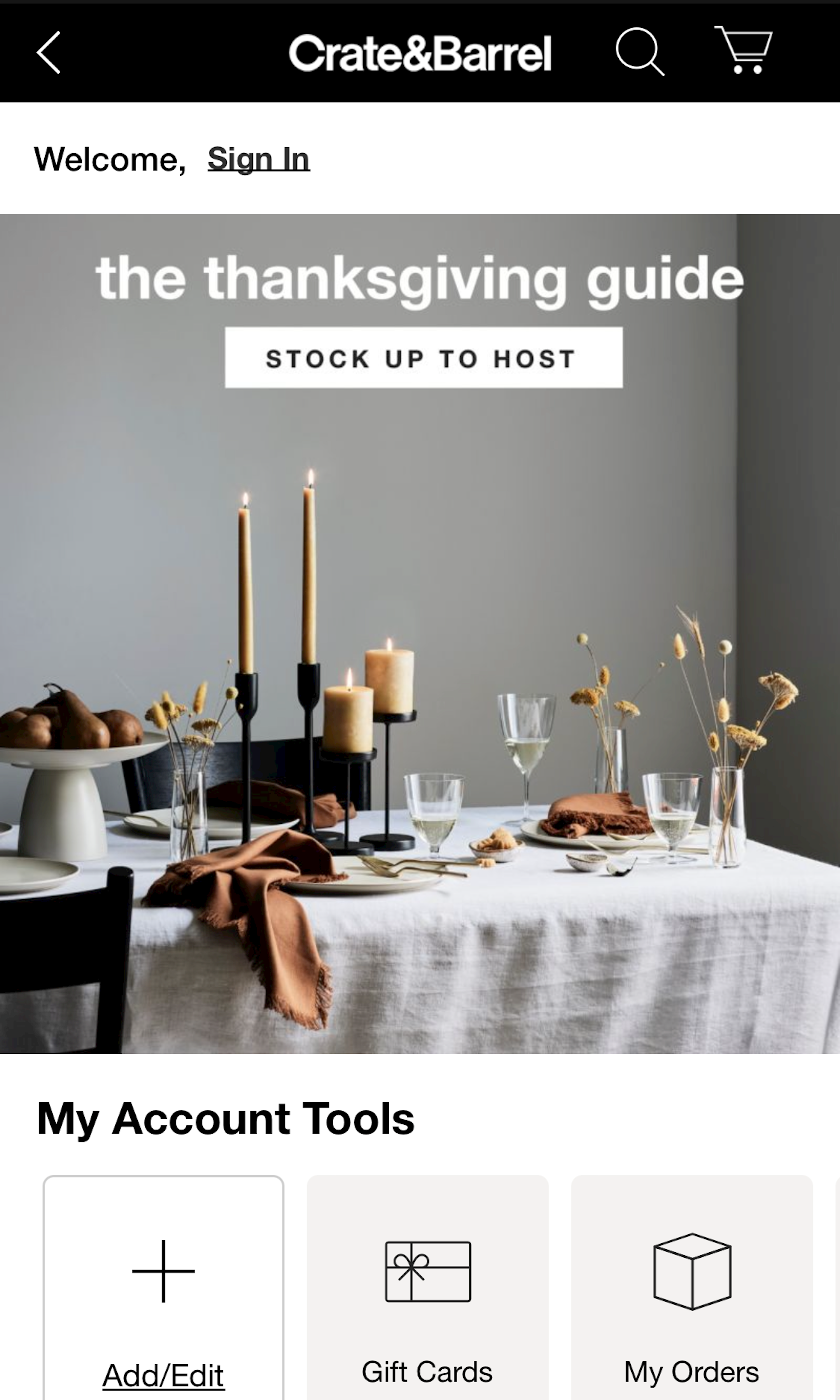
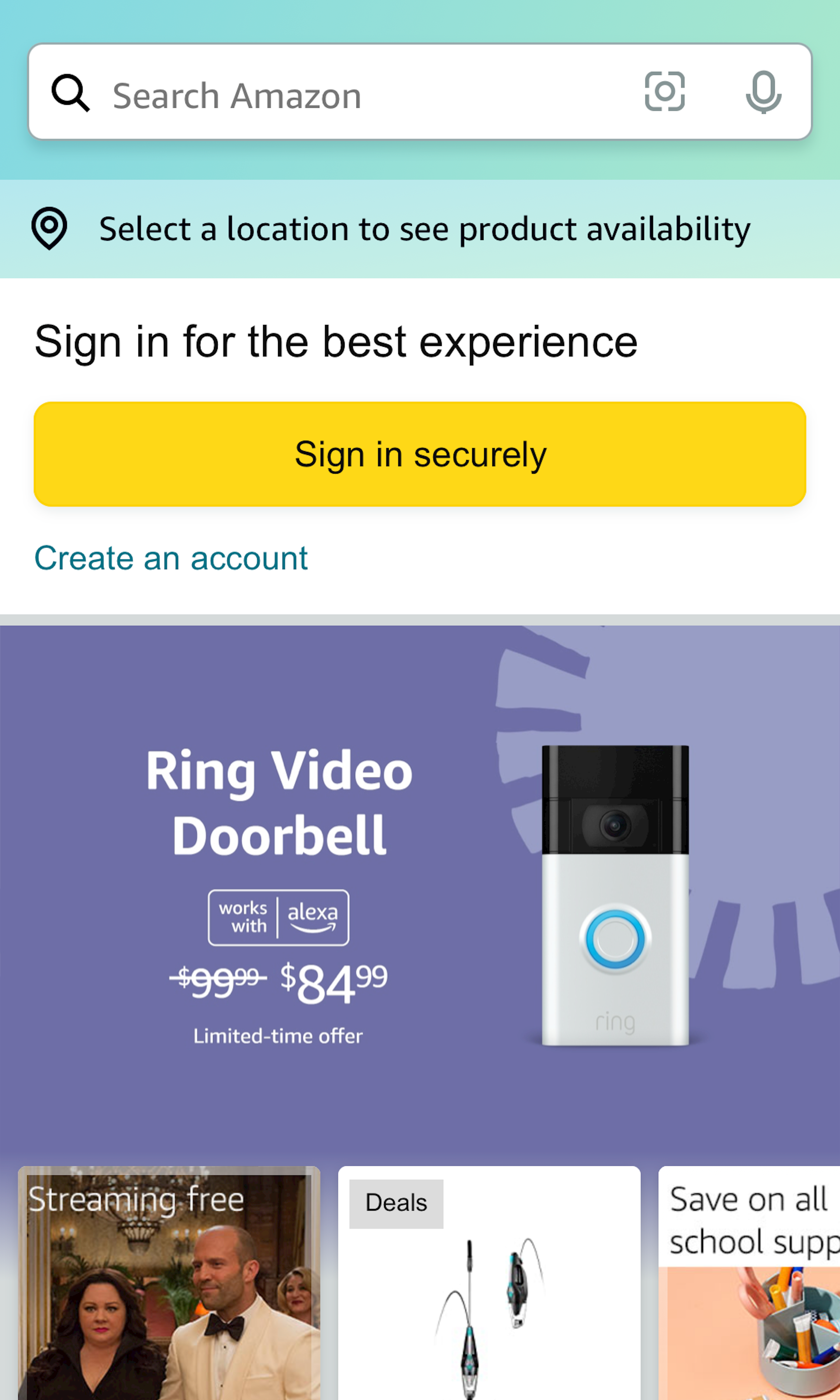
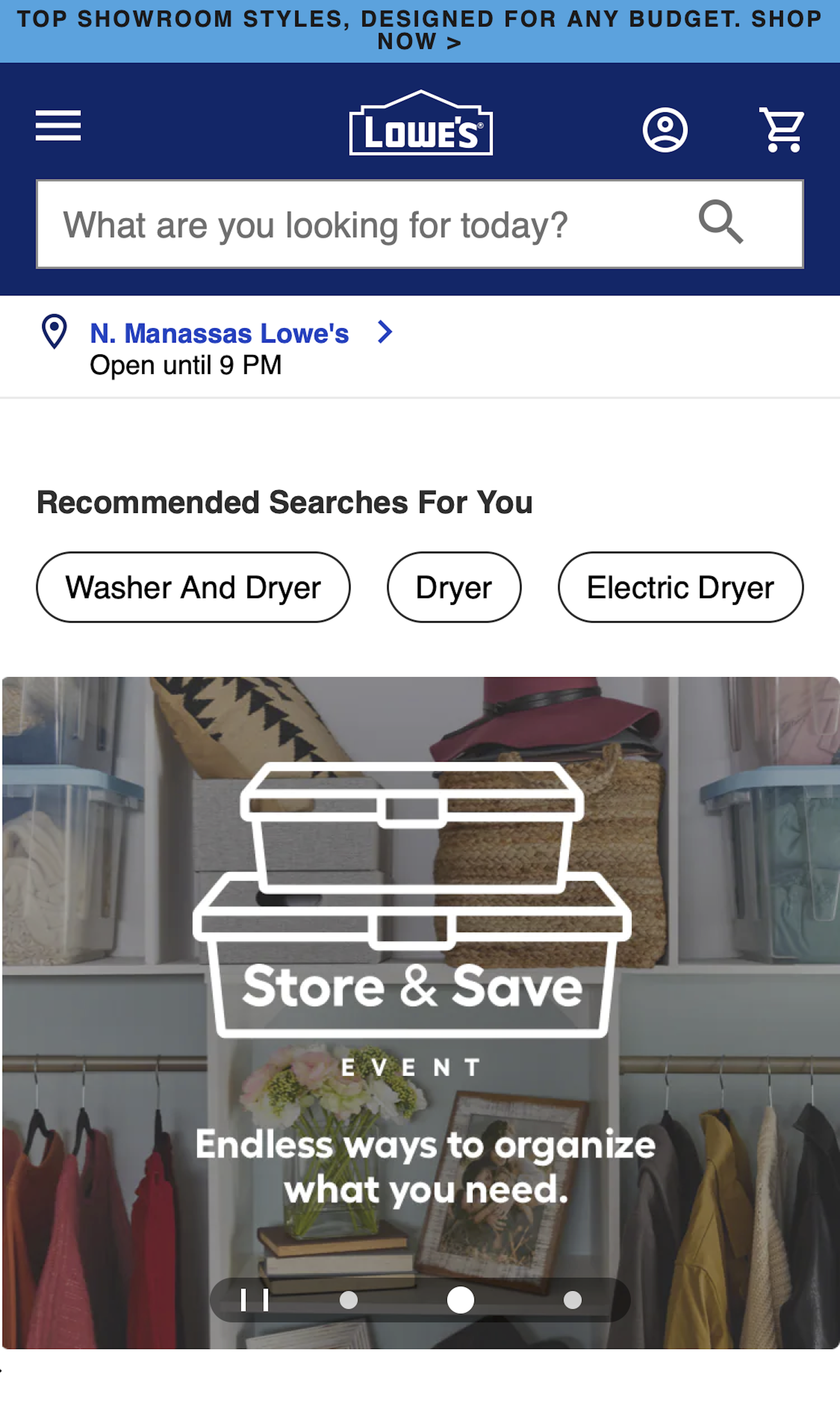
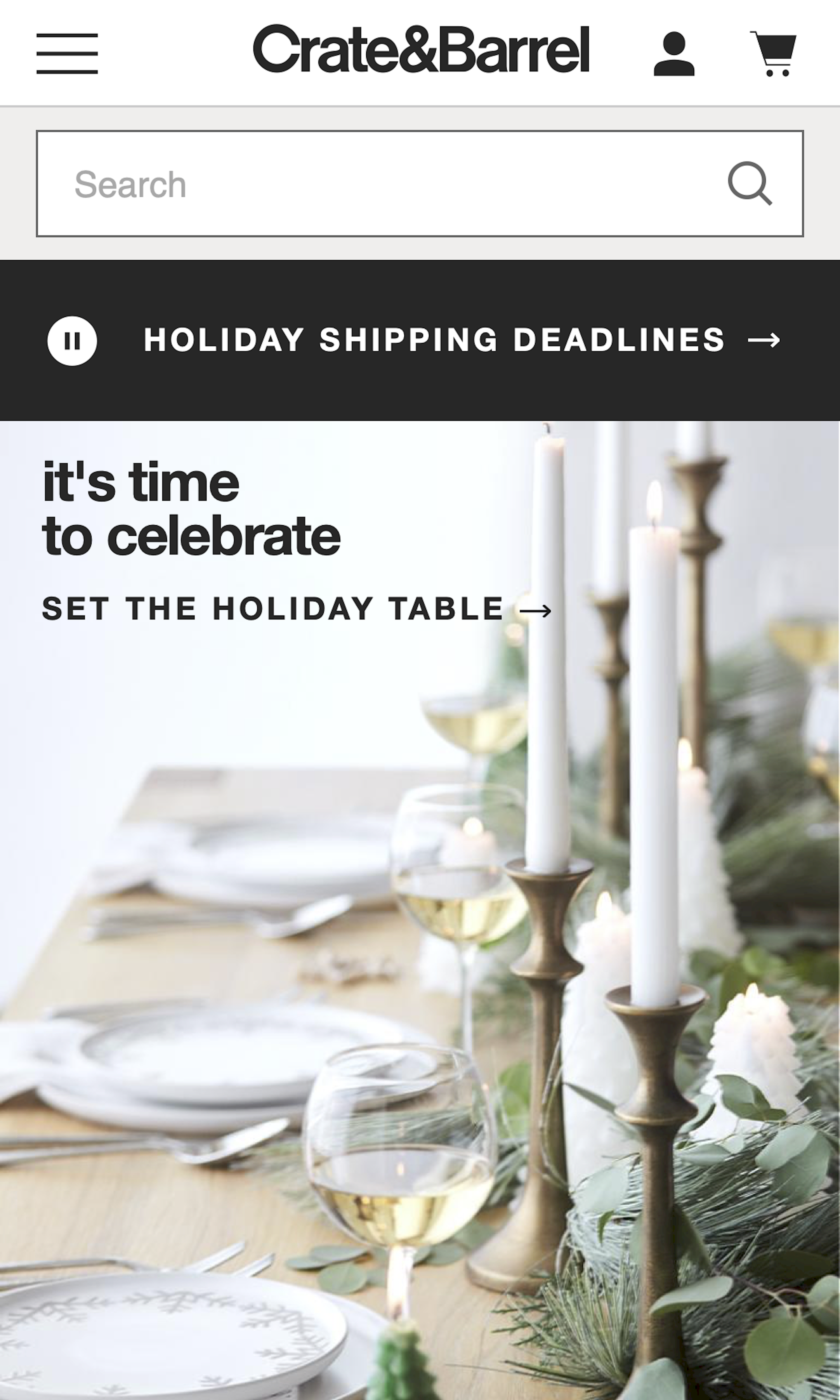
Although the majority of users, including first-time visitors, will typically not land directly at the homepage, but rather land directly at an intermediary category page or a specific product page through direct links (e.g., via social media, promotions, or organic search), our testing shows that the homepage is still a vital aspect of an e-commerce store. The homepage remains the “front door” for the many users who still begin their browsing experience here, but in testing we also observed it to act as a navigational anchor and a “safe” fallback.
More ‘Homepage’ Insights
-
It’s critical that the homepage makes it clear to users — new as well as repeat — how to pursue the three primary product-finding paths: category navigation, search, and curated paths (wizards, inspiration, new arrivals, etc.). For new visitors who are unfamiliar with the site or brand, the homepage is also an opportunity to shape the user’s perception and answer vital questions such as What type of site did I land on? What can I do here? and What should I expect to find?
-
In practice, the homepage design is a delicate balancing act between the different elements on the homepage, search field, and category navigation design, which shouldn’t be eclipsed by the often visually striking homepage content (e.g., featured products, campaigns, and promotions). At the same time the homepage should inspire users to explore, convey the site’s brand values and product range, and promote scope selection and product finders — all without causing visual overload, which tends to cause banner blindness.
-
Learn More: Besides exploring the 1369 “Homepage” design examples below, you may also want to read our related articles on “Homepage Usability: Can Users Infer the Breadth of Your Product Catalog?” and “8 UX Requirements for Designing a User-Friendly Homepage Carousel”.
-
Get Full Access: To see all of Baymard’s homepage and category navigation research findings you’ll need Baymard Premium access. (Premium also provides you full access to 200,000+ hours of UX research findings, 650+ e-commerce UX guidelines, and 275,000+ UX performance scores.)


User Experience Research, Delivered Weekly
Join 60,000+ UX professionals and get a new UX article every week.

User Experience Research, Delivered Weekly
Join 60,000+ UX professionals and get a new UX article every week.
Explore Other Research Content
300+ free UX articles based on large-scale research.

327 top sites ranked by UX performance.

Code samples, demos, and key stats for usability.