Key Takeaways
- Our late-2020 benchmark of 60 e-commerce websites shows that Homepage UX performs well overall
- However, 32% of sites perform either mediocre or poorly
- Avoiding the 8 common UX issues discussed in this article is the first step toward improving users’ Homepage experience
Note that this is not our most recent article on Homepage UX performance. Instead, read our newest article on the current state of Homepage & Category Navigation UX.
The homepage remains the “front door” for the many users who still begin their browsing experience here.
However, in testing we also observed it to act as a navigational anchor and a “safe” fallback.
Therefore, it’s critical that the homepage makes it clear to users — new as well as repeat — how to pursue the three primary product-finding paths: category navigation, search, and curated paths (wizards, inspiration, new arrivals, etc.).
Our late-2020 Homepage & Category e-commerce UX benchmark contains 10,900+ Homepage and Category elements that have been manually reviewed and scored by Baymard’s team of UX researchers, with an additional 3,100 best- and worst-practice examples from the 60 top-grossing e-commerce sites in the US and Europe (performance verified).
In this article we’ll analyze a portion of this dataset to provide you with the current state of the e-commerce Homepage UX, and outline 8 common UX design pitfalls and corresponding Homepage best practices applicable to most e-commerce sites.
The Current State of Homepage UX
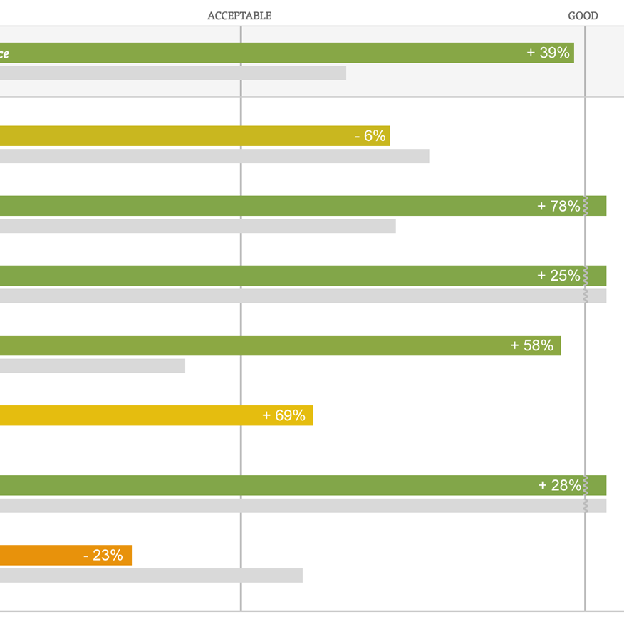
For this analysis we’ve summarized the 6,100+ Homepage usability performance scores and plotted the 60 benchmarked sites across these in the scatterplot above. Each dot, therefore, represents the summarized UX score of one site across each of the 17 guidelines within the Homepage experience. The top row is the total Homepage UX performance.
Our 2020 benchmark reveals, within Homepage, the average desktop e-commerce site performs good.
However, behind that average is a very scattered distribution of performances, with 32% of sites performing either mediocre or poorly (up from 25% in 2018). This is primarily due to sites setting a poor first impression and inappropriate expectations.
Thus, despite the decent average performance, many sites are going in the wrong direction when it comes to Homepage performance — harming their ability to keep users on the site and help them find suitable products.
Furthermore, the percent of sites with perfect Homepage performances has decreased from 30% to 17%, indicating many sites, after investing resources to improve the Homepage, haven’t kept up their investment to ensure users continue to have a high-quality Homepage experience.
In the end, the 2020 Homepage benchmark indicates that users are likely to have a fair-to-middling experience on any given Homepage — which is a lackluster beginning to a new site experience.
Below we’ll discuss the UX performance and 8 common pitfalls and the correspodning Homepage best practices to be aware of for Homepage:
- Failing to Visually Feature a Broad Range of Product Types
- The Use of Overly Aggressive and Distracting Ads
- Incorrect Implementation of Carousels
- Failing to Assist Selection of a Well-Defined Scope
- Lack of Bespoke Imagery and Design
- Not Making the Search Field Immediately Obvious
- Incorrect Implementation of Country and Language Selection
- Visual Hit Areas That Don’t Match the Actual Hit Areas
These pitfalls were chosen as they are the most interesting or the most suitable for discussion in an article.
(For a beginner’s introduction to UX, start with our primer, What Is UX?.)
8 Common Homepage UX Pitfalls and Best Practices
The pitfalls described here are issues that many sites have, and also include some “missed opportunities” for the e-commerce industry as a whole.
Also, note that this is an analysis of the average performance across 80 top-grossing US and European e-commerce sites.
When analyzing a specific site there are nearly always a handful of critical UX issues, along with a larger collection of worthwhile improvements. This is the case even when we conduct UX audits for Fortune 500 companies.
Thus, almost all sites have a few crucial areas of their Homepage that need to be fixed to avoid some users having a highly negative experience.
1) 6% of Sites Don’t Feature a Broad Enough Range of Product Types on the Homepage
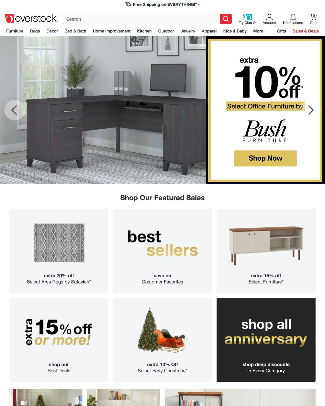
At Overstock, less than 20% of product categories are visually represented on the homepage, preventing users developing a strong understanding of the diversity of products the site has to offer.
During testing, many users misinterpreted the type of site or underestimated its product range because an overly narrow selection of product types were displayed on the homepage.
Such misinterpretations can be seriously harmful to a site as users typically won’t look for a type of product they don’t believe the site will carry.
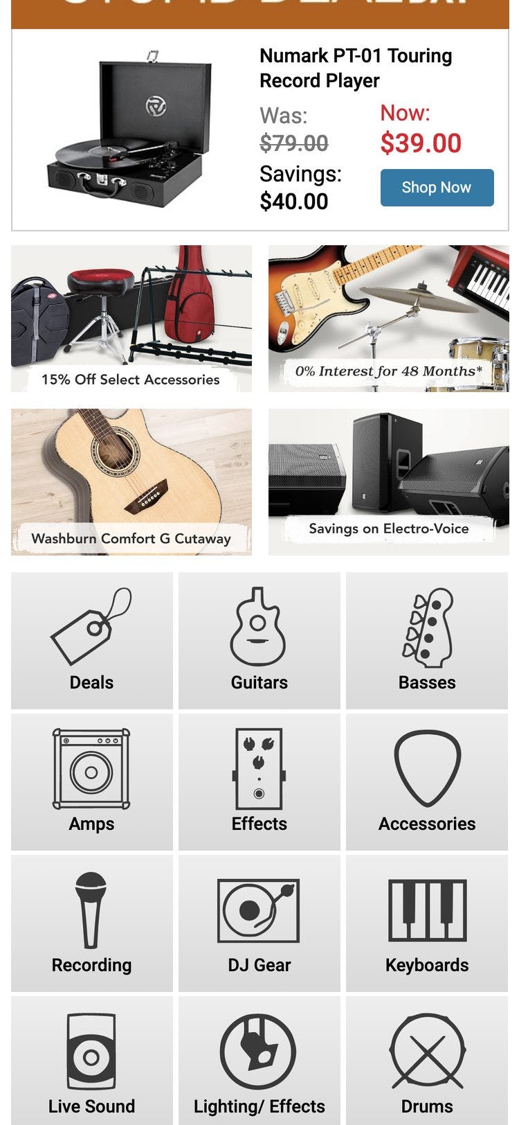
On mobile, it’s even more important to highlight on the homepage the different types of products users can find on a site because product categories aren’t permanently visible in the main navigation or available through a drop-down hover menu.
Mobile users are therefore reliant on the homepage to infer the type of site until they access the main navigation.
B&H Photo makes good use of image thumbnails to represent over 90% of product types on the homepage. This helps users select a well-defined scope.
Sites that sell a broad range of items should highlight a sufficiently broad range of product types (at least 40% of product types) on the homepage. On mobile text links can be used in place of or in addition to images and thumbnails.
Despite how much first-time users rely on homepage content to interpret product diversity, 6% of the largest e-commerce sites still get this “UX basic” wrong and visually feature fewer than 40% of their product types on the homepage (which admittedly is an improvement from 13% in 2018).
2) 59% of Sites Use Overly Aggressive and Distracting Ads on the Homepage
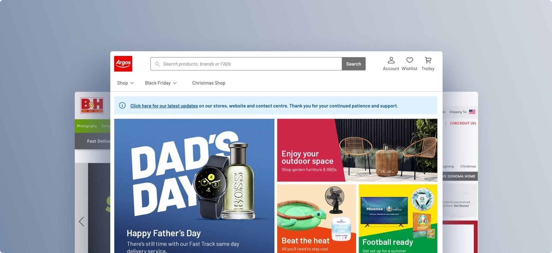
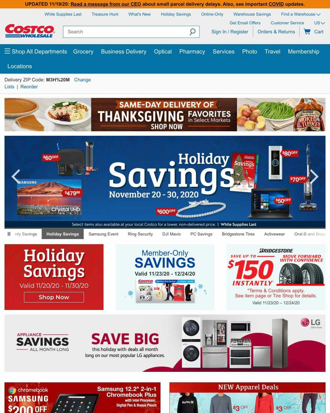
At Costco, the homepage is so focused on ads demonstrating what’s for sale that it’s difficult to get a clear overview of the full product catalog. With other vital homepage content missing or overpowered with aggressive visual advertisements, users who are new to a brand will have to spend extra time and energy exploring the site to learn basic information about its offerings and value proposition.
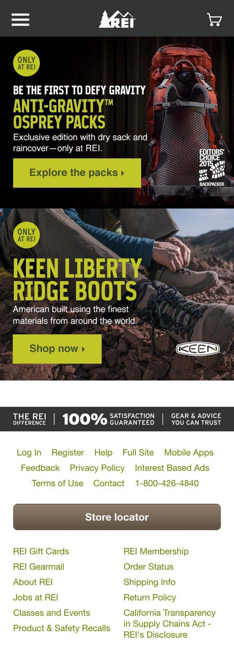
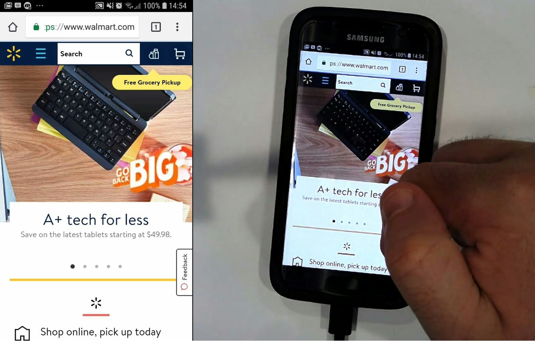
At Walmart, a user initially didn’t think he’d landed on the intended site due to the large promotion presented on the homepage, asking, “Did I click the right link? Oh, I did, sorry”. Such ads are especially disorienting for users on mobile, where other sources of information scent are hidden (e.g., the main navigation).
During testing, overly flashy ads in a prime content location on the homepage (particularly in the upper part of the page) were often met with negative reactions from users.
Pop-up banners and overlay dialogs (typically promoting newsletter signups) on the homepage were met with even greater disdain, with some users going as far as referring to them as “spam”.
Meanwhile, our mobile testing revealed the potential for homepage ads to cause even more — and more severe — issues is increased due to the reduced size of the viewport.
The homepage at Grainger encourages users to focus on exploring product categories, rather than distracting them with overly aggressive promotional ads.
The homepage at Northern Tool includes ads in a carousel (see #3 below). However, the carousel doesn’t overwhelm the other content — half the viewport showcases categories.
For both desktop and mobile, it’s critical to be particularly mindful of the size, placement, aesthetics, and integration of the ads within the overall homepage design.
Despite the risk of setting a poor first impression, 59% of sites exhibit issues with “ad-looking” content on the homepage (up from 37% of sites in 2018).
3) 75% of Sites That Use Carousels Implement Them Incorrectly
While our testing reveals that users generally like the large imagery of carousels, they can cause more harm than good if serious usability issues aren’t addressed.
For example, carousel slides were often observed changing just milliseconds before a user clicked — causing the wrong page to be loaded.
On the other hand, when implemented with care, carousels are a powerful way to promote features, offers, and wizards.
In particular, carousel slides can autorotate, but not too quickly (especially if they include text), and autorotation should temporarily pause while hovered and permanently pause after any user interaction.
For most e-commerce sites, static content sections, as used at Gilt, will often be a better choice than a carousel, as they are vastly simpler to develop and maintain, and perform as well with users.
Alternatively, using static content sections scattered throughout the homepage in combination with featured categories was observed to perform well during testing.
This instead relies on users scrolling the homepage, a vastly simpler and more ingrained web interaction.
While only 36% of sites use a carousel on the homepage, nearly 75% of those sites implement it incorrectly. See our complete guide on how to mitigate the most grave carousel usability issues.
4) 62% of Sites Don’t Assist Users in Selecting a Well-Defined Scope Directly from the Homepage
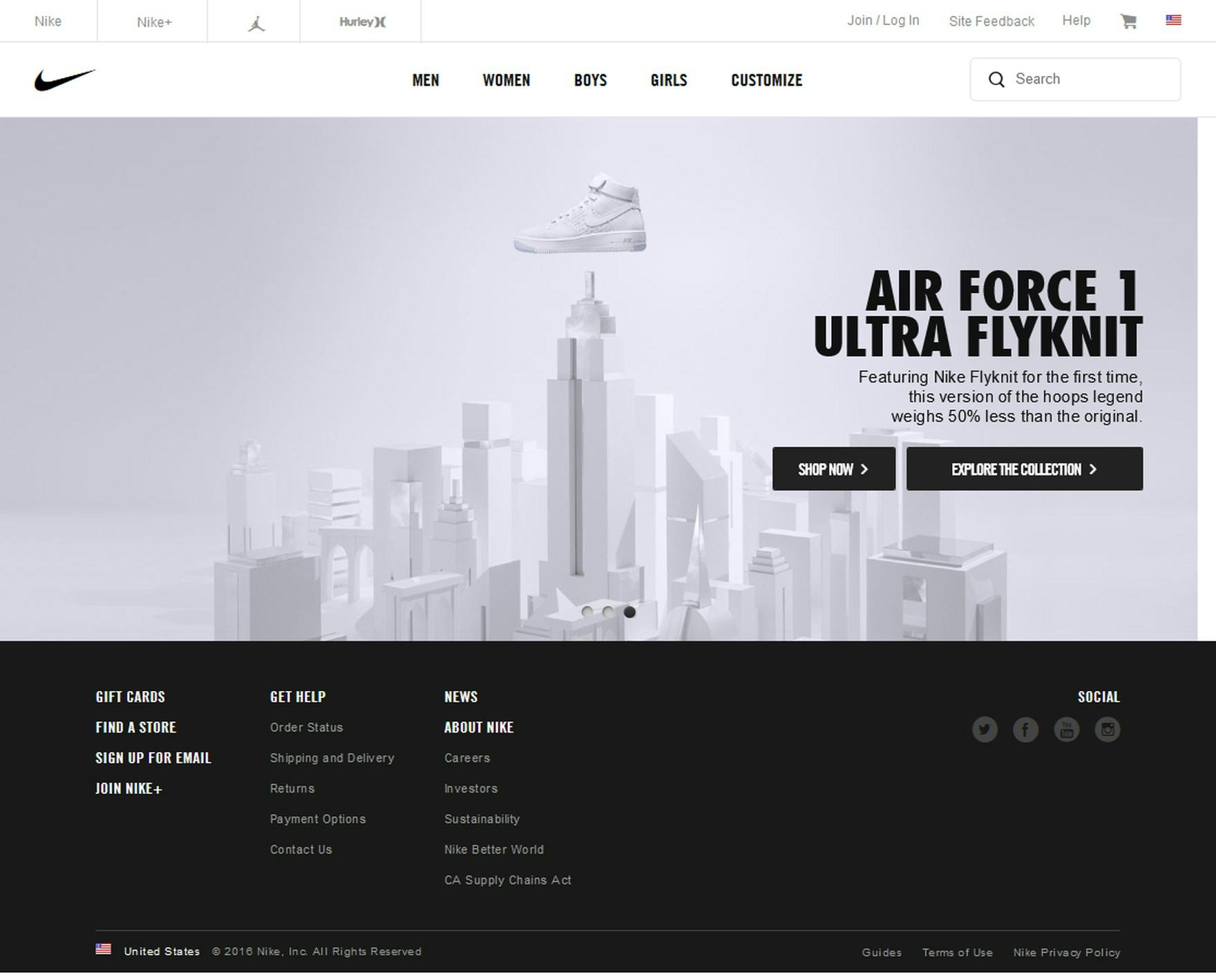
The lack of featured categories on the homepage makes it difficult for users to find the appropriate scope at Nike.
During testing, the success rate of a user’s initial product-finding strategy was tightly linked to their ability to quickly find a relevant well-defined scope within the site.
Meanwhile, ending up in the wrong scope had dire consequences, in particular when users believed they were in the right scope and consequently concluded that the site didn’t carry items that were relevant to them (a logical yet often false conclusion).
In contrast, Williams Sonoma features popular categories and subcategories directly on the homepage, making it easy for users to quickly dive into well-defined scope.
Promoting popular subcategories (in addition to popular categories; see #1 above) directly on the homepage helps users bypass the generic higher-level scopes and go straight to more relevant and well-defined parts of the site’s taxonomy.
Additionally, in certain industries such as toys and gifts (where users often buy for someone else), and for compatibility-dependent product catalogs, wizards can be a powerful scope to integrate on the homepage too.
Despite how harmful it can be when users end up in the wrong or a too-broad scope, 62% of sites don’t assist users in quickly and seamlessly finding a well-defined scope from the homepage (up from 55% of sites in 2018).
5) 19% of Sites Don’t Use Bespoke Homepage Imagery and Design
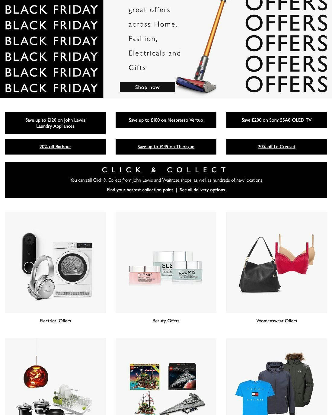
John Lewis misses an opportunity by not investing more in bespoke imagery to showcase its products, particularly in an in-use context (e.g., showing children playing with toys or using models to showcase apparel).
Through multiple rounds of testing, sites with good design and inspiring photography on the homepage received numerous positive remarks from users. In effect, the initial positive impression made users more loyal to the site.
Clearly, using design and imagery to make a good first impression is paramount.
Meanwhile, sites that didn’t have any custom imagery at all, instead relying on stock photography or bland and boring cut out imagery, were observed to underperform.
(However, note that it can be possible to go too far with bespoke design, as observed during our large-scale research study of direct-to-consumer (DTC) sites.)
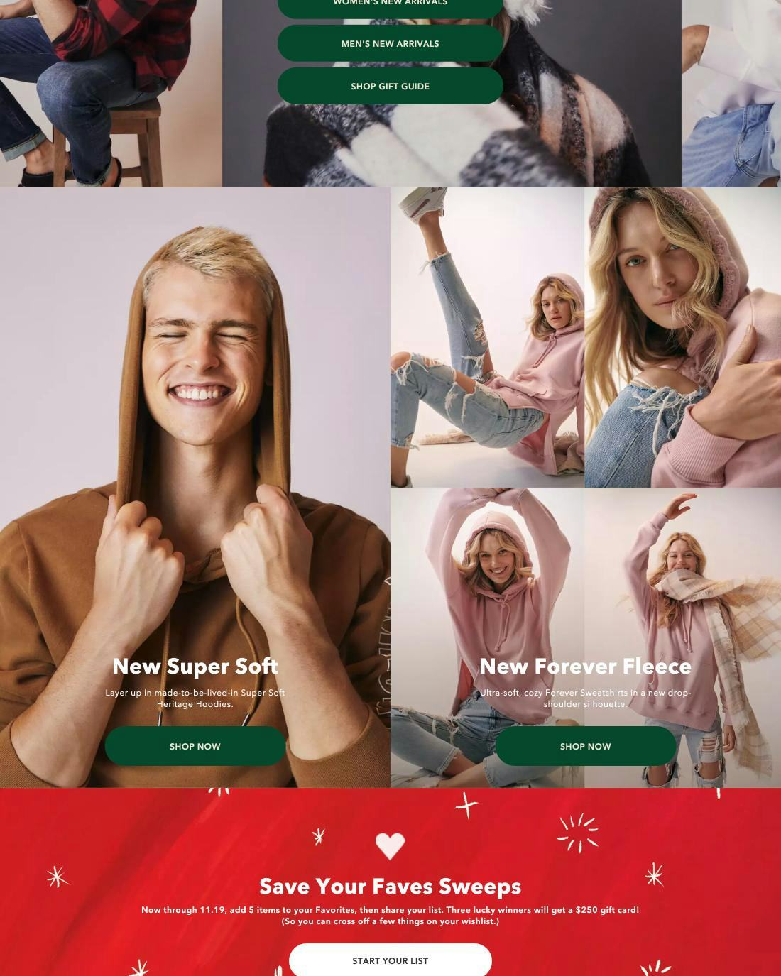
In visually driven industries, such as apparel, product aesthetics are a large factor in the purchasing decision. The large contextual imagery on the homepage at American Eagle draws users in while showcasing products and categories.
The beautiful photography and simple design used at Wayfair goes a long way toward setting a positive tone for the shopping session, while also showcasing specific products.
To set a positive first impression of your site and convey brand values, invest in design and content production (copywriting, graphic design, and especially photography), and curate it on an ongoing basis.
Despite the negative implications, 19% of sites don’t use bespoke homepage imagery and design to set a positive first impression of the site and convey its brand values (although down from 28% in 2018).
6) 22% of Sites Don’t Present the Search Field Prominently on the Homepage
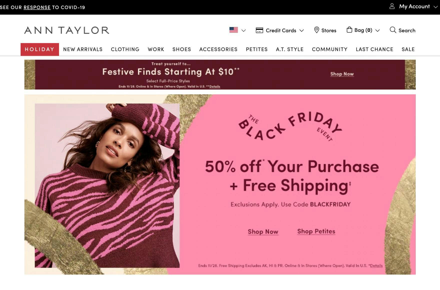
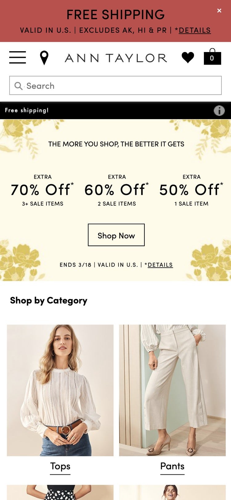
At Ann Taylor it’s difficult to see the search field right away on the homepage; the use of only an icon and textual label, its size and location, and nearby competing elements all impact its visibility.
During testing, numerous users relied on search as a fallback strategy when they got stuck.
However, the search field often drowns in the sea of eye-catching graphics on the homepage, which can lead to problems for search-driven users and those using search as a fallback.
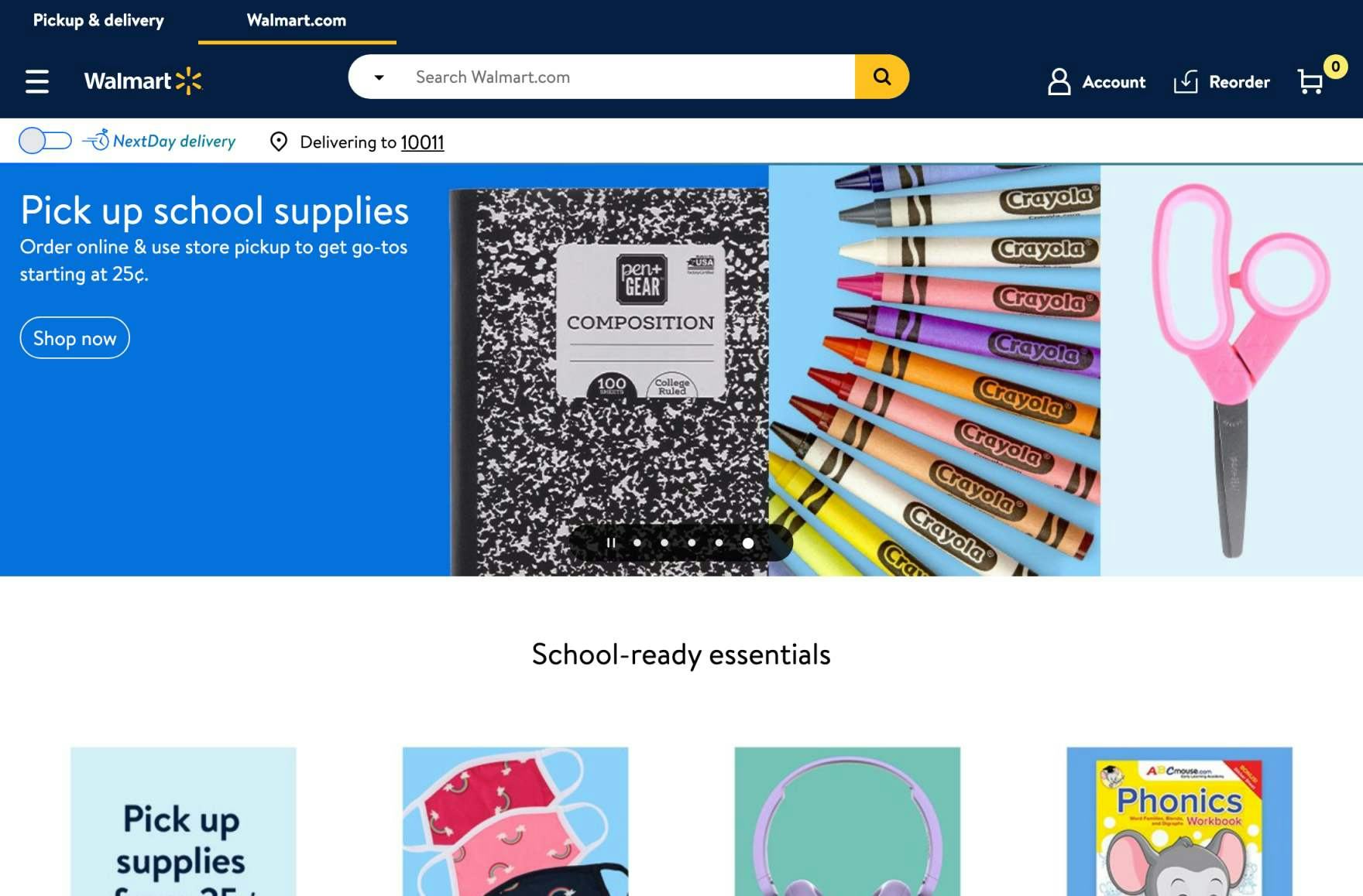
In contrast, the visual dominance of the search field at Walmart makes is instantly noticeable on the homepage.
The search field should be prominently presented on the homepage so users who want to search can get started immediately and seamlessly, but also so that any user — even those who don’t search right off the bat — instinctively know where the search field is located from the very beginning of their browsing session, so they can return to it as a fallback strategy in moments of despair.
Despite how critical search is to product finding, 22% of sites don’t present the search field prominently on the homepage (up from 15% in 2018).
7) 35% of Sites Don’t Implement Country and Language Selection Correctly
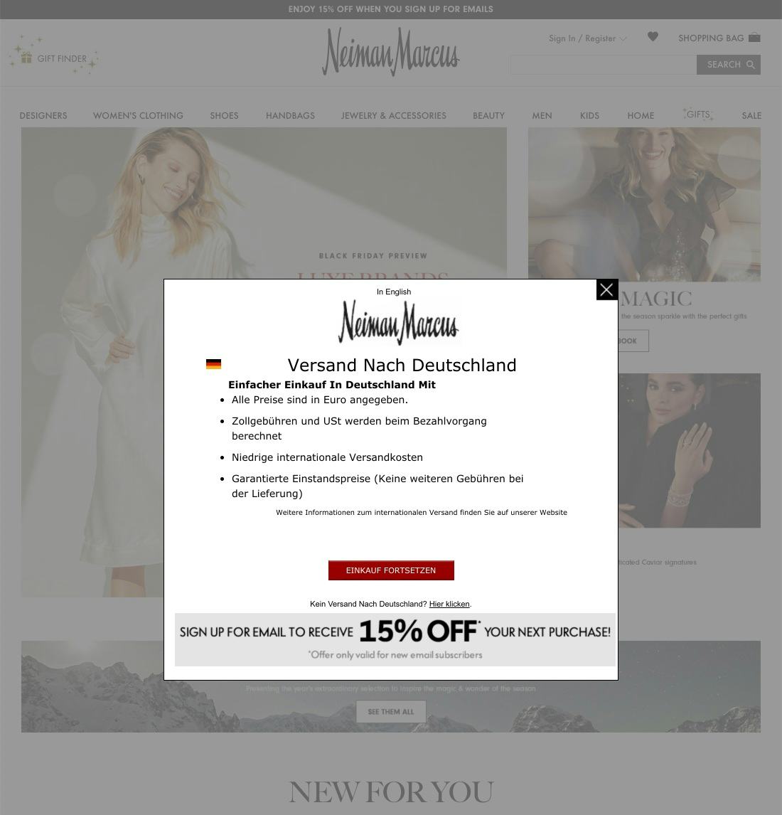
At Neiman Marcus, the use of an overlay to make country and language selection risks users mistaking it for a survey or newsletter subscription invitation and dismissing it without actually reading its content.
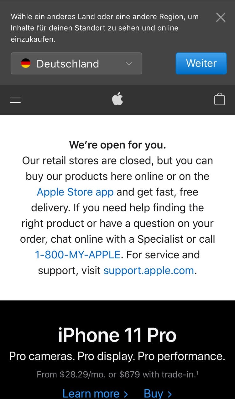
At Apple, the overlay takes up very little of the viewport, making it easy for users to overlook.
During desktop testing, the use of splash pages made country and language selection needlessly cumbersome for users.
Meanwhile, overlays showing shipping, country, and language selections were often mistaken by users for ads, surveys, account creation, or newsletter subscription boxes, and closed without users even glancing over their content.
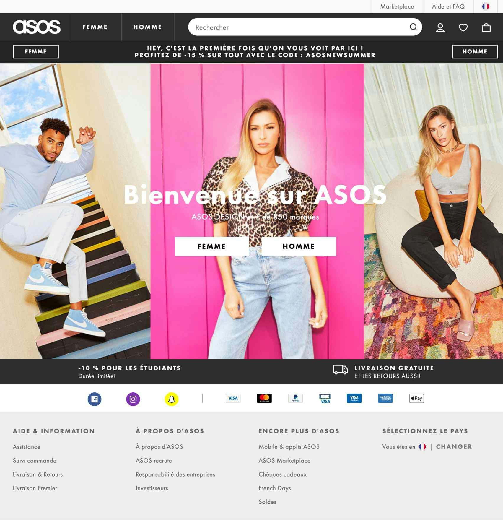
In contrast, Asos uses IP geotargeting to identify the user’s location and displays a flag icon in the upper-right corner as well as in the footer. This approach is makes it’s easy for users to change the country or language.
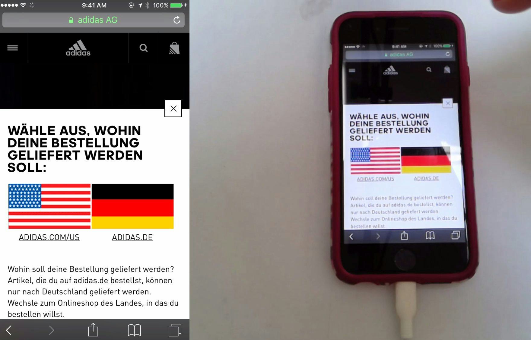
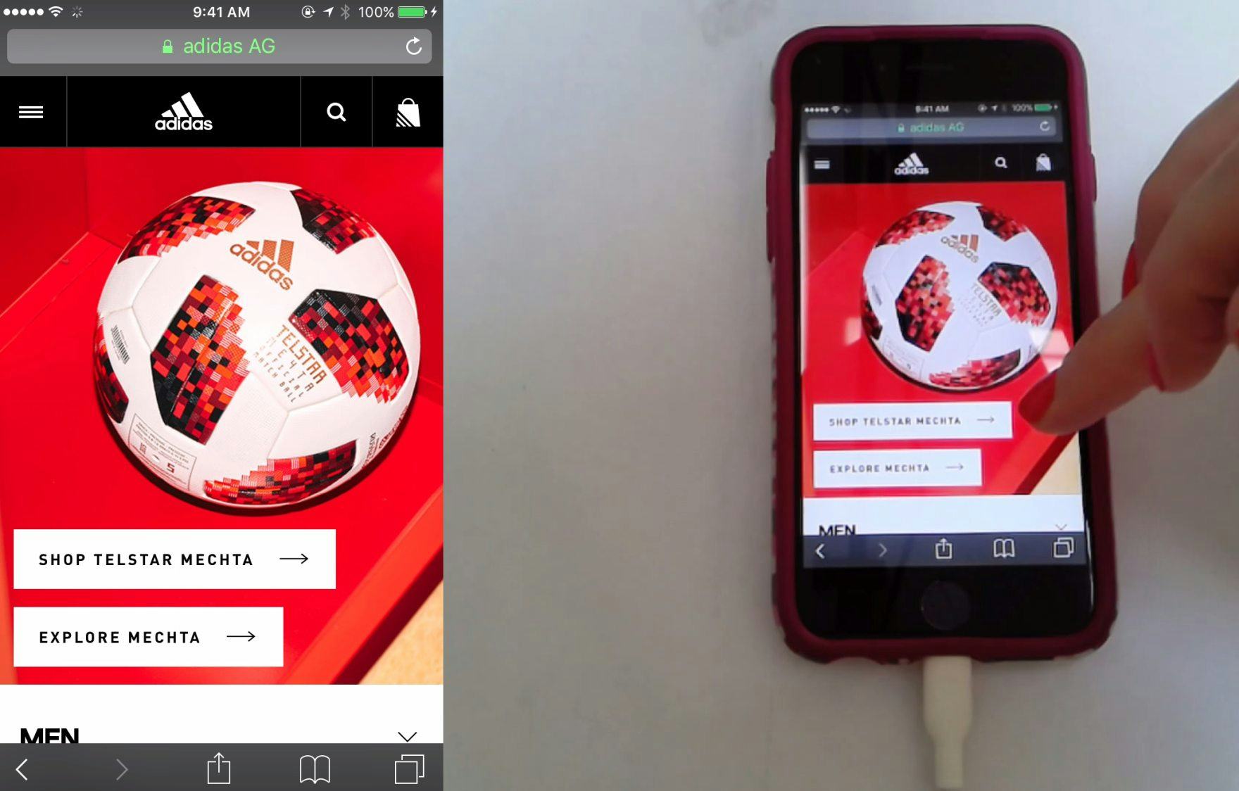
A user arriving at Adidas was presented with a country-selection overlay (first image). After choosing the US site, the overlay closed, and she began browsing the site (second image). On mobile, overlays receive more attention from users, given how the small viewport can focus users’ attention on the overlay content, compared to desktop overlays. Here, the country-selection overlay at Adidas took up 77% of the viewport, and included eye-catching flag graphics, both of which likely contributed to focussing this user’s attention on the overlay content.
Therefore, only use splash pages on desktop to force the user to make a country or language selection (or confirm one) if you have significant regional customizations or restrictions, and never use an overlay dialog.
Additionally, make the process unobtrusive by autoselecting a value for the user (preferably by using IP geotargeting; otherwise, by autoselecting the most popular country).
On mobile the overlay should take up the vast majority of the viewport — typically 70% or more — and include very prominent flag graphics to assist users in quickly recognizing that the overlay is for country or language selection, rather than, for example, a newsletter sign-up.
Country and language selection can have wide-ranging implications for the shopping experience, yet 35% of sites don’t implement country and language selection correctly (up from 27% in 2018).
8) 43% of Sites Don’t Style Clickable Interface Elements Effectively
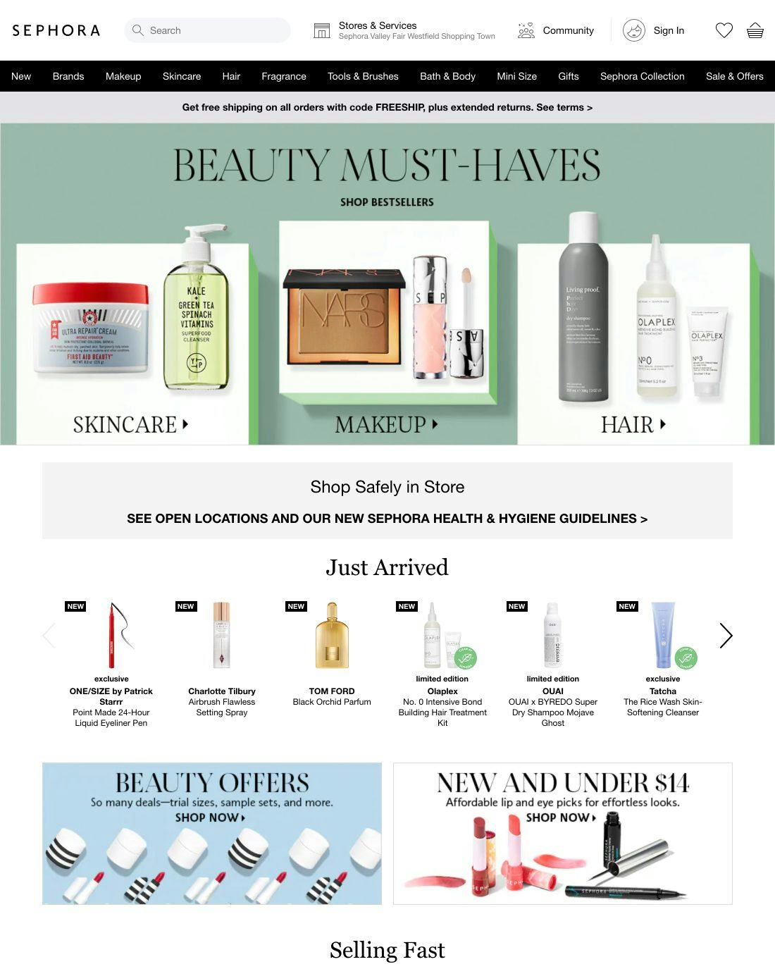
At Sephora, it’s unclear whether the elements featured on the homepage represent a single path or multiple paths. This risks some users missing out on paths that lead directly to where they want to go, or having to spend more time trying to find where they want to go. Meanwhile, other users will wind up disoriented when clickable elements do not lead to the expected destination.
During testing, users were observed to hesitate when multiple items were enclosed in a single visual element.
This was due to the fact that it was unclear if the visual element was one large hit area leading to a single page or whether there were multiple distinct hit areas leading to different pages.
On mobile, users sometimes experienced an even more foundational issue — whether a visual element was even tappable.
Wayfair makes it clear that both the title and thumbnail of subcategory links lead to the same place by using a unified hover area.
To address this issue, hover effects and styling can be leveraged to make it clear if a visual element leads to a single location or multiple different locations.
Meanwhile, on mobile it’s crucial to always make it clear what elements are links, make each visual element a single hit area that goes to one location, and to ensure that the hit area for links matches the size of the visual element.
Despite how vital it is to the overall navigation experience, 43% of sites don’t make it obvious to users what in the interface is clickable, where those clicks are going to take users, and where the hit areas begin and end (up from 18% in 2018).
Homepage UX Performance Has Declined
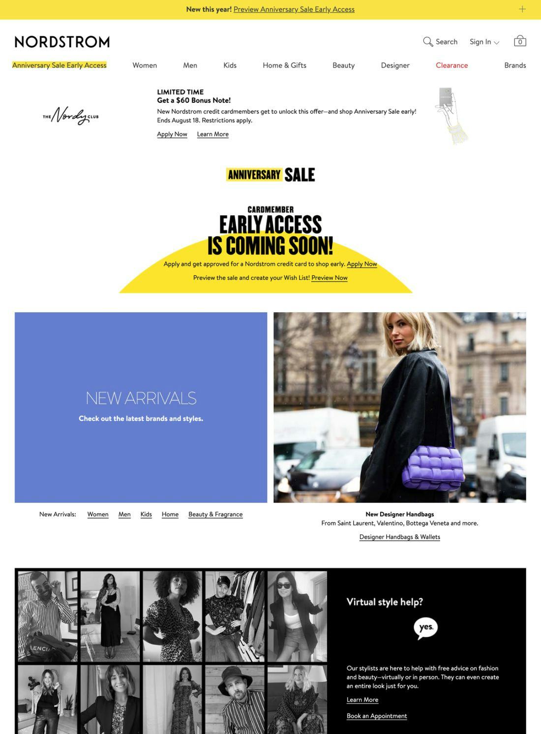
Nordstrom’s homepage suffers from 6 of the 8 issues identified in this article: overly aggressive and distracting ad content, incorrect carousel implementation, failure to assist users in selecting a well-defined scope, an easily overlooked search field, use of an overlay dialog for country and language selection, and ambiguous click areas. Hence, many users relying on Nordstrom’s homepage to begin product exploration will start off with a negative experience.
In practice, the homepage should simultaneously inspire users to explore, convey the site’s brand values and product range, and possibly even educate users about unique or novel product features — all without causing visual or mental overload.
Moreover, while the homepage may not be the predominant entrance path it once was (though its importance was observed to be even greater on direct-to-consumer websites), it still serves a central role as an anchor for the site’s category taxonomy, and an escape route — a place to refer back to throughout the shopping session.
Although our UX research for our 2020 Homepage benchmark has revealed that the average e-commerce site performs good, it’s clear that there’s room for improvement, as 32% of sites perform either mediocre or poorly— up from 25% in 2018.
This analysis of the current state of Homepage UX focuses on just 8 of the 17 homepage issues included in our benchmark analysis. The other 9 issues should be reviewed as well to gain a comprehensive understanding of the current state of Homepage UX, and to identify additional site-specific issues not covered here.
In particular, avoiding the 8 homepage UX pitfalls described in this article, by adhereing to the below 8 homepage best practices, is the first step toward improving users’ Homepage experience:
- Feature a Broad Range of Product Types (6% Don’t)
- Avoid Overly Aggressive and Distracting Ads (59% Don’t)
- Implement Carousels Carefully (75% Don’t)
- Assist the Selection of a Well-Defined Scope (62% Don’t)
- Invest in Bespoke Imagery and Design (19% Don’t)
- Make the Search Field Immediately Obvious (22% Don’t)
- Implement Country & Language Selection Carefully (35% Don’t)
- Ensure Visual Hit Areas Match the Actual Hit Areas (43% Don’t)
For additional inspiration explore our public database of 242 desktop Homepage examples and 79 mobile web Homepage examples from leading online retailers, annotated with what homepage UIs to emulate, but also of what to avoid.
This article presents the research findings from just 1 of the 700+ UX guidelines in Baymard – get full access to learn how to create a “State of the Art” ecommerce user experience.

