Key Takeaways
- During seasonal and time-sensitive sales and promotions, shoppers face pressure to find the right products quickly, with multiple sites often competing for their attention
- Common ecommerce frustrations feel magnified during this time, often reducing buyer confidence and leading to abandoned carts and missed sales
- This article offers 10 research-backed UX best practices to streamline the ecommerce shopping experience and minimize cart abandonment during peak sales days
At Baymard, our large-scale research testing has produced hundreds of best practices for optimizing sites’ UX.
Yet it can be overwhelming to consider where to start when it comes to tackling the UX issues on a site.
Therefore, as we approach Cyber Monday we’ll share some of our research findings by discussing 10 UX best practices particularly important for “Cyber Monday”, across these ecommerce sales topics:
- Helping users find sales and deals
- Clearly conveying prices and discounts
- Surfacing shipping and returns information
- Building confidence with social proof
- Streamlining the checkout process
While of course this is only a handful of UX best practices, understanding and implementing these 10 is a way to get started improving your site’s UX — especially relevant in this time of seasonal sales and promotions.
Helping Users Find Relevant Products
Our research indicates that roughly half of users will rely on search to find relevant products (with the other half using category navigation).
It’s therefore key that the search feature functions to help users quickly and reliably find products of interest.
Below are 2 search UX best practices to help users easily find relevant products during Cyber Monday sales.
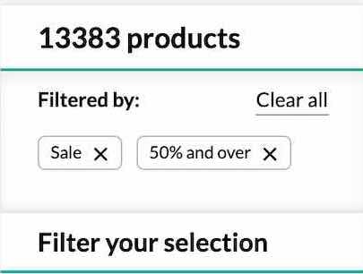
1) Support the 8 Most Common “Query Types” (55% Get One or More Wrong)
Our latest ecommerce UX Search benchmark — based on reviewing the largest ecommerce sites and 5,000 manually scored UX performance ratings — reveals that there’s only mediocre support for 8 key search query types.
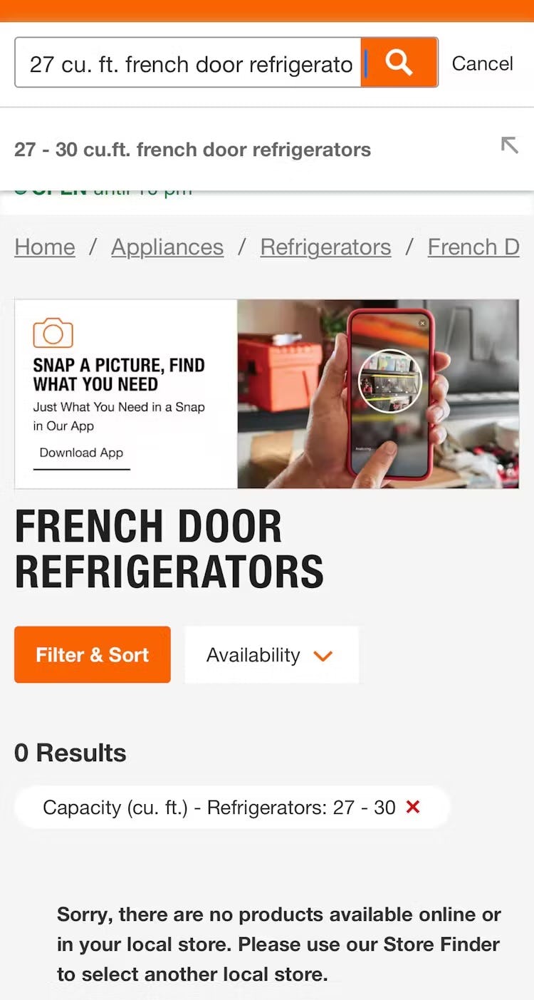
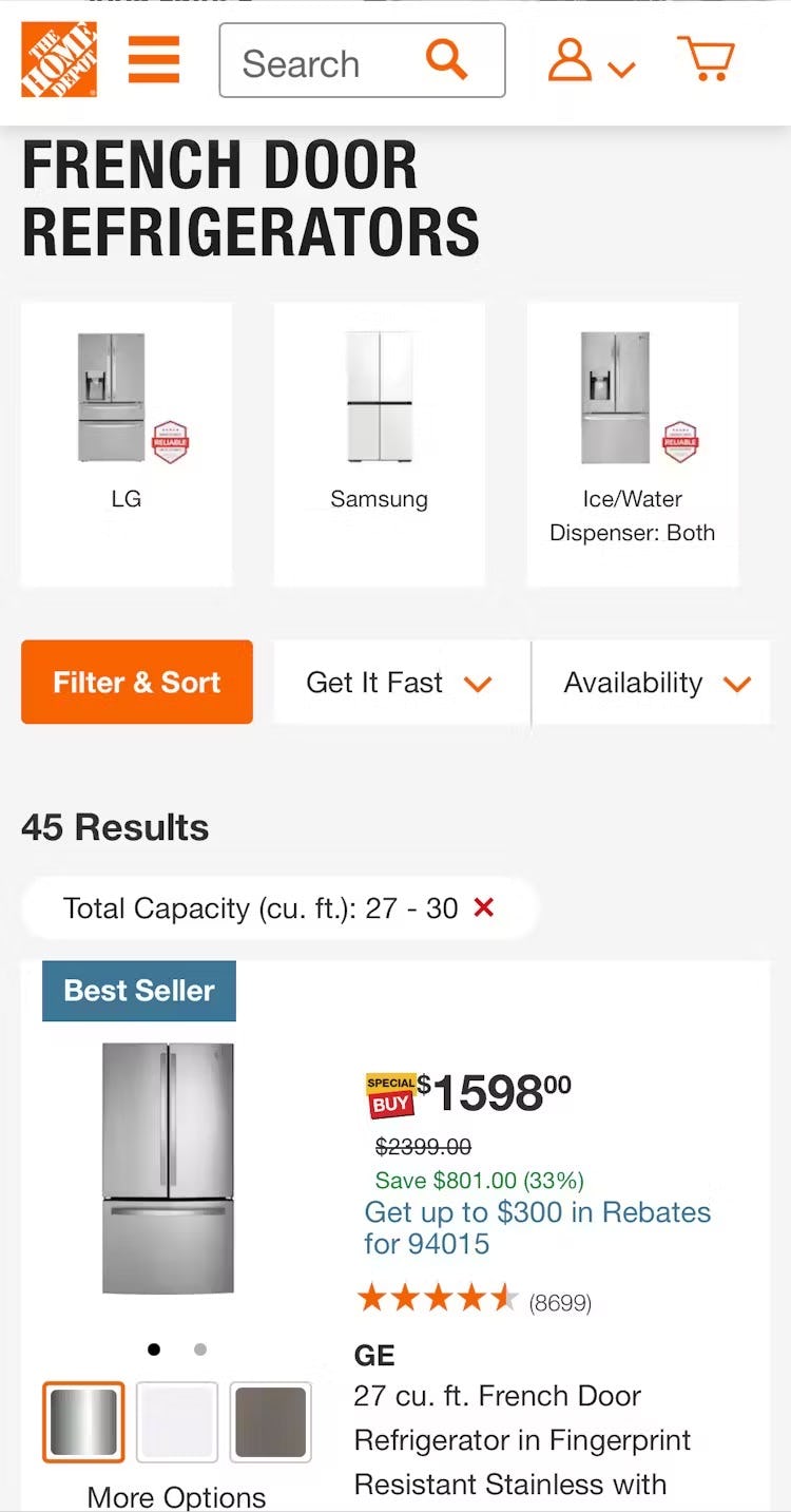
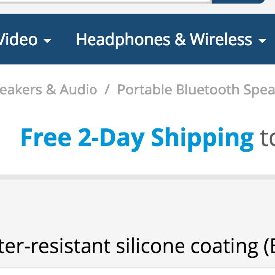
A search using both capacity and style of refrigerator at Home Depot returns 0 products (first image), even though product type and capacity filters exist on the site and 45 products match those attributes (second image). Users are left to wonder if the products are carried online at this site and must decide whether to spend more time to find that out.
These 8 query types — which include “Product Type” search, “Exact” search, “Compatibility” search, among others — are key to users’ ability to find products.
Yet as our benchmark shows, support for these searches tends to be “mediocre” — leaving half of the users on the site with a subpar experience when using their preferred method to find products.
As a result, users will be forced to work harder to find relevant products — which, of course, also means that a subgroup will simply give up their hunt.

Here we see that Kohl’s has made a clear effort to support “Use Case” searches. In this case, a query for “winter jacket” returns the “Coats & Jackets” category, with the “Warmth Factor: Midweight” and “Warmth Factor: Heavyweight” filters selected.
Therefore, to prep your site for Cyber Monday be sure to test how well the site performs across all 8 key search query types.
Any search types that struggle to find relevant products should be targeted for improvement, with particular attention paid to the search query types that are most relevant for the site’s context (e.g., “Compatibility” searches for electronics sites, “Symptom” searches for health and beauty sites, etc.).
2) Optimize the “No Results” Page (74% Don’t)
At some point, even the best search engines will fail to return results for certain user queries.
This can happen when a site simply doesn’t carry the item users are searching for, or when the query is too ambiguous for even a well-honed search engine to interpret correctly.

At Marks & Spencer, users are simply urged “Don’t give up!” and offered advice that often goes ignored. Without relevant crumbs to follow, users often lose their appetite to remain on site.
While some sites offer “search tips” — ideas for how a user can change the search to obtain better results — our research shows that search tips are not enough on their own.
Most users won’t bother to read the tips — and it takes a very diligent user to both read the tips and attempt to apply them when crafting a new query.
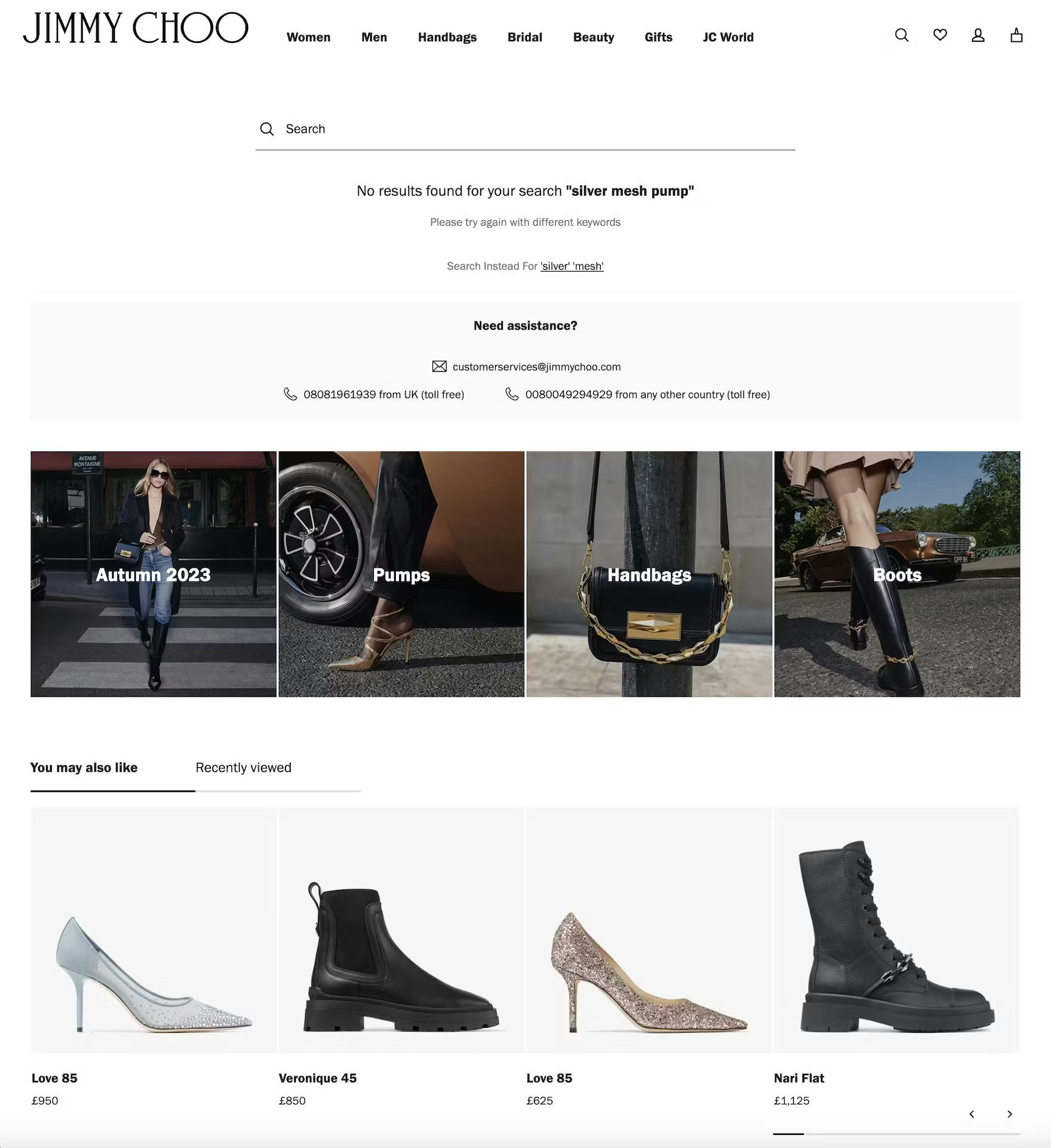
At Jimmy Choo, the “No Results” page offers 4 of 5 winning strategies for “No Results” pages: related categories, an alternative search suggestion, personalized recommendations, and phone numbers to call — making it more likely users will find something worth pursuing.
Instead, users should be actively helped to get back on track: by including related categories, alternative searches, personalized recommendations, sales contact information, and popular product suggestions on “No Results” pages.
Clearly Conveying Prices & Discounts
Whether users are browsing a product list or viewing a product page, they should be able to instantly identify the discounted price for items on sale or part of a promotion.
When the price or promotional terms are unclear, our Checkout and industry UX testing show that some users are less likely to commit to the purchase.
Two critical factors for success are where and how pricing information is displayed, especially within the “Buy” section on a product page.
Further, users also appreciate when eligible sales, deals, or promotions are applied to the cart with the guesswork removed.
Here are 2 sales UX best practices that build user confidence and help them take full advantage of available deals.
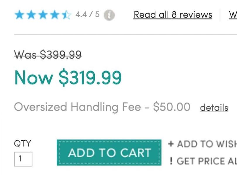
3) Display Price-Per-Unit (62% Don’t)


6 rolls for $5.99 (first image) or 18 rolls for $12.99 (second image) — how much better of a deal is the larger quantity? Users must rely on their own arithmetic skills to compare prices across products sold in varying quantities, as shown here at Target.
When products are sold in varying sizes, price per unit becomes highly relevant as users must otherwise calculate for themselves which size represents the best value for the money.
This can become especially burdensome if a product is offered in many different sizes or if the sizes or prices aren’t in round numbers.
For example, consider a hand cream offered in a 3.75 fl. oz. bottle at $12.75 and in a 6.25 fl. oz. bottle at $16.50 — which is the better deal, and how much better?

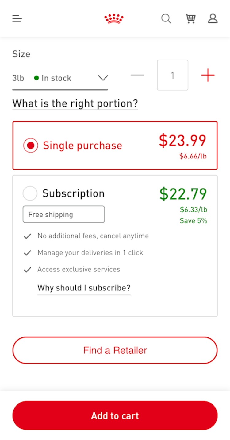
At Walgreens (first image), the price-per-count is displayed for allergy relief tablets, while at Royal Canin (second image), the price-per-pound is displayed for pet food. Displaying the unit cost helps users make informed decisions.
Therefore, to avoid users cutting their comparison process short, product pages should calculate and display price per unit for any product available in multiple quantities or sizes.
Of course, the total package price should still be prominently displayed — the price per unit should be an additional piece of necessary information within the “Buy” section, assisting users in their product-evaluation and -comparison process.
Simply displaying the unit prices for each size allows users to quickly determine which size offers the better deal.
4) Apply Discounts and Promo Codes Automatically (83% Don’t)

“We don’t have a code. We don’t have any of that.” Multiple participants at Shoreline Sightseeing failed to notice the 10% discount code featured directly above the promo code field in the cart, neglecting to enter the code to realize the sitewide discount. In reality, this can lead directly to abandonments if the total cost is above a user’s budget, but would have been in budget with the code.
Checkout testing consistently shows that participants are more likely to complete their orders when they feel they’re getting a “good deal”.
However, many sites complicate access to discounts by using distracting pop-ups or promo codes that can be difficult to copy, adding friction to the process.
Obstacles during checkout can lead to abandoned purchases and post-purchase frustration when users realize they have missed out on savings.
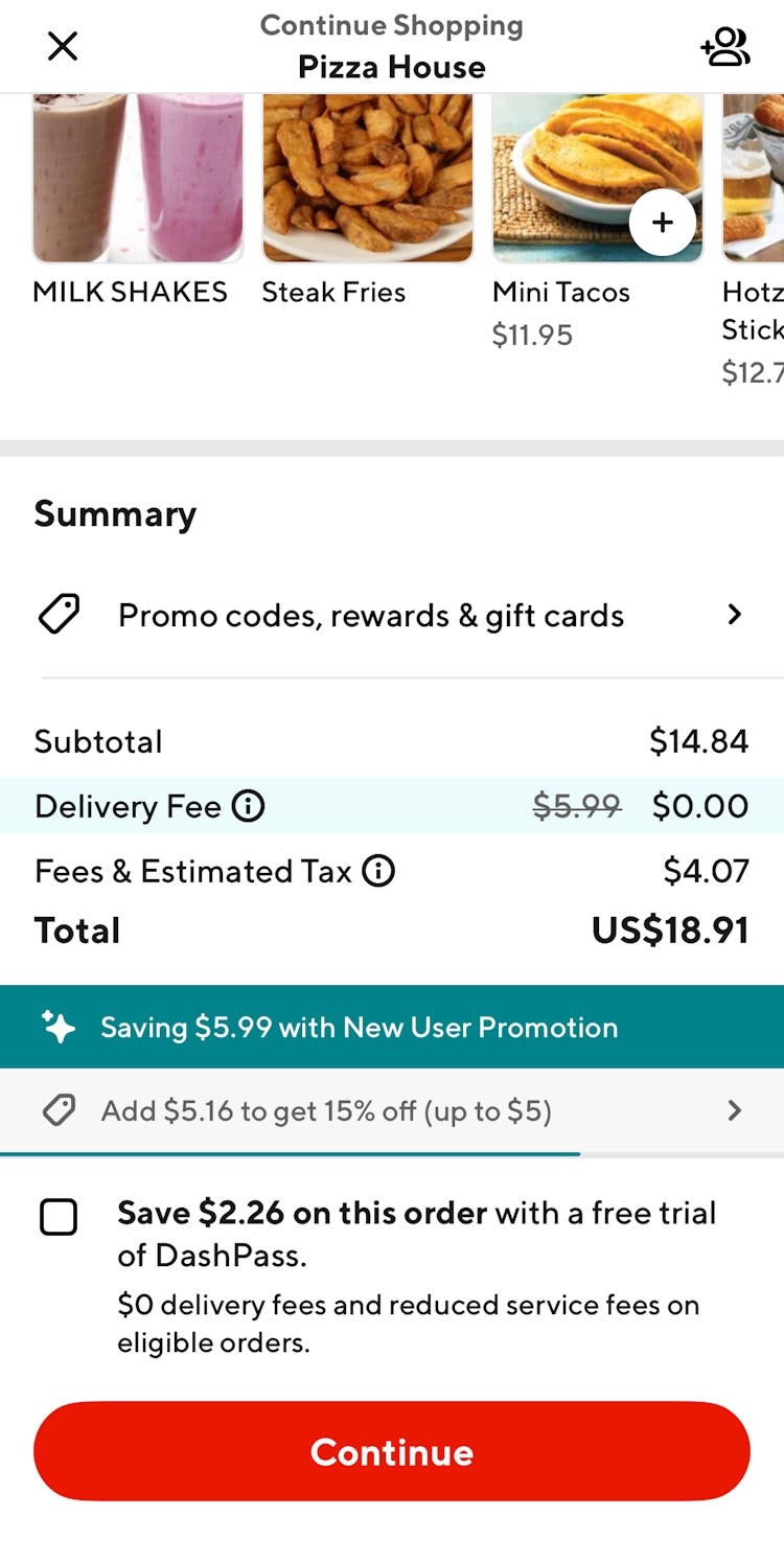
At DoorDash, a “New User Promotion” is highlighted in the cart with the now-zero “Delivery Fee” visibly applied, ensuring users they received the promotion.

Similarly, a user qualifying for this promotion at Deliveroo can quickly observe it’s been applied automatically and requires no further effort.
”This is nice that they already apply this for you. You don’t have to think about it or do anything.” (Participant, Checkout study)
To improve this experience, consider automatically applying the best promo codes and discounts for which the user qualifies and clearly displaying them in the cart.
Testing shows that participants appreciate sites that automatically apply valid discounts, viewing it as a sign that the site is customer-focused and trustworthy, rather than trying to “trick” them into paying full price.
Surfacing Shipping & Returns Information
Our testing reveals that UX issues with shipping and return policies remain a top reason for cart abandonment.
Shipping costs, delivery times, and return policies significantly impact users’ purchase decisions, with the details often varying widely across sites.
When users need this information, any difficulty locating and understanding it can influence their choice to buy.
Thus, making shipping and returns information easy to find and digest is paramount to streamlining the buying journey.
Here are 2 sales UX best practices that help inform users considering shipped products (versus pickup) or those that may need returning.
5) Promote Free Shipping in the “Buy” Section (47% Don’t)

“I don’t have clarity around shipping, so what I would do is add it to the cart to see.” This participant on Tempo couldn’t find any mention of shipping cost on the product page and needed to put forth additional time and effort to find it through other means.
Many users compare prices across sites, especially during sales events, and free shipping can be a deciding factor in which site they use.
However, testing shows that this advantage is often missed when placed in headers and banners rather than near the product.
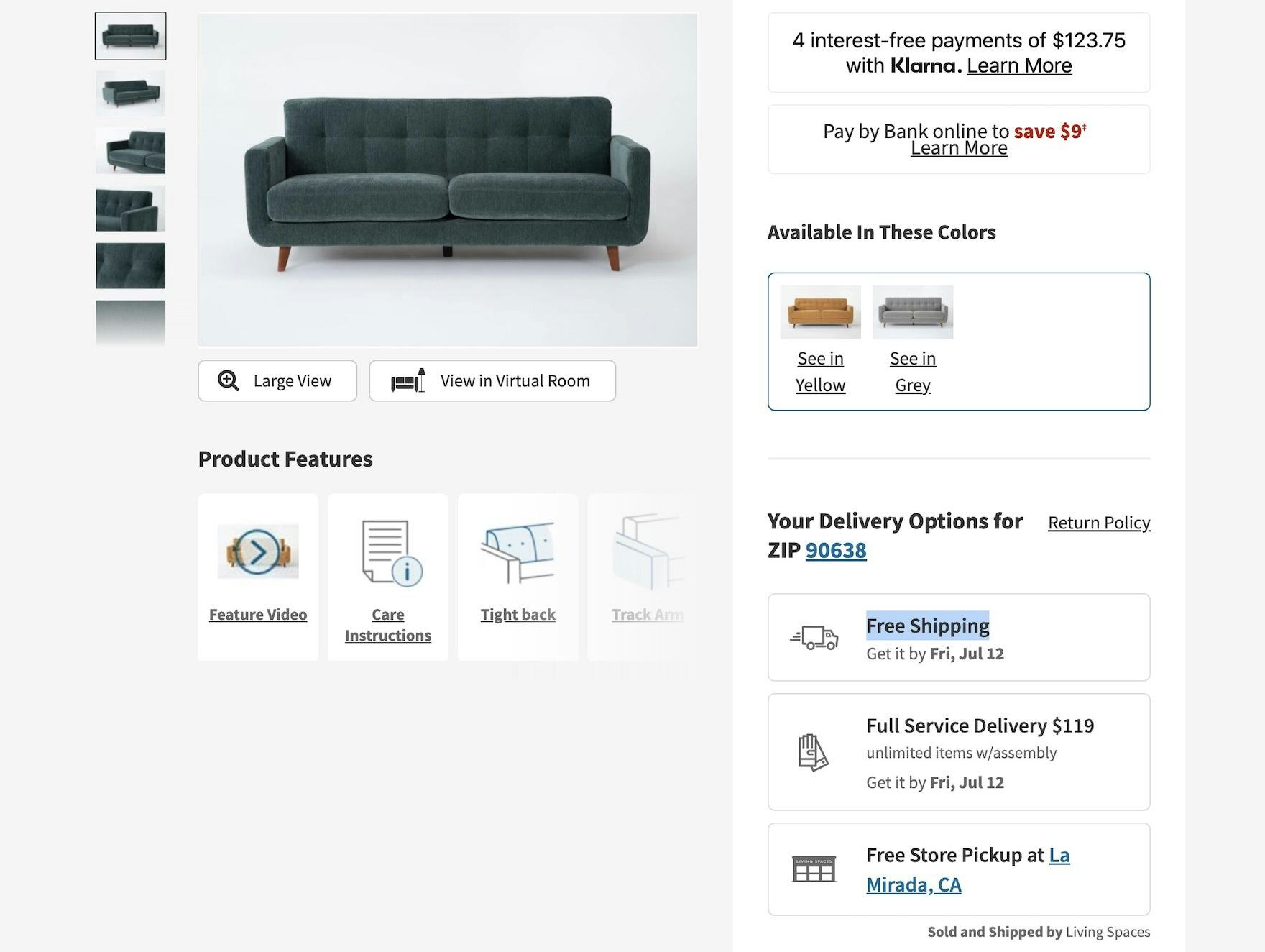
At Living Spaces, “Free Shipping” is clearly visible along with other key shipping details where delivery options are listed, enabling users to quickly factor that into the buying equation.
To address this, place free shipping details directly into the “Buy” section alongside other essential information — making it easy to spot and reassuring users it applies to this product.
”I do notice it says “Qualifies for free shipping”, so that’s nice. I usually like to compare different websites based on if they offer free shipping or discounts, so that would stand out to me when deciding.” (Participant, Apparel & Accessories study)
Note that while only essential details should appear in the “Buy” section, be sure to include any conditions required for free shipping.
6) Place Links to Shipping & Return Policies in the Footer (46% Don’t)

“I go to — trying to find — usually it’s somewhere on here, especially at the bottom. I’m looking for a return policy, but I don’t see it. Just click around until I find something…I would probably at this point start the live chat.” When users such as this participant on Home Depot (iOS) are unable to find the returns policy link in the footer, they could resort to contacting help directly. This takes up the valuable time of both users and, potentially, support staff unnecessarily.
In testing, we’ve observed that some participants look for shipping and return policies before they begin shopping.
For example, many sites have a “no returns” policy on sale or clearance items — a detail users prefer to know before investing time in finding the right product.
While shipping and returns information should be accessible in multiple places (such as described above on the Product Page), we’ve observed that a subset of users consistently navigate to the footer to find them.


When users head to the footer at both CB2 (first image) and Williams Sonoma (second image), they can quickly find visible links to shipping and return policies without spending time tapping the more generic links and possibly failing to find these topics.
Therefore, to support these users, include stand-alone links to “Shipping Information” and “Returns Policy” in the footer with clear, specific labels rather than hiding them behind general “Help” or “FAQ” links.
Additionally, users sometimes confuse “Returns” and “Returns Policy” links, so cross-referencing these sections can help ensure they find the exact information they need.
Building Confidence with Social Proof
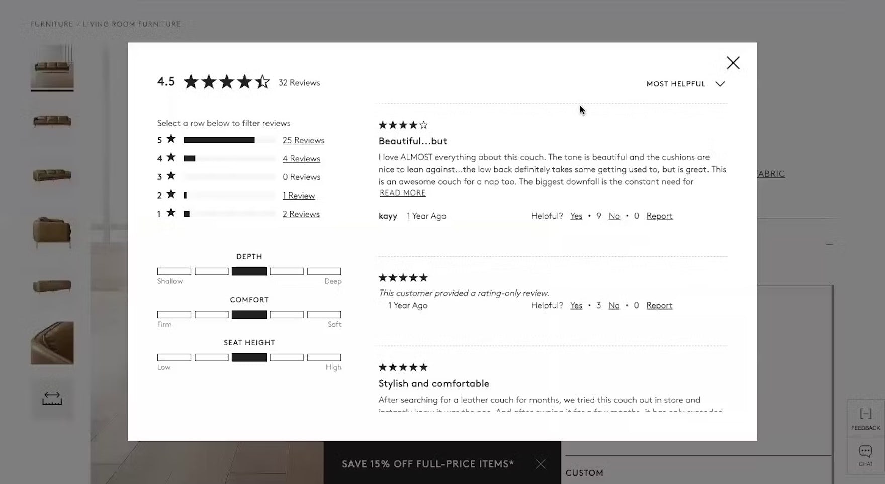
Product images are essential for evaluating an item, and users increasingly seek user-submitted content to build confidence that a product meets their needs.
During Product Page testing, we’ve found that user-submitted images often provide crucial details missing from a site’s standard images, such as how a makeup shade looks on different skin tones or creative styling ideas for clothing and decor.
As such, we recommend encouraging customers to submit multiple images and feature these “authentic” visuals prominently.
The following 2 sales UX best practices help users harness the power of social proof, offering valuable insights to guide their purchasing decisions.
7) Encourage Users to Submit Photos with Reviews (40% Don’t)
“Come on, no pictures. I mean, I know CB2 couches are beautiful, but no pictures for the reviews is not good for me.” This participant at CB2 was frustrated that the site didn’t offer the ability for past buyers to upload images with their reviews. She returned to the site-provided images, where she lamented the absence of a “Lifestyle” image, and then finally found a few user-provided images in the social media carousel.
Users often find user-submitted product images more objective, reliable, and trustworthy than site-provided ones, which can seem overly polished or enhanced.
Past buyers tend to share a range of both negative and positive experiences, while site images tend to focus on only the positives.
This kind of social proof allows users to view products in real-life settings, assess size and scale, and uncover unexpected details — boosting confidence in their purchase.

At Urban Outfitter's, reviewers are encouraged to submit up to six images with introductory text explaining that people find them “more helpful than text alone”.

And at Lowe's, reviewers are encouraged to “improve your review” by adding up to six photos and video too.
To support this, actively request images in the review form, and encourage uploads of one or more photos.
”Oh, see this reviewer has pictures! That’s cool, because now I see what it looks like on her, and she’s 5’1”. You know this model’s probably not 5’1”. I really like the pictures.” (Participant, Product Finding study)
Making reviewer-submitted images easy to find and simple to navigate reinforces their value and can motivate others to share their experiences too.
8) Add Social Media Visuals to the Product Page (60% Don’t)

“I would’ve liked to have seen real people wearing and using this, not necessarily from a review perspective, but from Instagram or something. Just having more of that to make me feel more comfortable with the brand and to decide what to buy.” This participant at Nicce struggled to make a purchase decision in the absence of images from customers.
Alongside review images, incorporating social media photos can further boost buyer confidence.
Some users seek inspiration for styling or want to confirm a design idea they have in mind, and social media images offer an authentic look at specific product attributes that may not be fully captured in brand-provided photos.

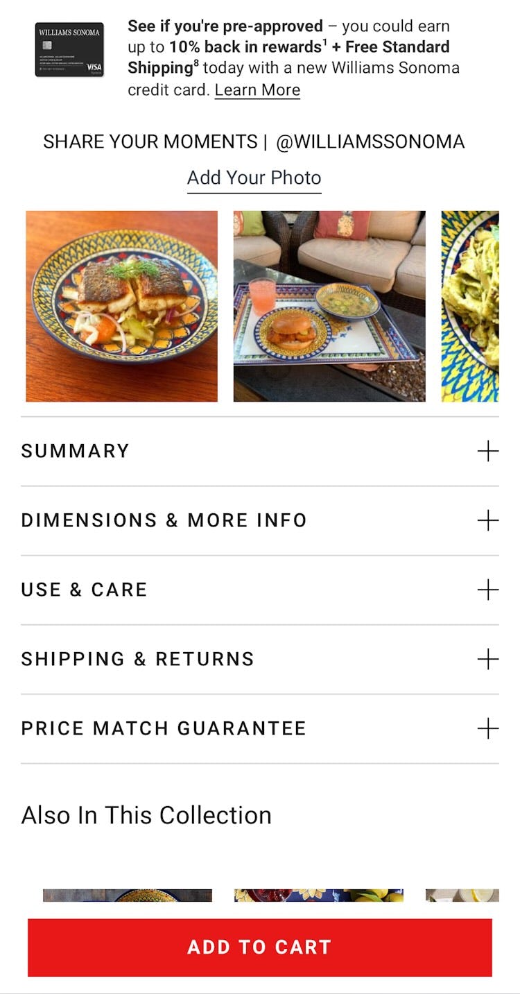
Both IKEA (first image) and Williams Sonoma (second image) curate photos from customers who have uploaded them to their brand’s Instagram accounts, helping users decide whether the products are suitable.
To give users ample “visual social proof” from real customers, sites should curate social media images from platforms like Instagram and integrate them on their product pages.
Social media carousels should focus exclusively on the product being viewed; in particular, by ensuring the item is present in each image.
Streamlining the Checkout Process
Once users have added products associated with your sales and deals, it’s crucial to guide them through checkout without delay.
Unfortunately, Cart & Checkout testing shows that friction from poor checkout design and flow can sometimes be the sole reason users abandon their purchase.
For new visitors, especially those in a hurry, it pays to feature the quickest paths — such as options that skip account creation until the order is placed or minimize typing for payment and address details.
Review these final 2 sales UX best practices to help users complete their purchases smoothly during the busy holiday sales season.
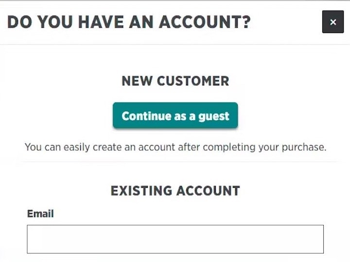
9) Make “Guest Checkout” the Most Prominent Option (23% Don’t)


“I have to log in. That’s frustrating…I see no way around it.” During testing of Walgreens’s mobile app, several participants failed to find the “Guest Checkout” option, which became hidden by the keyboard UI invoked by the sign-in form (first image). Even when participants dismissed the keyboard, the “Guest Checkout” option remained subdued due to its location below the sign-in option (second image).
Sites and apps should always offer a “Guest Checkout” option — many users don’t have the time or desire to create an account for every purchase.
While most sites do offer “Guest checkout”, over half of those tested made it hard to find, leading some participants in testing to miss it entirely.

West Elm features “Check Out as Guest” with a large red button in the upper left of the checkout page, ensuring it is the first checkout action users see. This UX well supports users who desire a quick wrap-up at checkout.
Therefore, to reduce friction, make “Guest Checkout” the most prominent option, use a clear label (e.g., “Guest Checkout” or “Continue as Guest”), and place it above or directly next to the option to sign in.
”’Continue as Guest.’ I don’t really make an account when I’m checking out. I always quickly just check out as a guest.” (Participant, Checkout study)
Thoughtfully implementing this feature while avoiding common pitfalls can significantly reduce cart abandonment for users seeking a quick exit.
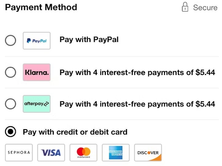
10) Provide Third-Party Payment Options (8% Don’t)
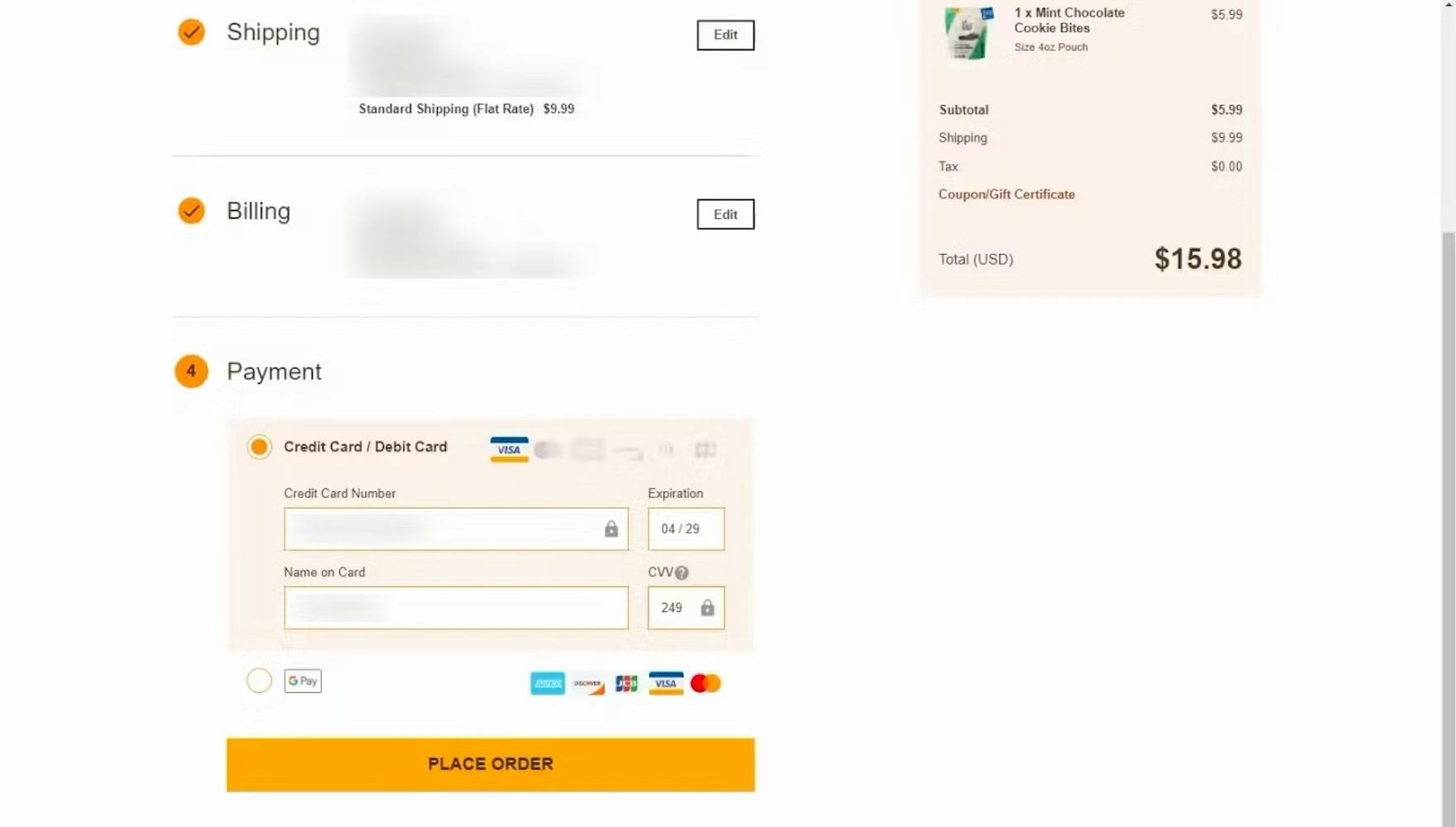
“I am disappointed that PayPal’s not an option, or it doesn’t appear to be.” This participant checking out at Theo Chocolates expressed disappointment that her preferred payment method, PayPal, was unavailable (though Google Pay was offered). For some users, the availability of their favorite payment method makes purchasing more cumbersome — and can potentially lead to abandonments.
Third-party payment options are increasingly popular for several reasons: they serve as a fallback if a regular card fails, reduce manual data entry, and some allow users to pay over time (e.g., PayPal or Afterpay).
In fact, Checkout testing reveals that a 10% of users will bail during checkout if their preferred payment method isn’t available.


To prevent this, always offer one or more alternative payment options and update the “payment” button’s microcopy to match the chosen method.
During busy sales events, when ecommerce deals and promotions compete, the final step of payment should be as seamless as possible.
Win Shoppers Over on Cyber Monday with Great Sales UX


Article (first image) and InsureandGo (second image) automatically apply users’ eligible promotions and visibly explain these discounts in the cart. This not only saves users from needing to leave the cart or the site to hunt for promotions, but it also builds goodwill for the brands.
Cyber Monday brings big sales and promotions that shoppers love, but also a sense of urgency with limited-time offers and items selling quickly.
Focusing on a seamless sales UX throughout the shopping journey ensures that users enjoy a hassle-free experience and feel confident completing their purchases.
Given the value of sales UX for both customers and brands, it’s a clear win-win to follow these 10 UX best practices:
- Support the 8 most common “Query Types” (55% get one or more wrong)
- Optimize the “No Results” page (74% don’t)
- Display price-per-unit (62% don’t)
- Apply discounts and promo codes automatically (83% don’t)
- Promote free shipping in the “Buy” section (47% don’t)
- Place links to shipping and returns policies in the footer (46% don’t)
- Encourage users to submit photos with reviews (40% don’t)
- Add social media visuals to the product page (60% don’t)
- Make “Guest Checkout” the most prominent option (23% don’t)
- Provide third-party payment options (8% don’t)
By refining the UX before the holiday rush, ecommerce sites not only offer a more satisfying shopping experience but also build trust and loyalty, encouraging shoppers to return year-round.
This article presents the research findings from just a few of the 700+ UX guidelines in Baymard – get full access to learn how to create a “State of the Art” ecommerce user experience.
If you want to know how your desktop site, mobile site, or app performs and compares, then learn more about getting Baymard to conduct a UX Audit of your site or app.